America Is Hard to See
May 1–Sept 27, 2015
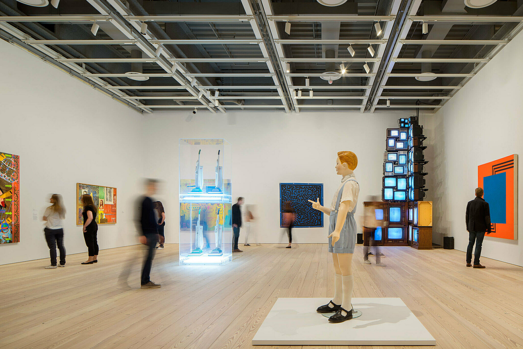
Drawn entirely from the Whitney Museum of American Art’s collection, America Is Hard to See takes the inauguration of the Museum’s new building as an opportunity to reexamine the history of art in the United States from the beginning of the twentieth century to the present. Comprising more than six hundred works, the exhibition elaborates the themes, ideas, beliefs, and passions that have galvanized American artists in their struggle to work within and against established conventions, often directly engaging their political and social contexts. Numerous pieces that have rarely, if ever, been shown appear alongside beloved icons in a conscious effort to unsettle assumptions about the American art canon.
The title, America Is Hard to See, comes from a poem by Robert Frost and a political documentary by Emile de Antonio. Metaphorically, the title seeks to celebrate the ever-changing perspectives of artists and their capacity to develop visual forms that respond to the culture of the United States. It also underscores the difficulty of neatly defining the country’s ethos and inhabitants, a challenge that lies at the heart of the Museum’s commitment to and continually evolving understanding of American art.
Organized chronologically, the exhibition’s narrative is divided into twenty- three thematic “chapters” installed throughout the building. These sections revisit and revise established tropes while forging new categories and even expanding the definition of who counts as an American artist. Indeed, each chapter takes its name not from a movement or style but from the title of a work that evokes the section’s animating impulse. Works of art across all mediums are displayed together, acknowledging the ways in which artists have engaged various modes of production and broken the boundaries between them.
America Is Hard to See reflects the Whitney’s distinct record of acquisitions and exhibitions, which constitutes a kind of collective memory—one that represents a range of individual, sometimes conflicting, attitudes toward what American art might be or mean or do at any given moment. By simultaneously mining and questioning our past, we do not arrive at a comprehensive survey or tidy summation, but rather at a critical new beginning: the first of many stories still to tell.
America Is Hard to See is organized by a team of Whitney curators, led by Donna De Salvo, Chief Curator and Deputy Director for Programs, including Carter E. Foster, Steven and Ann Ames Curator of Drawing; Dana Miller, Curator of the Permanent Collection; and Scott Rothkopf, Nancy and Steve Crown Family Curator and Associate Director of Programs; with Jane Panetta, Assistant Curator; Catherine Taft, Assistant Curator; and Mia Curran, Curatorial Assistant.
Sponsored by
Large Trademark
15
In the early 1960s, Pop art challenged the gestures of Abstract Expressionism with an unflinching embrace of America’s exploding commercial and media culture. The sources of this new art were generally neither the artist’s imagination nor direct observation of the world, but rather images themselves—whether product packaging, print advertisements, newspaper photography, or comic books. Early in their careers, many of Pop’s protagonists worked as commercial artists; Andy Warhol was an illustrator and James Rosenquist a Billboard painter, while Ed Ruscha trained in graphic design. These commercial backgrounds yielded flat, boldly graphic, mechanical-looking, and impersonal surfaces that were sometimes marked by photographic and printing processes.
The works on view in this chapter present a range of attitudes toward consumer culture. Some feel upbeat and celebratory, such as Tom Wesselmann’s enormous sandwich or Wayne Thiebaud’s luscious cakes. Other works, however, seem to distort or critique the American dream by hinting at overindulgent materialism or the social turmoil of the 1960s. Marisol’s fractured figures present themselves as mutant mannequins, and in Warhol’s hands, plastic surgery and an endless display of Coca-Cola bottles offer a false promise of beauty and sustenance, a vision of branding and self-improvement run amok. Despite its bright colors and visual wallop, Pop art’s tone was often deadpan and chilly, closer to its banal sources than to traditional fine art. Fittingly, it incited a media sensation and charges of vulgarity, but the aftershocks of its revolutionary take on American culture can still be felt today.
Below is a selection of works from this chapter.
JASPER JOHNS (B. 1930), THREE FLAGS, 1958
Jasper Johns, Three Flags, 1958
In The Whitney's Collection: Selections from 1900 to 1965 and Where We Are
0:00
Jasper Johns, Three Flags, 1958
0:00
Scott Rothkopf: A lot of people have debated whether this image is patriotic on the one hand or somehow critical of the American government, and part of its enduring appeal is that we just can’t decide. It’s interesting to think that seeing so many flags could recall parades, patriotism, a kind of festive embrace of American culture, and certainly this painting was made at a very interesting time in American history if we think of the triumphant feeling after World War II, as well as the fear of the Cold War, the repression of the 1950s era. In that way the flag could seem almost oppressive in this case, this kind of exaggerated image of American government, of patriotism, of jingoism, which sometimes stands for things that are not quite as positive as we would like them to be.
In 1954, Jasper Johns began painting what would become one of his signature emblems: the American flag. As an iconic image—comparable to the targets, maps, and letters that he also has depicted—Johns realized that the flag was “seen and not looked at, not examined.” The execution and composition of Three Flags elicit close inspection by the viewer. The painting draws attention to the process of its making through Johns’s use of encaustic, a mixture of pigment suspended in warm wax that congeals as each stroke is applied; the resulting accumulation of discrete marks creates a sensuous, almost sculptural surface. The work’s structural arrangement adds to its complexity. The trio of flags—each successively diminished in scale by about twenty-five percent—projects outward, contradicting classical perspective, in which objects appear to recede from the viewer’s vantage point. By shifting the visual emphasis from the flag’s emblematic meaning to the geometric patterns and variegated texture of the picture surface and the canvas structure, Johns explores the boundary between abstraction and representation. As he remarked, this painting allowed him to “go beyond the limits of the flag, and to have different canvas space.”
Artists
- Berenice Abbott
- Michele Abeles
- Vito Acconci
- Ansel Adams
- Robert Adams
- Carl Andre
- Kenneth Anger
- Eleanor Antin
- Diane Arbus
- Cory Arcangel
- David Armstrong
- Richard Artschwager
- Ruth Asawa
- Asco
- Charles Atlas
- Lutz Bacher
- Peggy Bacon
- Jo Baer
- Alex Bag
- Malcolm Bailey
- Lamar Baker
- John Baldessari
- Alvin Baltrop
- Lewis Baltz
- Matthew Barney
- Richmond Barthé
- Jean-Michel Basquiat
- Romare Bearden
- Cecil Beaton
- Robert Beavers
- Robert Bechtle
- Ericka Beckman
- Larry Bell
- George Bellows
- Lynda Benglis
- Thomas Hart Benton
- Wallace Berman
- Bernadette Corporation
- Judith Bernstein
- Huma Bhabha
- David Bienstock
- Henry Billings
- Ilse Bing
- Dara Birnbaum
- Nayland Blake
- Oscar Bluemner
- Peter Blume
- Lee Bontecou
- Jonathan Borofsky
- Louise Bourgeois
- Margaret Bourke-White
- Carol Bove
- Mark Bradford
- Stan Brakhage
- Robert Breer
- Patrick Henry Bruce
- Bernarda Bryson Shahn
- Charles Burchfield
- Jacob Burck
- Chris Burden
- Scott Burton
- Mary Ellen Bute
- Paul Cadmus
- John Cage
- Alexander Calder
- Cameron
- Luis Camnitzer
- Peter Campus
- James Castle
- Elizabeth Catlett
- Maurizio Cattelan
- Vija Celmins
- John Chamberlain
- Paul Chan
- Sarah Charlesworth
- Ayoka Chenzira
- Chryssa
- Larry Clark
- Chuck Close
- Sue Coe
- Anne Collier
- Bruce Conner
- Joseph Cornell
- Eldzier Cortor
- Miguel Covarrubias
- John Covert
- Ralston Crawford
- E.E. Cummings
- Imogen Cunningham
- John Currin
- John Steuart Curry
- Allan D'Arcangelo
- James Daugherty
- Emma Lu Davis
- Stuart Davis
- Roy DeCarava
- Jay DeFeo
- Willem de Kooning
- Walter De Maria
- Charles Demuth
- Maya Deren
- Jim Dine
- Mark di Suvero
- Arthur Dove
- Thomas Downing
- Elsie Driggs
- Guy Pène Du Bois
- Carroll Dunham
- Sam Durant
- Jimmie Durham
- Mabel Dwight
- William Eggleston
- Nicole Eisenman
- Wharton Esherick
- Walker Evans
- Kevin Jerome Everson
- Loretta Fahrenholz
- Andreas Feininger
- Lyonel Feininger
- Duncan Ferguson
- Rafael Ferrer
- Paul Fiene
- Morgan Fisher
- John B. Flannagan
- Hollis Frampton
- Robert Frank
- Andrea Fraser
- LaToya Ruby Frazier
- Hermine Freed
- Jared French
- Lee Friedlander
- Brian Frye
- Charles Gaines
- Anna Gaskell
- GCC
- Gerald K. Geerlings
- Hugo Gellert
- Sandra Gibson
- Luis Gispert
- William Glackens
- Milton Glaser
- Robert Gober
- Nan Goldin
- Wayne Gonzales
- Felix Gonzalez-Torres
- Boris Gorelick
- Arshile Gorky
- Dan Graham
- William Gropper
- Nancy Grossman
- George Grosz
- Louis Guglielmi
- Philip Guston
- Walter Gutman
- Wade Guyton
- Hans Haacke
- Peter Halley
- David Hammons
- Keith Haring
- Rachel Harrison
- Marsden Hartley
- David Hartt
- David Haxton
- Sharon Hayes
- Al Held
- Robert Henri
- Carmen Herrera
- Eva Hesse
- Lewis Hine
- Nancy Holt
- Jenny Holzer
- Edward Hopper
- Roni Horn
- Earl Horter
- Alex Hubbard
- Peter Hujar
- Victoria Hutson Huntley
- Richard Hunt
- Robert Indiana
- Abraham Jacobs
- Ulysses Jenkins
- Neil Jenney
- Candy Jernigan
- Jess
- Jasper Johns
- Rashid Johnson
- Ray Johnson
- William H. Johnson
- Joan Jonas
- Joe Jones
- Philip Mallory Jones
- Michael Joo
- Donald Judd
- Alex Katz
- On Kawara
- Mike Kelley
- Ellsworth Kelly
- Sister Corita Kent
- Rockwell Kent
- Karen Kilimnik
- William Klein
- Franz Kline
- Josh Kline
- Jeff Koons
- Lee Krasner
- Barbara Kruger
- Yasuo Kuniyoshi
- Yayoi Kusama
- Suzanne Lacy
- David Lamelas
- Dorothea Lange
- Liz Magic Laser
- Robert Laurent
- Louise Lawler
- Jacob Lawrence
- An-My Lê
- William Leavitt
- Zoe Leonard
- Alfred Leslie
- Howard Lester
- Sherrie Levine
- Herschel Levit
- Helen Levitt
- Sol LeWitt
- Roy Lichtenstein
- Glenn Ligon
- Kalup Linzy
- Alvin Loving
- Lee Lozano
- Louis Lozowick
- George Luks
- Helen Lundeberg
- Len Lye
- Danny Lyon
- Stanton Macdonald-Wright
- Tala Madani
- Sylvia Plimack Mangold
- Man Ray
- Robert Mapplethorpe
- Christian Marclay
- Brice Marden
- Marisol
- Kyra Markham
- Reginald Marsh
- Agnes Martin
- Fletcher Martin
- Gordon Matta-Clark
- Cynthia Maughan
- Keith Mayerson
- Paul McCarthy
- John McCracken
- Adam McEwen
- John McLaughlin
- Josephine Meckseper
- Jonas Mekas
- Ana Mendieta
- Sam Middleton
- Aleksandra Mir
- Joan Mitchell
- Toyo Miyatake
- Lisette Model
- Donald Moffett
- Abelardo Morell
- Robert Morris
- Mark Morrisroe
- Gerald Murphy
- Elizabeth Murray
- Julie Murray
- Reuben Nakian
- Bruce Nauman
- Alice Neel
- Louise Nevelson
- Barnett Newman
- Isamu Noguchi
- David Novros
- Jim Nutt
- Chiura Obata
- Georgia O'Keeffe
- Claes Oldenburg
- Catherine Opie
- José Clemente Orozco
- Raphael Montañez Ortiz
- Alfonso Ossorio
- Tony Oursler
- Bill Owens
- Akosua Adoma Owusu
- Nam June Paik
- Gordon Parks
- Agnes Pelton
- I. Rice Pereira
- Raymond Pettibon
- Elizabeth Peyton
- Paul Pfeiffer
- Howardena Pindell
- Adrian Piper
- Horace Pippin
- Lari Pittman
- Jackson Pollock
- Liliana Porter
- Richard Pousette-Dart
- Richard Prince
- Nancy Elizabeth Prophet
- Noah Purifoy
- R. H. Quaytman
- Walid Raad
- Yvonne Rainer
- Christina Ramberg
- Robert Rauschenberg
- Charles Ray
- Luis Recoder
- Jeffrey Reed
- Robert Reed
- Earl Reiback
- Ad Reinhardt
- Hans Richter
- Faith Ringgold
- Dorothea Rockburne
- James Rosenquist
- Martha Rosler
- Theodore Roszak
- Susan Rothenberg
- Mark Rothko
- Edward Ruscha
- Morgan Russell
- Betye Saar
- David Salle
- Lucas Samaras
- Jacolby Satterwhite
- Peter Saul
- Matt Saunders
- Morton Schamberg
- Carolee Schneemann
- Dana Schutz
- Dread Scott
- George Segal
- Richard Serra
- Ben Shahn
- Joel Shapiro
- Paul Sharits
- Charles Sheeler
- Cindy Sherman
- Roger Shimomura
- Everett Shinn
- Amy Sillman
- Laurie Simmons
- Taryn Simon
- Lorna Simpson
- John Sloan
- David Smith
- Jack Smith
- Kiki Smith
- Robert Smithson
- Tony Smith
- Keith Sonnier
- Edward Steichen
- Ralph Steiner
- Frank Stella
- Joseph Stella
- Harry Sternberg
- Hedda Sterne
- Florine Stettheimer
- May Stevens
- Alfred Stieglitz
- John Storrs
- Michelle Stuart
- Sturtevant
- Wayne Thiebaud
- Alma Thomas
- Rirkrit Tiravanija
- George Tooker
- Bill Traylor
- Ryan Trecartin
- Trisha Brown Dance Company
- Anne Truitt
- Wu Tsang
- Richard Tuttle
- Cy Twombly
- Stan VanDerBeek
- Kara Walker
- Kelley Walker
- Carl Walters
- Andy Warhol
- Max Weber
- Weegee
- William Wegman
- Lawrence Weiner
- Tom Wesselmann
- H.C. Westermann
- Charles White
- Gertrude Vanderbilt Whitney
- Jack Whitten
- Hannah Wilke
- Christopher Williams
- Sue Williams
- Fred Wilson
- Garry Winogrand
- William Winter
- Karl Wirsum
- David Wojnarowicz
- Jordan Wolfson
- Martin Wong
- Grant Wood
- Francesca Woodman
- Hale Aspacio Woodruff
- Christopher Wool
- Andrew Wyeth
- William Zorach
Mobile guides
99 Objects
Listen to selections from the in-gallery programs series named in honor of the Whitney’s new address, 99 Gansevoort Street. Artists, writers, Whitney curators and educators, and an interdisciplinary group of scholars focus on individual works of art from the Museum’s collection on view in America Is Hard to See.
Explore works from this exhibition
in the Whitney's collection
View 646 works
In the News
“2015 was the Year of the Whitney…the cross-disciplinary approach taken by America Is Hard to See and Collected by Thea Westreich Wagner and Ethan Wagner, is becoming the model for a new generation of curators.”
—Hyperallergic
“2015 belonged to the Whitney…both my museum—and my show—of the year.”
—Adrian Searle in The Guardian
"Best of 2015: Our Top 20 NYC Art Shows"
—Hyperallergic
"The museum’s inaugural show in its new building, America Is Hard to See, tells a different story of modern and contemporary American art than the lily-white version we’re used to"
—The New Yorker
Interview: Curator Scott Rothkopf speaks about America Is Hard to See on Slate's Culture Gabfest
—Slate
"New Whitney Museum Signifies a Changing New York Art Scene"
—The New York Times
"With its abundantly sumptuous holdings, the museum tells us how we got where we are, offering a teeming lineage of the art of this country"
—Hyperallergic
"The Whitney Opens With a Winner"
—Artnews
"Review: New Whitney Museum’s First Show, America Is Hard to See"
—The New York Times
"Curators at the Whitney Museum of American Art discuss their largest exhibition to date at their new downtown location, designed by architect Renzo Piano"
—The Wall Street Journal
"The exhibition will include plenty of crowd-pleasers—Hopper, O’Keeffe, Calder’s “Circus”—but, with the Whitney’s brilliant chief curator, Donna De Salvo, at the helm, expect major twists in the conventional art-historical plot."
—The New Yorker
"The Whitney Museum, Soon to Open Its New Home, Searches for American Identity"
—The New York Times
"One of this year's most anticipated art world events"
—Huffington Post

