Spilling Over: Painting Color in the 1960s

Mar 29–Aug 18, 2019

This exhibition gathers paintings from the 1960s and early 1970s that inventively use bold, saturated, and even hallucinatory color to activate perception. During this period, many artists adopted acrylic paint—a newly available, plastic-based medium—and explored its expansive technical possibilities and wider range of hues. Color Field painters poured paint and stained unprimed canvas, dramatizing painting’s materiality and visual force. Painters associated with Op art deployed pattern, geometric arrangement, and intense color combinations to emphasize that vision is a commingling of physical response and unconscious association. At the same historical moment, an emerging generation of artists of color and women explored color’s capacity to articulate new questions about perception, specifically its relation to race, gender, and the coding of space. The exhibition looks to the divergent ways color can be equally a formal problem and a political statement.

Drawn entirely from the Whitney’s collection, Spilling Over includes important recently acquired works by Emma Amos and Kay WalkingStick, as well as paintings that entered the collection soon after they were made, by artists such as Alvin Loving, Ellsworth Kelly, Miriam Schapiro, and Frank Stella, among others. The title comes from a quote by artist Bob Thompson, whose work is also presented. He said, “I paint many paintings that tell me slowly that I have something inside of me that is just bursting, twisting, sticking, spilling over to get out. Out into souls and mouths and eyes that have never seen before.” Spilling Over demonstrates how painting retained an urgency for artists who wanted to see anew.

The exhibition is organized by David Breslin, DeMartini Family Curator and Director of the Collection, with Margaret Kross, curatorial assistant.


Support for Spilling Over: Painting Color in the 1960s is provided by the LLWW Foundation and the Helen Frankenthaler Foundation.


Back

16 / 18

Previous Next

Frank Stella

16

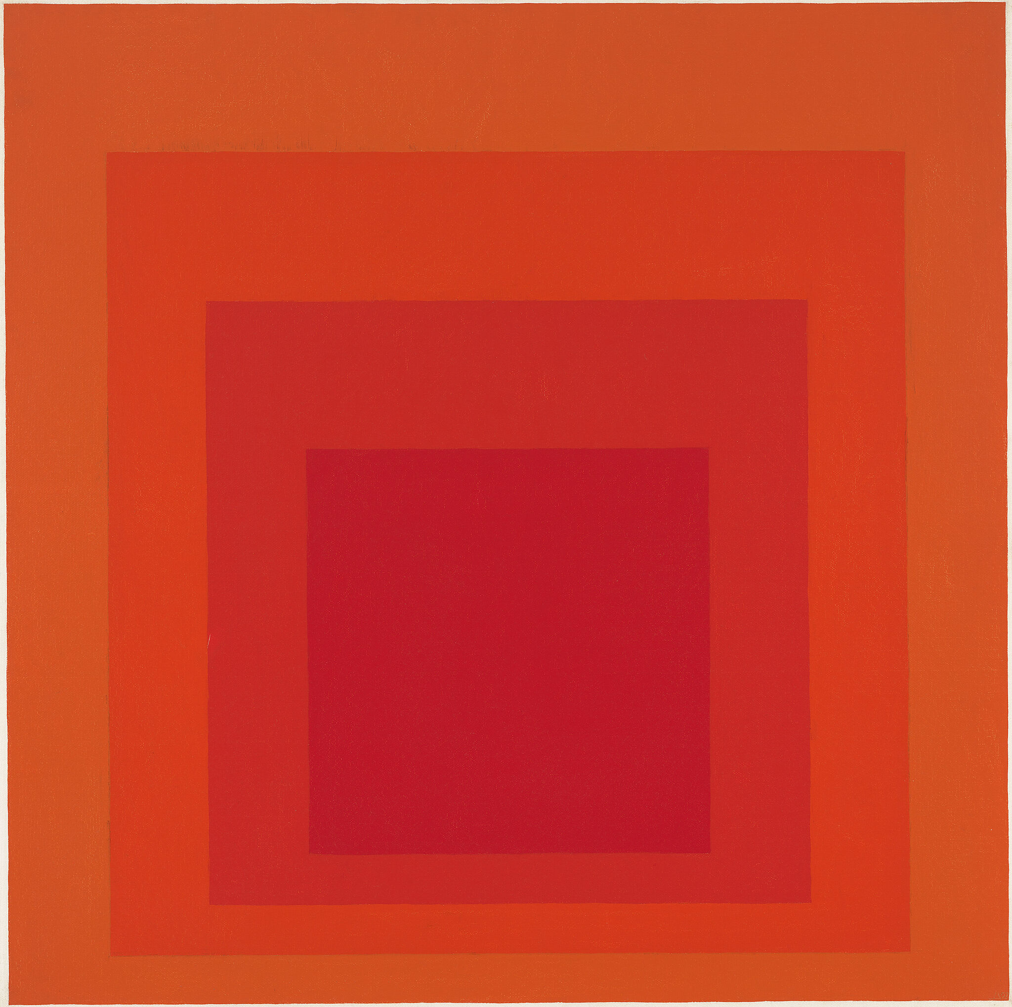
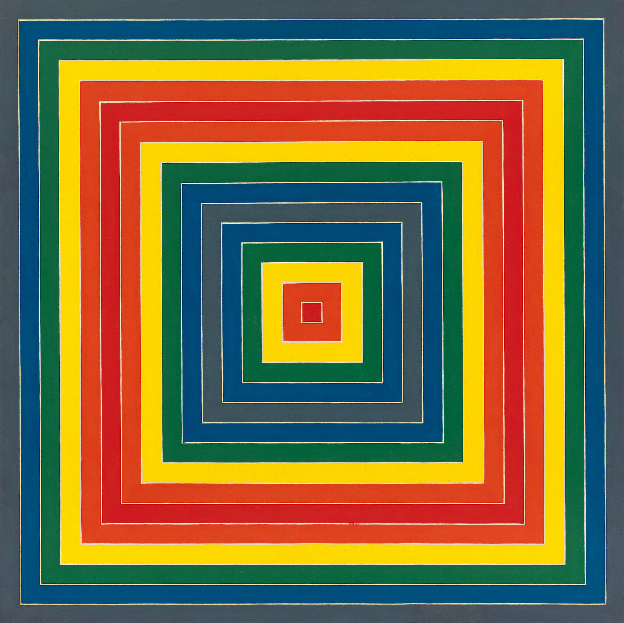
Frank Stella’s Gran Cairo simultaneously puts forward two painterly values that are sometimes seen as competing with each other: rationality and seductive beauty. He based his symmetrical, linear compositions on the dimensions of his canvases, thereby emphasizing the structure of the paintings. “What you see,” Stella once famously remarked, “is what you see.” His use of color in Gran Cairo—with its predetermined palette derived from commercial paints and its strict arrangement of concentric squares—reinforces this impersonal sensibility. Yet it also reflects Stella’s belief, which ran counter to that of Minimalist contemporaries such as Donald Judd and Robert Morris, that beauty, visual energy, and pleasure should be fair game for abstract art.

Gran Cairo, 1962


Events

View all

Audio guides

"More often than not, you have to assume that there is some sort of relationship between radical gestures and art, and radical gestures and the world."
—Rashid Johnson

Hear from the artists, the exhibition’s curator, and scholars speaking about works on view.

View guide


Explore works from this exhibition
in the Whitney's collection

View 18 works

In the News

“It’s a perfect summer show that you will want to visit again and again. Its abounding freshness clears your eyes and lifts your spirits, so that everything around you, in and out of the museum, looks clear, bright, alive, and new.”
-Hyperallergic