
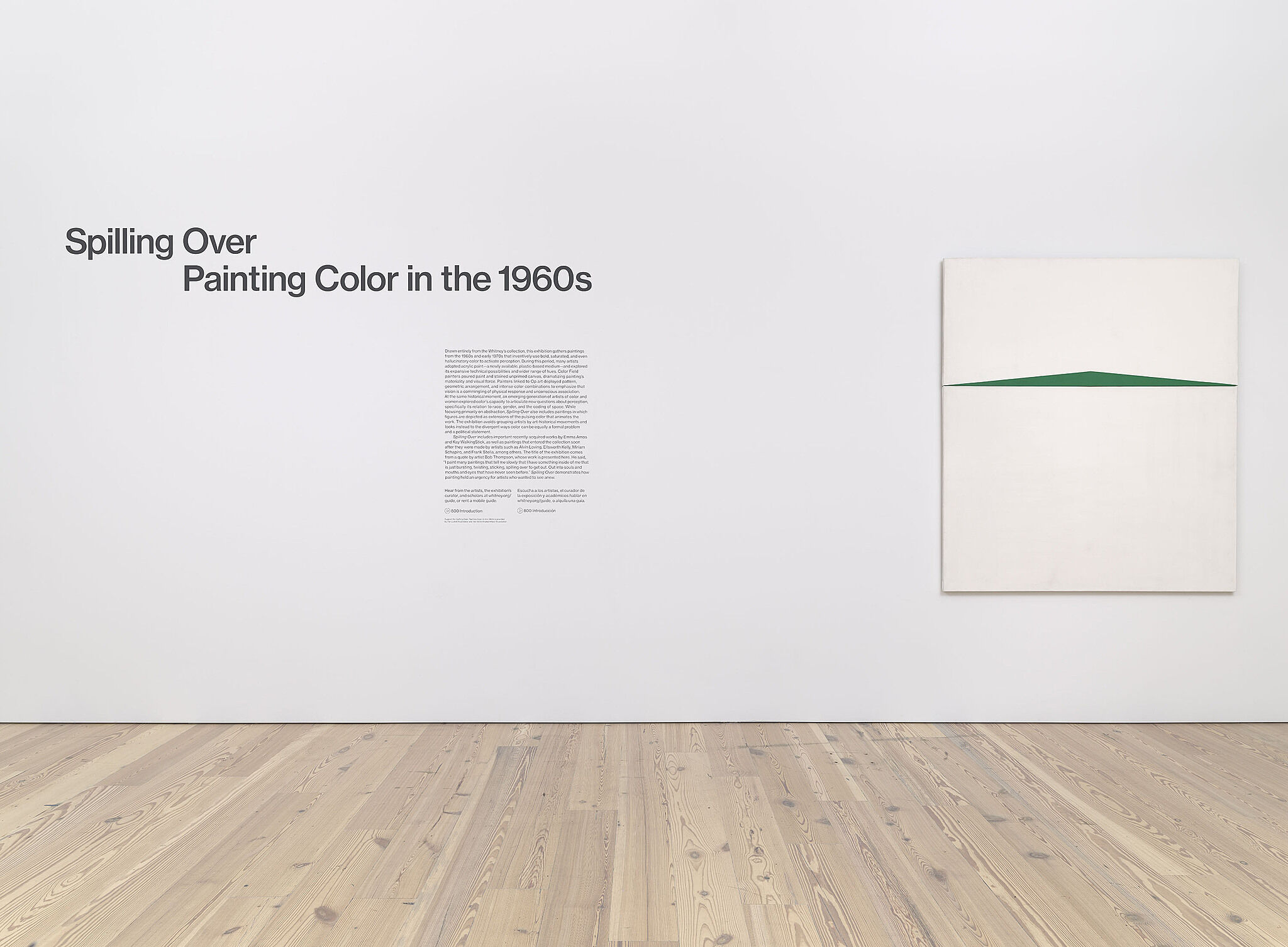
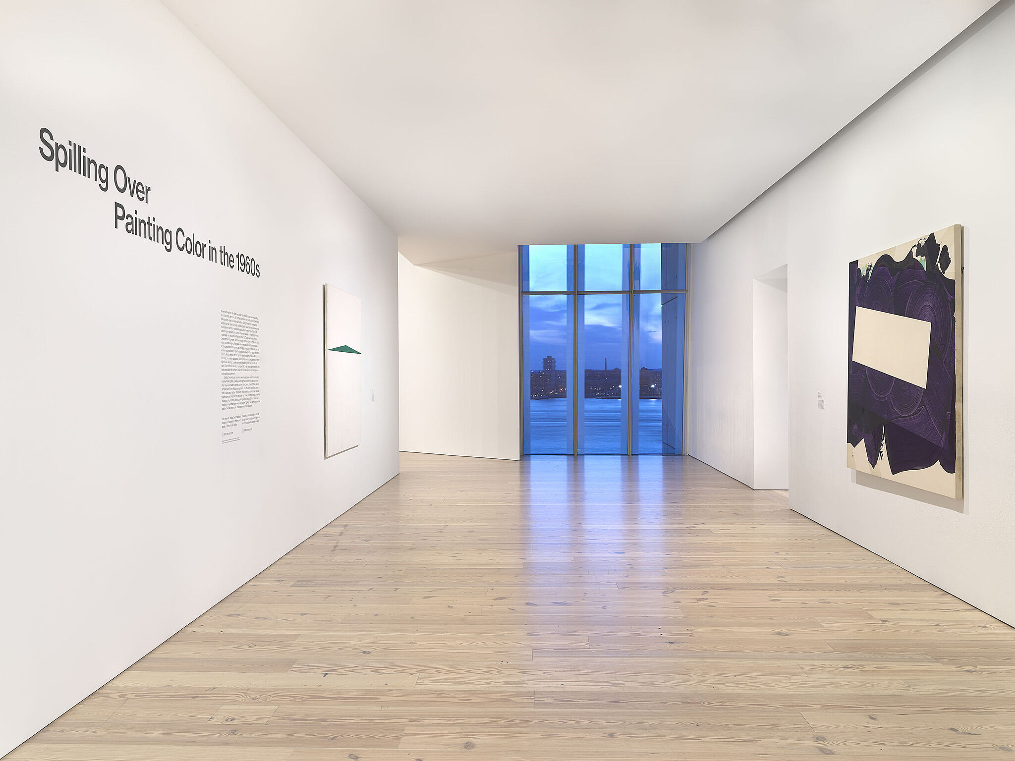
Spilling Over: Painting Color in the 1960s
Mar 29–Aug 18, 2019
This exhibition gathers paintings from the 1960s and early 1970s that inventively use bold, saturated, and even hallucinatory color to activate perception. During this period, many artists adopted acrylic paint—a newly available, plastic-based medium—and explored its expansive technical possibilities and wider range of hues. Color Field painters poured paint and stained unprimed canvas, dramatizing painting’s materiality and visual force. Painters associated with Op art deployed pattern, geometric arrangement, and intense color combinations to emphasize that vision is a commingling of physical response and unconscious association. At the same historical moment, an emerging generation of artists of color and women explored color’s capacity to articulate new questions about perception, specifically its relation to race, gender, and the coding of space. The exhibition looks to the divergent ways color can be equally a formal problem and a political statement.
Drawn entirely from the Whitney’s collection, Spilling Over includes important recently acquired works by Emma Amos and Kay WalkingStick, as well as paintings that entered the collection soon after they were made, by artists such as Alvin Loving, Ellsworth Kelly, Miriam Schapiro, and Frank Stella, among others. The title comes from a quote by artist Bob Thompson, whose work is also presented. He said, “I paint many paintings that tell me slowly that I have something inside of me that is just bursting, twisting, sticking, spilling over to get out. Out into souls and mouths and eyes that have never seen before.” Spilling Over demonstrates how painting retained an urgency for artists who wanted to see anew.
The exhibition is organized by David Breslin, DeMartini Family Curator and Director of the Collection, with Margaret Kross, curatorial assistant.
Support for Spilling Over: Painting Color in the 1960s is provided by the LLWW Foundation and the Helen Frankenthaler Foundation.
Josef Albers
1
This painting comes from Homage to the Square, a series Josef Albers developed from 1950 to 1976 that eventually encompassed more than one thousand separate artworks. Albers approached each of the Homages with meticulous consistency. He would select one of four set layouts, all of which were symmetrical and oriented toward the bottom edge. He then applied each color, in this work a range of oranges and reds, from the center out, using a knife to spread paint straight from the tube. Albers’s technique allowed him to use the same form to create vastly different experiences, and to explore the distinction between “physical fact and psychic effect.” Across the series, color combinations affect not only how we see individual hues but also how we perceive space and form, with some squares seeming to leap forward while others recede.
Homage to the Square: "Wait", 1967
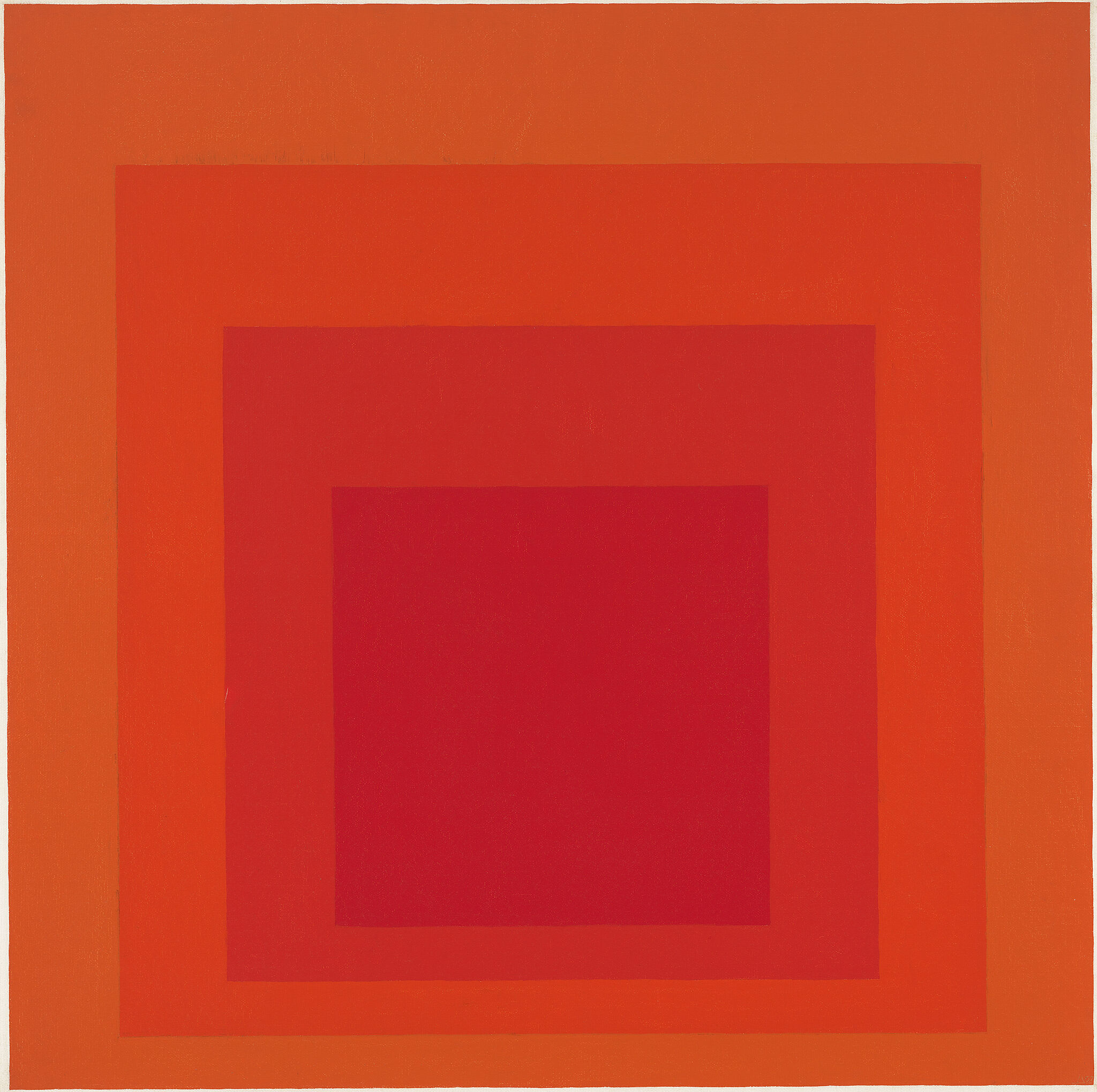
Josef Albers, Homage to the Square: "Wait", 1967. Oil on composition board, 47 7/8 × 47 7/8 in. (121.6 × 121.6 cm). Whitney Museum of American Art, New York; Bequest of Richard S. Zeisler 2007.81. © The Josef and Anni Albers Foundation / Artists Rights Society (ARS), New York
Artists
Mobile guides
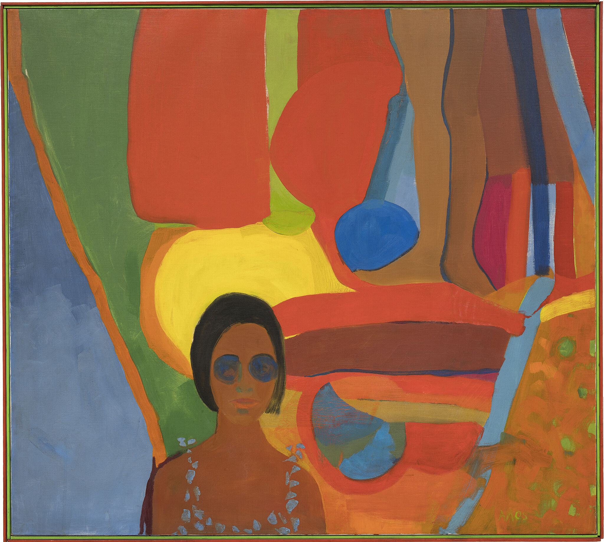
Emma Amos, Baby, 1966. Oil on canvas, 46 1/2 × 51 in. (118.1 × 129.5 cm). Whitney Museum of American Art, New York; purchased jointly by the Whitney Museum of American Art, with funds from the Painting and Sculpture Committee; and The Studio Museum in Harlem, museum purchase with funds provided by Ann Tenenbaum and Thomas H. Lee T.2018.33a-b. © Emma Amos; courtesy of the artist and RYAN LEE Gallery, New York
"More often than not, you have to assume that there is some sort of relationship between radical gestures and art, and radical gestures and the world."
—Rashid Johnson
Hear from the artists, the exhibition’s curator, and scholars speaking about works on view.
Installation photography
-
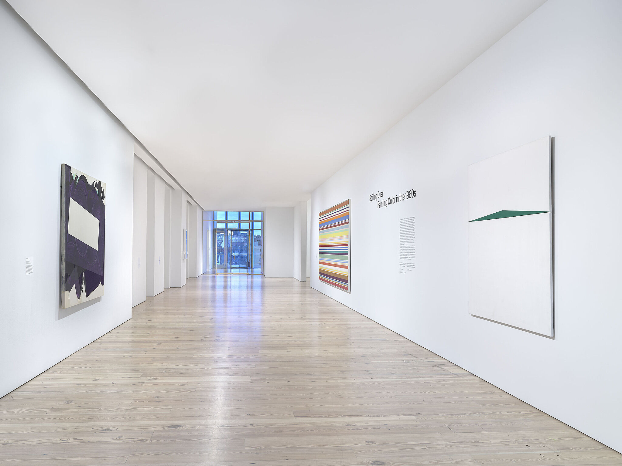
Installation view of Spilling Over: Painting Color in the 1960s (Whitney Museum of American Art, New York, March 29-August 2019). From left to right: Robert Reed, Plum Nellie, Sea Stone, 1972; Kenneth Noland, New Day, 1967; Carmen Herrera, Blanco y Verde, 1959. Photograph by Ron Amstutz
-
Installation view of Spilling Over: Painting Color in the 1960s (Whitney Museum of American Art, New York, March 29-August 2019). Carmen Herrera, Blanco y Verde, 1959. Photograph by Ron Amstutz
-
Installation view of Spilling Over: Painting Color in the 1960s (Whitney Museum of American Art, New York, March 29-August 2019). From left to right: Kenneth Noland, New Day, 1967; Carmen Herrera, Blanco y Verde, 1959; Robert Reed, Plum Nellie, Sea Stone, 1972. Photograph by Ron Amstutz
-
Installation view of Spilling Over: Painting Color in the 1960s (Whitney Museum of American Art, New York, March 29-August 2019). From left to right: Carmen Herrera, Blanco y Verde, 1959; Robert Reed, Plum Nellie, Sea Stone, 1972. Photograph by Ron Amstutz
-
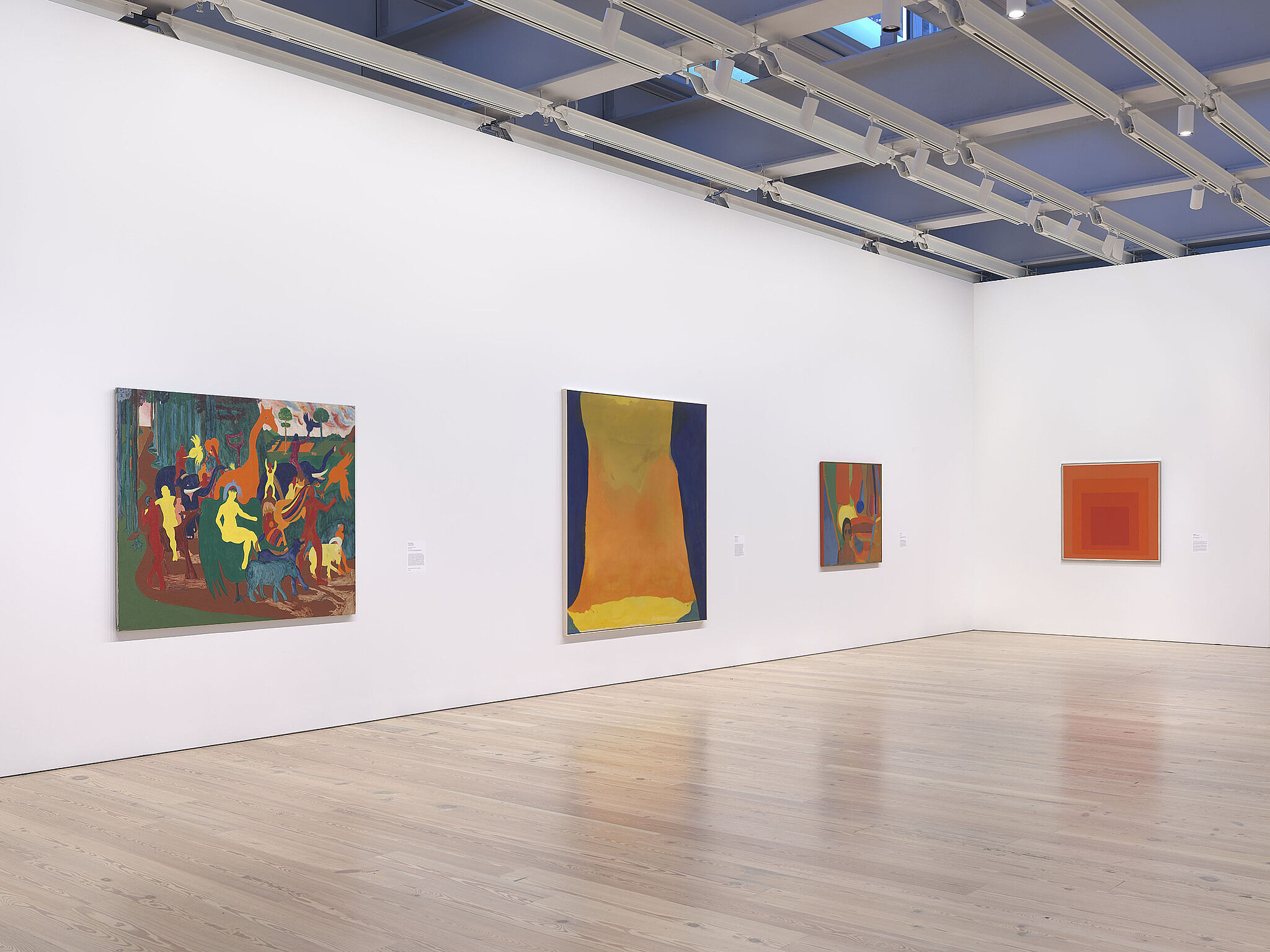
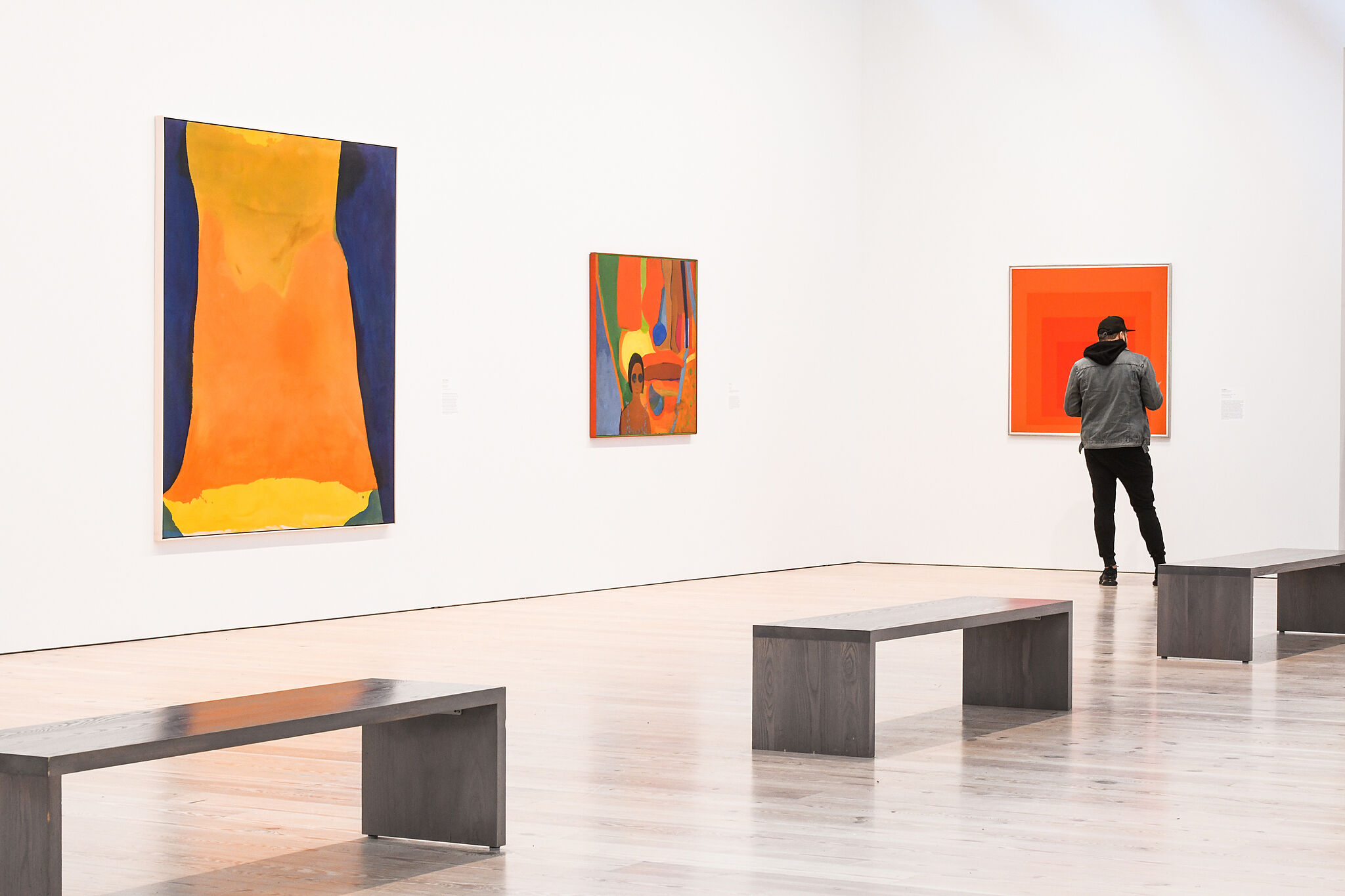
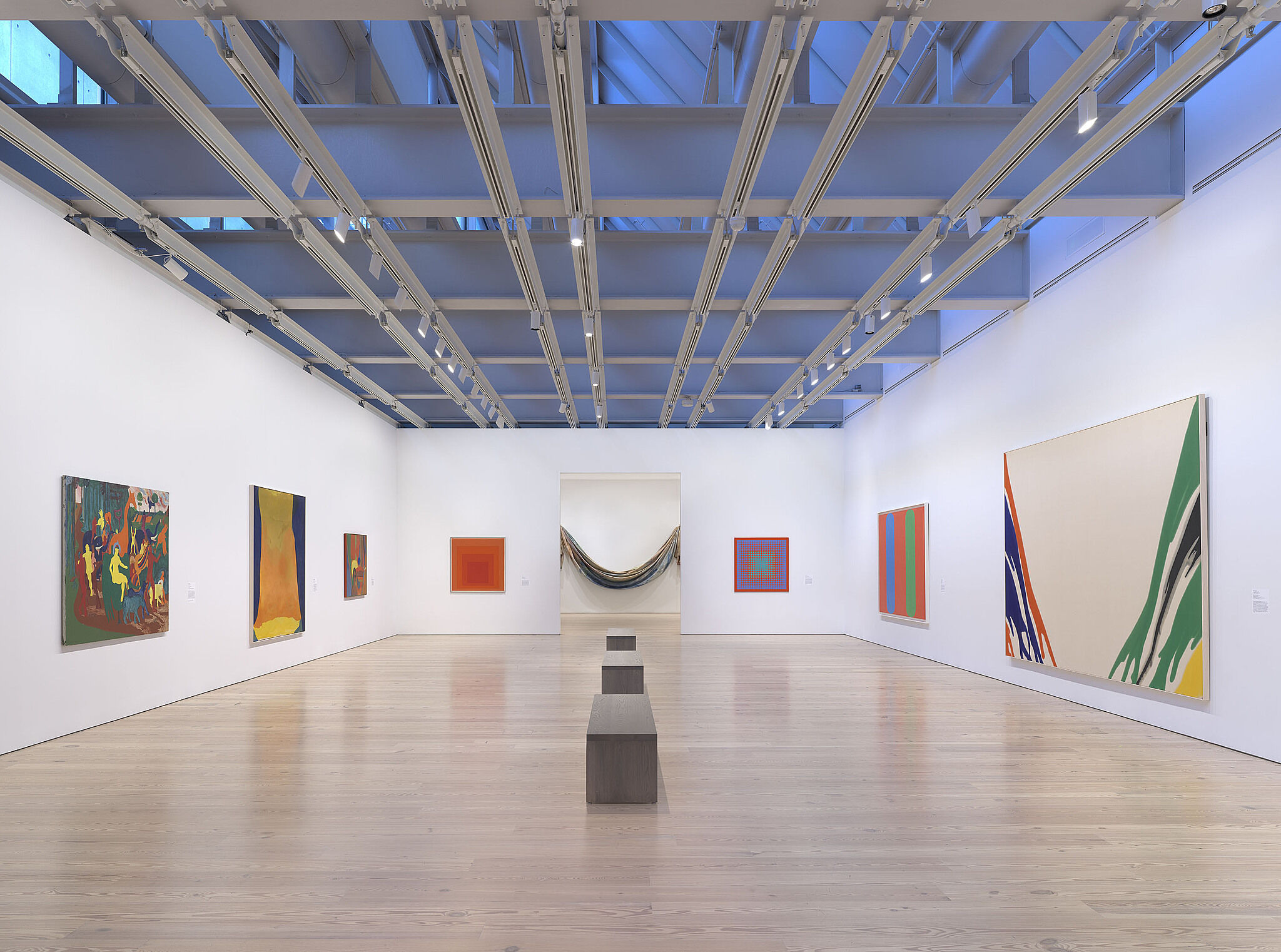
Installation view of Spilling Over: Painting Color in the 1960s (Whitney Museum of American Art, New York, March 29-August 2019). From left to right: Bob Thompson, Triumph of Bacchus, 1964; Helen Frankenthaler, Orange Mood, 1966; Emma Amos, Baby, 1966; Josef Albers, Homage to the Square: “Wait”, 1967. Photograph by Ron Amstutz
-
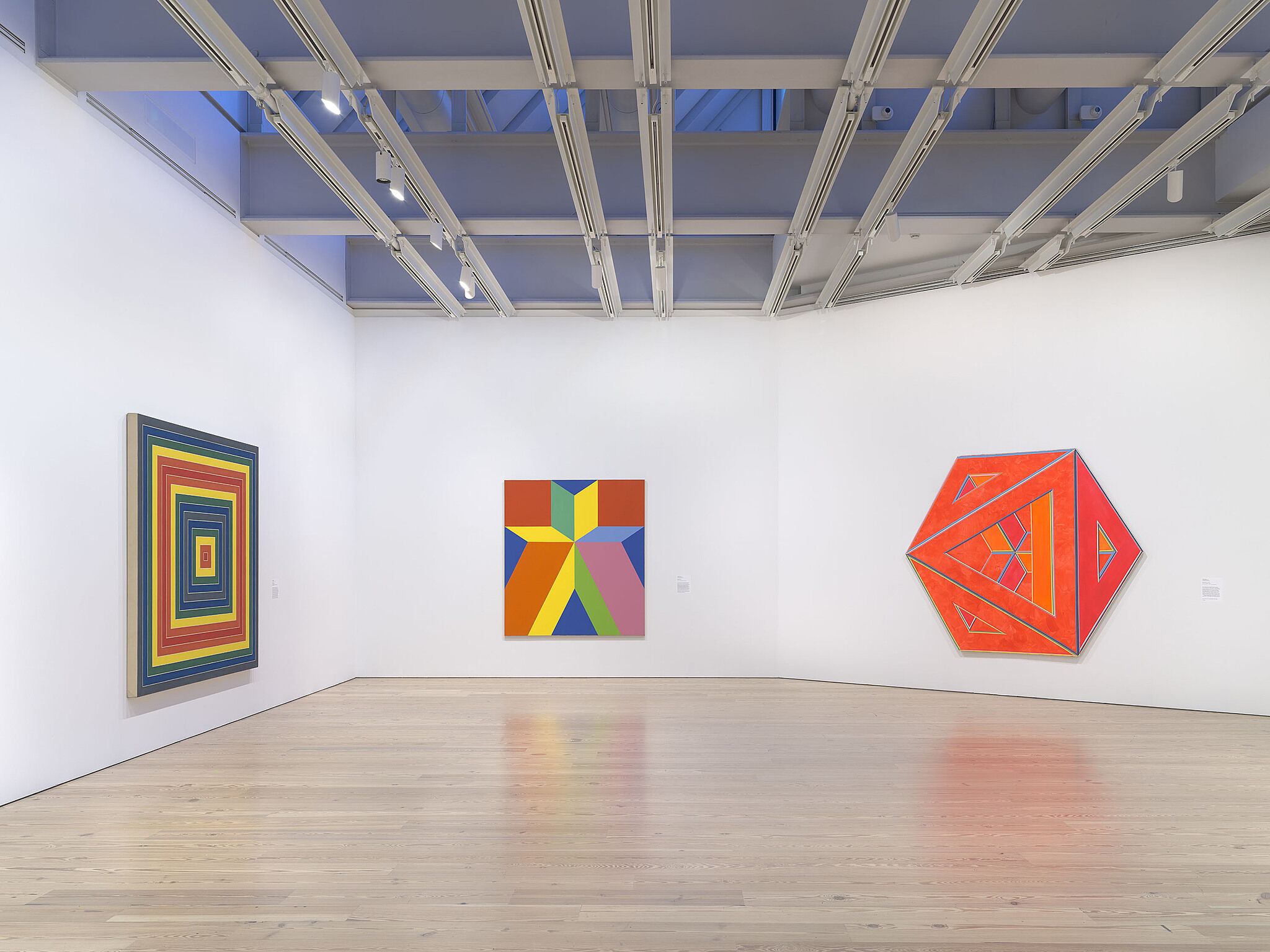
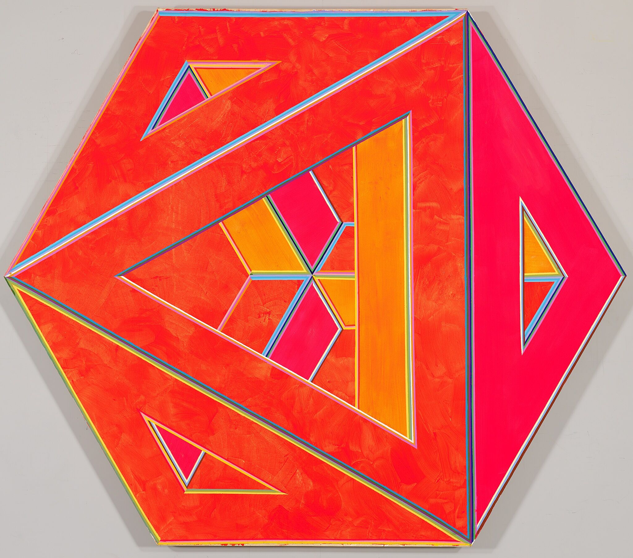
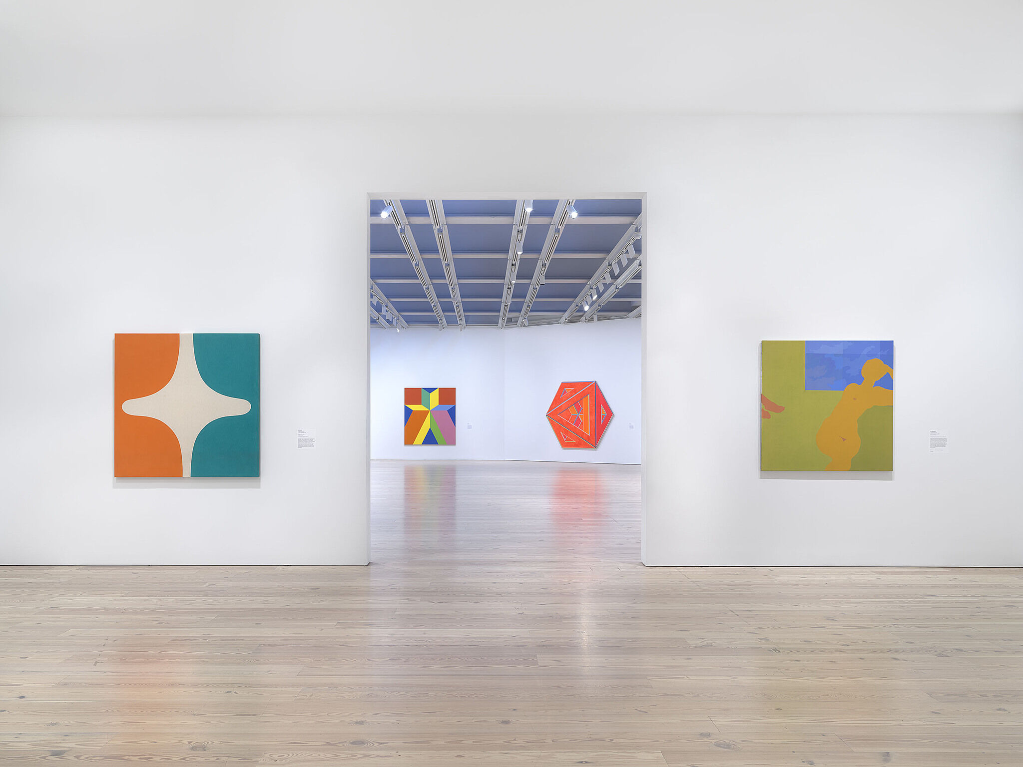
Installation view of Spilling Over: Painting Color in the 1960s (Whitney Museum of American Art, New York, March 29-August 2019). From left to right: Frank Stella, Gran Cairo, 1962; Miriam Schapiro, Jigsaw, 1969; Alvin Loving, Septehedron 34, 1970. Photograph by Ron Amstutz
-
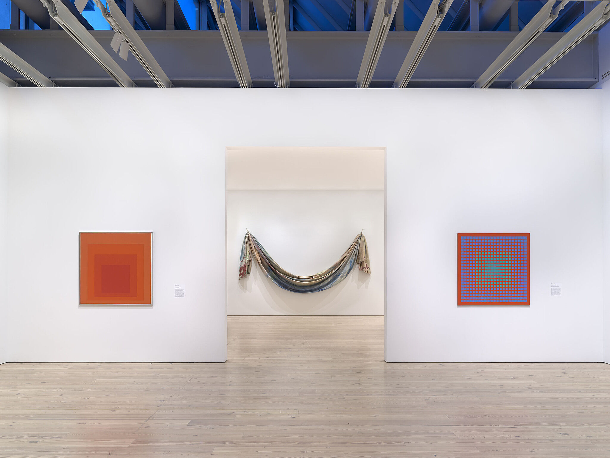
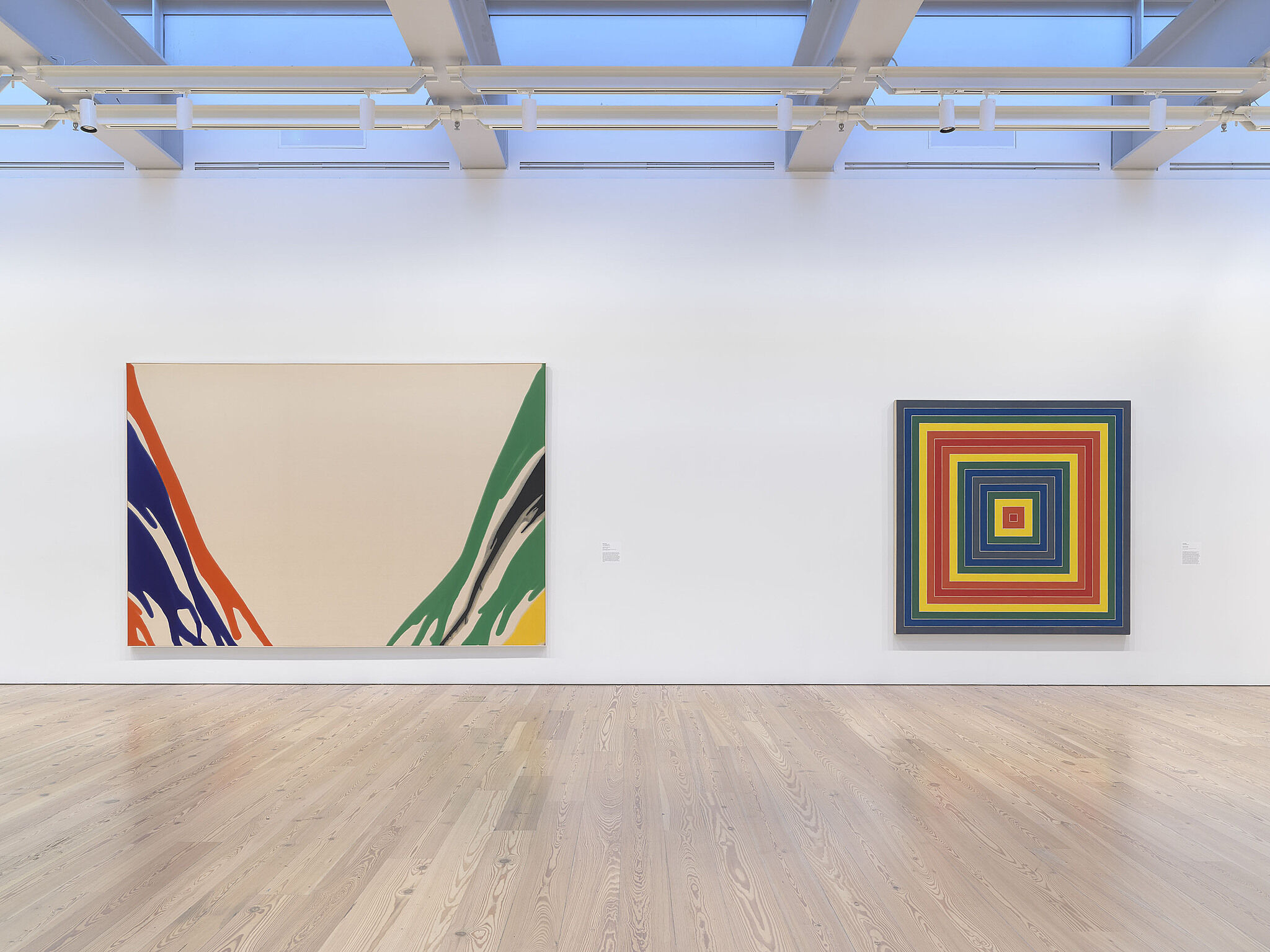
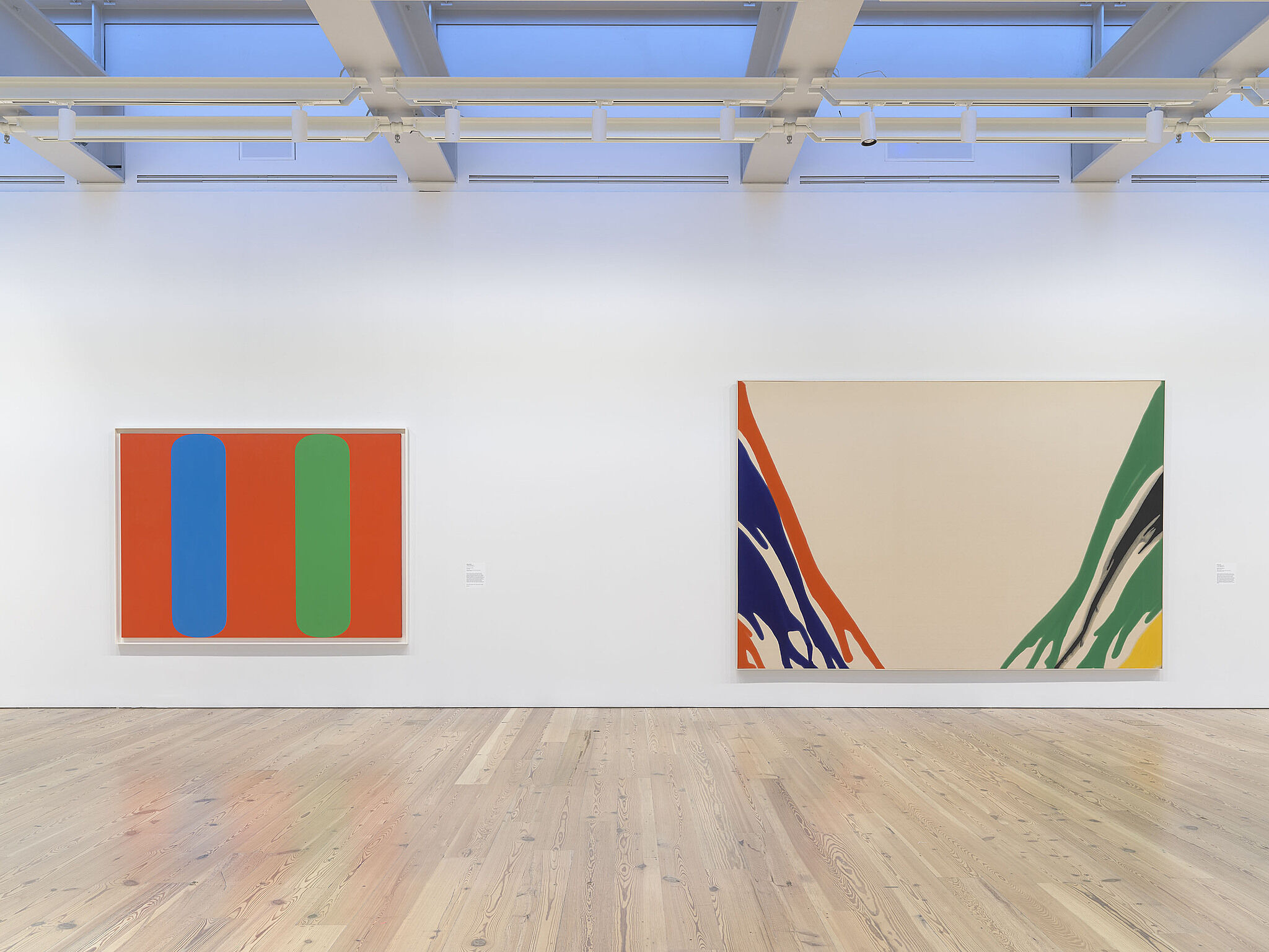
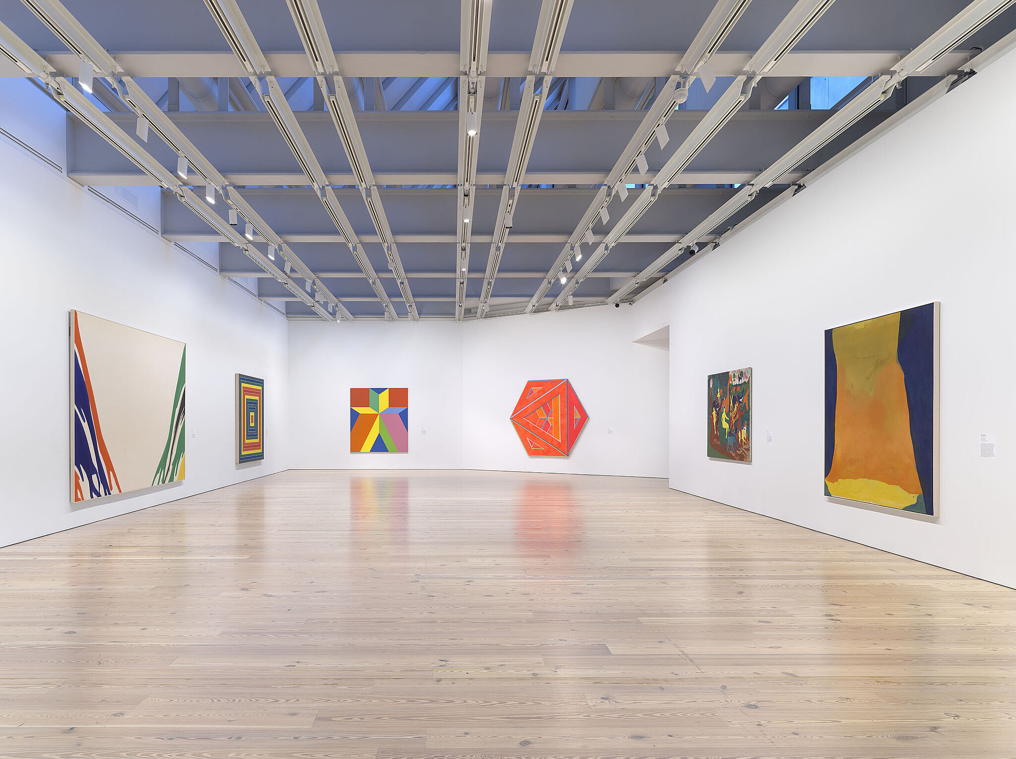
Installation view of Spilling Over: Painting Color in the 1960s (Whitney Museum of American Art, New York, March 29-August 2019). From left to right: Josef Albers, Homage to the Square: “Wait”, 1967; Sam Gilliam, Bow Form Construction, 1968; Richard Anuszkiewicz, The Fourth of the Three, 1963. Photograph by Ron Amstutz
-
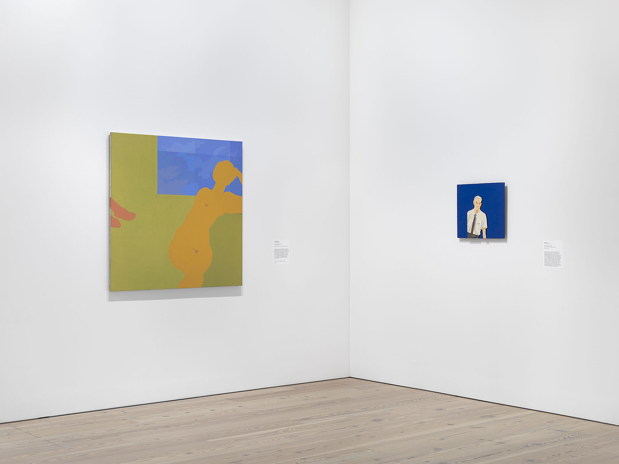
Installation view of Spilling Over: Painting Color in the 1960s (Whitney Museum of American Art, New York, March 29-August 2019). From left to right: Kay WalkingStick, April Contemplating May, 1972; Alex Katz, Edwin, Blue Series, 1965. Photograph by Ron Amstutz
-
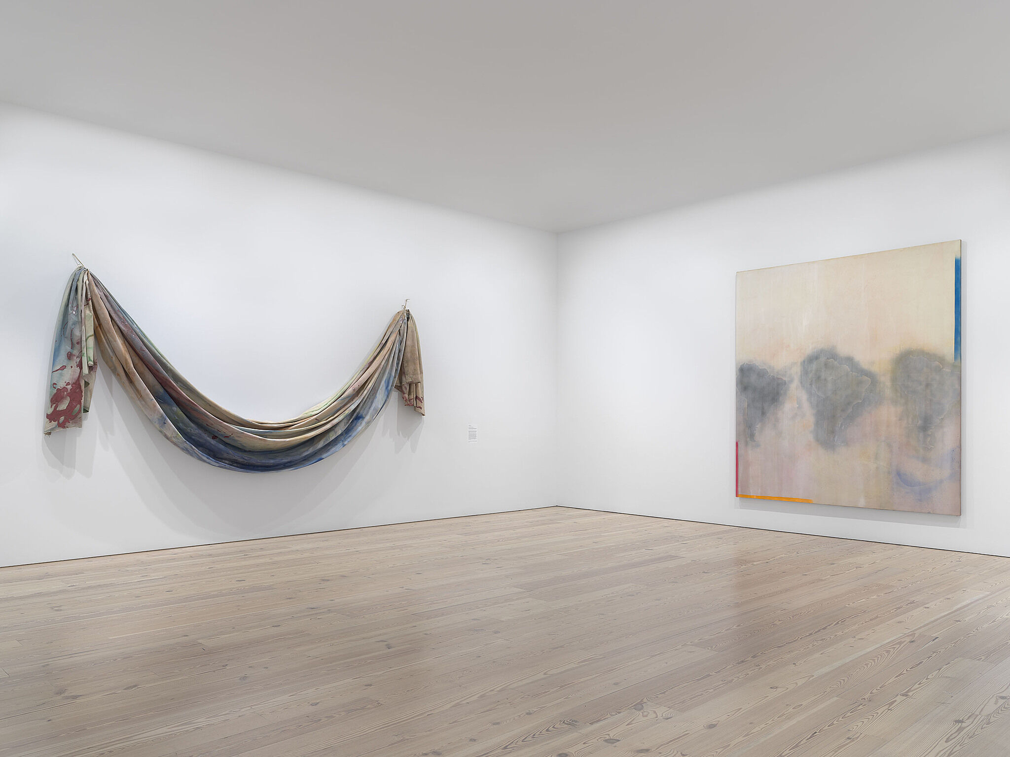
Installation view of Spilling Over: Painting Color in the 1960s (Whitney Museum of American Art, New York, March 29-August 2019). From left to right: Sam Gilliam, Bow Form Construction, 1968; Frank Bowling, Dan Johnson’s Surprise, 1969. Photograph by Ron Amstutz
-
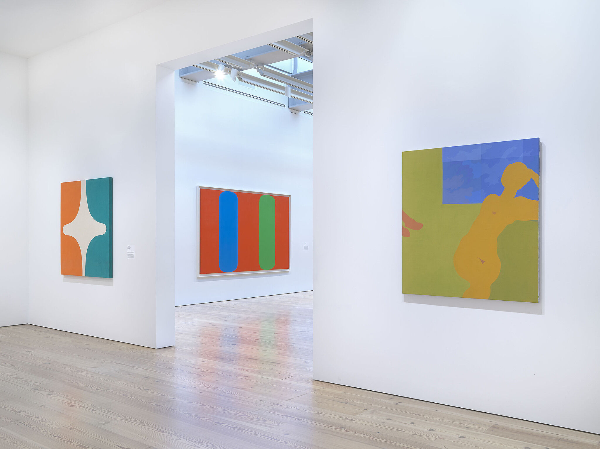
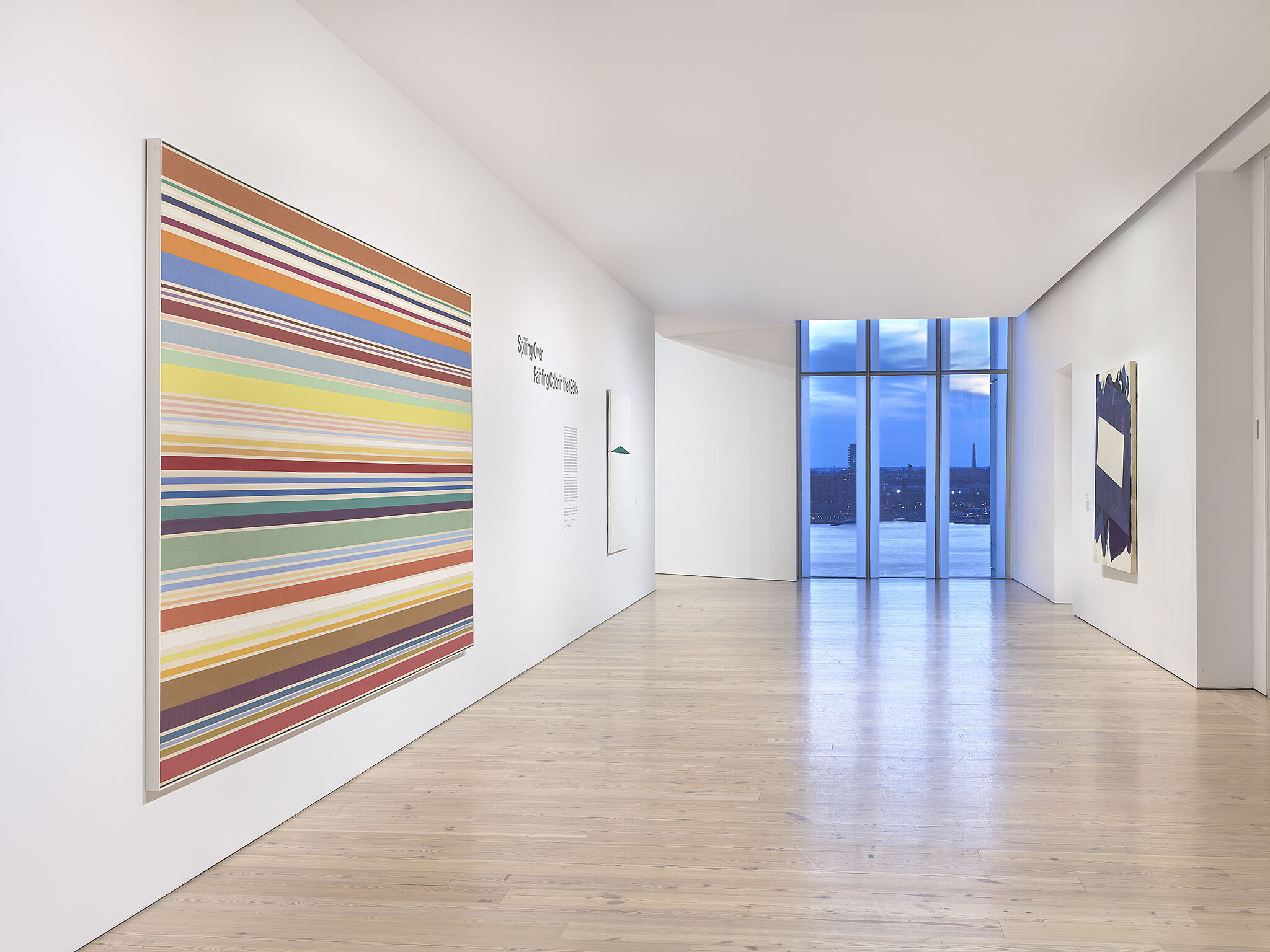
Installation view of Spilling Over: Painting Color in the 1960s (Whitney Museum of American Art, New York, March 29-August 2019). From left to right: Marcia Hafif, 72., March 1965, 1965; Ellsworth Kelly, Blue Green Red, 1964; Kay WalkingStick, April Contemplating May, 1972. Photograph by Ron Amstutz
-
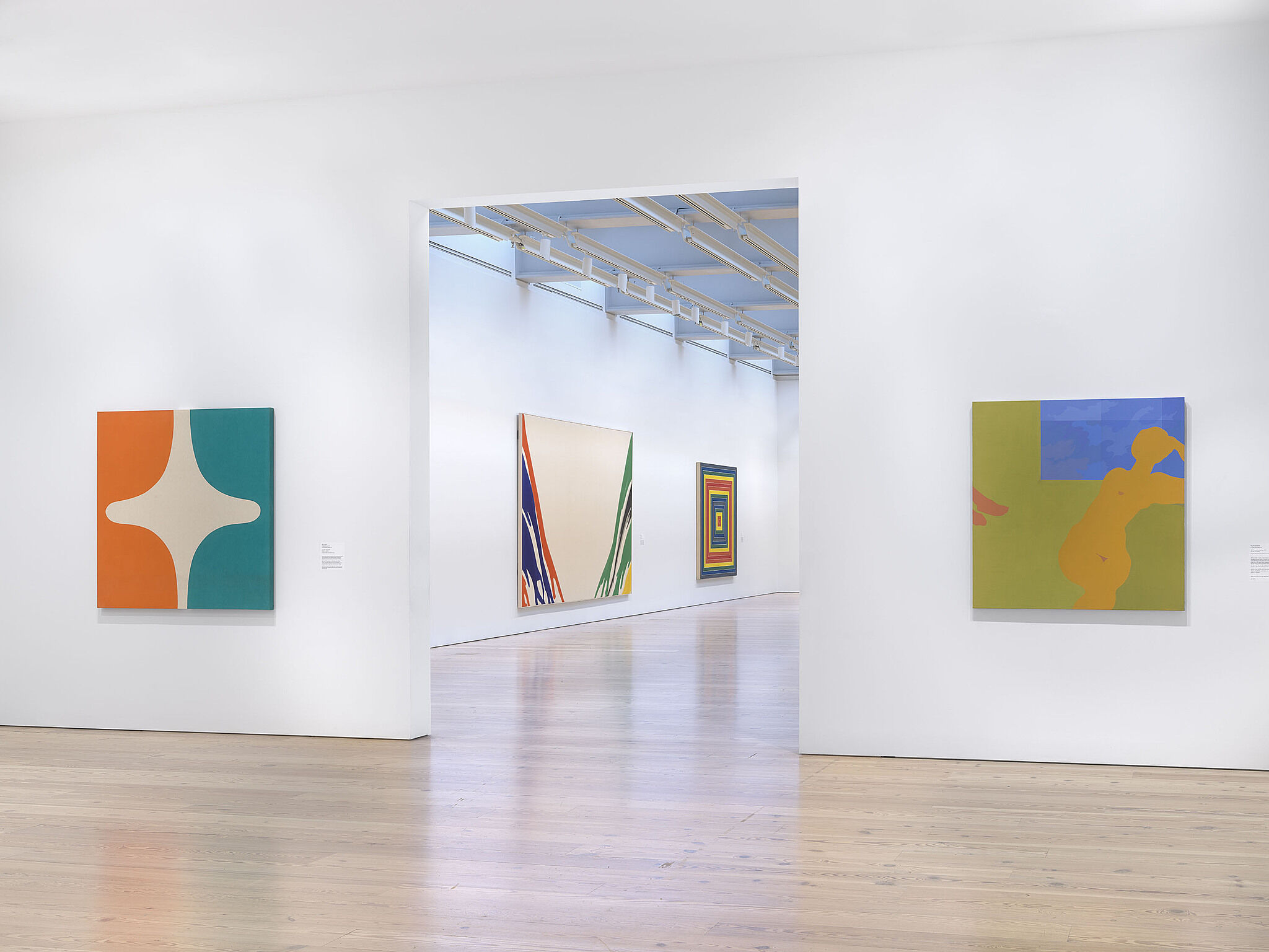
Installation view of Spilling Over: Painting Color in the 1960s (Whitney Museum of American Art, New York, March 29-August 2019). From left to right: Marcia Hafif, 72., March 1965, 1965; Morris Louis, Gamma Delta, 1959-60; Frank Stella, Gran Cairo, 1962; Kay WalkingStick, April Contemplating May, 1972. Photograph by Ron Amstutz
-
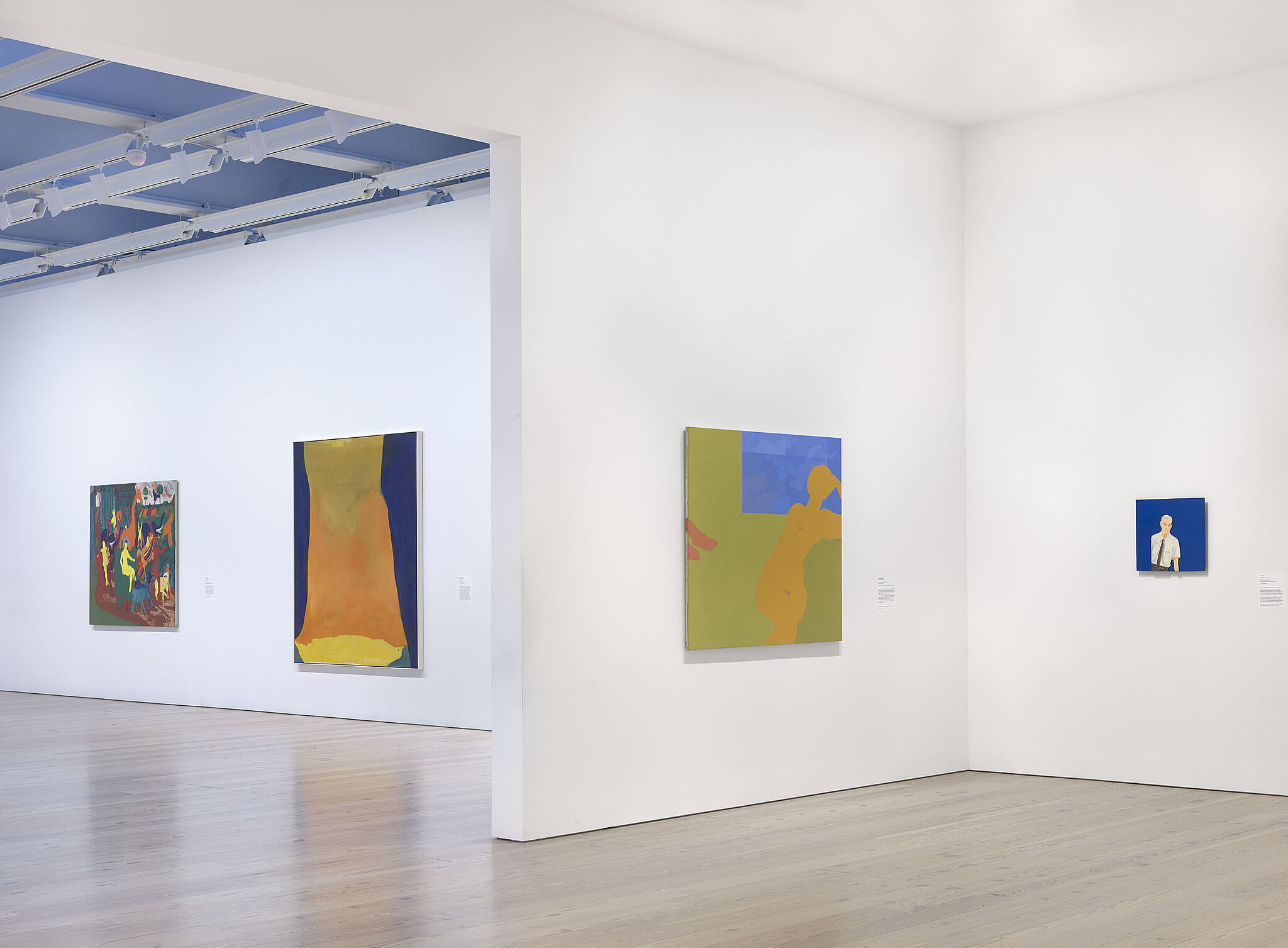
Installation view of Spilling Over: Painting Color in the 1960s (Whitney Museum of American Art, New York, March 29-August 2019). From left to right: Bob Thompson, Triumph of Bacchus, 1964; Helen Frankenthaler, Orange Mood, 1966; Kay WalkingStick, April Contemplating May, 1972; Alex Katz, Edwin, Blue Series, 1965. Photograph by Ron Amstutz
-
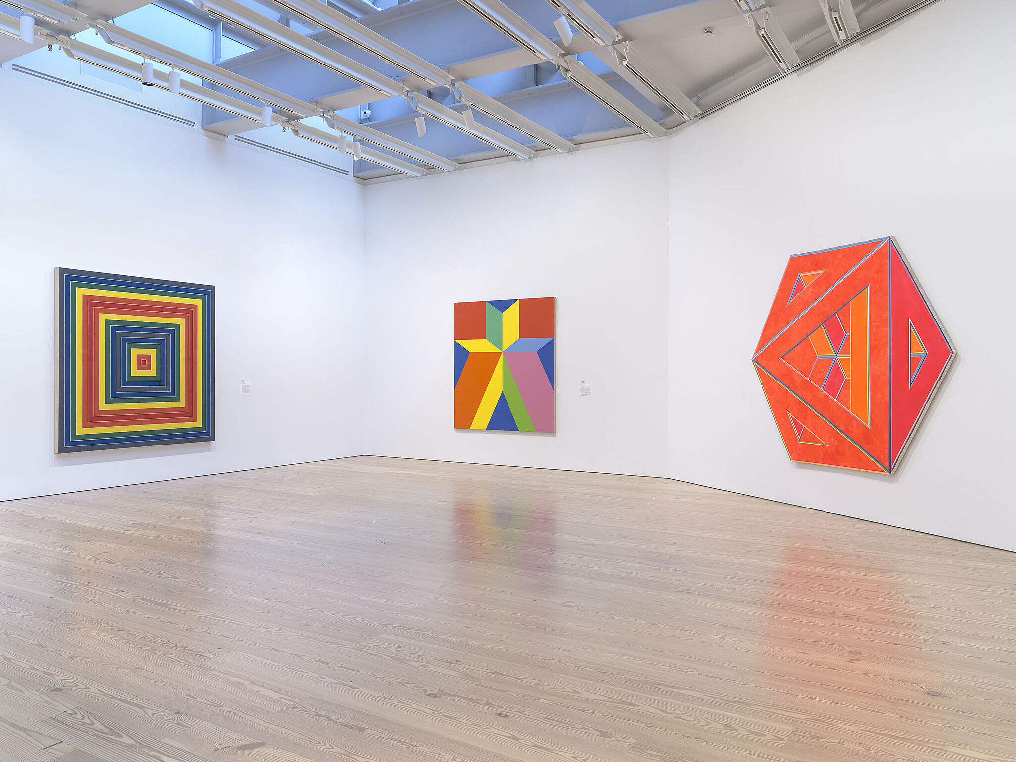
Installation view of Spilling Over: Painting Color in the 1960s (Whitney Museum of American Art, New York, March 29-August 2019). From left to right: Frank Stella, Gran Cairo, 1962; Miriam Schapiro, Jigsaw, 1969; Alvin Loving, Septehedron 34, 1970. Photograph by Ron Amstutz
-
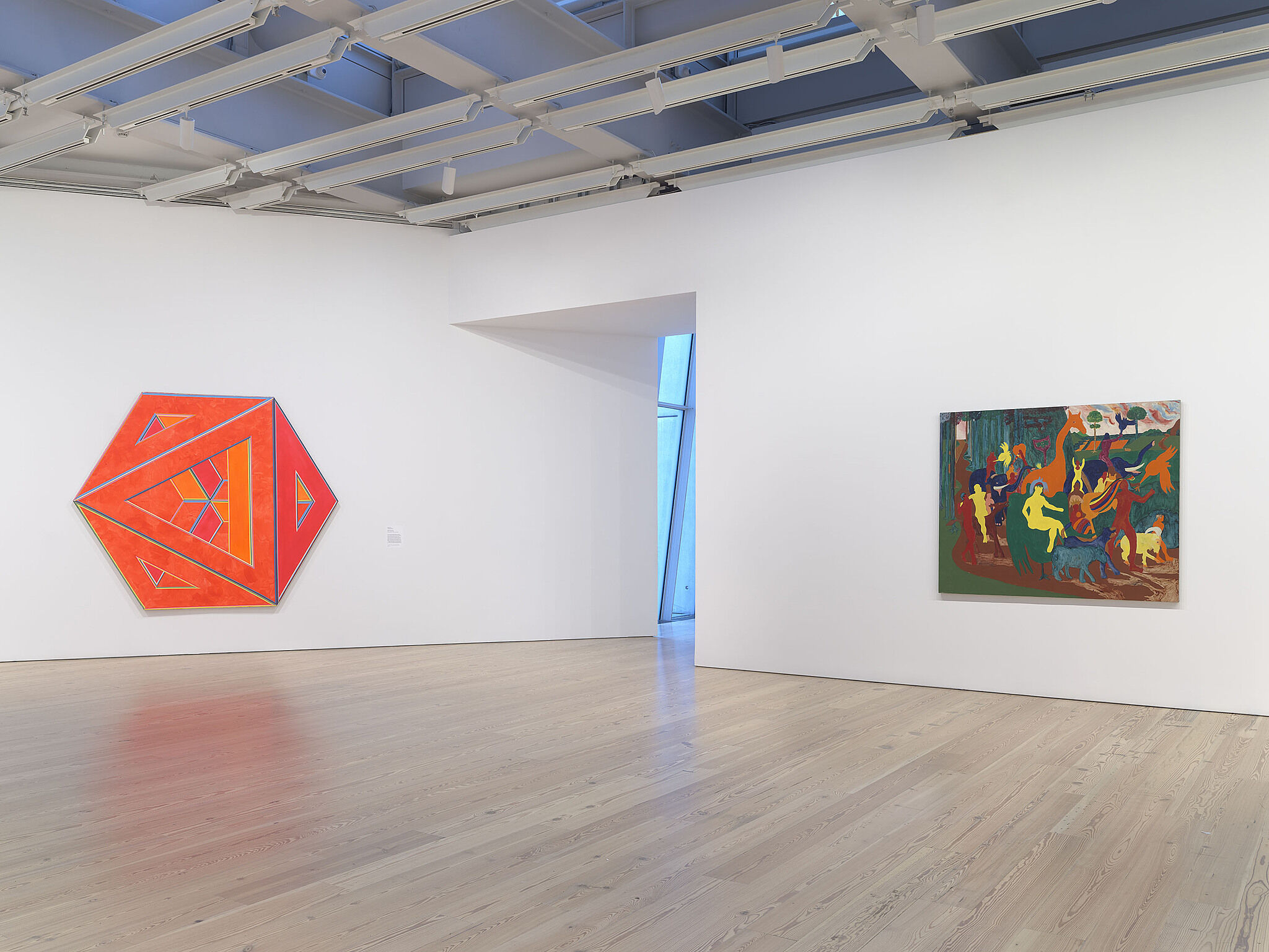
Installation view of Spilling Over: Painting Color in the 1960s (Whitney Museum of American Art, New York, March 29-August 2019). From left to right: Alvin Loving, Septehedron 34, 1970; Bob Thompson, Triumph of Bacchus, 1964. Photograph by Ron Amstutz
-
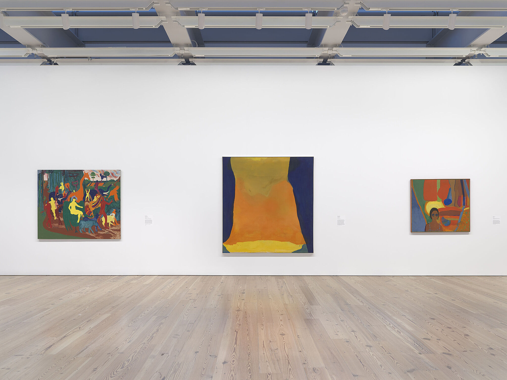
Installation view of Spilling Over: Painting Color in the 1960s (Whitney Museum of American Art, New York, March 29-August 2019). From left to right: Bob Thompson, Triumph of Bacchus, 1964; Helen Frankenthaler, Orange Mood, 1966; Emma Amos, Baby, 1966. Photograph by Ron Amstutz
-
Installation view of Spilling Over: Painting Color in the 1960s (Whitney Museum of American Art, New York, March 29-August 2019). From left to right: Morris Louis, Gamma Delta, 1959-60; Frank Stella, Gran Cairo, 1962. Photograph by Ron Amstutz
-
Installation view of Spilling Over: Painting Color in the 1960s (Whitney Museum of American Art, New York, March 29-August 2019). From left to right: Ellsworth Kelly, Blue Green Red, 1964; Morris Louis, Gamma Delta, 1959-60. Photograph by Ron Amstutz
-
Installation view of Spilling Over: Painting Color in the 1960s (Whitney Museum of American Art, New York, March 29-August 2019). From left to right: Marcia Hafif, 72., March 1965, 1965; Miriam Schapiro, Jigsaw, 1969; Alvin Loving, Septehedron 34, 1970; Kay WalkingStick, April Contemplating May, 1972. Photograph by Ron Amstutz
-
Installation view of Spilling Over: Painting Color in the 1960s (Whitney Museum of American Art, New York, March 29-August 2019). From left to right: Morris Louis, Gamma Delta, 1959-60; Frank Stella, Gran Cairo, 1962; Miriam Schapiro, Jigsaw, 1969; Alvin Loving, Septehedron 34, 1970; Bob Thompson, Triumph of Bacchus, 1964; Helen Frankenthaler, Orange Mood, 1966. Photograph by Ron Amstutz
-
Installation view of Spilling Over: Painting Color in the 1960s (Whitney Museum of American Art, New York, March 29-August 2019). From left to right: Bob Thompson, Triumph of Bacchus, 1964; Helen Frankenthaler, Orange Mood, 1966; Emma Amos, Baby, 1966; Josef Albers, Homage to the Square: “Wait”, 1967; Sam Gilliam, Bow Form Construction, 1968; Richard Anuszkiewicz, The Fourth of the Three, 1963; Ellsworth Kelly, Blue Green Red, 1964; Morris Louis, Gamma Delta, 1959-60. Photograph by Ron Amstutz
Explore works from this exhibition
in the Whitney's collection
View 18 works
In the News
“It’s a perfect summer show that you will want to visit again and again. Its abounding freshness clears your eyes and lifts your spirits, so that everything around you, in and out of the museum, looks clear, bright, alive, and new.”
-Hyperallergic