Stuart Davis: In Full Swing | Art & Artists
June 10–Sept 25, 2016
Stuart Davis: In Full Swing | Art & Artists
The 1950s
6
Davis's early paintings had often included words and phrases as product names and signage. In 1950, he began incorporating words into his art as independent design elements. Doing so allowed him to infuse his paintings with the bold energy and ebullience of advertising and popular culture without resorting to illusionistic realism. Sometimes the words he included referenced objects he observed in the world, as in Little Giant Still Life (1950), based on a matchbook cover advertising Champion spark plugs. In other paintings, the words refer to aesthetic concepts he was writing about in his journals. In neither case did he intend the words to be clues to a painting's meaning, which he insisted rested exclusively in the work's formal properties.
Davis's reliance on words as major design elements coincided with his introduction of a new vocabulary of expansive shapes whose increased scale heightened the impact of their color. By controlling the spatial properties of color to advance and recede, Davis ensured that the forms in his paintings visually moved forward and backward at equal speeds. The effect was of a fast-moving surface, perceived simultaneously as a single impression that seemed to push into the viewer's space with enormous force an impression one critic approvingly likened to a "good sock on the jaw."
Below is a selection of works from The 1950s.
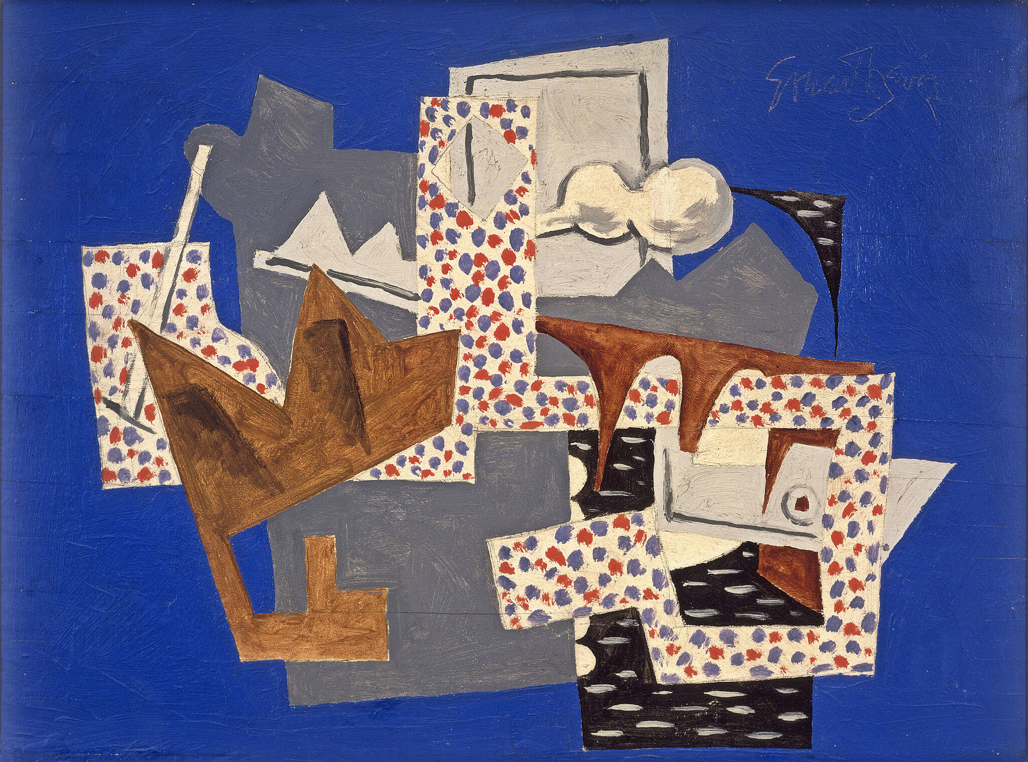
Landscape, Gloucester, 1922/1951/1957
Davis reworked this painting of the Gloucester, Massachusetts, harbor twice after its completion, adding dots and changing the background color to blue. In 1954, he returned to the composition to create Colonial Cubism and two years later used it as the foundation of Memo #2. Both late works are hanging nearby.

