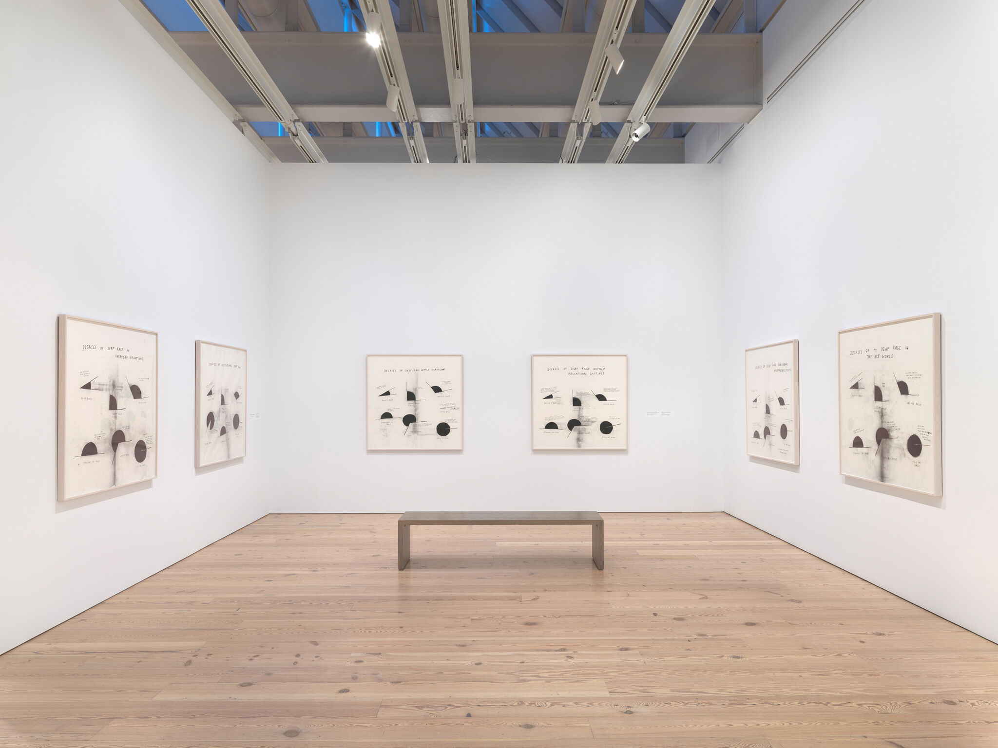
Verbal Description: Future Base, 2016
Jan 28, 2025
0:00
Verbal Description: Future Base, 2016
0:00
Narrator: Future Base refers to a series of twenty charcoal drawings on paper spread out across two walls of the gallery space. Each drawing measures nearly 12 inches wide by 16 inches tall. Christine Sun Kim is visually rendering the path a hand traces to sign the word for “future” in American Sign Language through sketchy lines highlighting the movement of the sign. To sign the word “future”, hold your open hand parallel to the side of your face and lift your hand forward, away from you, in an upward arching line. There is movement across the drawings, due to the arches and edges created by the lines of each drawing.
In Future Attempts to Hearsplain, a cartoonish hand is sketched in the center of the paper, held in a closed fist with the pointer finger up. A single line bounces from one side of the drawing to the other, dipping into a downward point that touches the finger’s top. Offset to the right, above the drawing of the line and the finger, the words “FUTURE ATTEMPTS TO HEARSPLAIN” are written in all caps in the same thick charcoal. The words extend farther toward the right edge of the paper than the line does. There are smudges and smears near where the arching line starts on the left side of the page. These are unintentional marks that occur while the artist is drawing. The finger, coupled with the word “Hearsplain” in the title of the work, implies a hearing person interjecting or offering unwelcome communication.
In another drawing in the group, titled Too Much Future, the same bouncing double arch is rendered in thick black chunky lines, taking up almost half the composition. The top of the left arc begins three quarters up the left side of the page, curving toward the center where the line launches back up and roundly arches toward the bottom right corner, ending nearly halfway up the right side of the page. The negative space in this drawing is far from bright and pristine; rather, it is smudged to a nearly uniform dingy gray due to the amount of charcoal medium in the arches. “TOO MUCH FUTURE” is handwritten in all-caps in the center of the page, above the sharp meeting point of the two thick lines. The phrase has been written in a somewhat small size, which makes it almost demure in contrast to the overwhelming size and saturation of the arches below it. These size differentials coupled with the existential weight of the phrase “too much future” result in an almost comical tension within this drawing. The chunkiness of the otherwise-thin line describing the sign for “future” here illustrates the concept of “too much” in the drawing’s title. An iteration of this work was on view as a Whitney billboard project in 2018.