Where We Are
2017
Hear directly from artists and curators on selected works from Where We Are: Selections from the Whitney’s Collection, 1900–1960.
-
700
Introduction to Where We Are
Audio, Kids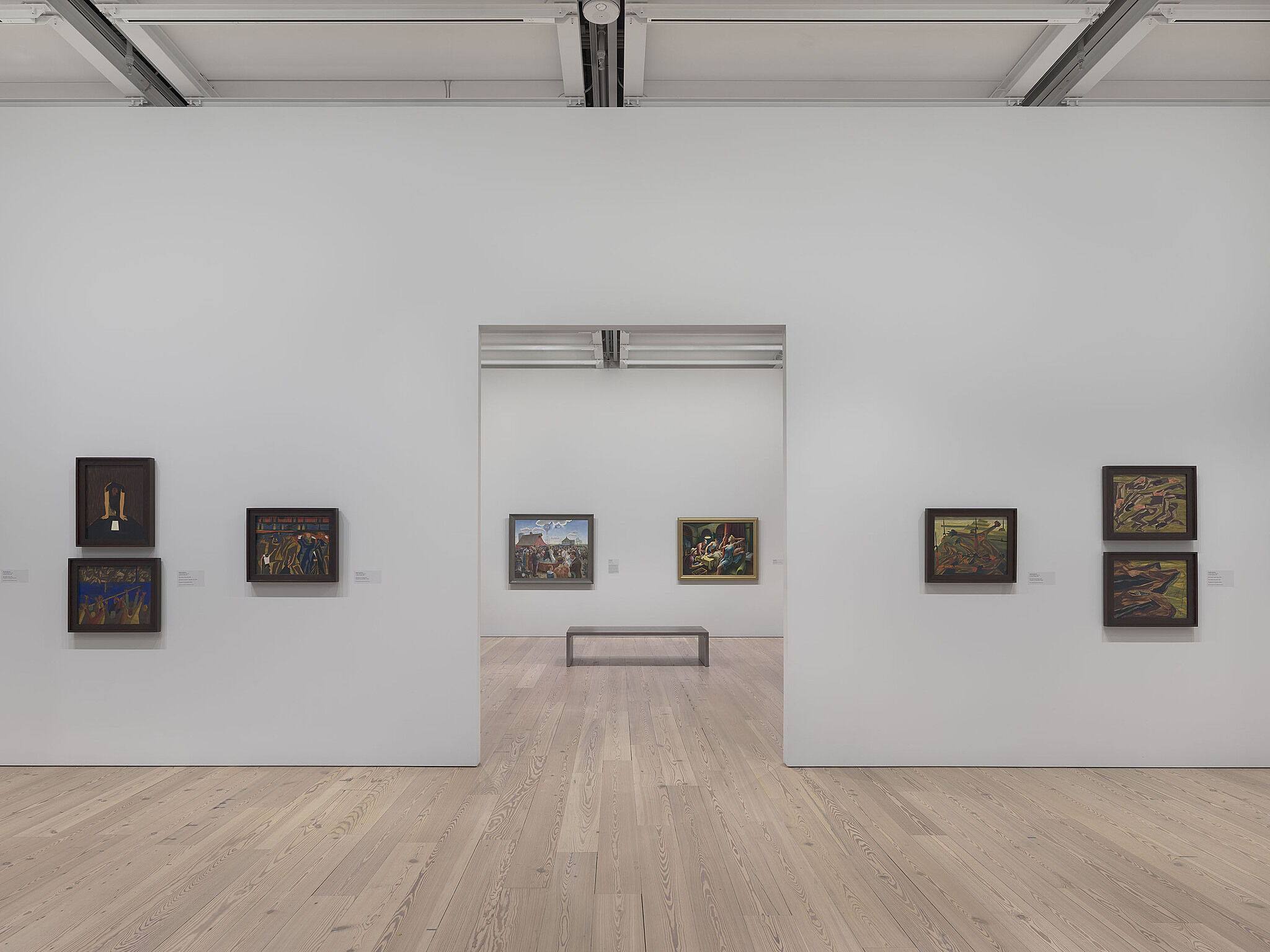
-
701
Jacob Lawrence, War Series, 1946–47
Audio, Kids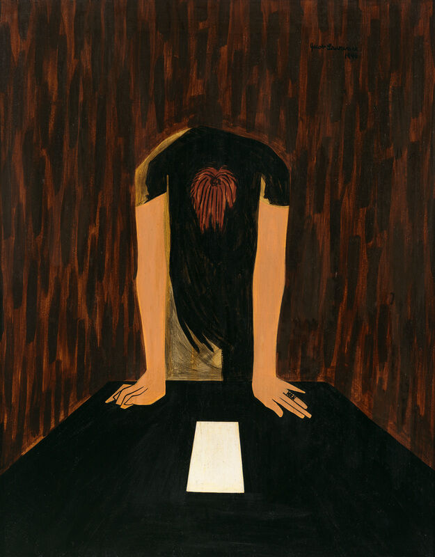
-
702
Georgia O’Keeffe, Music, Pink and Blue No 2, 1918
Audio, Kids, ASL
-
711
Jay DeFeo, The Eyes, 1958
Audio, Kids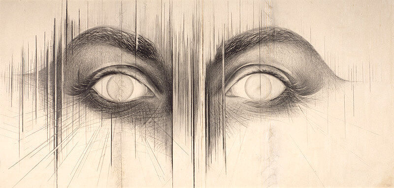
-
713
Joseph Stella, The Brooklyn Bridge: Variation on an Old Theme, 1939
Audio, Kids, ASL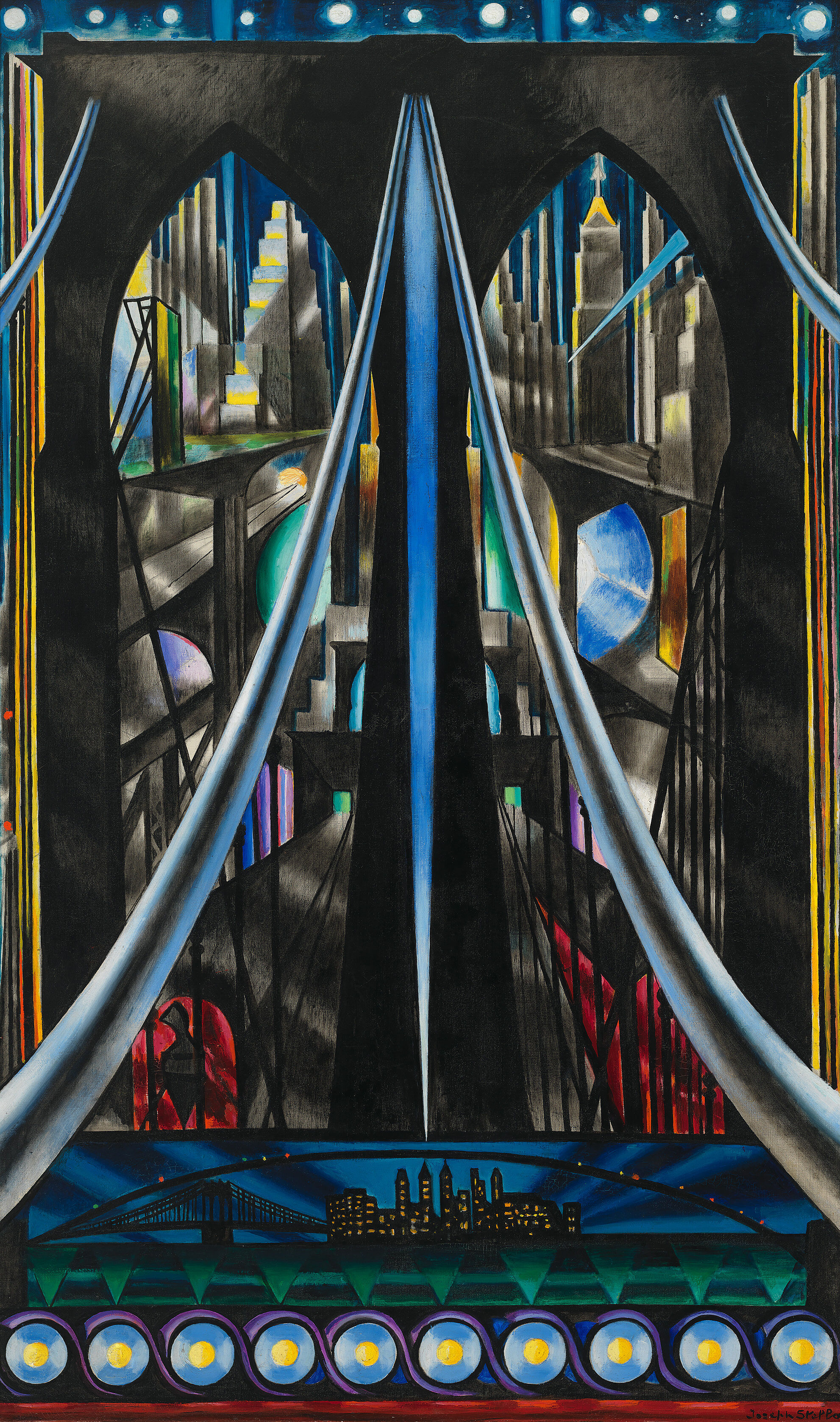
-
714
Clyfford Still, Untitled, 1956
Kids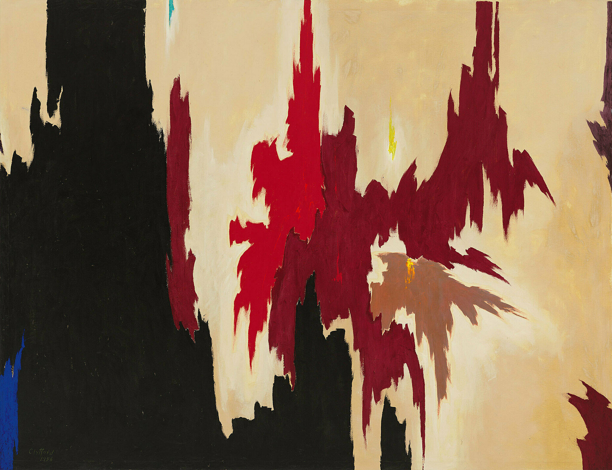
-
720
Roy Lichtenstein, Bathroom, 1961
Kids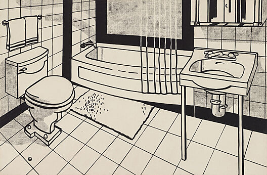
-
721
Henry Koerner, Mirror of Life, 1946
Audio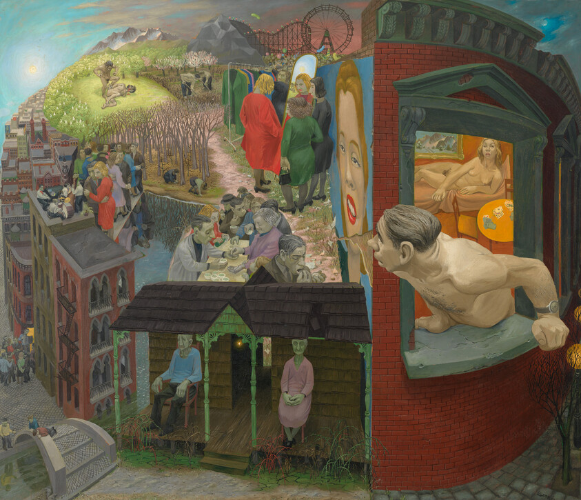
-
722
Edward Hopper, New York Interior, 1921
Audio, Kids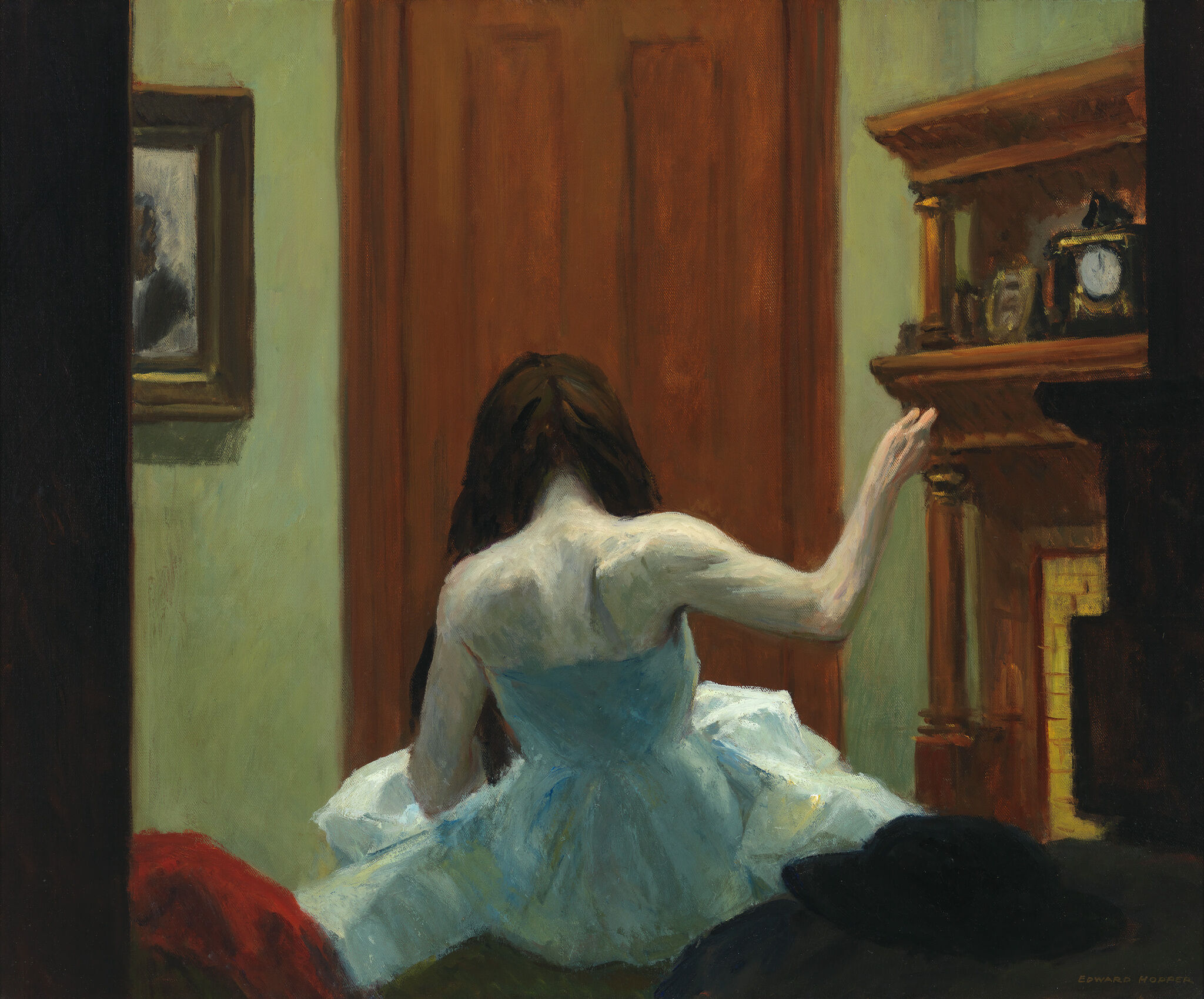
-
734
George Tooker, The Subway, 1950
Audio, Kids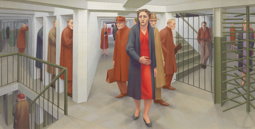
-
742
Elizabeth Catlett, Prints
Audio, Kids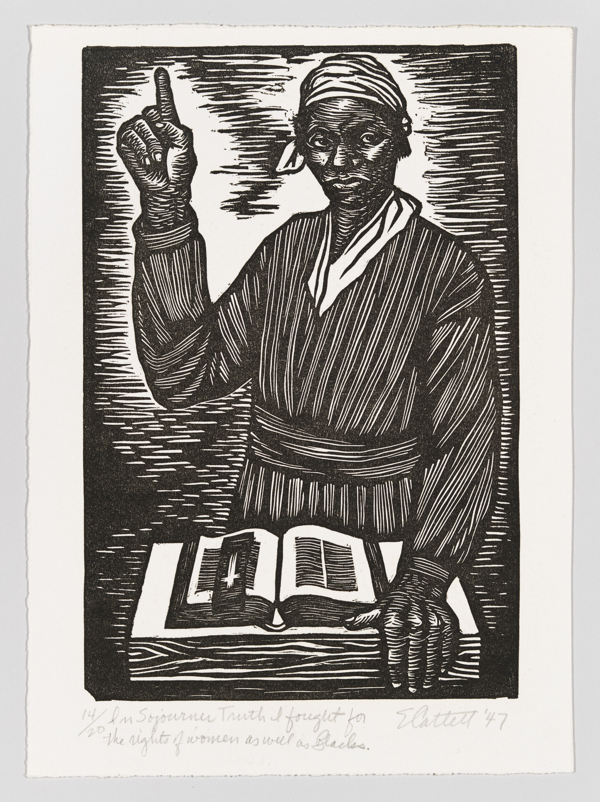
-
743
Frank Stella, Die Fahne Hoch!, 1959
Audio, Kids, ASL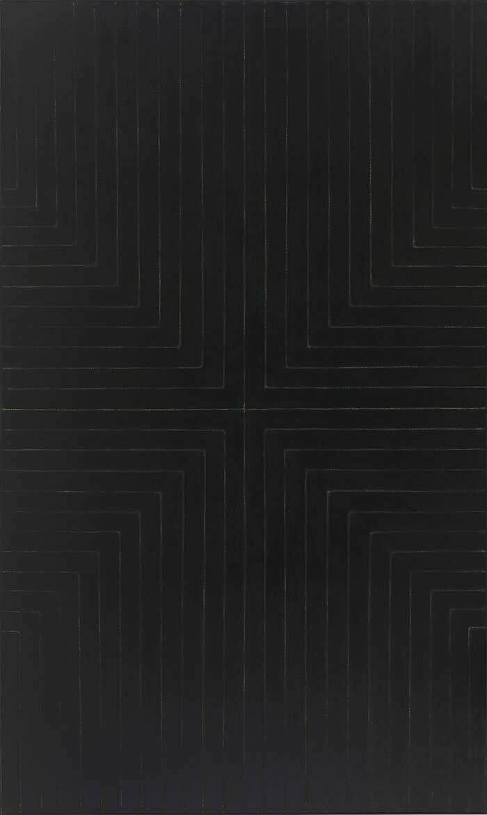
-
746
Mark Rothko, Four Darks in Red, 1958
Audio, Kids -
744
Charles Demuth, My Egypt, 1927
Audio, Kids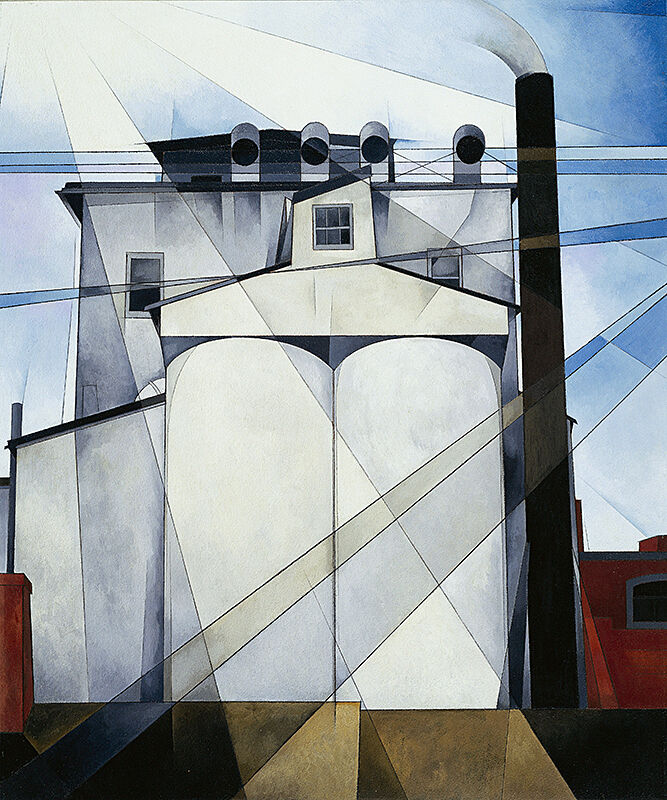
-
750
Jasper Johns, Three Flags, 1958
Audio, Kids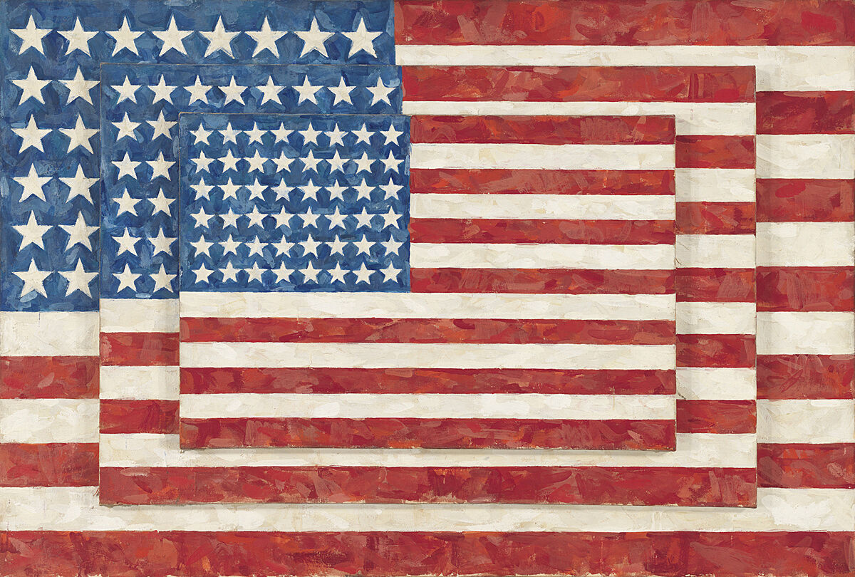
-
751
Isamu Noguchi, Humpty Dumpty, 1946
Audio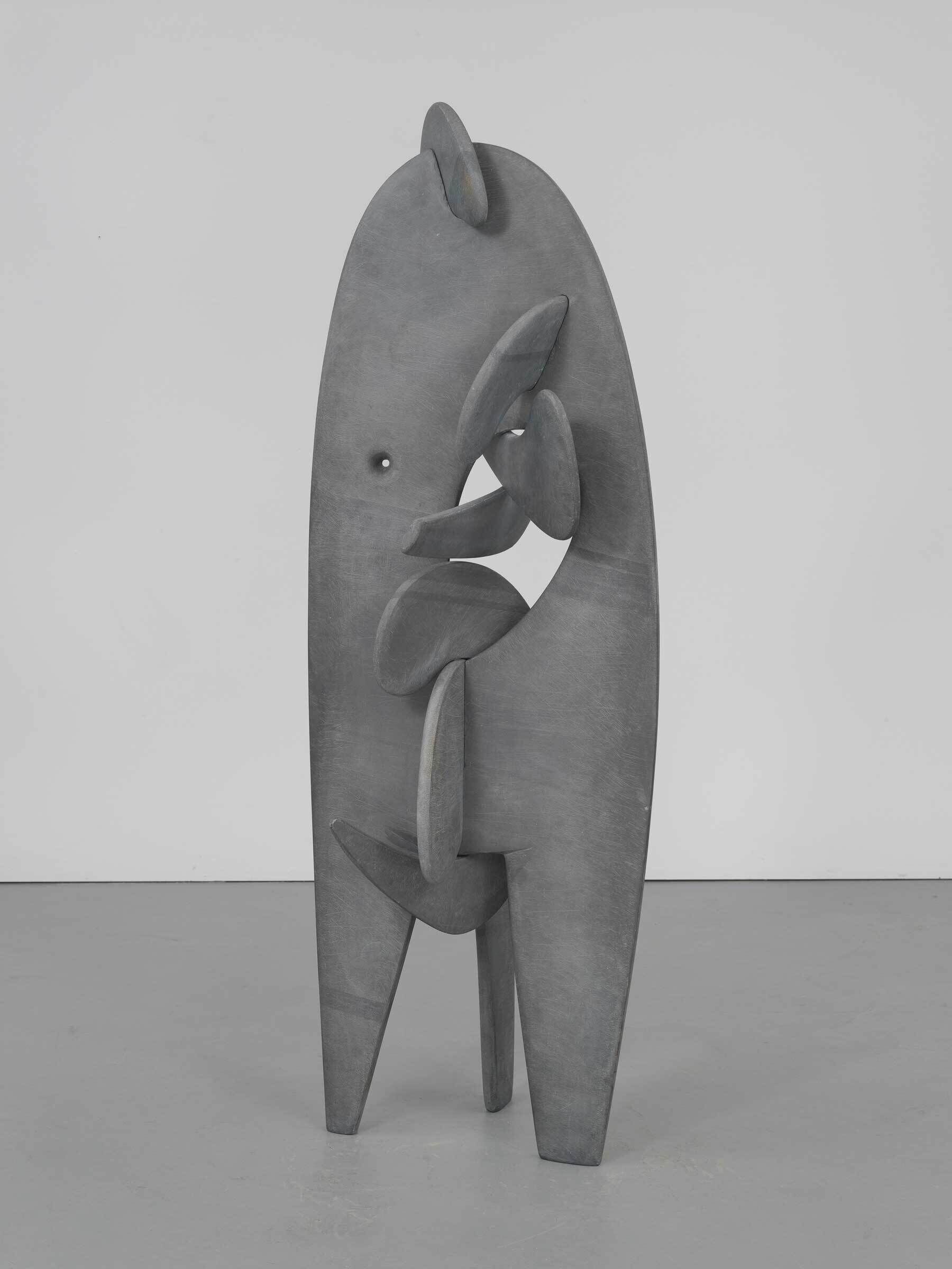
-
752
Edward Hopper, Early Sunday Morning, 1930
Audio, Kids, ASL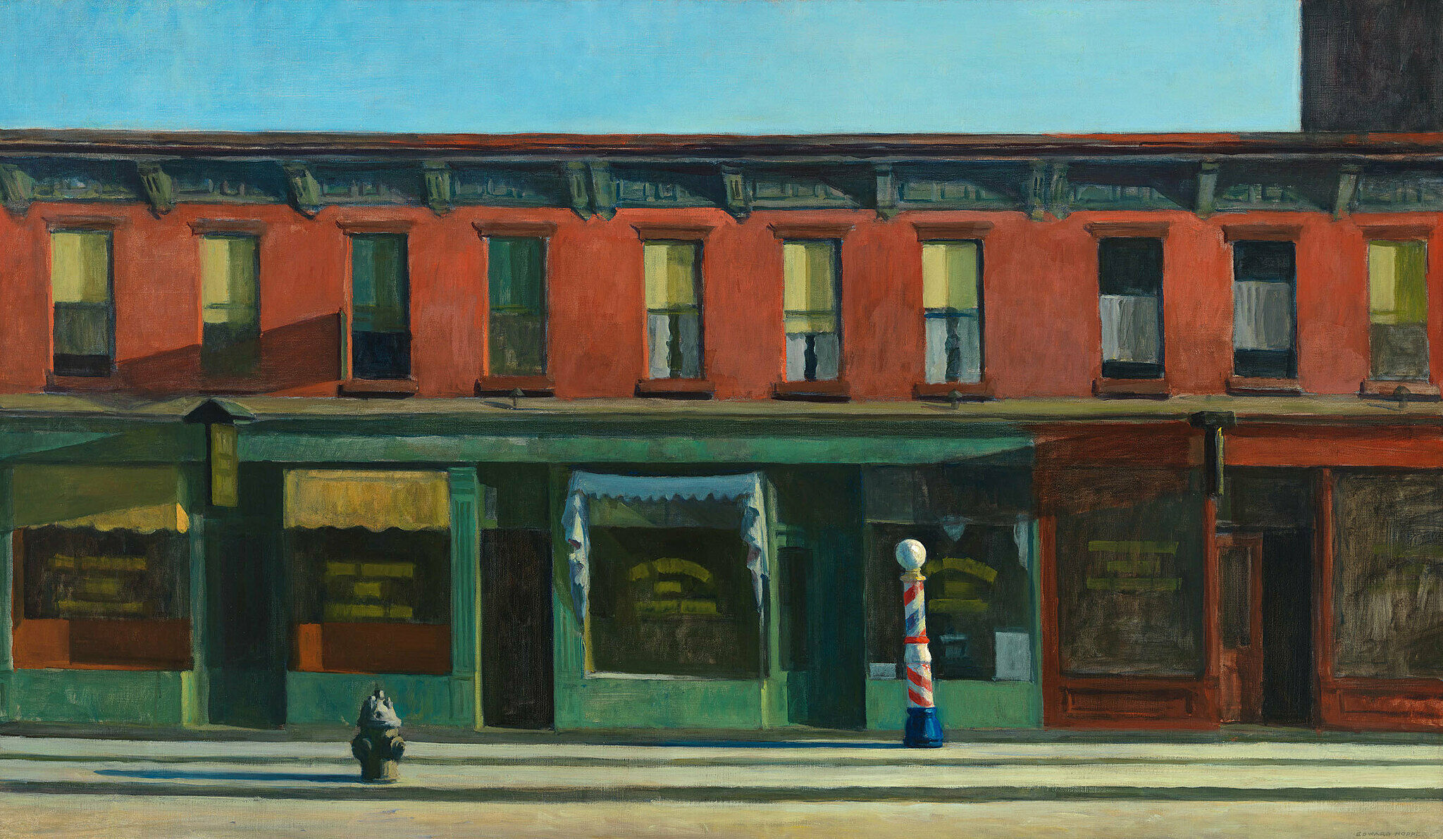
-
702-2
Georgia O’Keeffe, Music, Pink and Blue No. 2, 1918
Audio
-
703
Marsden Hartley, Painting, Number 5, 1914–15
Audio, ASL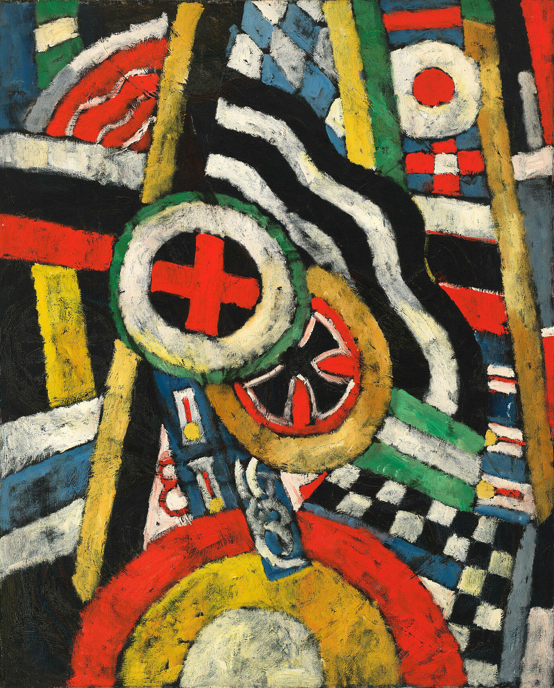
-
710
Morris Louis, Tet, 1958
Audio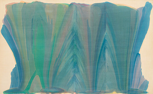
-
710-2
Morris Louis, Tet, 1958
Audio
-
712
Barnett Newman, Day One, 1951-52
Audio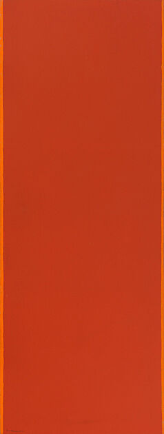
-
715
Barnett Newman, The Promise, 1949
Audio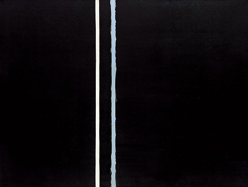
-
721-2
Henry Koerner, Mirror of Life, 1946
Audio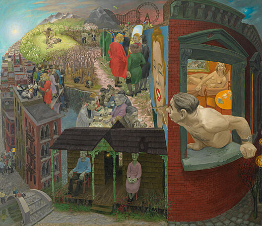
-
723
James Castle, Drawings
Audio, ASL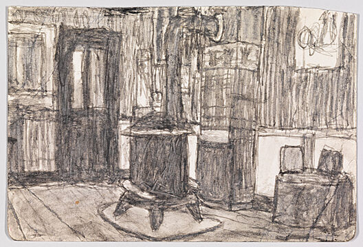
-
724
Jacob Lawrence, Tombstones, 1942
Audio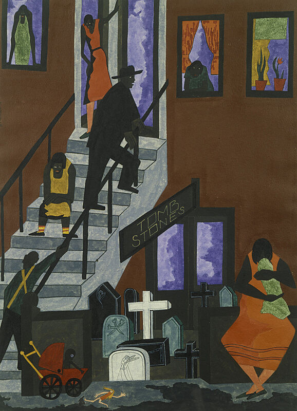
-
731
Arshile Gorky, The Artist and His Mother, 1926-c.1936
Audio, ASL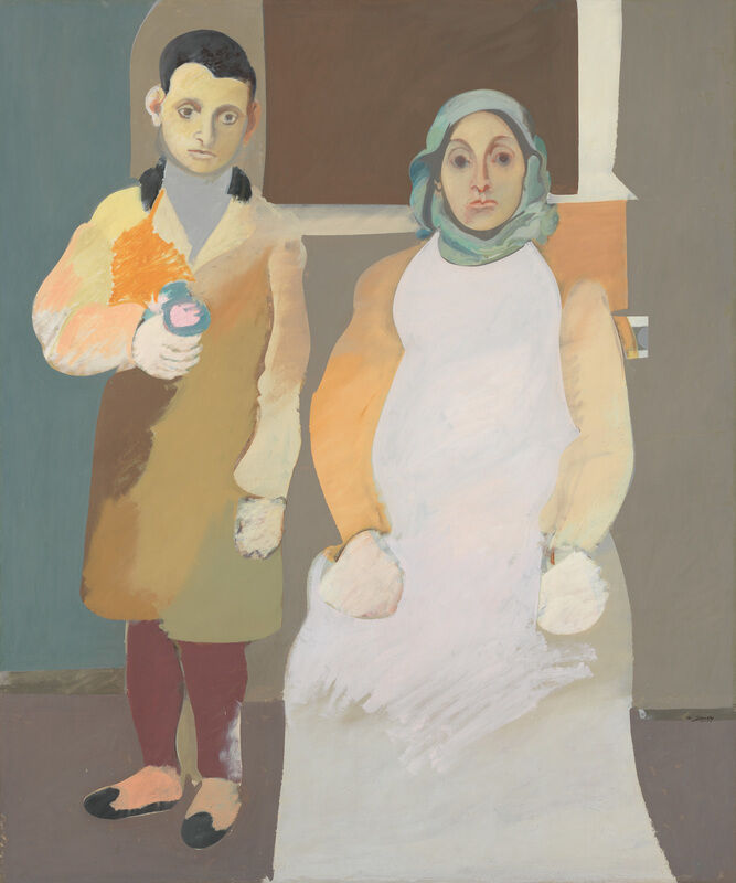
-
732
Thomas Hart Benton, Poker Night (from A Streetcar Named Desire), 1948
Audio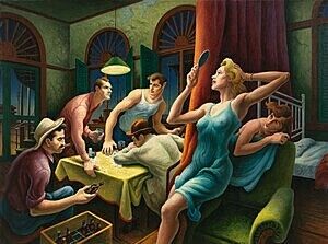
-
735
Thomas Hart Benton, The Lord is my Shepherd, 1926
Audio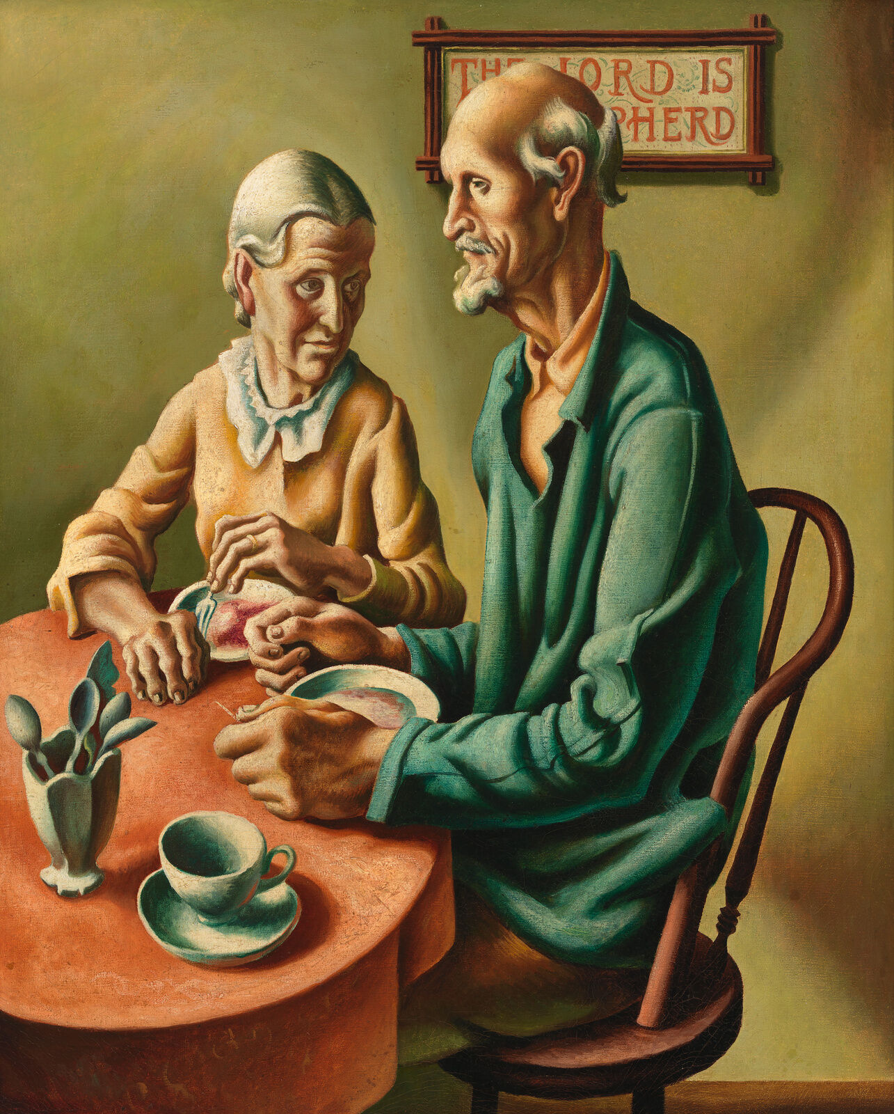
-
740
Charles Sheeler, River Rouge Plant, 1932
Audio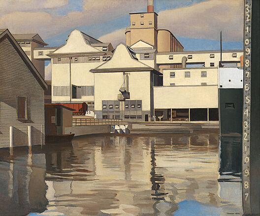
-
741
Elsie Driggs, Pittsburgh, 1927
Audio, Kids, ASL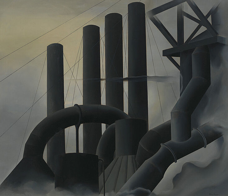
-
745
Alice Neel, Pat Whalen, 1935
Audio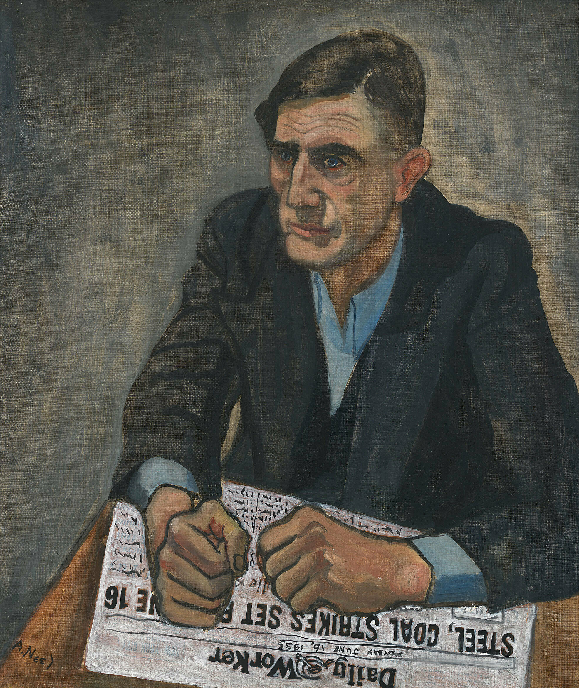
-
750-2
Jasper Johns, Three Flags, 1958
Audio
-
752-2
Edward Hopper, Early Sunday Morning, 1930
Audio
-
770
Jacob Lawrence, War Series, 1946–47
Audio, ASL
-
760
Archibald Motley, Gettin' Religion, 1948
Audio, ASL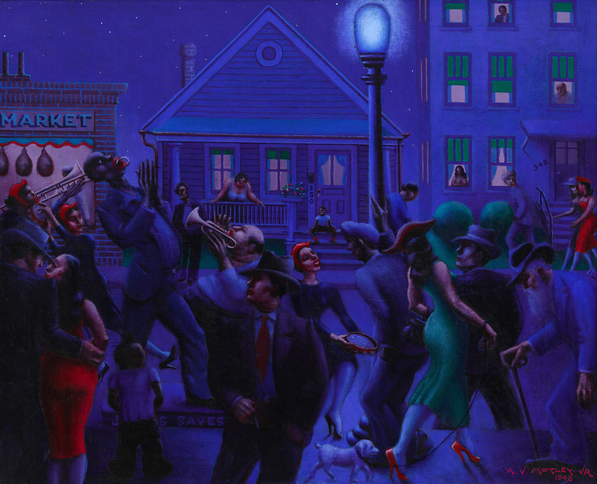
-
736
Jared French, State Park, 1946
ASL -
613
Alice Neel, Andy Warhol, 1970
Audio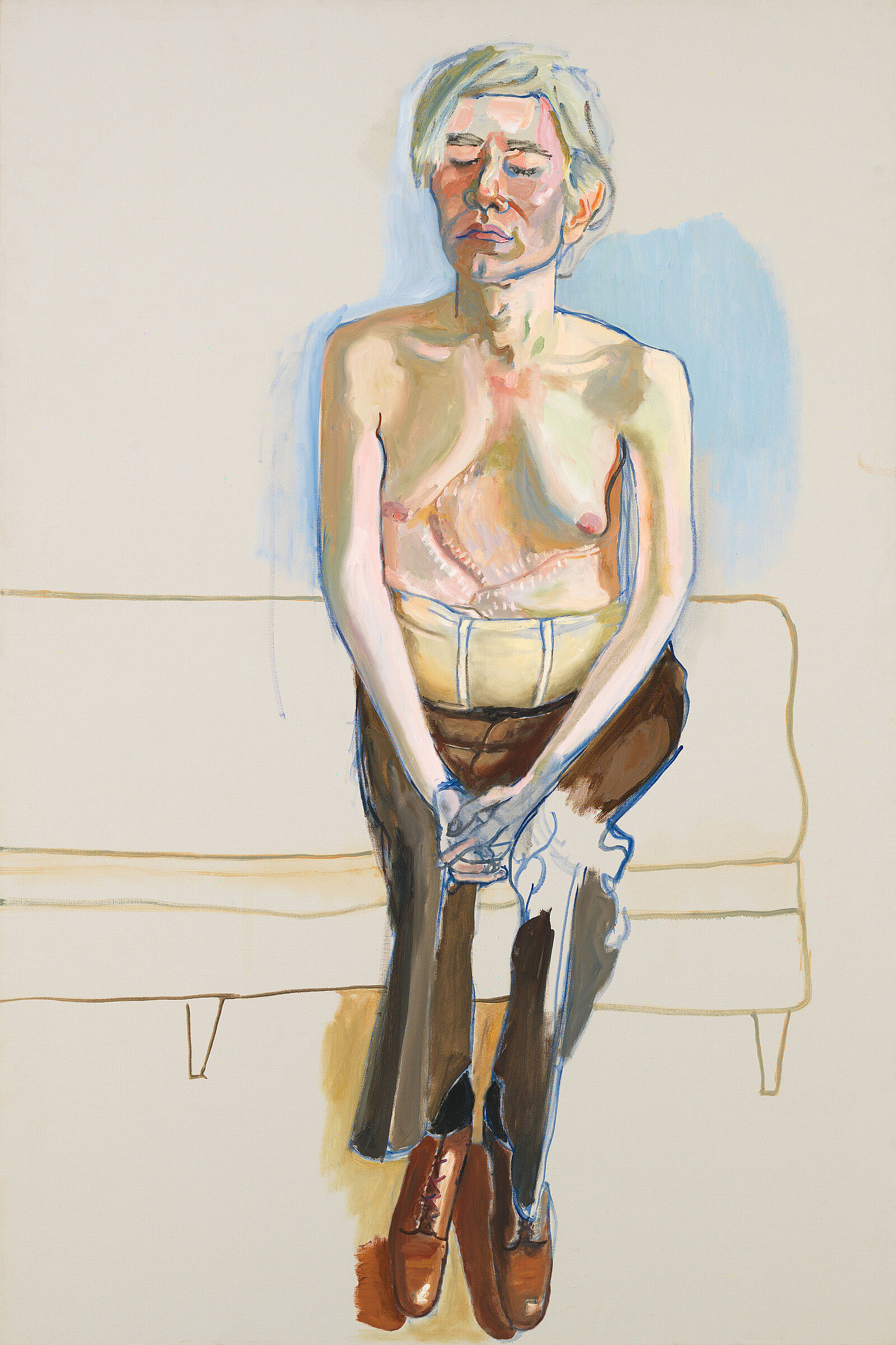
-
734
Louise Bourgeois, Quarantania, 1941
Kids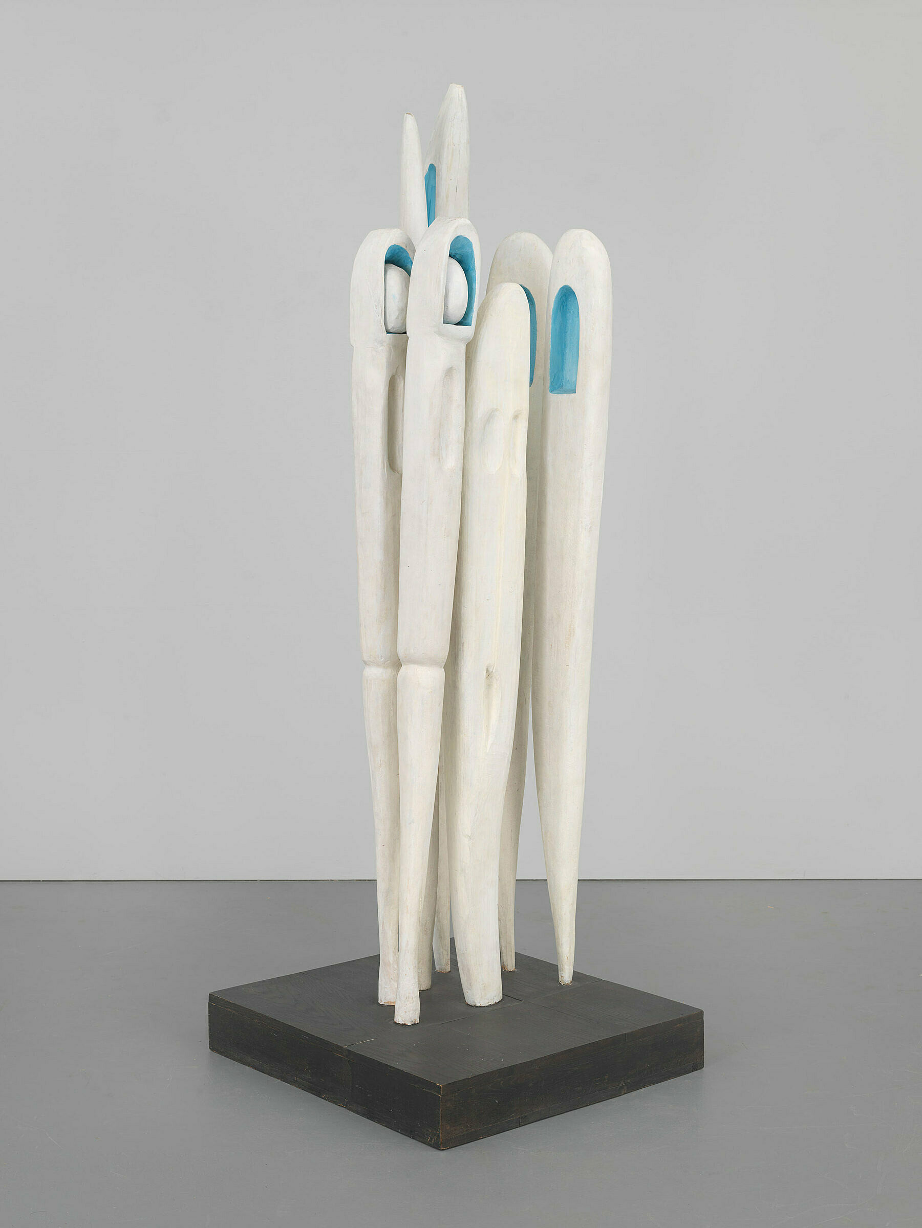
-
733
Charles Henry Alston, The Family, 1955
Kids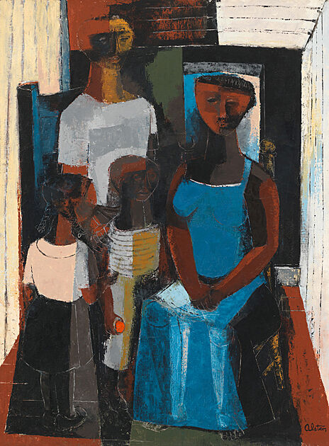
-
751
Isamu Noguchi, Humpty Dumpty, 1946
Kids
-
747
Georgia O'Keefe, Summer Days, 1936
Audio
David Breslin: My name is David Breslin. I’m the DeMartini Family Curator and the director of the collection here at the Whitney Museum of American Art. I’m the curator of Where We Are: Selections from the Whitney’s Collection 1900-1960.
The exhibition looks at artworks in the Whitney's collection made between 1900 and 1960. The idea behind the exhibition was to really show themes or groups of works that American artists have traditionally, even habitually returned to. The idea was to look, during a particularly divisive current American history, at these groups of works to show how American artists have looked at these ideas in very different ways and to put forth the idea that we can have difference without division or divisiveness.
The exhibition is broken into five groups or themes: Family and Community, the Home, Labor, the Nation, and the Spiritual.
The title of the exhibition, Where We Are, comes from W.H. Auden’s poem, September 1, 1939. It’s a poem that Auden wrote shortly after he emigrated to the United States from the United Kingdom and September 1, 1939 is the day that Germany invades Poland, really setting in motion World War II. And in the poem, Auden begins to play out how the shadow of this global emergency will play itself out in every corner of everyday life, so the Family, the Home, the Nation—all the themes that this exhibition takes under consideration. The exhibition has been framed also with lines from the same poem, so in addition to Where We Are coming from the poem, each section or theme is also titled after a line from the poem.
Mark Joshua Epstein: Welcome to Where We Are, an exhibition of works from the Whitney’s permanent collection. My name is Mark Joshua Epstein, and I’m an Educator here at the Whitney. Today, we’ll be exploring this exhibition with students from PS 3 in Manhattan, and PS 146, Brooklyn New School. We’ll look at a few works in each gallery.
As we go through the exhibition, we’ll focus on a few specific works. You might want to compare them to the art on view nearby. As you do, you’ll notice that each room has a different theme. There are galleries focused on the home, family, work, nationhood, and spirituality.
Thanks for joining me, and enjoy your visit today!
Installation view of Where We Are: Selections from the Whitney’s Collection, 1900-1960 (Whitney Museum of American Art, New York, April 28, 2017–). From left to right, top to bottom: Jacob Lawrence, War Series: The Letter, 1946; Jacob Lawrence, War Series: Docking – Cigarette, Joe?, 1947; Jacob Lawrence, War Series: On Leave, 1947; John Steuart Curry, Baptism in Kansas, 1928; Thomas Hart Benton, Poker Night (from A Streetcar Named Desire), 1948; Jacob Lawrence, War Series: Beachhead, 1947; Jacob Lawrence, War Series: Purple Hearts, 1947; Jacob Lawrence, War Series: How Long?, 1947. Photograph by Ron Amstutz
Narrator: In War Series, Jacob Lawrence walks us through the traumatic experience of World War II.
Take a close look at the paintings, one by one. Notice the repetitive shapes and colors. Some emphasize the chaotic conditions of life in battle. Others, the cramped, confined conditions soldiers suffered off the field.
Find a group of soldiers clustered underneath a tank. Notice which directions each of the men are looking. The ones near the top seem focused on the battle ahead—but at the bottom, a wounded soldier is being carried away on a stretcher. What’s the body language like here? There’s an intense mix of stress, pain, and probably fear.
Now look at a person leaning over a black table, and looking at a single bright white sheet of paper. The painting is called The Letter. What kind of news do you think it’s delivering? And what clues does Lawrence give you about its recipients’ feelings?
Finally, let’s look at the last painting. It’s called Victory. It shows a single soldier, his head bent. You can’t see his face, but his body helps to communicate his emotions. The war is won—how would you expect him to feel? Is that how he actually looks? What kinds of words would you use to describe him? Excited? Thankful? Tired?
During the war, Lawrence served in the Coast Guard, which was then part of the Navy. Soon after it was over, he made these paintings in order to deal with his feelings about it.
Mark Joshua Epstein: So we are sitting in front of a series of paintings called the War Series by an artist named Jacob Lawrence. And we're going to concentrate on one called The Letter. Take a moment to find it. What do you notice about this painting?
Student 1: I think it’s almost like the letter has done something to her. Like it was very bad news and she’s very upset about it.
Student 2: Also the colors are very dark. And their head is very low down and sad.
Student 3: Maybe she lost her husband or something because I see a ring on her finger.
Mark Joshua Epstein: It's interesting that a lot of you identified it as maybe it's a man or maybe it's a woman. It's often written about that it's a man but you're bringing up the point that it's actually kind of hard to tell because someone was just saying that we don't see the face. So when I say the title of the series, which is the War Series, do you think of paintings that look like this, that look like The Letter, or do other kinds of images come to mind?
Student 1: Usually other kinds of images. Like maybe a hospital or something, where people that have been affected by the war, like hurt, go.
Student 2: I’ve seen some paintings of ancient wars, of a bunch of soldiers with spears and riding on horses. If I was going to just hear the name I’d probably think of something like that.
Student 3: I normally think of men fighting in wars. I don't normally think of the people back at home.
Mark Joshua Epstein: Jacob Lawrence made this series in 1946 and 1947, which is right after he actually served in World War II in the Coast Guard, and he served first in an all-black regiment, and it was kind of lower down the totem pole of what one could do in the army or in the coast guard, and then later he served in an integrated regiment. He had experience of being in the war and he had experience of being all over the world. And someone mentioned before that you were thinking—maybe we think about ancient war scenes and people with spears, and people have said that Jacob Lawrence was inspired in part by the time he spent in Egypt in the Coast Guard where he would have seen these more ancient works of art.
Jacob Lawrence, The Letter, 1946-47. Tempera on composition board, 20 1/4 × 16 1/8in. (51.4 × 41 cm). Whitney Museum of American Art; Gift of Mr. and Mrs. Roy R. Neuberger 51.11 © 2017 The Jacob and Gwendolyn Lawrence Foundation / Artists Rights Society (ARS), New York.
Narrator: With its soft, petal-like folds, this painting by Georgia O’Keeffe seems floral—but it doesn’t depict any particular flower. It’s an abstraction that the artist has rooted in natural form. When O’Keeffe painted this canvas in 1918, abstract art was very new and radical: the first fully abstract paintings had been made only eight years earlier. But the title that O’Keeffe has given this work—Music Pink and Blue—hints that the ideas behind abstract art were already part of western culture. It had long been understood that music was expressive—even when it had no narrative or representational content. By likening her painting to music, O’Keeffe suggests that pure form and color can have expressive power too.
Wanda Corn: One of the features of this painting is the beautiful sense of movement that you have where nothing is static in the picture.
Narrator: Wanda Corn is a historian of American Art.
Wanda Corn: You feel as if every form is breathing and opening up to the form next to it. This was a very important concept of keeping forms in the stage of becoming. This was something that artists tried to do in their abstractions in the late '10s, and O'Keeffe is responding to that notion of time not stopping, of there being a constant movement in the work itself.
Narrator: Georgia O'Keeffe was inspired by things she saw in nature. Even in an abstract painting like this one, she used curvy, flowing lines and brilliant colors that might suggest something natural, like a blooming flower or a shell.
In many of her paintings, O’Keeffe draws your eye from the edge to the center. Here, it moves from a pale billowy arc into deep blue.
Can you picture yourself in this painting? Would you cocoon yourself in the center? Slip along the outer edge? Or wrap the colors around you like a scarf?
O’Keeffe wanted her paintings to express feelings that she didn’t have words for. She called this painting Music, Pink and Blue No. 2. Music can express feelings even when it’s instrumental, and doesn’t have lyrics. O’Keeffe thought paintings could be the same way—they didn’t need to have identifiable images. They could communicate in other ways. Can you see the rhythms in this painting?
Georgia O'Keeffe, Music, Pink and Blue No. 2, 1918. Oil on canvas, 35 x 29 15/16 in. (88.9 x 76 cm). Whitney Museum of American Art, New York; gift of Emily Fisher Landau in honor of Tom Armstrong 91.90. © The Georgia O'Keeffe Foundation/Artists Rights Society (ARS), New York
Narrator: When DeFeo made The Eyes, she was thinking about vision in a deep, almost prophetic sense—imagining what would come next for her as an artist. She spoke about the drawing in 1980.
Jay DeFeo: It was a very important drawing for me to do. It was almost a kind of visionary experience for me, as though I were seeing from the inside out.
Narrator: Leah Levy is Director and Co-Trustee of the Jay DeFeo Trust in Berkeley, California.
Leah Levy: This drawing is of Jay DeFeo's own eyes. It's done at a very large scale, and she used a small photograph of her own eyes as a model for this. The vertical marks are kind of a scrim or a veil. We don't specifically know what she was thinking or what they represent, but they turn it from a realistic or almost super realistic drawing into something that's not only more mysterious, but that's more visionary, that's more otherworldly.
Mark Joshua Epstein: We’re looking at a piece by Jay DeFeo called The Eyes, and I'm wondering, what do you notice about this art work?
Student 1: To make it just the eyes they kind of blur out everything—like everything even close to the eyes.
Student 2: I noticed that in the middle, like where the nose should be, it’s just kind of like almost, it reminds me of slices almost.
Student 3: It looks like it is just staring right at you.
Mark Joshua Epstein: Jay DeFeo was looking at a photograph of her own eyes—the artist was looking at a photograph of her own eyes when she made this artwork and I'm wondering, do you think it counts as a self-portrait even though it’s just her eyes?
Student 1: I think it does count because even though it doesn’t show your entire whole face, the eyes sort of convey a lot.
Student 2: Maybe she is looking at sadness or something, because sometimes people would compare sadness to something being cracked or broken, so she could be looking at something sad.
Student 3: I think that sometimes like a photograph looks very real, but sometimes if something is not super realistic, or if it’s kind of realistic with a little bit of something like a twist, it gives you more to think about.
Jay DeFeo, The Eyes, 1958. Graphite pencil on paper, 42 × 84 3/4 in. (106.7 × 215.3 cm). Whitney Museum of American Art, New York; gift of the Lannan Foundation 96.242.3. ©️ The Jay DeFeo Foundation/Artists Rights Society (ARS), New York
Narrator: Artist Joseph Stella first saw the Brooklyn Bridge when he arrived in New York from a small town in southern Italy. He was struck by the technological wonders of the city. The bridge was an iconic symbol of the possibilities of the new world—simultaneously grand and frightening. Many nights, Stella visited the vast expanse of the bridge’s walkway. He later wrote, “I felt deeply moved, as if on the threshold of a new religion.”
Henri Petroski is the Aleksandar S. Vesic Professor of Civil Engineering at Duke University.
Henri Petroski: The cables that dominate this picture are the suspension cables. The Brooklyn Bridge was really a ground-breaking suspension bridge. It was designed by John Roebling, the civil engineer who wanted to connect Brooklyn and New York, which were then separate cities across the East River.
Stella's perspective is essentially the impression you get as you walk along the bridge. The elevated walkway is cradled in these cables, so you’re caught in this net of cables and wires and it’s really a very spectacular setting.
The Brooklyn Bridge walkway provides one of the classic walks in the world. To walk across the bridge and to approach Manhattan at a walking pace is something that is hard to reproduce anywhere else. It gives you ample time to reflect upon the magnitude of the city, the achievements of the engineers and architects who made the city what it is. The people walking on the walkway coming towards you, walking with you, also remind you of the real diversity of the city. It’s just a spectacular, spectacular experience.
Narrator: Artist Joseph Stella moved to America from a small village in Italy and fell in love with the skyscrapers, subways, and bridges of New York City. They were all so impressive! Stella painted the Brooklyn Bridge several times over the years, visiting it like an old friend.
Here, he captures its sweeping cables, glittering lights, bustling traffic, and spectacular views. Imagine that you've just stepped into the painting—maybe with someone who’s never seen New York City before. This massive bridge is almost shaking with energy. Look around. Find the city sparkling ahead of you. Notice the different types of lights Stella added to the top and in between the openings of the bridge. They might remind you of the stars above. Or maybe the headlights of cars rushing across the bridge, or the bright lights of theater on Broadway.
Joseph Stella, The Brooklyn Bridge: Variation on an Old Theme, 1939. Oil on canvas, overall: 70 1/4 × 42 3/16 in. (178.4 × 107.2 cm). Whitney Museum of American Art, New York; Purchase 42.15
Clyfford Still, Untitled, 1956. Oil on canvas, 113 1/8 × 147 1/4 in. (287.3 × 374 cm). Whitney Museum of American Art, New York; gift of The American Contemporary Art Foundation, Inc., Leonard A. Lauder, President 2002.265 © 2017 City and County of Denver, Courtesy Clifford Still Museum/Artists Rights Society (ARS), New York, NY
Mark Joshua Epstein: We are looking at a 1961 painting by Roy Lichtenstein called Bathroom.
Student 1: It's kind of random, like most people in their house have a bathroom, and why would you paint it is my feeling.
Student 2: I think the object of this painting is just to show everyday, daily things that you see in life, and just to represent what their purpose is.
Student 3: Well, I'm wondering why there's a copyrighted sign on the bottom left corner.
Student 4: Well, it looks sort of like it was drawn in a cartoon style.
Mark Joshua Epstein: Roy Lichtenstein was a Pop artist, which meant that he was really inspired by things from popular culture. One of the reasons this might have a copyright sign on it is because it was taken from a brochure or some kind of advertisement about a bathroom. If you were going to create a work of art now and you were going to take inspiration from something in popular culture, what could it be?
Student 1: I think maybe a landscape, because in magazines and advertisements, you always see these beautiful landscapes.
Student 2: This might sound a little odd, but I'm kind of interested in facial hair. Maybe you can draw a picture of a mustache in a certain action.
Student 3: I would probably draw a plant or a flower because there's so many different variations, and they're very fun to draw.
Roy Lichtenstein, Bathroom, 1961. Oil on canvas, 45 3/4 × 69 3/8 in. (116.2 × 176.2 cm). Whitney Museum of American Art, New York; gift of The American Contemporary Art Foundation, Inc., Leonard A. Lauder, President 2002.253. © Estate of Roy Lichtenstein
Narrator: On the right-hand side of Henry Koerner’s Mirror of Life, a nude man peers out a window at the spectacle of the world. Joseph Leo Koerner, the artist’s son and a professor of art history at Harvard University, describes the role of the man.
Joseph Leo Koerner: His leaning gesture—which I know my father spent a lot of time getting right—is there to sort of combine the interior scene of everyday life and of the erotic life of a person with the exterior world in which everything that can go on in life is encapsulated, from eating and buying clothes to leisure pursuits, like dancing.
In the far distance in the scene of a man killing another man—probably Cain killing Abel—one is given a sense that whatever one sees is not just everyday life but it's sort of everyday life raised to a slightly higher magnitude.
In the middle ground you see people picking up bits from a treeless forest. And that's a little abbreviated version of the Vienna woods.
But at the same time, there are obviously references to the cityscape of New York in the style of buildings, the South of the United States in the scene of the old man and woman sitting on the porch.
Narrator: The references to New York and Vienna—as well as the sense of anxiety that pervades the painting—have their roots in Koerner’s own life.
Henry Koerner, Mirror of Life, 1946. Oil on composition board, overall: 36 × 42 in. (91.4 × 106.7 cm). Whitney Museum of American Art, New York; purchase 48.2. With permission of the Estate of Henry Koerner
Narrator: Artist and art critic Brian O’Doherty.
Brian O’Doherty: We're looking at New York Interior. He was 39 when he did that. But Hopper lived long and he was a slow starter, determined. He was a long-distance runner and he paced himself. So, New York Interior proves something that he said to me. He said every artist has a core of originality, a core that is himself. And how does that come out in art? It comes out in the format of things. It comes out in the concerns, the themes, and the details of the paintings he does, even when he's young.
Narrator: In New York Interior, as is true in paintings from throughout his career, Hopper offers select details, but ultimately doesn’t reveal who or what we are looking at.
Brian O’Doherty: But she does seem to be a sort of ballerina or dancer. She's in a very flouncy dress. But as I look at it further I see that what she's doing is she's sewing something on her lap and the hand raised, as you may remember from watching your mother. She's sewing and in that hand there's probably—if we could see closely enough—a needle.
Now on the right there is some typical Hopper furniture, a clock that's rather unusual; time is present. On the left there's another picture. And I look at those things and they're incidentals which gradually tended to be burned away from his art as his vision got purer. But what I do look at as a very powerful thing is that big black vertical on the left which is holding the piece in and is like a kind of exclamation saying, "Look at this picture."
Mark Joshua Epstein: Now we're here at New York Interior by the artist Edward Hopper.
Student 1: I notice that it's a woman in a very beautiful, elegant dress, but it kind of looks depressing because of how dark it is.
Student 2: Also, her hand is up in the air, and I was wondering why, and she's holding her dress up, so it almost looks like she's fixing it or something.
Student 3: I see in the top right corner there's a clock, and it looks like both of the hands are pointing at the twelve, so that shows it might be late at night.
Student 4: She kind of seems lonely. Maybe she was in a relationship of some sort and they decided to separate.
Mark Joshua Epstein: A lot of historians think that Edward Hopper was inspired to paint this scene by his travels on the El Train, which was a train in New York that had an elevated track, so he could see through people's windows when he was on the train.
Student 1: Well, now that you said that, I noticed that the sides are cut off so it looks like a window.
Student 2: I'm kind of thinking since he only really got a glimpse of what was happening, you can't really totally describe the significance of the moment, and so she might actually be really happy, because from that point of view, you can’t really see her face.
Mark Joshua Epstein: One other question I had just to think about our own experience for a moment, if you walked into the museum, and you saw a painting like this of you through a window of your apartment, how would you feel?
Student 1: I would feel kind of invaded, like somebody took a picture of me.
Student 2: I would also feel kind of like, why are you looking at me, and what's so interesting about me when I'm just sewing up my dress?
Student 3: Unpopular opinion. It would be cool to have a painting by a famous artist about you. I'd be kind of surprised, but I'd also be like, cool!
Edward Hopper, New York Interior, c. 1921. Oil on canvas, Overall: 24 1/4 × 29 1/4 in. (61.6 × 74.3cm). Whitney Museum of American Art, New York; Josephine N. Hopper Bequest 70.1200. © Heirs of Josephine N. Hopper/Licensed by VAGA, New York, NY
Narrator: Have you ever had the feeling, as you enter a subway station, that you might somehow never get out again? This painting by George Tooker is full of entrances and exits, yet the people in the image appear trapped. Look at the woman in the center of the painting with the grey overcoat. You can see she’s put one foot in front of the other, but her body seems frozen. The anxious expression on her face suggests she knows she’s going nowhere.
Notice how much this subway scene resembles a labyrinth or a prison with its bars and gates. Look to the left side of the painting. Note the three figures in overcoats standing inside narrow cubicles. They could be people using public telephones, but they seem mysterious and even sinister. For Tooker, the subway is a symbol for the anxiety and estrangement of modern life. Tooker made this image not with oil paints but with egg tempera. In this technique, pigments are mixed with egg yolk so that the paint dries very quickly. Tooker liked the medium because he felt it suited the careful realism of his paintings.
Narrator: At first glance, this looks like an ordinary subway station. But take a close look. The station is full of people, yet each one is traveling alone. Notice how none of them are exactly the same—yet they’re eerily similar. Notice how they are not looking at each other. And what do you think of the looks on their faces?
And another thing: how do you get out? This painting by George Tooker is full of entrances and exits, yet the people appear trapped. Trapped by the low ceiling, the bars and gates to the right and left, and the strange angle of the hallways behind. This isn’t a subway station I’d want to be in. And I don't know about you, but I don't think any of these people want to be there, either.
George Tooker, The Subway, 1950. Tempera on composition board, overall: 18 1/2 × 36 1/2 in. (47 × 92.7 cm). Whitney Museum of American Art, New York; purchase, with funds from the Juliana Force Purchase Award 50.23. © Estate of George Tooker. Courtesy DC Moore Gallery, N.Y.
David Breslin: Elizabeth Catlett made this body of prints, I Am the Negro Woman, in 1947 at a workshop in Mexico City.
Narrator: David Breslin is the DeMartini Family Curator and Director of the collection.
David Breslin: This group of works are linoleum woodcuts that feature some known figures like Harriet Tubman, Sojourner Truth, and Phyllis Wheatley, and the idea that their labor—now-famous black women’s labor—should be celebrated, seen, and be made as a model. But also within this group of works are “unknown women” and the invisible labor. Whether it’s in the home, or in the field, or in the factory, that frequently wasn’t seen or wasn’t made heroic. For Catlett, the idea was not only to celebrate these exemplary figures like [Sojourner] Truth, but also to celebrate the everyday labor of ones who have not been noticed—who go unnoticed throughout their work.
Mark Joshua Epstein: Okay, we're looking at a series of prints by the artist Elizabeth Catlett. These prints were made in 1946 and 1947, and were originally called I am the Negro Woman, and later on in her life she changed the title to The Black Woman to reflect language of the time. I'm wondering in general what you notice about these prints on the wall?
Student 1: So it’s kind of like the Black route to freedom, they start out at slavery but they go along. You see Harriet Tubman helping them escape to the north.
Student 2: Then it kind of gets a tiny bit better for Black people, slavery is outlawed. Then I see like “colored-only” bus seats and I know that was further on, when there was segregation. It’s kind of like a timeline with pictures.
Mark Joshua Epstein: Let's focus in on this one work about Harriet Tubman. I'm wondering, what do you know about Harriet Tubman’s story?
Student 1: Well, she was a conductor on something called the Underground Railroad.
Student 2: “Underground” is also a metaphor. It doesn’t necessarily mean it’s actually underground, but it sort of means secret, and she led slaves to freedom, first Pennsylvania, where slavery was not allowed. Then she had to go all the way to Canada.
Student 3: Harriet Tubman used to be a slave, working on a plantation but she escaped, but it was really daring of her to go back and help a lot of other slaves.
Mark Joshua Epstein: Elizabeth Catlett thought of a lot of the people in these prints as heroes. She mixes together American history heroes, like Harriet Tubman and normal everyday people of color who are working in domestic spaces who might be cleaning homes or working in the field. I'm wondering, why do you think she mixed those things together, these heroes that we’ve acknowledged and these everyday people?
Student 1: Well, these everyday people are also heroes, just like the heroes that we acknowledge because they are all Black, so they have to endure a lot in that time.
Mark Joshua Epstein: Do you guys have any last thoughts or questions?
Student 2: I have a question, are these the original paintings or just copies?
Mark Joshua Epstein: So this is series of linoleum prints. And it means that Elizabeth Catlett made the original—she carved it into linoleum and then she could print it a number of times. She actually said that the reason she made prints instead of paintings, in this case, was because it made them less expensive, because there were more of them. It meant that the people who were featured in the prints could afford to buy the prints, and that was really important to her.
Elizabeth Catlett, In Sojourner Truth I fought for the rights of women as well as Blacks, printed 1989. Linoleum cut, 10 1/4 × 7 3/8in. (26 × 18.7 cm). Whitney Museum of American Art; Purchase, with funds from the Print Committee 95.195 Art © Catlett Mora Family Trust/Licensed by VAGA, New York, NY
Adam Weinberg: When artist Frank Stella first showed this painting at the Museum of Modern Art in 1959, people were baffled by its austerity.
Narrator: Adam Weinberg is Alice Pratt Brown Director of the Whitney Museum.
Adam Weinberg: Stella responded “What you see is what you see. Painting to me is a brush in a bucket and you put it on a surface. There is no other reality for me than that.” He wanted to create work that was methodical, intellectual, and passionless. To some, it seemed to be nothing more than a repudiation of everything that had come before it—a rational system devoid of pleasure and personality. But other viewers saw that the black paintings generated an aura of mystery and solemnity.
The title of this work, Die Fahne Hoch, literally means, “the banner raised.” It comes from the marching anthem of the Nazi youth organization. Stella pointed out that the proportions of this canvas are much the same as the large flags displayed by the Nazis.
But the content of the work makes no reference to anything outside of the painting itself. The pattern was deduced from the shape of the canvas—the width of the black bands is determined by the width of the stretcher bars. The white lines that separate the broad bands of black are created by the narrow areas of unpainted canvas.
Narrator: [Frank] Stella painted these large, abstract paintings when he was a young man.
Mark Joshua Epstein: I think these early works take a lot of extended looking. The white lines that Stella has left showing through the black paint take a long time to find themselves to your eyes. It’s almost as if you’re trying to look at something in pitch black and you need to give your eyes time to adjust so that you can really see the details. There’s all of this brushwork that comes through. These lines aren’t exactly—they don’t look like they’re made by machines. They’re definitely made by humans, and you see his brushwork and the evidence of the artist’s hand, which I think is really cool in this work.
You also notice that the paint that he’s using shines in certain spots more than others, and that’s because it was household paint. It was paint from a hardware store, and sometimes the finish was a little bit uneven.
I think this work looks kind of plain because Frank Stella was really getting to the basics of painting, and he’s trying to really narrow it down to see, if I take out almost everything, can I still make a picture? And what will that picture look like?
Frank Stella, Die Fahne hoch!, 1959. Enamel on canvas, 121 5/8 x 72 13/16 in. (308.9 x 184.9 cm). Whitney Museum of American Art, New York; gift of Mr. and Mrs. Eugene M. Schwartz and purchase with funds from the John I. H. Baur Purchase Fund, the Charles and Anita Blatt Fund, Peter M. Brant, B. H. Friedman, the Gilman Foundation, Inc., Susan Morse Hilles, The Lauder Foundation, Frances and Sydney Lewis, the Albert A. List Fund, Philip Morris Incorporated, Sandra Payson, Mr. and Mrs. Albrecht Saalfield, Mrs. Percy Uris, Warner Communications Inc., and the National Endowment for the Arts 75.22. © 2015 Frank Stella / Artists Rights Society (ARS), New York. Digital Image © Whitney Museum
A.M. Homes: And I think for me, looking at Mark Rothko paintings was, for lack of a better description, the first time I saw myself in art.
Narrator: Novelist A.M. Homes.
A.M. Homes: I also think it’s an incredibly compressed field which always amazes me that he is able to take everything from horror and ecstasy and pure, sheer rage and the most sublime, delicate, wonderful experience and boil it all down and render it as indivisible. Each element is there and you can't even begin to break apart which one is which.
I think that he achieves in his paintings what I'm trying to achieve in fiction. Which is that expression of the things that go unseen and unsaid and unarticulated. And I'd never seen anything—color, gesture, texture—represent an emotional experience so fully. So that meant an incredible amount to me.
The story of me and Mark Rothko is that when I was a kid, my father, who's a painter, used to go every weekend and look at art in Washington. And every weekend, I would eventually go with him. Because in addition to being a lover of art, my father was also incredibly picky about what foods we ate and what we could have in the house. And he was a real health food fanatic early on. So we had no cookies, we had no cake, we had no twinkies or hohos. We also couldn’t have grapes that weren’t picked by union workers and no iceberg lettuce and no soda. But if you went with my father to look at art, at a certain point he could break down and he would take you to the cafeteria. And in addition to not allowing sweets he also kind of got overwhelmed in the cafeteria because I think it was his big moment as well and so you could pick out whatever you wanted. And you could usually pick out more than one thing. So you could have pie AND Jello which I think was almost anti-religious in our family. And I would go with him, and I would sit in museums all over Washington, looking at art for hours and hours and hours, and having this accidental art education where I would just stare at the painting sitting on benches waiting for him. And in the end it turned out it was really incredibly marvelous. And I discovered Mark Rothko among many other artists. And had very nice pie at the end of the day. And I think it's in a large part how I became who I became.
Narrator: Red, red, and more red.
Mark Rothko used very thin washes of color on top of very thin washes of another color to give paintings like Four Darks in Red a luminous depth.
What happens to the colors the longer you look?
In some cases you might be able to spot one color glowing through the thin layer of paint on top of it. Crimson here, rust there, and a rich maroon other there. And look at the second shape from the top—you might almost imagine getting lost in that deep, textured black. For Rothko, the drama was in the play of the colors and shapes.
Rothko wanted viewers to get close to his art and experience the big emotions he felt while painting. How does it look from the middle of the room? How is it different if you get closer—three or four feet away from the canvas?
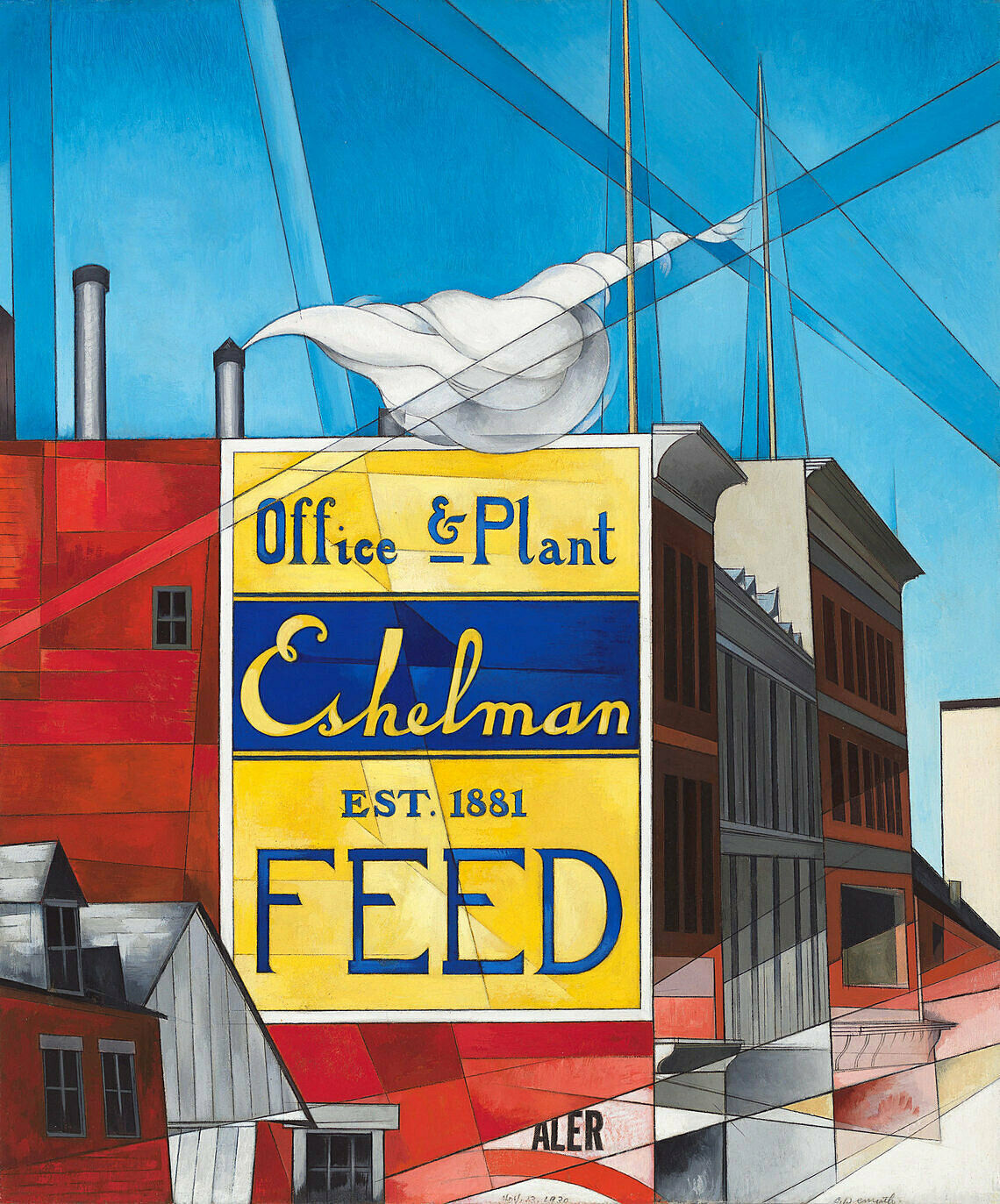
Narrator: Adam Weinberg on Charles Demuth’s My Egypt.
Adam Weinberg: Enormous concrete grain elevators loom at the center of this painting by Charles Demuth. At the right, we see an almost elegant-looking smokestack—its plume of smoke barely discolors the clear blue sky. At the bottom left, a small chimney suggests rooftops of buildings dwarfed by the concrete structure behind them—as if the giant silos are actually pushing the older structures right off the edge of the canvas. What does the presentation of these grain elevators tell us about the ideology behind them? The image is oddly sterile—painted in a precise, machine-like way. The surface of this painting is so pristine, you can hardly find a single brushstroke. It almost looks like a photograph. Rays of light bifurcating the canvas spotlight the building, but the light is cold, almost harsh. The painting’s title provides another clue—it’s called My Egypt. The title and the monumentality of these grain elevators suggest that Demuth is placing the architecture of American industry on par with the great monuments of the past, like the pyramids of ancient Egypt. In this painting we can see both the optimism and the anxiety of the period.
Narrator: This building is an unusual subject for a painting. It’s a plain, industrial looking structure. The painter Charles Demuth filled the canvas with dynamic criss-crossing diagonal lines to make it more exciting to look at. He did something similar with the colors. He started with just a few, but made them more interesting by experimenting with different amounts of lightness and darkness in shapes throughout the painting.
But what kind of building is this? It’s called a grain elevator. In the early 1900s, the family farm began to be replaced by larger scale operations. Trains could move tons and tons of grain, so farmers needed new, modern storage sites. And so the grain elevator came about—and it was more like a factory than a barn. This one was in Lancaster, Pennsylvania, where the artist was born. The building is tipped back slightly, to give the feeling that we are looking up at something huge. By naming the piece “My Egypt” Charles Demuth lets us know that this building is as important to him as the great Egyptian pyramids.
Charles Demuth, My Egypt, 1927. Oil and graphite pencil on fiberboard, 35 3/4 × 30 in. (90.81 x 76.2 cm). Whitney Museum of American Art, New York; Purchase, with funds from Gertrude Vanderbilt Whitney 31.172
Scott Rothkopf: We’re looking at a painting called Three Flags by Jasper Johns.
Narrator: Scott Rothkopf is the Alice Pratt Brown Director of the Whitney Museum.
Scott Rothkopf: It was painted in 1958, about four years after Johns made his first painting of a flag. He said that he painted a flag the first time because it was something that came to him in a dream and he also was interested in painting things that he said “are things the mind already knows.” That is, things that we see in our daily lives that the artist doesn’t make up. In that sense, the flag was also in a series that also included targets, numbers, and other forms that Johns didn’t invent, but could take right out of the culture and the images that were all around him.
At the time he did this, it was a really radical act because most of the painting that he would have seen in New York and admired were abstract expressionist canvases that were full of aggressive, exciting, something beautiful and diaphanous marks that painters supposedly made directly on the surface and invented as a way of thinking about picturing a new world. This, by contrast, was something we could all recognize, a flag, a really common symbol.
Mark Joshua Epstein: This is a painting called Three Flags that was made in 1958, by the artist Jasper Johns.
Student 1: It looks like since there are a lot of layers of the American flag, maybe it’s showing that there are a lot of different kinds of people and things in America.
Student 2: Well, first it looks like an optical illusion to me because it’s big, small, and then smaller.
Student 3: I think the artist had this idea, like I’m going to make something with the American flag. They just thought it would look cool, they just stacked a couple of American flags on top of each other. I don’t think it has an actual meaning.
Mark Joshua Epstein: Jasper Johns talked about the American flag as something we see, but that we don’t look at. What do you think he meant?
Student 1: Well, we just kind of just take it for granted. Oh! We see that every day.
Student 2: I think they layered it to make it interesting, so you actually look at it closely and read what the sign says and learn about it and actually get into it, rather than just being oh! that’s the American flag. Next picture.
Jasper Johns, Three Flags, 1958. Encaustic on canvas (three panels), 30 7/8 × 45 3/4 in. (78.4 × 116.2 cm) overall. Whitney Museum of American Art, New York; purchase, with funds from the Gilman Foundation, Inc., The Lauder Foundation, A. Alfred Taubman, Laura-Lee Whittier Woods, Howard Lipman, and Ed Downe in honor of the Museum’s 50th Anniversary 80.32. © 2021 Jasper Johns / Licensed by VAGA at Artists Rights Society (ARS), New York
Narrator: Isamu Noguchi composed this 1946 sculpture out of flat interlocking pieces of stone, held together without pins or adhesives. The work is made out of ribbon slate, a stone that breaks easily. A sense of fragility is also evoked by the work’s title, Humpty Dumpty, the children’s nursery rhyme that ends with this well-known verse: “and all the king’s horses, and all the king’s men, couldn’t put Humpty back together again.” Walk around the sculpture. Notice how Noguchi fits the pieces of stone together—hanging some, balancing and propping up others. They remain in a dynamic state of tension.
Noguchi himself has stated that the fragility of the work mirrors the impermanence of life. He compared his interlocking sculptures to Japanese poetry or cherry blossoms, stating that perfection can “only be transient—a fragile beauty is more potent.”
Isamu Noguchi, Humpty Dumpty, 1946. Ribbon slate, 59 × 20 3/4 × 17 1/2 in. (149.9 × 52.7 × 44.5 cm). Whitney Museum of American Art, New York; purchase 47.7a-e. © 2025 The Isamu Noguchi Foundation and Garden Museum / Artists Rights Society (ARS), New York
Narrator: All you’re looking at here is a block of brick storefronts with apartments above them. The title, Early Sunday Morning, may explain the emptiness of the street, but it can’t explain the emotional pull of the painting.
When Edward Hopper made this image in 1930, he based it on a real street he knew—Seventh Avenue South in Greenwich Village. But he’s made it look like any main street in any small town anywhere in America. Notice the storefront windows. They have lettering on them, yet Hopper doesn’t let you make out what the letters say. Hopper is an artist of universals, not particulars; he doesn’t want to be that specific.
Now look up at the windows on the second floor. Begin at the left. A yellow shade is drawn; another is half raised; further along, some of the windows are covered with darker window coverings; to the right, a few more have decorative curtains. Each is slightly different, hinting at a life being lived beyond our view. In this small detail, Hopper makes us acutely aware that the people are missing from the picture. As a result, the painting communicates a sense of loneliness.
At the upper right corner of the canvas, a small dark rectangle rises above the building—the suggestion of a skyscraper in the background. It doesn’t catch your eye at first, but once you notice it, the tall building changes the whole picture. A threat overshadows the otherwise quiet street. Sooner or later the juggernaut of commerce and technology will eradicate a small-town way of life.
Mark Joshua Epstein: This painting is called Early Sunday Morning and it was made by Edward Hopper. What do you notice about it?
Student 1: Well, it looks like everything is closed, and all the shops and the windows are closed, and it doesn’t look like anybody is on the street.
Student 2: I think that it also really looks like a morning because of the way that the shadows are long.
Student 3: It shows the stillness of the morning when the sun just comes up, everybody is still in bed.
Student 4: I’m wondering if, I think the words were blurred on purpose to let you imagine what the shops would be.
Mark Joshua Epstein: Edward Hopper said that this painting was based on a part of Seventh Avenue, which is a north-south Street in New York, and I’m wondering if anyone notices something funny about the shadows.
Student 1: When the sun rises like east-west and when the street’s sky is north-south, it’s kind of weird, because you think the shadows would be going horizontally rather than vertical.
Mark Joshua Epstein: Does anyone think it’s possible that this painting is a result of a combination of observation with imagination?
Student 1: I think yes because the shadows aren’t very realistic. It’s like realistic but then some things are like a little bit off, almost.
Edward Hopper, Early Sunday Morning, 1930. Oil on canvas, 35 3/16 × 60 1/4 in. (89.4 × 153 cm). Whitney Museum of American Art, New York; purchase with funds from Gertrude Vanderbilt Whitney 31.426. © Heirs of Josephine N. Hopper/Licensed by VAGA, New York, NY
Wanda Corn: When these paintings were seen for the first time, very often critics would see in them female forms. They would see in it allusions to the womb or to female reproductive organs. They would see womanly colors such as the pinks, the blues and the lavender. And it would be read as a painting that was one that could only have been made by a female intelligence.
This was a common way of talking about O'Keeffe's paintings in her early years. It was one that was prompted by her husband Alfred Stieglitz who liked to read in O'Keeffe's paintings an expression of the sort of eternal female.
O'Keeffe herself felt as if that was more a comment on the critic than what she intended. She often would say it's about natural forms, but it's not to be tied to exclusively the female body. And she would have you rather see in a work like this a kind of slipperiness of form where you can't tie it to any one thing, be it a flower or be it a female body or be it a landscape. But that it has poetic allusions to all of those.
Georgia O'Keeffe, Music, Pink and Blue No. 2, 1918. Oil on canvas, 35 x 29 15/16 in. (88.9 x 76 cm). Whitney Museum of American Art, New York; gift of Emily Fisher Landau in honor of Tom Armstrong 91.90. © The Georgia O'Keeffe Foundation/Artists Rights Society (ARS), New York
Narrator: Adam Weinberg is Alice Pratt Brown Director of the Whitney Museum.
Adam Weinberg: Painting, Number Five, by Marsden Hartley, is an exuberant cacophony of color and pattern. Near the center of the canvas, two circles overlap—one contains the German Iron Cross, a medal of valor awarded to German soldiers for their courage in battle. The other contains a red cross. Look carefully and you can find references to flags, military insignia, and even an army uniform. The effect is like a collage, combining impressions of things Hartley encountered in Berlin, where he lived before the start of the First World War.
What is the real subject of this painting? Think about how you recall things that have happened to you in the past. Often, it’s hard to conjure up a sense of something in its entirety. We remember a person or an event in the details—a gesture, a smell, a color. Hartley’s paintings function that way too; it’s actually a portrait, although the literal image of an actual person is altogether absent. The painting commemorates a young German officer, Karl von Freyburg, who died in the early months of World War I. Hartley was in love with von Freyburg, and he made this painting after learning of his death.
Inspired by European avant-garde artists of the time, Hartley began to move away from direct representations of his subject matter toward more abstract, evocative imagery. Hartley once said that the artist’s challenge was to reveal what he called “the magic that is beneath the surface of what the eye sees.” In this painting, he captures a sense of an individual personality, and the emotional content of his relationship to Berlin and to von Freyburg.
The semi-abstract style of Hartley’s painting means that we have to struggle a bit to decode its meaning. If you’d like to hear about it, please tap the button to continue.
Marsden Hartley (1877–1943), Painting, Number 5, 1914–15. Oil on linen, 39 1/4 × 32 in. (99.7 × 81.3 cm). Whitney Museum of American Art, New York; gift of an anonymous donor 58.65
David Breslin: I love these paintings because I have such a hard time—when looking at it—understanding how he made it.
Narrator: David Breslin is the DeMartini Family Curator and Director of the collection.
David Breslin: Even when you realize or find out that he makes a painting like Tet by pouring paint onto the canvas, letting that paint really seep into the canvas and stain it. Even though I know that’s how he’s achieved what's happened in the painting, I’m still blown away by the unknown of the work. I think that’s why this painting has caused critics, particularly at the moment in which it was made, to describe some of them as having this, quote-unquote, “chromatic mysticism.” I love that idea because the chromatic, the idea of the color, is very material. But then pair it with this idea of mysticism. Something we don’t know, that's out-of-hand ,that calls us out of this earth, that imagines that there’s something more than or different than the material—is really fitting to this painting, one’s experience of viewing it.
Morris Louis, Tet, 1958. Acrylic on canvas, 94 1/8 × 152 1/8 in. (239.1 × 386.4 cm). Whitney Museum of American Art; Purchase, with funds from the Friends of the Whitney Museum of American Art 65.9 © 2017 Maryland Institute College of Art (MICA), rights administered by Artists Rights Society (ARS), New York, NY
David Breslin: One of the things I have always found interesting about Louis’s painting is that he never really let anyone watch him paint, except with the exception maybe of his wife, but he worked within his home. He didn’t have a large studio and none of the rooms in his house were anywhere close to the size of his paintings. So conservators for years and years have tried to figure out how in the heck he did this, and what they really came to discover was that he would roll the canvas in portions and pour, and then unroll the canvas, and then reroll the portion that had dried. What I find pretty fascinating about that—and really fascinating about his entire way of working—is that he himself, while working, never saw the entirety of the painting at one time.
Morris Louis, Tet, 1958. Acrylic on canvas, 94 1/8 × 152 1/8 in. (239.1 × 386.4 cm). Whitney Museum of American Art; Purchase, with funds from the Friends of the Whitney Museum of American Art 65.9 © 2017 Maryland Institute College of Art (MICA), rights administered by Artists Rights Society (ARS), New York, NY
Narrator: This painting from 1951-52 is by Barnett Newman. Newman believed strongly in the power of abstraction to communicate the most dramatic and elemental aspects of human existence. Art historian and author Irving Sandler.
Irving Sandler: One of the ideas that Barnett Newman worked with was to begin with color rather than with drawing and with modeling and this picture, Day One is essentially a color field of a single color. The stripes, which neither sit in front of nor behind the color field, therefore they cannot be considered forms, Barnett Newman referred to them as zips and their function was to intensify, to animate, the orange field and to give it scale. And, of course, size contributes to the intensity, although Newman wanted these pictures shown in small rooms so the color would literally inundate, you'd be transported, actually in this field of orange.
Now what does this picture signify? What does it mean? The content of the work, the meaning of this work as Newman saw it, was a striving for the sublime. Now sublime is one of those real wishy washy words. I mean it could more or less mean anything, but in—we've all experienced it. If you think about certain experiences in nature that you've had, say, before Niagara Falls or the Rocky Mountains or perhaps experiencing or looking at pictures of an atomic blast or a cyclone or a great storm.
It's interesting that this painting should be titled Day One, as if we're at the beginning of a new world. Or at least a new picture.
Barnett Newman, Day One, 1951-52. Oil on canvas, 132 1/16 × 50 1/8 in. (335.4 × 127.3 cm). Whitney Museum of American Art; purchase, with funds from the Friends of the Whitney Museum of American Art 67.18 © 2017 Barnett Newman Foundation/Artists Rights Society (ARS), New York, NY
Narrator: This painting by Barnett Newman, The Promise, consists of a black field, one vertical line brushily painted in light gray-blue, and another vertical that is the color of raw canvas. Newman called these vertical lines “zips,” a name that suggests they’re more like actions than things. And in fact, Newman was primarily interested in the way the zips divide the canvas and reorient its centers of gravity. He was less interested in the appearance of the lines themselves.
Newman once said “If we could describe the art of this, the first half of the twentieth century, in a sentence, it would read as the search for something to paint.” The zip paintings were his solution to this problem, and he continued making them from 1948 until his death. His intention was that they would not be pictures or interpretations of anything outside of themselves. Instead, they would create a completely new perceptual experience every time a viewer looked at the painting.
This idea—that painting could be an origin of experience—was extremely important to Newman. He was obsessed with ideas of genesis and original creation. His ambition for each painting was that it be like a world created entirely anew.
Barnett Newman, The Promise, 1949. Oil on canvas, 51 1/2 × 68 1/8 in. (130.8 × 173 cm). Whitney Museum of American Art, New York; gift of Adriana and Robert Mnuchin 2000.338
© 2009 Barnett Newman Foundation, New York / Artists Rights Society (ARS), New York
Narrator: Koerner, who was Jewish, was born in Vienna, and had to flee when the Nazis invaded. He was the only member of his family to survive the war. He came to New York, but returned to Europe during the war as part of the U.S. Army. Later, in 1946, he visited his native city and found that the building where he’d grown up had been destroyed. He painted Mirror of Life that same year.
Henry Koerner, Mirror of Life, 1946. Oil on composition board, 36 × 42 in. (91.4 × 106.7 cm). Whitney Museum of American Art; purchase 48.2
David Breslin: The group of work here is by an artist named James Castle. They are very different types of work that one sees here—from depictions of interiors to landscape, constructions, to books that Castle fabricated.
Narrator: David Breslin is the DeMartini Family Curator and Director of the collection.
David Breslin: Castle was born in rural Idaho, and later lived in Boise, Idaho. He was drawing from a very early age, and the way that he drew was completely of his own creation. Instead of using purchased materials, he came up with his own form of medium which combined soot from the furnace with spit that he would then apply to found paper.
Castle was born Deaf and his access to the world through language was limited, but his visual access to the world was almost infinite, as you will see in these drawings. The idea that what is closest to hand could be the subject for one’s art, that the familiar can also be the most mysterious when translated into one’s art form, and the idea that—really one of the foundational ideas for making art is to become more aware of the things that are part of one’s everyday life—are really at work in Castle’s drawings.
James Castle, Interior with Stove and Wood Box, c. 1931-1977. Stick-applied soot and spit on found paper, sheet (Irregular): 7 × 10 1/2in. (17.8 × 26.7 cm). Whitney Museum of American Art; gift of an anonymous donor 2001.35 © James Castle Collection and Archive / Boise, Idaho
Narrator: On hot summer days, life in Harlem moved out onto the pavement. This 1942 painting by Jacob Lawrence shows residents passing time in front of their apartment building. Notice the sign over the store in the basement: Tombstones.
The stark stone slabs and crosses for sale seem out of place in this lively, colorful setting. A mother rocks her baby on the right. A man stands above on the steps, chatting up a smiling woman in one of the apartments. We're watching a life cycle in progress on a city stoop.
Without polemics, Lawrence reminded viewers that death was a visible presence in Harlem. Lawrence's wife, the artist Gwendolyn Knight.
Gwendolyn Knight: I think Jake just recorded what was there. And his early paintings are of the Harlem scene-what was there-some of it was not pleasant. I guess a great deal of it was not pleasant because we didn't live in a society that was very pleasant; and he happened to be such a good artist that it was very moving, very touching, and very real.
Jacob Lawrence, Tombstones, 1942. Gouache on paper, 30 7/8 × 22 13/16 in. (78.4 × 57.9 cm). Whitney Museum of American Art, New York; purchase 43.14
© 2010 The Jacob and Gwendolyn Lawrence Foundation, Seattle / Artists Rights Society (ARS), New York
Narrator: This painting of artist Arshile Gorky and his mother is based on a photograph from 1912. A few years after the photo was taken, Gorky and his family were among more than a million ethnic Armenians who were victims of the Armenian genocide. The artist and his sister survived the ordeal. Geoffrey Hartman is Professor of Comparative Literature at Yale University.
Geoffrey Hartman: We know that this painting was done when the mother was dead. She died close to him, he says in his arms of starvation when he was, then he would have been, what, sixteen years old.
It's clear in the picture that there may have been some, a painting of actual hands, at least the right hand. But there does seem to be a violence in erasing the two hands. So I am struck by the muteness here. If you wanted to bring that muteness back to the actual features of the painting, you would probably mention the very tightly closed mouths.
Of course, we know that trauma often produces muteness. Sometimes psychologists call it elective silence, often especially in the young child. There's a refusal to speak or a difficulty of speaking. That is when you begin to stutter, for instance. What one could very metaphorically say there is some stuttering there, around the hands. You know, the painting begins to stutter, shake and stutter around the hands.
Arshile Gorky, The Artist and His Mother, 1926-c. 1936. Oil on canvas, 60 × 50 1/4 in. (152.4 × 127.6 cm). Whitney Museum of American Art; gift of Julien Levy for Maro and Natasha Gorky in memory of their father 50.17 © 2017 The Arshile Gorky Foundation/Artists Rights Society (ARS), New York, NY
Kathryn Potts: As you look at this painting by Thomas Hart Benton, I think you can't help but be aware of the incredible sense of artificiality.
Narrator: Kathryn Potts is Associate Director, Helena Rubinstein Chair of Education at the Whitney.
Kathryn Potts: However, the theatricality of the painting is totally appropriate because what we're looking at is a scene from the theatre and these are actors on a stage. The play is Tennessee Williams's Pulitzer Prize winning A Streetcar Named Desire, which would later become a movie. This painting was painted on commission. It was intended as a surprise gift for Irene Selznik, who was the producer of Streetcar.
What's really interesting about the story, however, is that Jessica Tandy, who plays the Blanche Du Bois character was incredibly offended by the way that Benton portrayed her. She looks actually like she 'd be the prize contestant in a wet T-shirt contest. Her dress reveals more than it covers up. What's also interesting is that you compare the painting, as presented by Benton, to photographs that were actually made of the stage version of the play, Jessica Tandy never wore a dress like this. She in fact wore these kind of flouncy costumes with ribbons and bows on them, and southern-lady type hats, and she wasn't at all somebody who would have tried to catch the attention of Stanley.
And Benton kind of creates his own interpretation. And it was really this reason that Tandy as an actress felt that it was very inappropriate, and the way we would probably describe this today was that she felt that Benton was blaming the victim.
Thomas Hart Benton, Poker Night (from A Streetcar Named Desire), 1948. Tempera and oil on linen mounted on composition board. Sheet (sight): 36 × 48 in. (91.4 × 121.9 cm). Whitney Museum of American Art, New York; Mrs. Percy Uris Bequest 85.49.2 Art (c) Thomas Hart Benton and Rita P. Benton Testamentary Trusts/Licensed by VAGA, New York, NY
Narrator: A man and a woman are finishing a frugal meal together. You can see there are only two plates on the table, an empty coffee cup, and a sugar bowl full of spoons. The couple may be poor, but they seem to have great dignity. Notice how their powerful, gnarled hands invoke a lifetime of hard work.
The painter, Thomas Hart Benton, knew these people. Here, they become symbols of the old-fashioned rural values he championed. Benton was one of a group of painters in the thirties who turned their backs on the sophisticated world of cities. They embraced a nostalgic, idealized vision of a simpler life. Critics called them American regionalists, and Benton made no bones about preferring America to Europe. He once said “I love America. It motivates me; it is a constant source of stimulation to my own activity. Its people and its way have values for me which are intensified year by year.”
Notice the sampler hanging on the wall behind the man’s head. You can make out part of a quote from the Bible. It says “The Lord is my shepherd.” The man and his wife stand for faith, hard work, temperance, and endurance—the qualities Benton thought could save the country in troubled times.
Thomas Hart Benton, The Lord is my Shepherd, 1926. Tempera and oil on canvas, Overall: 33 3/8 × 27 7/16 in. (84.8 × 69.7 cm); image: 32 5/8 × 26 ¾ in. (82.9 × 67.9 cm). Whitney Museum of American Art, New York; purchase © T.H. Benton and R.P. Benton Testamentary Trusts / Licensed by VAGA at Artists Rights Society (ARS), New York
Narrator: This pristine painting depicts the River Rouge plant, the first factory in America to assemble a complete automobile onsite. Charles Sheeler was hired by the Ford Motor Company to photograph the factory; later, he based this painting from 1932 on those photographs. River Rouge was a vast complex near Detroit, employing seventy-five thousand people. The painting is an homage to modern industry, reminiscent of a statement by President Calvin Coolidge: "The man who builds a factory builds a temple; the man who works there, worships there."
But the painting is strangely devoid of human presence. It is a place built by and for machines. And eventually, many of the workers at the River Rouge plant were themselves replaced by more efficient machinery. During the early years of the Depression, the plant became the site of violent battles between plant management and the workers who were attempting to unionize in order to preserve their jobs.
Charles Sheeler, River Rouge Plant, 1932. Oil and pencil on canvas, 20 3/8 × 24 5/16in. (51.8 × 61.8 cm). Whitney Museum of American Art; purchase 32.43
Narrator: The factory you see in this painting seems ominous. Look at the four dark cylinders in the center. These are smokestacks, and the thin lines that fill the air around them are support cables. If you think of them only as geometric shapes, they might be beautiful. But as an image of industrialization, they’re gloomy and menacing. They suggest that all is not well in the brave new world of technology. Clouds of toxic fumes drift up from the bottom of the painting and across the sky.
The artist, Elsie Driggs, saw this factory, a Pittsburgh steel mill, on a train trip she took as a child. When she went back in l927 to make a painting, the owners of the mill refused to let her in. They were afraid she was a labor agitator. Anyway, they said, a factory was no place for a woman. Driggs later recalled, “By the time they decided I was harmless, I didn't care if I went in there anymore. But walking up toward my boarding house one night, I found my view. The forms were so close. And I stared at it and told myself, "This shouldn't be beautiful. But it is."
Narrator: Cough, cough, splutter, choke. It’s a little hard to breathe here, outside the factory.
Elsie Driggs made this somber painting of one of the many steel mills in Pittsburgh, Pennsylvania. She liked the cylinder shapes of the chimneys and tubes and thought they had a “cool and classical” beauty. But she wasn't allowed to look inside the factory—the owners told her it was no place for a woman. Instead she found a view from a hill just above the mills. What do you think about that?
Take a look at the colors that Driggs used to make this painting. Why do you think she chose them? What kind of environment is Driggs showing you? It’s pretty dirty, right? But when Driggs made the painting, people didn’t realize what a problem pollution was going to cause. For her, this scene was beautiful.
Narrator: Cough, cough, splutter, choke. It’s a little hard to breathe here, outside the factory.
Elsie Driggs made this somber painting of one of the many steel mills in Pittsburgh, Pennsylvania. She liked the cylinder shapes of the chimneys and tubes and thought they had a “cool and classical” beauty. But she wasn't allowed to look inside the factory—the owners told her it was no place for a woman. Instead she found a view from a hill just above the mills. What do you think about that?
Take a look at the colors that Driggs used to make this painting. Why do you think she chose them? What kind of environment is Driggs showing you? It’s pretty dirty, right? But when Driggs made the painting, people didn’t realize what a problem pollution was going to cause. For her, this scene was beautiful.
Elsie Driggs, Pittsburgh, 1927. Oil on canvas, 34 1/4 × 40 1/4 in. (87 × 102.2 cm). Whitney Museum of American Art; gift of Gertrude Vanderbilt Whitney 31.177. © Estate of Elsie Driggs
Julian Myers-Szupinska: Pat Whalen, or Patrick Whalen, or Paddy Whalen. Pat Whalen was a dock worker that Alice Neel, who was an artist, knew through bohemian circles in New York City.
Narrator: Julian Myers-Szupinska is an art historian based in Los Angeles.
Julian Myers-Szupinska: He was politically active on the docks and was an organizer on the docks. He was a committed Communist. She probably encountered him in Communist meetings with the International Workers of the World.
Alice Neel is probably one of the best known and best loved portraitists of the 20th century. She's a figurative painter, almost exclusively.
Narrator: Neel painted from life. In this case, Whalen came to her Manhattan apartment to sit for her.
Julian Myers-Szupinska: When I look at this picture, I look first at the hands and the face. She's devoted quite a lot of extremely vivid, realist attention to those things. We are offered a picture of his body so convincing, I think, that we don't actually pay much attention to the things that the picture leaves out. We don't actually know, for example, where Pat Whalen is sitting in this real space that Alice Neel knew very well.
I think that one of the most interesting things about this painting that revealed itself as I was researching it, is just how different it is than other paintings made by committed leftists of this moment.
This isn't a piece of uncomplicated propaganda, for example. It isn't a piece of socialist realism exactly. The dissonances that one can start to see in it matter to its meaning, because it does and doesn't belong. It isn't aesthetically dogmatic. It's aesthetically dissident from not only what was being represented as part of the larger movement of, say, the New Deal era—representations in the New Deal era of politically concerned painting. It wasn't a part of that. It also wasn't a part of what was seen by leftists themselves as proper subjects and proper ways to paint. It was thoroughly unique.
Alice Neel, Pat Whalen, 1935. Oil, ink, and newspaper on canvas: 27 1/8 × 23 1/8 in. (68.9 × 58.7 cm); image, 26 3/4 × 22 7/8 in. (67.9 × 58.1 cm). Whitney Museum of American Art, New York; gift of Dr. Hartley Neel 81.12. © The Estate of Alice Neel. Courtesy David Zwirner, New York/London
Scott Rothkopf: A lot of people have debated whether this image is patriotic on the one hand or somehow critical of the American government, and part of its enduring appeal is that we just can’t decide. It’s interesting to think that seeing so many flags could recall parades, patriotism, a kind of festive embrace of American culture, and certainly this painting was made at a very interesting time in American history if we think of the triumphant feeling after World War II, as well as the fear of the Cold War, the repression of the 1950s era. In that way the flag could seem almost oppressive in this case, this kind of exaggerated image of American government, of patriotism, of jingoism, which sometimes stands for things that are not quite as positive as we would like them to be.
Jasper Johns, Three Flags, 1958. Encaustic on canvas (three panels), 30 7/8 × 45 3/4 in. (78.4 × 116.2 cm) overall. Whitney Museum of American Art, New York; purchase, with funds from the Gilman Foundation, Inc., The Lauder Foundation, A. Alfred Taubman, Laura-Lee Whittier Woods, Howard Lipman, and Ed Downe in honor of the Museum’s 50th Anniversary 80.32. © 2021 Jasper Johns / Licensed by VAGA at Artists Rights Society (ARS), New York
Art Spiegelman: Hopper's a regionalist and I've always liked the American regionalists like Reginald Marsh and Grant Wood. But the region that Hopper occupies is basically the desolate inner landscape of America.
And in Early Sunday Morning, I also was aware of how thoroughly related this is to my medium, comics. You know the word comics is kind of a misnomer and in Portuguese, I've discovered, they are called quadrenos, little boxes. And basically Hopper's a painter of little boxes. He takes his little box, he subdivides it into other boxes.
So I think of Early Sunday Morning as a comic strip before the Sunday sun comes up. The boxes before they're fully inhabited. Some people sleeping, some people just sort of brushing their teeth, at best. The stores not activated and therefore full of a kind of sad potential.
It looks like the barbershop pole is sort of already tipping its bulb to the little fire hydrant. It's kind of like the CP3O and R2D2 of 1930. This kind of mechanized urban, but very alive, possibly as least as alive as the people living behind those windows might be creatures.
And it kind of makes a mournful song, even though it's morning.
Edward Hopper, Early Sunday Morning, 1930. Oil on canvas, 35 3/16 × 60 1/4 in. (89.4 × 153 cm). Whitney Museum of American Art, New York; purchase with funds from Gertrude Vanderbilt Whitney 31.426. © Heirs of Josephine N. Hopper/Licensed by VAGA, New York, NY
Narrator: Lawrence’s War Series originated during his service on a World War II navy transport ship.
Jacob Lawrence: I served on the USS Sea Cloud, which was a weather patrol ship, and I served on the United States Richardson, which was a troop transport. Again, I will never forget that experience. We would go over carrying 5,000 troops—young, American troops—and we would come back a hospital ship. Many of these cases were horrible. They were terrible to see, what can happen in war, especially what can happen to a person mentally, physically, psychologically. I don’t think I can verbalize that, because I would only cheapen the experience.
Narrator: Lawrence was initially given the rank of Steward’s Mate, a post that was often the only one available to African Americans. He soon rose to serve in an integrated regiment as a Coast Guard Artist, going on to document the war in Italy, England, Egypt, and India. After the war, Lawrence became an influential teacher and completed numerous public works and illustrations in addition to his painted works.
Jacob Lawrence, The Letter, 1946-47. Tempera on composition board, 20 1/4 × 16 1/8in. (51.4 × 41 cm). Whitney Museum of American Art; Gift of Mr. and Mrs. Roy R. Neuberger 51.11 © 2017 The Jacob and Gwendolyn Lawrence Foundation / Artists Rights Society (ARS), New York.
Davarian Baldwin: The entire piece is bathed in a kind of a midnight blue, and it gets at the full gamut of what I consider to be Black democratic possibility, from the sacred to the profane.
Narrator: Davarian Baldwin, the Paul E. Raether Professor of American Studies at Trinity College in Hartford, discusses Archibald Motley’s street scene, Gettin’ Religion, which is set in Chicago.
Motley had studied painting at the School of the Art Institute of Chicago. Here, he depicts a bustling scene in the city at night.
Davarian Baldwin: It really gets at Chicago's streets as being those incubators for what could be considered to be hybrid cultural forms, like gospel music that came out of the mixture of blues sound with sacred lyrics. You could literally see a sound like that, a form of worship, coming out of this space, and I think that Motley is so magical in the way he captures that. But the same time, you see some caricature here.
The gentleman on the left side, on top of a platform that says, "Jesus saves," he has exaggerated red lips, and a bald, black head, and bright white eyes, and you're not quite sure if he's a minstrel figure, or Sambo figure, or what, or if Motley is offering a subtle critique on more sanctified, or spiritualist, or Pentecostal religious forms. You're not sure if he's actually a real person or a life-sized statue, and that's something that I think people miss is that, yes, Motley was a part of this era, this 1920s and '30s era of kind of visual realism, but he really was kind of a black surreal painter, somewhere between the steady march of documentation and what I consider to be the light speed of the dream.
Archibald John Motley, Jr., Gettin’ Religion, 1948. Oil on linen, 32 × 39 7/16 in. (81.3 × 100.2 cm). Whitney Museum of American Art, New York; purchase Josephine N. Hopper Bequest, by exchange 2016.15. © Valerie Gerrard Browne
Trevor Fairbrother: My name is Trevor Fairbrother. I’m an independent curator and writer.
Narrator: Fairbrother discusses Alice Neel’s 1970 portrait of Pop artist Andy Warhol.
Trevor Fairbrother: It’s an interesting year for both of these artists. Alice Neel was actually seventy years old when she painted it, and in a sense was just hitting her stride as an important American realist. She’d had an incredible career since the thirties, but she hadn’t really had much recognition until the wave of feminist interest in the arts in the sixties. And suddenly she was a forebear for a whole new generation of feminist artists and writers.
Narrator: The late sixties were much harder on Warhol. He’d been shot two years before Neel painted this portrait—an attempted assassination by a member of his artistic circle. In posing shirtless for Neel, he exposes the corset that he was required to wear for the rest of his life. He also bares his aging body, his chest sagging so that he almost appears to have breasts.
Trevor Fairbrother: She shows him—I think it’s this kind of essence of loneliness and vulnerability, but at the same time I think she knows that he knows that everybody is looking at him. He was very much invested in famous artists. He wanted to be a kind of brand-name Pop artist, and he certainly is that now, long after his death. He, Warhol, in a sense is rising to her challenge to sit for her, to be painted and to take his clothes off. And so in a sense he’s doing a brave thing, but he’s also―he’s getting through it by shutting his eyes and being very focused internally.
I think part of the soulfulness of this picture is the fact that it might seem unfinished. I wouldn’t say it’s unfinished. I think she decided she had what she needed, and she stopped where she was ready to stop. The picture doesn’t need more.
Alice Neel, Andy Warhol, 1970. Oil and acrylic on linen, 60 × 40 in. (152.4 × 101.6 cm). Whitney Museum of American Art, New York; gift of Timothy Collins 80.52 © The Estate of Alice Neel
Mark Joshua Epstein: We are looking at the artwork Quarantania by the artist Louise Bourgeois. What are your questions about this artwork?
Student 1: Well I don’t even know what it is. They’re all kind of the same shape, but they’re different.
Student 2: It reminds me of tall buildings, maybe skyscrapers.
Student 3: It reminds me of writing utensils, and maybe they also chose to simplify writing utensils and make it a sculpture.
Mark Joshua Epstein: Just to give you some information about the artist and the artwork—Louise Bourgeois was born in France, and this sculpture was made in 1941, which is three years after she emigrated to New York, so she had moved here three years earlier with her husband. She had adopted a child in 1939 back in France and then had two children in quick succession. I'm wondering now as you look at the sculpture if you see anything that could represent a family.
Student 1: I kind of see that it's like a bunch of simplified people, kind of. I see in the middle one in front there are two little holes which kind of look like eyes.
Student 2: I can see in some of the pieces there are circles inside, and maybe that's representing people's faces.
Mark Joshua Epstein: Louise Bourgeois's family in France had a business where they would restore carpets and tapestries, so they would fix them when they got broken. So she has spoken before about these being needles, sewing needles. Does anybody see that in the piece?
Student 1: Now I do, because the holes may represent the eye of the needle, but then she made it into a person.
Louise Bourgeois, Quarantania, 1941. Painted wood, 84 × 29 1/4 × 31 1/4 in. (213.4 × 74.3 × 79.4 cm). Whitney Museum of American Art, New York; gift of an anonymous donor 77.80. © Louise Bourgeois Trust, licensed by VAGA, New York, N.Y.
Narrator: Charles Henry Alston lived in Harlem in the mid-1900s. He often focused on his community. Here, he’s pictured a couple of parents with their two children.
He created the image using a combination of big shapes and very skinny lines, almost like a drawing on top of an abstract painting. Instead of just using paintbrushes, he chose to apply the paint with palette knives—a tool shaped a like a spatula—giving the piece a blocky feel.
Who do you think these people were? It’s kind of hard to tell, isn’t it? Their faces are pretty abstract, and their expressions are hard to make out. Alston wasn’t so focused on the individuals here. He was more interested in the idea of a family, and the feeling of stability and love that comes with it. As you look at the painting, see if you can find ways that he made the family members appear connected to each other.
Charles Henry Alston, The Family, 1955. Oil on canvas, 48 3/16 × 35 13/16 in. (122.4 × 91 cm). Whitney Museum of American Art; purchase, with funds from the Artists and Students Assistance Fund 55.47
Mark Joshua Epstein: This is a sculpture by the artist Isamu Noguchi that’s called Humpty Dumpty.
Student 1: With the name Humpty Dumpty, it kind of looks like it is pieces, it used to be something flat and whole.
Mark Joshua Epstein: Isamu Noguchi was half Japanese. He had one parent who was Japanese and he lived in Japan until he was about thirteen years old. This sculpture was made just after World War II, which ended because parts of Japan were bombed. I'm wondering if anything thinks that, Humpty Dumpty, the title, has anything to do with this bombing of Japan?
Student 1: Well, I see maybe the artist, he was looking after World War II at the rubble of Japan and the people who had died in the bombing, and he saw that maybe their lives had kind of shattered metaphorically. I think that it is kind of like war, because even after a war might end, it leaves its mark.
Student 2: Well, I feel like it’s sort of a piece of paper when you crumple it up and then you uncrumple it, it’s wrinkled; you can't make it the same.
Isamu Noguchi, Humpty Dumpty, 1946. Ribbon slate, 59 × 20 3/4 × 17 1/2 in. (149.9 × 52.7 × 44.5 cm). Whitney Museum of American Art, New York; purchase 47.7a-e. © 2025 The Isamu Noguchi Foundation and Garden Museum / Artists Rights Society (ARS), New York
Narrator: Like a mirage, a deer skull hovers in the sky above wild flowers. The artist, Georgia O’Keeffe, didn’t like to explain her paintings. To her, they were simple records of what she saw around her. Walking in the desert, she collected bones that had been bleached by the New Mexico sun.
Georgia O'Keeffe: The bones do not symbolize death to me. They are shapes that I enjoy. It never occurs to me they have anything to do with death. They are very lively. They please me. And I have enjoyed them very much in relation to the sky.
Narrator: O’Keeffe, who began her career in New York, eventually began living in the American Southwest in 1929.
Georgia O'Keeffe: When I got to New Mexico that was mine. As soon as I saw it that was my country. I’d never seen anything like it before but it fitted to me exactly. Like something that’s in the air—it’s just different. The sky is different, the stars are different, the wind is different.
Georgia O'Keeffe, Summer Days, 1936. Oil on canvas, overall: 36 1/8 × 30 1/8 in. (91.8 × 76.5 cm). Whitney Museum of American Art, New York; gift of Calvin Klein 94.171. © Georgia O'Keeffe Museum / Artists Rights Society (ARS), New York
0:00
0:00