
Stuart Davis: In Full Swing | Art & Artists
June 10–Sept 25, 2016
Stuart Davis: In Full Swing | Art & Artists
Exhibition works
-
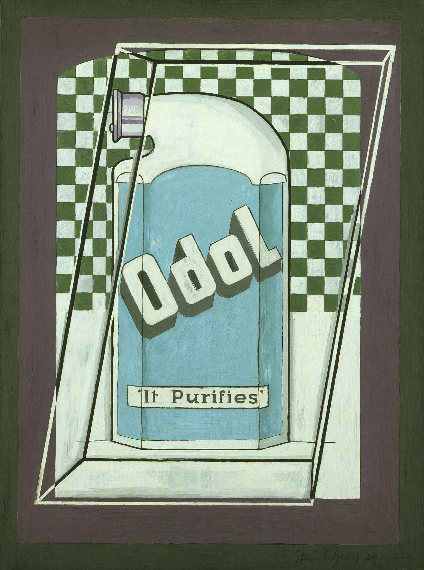
Product Still Lifes, 1921–25.
-
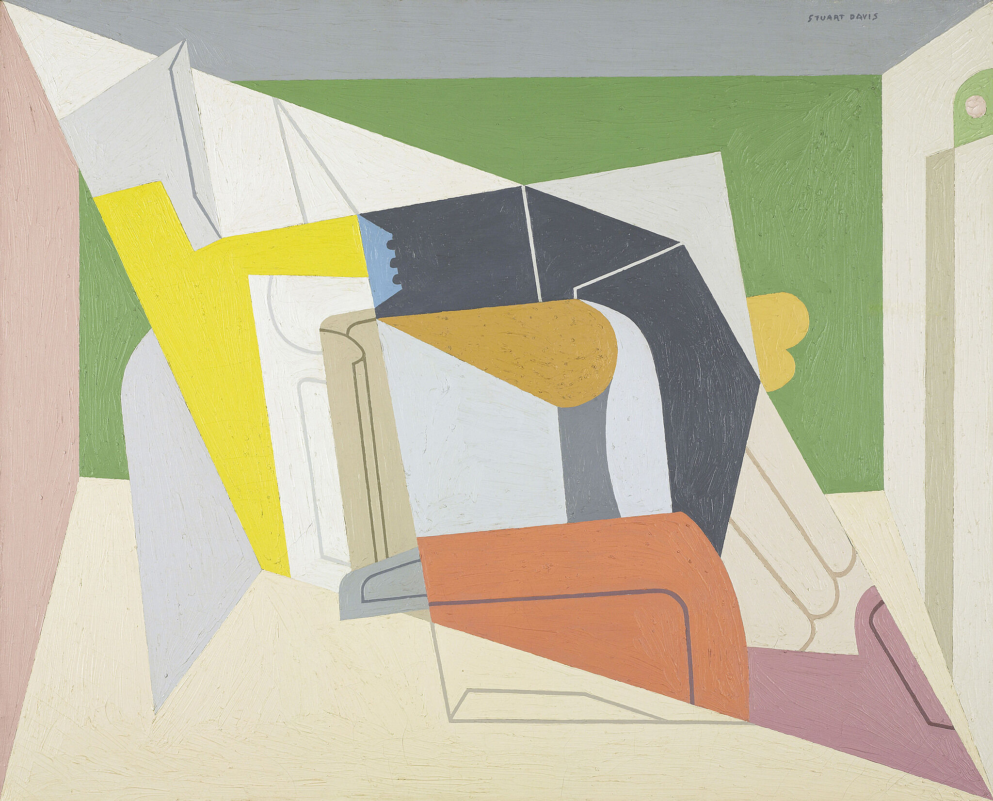
Egg Beaters, 1927–28.
-
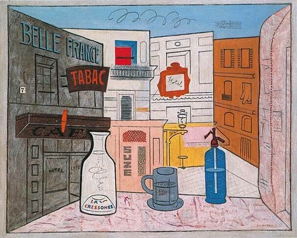
Paris, New York, and Gloucester.
-
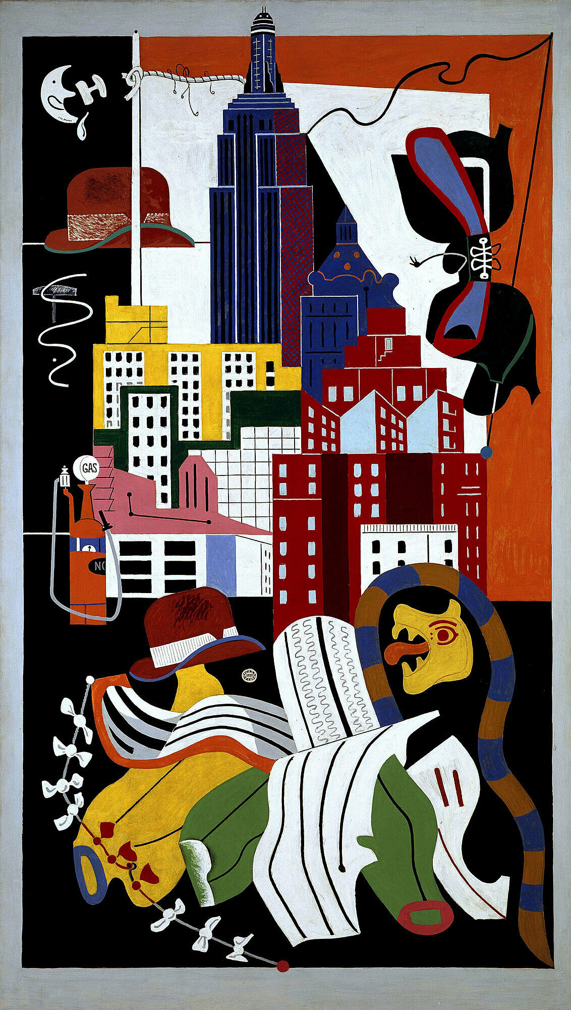
The 1930s.
-
The 1940s.
-
The 1950s.
-
Late Work.
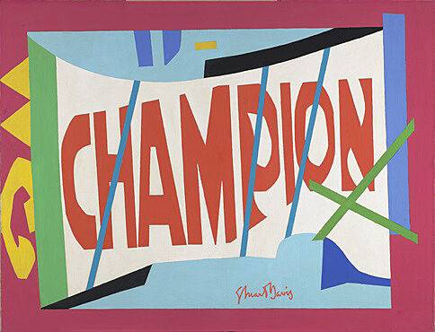
Stuart Davis, Little Giant Still Life, 1950. Oil on canvas, 33 x 43 in. (83.8 x 109.1 cm). Virginia Museum of Fine Arts, Richmond; The John Barton Payne Fund 50.8. © Estate of Stuart Davis/Licensed by VAGA, New York, NY
Davis's early paintings had often included words and phrases as product names and signage. In 1950, he began incorporating words into his art as independent design elements. Doing so allowed him to infuse his paintings with the bold energy and ebullience of advertising and popular culture without resorting to illusionistic realism. Sometimes the words he included referenced objects he observed in the world, as in Little Giant Still Life (1950), based on a matchbook cover advertising Champion spark plugs. In other paintings, the words refer to aesthetic concepts he was writing about in his journals. In neither case did he intend the words to be clues to a painting's meaning, which he insisted rested exclusively in the work's formal properties.
Davis's reliance on words as major design elements coincided with his introduction of a new vocabulary of expansive shapes whose increased scale heightened the impact of their color. By controlling the spatial properties of color to advance and recede, Davis ensured that the forms in his paintings visually moved forward and backward at equal speeds. The effect was of a fast-moving surface, perceived simultaneously as a single impression that seemed to push into the viewer's space with enormous force an impression one critic approvingly likened to a "good sock on the jaw."
Below is a selection of works from The 1950s.
0:00
Stuart Davis, Little Giant Still Life, 1950
0:00
Stuart Davis: Well this first “Champion,” called Little Giant Still Life, that was made from a—I just had a package of paper matches on the table alongside of me. And I made a drawing without any intention of doing anything with it; I just drew, looking at this package of matches. It had the word “champion” on it. And it seemed interesting, so I just drew it on a canvas and made, developed it from there on, without reference to any matches or anything like that.
Barbara Haskell: It was the first time he had really elevated words to a position of prominence.
He begins to invest color with spatial properties, so he very much controls the properties of color to advance and recede so that there's a back and forth motion in all of his pictures, but they nevertheless stay very much on the surface, so that the paintings are perceived in a single glance, and he was very conscious that a single impression painting was what he wanted to create which, of course, is what advertising does.
He's very much considered the father of Pop art, but was always very different. Pop artists generally, Pop painters use two dimensional media images. Davis never did that. He was not concerned about commenting on culture or consumer society.
Stuart Davis, Little Giant Still Life, 1950
Little Giant Still Life, 1950
0:00
Stuart Davis, Owh! In San Pao, 1951
0:00
Ben Sidran: When you look at something like Owh! In San Pao, first you see these incredibly bright-key colors.
Narrator: Ben Sidran is a jazz piano player and author of a two-volume oral history called Talking Jazz.
Ben Sidran: And there’s an analogue in jazz to the advanced harmonies that jazz players used, kind of like shining, shining harmonies, bright flashy harmonies. And similarly, he loved the rhythmic thrust of barrelhouse piano players. And when you look at the planar surfaces in Owh! In San Pao, you get the sense of a rhythm of a kind of almost floating or a tumbling feeling. There’s sort of a freedom in it that kind of feels like jazz feels. And you can also look for example in the use of little cryptic phrases, “else” and “now,” I like to think of that as sort of how a jazz fans in a bar would shout out to musicians, you know, like “get it!” “do it!”
Barrelhouse piano was this kind of free-swinging piano that was played in these saloons. You’d go into these rough bars and there’d be a piano player there, and sometimes, you know, Davis reported that the piano would be covered in barbed wire, so that people wouldn’t lean against it, or bother the piano player. Barrelhouse was a kind of dance music where the piano player’s left hand was like taking the place of the drum beating the rhythm, and the right hand was the melody and kind of the flashing entertainment part of it.
Stuart Davis, Owh! In San Pao, 1951
Owh! in San Pao, 1951
Davis based this work on his geometric abstraction Percolator (1927), which hangs nearby. Here he electrified the palette of the original work, incorporated a dynamic swath of red polka dots, and included the words “else” and “used to be—now.” In the process, he changed the identity of the percolator from a kitchen appliance to a dynamic arrangement of abstract forms and colors. Davis intended for the painting to be included in the prestigious 1951 Bienal de São Paulo at the Museu de Arte Moderna in Brazil. Unable to finish the canvas in time for the exhibition’s opening, he titled it Owh! in San Pao, changing “ouch!” to “owh!” to create a rhythmic rhyme.
Stuart Davis (1892–1964), Percolator, 1927. Oil on canvas, 36 × 29 in. (91.4 × 73.7 cm). The Metropolitan Museum of Art, New York; Arthur Hoppock Hearn Fund, 1956. © Estate of Stuart Davis/Licensed by VAGA, New York
Percolator, 1927
0:00
Stuart Davis, Colonial Cubism, 1954
0:00
Narrator: In the 1950s, Davis began to make abstract paintings on a grand scale. In part, he was influenced by his experience painting murals. But after a retrospective at the Museum of Modern Art in 1945, he was also commercially and critically successful for the first time. And with the rise of Abstract Expressionism, abstraction moved to the center stage in American art. Davis’s status shifted from outsider to trailblazer. He also began reacting to the work of younger artists.
Sarah Humphreville: I think one of the things that really impacts him in the '50s is seeing paintings by Abstract Expressionists. A lot of the history that's written about Davis talks about him as having an antagonistic relationship with these artists. But it's actually much more complicated than that. He didn't agree with the idea that art should only be about art, or that art should be this really emotional experience and about the inner psyche of the artist. But he didn't think that that meant they had bad painting.
He knew a lot of these artists personally. And he also exhibited with them in group shows. One of the things I think that particularly he notes in these group shows is that if he's going to compete with them and look to be an equivalent or better artist, that he needs to compete with their monumental scale. It's not like he sees a Pollock painting and says, "Oh, I'm going to make it big now." It's not that direct. It's this continuous process of not only looking but also making his own, and figuring out what he can pull out from there and collage into his own voice. You see that here, that it's this painted collage in a way with all these different layers.
Stuart Davis, Colonial Cubism, 1954
Colonial Cubism, 1954
Stuart Davis, Memo #2, 1956. Oil on canvas, 24 x 32 in. (61 x 81.3 cm). Private collection. © Estate of Stuart Davis/Licensed by VAGA, New York
Memo #2, 1956
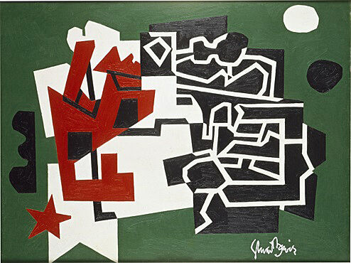
Stuart Davis (1892–1964), Landscape, Gloucester, 1922/1951/1957. Oil and wood on panel, 12 x 16 1/8 in. (30.5 x 41 cm). Ted and Mary Jo Shen. © Estate of Stuart Davis/Licensed by VAGA, New York
Landscape, Gloucester, 1922/1951/1957
Davis reworked this painting of the Gloucester, Massachusetts, harbor twice after its completion, adding dots and changing the background color to blue. In 1954, he returned to the composition to create Colonial Cubism and two years later used it as the foundation of Memo #2. Both late works are hanging nearby.
0:00
Stuart Davis, Rapt at Rappaport’s, 1951-52
0:00
Narrator: Davis called this painting Rapt at Rappaport’s. It’s based on an earlier work called Landscape with Saw. The saw is barely recognizable, with its red-and-white polka-dotted handle and patterned blade. But as abstract as this painting may appear, it was important to Davis that it, like all his paintings, was rooted in reality.
Stuart Davis: I have never regarded myself as an abstract artist. Personally I felt that talking about “abstract” art had many dangerous and misleading implications. That it cut off the real fact that what is interesting in any painting is its specific references, which however they may differ with different people that look at the painting, are nevertheless specific. And to call those specific things abstract always worked the wrong way with me. And as to the content of it, I regard the fact that I give importance to simple things that give me pleasure, I think that is the content that has validity with me.
Stuart Davis, Rapt at Rappaport’s, 1951-52
Rapt at Rappaport’s, 1951–52
Davis based this painting on his Landscape with Saw (1922), which hangs nearby. The alliterative title evokes the snappy rhythms of “jive” talk that was popular among his jazz-musician friends. Davis’s parents had frequented a store named Rappaport’s Toy Bazaar, whose wrapping paper and delivery trucks had a distinctive polka-dot theme—making the “rapt” of the painting’s title a wordplay on “wrapped.”
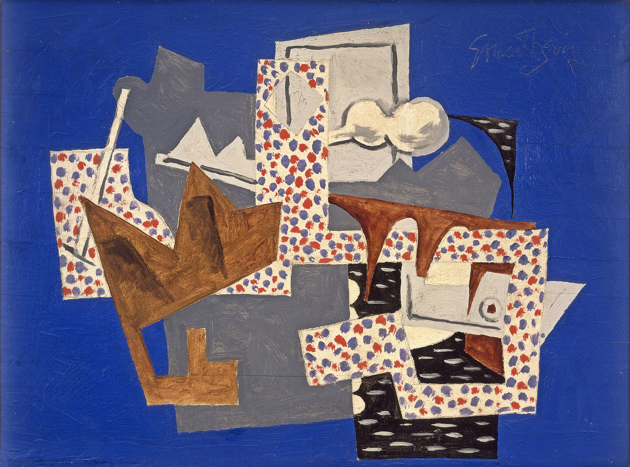
Stuart Davis (1892–1964), Semé, 1953. Oil on canvas, 52 x 40 in. (132 x 101.6 cm). The Metropolitan Museum of Art; George A. Hearn Fund, 1953. © Estate of Stuart Davis/Licensed by VAGA, New York, NY
Semé, 1953
Semé forms a “family group” with Davis’s paintings Rapt at Rappaport’s (1951–52) and Landscape with Saw (1922), which hang nearby. In addition to its title—an art historical term used to describe a grouping of shapes that cannot be divided into smaller, independent parts—the work includes a number of words related to Davis’s attitude toward subject matter and composition. “Any” refers to Davis’s theory that any subject can be used to make art, and “eydeas” is a playful conflation of “eye” and “ideas,” implying the interconnection of both elements in the act of painting.
0:00
Stuart Davis, Premiere, 1957
0:00
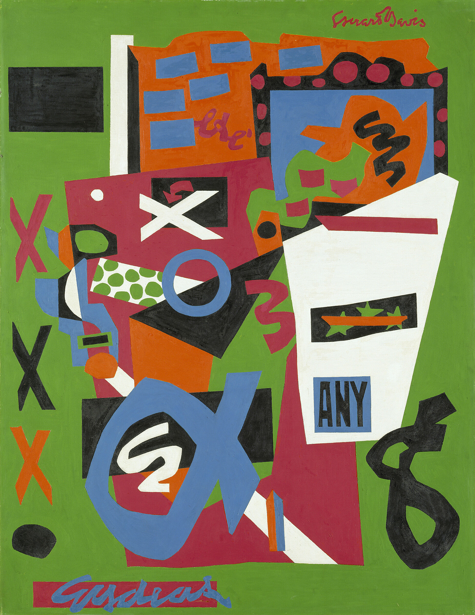
Barbara Haskell: Davis based Première on a gouache that he'd made in 1956 in response to a commission by Fortune Magazine to create a painting on the glamour of packaging. He was one of seven artists who was hired by Fortune. He chose to go into a grocery store, bought a package of groceries and laid them all out on his studio and began to work with the images.
What he ended up doing was not creating an image of the packages themselves. He extracted words to stand for the products so that you have in this painting bag, cow, pad, free, any, cat, hundred percent, new, juice. Again, this is very unlike Pop art. A Pop artist might have replicated the product itself. Davis chose to be much more abstract, and in a sense more universal that by taking words, which he believed introduced the human element into pictures, he created something very familiar but at the same time very abstract.
Stuart Davis, Premiere, 1957
Première, 1957
Stuart Davis (1892–1964), Tropes de Teens, 1956. Oil on canvas, 45 1/4 x 60 1/4 in. (114.8 x 153 cm). Hirshhorn Museum and Sculpture Garden, Smithsonian Institution, Washington, DC. © Estate of Stuart Davis/Licensed by VAGA, New York. Photograph by Cathy Carver
Tropes de Teens, 1956
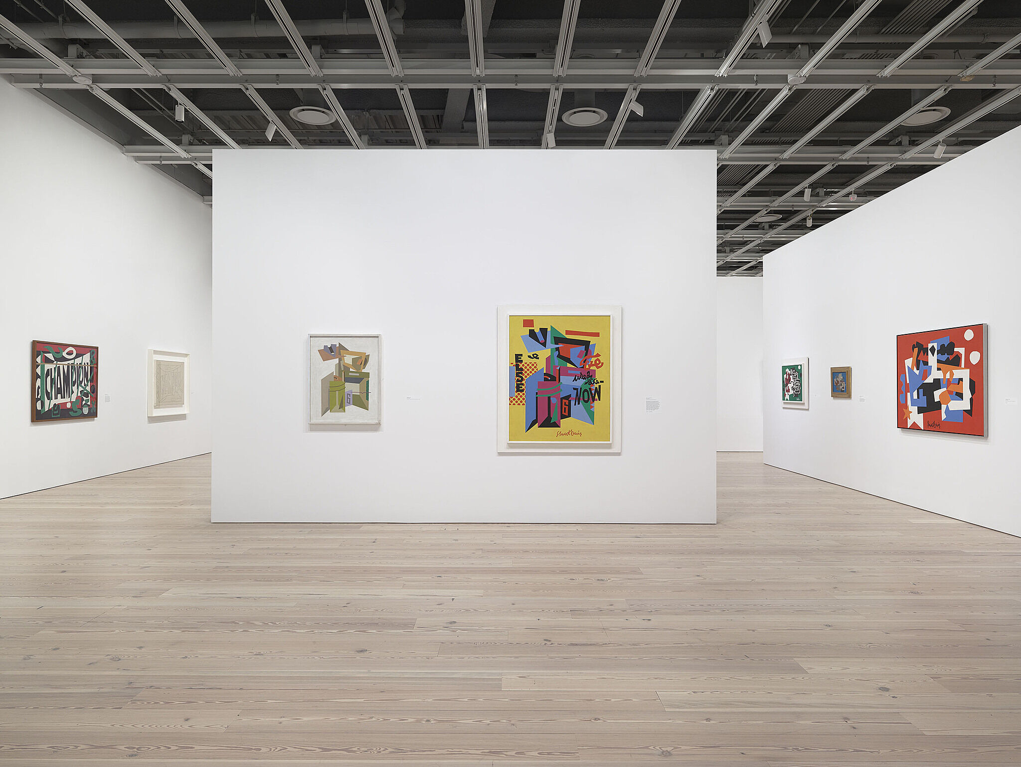
Installation view of Stuart Davis: In Full Swing (Whitney Museum of American Art, New York, June 10–September 25, 2016). Photograph by Ron Amstutz