
Jasper Johns: Mind/Mirror
2021
Hear from artists, curators, and scholars on selected works from the exhibition.
-
500
Introduction
Audio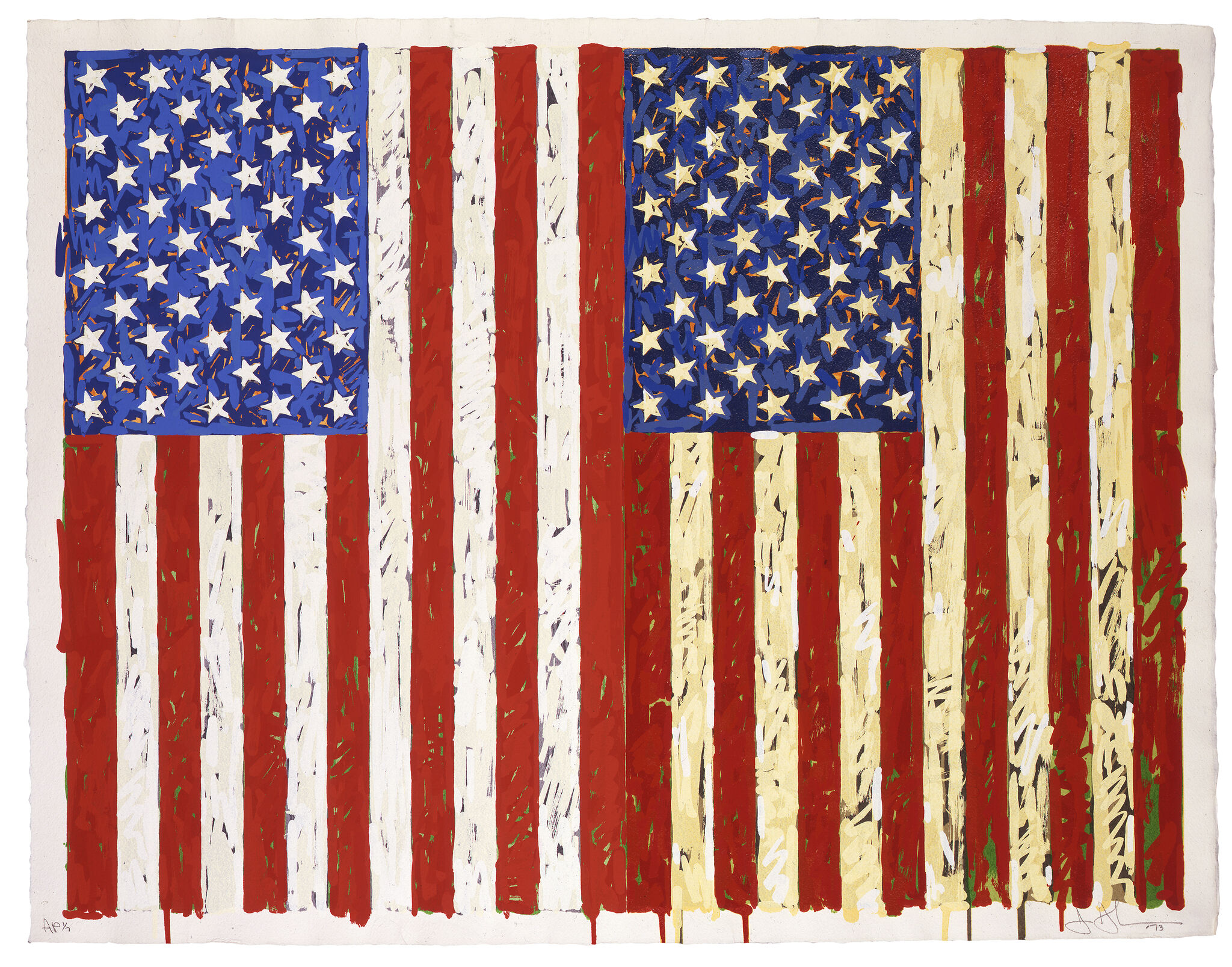
-
501
Target with Four Faces
Audio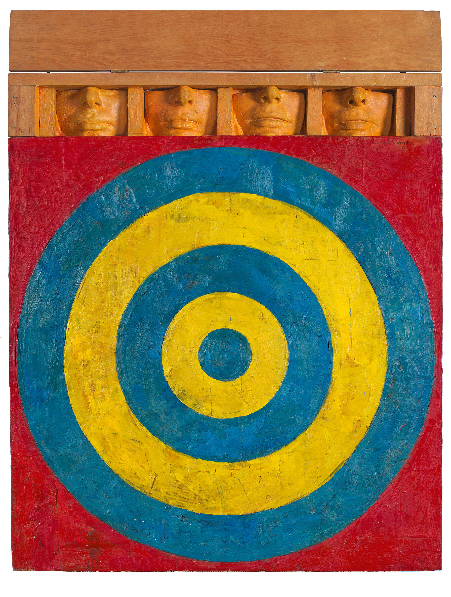
-
502
Diver
Audio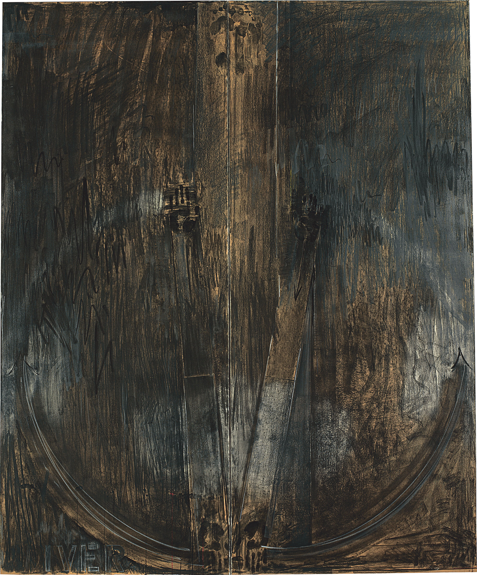
-
503
Water Freezes
Audio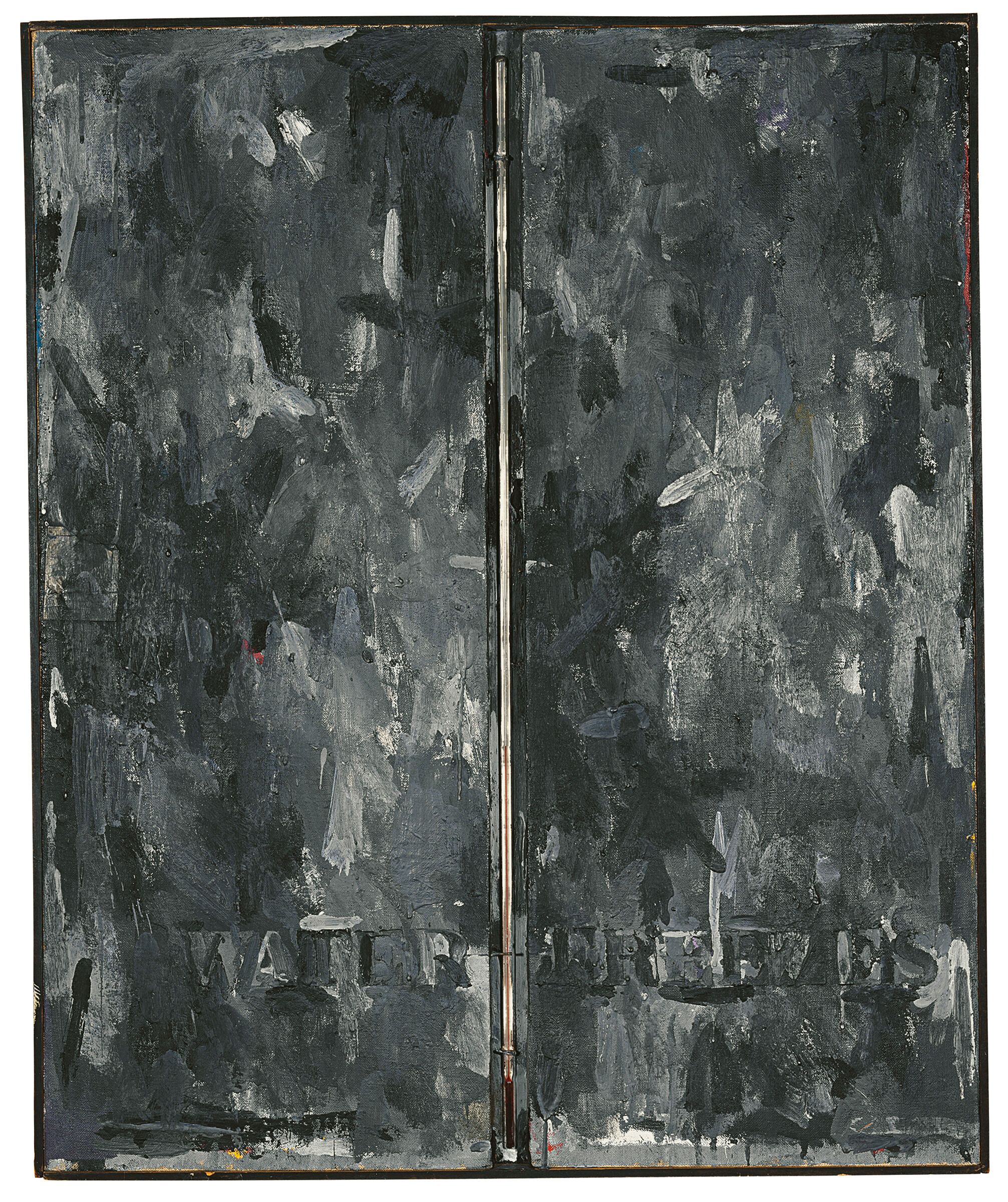
-
504
Two Maps
Audio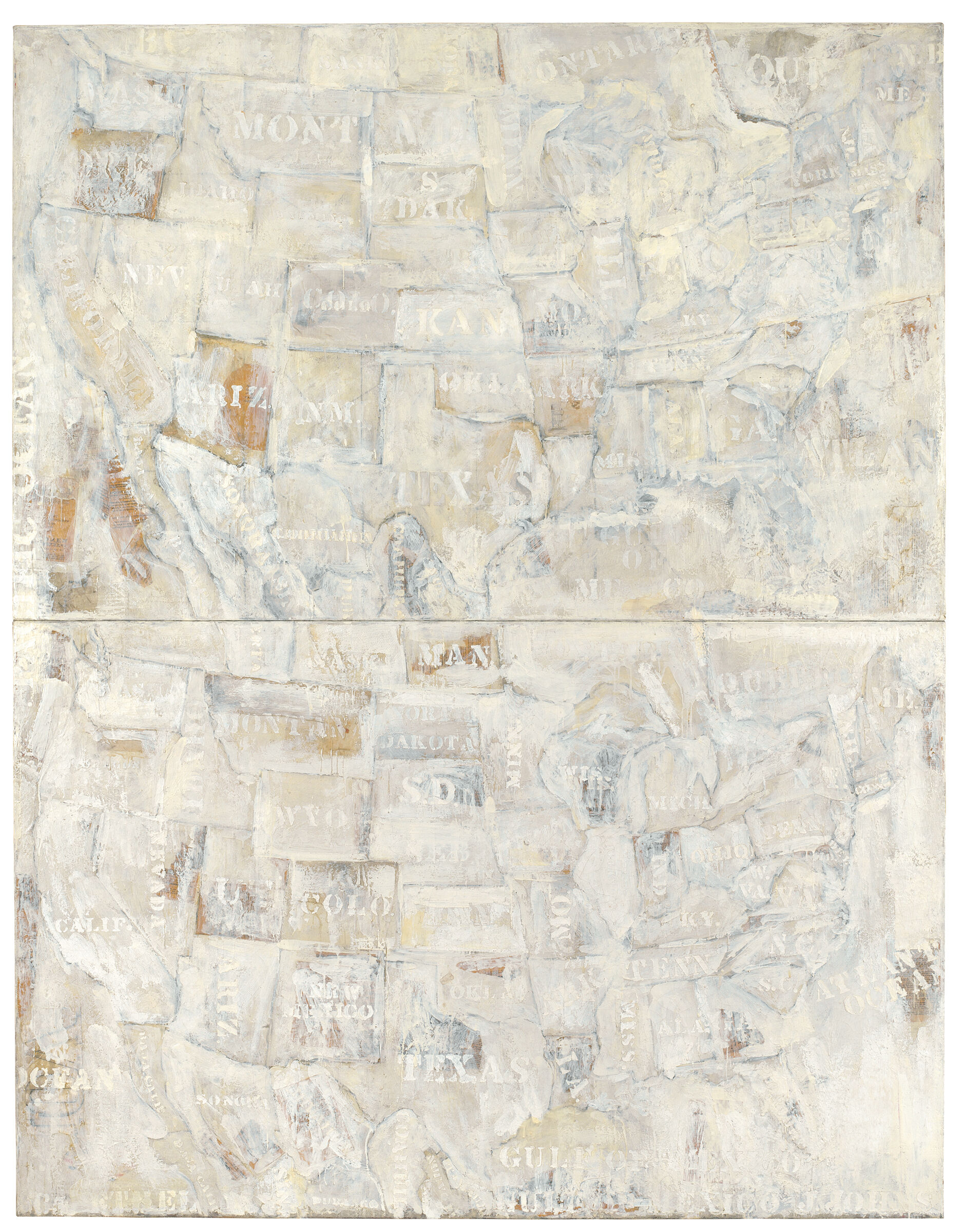
-
505
Three Flags
Audio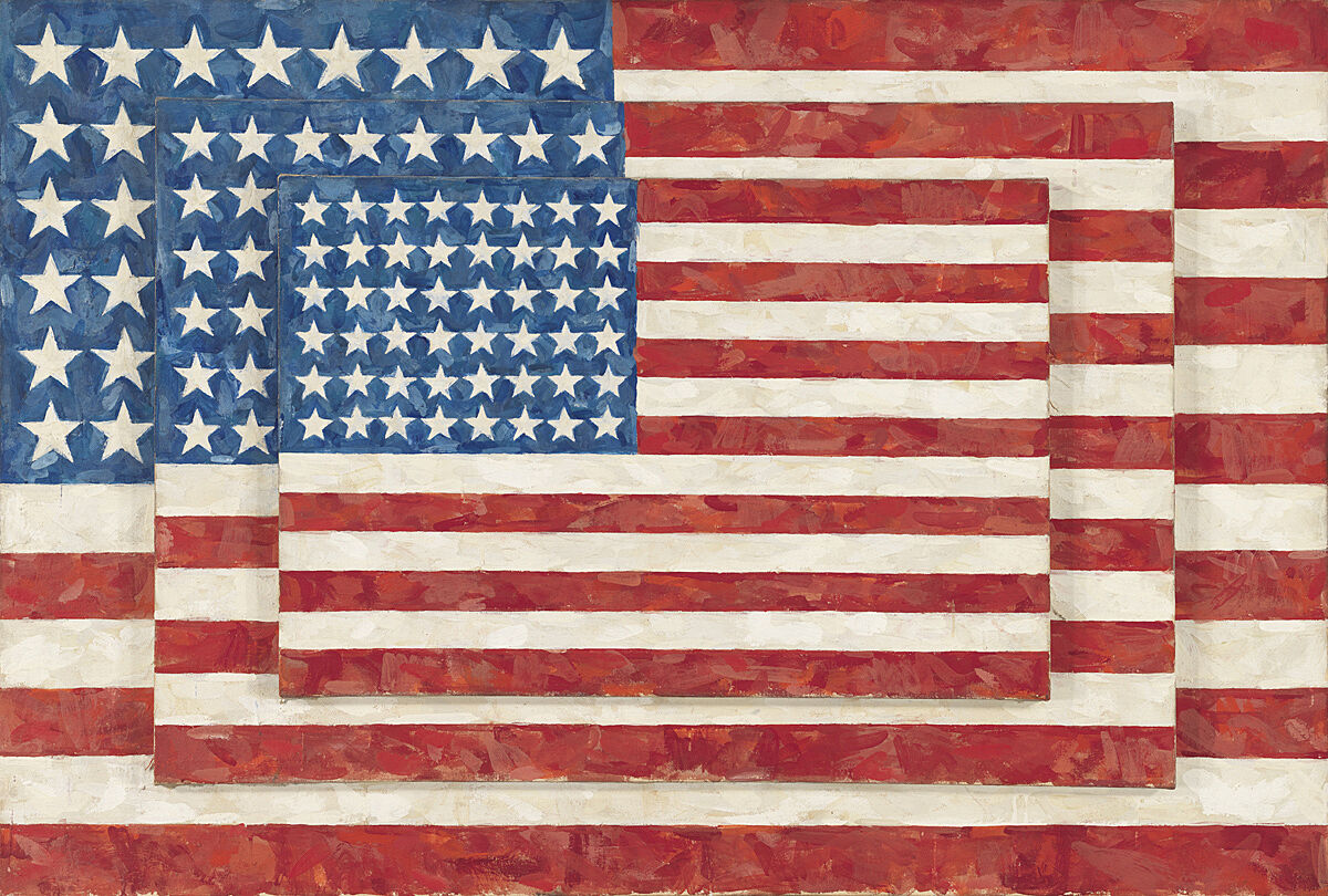
-
506
Map
Audio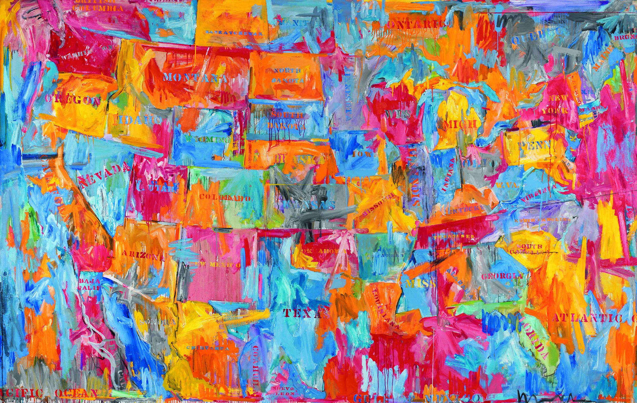
-
507
Studio
Audio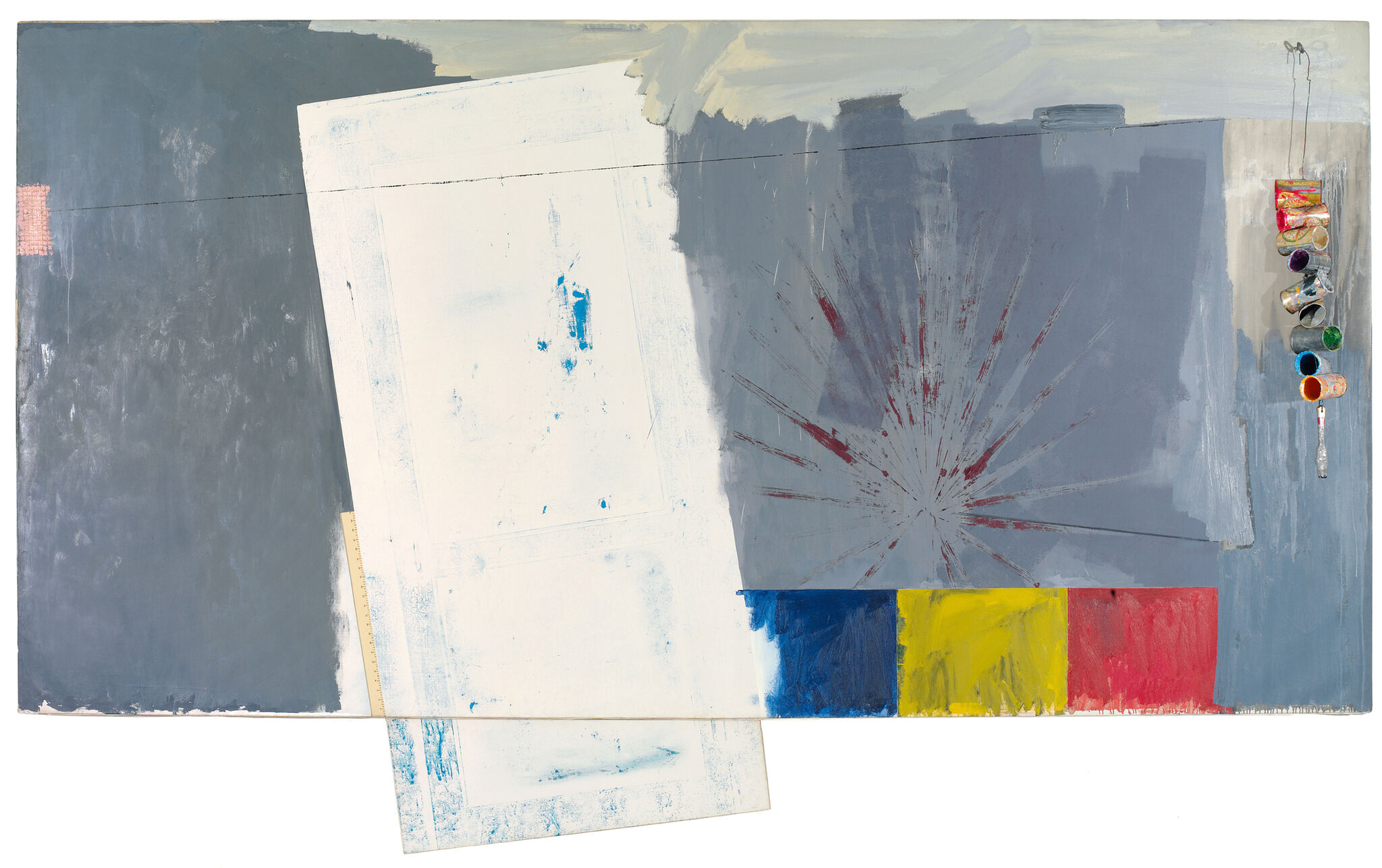
-
508
In Memory of My Feelings—Frank O’Hara
Audio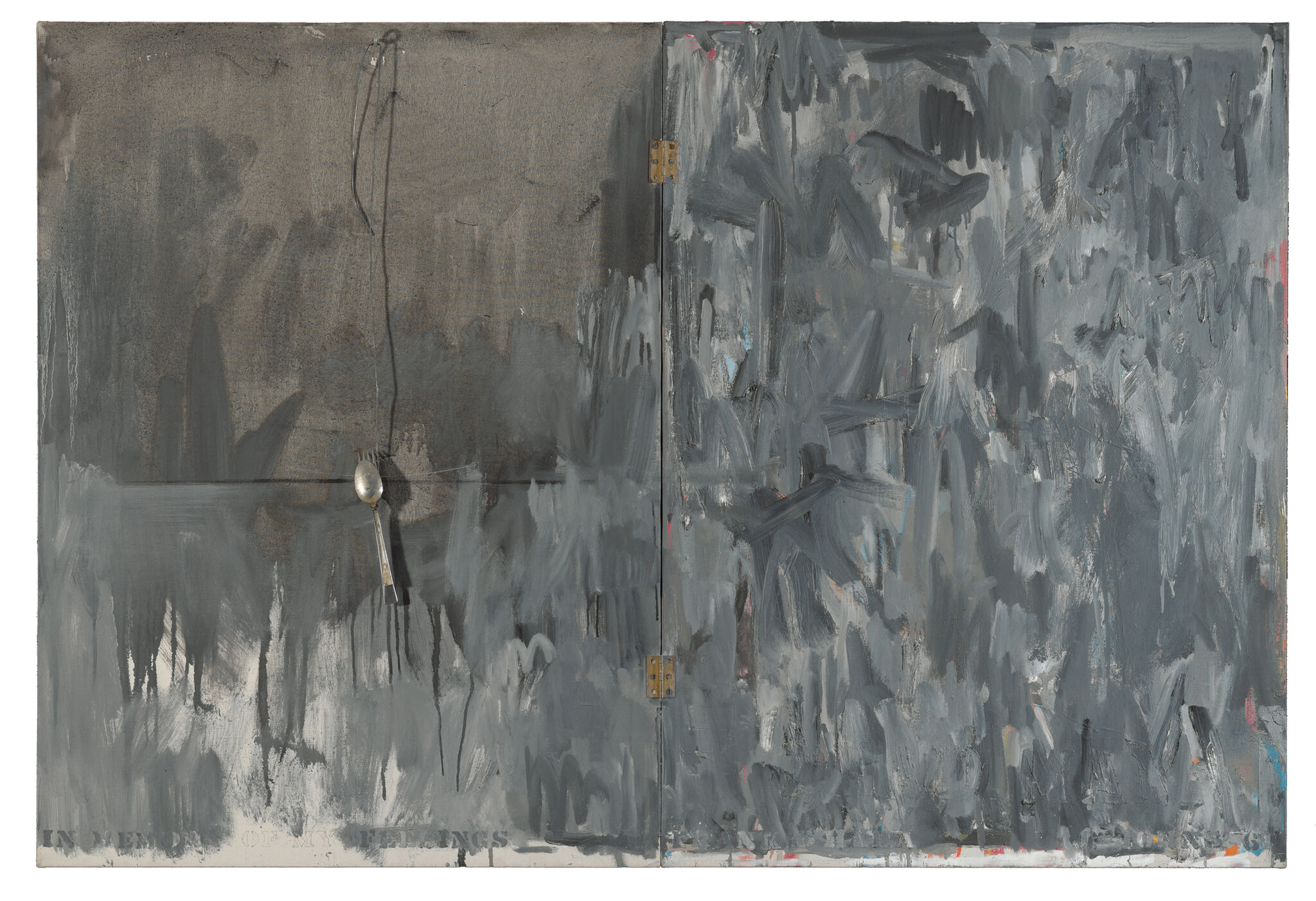
-
509
AudioUgo Mulas photographs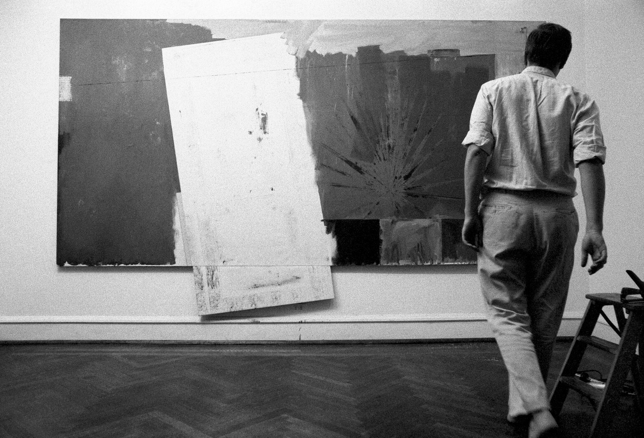
-
510
According to What
Audio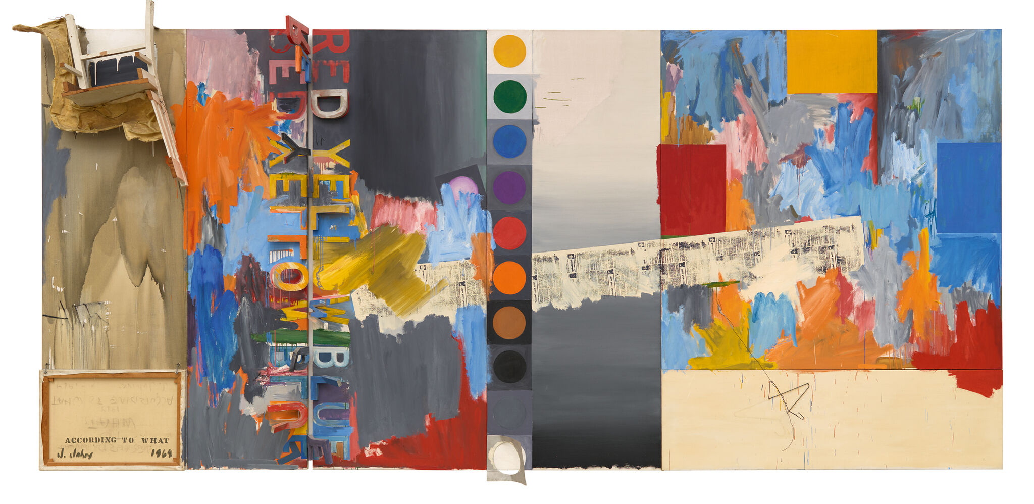
-
511
Harlem Light
Audio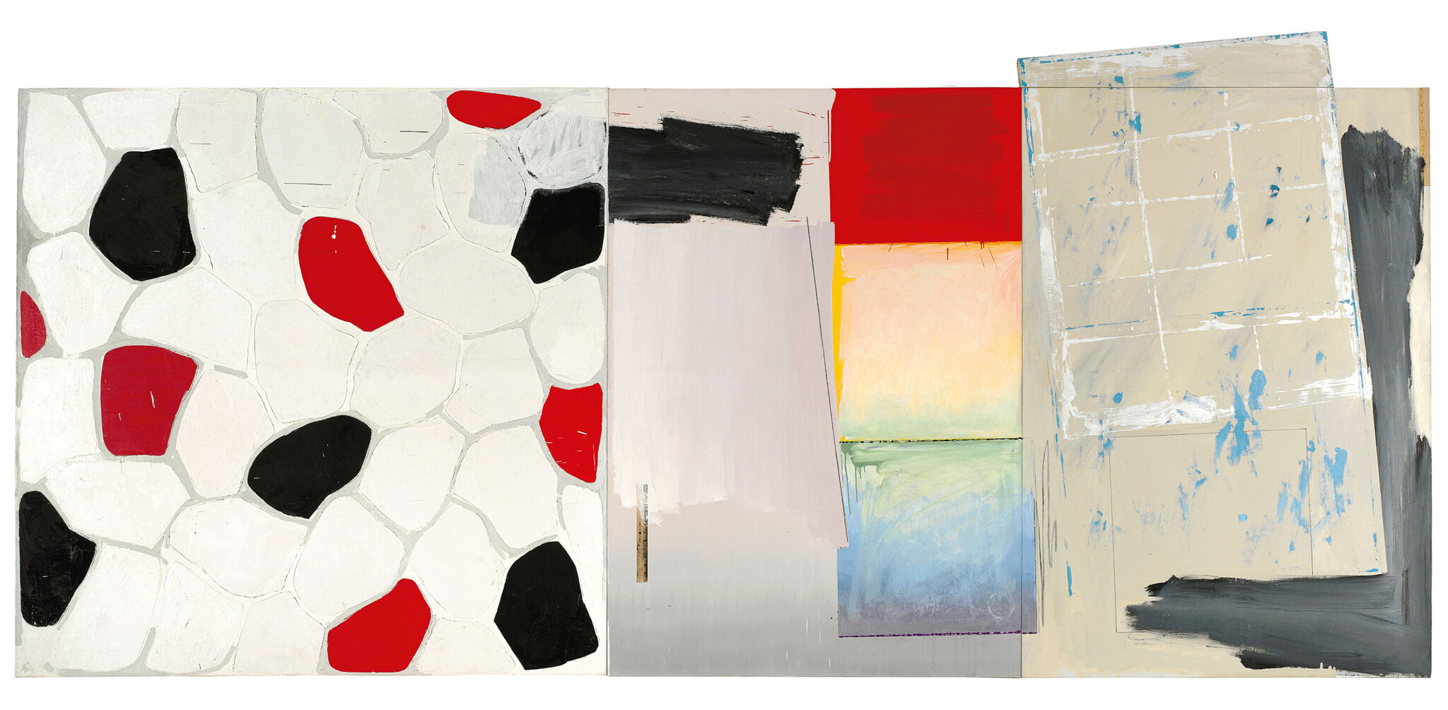
-
512
Savarin
Audio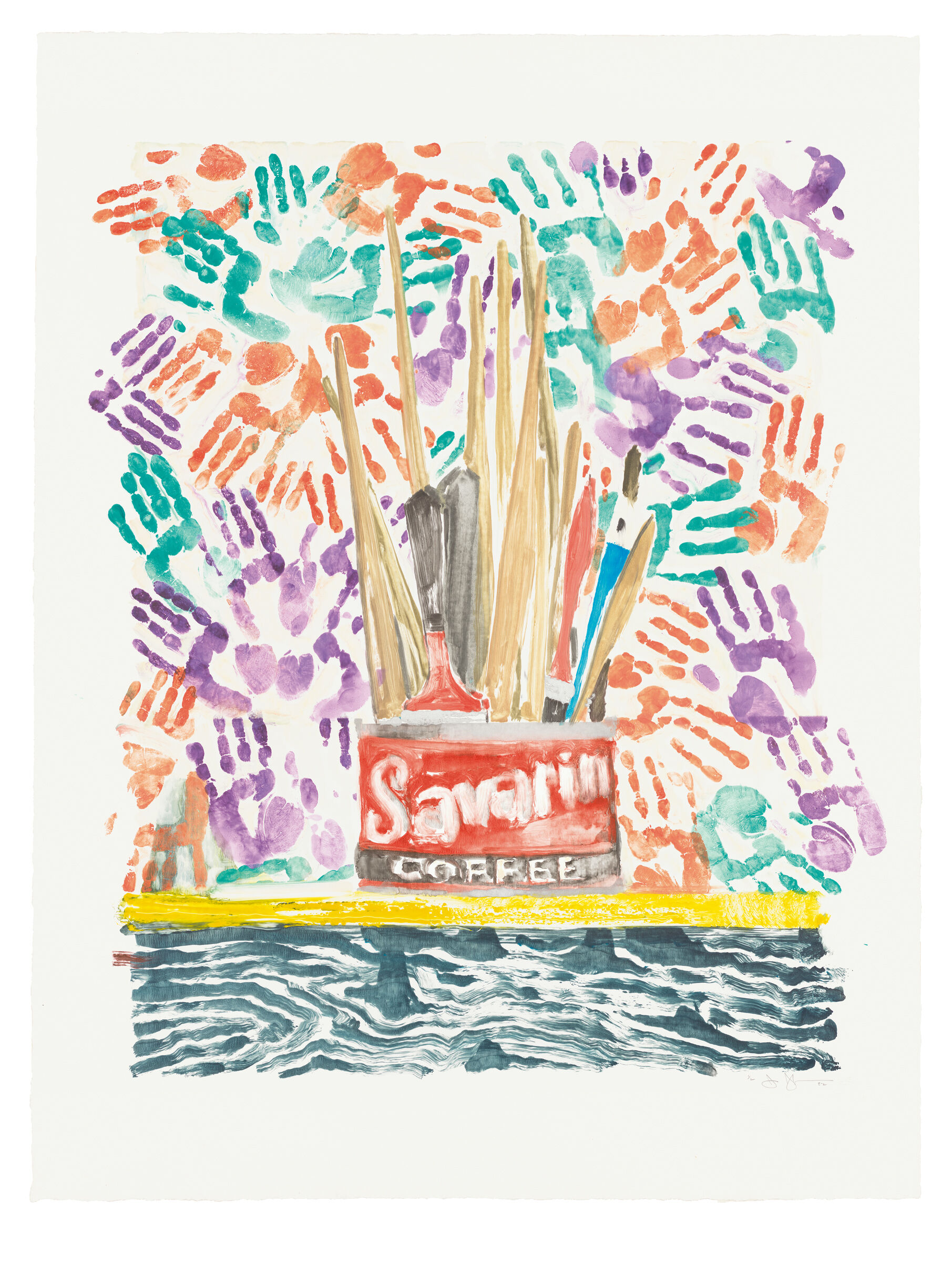
-
513
Painted Bronze
Audio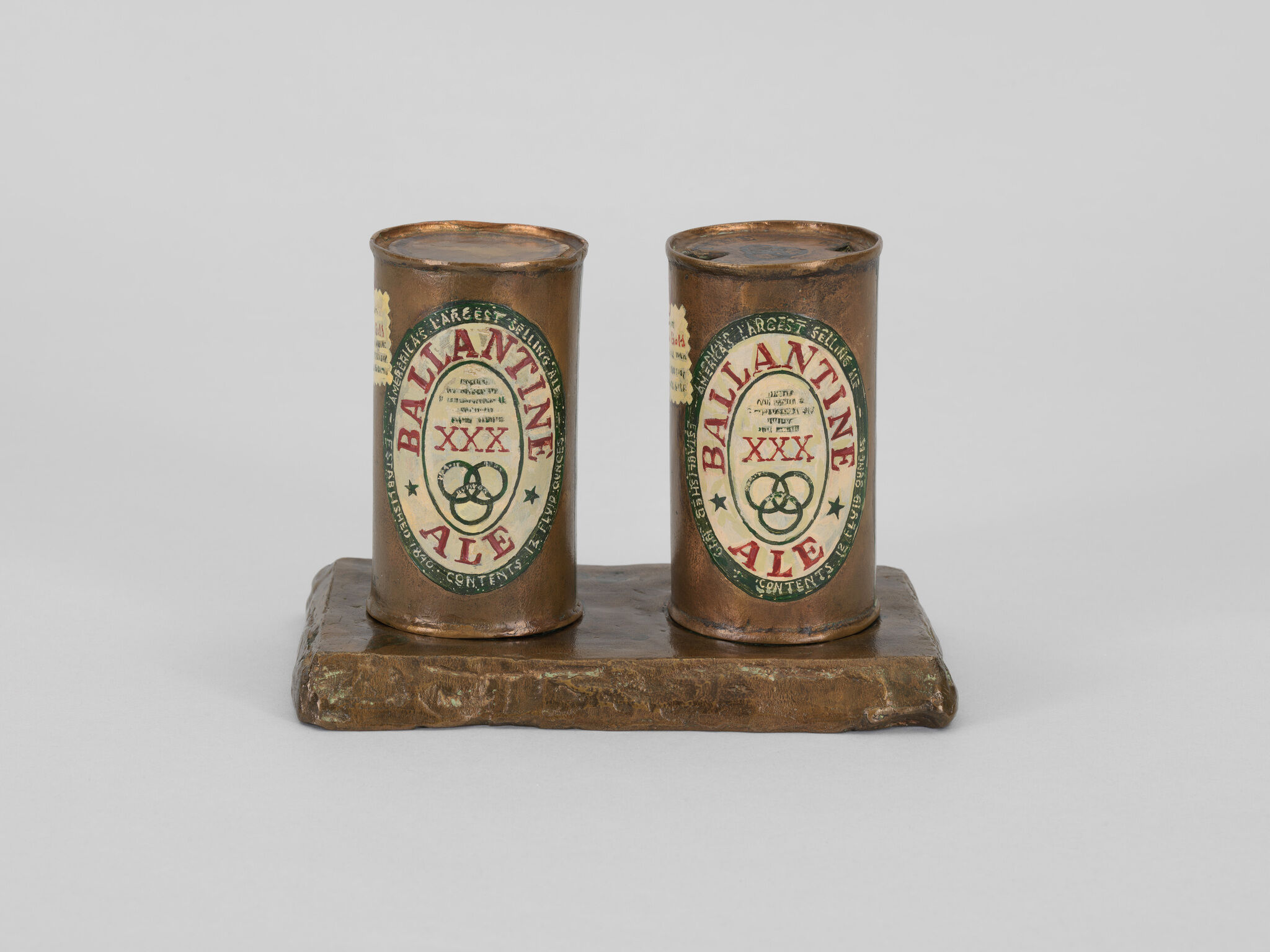
-
514
Spring
Audio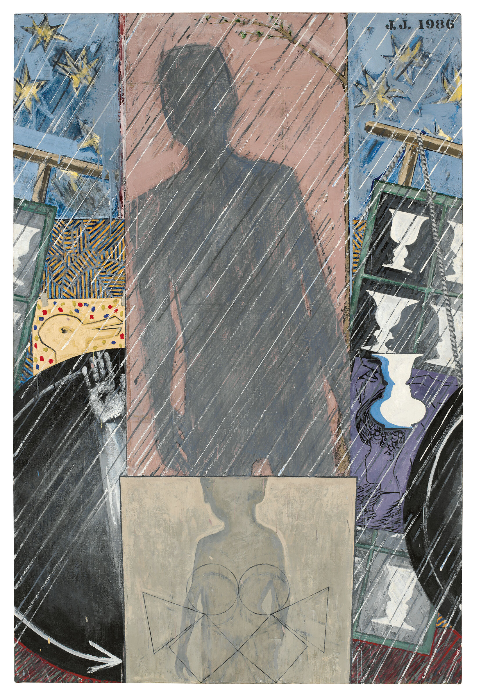
-
515
Dancers on a Plane
Audio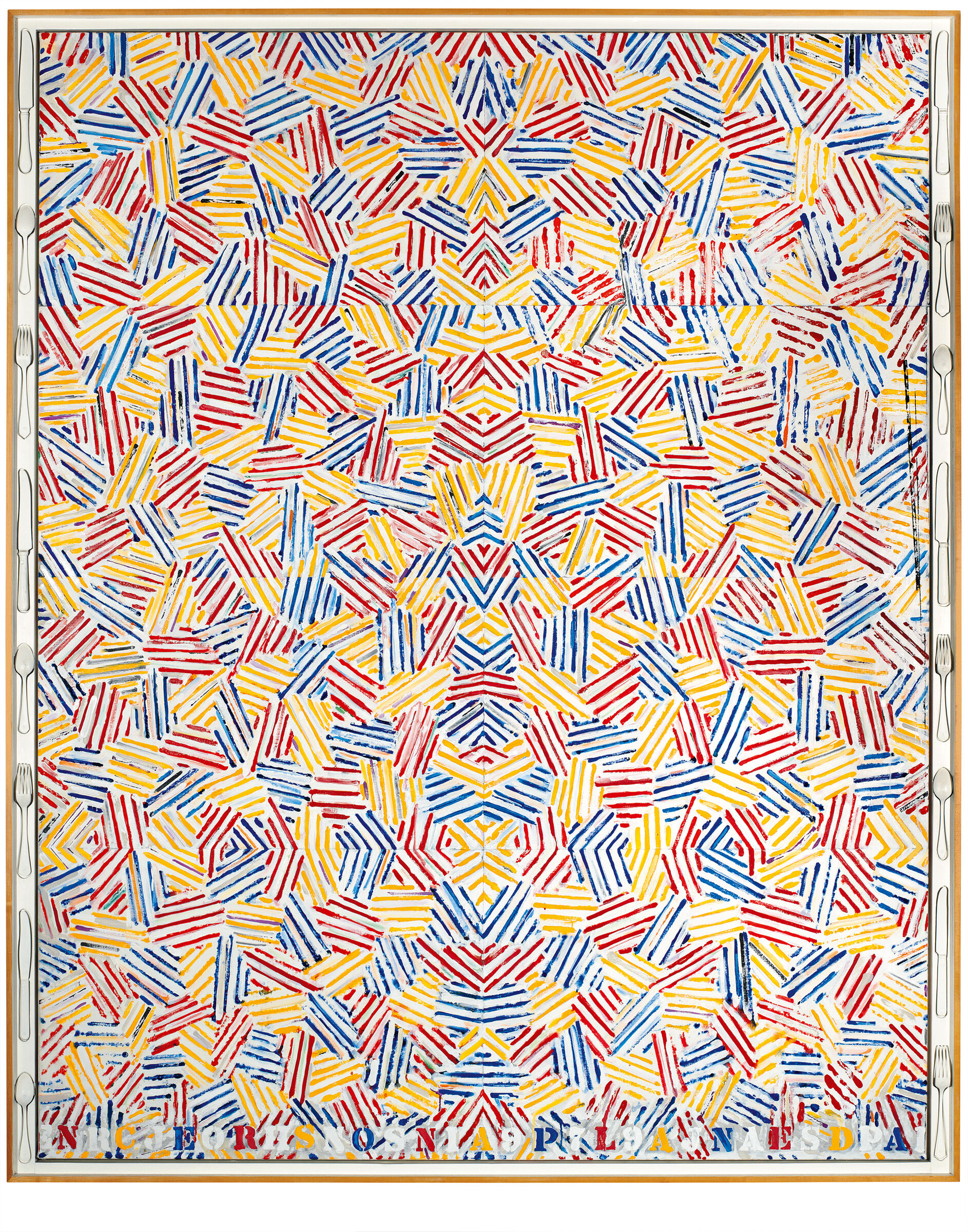
-
516
Montez Singing
Audio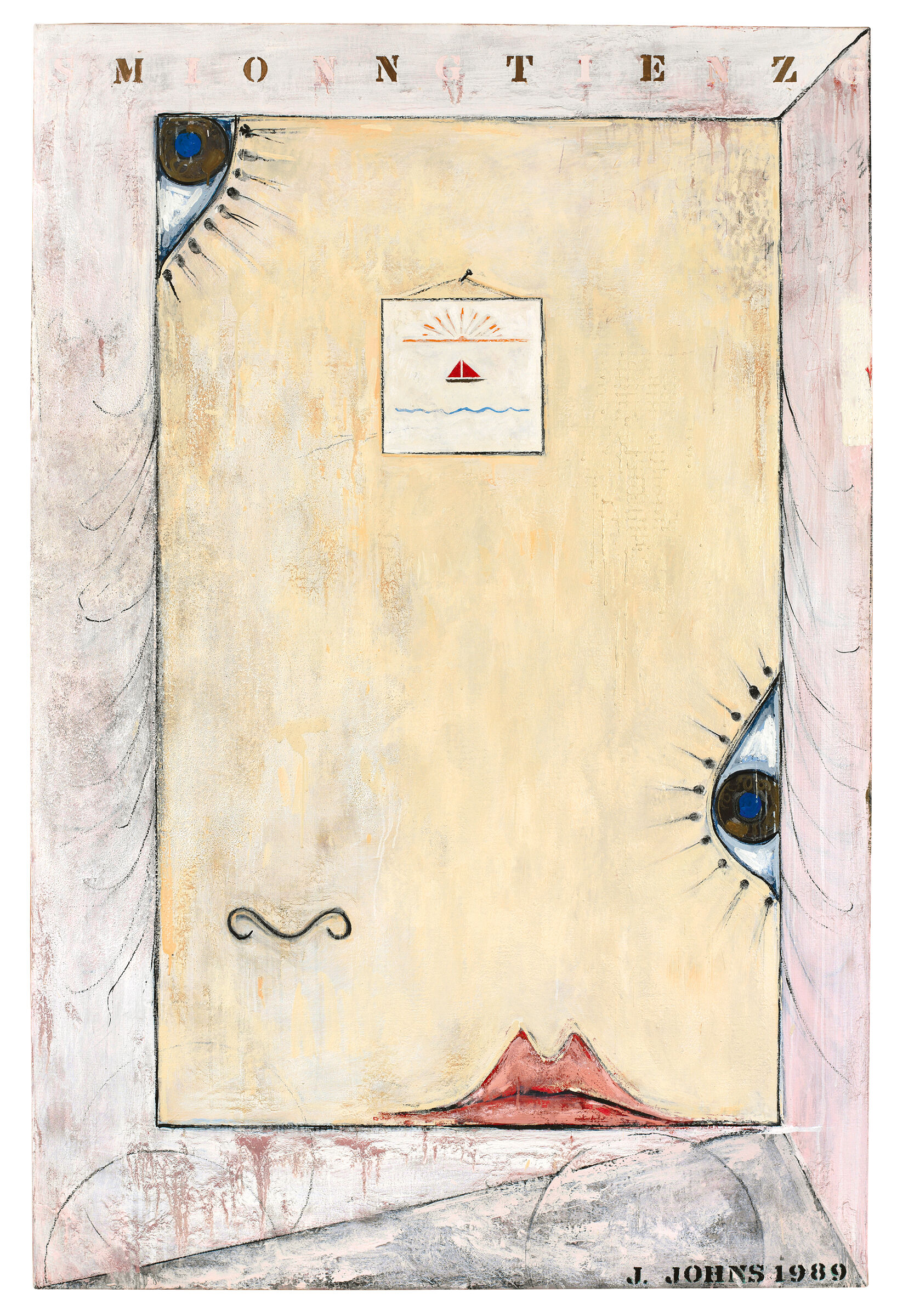
-
517
Numbers
Audio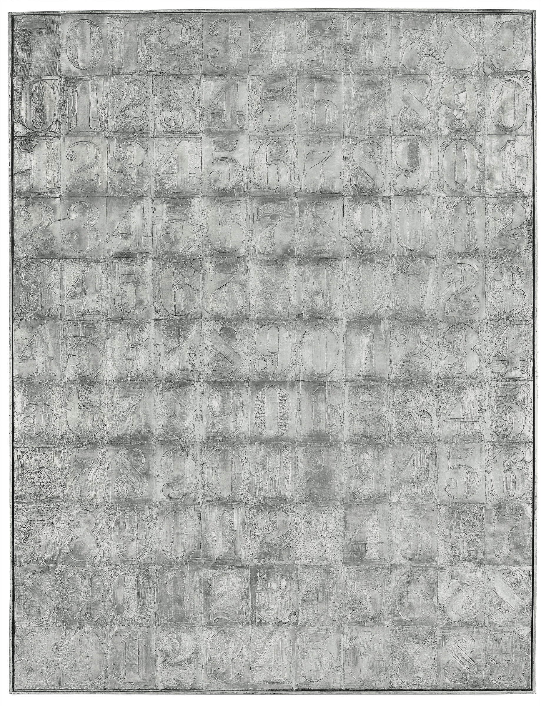
-
518
Catenary (I Call to the Grave)
Audio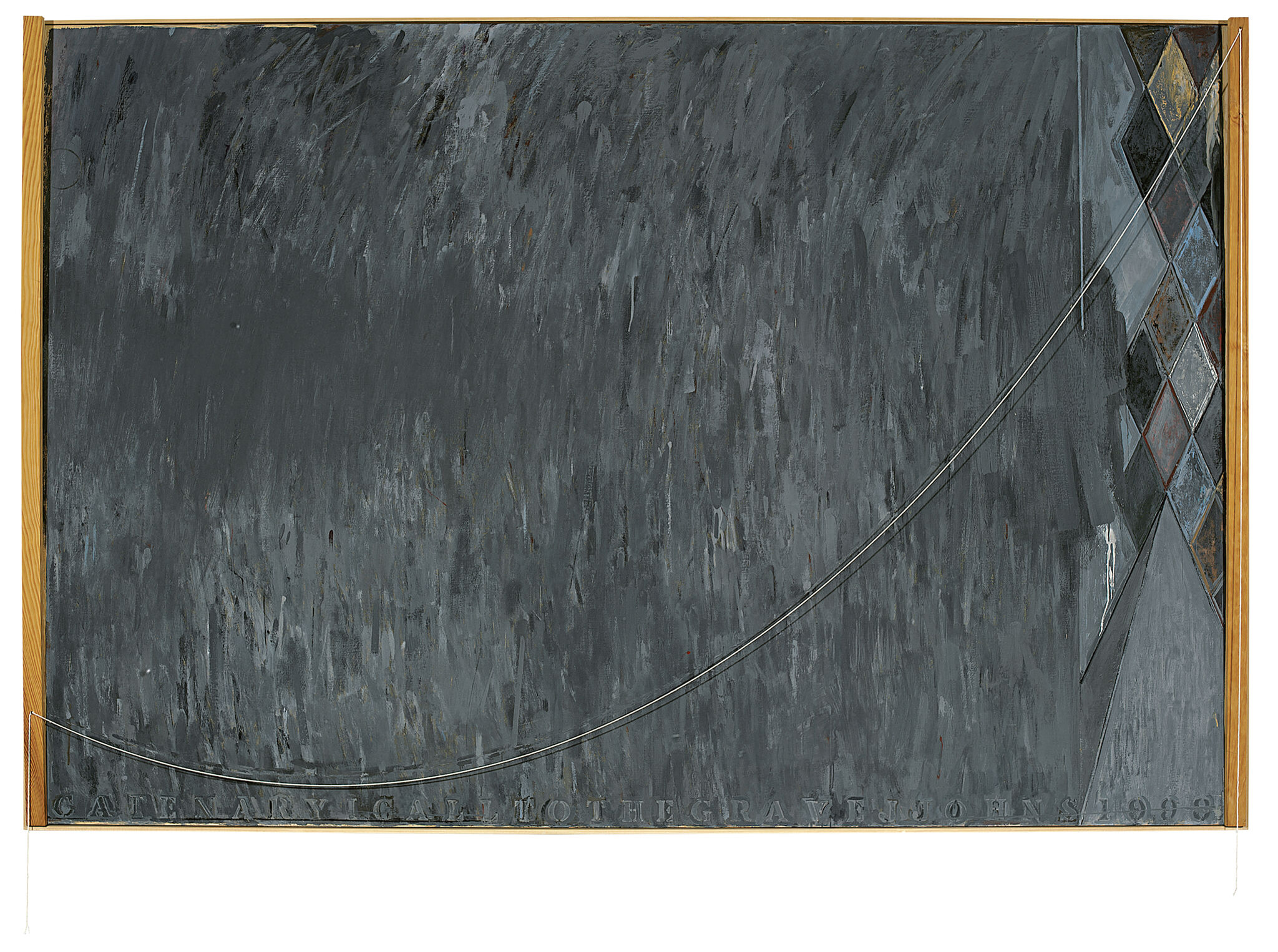
-
519
Farley Breaks Down
Audio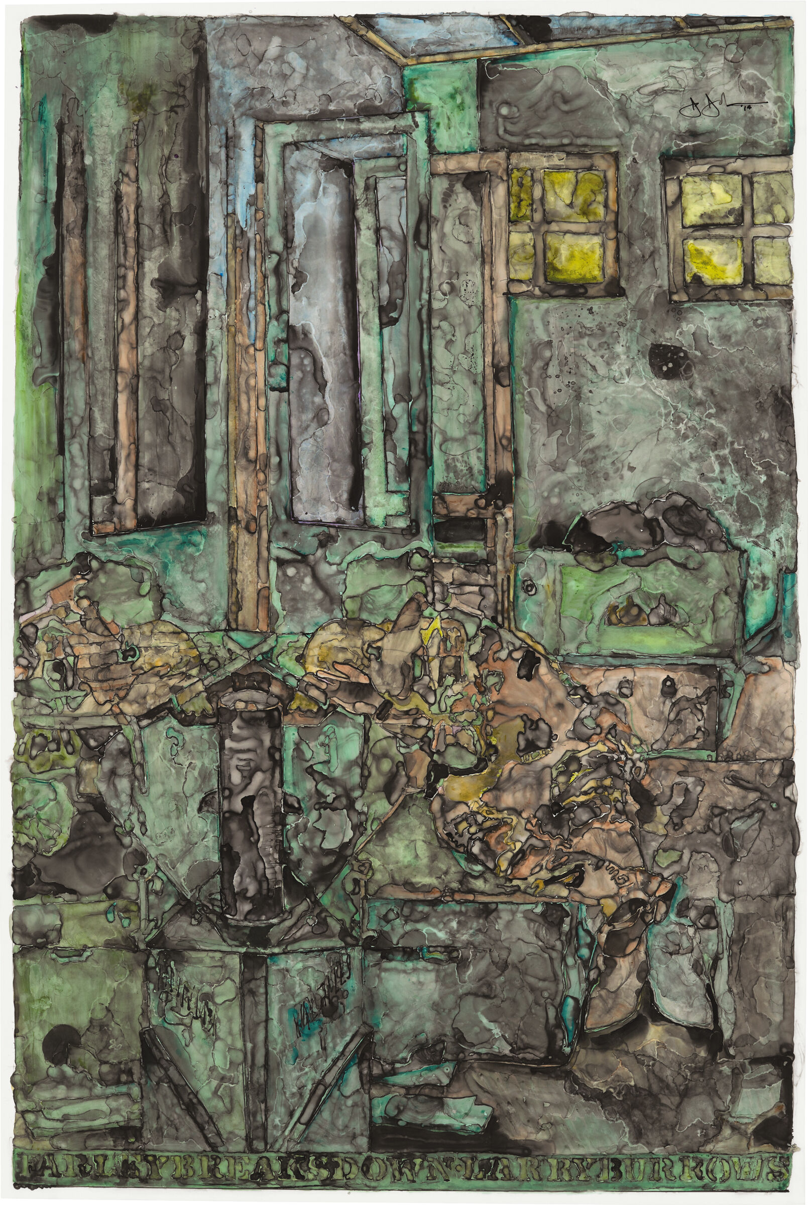
Scott Rothkopf: This show is a survey of Johns’s work from 1954 to 2021. That’s more than sixty-five years of art made by an artist who is now ninety-one, and still working in his studio almost every day.
Narrator: The installation of prints on this wall covers the full range of that long career. Take a look at the works as you hear more from Scott Rothkopf. He curated this exhibition along with Carlos Basualdo, curator at the Philadelphia Museum of Art.
Scott Rothkopf: Jasper Johns began making his work in the mid-1950s at a time when the predominant art in New York was abstract painting. He shocked people in the art world with images that were drawn from everyday life—a flag, a target, a map—things, as he calls them, that the mind already knows. This created a kind of scandal, because people didn’t think these subjects were appropriate to fine art. Yet, they also enabled Johns to think about things beyond the subject, so that eventually the subject became less important than a way of looking, making, thinking, and also, our perceiving the work.
Narrator: This exhibition is unusual in that it is being held simultaneously here at the Whitney, and at the Philadelphia Museum of Art.
Scott Rothkopf: As you move through the exhibition, you’ll see galleries that explore different ideas about Johns’s work: maybe how he used one medium, a different motif, a place that he worked in that was important to him. Each of these galleries has a reflection gallery in Philadelphia taking up the same idea, but with a different set of examples. Don’t worry: if you only see it here, it will make sense, but if you see it in both places, I know the sum will be greater than the parts.
Jasper Johns, Flags I, 1973. Silkscreen: thirty-one screens, 27 × 35 in. (69.9 × 88.9 cm). Kenjiro Nonaka, Hiroshi Kawanishi, Takeshi Shimada/JJ and SPA. Edition no. 64/65. Whitney Museum of American Art, New York; gift from the Emily Fisher Landau Collection 2015.274. © 2021 Jasper Johns / VAGA at Artists Rights Society (ARS), New York
Narrator: To make this work, Johns transposed the image of a target directly onto the canvas, and crowned it with four faces cast from life. At the time, the art world was largely dominated by abstract painters. Their work was promoted as being deeply expressive, and completely original. In this context, Johns’s choice to paint something as banal as a target caused something of a scandal—many people simply had a difficult time seeing it as being art. But the work is more emotionally complex than it may at first seem.
Scott Rothkopf: When I look at this painting, I think a lot about how a target is meant to focus sight.
Narrator: Scott Rothkopf.
Scott Rothkopf: You shoot at it to practice archery, or maybe gun practice, and these faces are missing their eyes. They can’t see. There’s some strange disconnect there between looking at a picture that seems almost to be looking back at you, but can’t really.
It’s a little disconcerting to mix the human form with a target that’s meant to be shot at. This painting has a latched lid at the top of it, which you could actually close. Johns did do that sometimes in his own studio, even if we can’t do it in a museum, hiding the faces, so there’s a secret to this picture, a puzzle meant to be both imagined and explored.
Jasper Johns, Target with Four Faces, 1955. Encaustic and collage on canvas with objects, 29 3/4 × 26 in. (75.6 × 66 cm). The Museum of Modern Art, New York; gift of Mr. and Mrs. Robert C. Scull 8.1958. © 2021 Jasper Johns / Licensed by VAGA at Artists Rights Society (ARS), New York. Photograph courtesy the Wildenstein Plattner Institute, New York
Scott Rothkopf: Diver is one of the largest works on paper that Johns has ever made in his entire career. It’s a drawing that takes up the scale of painting.
The image suggests a diver, hands at the bottom of the drawing and feet at the very top, like someone plunging into the water, with two arrows that indicate a kind of motion in a circle, maybe like someone’s starting to swim.
John Yau: It’s like, when you’re in the water, when does your body end, and where does the water begin?
Narrator: John Yau is a poet and a critic.
John Yau: I think a lot of his work is about that understanding of experience, that somehow, some things you put together. There’s a sense of loss of identity.
That’s so sensual, that drawing. There’s also real physicality, sensuality to his work that I think is really the meaning of it, as well. There’s a bleakness to his work. Bleak in the fact that he doesn’t offer us a transcendent possibility, but it’s not grim like—oh it’s all bad. It’s just, i.e., this is the way it is. It doesn’t have to be. We don’t have to see it badly, even if it’s bleak. You can see in the drawing, all that attention, so even if it’s bleak, look what I’ve done. I’ve made this beautiful drawing.
Scott Rothkopf: I wanted to include this work in the first gallery of this show because people often think of Jasper Johns as an early Pop artist, someone whose work is colorful, bright, full of symbols from the everyday world. Although that’s true, there’s also a darkness to his early work, a sense of withholding, a sense of sadness sometimes, of disappearing, of hiding.
Jasper Johns, Diver, 1962–63. Charcoal, pastel, and paint on two sheets of paper mounted on two adjoined canvas supports, 86 1/8 × 71 1/4 in. (218.8 × 181 cm). The Museum of Modern Art, New York; partial gift of Kate Ganz and Tony Ganz in memory of their parents, Victor and Sally Ganz, and in memory of Kirk Varnedoe; Mrs. John Hay Whitney Bequest Fund; gift of Edgar Kaufmann, Jr., gift of Philip L. Goodwin, bequest of Richard S. Zeisler, and anonymous gift (all by exchange). Acquired by the Trustees of The Museum of Modern Art in memory of Kirk Varnedoe 377.2003.a-b. © 2021 Jasper Johns / VAGA at Artists Rights Society (ARS), New York. Photograph by Jamie Stukenberg, Professional Graphics, Rockford, Illinois
Drew Sawyer: I’m Drew Sawyer, I’m a curator at the Brooklyn Museum. Water Freezes is part of a series of works that Johns makes beginning in 1961, which are gray monochromatic paintings that introduce language, specifically words—in this case “water freezes”—along with objects. Here we also see a thermometer, which is aligned with the words at the point at which water freezes: thirty-two degrees Fahrenheit. But, unlike Johns’s earlier works, this introduces something that seems to suggest a sort of personal or psychological or emotional meaning.
And so this is the point at which I think many, many critics have pointed out this turn to a potential interior or emotional meaning in Johns’s work. And it happens to coincide with the year that Johns’s relationship with Robert Rauschenberg ends. The two artists met in 1954 and were in a relationship until 1961, so many people have, since these bodies of works were created, read this emotional state as somehow connected to the disintegration of their relationship.
Narrator: Nearby in this gallery, you’ll find a small work called Liar. At first, one might read this as expressing a similarly biting reference to the breakup.
Drew Sawyer: But it’s tricky because Johns and Rauschenberg have never really openly discussed the nature of their relationship.
The work in a post-Stonewall moment is interpreted through the lens of the idea of the closet and that artists pre-1969 operated in the closet through coded language, because it wasn’t possible for them to openly express queer desire, queer love, queer relationships. That those had to be in some ways clandestine symbols and signs.
But I think one of the problems with that interpretation is that, especially in New York City, many of these artists operated in a sphere that was very open and there were very supportive cultures and there were many artists were not queer that openly accepted people who were attracted to the same sex. So I think in some ways that fixes a meaning onto artists that had a much more fluid sense of identity. At the core of so much of Johns’s work is this resistance to fixed narratives and fixed interpretations.
Jasper Johns, Water Freezes, 1961. Encaustic and collage on canvas and wood with objects (two panels), 31 × 25 1/2 in. (78.7 × 64.8 cm) overall. Collection of Marguerite and Robert Hoffman. © 2021 Jasper Johns / VAGA at Artists Rights Society (ARS), New York. Photograph © The Wildenstein Plattner Institute, New York, 2021
Jaune Quick-to-See Smith: My name is Jaune Quick-to-See Smith.
I’m a citizen of the Confederated Salish and Kootenai Tribe of Western Montana, and I’m an artist.
I always was aware of Jasper Johns’s work, and I was drawn to it. It’s hard to say exactly, not just his paint strokes, but I think his use of materials.
I randomly went through and then made a list of materials that he used: oil paint, watercolor, pencil, graphite, crayon, lithography, wax, metallic powder, synthetic vellum, paper, rag paper, plaster, pastel, graphite, wash color pencil, charcoal, collage, and I know there’s more.
There are a lot of paintings, works on paper that may appear to be colorless, and, in fact, they’re not. In fact, when you study them and you look at them, you’ll find quite a range of color.
When you study these works all together in a group, you begin to see that there’s a world of interior color. I use that word because interior color, I put that together because I was thinking that, when he’s working through this, if he controls the amount of material he uses, controls the image, then in a sense, he’s free to explore.
Jasper Johns, Two Maps, 1965. Encaustic and collage on canvas (two panels), 90 1/8 × 70 1/4 in. (228.9 × 178.4 cm) overall. Whitney Museum of American Art, New York; gift of the American Contemporary Art Foundation, Inc., Leonard A. Lauder, President, 2002.275. © 2021 Jasper Johns / VAGA at Artists Rights Society (ARS), New York
Narrator: In Three Flags—as in the other works in this room—Johns pictures what he called a “thing that the mind already knows.” And yet the paintings themselves can be quite surprising due to the ways he approaches his subjects. For example, it’s always worth looking closely at the surfaces of the works.
Scott Rothkopf: He used his signature technique of encaustic and newspaper collage, which you can see if you look up close.
Narrator: Scott Rothkopf.
Scott Rothkopf: Encaustic was a pretty unusual medium when Johns started using it in the 1950s. It’s basically hot wax that the artist warms on a plate with pigment mixed in. Then, he would paint it onto the surface while it was still warm, and it would dry very quickly on the canvas in a way that congealed or froze the mark almost like a sculpture on the surface. This was really different than, say, painting with oil, where the brush strokes might mush into one another and take a long time to dry.
Narrator: Johns liked the way that this process recorded his activity as a painter, emphasizing the act of making—and not just the finished result.
Jasper Johns, Three Flags, 1958. Encaustic on canvas (three panels), 30 7/8 × 45 3/4 in. (78.4 × 116.2 cm) overall. Whitney Museum of American Art, New York; purchase, with funds from the Gilman Foundation, Inc., The Lauder Foundation, A. Alfred Taubman, Laura-Lee Whittier Woods, Howard Lipman, and Ed Downe in honor of the Museum’s 50th Anniversary 80.32. © 2021 Jasper Johns / Licensed by VAGA at Artists Rights Society (ARS), New York
Narrator: The politics of Johns’s maps and flags have always been hard to pin down. Are they patriotic? Ironic? Quietly critical? Johns never tells us. As Jaune Quick-to-See Smith points out, our reading of the work depends on our perspective.
Jaune Quick-to-See Smith: Let’s say, if you’re Native American, the map holds very distinct feelings. It’s Turtle Island. It’s Indian country. It’s called by names other than an American map. When you look at the map, you see tribal lands.
When we see a U.S. map, we see stolen land, land that’s been taken away illegally. We see the tracks of genocide, the Trail of Tears, all of us have a story like that with our tribes. We can’t look at a map without having some emotion or some feeling about the land because everything in our lives, all of our stories, all of our teaching stories, all of our stories about where we come from; all are related to this map.
I’ll be interested in seeing that, not that anything should be taken away from [Johns] or his stature should be changed. I’m not saying that. I’m just saying that there are other voices that can be included in the conversation, especially around these icons.
Jasper Johns, Map, 1961. Oil on canvas, 78 × 123 1/4 in. (198.1 × 313.1 cm). The Museum of Modern Art, New York; gift of Mr. and Mrs. Robert C. Scull 277.1963. © Jasper Johns / VAGA at Artists Rights Society (ARS), NY
Scott Rothkopf: Studio might at first seem an unlikely name for this painting. Where are we? Are we even in a studio? In fact, it was made as an allegory of painting, a story about the act of artistic creation at Jasper Johns’s studio in Edisto Beach, South Carolina, on the shore. We see the imprint of a screen door that maybe makes us think of a place that’s warm and of a palmetto frond from a tree that grows on the island. We also see on the right side the cans Johns used for mixing paint and a brush dangling off the surface, so we have the tools of the artist trade, we have the place in which he worked, and we also have this big, gray expanse that might suggest the ocean or the sky, a different sense of space than Johns had in his earlier paintings that he made in New York.
Jasper Johns grew up in the South, in South Carolina. In 1961, he bought a house and returned there. He was going through a difficult time in his personal life. The artist Robert Rauschenberg, who had been his boyfriend for several years, finally moved out of the building they shared together, and he needed to find a retreat, and to connect maybe with his past, but also find a way into the future, a new way of making paintings and living his life.
Jasper Johns, Studio, 1964. Oil on canvas with objects (two panels) 88 × 145 3/4 in. (223.5 × 370.2 cm) overall. Whitney Museum of American Art, New York; purchase, with partial funding from the Friends of the Whitney Museum of American Art 66.1a-c. © 2021 Jasper Johns / Licensed by VAGA at Artists Rights Society (ARS), New York
Narrator: The proportions of this composition echo those of the American flag, one of the subjects that had made Johns famous by the time he made this work in 1961. But instead of the stars and stripes, he’s covered this painting in abstract marks made in shades of gray. A spoon and fork dangle in front of its surface, isolated.
Johns titled the painting In Memory of My Feelings, after a poem by his friend Frank O’Hara.
Brad Gooch: And it was at a time for Jasper Johns, I think, when he was breaking up with Robert Rauschenberg and I think the title appealed to him.
Narrator: Brad Gooch is the author of City Poet: The Life and Times of Frank O’Hara.
Brad Gooch: And the poem has to do with the various loves and selves that we have, and thematically, it was sort of about lost love turning into art in some way.
[O’Hara] was a brilliant poet, writing especially poems of the city. He was also a critic for Art News and for Culture Magazine. And—a career path that I don’t know could be replicated today—began working at The Museum of Modern Art in 1951, selling postcards by the cashier’s desk, so that he could see the Matisse exhibit mounted by his hero, Alfred Barr, as often as he wanted. Somehow he rises from this to become an associate curator doing traveling, circulating shows in Europe for the international program, and then the associate curator of painting and sculpture for the museum.
Narrator: O’Hara was killed in a dune buggy accident on Fire Island in 1966. You’ll find one of Johns’s memorials to him elsewhere in this gallery—a sculpture called Memory Piece. It incorporates a cast of the poet’s foot, which Johns had made earlier.
Jasper Johns, In Memory of My Feelings—Frank O’Hara, 1961. Oil on canvas with objects (two panels), 40 × 59 in. (101.6 × 151.8 cm) overall. Museum of Contemporary Art, Chicago; partial gift of Apollo Plastics Corporation, courtesy of Stefan T. Edlis and H. Gael Neeson, 1995.114.a–d. © 2021 Jasper Johns / Licensed by VAGA at Artists Rights Society (ARS), New York. The Art Institute of Chicago: photograph by Jamie Stukenberg, Professional Graphics, Rockford, Illinois
Narrator: For this exhibition’s catalog, choreographer Ralph Lemon wrote an essay about Johns and the American South. Here, he reads a brief excerpt of that essay.
Ralph Lemon: Johns said that going to Edisto changed his life. (A temporary refuge, until his Edisto home and studio burned to the ground and Johns went back north.) Edisto Island, South Carolina was originally home to the Edisto people, a Native American subtribe of the Cusabo, who lived along the Atlantic coast in what is now South Carolina. The Spanish arrived in the sixteenth century, followed in the early seventeenth century by the English, who took over large tracts of land for rice, indigo, and cotton plantations. The Edisto people had disappeared by the early 1700s, and Edisto became a sea island slave culture. (The 1790 census reported a population of 223 whites and 1,692 black slaves; the 1860 census indicated 329 whites and 5,082 slaves.) After the Civil War, the planters/slavers abandoned the island but maintained ownership of large tracts of its land. Free black people created Geechee/Gullah communities, different from those on the mainland, and maintained them for a time. Since the twentieth century, the island has been redeveloped as a tourist destination with resorts. (In 2017 the island’s population was 96% white, 0.3% black).
I know little about Johns’s early life in the South. I do know that he was afforded the emphatic advantages of southern white primacy and black segregation. (This is not an indictment, just fact.) How extreme, pervasive, and visible it was. When I look at any Johns painting, with its complex layering, curated art history, masterful craft, and virtuosity, I find no traces of that southern world of Jim Crow in which he was born, grew up, and became (or unbecame) the man he is. How is that possible? Is it a purposeful cultural negation, amnesia, and/or an innocent ontological relationship to the South and its horrific legacy of slavery and all the other trauma that followed? Where in his work is the cultural body memory of the South that I know, grew up with (my mother’s shrieks), imagine? I would like to believe that the monster is there, if only in a color, surface texture, a geometrical rhythm. Because it is human for the body to hold, somewhere, the inescapable trauma of what happened there.
Ugo Mulas, Jasper Johns, 1964. Vintage gelatin silver print, 9 7/8 × 14 1/2 in. (25 × 37 cm). Ugo Mulas Archive, Milan. Photograph © Ugo Mulas Heirs
Narrator: It’s pretty common to describe a work of art as being “dynamic.” In the case of According to What, that’s literally true: the painting is open to change. Since we’re in a museum, the usual “do not touch” rules apply. But originally, Johns meant for the work to be manipulated by the viewer. Some of the letters spelling out RED, YELLOW, and BLUE are on hinges. And in the bottom left, there’s a panel with a portrait of the French-born artist Marcel Duchamp that can be opened and closed.
Carlos Basualdo: But, most importantly, we should not forget the implications of the title. The title is According to What.
Narrator: Carlos Basualdo is a curator at the Philadelphia Museum of Art, and co-curator of this exhibition.
Carls Basualdo: And, that “what” might mean anything really. Ultimately, the title implies that any meaning depends on its use or uses. That no meaning is ever fixed once and for all. But, that the meaning depends really on: what do we bring to the scene in which the painting, in this case, takes place?
Narrator: This idea connects the painting back to the artist pictured on its surface, Marcel Duchamp. Duchamp had once proposed that works of art don’t stand on their own—they need the viewer to complete their meaning. That idea was very important to Johns, and to other artists of his generation like the composer John Cage and the choreographer Merce Cunningham. Johns became friends with Duchamp, and eventually came to own an edition of the French-born artist’s Green Box. You can find it to the left.
Carlos Basualdo: Many of the ideas of Duchamp, that Duchamp used, included in the notes of the Green Box could almost find equivalence in aspects of According to What. So, Duchamp writes to the effect that language hinges on painting or painting hinges on language. And, Johns, one can say, literalizes that in According to What. So, I think that’s very much tongue in cheek. And, I think that there’s also a sort of code-sharing between the two of them. The painting, one could think of, is like an affectionate missive. An affectionate letter from Johns to Duchamp.
Jasper Johns, According to What, 1964. Oil, charcoal, and graphite on canvas with objects (six panels), 88 × 191 3/4 in. (223.5 × 487 cm) overall. The Middleton Family Collection. © 2021 Jasper Johns / Licensed by VAGA at Artists Rights Society (ARS), New York. Photograph courtesy Philadelphia Museum of Art Photo Studio; Joseph Hu
Narrator: Johns called this painting Harlem Light. He covered most of its left half in a flagstone pattern. Riding in a taxi through Harlem he’d seen a similarly painted wall, and it stuck with him. He tried to find it again, but couldn’t—so he repainted it from memory. As he later explained, he wanted to replicate it as exactly as possible.
Johns included the work in a 1968 exhibition at the Leo Castelli Gallery on Manhattan’s Upper East Side.
Scott Rothkopf: We’ve actually built the walls to be the same size as they were in that gallery and hung all the paintings pretty much where they were originally, with the exception of an additional door. This show was an important one for Johns’s work, because it showed him pushing beyond, I think, some of the symbols that he had been most commonly known for, like the flags and maps of the ‘50s and ‘60s into a more abstract way of working.
Narrator: In the large gray and black works originally made for the same exhibition, Johns also silkscreened images.
Scott Rothkopf: He’s using the silk screen here to recreate an image over and over again that pictures a fork and a spoon hanging in the middle of the screen. It said, “Fork should be seven inches long,” but if you look at it closely, you can realize the fork is bigger than that. In fact, it’s twice as big. He’s playing a little bit with us as the viewer and with our sense of what’s real and what happens in art, how there’s a difference between maybe the language that you’re reading and the thing that you’re seeing.
Johns’s use of the silk screen in these paintings, to me, actually suggests that he learned something from the Pop artists that he had inspired, and artists like Andy Warhol, at this point in art history, who showed in the very same gallery, had become famous for his silk screen paintings. Here, Johns is showing that not only was he an artist who invented something and inspired people, but he could learn and be influenced from the artists who came after him.
Jasper Johns, Harlem Light, 1967. Oil and collage on canvas (four panels), 85 × 172 1/8 in. (215.9 × 437.2 cm) overall. Seattle Art Museum; partial and promised gift of Jon and Mary Shirley, in honor of the 75th Anniversary of the Seattle Art Museum 2002.67 © 2021 Jasper Johns / Licensed by VAGA at Artists Rights Society (ARS), New York. Photograph courtesy the Wildenstein Plattner Institute, New York
Narrator: The prints lining the walls of this gallery have their origin in a sculpture that Johns made about two decades earlier—you’ll see it in the center of the room. Johns often returns to a theme again and again, taking it as an opportunity to explore new processes and approaches. These prints are monotypes, which Johns made on top of another type of print, a series of lithographs.
Kim Conaty: The actual process that Johns used to make these monotypes was one in which he positioned a plexiglass plate over an existing lithograph so that he could clearly see the image on which his marks were going to be superimposed.
Narrator: Curator Kim Conaty.
Kim Conaty: And then he painted on that plexiglass. While that ink was still wet, Johns pressed paper onto the plexiglass and ran it through a press to transfer the ink. This is following a typical monotype process.
Narrator: In the process, the image on the plexiglass is destroyed. This is why these prints are called monotypes—the method only makes one of each.
Kim Conaty: It also makes it a process that is extremely open to chance. And to me, I think that this aspect of chance, this sort of playfulness that Johns could experience through this process, is part of what drew him to it.
I think in looking at the prints that have, for example, Johns’s own hand, we really see quite literally the human touch in each of these works. Other examples of the Savarin monotypes in this room that are absolutely open to chance are those where Johns used an emulsifier. He added drops of this emulsifier as part of the monotype process to literally dissolve the ink, which means he’s dropping this liquid onto the surface and liquid will do what it will and it will spread and it will make these marks. It’s as if rain drops have hit these prints.
Jasper Johns, Savarin, 1982. Monotype, 50 × 38 in. (127 × 96.5 cm). Printed by Bill Goldston, James V. Smith, Thomas Cox; published by Universal Limited Art Editions. Whitney Museum of American Art, New York; gift of the American Contemporary Art Foundation, Inc., Leonard A. Lauder, President, 2002.228. © 2021 Jasper Johns and ULAE / VAGA at Artists Rights Society (ARS), New York
Narrator: Painted Bronze from 1960 is one of Johns’s most deceptively simple works.
Scott Rothkopf: At first, it just looks like two casts of a Ballantine ale can, which was a popular beer when Johns made the sculpture. You see these two seemingly identical metal forms side by side on a plinth.
Then, if you look up close, you notice that the labels are not printed, but actually painted by hand to mimic what would have been an endlessly mass-produced, printed label. Here, you have the artist playing with this idea of reproduction, the idea that an artist reproduces something they see in the world, but also that commercial production of the things we consume makes one thing after the other thing after another thing. Already, you’re mixing up ideas about a copy and an original, a thing that’s fine art, or a thing that’s maybe just an everyday object from the world.
As you note these little differences, you’ll also see that the top of one of the ale cans appears to have been opened by an old-fashioned can opener. The two little depressions at the top. If you could touch this sculpture and pick it up, you would see that the sculpture with those impressions is actually hollow. It weighs less, as though it’s been emptied of beer, or in this case, bronze.
Narrator: The sculpture is one of the earliest works in this gallery, which explores the themes of mirroring and doubling that have been important to Johns throughout his career. These works, with their invitations to compare and contrast, emphasize the fact that looking at art is not a passive or simple activity.
Jasper Johns, Painted Bronze, 1960 (cast and painted in 1964). Bronze and oil paint (three parts), 5 1/2 × 8 × 4 5/8 in. (14 × 20.3 × 11.8 cm). Edition no. 2/2. Whitney Museum of American Art, New York; purchase with funds from the Leonard A. Lauder Masterpiece Fund. © 2021 Jasper Johns / Licensed by VAGA at Artists Rights Society (ARS), New York
Narrator: Spring and Fall are part of “The Seasons,” a series Johns made in 1986. Soon after, he described working on the series to filmmaker Judith Weschler.
Jasper Johns: The first of the paintings that I did was Summer, and for that someone traced a shadow that was cast on the ground, and I cut it out and used that as a basis for that image, and then I used the same thing in all four paintings.
Judith Weschler: Did it matter whose shadow it was?
Jasper Johns: Well, there were only two of us present so it was either his or mine. [Laughs] And so I ask him to do it.
Judith Weschler: And the arm?
Jasper Johns: It’s a kind of form that I’ve used repeatedly, the arm inside the circle. It suggests a motion in time, and a kind of record, an image made by an activity.
Narrator: This conversation is interesting for what it tells us about Johns’s process. It’s also typical in the way that it shows his reluctance to be pinned down. But while he may sound a bit evasive about exactly whose shadow he reproduced in the work, it was in fact his own—so there is an element of self-portraiture to this work. Around the same time he made this series, he reflected on his increasing willingness to make his work more personal. Here’s his friend, the composer John Cage, reading Johns’s words.
John Cage: “In my early work, I tried to hide my personality. My psychological state, my emotions. This was partly due to my feelings about myself and partly due to my feelings about painting at the time. I sort of stuck to my guns for a while but eventually it seemed like a losing battle. Finally, one must simply drop the reserve. I think some of the changes in my work relate to that.”
Narrator: This audio was drawn from the film Jasper Johns: Take an Object, directed by Hans Namuth and Judith Wechsler.
Jasper Johns, Spring, 1986. Encaustic on canvas, 75 × 50 in. (190.5 × 127 cm). The Robert and Jane Meyerhoff Collection. © 2021 Jasper Johns / VAGA at Artists Rights Society (ARS), New York. Photograph courtesy the Wildenstein Plattner Institute, New York
Narrator: In Dancers on a Plane, Johns made vibrant use of a red, yellow, and blue crosshatch pattern.
Scott Rothkopf: He remembers that he originally saw this shape or pattern on a car that was passing him on the road. It caught his attention and became something he used again, and again. Here, if you look closely at the painting, you see there’s a central vertical seam from the top to the bottom, that creates a line. The painting mirrors itself across this scene. That’s called bilateral symmetry. It’s actually pretty common. People are mostly bilaterally symmetrical, animals, a lot of plants. This painting appears in this gallery about mirroring and doubling, because it shows Johns’s interest in the very process of mirroring. How, in some cases, the mirror creates a perfect reflection.
The painting is called Dancers on a Plane, and it’s dedicated to Merce Cunningham, who was a great dancer, choreographer, and friend of Jasper Johns. If you look at this painting and imagine the way that it invokes the human body, by that early symmetrical figure at the center, you get a sense of movement, a liveliness, a sense maybe of dancing, that the marks are responding to one another, to us as we look at them.
Jasper Johns, Dancers on a Plane, 1979. Oil on canvas and partially painted wood frame with objects, 77 7/8 × 64 1/8 in. (197.8 × 162.9 cm). Collection of the artist; on long-term loan to the National Gallery of Art, Washington, D.C., 2000. © 2021 Jasper Johns / Licensed by VAGA at Artists Rights Society (ARS), New York. Photograph courtesy the Wildenstein Plattner Institute, New York
Scott Rothkopf: Montez Singing is named after Johns’s step-grandmother, with whom he lived as a boy. That’s the name, Montez, at the top. The singing is because he remembered her singing a song called “Red Sails at Sunset.” You can see a little picture in this bigger picture that shows almost like a child’s drawing of a sailboat and a sunset.
The painting feels like it depicts a face, but it’s also a painting looking at itself. If you look around the edges of the frame, you see these two eyes that Johns used repeatedly in this room from a Picasso portrait. Here, they’ve attached themselves to the edges of this frame where you also see wispy lines that maybe evoke hair. At the bottom of the painting, you see lips and this funny curlicue that could be most likely a nose, but also, a mustache.
Some people have looked at this painting and actually seen it not just as a face, but as a landscape, where maybe that nose is a cloud, and the lips are mountains, and the eyes are like suns. This idea of a painting that is dreamy, and reminds you of maybe surrealism of the 1930s, was important to Johns at this time. He wanted to get away from images that were easy to recognize and from the abstract images of his crosshatch paintings into something that suggested reverie, the unconscious daydreams. That’s an important theme of all the works in this gallery.
Jasper Johns, Montez Singing, 1989. Encaustic and sand on canvas, 75 × 50 in. (190.5 × 127 cm). Collection of Marguerite Steed Hoffman. © 2021 Jasper Johns / Licensed by VAGA at Artists Rights Society (ARS), New York. Photograph courtesy the Wildenstein Plattner Institute, New York
Narrator: In 2007, Johns decided to revisit a Numbers painting he had made for the lobby of Lincoln Center in 1964, transforming it into a sculpture. In the original, he’d painted each number on a separate canvas, and gave each one a unique visual treatment. He did the same in casting each individual number for the sculpture.
Roberta Bernstein: He really thought of how to make it as painterly as possible.
Narrator: Roberta Bernstein is an art historian. She’s the author of the catalog raisonné of Johns’s work.
Roberta Bernstein: So he manipulated the wax so that it had painterly effects that look like brush strokes and there were drips because he was pushing that question of what is a painting? What is a sculpture? What’s the difference between them? But, interestingly, both the Lincoln Center painting and this sculpture have collage elements. In the Lincoln Center painting, he used silk fabric that was silk screened with sculpt metal to simulate newsprint.
So when you look at that surface, you think you’ll looking at paper collage, but it’s really this fictional silk screened element. In the Glenstone sculpture, what he does is use thin sheets of wax on which he’s silk screened text in wax. So when you look at the surface, you think you’re looking at collage with newsprint, but in fact, it’s done in this other way. So this is typical of the way Johns makes you see one thing and then be forced to examine it, to figure out exactly what’s going on.
Jasper Johns, Numbers, 2007 (cast 2008). Aluminum, 107 3/4 × 83 in. (273.7 × 210.8 cm). Glenstone, Potomac, Maryland. © 2021 Jasper Johns / Licensed by VAGA at Artists Rights Society (ARS), New York. Photograph courtesy the Wildenstein Plattner Institute, New York
Scott Rothkopf: Catenary (I Call to the Grave) is one of the largest paintings from the Catenary series that Johns began making in the late 1990s.
Narrator: Scott Rothkopf.
Scott Rothkopf: The word “catenary” describes a curve that’s created by gravity, when a string is held from two fixed points. You see that in suspension bridges, or here on the surface where you have the string hanging from the top right edge and coming down to the left.
Johns’s Catenary paintings are dark and moody. They remind me of some of the earlier paintings in his career, but here, he’s making them as an older man. You see this string traversing, this large expanse, and it seems fragile, fluttering in the air of the gallery, casting a shadow. It’s been compared by some, to the fragile thread of life, if we think about how one ages. At the bottom of the painting, you see an inscription that says, “I Call to the Grave,” which is a phrase from the Old Testament prophet, Job, where he was being tested by God and was thinking about death as being the only solution to his troubles. These paintings are very powerful, when one thinks of an artist who is approaching, in this case, the age of seventy, making work to some degree about death or the end of life. I find this series one of the most moving in all of Johns’s career.
Jasper Johns, Catenary (I Call to the Grave), 1998. Encaustic on canvas with objects, 78 × 118 in. (198.1 × 299.7 cm). Philadelphia Museum of Art; 125th Anniversary Acquisition; purchased with funds contributed by Gisela and Dennis Alter, Keith L. and Katherine Sachs, Frances and Bayard Storey, The Dietrich Foundation, Marguerite and Gerry Lenfest, Mr. and Mrs. Brook Lenfest, Marsha and Jeffrey Perelman, Jane and Leonard Korman, Mr. and Mrs. Berton E. Korman, Mr. and Mrs. William T. Vogt, Dr. and Mrs. Paul Richardson, Mr. and Mrs. George M. Ross, Ella B. Schaap, Eileen and Stephen Matchett, and other donors, 2001-91-1a–d. © 2021 Jasper Johns / VAGA at Artists Rights Society (ARS), New York. Photograph courtesy the Philadelphia Museum of Art
Narrator: Lauren Young is the curatorial assistant for this show.
Lauren Young: This painting is based off of an image by Larry Burrows, the photojournalist, of a Marine crumpled in grief after a helicopter mission in Vietnam. Johns came upon this one in a book and was really struck by the image. He has taken the image and abstracted it into various shapes, relying on outlines. At first, it’s very hard to discern what the image is of. The yellow blurry figure is Marine Lance Corporal Farley breaking down in a store room after a comrade died in battle.
What’s interesting about this work is that Johns takes up photographs. Something he only did in the 2000s, so, quite late in his career. Before this point, all of the source material he is using are symbols that the symbols are things the mind already knows: his flags, maps and numbers, or motifs he’s come across in real life. Johns said about these works that he wanted to find the structure, free of the information that the image conveys. However, the subject matter itself is important to Johns.
Even though Johns stated that he wanted to get away from the information that these images convey, they still very much matter and tie into this gallery as a whole, which is about mortality, sadness, despair. It is not a coincidence that both of the photographs Johns uses in the 2000s are of young men crumpled in grief. In this case, it’s even a documentary image of an event that actually took place.
Jasper Johns, Farley Breaks Down, 2014. Ink and water-soluble encaustic on plastic, 42 × 29 1/8 in. (106.7 × 74 cm). Whitney Museum of American Art, New York; promised gift of Monique H. and Gregg G. Seibert, P.2018.262. © 2021 Jasper Johns / VAGA at Artists Rights Society (ARS), New York. Photograph by Jerry L. Thompson
0:00
0:00