A New Graphic Identity for the Whitney
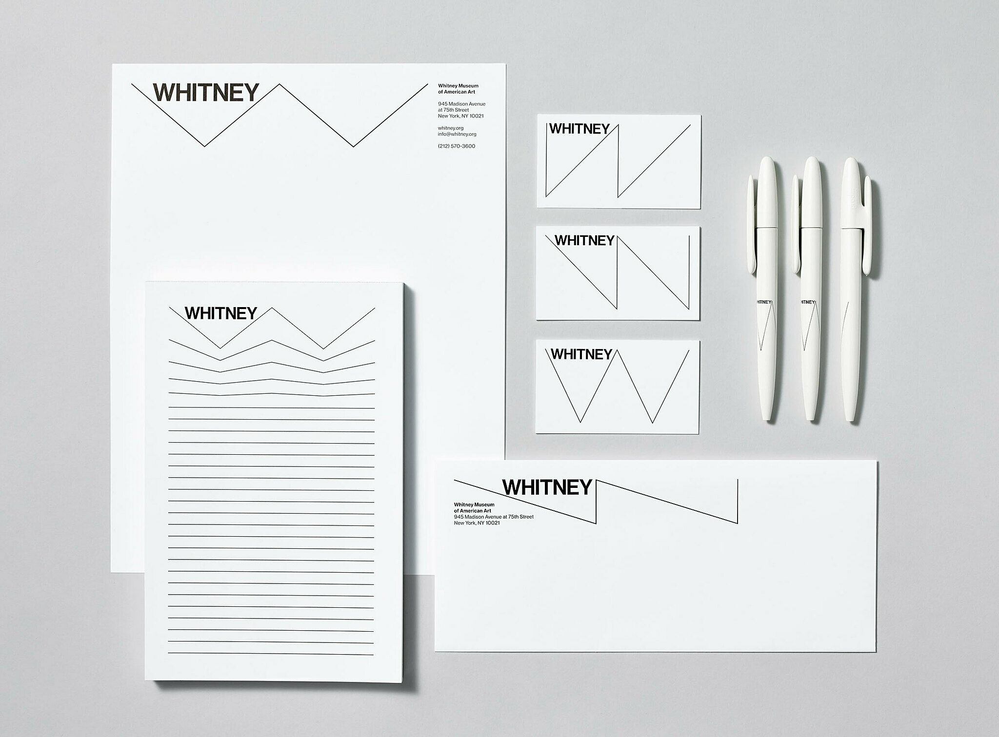
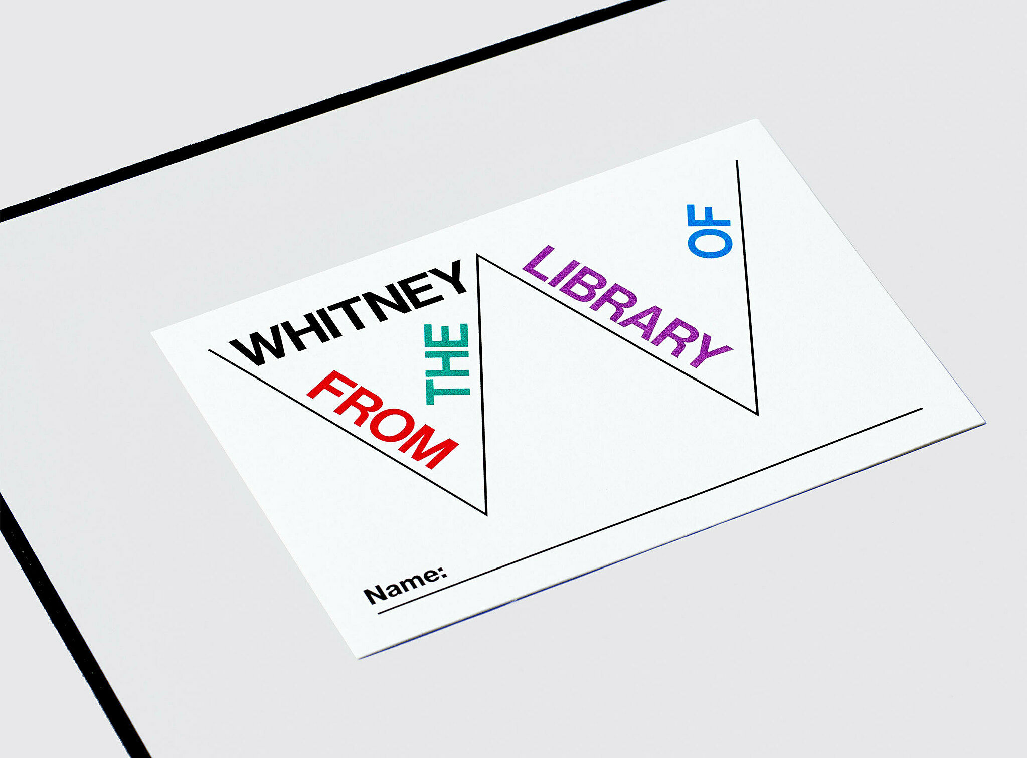
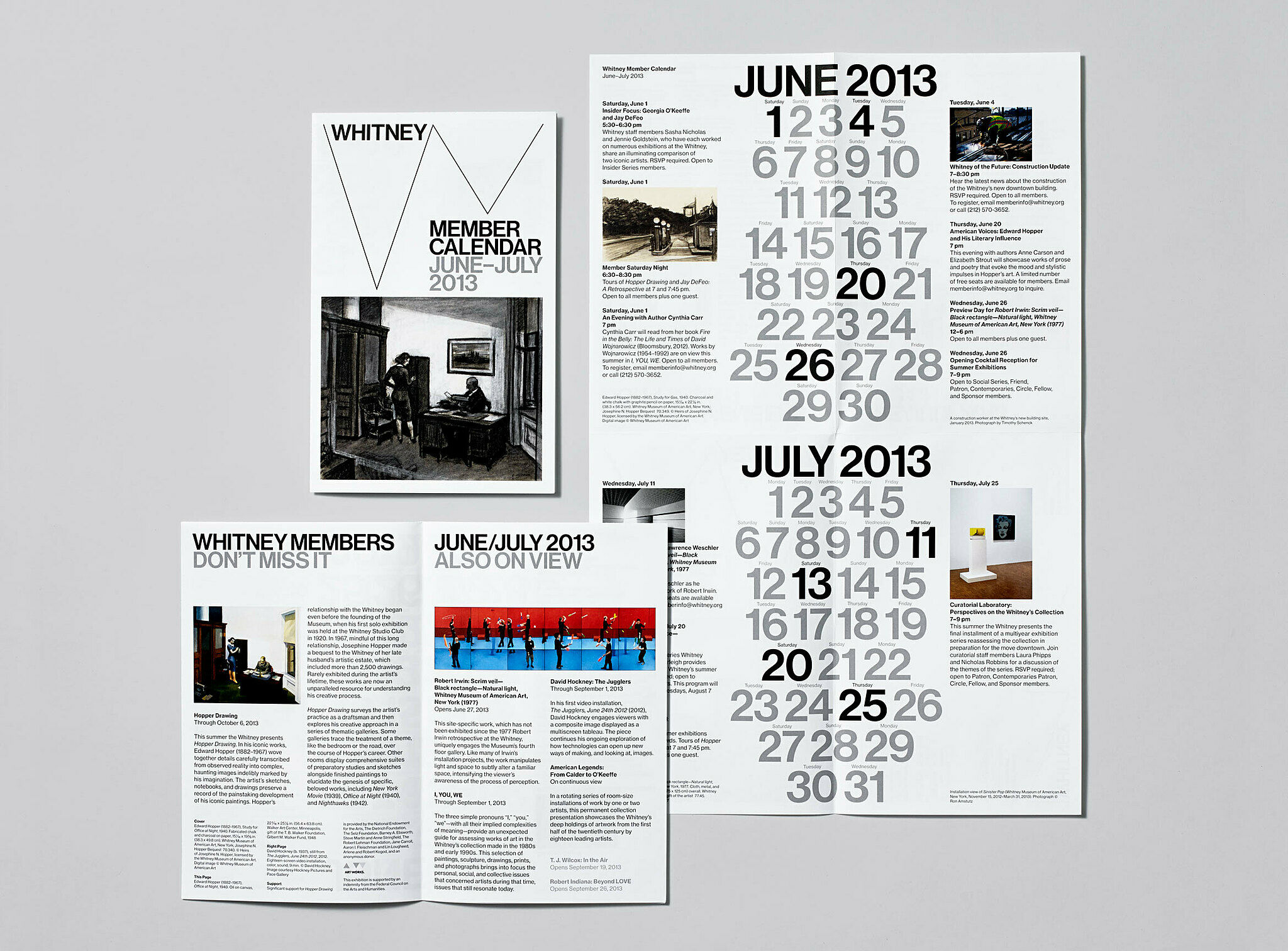
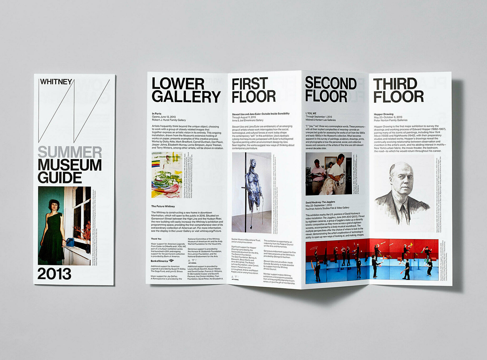
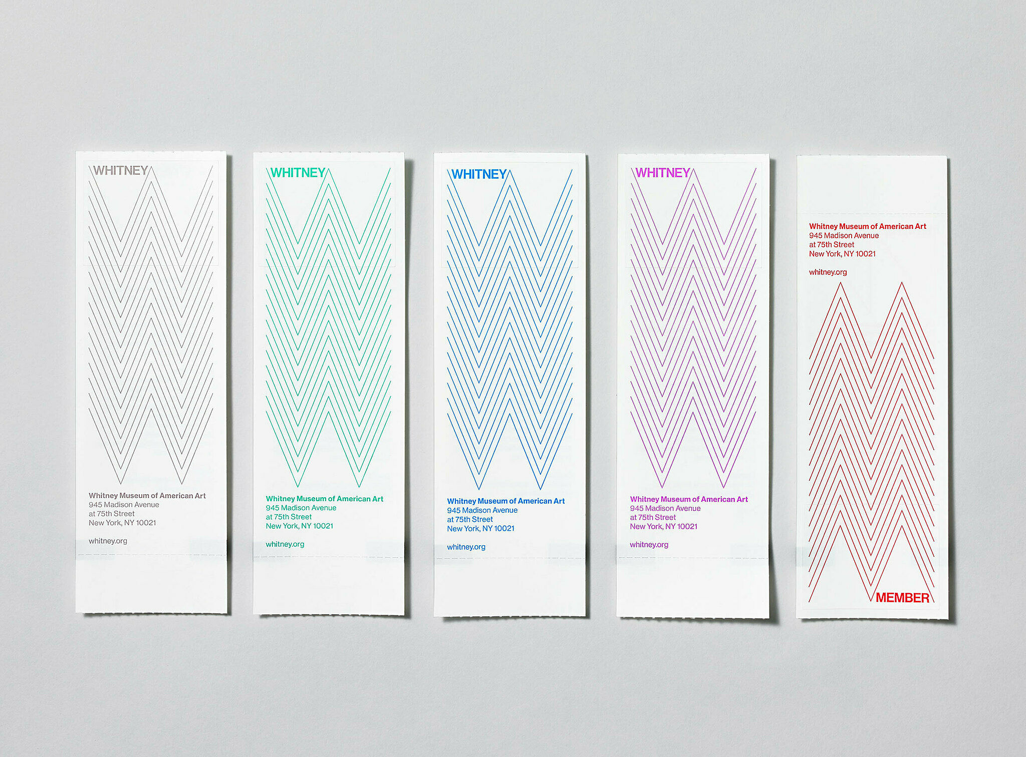
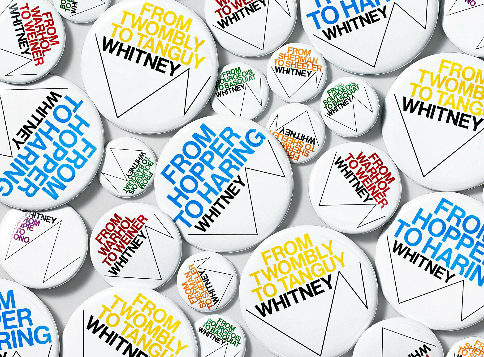
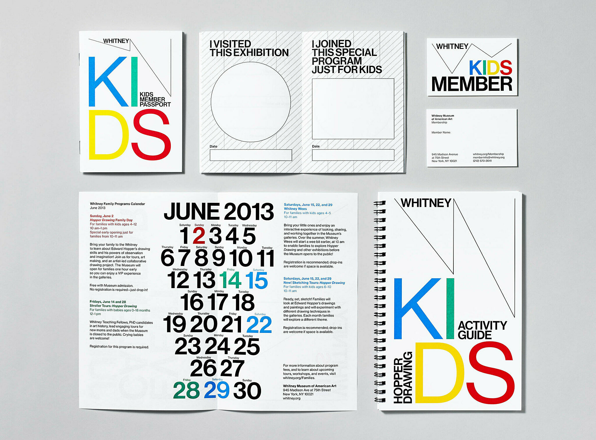
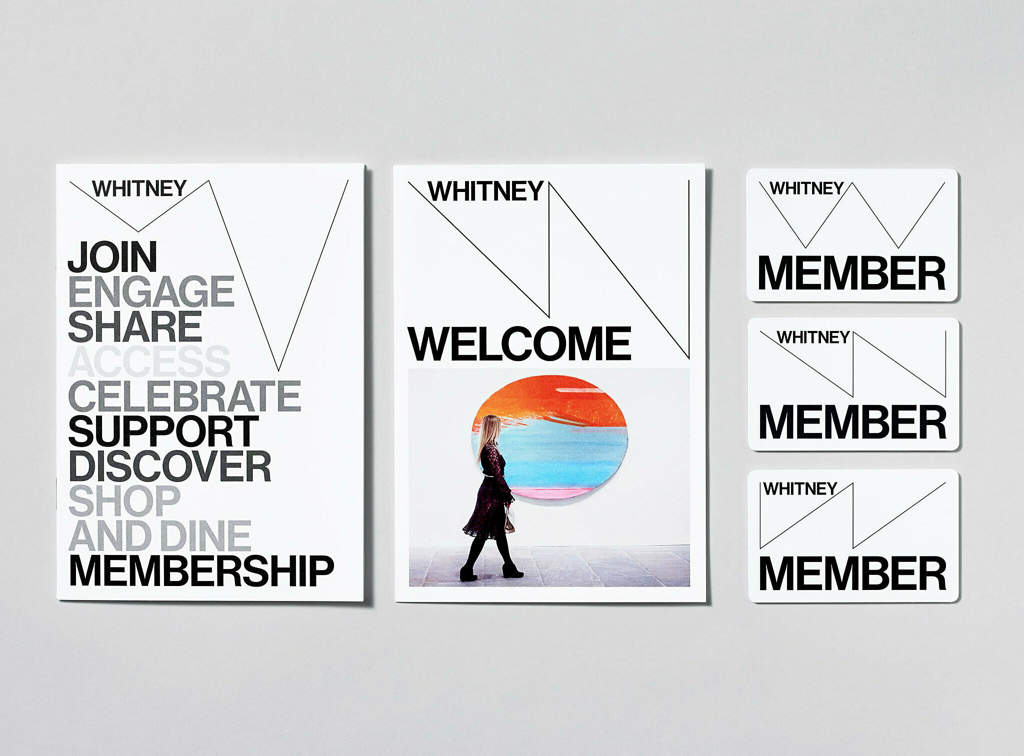
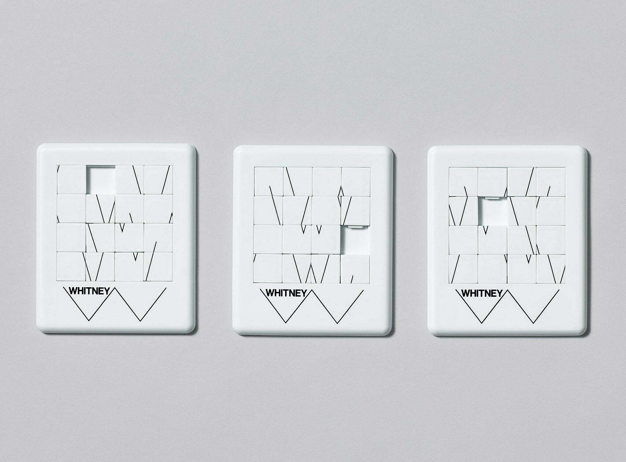
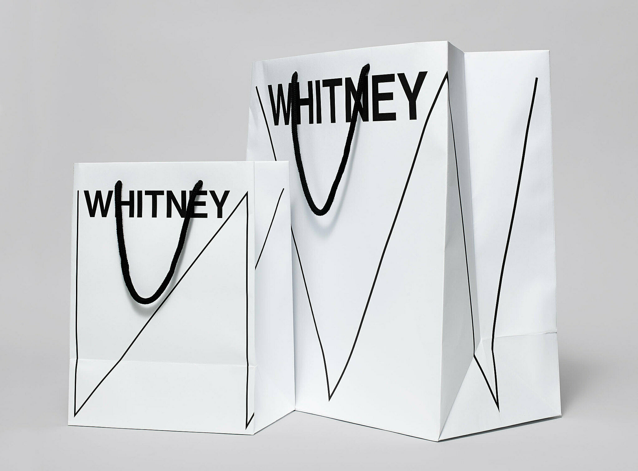
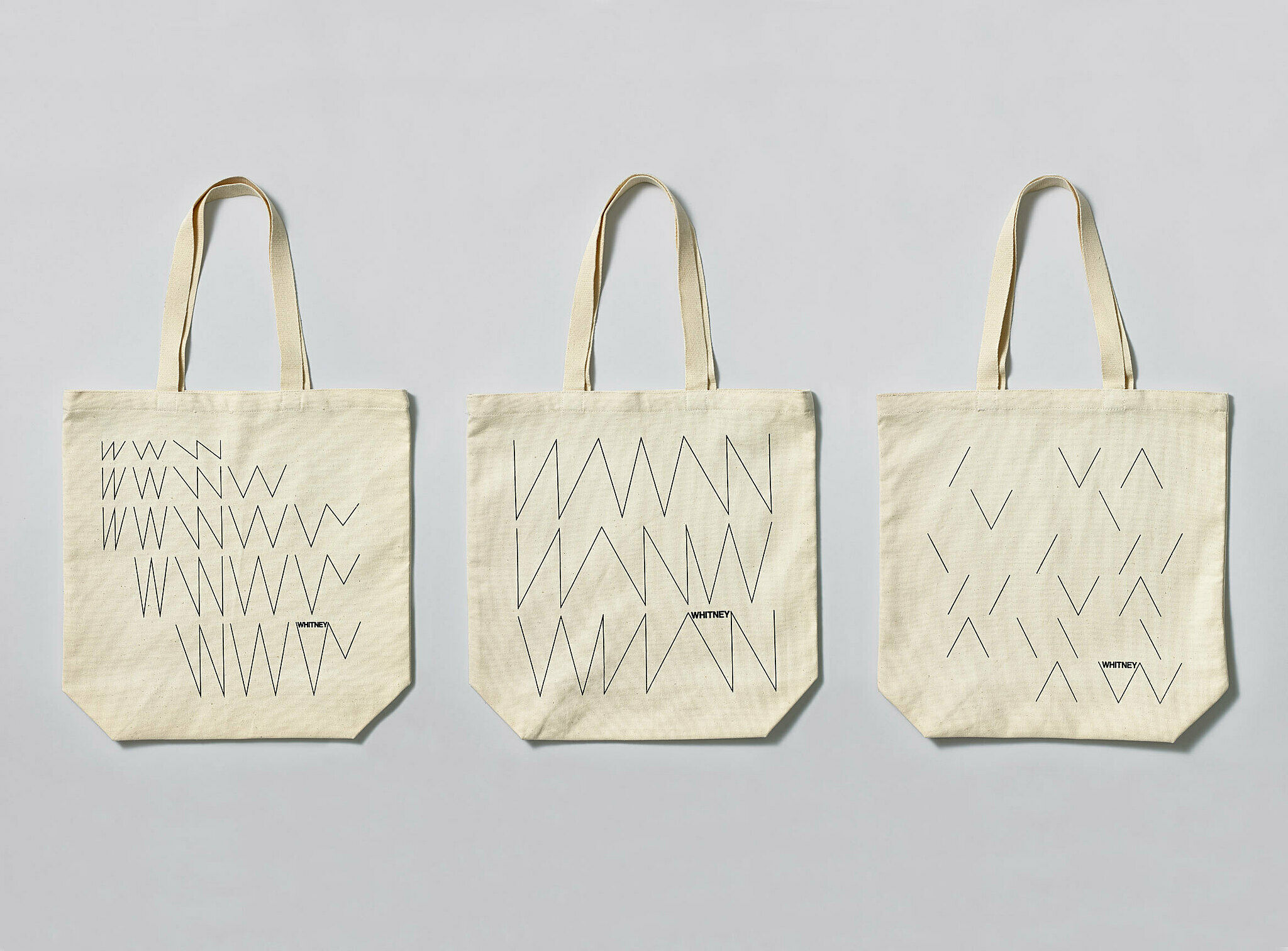
The Whitney Museum has a new mark: a dynamic W that responds to the artworks and words around it. Designed by Experimental Jetset, the new graphic identity embraces the inventive spirit of the Museum, and signals other changes afoot as the Whitney prepares to move to its new building in 2015.
As the Whitney approaches the opening of its new building in 2015, Museum staff are taking stock of all aspects of programming and operations. While much of this work is happening behind the scenes, one very visible aspect of this focus is the Whitney’s graphic identity. While the Museum has changed considerably in the thirteen years since it introduced the word mark designed by Abbott Miller of Pentagram, even more extensive institutional changes will come with the move downtown.
Two years ago, Museum staff began a thoughtful internal dialogue regarding the Whitney’s graphic identity and selected the design studio Experimental Jetset to develop an approach which embraces the spirit of the Museum while serving as a visual ambassador for our new building. The result is a distinctive and inventive graphic system that literally responds to art—a fundamental attribute of the Whitney since its founding in 1930. This dynamic identity, which the designers refer to as the “responsive ‘W’”, also illustrates the Museum’s ever-changing nature. In the upcoming years it will provide an important point of continuity for members, visitors, and the public during the transition to the new space.
The Museum’s thanks go to Experimental Jetset, its Graphic Design and Digital Media staff, Linked by Air, and the many talented people who have contributed to its creation. Below you’ll find some examples of work produced for the launch; please explore whitney.org itself, too. For a detailed look at the process Experimental Jetset's employed in developing the identity, please visit their website.

