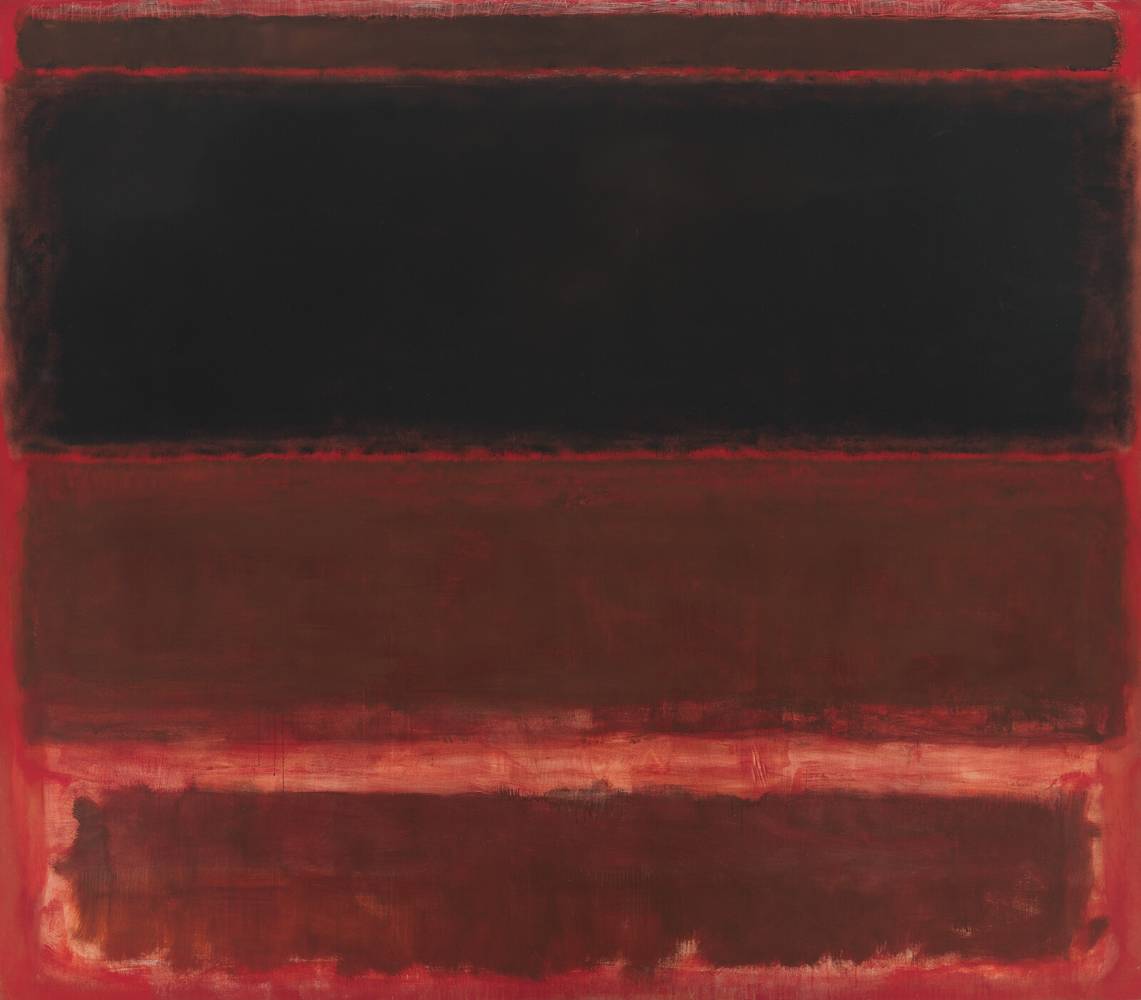
Mark Rothko, Four Darks in Red, 1958
June 4, 2019
0:00
Mark Rothko, Four Darks in Red, 1958
0:00
Narrator: Red, red, and more red.
Mark Rothko used very thin washes of color on top of very thin washes of another color to give paintings like Four Darks in Red a luminous depth.
What happens to the colors the longer you look?
In some cases you might be able to spot one color glowing through the thin layer of paint on top of it. Crimson here, rust there, and a rich maroon other there. And look at the second shape from the top—you might almost imagine getting lost in that deep, textured black. For Rothko, the drama was in the play of the colors and shapes.
Rothko wanted viewers to get close to his art and experience the big emotions he felt while painting. How does it look from the middle of the room? How is it different if you get closer—three or four feet away from the canvas?
In Where We Are (Kids).


