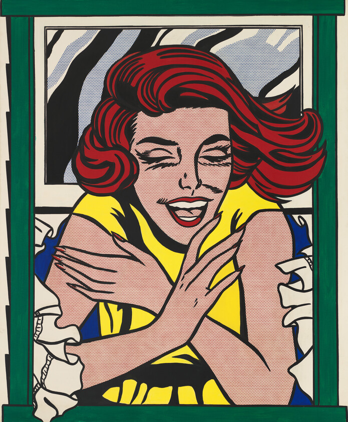
Roy Lichtenstein, Girl in Window (Study for World’s Fair Mural), 1963
Mar 24, 2014
0:00
Roy Lichtenstein, Girl in Window (Study for World’s Fair Mural), 1963
0:00
Max Anderson: Roy Lichtenstein created this painting of a woman for the 1964 World’s Fair in New York. Architect Philip Johnson designed one of the fair’s pavilions and invited leading contemporary artists to create works that would hang on the exterior of his building.
Michael Lobel, author of Image Duplicator: Roy Lichtenstein and the Emergence of Pop Art:
Michael Lobel: When you look at this painting, what you have to understand is that this was a study for a much larger painting. The mural on the façade of the pavilion was in fact 24 by 16 feet, so a large mural. The fair opened in the summer of 1964. As all the World’s Fairs were, this was a celebration of American culture, technological progress and innovation.
Max Anderson: The 1964 World’s Fair featured many works of Pop art―embracing the movement’s new, bold style and interest in commercial images. Initially, though, Americans struggled to come to terms with the new movement. Many considered advertisements and comic strips as not worthy of being artistic subjects.
Michael Lobel: In fact, in 1962, reviewing a show of Pop art, the critic Max Kozloff writes, “the truth is: the art galleries are being invaded by the pinheaded and contemptible style of gum-chewers, bobby-soxers and worse, delinquents.” And this is an index. It shows us. . .the real hostility that Pop was met by in the early 1960s when it first appeared on the art scene.
Max Anderson: At first glance, Lichtenstein’s work may look simple and cartoonish. But as Michael Lobel explains, the artist possessed an extensive and sophisticated understanding of art history.
Michael Lobel: If you look at the window above the head of the female figure, you see the way in which Lichtenstein is very cleverly and knowingly straddling the world of mechanical reproduction and the kind of language of abstract painting. On the one hand, you see everything that distinguishes his language of pop art―the bold outlines, the screens of regularized dots, the reduced painterly palette…so on one hand, this looks like the way a reflection off a pane of glass would be depicted by a commercial artist or popular illustrator. . .But at the same time, he’s using these to make almost abstract shapes. . .In this way, Lichtenstein in his Pop art is straddling these two worlds and bringing them together—what’s often called the high and low, or high art and popular culture.


