
In the Balance: Between Painting and Sculpture, 1965–1985
2022
-
550
Introduction
Audio -
551
Alma Thomas, Mars Dust, 1972
Audio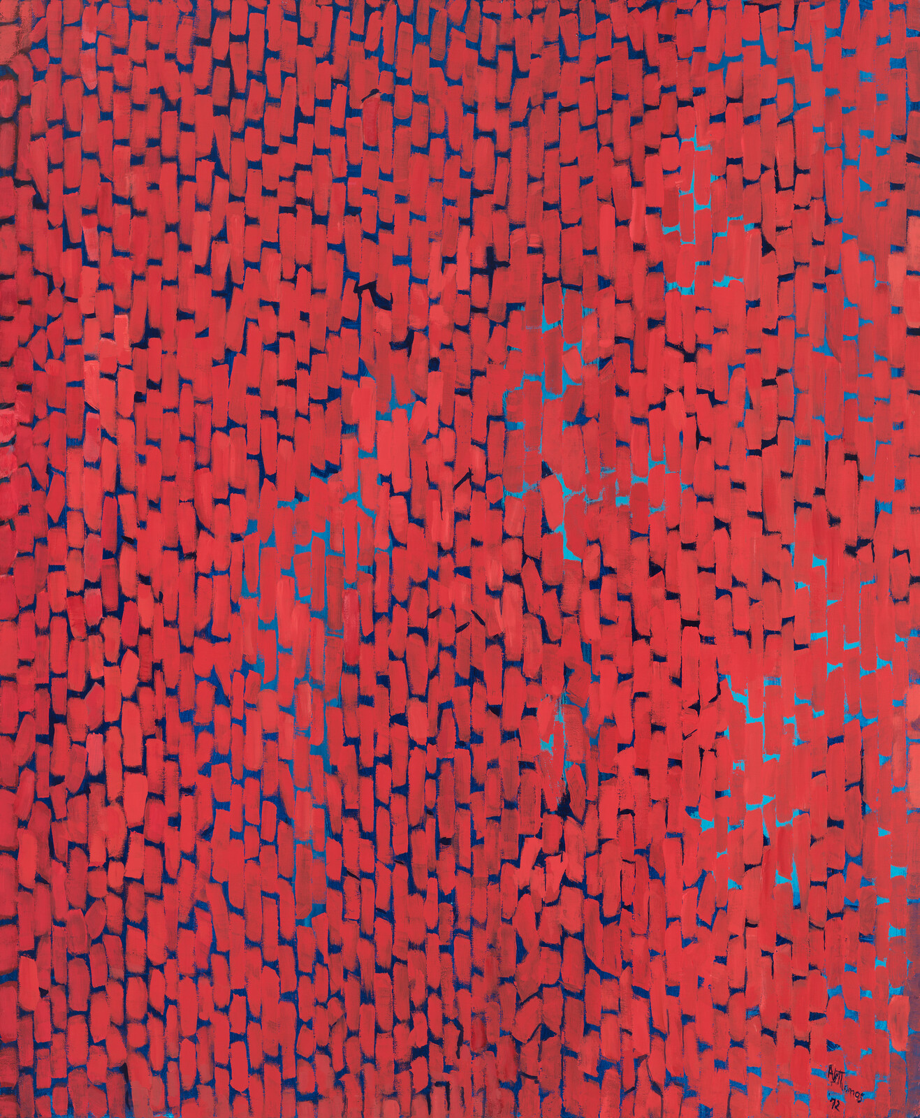
-
552
Freddy Rodríguez, Y me quedé sin nombre, 1974
Audio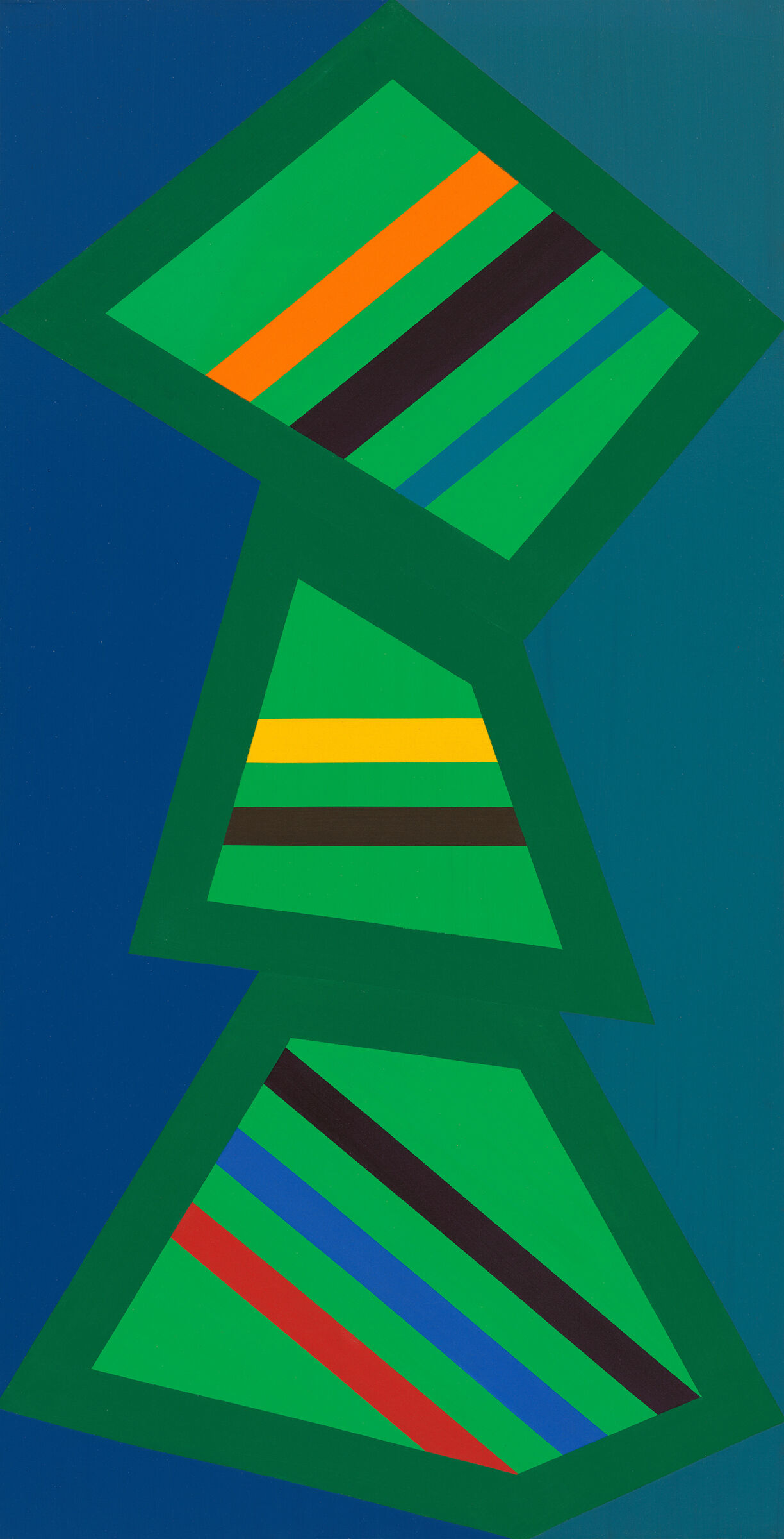
-
553
Lynda Benglis, Contraband, 1969
Audio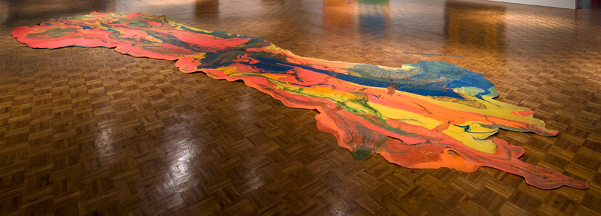
-
554
Alvin Loving, Rational Irrationalism, 1969
Audio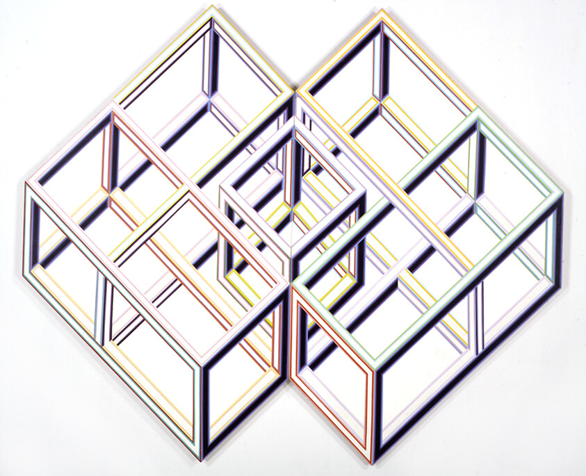
-
555
Tishan Hsu, Outer Banks of Memory, 1984
Audio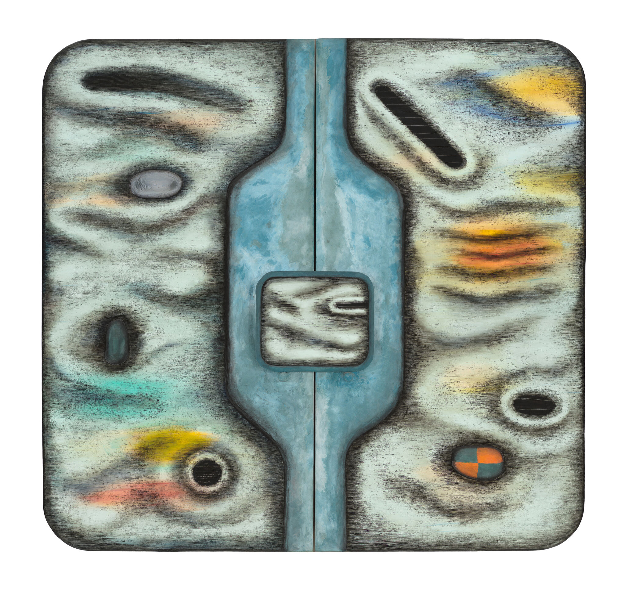
-
556
Kay WalkingStick, Gray Apron, 1974
Audio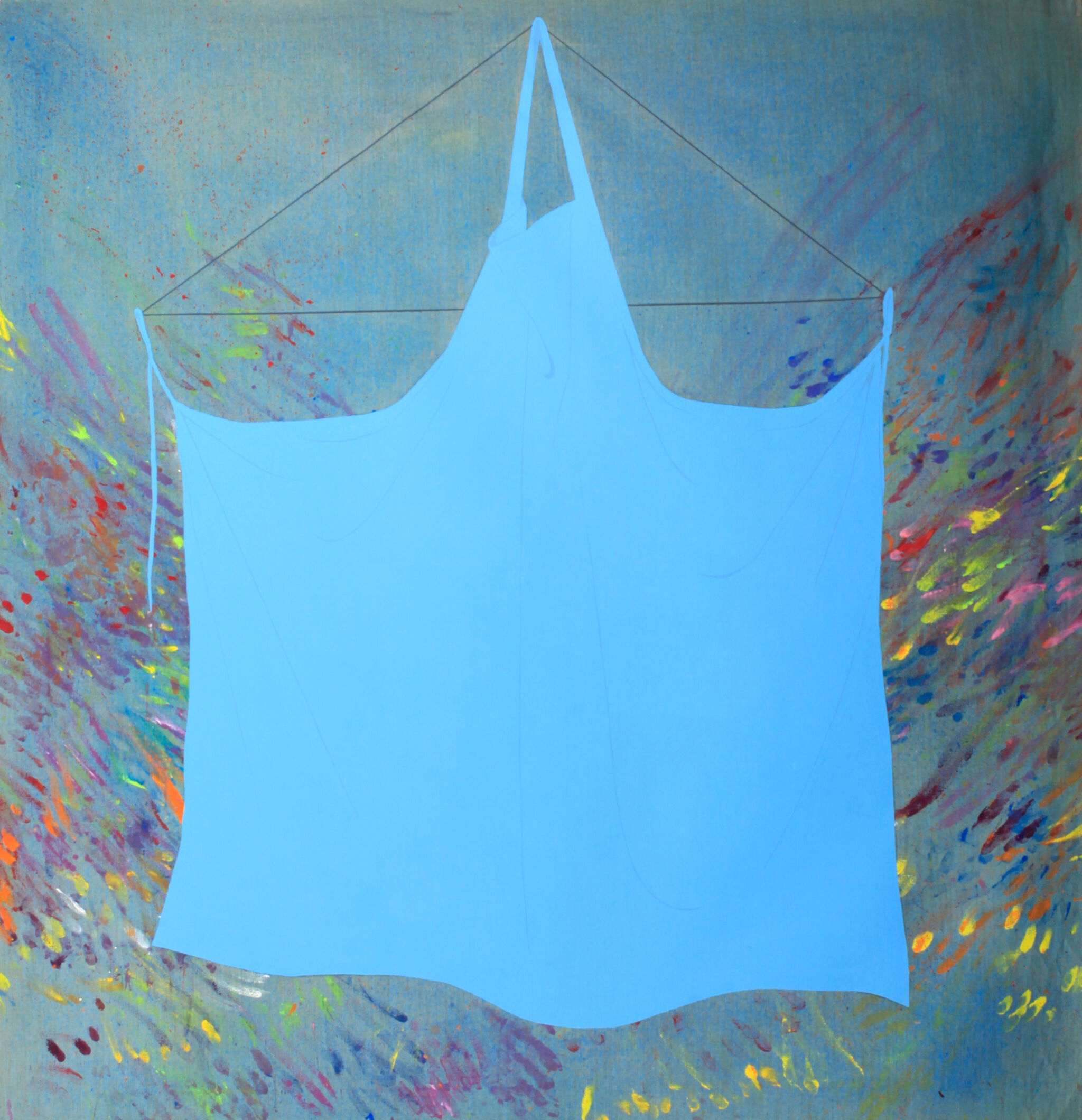
-
560
Verbal Description: Introduction
Verbal description -
561
Verbal Description: Lynda Benglis, Contraband, 1969
Verbal description
-
562
Verbal Description: Freddy Rodríguez, Y me quedé sin nombre, 1974
Verbal description
-
563
Verbal Description: Alma Thomas, Mars Dust, 1972
Verbal description
-
564
Verbal Description: Kay WalkingStick, Gray Apron, 1974
Verbal description
-
565
Verbal Description: Alvin Loving, Rational Irrationalism, 1969
Verbal description
Jennie Goldstein: My name is Jenny Goldstein and I’m an Assistant Curator at the Whitney.
I couldn't stop thinking about this idea of balance, and how that resonates across mediums. This idea of balance just kept coming up for me over and over, and I kept thinking about all the different ways that the word balance can mean, in other words all of its different definitions.
There's maybe literal understandings of it, like equilibrium, you know something that is compositionally balanced. And there’s also ways to think about balance that are more tied to remainders, like if you take money out of your bank account: there's a balance. And what remains is often just as important as what you've spent. So what's there? What's visible is very much alive in the space. But the space the artists aren't using, what they cut off, or what becomes part of the wall versus the painting itself is also incredibly important.
And I think about this a lot when I'm considering artists who are working with shaped canvases for instance. What relationship to the wall does that bring?
It's maybe less about questions of positive and negative space, and more about questions of this actual physical environment, and how much it matters to our understanding of the object, that remainder, the wall as a kind of remainder. The space of the gallery is a kind of remainder.
Lauren Haynes: So this work, Mars Dust, was created in 1972.
Narrator: Lauren Haynes is the Director of Curatorial Affairs at the Queens Museum. In 2015 she discussed this work by Alma Thomas as part of a series of gallery talks at the Whitney, called 99 Objects. You can listen to all of these lectures on our website.
Lauren Haynes: With this work, which has the cobalt blue and the darker blue underlay with the red bands that she made using an elastic band to sort of create the layers. And the different levels of red are her interpretation. I think of dust and this dust storm and this very overwhelming way that the color red is taking over this canvas and how the dust sort of took over Mars, which we know as the red planet.
In 1969, around the Apollo space missions, when we sent the first American astronauts to the moon, and there was a whole series of different landings and explorations, Alma Thomas got very caught up in that. She was really interested in this idea of space, but also the way that technology opened the door for everyone to be able to see what was going on. She has a really great quote: “Today not only can our great scientists send astronauts to and from the moon to photograph its surface and bring back samples of rocks and other materials, but through the medium of color television, all can actually see and experience the thrill of these adventures. These phenomena set my creativity in motion.”
Alma Thomas, Mars Dust, 1972. Acrylic on canvas, overall: 69 1/4 × 57 1/8 in. (175.9 × 145.1 cm). Whitney Museum of American Art, New York; purchase, with funds from The Hament Corporation 72.58. © Estate of Alma Thomas (Courtesy of the Hart Family)/Artists Rights Society (ARS), New York
Narrator: Marcela Guerrero is an Associate Curator at the Museum.
Marcela Guerrero: When I see this painting, I see this sole figure dancing. When you’re dancing Merengue, Salsa, or Bachata, it wouldn't be uncommon for your head and your torso and your legs to be in three different points or moving in three different directions.
The box and kind of the hard angles of these three sections that you see in the painting can also relate to dance in the sense that when you're dancing, you want to create a frame with your arms. You have a certain path that you move. You have some flexibility within that, but that's kind of the fundamentals of many dance forms.
And then the lines embedded in each of these three blocks for me, they point to musical notes.
Narrator: When a teacher of Rodríguez’s gave him a pass to the the Museum of Modern Art, shortly after arriving in New York in the late 1960s, he was struck by Piet Mondrian’s geometric painting Broadway Boogie Woogie. Abstraction opened up a world of possibilities for Rodríguez.
Marcela Guerrero: For him it was kind of a way of saying, or thinking, you know, “I can do abstraction, I can do something that grounds me, that takes me away from the chaos that's in my life and from where I came from.”
The title is Y me quedé sin nombre, which translates to “and I remained unnamed,” or “I ran out of names.” I think it points to a sort of abstraction. It's kind of another way of saying “untitled” without that detachment or without sounding so cold.
Freddy Rodríguez, Y me quedé sin nombre, 1974. Acrylic on canvas, 70 1/8 × 35 7/8 in. (178.1 × 91.1 cm). Whitney Museum of American Art, New York; purchase with funds from the Painting and Sculpture Committee 2021.20. © Freddy Rodríguez
Lynda Benglis: My name is Lynda Benglis and the name is Contraband. I did it in 1969.
These are ultra-violet colors. The trade name was DayGlo, and I ordered 500 pounds of the colors, and had them in my small studio and would go into larger studios and actually pigment large vats of rubber latex, and I would pour the painting on waxed linoleum and sometimes directly on the floor. The scale was dictated by the places that I actually did the work.
Narrator: Benglis grew up in Louisiana, near the Contraband bayou. She titled this work because it reminded her of toxic oil slicks on the water.
Lynda Benglis: The work itself has a certain kind of demand, it’s moving. It bespeaks of nature.
I still think of myself as a painter for some reason. I think I'm painting with liquids but making objects that are dimensional, that have a sense of their own space, but demand some viewing in terms of walking around.
Lynda Benglis, Contraband, 1969. Pigmented latex, overall (irregular): 3 × 116 1/4 × 398 1/4 in. (7.6 × 295.3 × 1011.6 cm) Overall (thickness of latex): 1/8 in. (0.3 cm). Whitney Museum of American Art, New York; purchase, with funds from the Painting and Sculpture Committee and partial gift of John Cheim and Howard Read 2008.14. © Lynda Benglis / Licensed by VAGA at Artists Rights Society (ARS), New York
Narrator: Alvin Loving was fascinated by spatial illusion, and would explore it throughout his career. This interview with the artist was recorded at WFUV radio station in New York, in 1973.
Alvin Loving: The primary problem I was working with was breaking the picture plane.
Narrator: By that, he meant that he didn't want the image he was creating to be limited by the flatness of the physical canvas. He was fascinated by the possibility that creating a sense of three-dimensional depth could change a viewer's sense of space—and maybe impact their real, lived experience of the world.
Alvin Loving: I've always felt that composition was really what articulated what any given reality was about. And I think the artist's responsibility is to kind of project on where that reality that he's living in is going to go. That is, if an artist has any responsibility at all it's to kind of prepare people for things that are about to happen to them.
Narrator: [This audio is credited to] Arlene Slavin and Vivienne Thaul Wechter. [The] Interview [was conducted] with Arlene Slavin, Alvin Loving, and Brenda Miller for the Today's World radio series, circa 1973. [as part of] WFUV radio interviews relating to art, 1969-1973. Archives of American Art, Smithsonian Institution.
Alvin Loving, Rational Irrationalism, 1969. Acrylic on shaped canvas, overall (Irregular): 82 1/8 × 97 in. (208.6 × 246.4 cm). Whitney Museum of American Art, New York; purchase, with funds from the Robert C. Scull Fund for Young Artists not in the Collection 69.74a-b. Courtesy the Estate of Al Loving and Garth Greenan Gallery, New York
Jennie Goldstein: Among Hsu’s primary concerns is the relationship between technology and the body, and this is something that he's been fascinated with since the 1980s. And, in some ways, has proven to be anticipatory of all kinds of technological advances or ways that we understand the role of media, especially social media, other technological content in our lives.
Narrator: Tishan Hsu studied Environmental Design and Architecture at MIT before becoming an artist. Curator Jennie Goldstein discusses this work, Outer Banks of Memory.
Jennie Goldstein: You can understand it to be like a topography, like a body, as if it has orifices and openings, parts of it project out, parts of it recede. There seems to be a kind of screen-like shape in the center that's propped up against the painting itself. So it becomes like a screen on top of a screen, something portable that's related to the whole. So when I look at it with twenty-first century eyes. I can't help but think of, you know, tablets or other kinds of portable technologies.
He's always been committed to painting. So this is not a rejection of a medium that has ancient roots for something more advanced or new would be a better way to say that. But someone who's thinking through kind of complex ideas about a very old art form.
Tishan Hsu, Outer Banks of Memory, 1984. Acrylic, concrete, Styrofoam, oil, and enamel on wood, 89 15/16 × 94 3/4 × 8 5/8 in. (228.4 × 240.7 × 21.8 cm). Whitney Museum of American Art, New York; purchase with funds from the Painting and Sculpture Committee 2021.105a-c. © 2022 Tishan Hsu / Artists Rights Society (ARS), New York
Kay WalkingStick: I'm Kay WalkingStick, I'm a painter.
Narrator: This work is part of a series of “apron” paintings that WalkingStick did when she was a graduate student.
Kay WalkingStick: I made a series of paintings about my aprons because, at the time, I was very aware of the fact that I was leading two lives. So this is really a painting about who I am and my life. I was actually making my work aprons out of scraps of canvas linen. I was trying to, through this iconic shape, and I felt it was an iconic shape, that expressed these two connected sides of my life.
In this painting, I was stating who I was as a painter, but also saying, and yes, this painter is a woman who has responsibilities to a family. I'm sure many people on the outside saw me as a suburban housewife who painted. And I was, to me, a painter who happened to be married and had kids.
Narrator: WalkingStick remembers the early seventies as a politically loaded era. Second wave feminism and the American Indian Movement were in full swing. She explains that it was a “very personal” time because women were rethinking their place in society. She was also immersing herself in the New York art world during Minimalism’s rise. The triangle at the top of this work is a nod to the hard-edge forms she saw in her contemporaries’ work, what she described as “diagrammatic paintings.”
Kay WalkingStick: It was to optically support the apron that I put this triangle in.
Looking back on it, I see this triangle a little differently, I see it as balance. And here I am talking about this life of mine, which seems divided and yet actually it was very balanced, like the triangle.
Kay WalkingStick, Gray Apron, 1974. Acrylic on canvas, 52 x 50 in. (132.1 x 127 cm). Whitney Museum of American Art, New York; promised gift of the Gochman Family and in honor of Forge Project, traditional lands of the Muh-he-con-ne-ok P.2022.1. © Kay WalkingStick
Narrator: On the fifth floor, as you exit the elevators you will see an exhibition titled Hopper’s New York. If you move to the right there is a smaller focus collection show titled In the Balance: Between Painting and Sculpture 1965-1985. On the left wall is an intro text for In the Balance and in the center of the space there are two artworks spread out in the center of the floor. This show is located in a large 60 by 70 foot room, and places all of the artworks along the walls except for two artworks situated in the center of the space. The sculptures in the middle of the room have friction tape around them to demarcate where visitors should stop walking so as not to disturb or damage the artworks. One of the works on the floor is by Lynda Benglis and is about 33 feet by 10 feet and positioned diagonally on the floor. Directly forward and to the left, past this floor sculpture, are several benches. Just beyond the Benglis is an artwork by Judy Chicago, which is a 10 foot by 5 foot series of three triangular forms stacked in front of one another. Many of the paintings in the show have shaped canvases that are not squares or rectangles. Others are quite thick and are almost sculptural. One artwork hangs high on the wall and takes on an undulating form. On the long wall across the room, a sculpture connects the floor and the wall in an almost rainbow-like coil. On either side of the long wall there is access to a respite space with sofa seating in front of full wall windows, which overlook the Hudson river.
Narrator: Lynda Benglis, Contraband, 1969. Contraband is an irregularly shaped pigmented latex “spill” displayed on the floor. The spill measures just over 9 feet tall and 33 feet wide and is about an inch thick. It is positioned diagonally in the middle of the gallery space. Composed of blue, green, red, orange, yellow, and the hues made from colors mixing, this work offers a non-shape as a deliberate alternative to the rigidity of paintings stretched on canvas. The spill’s center is primarily dark blue with pink, yellow, and flecks of green swirled within. The blue “center” extends tendrils of varying sizes to the upper right where the blue latex pools, almost suggesting a river’s course meeting the mouth of an ocean. On the left side of the spill, orange, yellow, and red gather to resemble bumbling lava, a gooey portal where some greens and blues swirl and puddle. Like many of her contemporaries, Benglis didn’t try to represent specific images or content in her work. But her approach was influenced by nature, politics, bodily emissions, and contemporary technologies.
The work’s title, Contraband, references a bayou of the same name near her childhood home in Louisiana, and Benglis said the work reminded her of oil slicks on the water. This reference, along with the artwork’s faded Day Glo hues and industrial scale, brings to mind the destruction of natural landscapes. In doing so, Contraband might even question art’s relationship to the environment and the resources we extract from it.
Lynda Benglis, Contraband, 1969. Pigmented latex, overall (irregular): 3 × 116 1/4 × 398 1/4 in. (7.6 × 295.3 × 1011.6 cm) Overall (thickness of latex): 1/8 in. (0.3 cm). Whitney Museum of American Art, New York; purchase, with funds from the Painting and Sculpture Committee and partial gift of John Cheim and Howard Read 2008.14. © Lynda Benglis / Licensed by VAGA at Artists Rights Society (ARS), New York
Narrator: Freddy Rodriguez, Y me quedé sin nombre, 1974. Y me quedé sin nombre (translated to "and I remained without a name") is a highly geometric acrylic painting on canvas. The painting measures 70 ⅛ inches tall by 35 ⅞ inches wide.
Three dark green outlines of shapes—a parallelogram, a trapezoid, an outstretched kite—balance atop each other. Inside of the parallelogram, the trapezoid, and outstretched kite are straight lines crossing the lime green filling of each shape. The parallelogram features an orange line, a brown line of equal thickness, and a thinner desaturated blue line–all running diagonally to the left. In the middle, the trapezoid features two lines—one thicker yellow line and one thinner brown line—running parallel to the base of the painting. The third and final form—the outstretched diamond shape—has a red line, a blue line, and a brown line (all of equal thickness) extending diagonally to the right. The blue background of the painting—darker on the left side and lighter on the right—is both flat and dynamic, playing into the illusion of shadows and depth.
The artist chose to include vibrant green hues, which we might associate with spring, birth, and vitality. The geometric elements might evoke a traffic stop light that has every bulb glowing green go go.
Rodríguez’s attention to balance, shape, proportion, and scale all work to create an abstract painting that references the human body in motion with influences from dance and movement of Merengue and Bachata, two dances made popular inthe Dominican Republic, Rodríguez’s birthplace.
Conceptually, the name of the painting Y me quedé sin nombre (which translates to "and I remained without a name") points to another abstraction. Instead of simply titling this work “Untitled” or “sin título,” Rodríguez chose a less detached, more poetic way of saying the same thing. In doing so, he might be imbuing a potentially impersonal abstraction with subjective sensibilities, subverting any notion of objectivity.
Freddy Rodríguez, Y me quedé sin nombre, 1974. Acrylic on canvas, 70 1/8 × 35 7/8 in. (178.1 × 91.1 cm). Whitney Museum of American Art, New York; purchase with funds from the Painting and Sculpture Committee 2021.20. © Freddy Rodríguez
Narrator: Alma Thomas, Mars Dust, 1972. Mars Dust is an acrylic painting on canvas. The painting measures 69 ¼ inches tall by 57 ⅛ inches wide. The background of the painting is primarily a cool, dark blue with lighter blue tones and tints coalescing into washy expanses. On top of the blue, hundreds of short, warmer, red vertical brush strokes rest in a dazzling array. These marks are each about the size of an adult thumb. Not all of the reds are the same tint; some of the strokes are a whisper whiter than others. The brush strokes are deliberate and purposeful, averaging in similar thicknesses though some are slightly longer than others. The brush strokes are opaque and bristle marks are not apparent. The strokes are ordered so that sometimes they touch side to side (and very rarely top to bottom), often leaving small spaces between them, like vertically arranged bricks. These small spaces allow the blues to poke through, appearing as if seen through a sieve.
Thomas strikes a delicate and evocative balance in her use of positive and negative space. This texture brings about the illusion of dust storms on mars placed vertically, as if the viewer is peering down upon them.
Thomas cites the scientific advancements of the “space age” and color television as being pivotal in the conception of her creativity, and as an influence for this painting. Knowing this, her use of color is especially important, reflecting the vibrancy that would have been broadcast on technicolor TV screens. The mutability of the painting’s surface makes a gentle gesture towards the realms that cannot be visually grasped, towards the unknown hopes, aspirations, dreams, and illusions that lie in humankind’s probing of the universe. This question may point to the wonders of space lying not in what we know, but in what we cannot know.
Alma Thomas, Mars Dust, 1972. Acrylic on canvas, 69 1/4 × 57 1/8 in. (175.9 × 145.1 cm). Whitney Museum of American Art, New York; purchase with funds from The Hament Corporation 72.58. © 2024 Estate of Alma Thomas (Courtesy of the Hart Family) / Artists Rights Society (ARS), New York
Narrator: Kay WalkingStick, Gray Apron, 1974. Gray Apron is an acrylic painting on canvas. The painting measures 52 inches tall by 50 inches wide. The background of the painting, visible around the canvas’s edges, contains short, radial bursts of multicolored marks on a soft gray/blue background almost like hand marks. Squarely in the foreground, a saturated gray apron with a bluish tint hangs, outstretched, from a thinly painted equilateral triangle. The apron’s neck strap hangs from the vertex of the triangle; the back straps of the apron hang from both sides of the triangle’s base. As if in preparation for wear, the apron stretches wide across the canvas. While the apron depicts small, soft folds in its fabric, the garment does not drape on a body, and the garment is relatively flattened.
This painting moves away from simply a representation of an apron, to incorporate the act of artmaking itself. While the apron is represented as an object, white-gray-blue and unstained, the colorful brush strokes and markings moving from behind might connote a messy paint space.
Kay WalkingStick, Gray Apron, 1974. Acrylic on canvas, 52 x 50 in. (132.1 x 127 cm). Whitney Museum of American Art, New York; promised gift of the Gochman Family and in honor of Forge Project, traditional lands of the Muh-he-con-ne-ok P.2022.1. © Kay WalkingStick
Narrator: Alvin Loving, Rational Irrationalism, 1969. Rational Irrationalism is an acrylic painting on a shaped canvas. The painting measures 82 ⅛ inches tall by 97 inches wide.
This work plays with spatial illusion, and Loving intentionally created a geometric shape that looks like it’s almost popping off the wall at the viewer. Depicted are two large overlapping open-faced cubes positioned diagonally on their sides, with the corners of the cubes oriented up and down, creating multiple right-angled edges on the outsides of the work. This work itself is not rectangular, but instead takes the shape of the diagonally-tilted overlapping cube forms. Each of these large cubes is made up of four smaller sub-cubes. All sides of the sub-cubes are visible and differentiated with thin outlines of glowing neon hues like yellow, pink, green, red, blue, purple, light orange, and rust. Where the two large cubes overlap in the center of the work, there sits yet another, smaller cube, like a nesting doll. The inner cube has yellow base lines, light orange and rust inner lines, and a white top lines. Some lines on the edges of the shape are dark, filled in areas to indicate shadows. The shadows are inconsistent allowing this piece to be viewed from multiple angles and initiate shifting perspectives.
Conceptually, Loving mediates and meditates on optical illusion within the limitations of painterly expression. Relationships of geometric harmony and balance form the central precepts of this composition. It is important to note: after making this artwork, Loving began to think about quiltmaking. Much of this work expresses the mathematical rigor that hallmarks the quiltmaking tradition, and his attempts to investigate the dimensionality of this tradition through another medium.
Alvin Loving, Rational Irrationalism, 1969. Acrylic on shaped canvas, overall (Irregular): 82 1/8 × 97 in. (208.6 × 246.4 cm). Whitney Museum of American Art, New York; purchase, with funds from the Robert C. Scull Fund for Young Artists not in the Collection 69.74a-b. Courtesy the Estate of Al Loving and Garth Greenan Gallery, New York
0:00
0:00