
The Whitney's Collection: Selections from 1900 to 1965
2023
Escucha a una variedad de artistas, curadores y académicos hablar sobre trabajos en la exhibición.
-
700
Introducción
Audio -
701
George Bellows, Dempsey and Firpo, 1924
Audio (inglés), Niños (inglés), ASL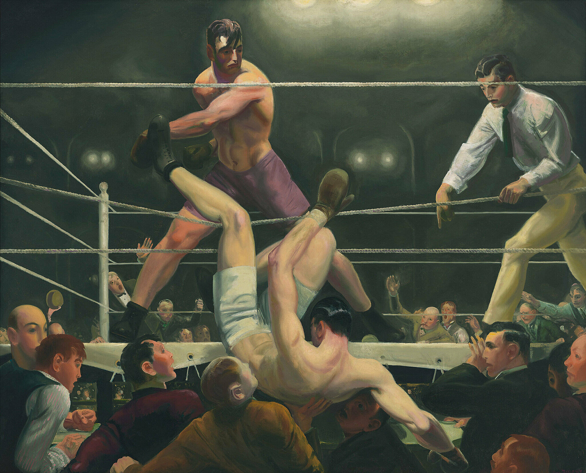
-
702
Robert Henri, Gertrude Vanderbilt Whitney, 1916
Niños (inglés)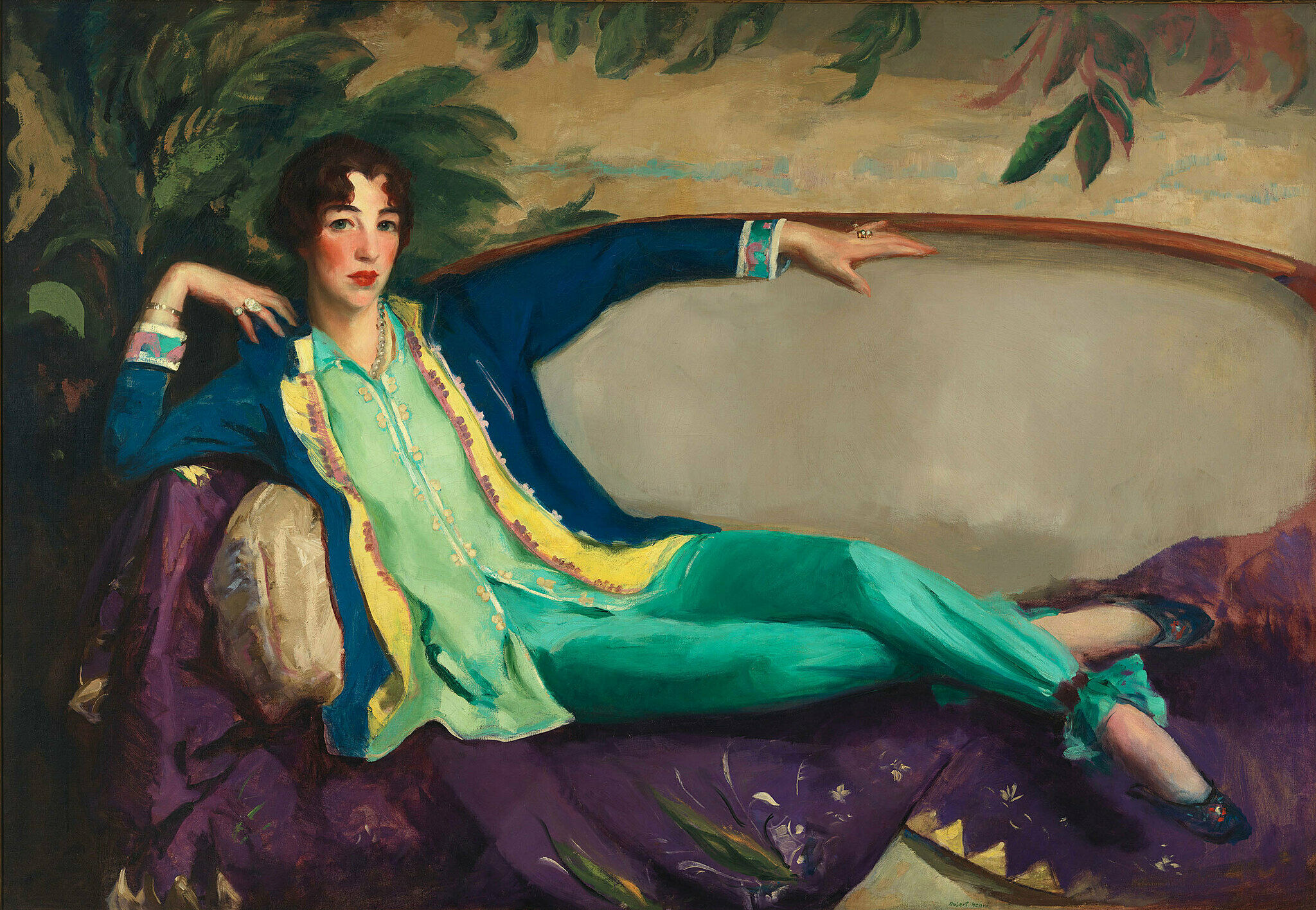
-
703
Madeline Shiff, Wiltz at Work, 1932
Descripción verbal (inglés)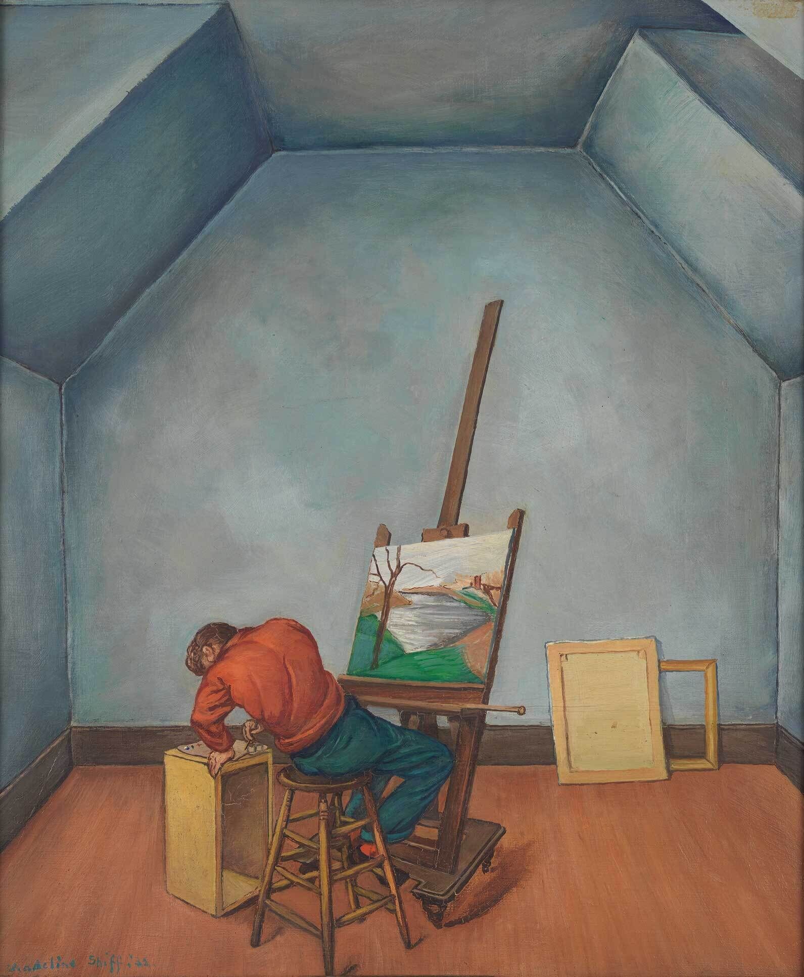
-
711
Elizabeth Catlett, Head, 1947
Audio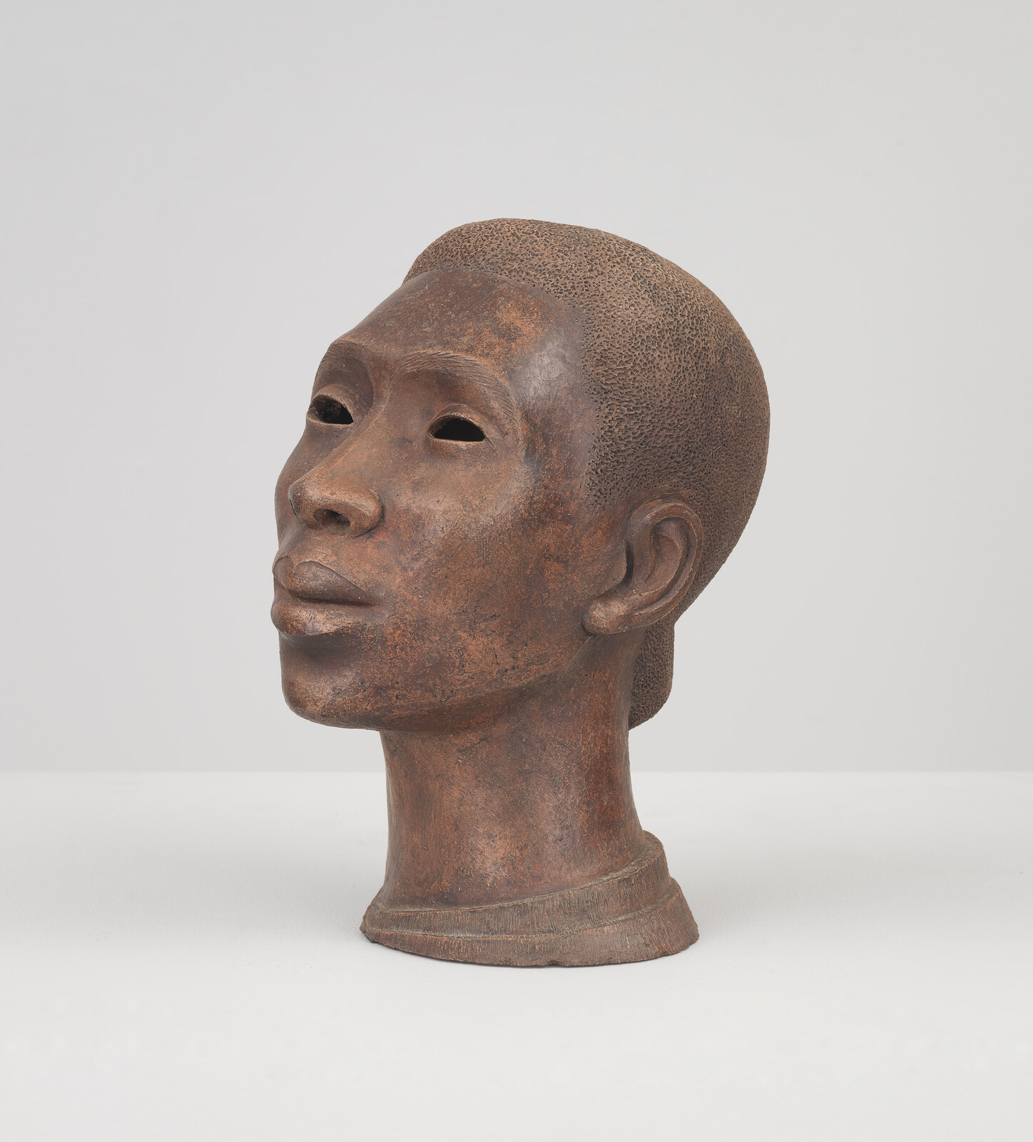
-
720
Joseph Stella, The Brooklyn Bridge: Variation on an Old Theme, 1939
Audio, Niños, ASL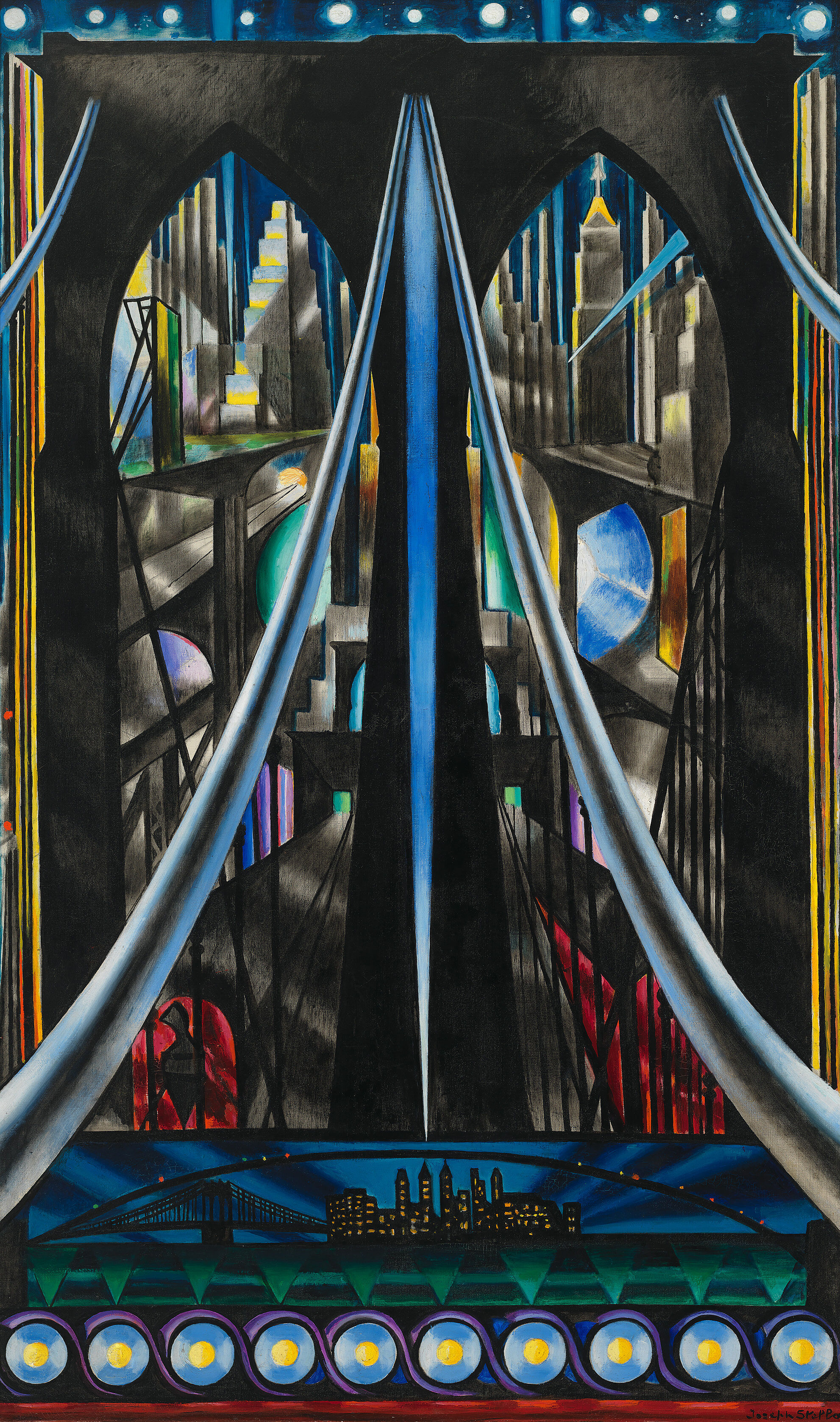
-
721
Elsie Driggs, Pittsburgh, 1927
Audio, Niños (inglés), ASL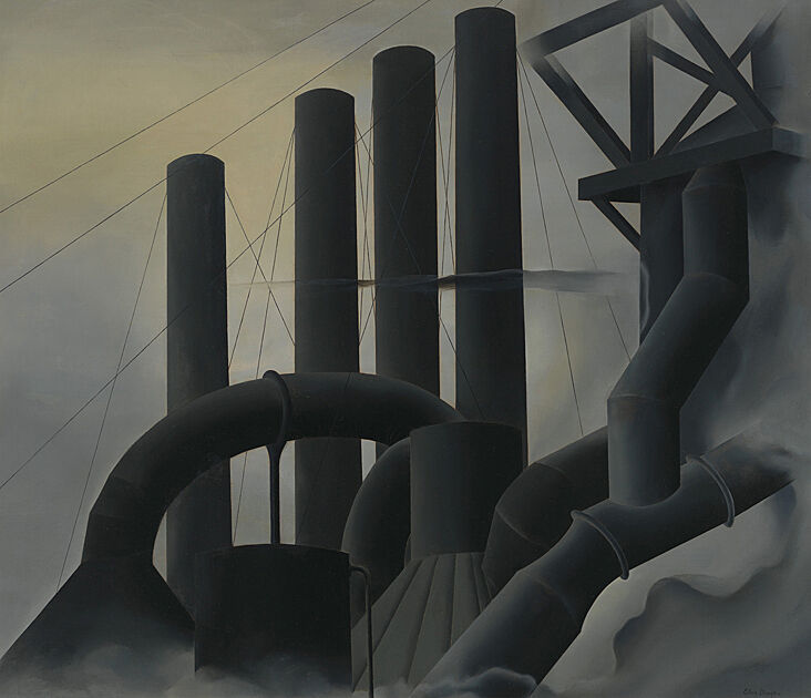
-
722
Charles Demuth, My Egypt, 1927
Audio, Niños (inglés)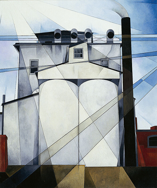
-
730
Alexander Calder, Calder’s Circus, 1926–31
Audio, Niños (inglés), ASL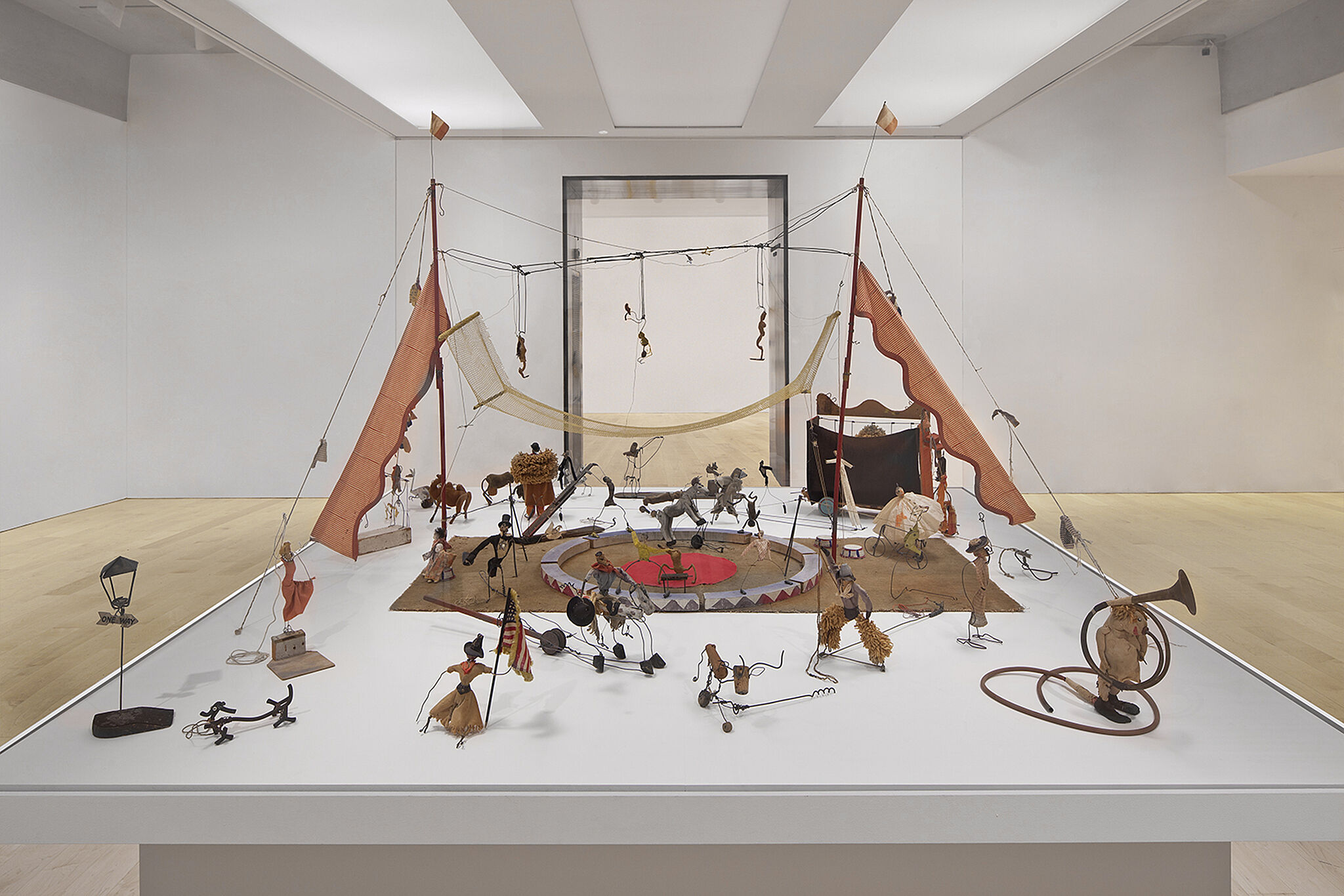
-
740
Georgia O'Keeffe, Music, Pink and Blue No. 2, 1918
Audio (inglés), Niños (inglés), Descripción verbal (inglés)
-
741
Georgia O'Keeffe, Summer Days, 1936
Descripción verbal (inglés)
-
742
Marsden Hartley, Painting, Number 5, 1914–15
Audio, Descripción verbal (inglés)
-
750
Edward Hopper, Soir Bleu, 1914
Audio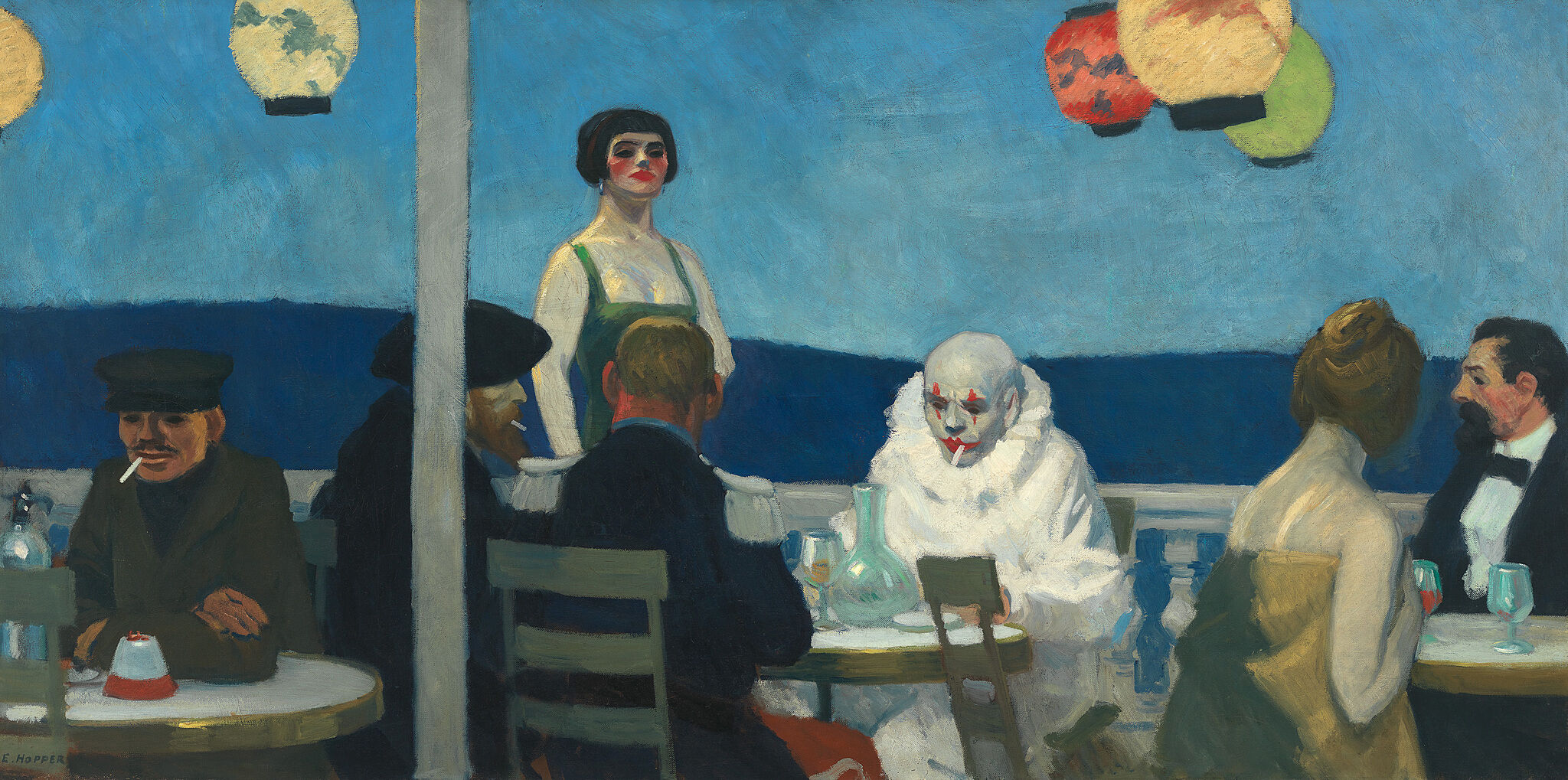
-
751
Edward Hopper, New York Interior, 1921
Audio, Niños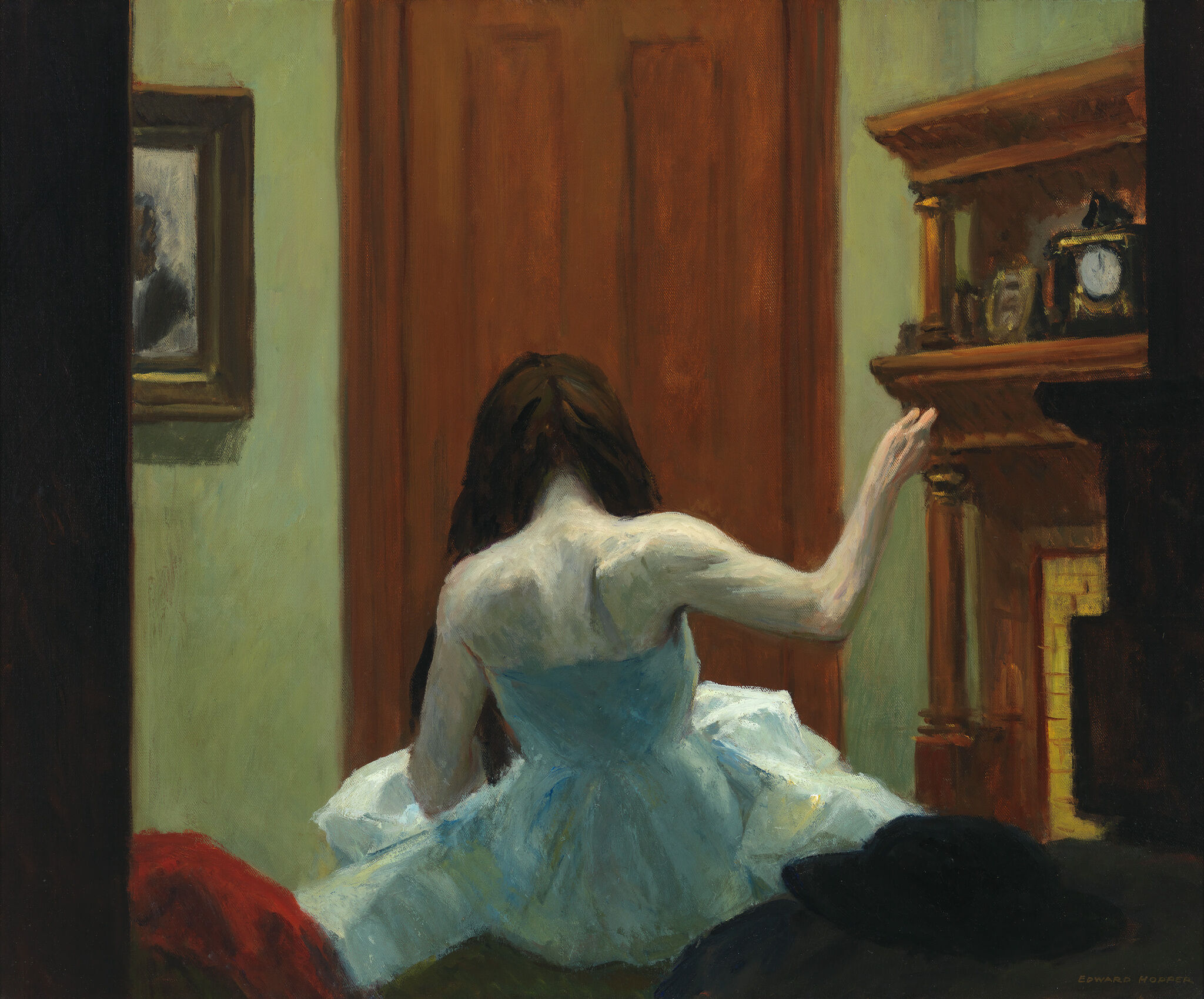
-
752
Edward Hopper, Early Sunday Morning, 1930
Audio, Niños, Descripción verbal (inglés)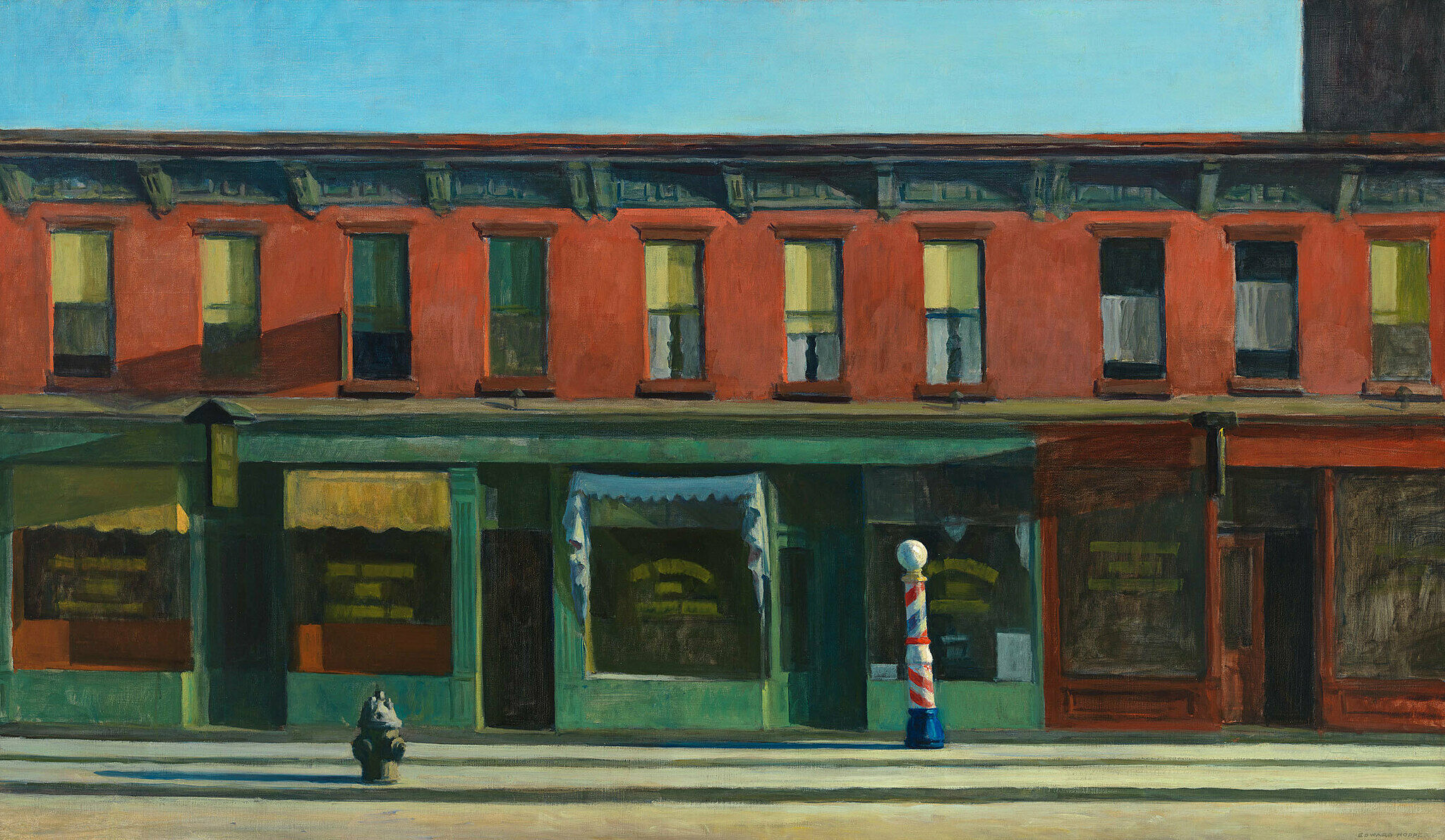
-
761
Man Ray, La Fortune, 1938
Audio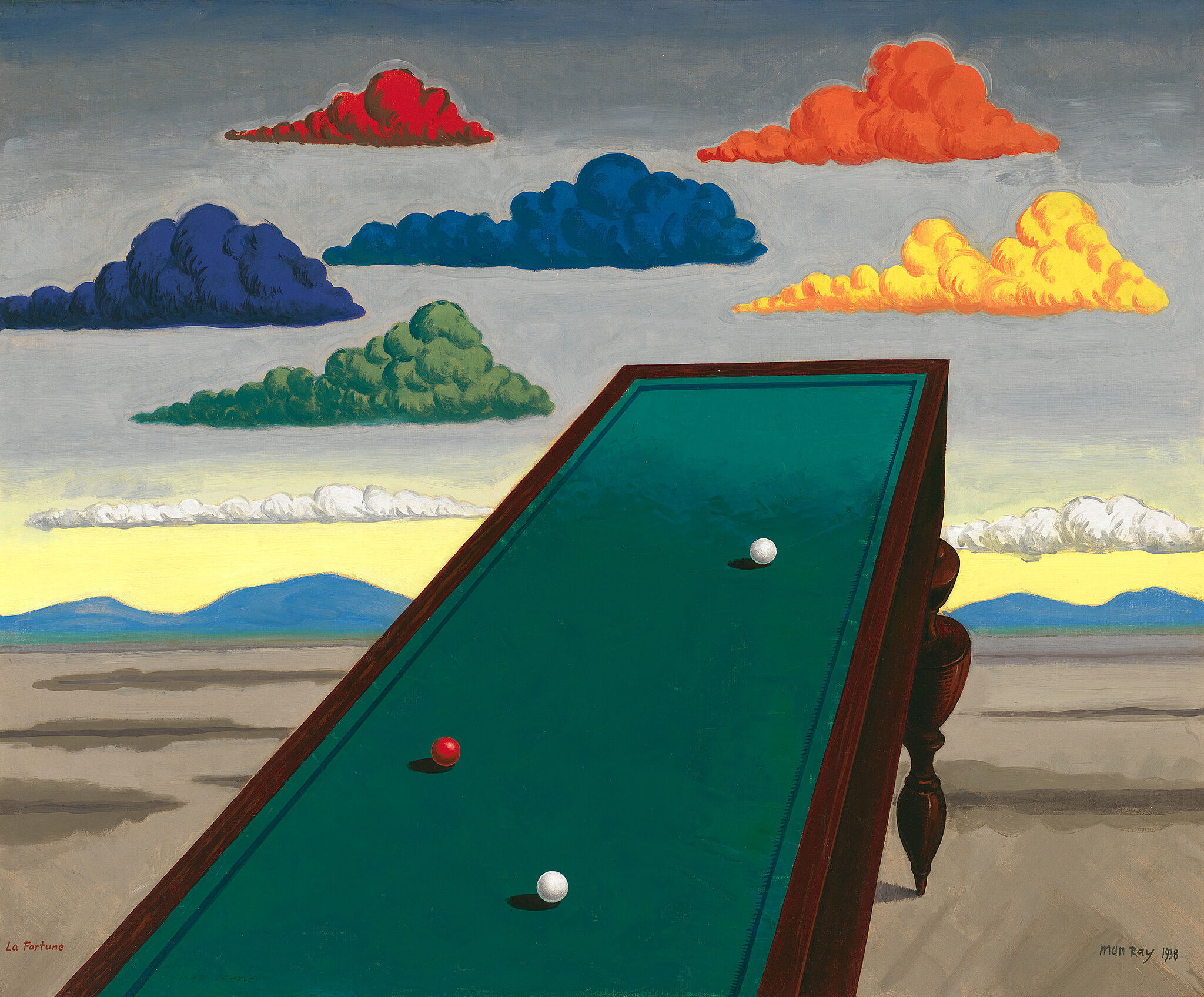
-
770
Jacob Lawrence, War Series, 1946-47
Audio (inglés), Descripción verbal (inglés)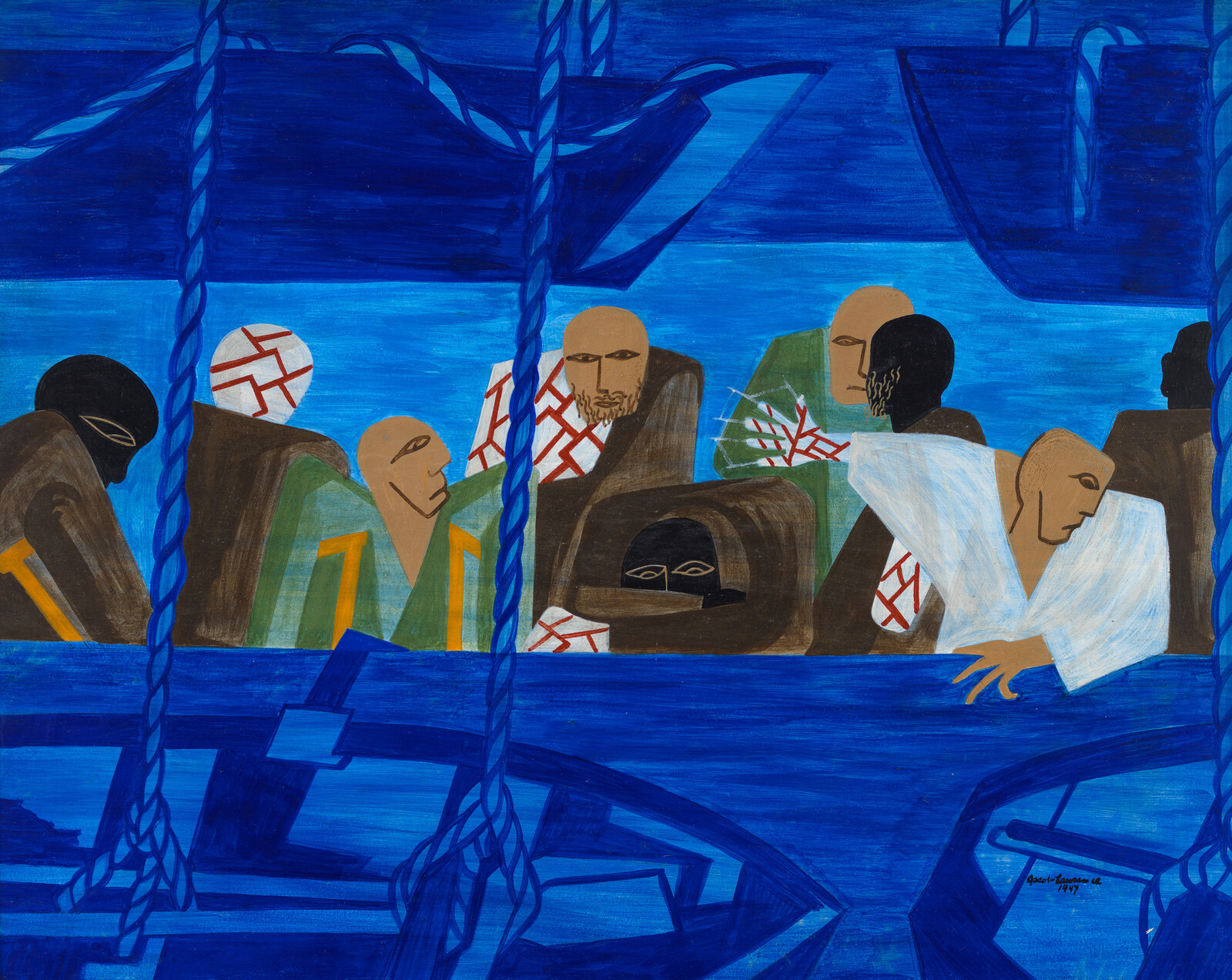
-
782
Jay DeFeo, The Rose, 1958–1966
Audio, Niños (inglés)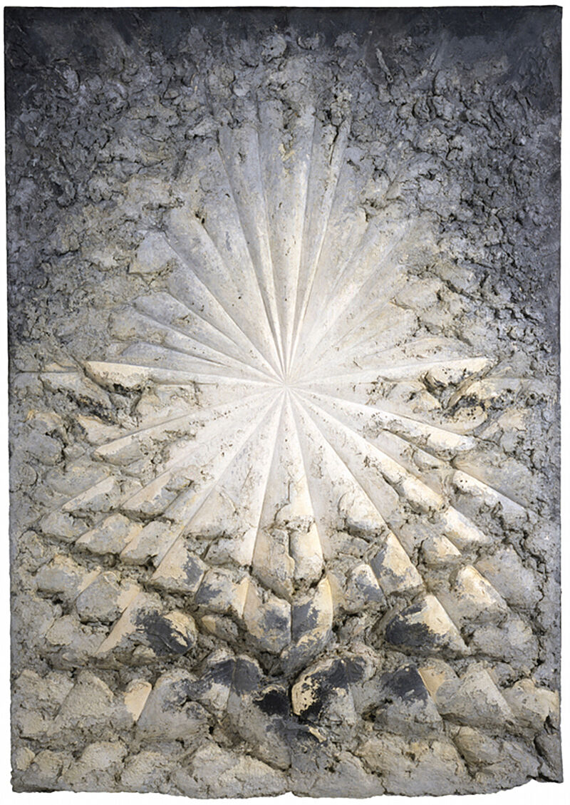
-
783
Norman Lewis, American Totem, 1960
Audio, Niños (inglés)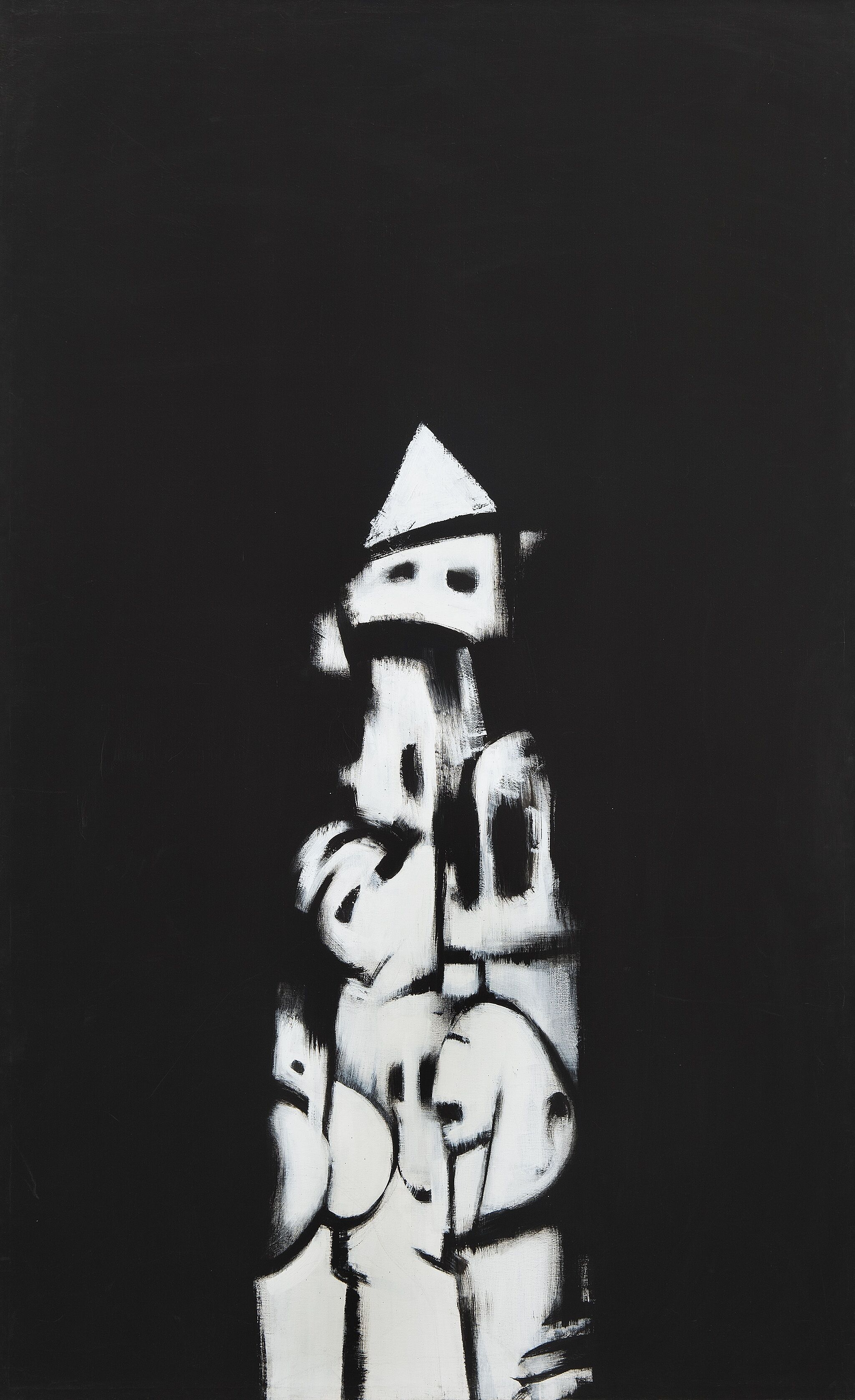
-
784
Ed Clark, Winter Bitch, 1959
Audio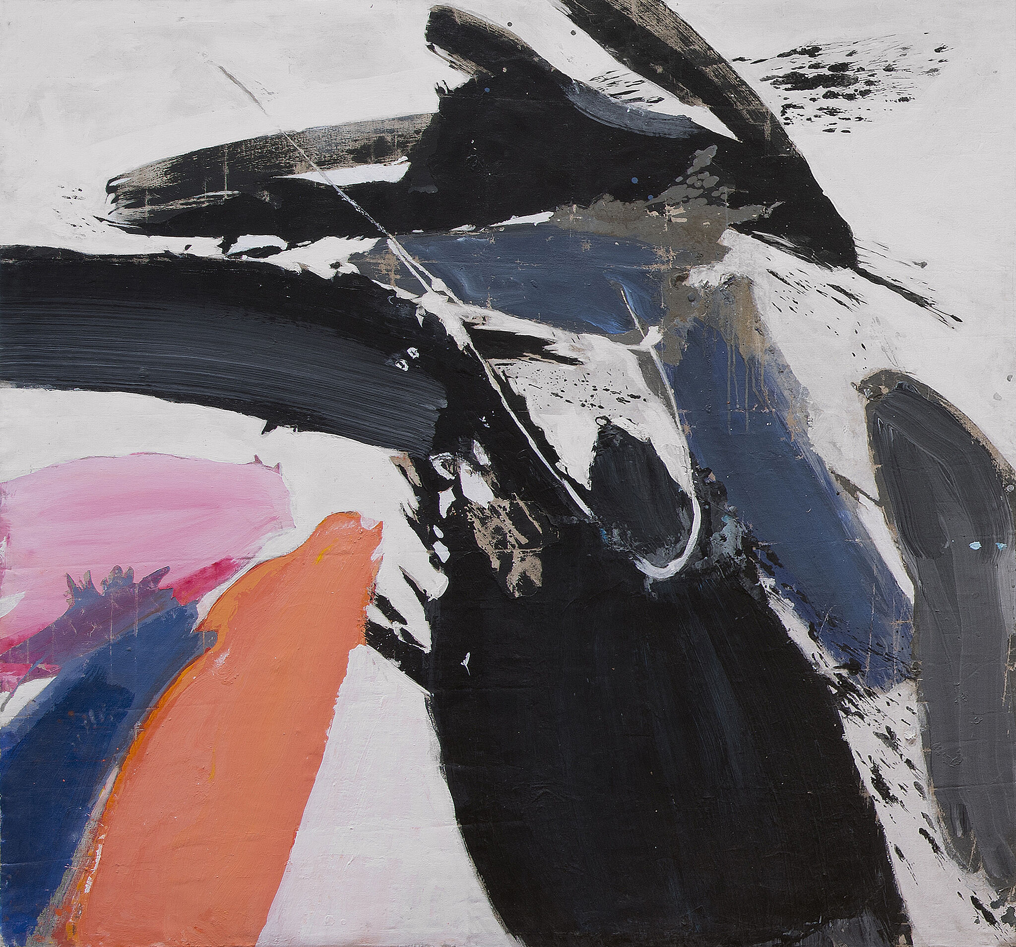
-
791
Jasper Johns, Three Flags, 1958
Audio, Niños (inglés), ASL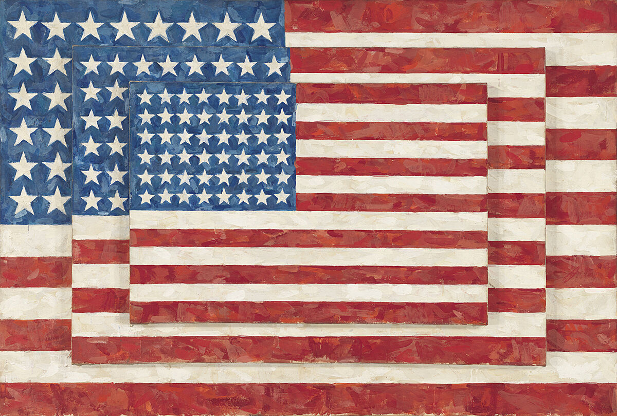
-
791-2
Jasper Johns, Three Flags, 1958
Audio
Narrador: Esta exhibición proviene en su totalidad de la colección del Whitney, con obras que datan del año 1900 hasta 1965. Esta exhibición ha sido organizada por David Breslin, el DeMartini Family Curator y director de la colección.
Narrator: In 1923, artist George Bellows’ attended a boxing match on assignment for the New York Evening Journal. He made several drawings, on which this painting is based. The late writer George Plimpton described the painting.
George Plimpton: It shows Firpo, the Argentinian boxer--quite untutored, almost an amateur—in what is considered one of the most dramatic moments in fistic history, namely knocking the champion, Jack Dempsey, through the ropes. Dempsey was destroying Firpo when Firpo hit him with this left, as you can see and knocked him through the ropes. Dempsey was a killer. He was referred to as the Manassa Mauler. and simply destroyed people in the ring with him. It's the sort of painting that I think photography really does now.
It's overdramatic, this picture Dempsey was not a popular champion at all. He was famous for hitting low blows, hitting fighters when they were rising from the canvas. On this particular fight in the Polo Grounds everybody's sitting there—Babe Ruth, all these people, dignitaries. Great courses of booze. And I think they really wanted Firpo, this great amateur, to take him out. He was that unpopular, Dempsey was. Somewhat romanticized here, in Bellows' painting. Firpo looking like sort of a great god, looking indestructible tree-like limbs there, legs. And Dempsey of course looked like a beetle falling out of a tree here. But that wasn't the way it turned out, at all.
Narrator: The fight lasted only four minutes—and Dempsey was declared the winner. But the moment that became boxing legend was the one commemorated in this painting, when Firpo knocked Dempsey out of the ring.
Melanie Adsit: So this is a portrait of lots of people that shows a frozen moment in time. What's happening in this painting?
Student: What's happening in this painting is that there are two boxers, one of them has knocked the other wrestler out, and the one that got knocked out is falling into the crowd, and the crowd is going wild.
Student: The crowd is backing up. Their mouths are open, and they’re not going to be having their mouths open without any sound. It's obvious that they're yelping, screaming, roaring.
Melanie Adsit: Great, you guys. This is a painting made by George Bellows in 1924 of a very famous fight between Jack Dempsey, who was the heavyweight champion of the world, and Luis Firpo, who was his rival from Argentina. We see Dempsey in the white shorts and Firpo in the purple shorts. In the first round, Dempsey knocked Firpo down seven times, but then, Firpo landed a punch right on Dempsey's chin and knocked him out of the ring. How does that change the way that you think about this painting?
Student: This shows that some people never quit, even if their challenge is really hard and they get beat. But if you keep trying, you can throw in one little thing that can change the whole time.
Melanie Adsit: At the end of the fight, though, after this moment, Dempsey got back in the ring, and ultimately Dempsey won the fight. So even though he got knocked out, he came back and beat Firpo in the end.
George Bellows, Dempsey and Firpo, 1924. Oil on canvas, 51 1/8 x 63 1/4 in. (129.9 x 160.7 cm). Whitney Museum of American Art, New York; purchase with funds from Gertrude Vanderbilt Whitney 31.95
Narrator: This is a portrait of Gertrude Vanderbilt Whitney. She was an artist, and the founder of the Whitney Museum. Robert Henri made this painting in 1916—over a hundred years ago. Think about the choices that Whitney and Henri made about how she appears here. For one thing, she’s looking at us very directly. She rests on the sofa with a sense of ease—and she’s wearing elegant silk pajamas. At the time, she would have looked like a very modern woman. In fact, she looked too modern for her husband, who thought it was scandalous that she had herself depicted wearing pants! He wouldn’t let her hang the painting in their mansion uptown. Instead, she displayed it in her studio in Greenwich Village.
Robert Henri, Gertrude Vanderbilt Whitney, 1916. Oil on canvas, 49 15/16 × 72in. (126.8 × 182.9 cm). Whitney Museum of American Art, New York; gift of Flora Whitney Miller 86.70.3
Wiltz at Work is a painting by Madeline Shiff that is 18 inches tall and 15 inches wide. Shiff portrays her husband, painter Arnold Wiltz, with his easel in the center of a small, windowless painting studio. Wiltz is shown from behind sitting on a wooden stool, bent over a small light wooden table to his left in the act of mixing paint. Resting on the easel is a green landscape painting featuring a body of water and a bare tree in the foreground. The natural world depicted inside Wiltz’s painting is in contrast to his relatively blank and windowless surroundings.
The nearly empty room has warm, orange-brown wood floors and blue-gray walls. The back wall is a pentagonal shape, symmetrically framing Wiltz and his canvas in a manner that emphasizes the compact size and barrenness of the studio. The only other objects in the room are the stool Wiltz sits on, his table, and an empty frame leaning against the back wall. Wiltz’s clothes, blue pants and an orange shirt and socks, mirror the colors of the space; the limited color palette adds to the illustration-like quality of Shiff’s painting style and the restricted feeling that she creates in her depiction of this studio. The room’s undecorated walls have a dynamic texture comprising various shades of muted blue and gray paint. This simple, yet painterly wall is punctuated by the vivid landscape painting and the top of the easel.
Shiff, Madeline, Wiltz at Work, 1932. Oil on canvas, Overall: 18 × 15in. (45.7 × 38.1 cm). Whitney Museum of American Art, New York; Purchase 32.51
Dana Miller: Esta obra de la artista Elizabeth Catlett es de 1947.
Narrador: Dana Miller, excuradora de la colección permanente en el Whitney.
Dana Miller: Ella hizo esta obra en México, poco después de mudarse allí para trabajar con una beca. Esta obra se hizo con una técnica de rollos de terracota, algo que aprendió en México al poco tiempo de llegar, y que era una forma de arte indígena. Y para Catlett, eso era algo importante. Ella buscaba ver estos métodos indígenas y autóctonos de hacer arte como un medio de inspiración. Y para nosotros, esta escultura es algo tan sencillo en cuanto a contenido, pero que transmite sentimientos tan profundos. Y cuando la luz les da de una manera particular, los planos del rostro son tan increíblemente bellos.
Narrador: Catlett estudió artes en la Universidad Howard, y luego en la Universidad de Iowa. Allí trabajó con el pintor Grant Wood.
Dana Miller: Y fue Wood quien tuvo una enorme influencia en ella. Él la incentivó a pintar, esculpir y representar lo que ella conocía. Y para ella, la experiencia de ser una mujer afroamericana consistía en eso. Gran parte de su creación se enfoca en un arquetipo de mujer afroamericana bellísimo y dignificado.
Elizabeth Catlett, Head, 1947. Terracotta, overall: 10 3/4 × 6 1/2 × 8 3/4 in. (27.3 × 16.5 × 22.2 cm). Whitney Museum of American Art, New York; purchase, with funds from the Jack E. Chachkes Purchase Fund, the +6 Schmidt Shubert Purchase Fund, and the Wilfred P. and Rose J. Cohen Purchase Fund in memory of Cecil Joseph Weekes 2013.103. © Catlett Mora Family Trust / Licensed by VAGA at Artists Rights Society (ARS), New York
Narrador: El artista Joseph Stella vio por primera vez el Puente de Brooklyn cuando llegó a Nueva York desde un pueblito del sur de Italia. Al principio, lo asombraron las maravillas tecnológicas de la ciudad. El puente era un símbolo emblemático de las posibilidades que ofrecía el nuevo mundo: grandiosas y aterradoras al mismo tiempo. Muchas noches Stella visitaba la vasta extensión de la pasarela peatonal del puente. Más tarde escribió: “Me conmovió profundamente, como si me encontrara en el umbral de una nueva religión”.
Henry Petroski es Profesor de Ingeniería Civil Aleksandar S. Vesic de la Universidad Duke.
Henry Petroski: Los cables que dominan el cuadro son los cables de suspensión. El Puente de Brooklyn fue un puente de suspensión realmente innovador. Fue diseñado por John Roebling, el ingeniero civil que quiso conectar Brooklyn con Nueva York, dos ciudades separadas por el río Este.
La perspectiva de Stella es, fundamentalmente, la impresión que uno tiene cuando cruza el puente caminando. La pasarela peatonal elevada está envuelta en estos cables, así que uno se encuentra inmerso en una red de cables y alambres, y es realmente un entorno muy espectacular.
La pasarela del Puente de Brooklyn es una de los paseos más emblemáticos del mundo. Cruzar el puente a pie y acercarse a Manhattan andando es algo que es difícil de reproducir en cualquier otra parte. Permite reflexionar sobre la magnitud de la ciudad, sobre los logros de los ingenieros y arquitectos que han hecho de esta ciudad lo que es hoy. La gente que camina por la pasarela en sentido contrario o en el mismo sentido que uno también sirve de recordatorio de la gran diversidad de la ciudad. Sin duda es una experiencia sencillamente espectacular.
Narrador: El artista Joseph Stella se mudó a Estados Unidos desde un pueblito de Italia y se enamoró de los rascacielos, los trenes subterráneos y los puentes de la ciudad de Nueva York. ¡Eran tan impresionantes! Stella pintó el Puente de Brooklyn en varias ocasiones a lo largo de los años y lo visitó como si fuera un viejo amigo.
En esta obra, el artista captura los inmensos cables, las luces parpadeantes, el tráfico bullicioso y las vistas espectaculares de su querido puente.
Imaginen que acaban de entrar dentro de la pintura, quizás junto a alguien que nunca antes ha visitado Nueva York. Este grandioso puente parece casi vibrar de energía. Miren a su alrededor. Observen la ciudad parpadeando delante de ustedes. Fíjense en los distintos tipos de luces que Stella añadió en la parte superior y entre las aberturas del puente. Es posible que les recuerden a las estrellas que hay en el cielo. O quizás a los faros delanteros de los autos que cruzan el puente a toda velocidad o a las luces brillantes de los teatros de Broadway.
Joseph Stella, The Brooklyn Bridge: Variation on an Old Theme, 1939. Oil on canvas, overall: 70 1/4 × 42 3/16 in. (178.4 × 107.2 cm). Whitney Museum of American Art, New York; Purchase 42.15
Narrador: La fábrica que vemos en esta pintura pareciera ominosa. Observe los cuatro cilindros negros que hay en el centro. Son chimeneas, y las líneas delgadas que pueblan el aire a su alrededor son cables de soporte. Si se las considera solo como figuras geométricas, pueden resultar bellas. Pero, como imagen de la industrialización, resultan sombrías y amenazadoras. Sugieren que no todo anda bien en el mundo feliz de la tecnología. Nubes de humo tóxico se elevan desde el extremo inferior del cuadro y atraviesan el cielo.
La artista, Elsie Driggs vio esta fábrica, una fábrica de acero en Pittsburgh, cuando de niña hizo un viaje en tren. Regresó en 1927 para realizar esta pintura, pero los dueños de la acerería le negaron la entrada. Temían que fuera una agitadora laboral. Además, añadieron, las fábricas no son lugar para una mujer. Más tarde, Driggs recordaría: “Pero cuando ellos decidieron que yo no representaba peligro alguno, ya había perdido interés por entrar. Sin embargo, una noche, al regresar a la casa de huéspedes donde me alojaba, descubrí el ángulo para mi pintura. Las formas estaban tan cerca. Las contemplé mientras me decía a mí misma: "Esto no debería de ser bello, pero lo es."
Narrator: Cough, cough, splutter, choke. It’s a little hard to breathe here, outside the factory.
Elsie Driggs made this somber painting of one of the many steel mills in Pittsburgh, Pennsylvania. She liked the cylinder shapes of the chimneys and tubes and thought they had a “cool and classical” beauty. But she wasn't allowed to look inside the factory—the owners told her it was no place for a woman. Instead she found a view from a hill just above the mills. What do you think about that?
Take a look at the colors that Driggs used to make this painting. Why do you think she chose them? What kind of environment is Driggs showing you? It’s pretty dirty, right? But when Driggs made the painting, people didn’t realize what a problem pollution was going to cause. For her, this scene was beautiful.
Elsie Driggs, Pittsburgh, 1927. Oil on canvas, 34 1/4 × 40 1/4 in. (87 × 102.2 cm). Whitney Museum of American Art; gift of Gertrude Vanderbilt Whitney 31.177. © Estate of Elsie Driggs
Adam Weinberg: Enormes elevadores de grano de hormigón se elevan en el centro de esta pintura de Charles Demuth.
Narrador: Adam Weinberg es Director Alice Pratt Brown del Whitney Museum.
Adam Weinberg: A la derecha se observa una chimenea casi elegante; la columna de humo que emana de ella apenas tiñe el cielo azul y despejado. En el extremo inferior izquierdo, una chimenea pequeña sugiere la presencia de techos de edificios empequeñecidos por la estructura de hormigón que se erige detrás de ellos, como si los silos gigantes empujaran a las estructuras más antiguas hasta el borde del lienzo.
¿Qué nos dice la representación de estos elevadores de granos acerca de la ideología que los sustentan? La imagen, extrañamente estéril, está pintada con una precisión semejante a la de una máquina. La superficie de la pintura es tan prístina que apenas se vislumbra alguna pincelada. Tiene una calidad casi fotográfica. Los rayos de luz que dividen el lienzo ponen de relieve el edificio, pero la luz es fría, casi hostil. El título de la pintura proporciona otra pista: se llama My Egypt. Tanto el título como la monumentalidad de estos elevadores de grano sugieren que Demuth equiparó la arquitectura de la industria estadounidense con los grandes monumentos del pasado, como las pirámides del Antiguo Egipto. En esta pintura podemos apreciar tanto el optimismo como la ansiedad característicos de este periodo.
Narrator: This building is an unusual subject for a painting. It’s a plain, industrial looking structure. The painter Charles Demuth filled the canvas with dynamic criss-crossing diagonal lines to make it more exciting to look at. He did something similar with the colors. He started with just a few, but made them more interesting by experimenting with different amounts of lightness and darkness in shapes throughout the painting.
But what kind of building is this? It’s called a grain elevator. In the early 1900s, the family farm began to be replaced by larger scale operations. Trains could move tons and tons of grain, so farmers needed new, modern storage sites. And so the grain elevator came about—and it was more like a factory than a barn. This one was in Lancaster, Pennsylvania, where the artist was born. The building is tipped back slightly, to give the feeling that we are looking up at something huge. By naming the piece My Egypt Charles Demuth lets us know that this building is as important to him as the great Egyptian pyramids.
Charles Demuth, My Egypt, 1927. Oil and graphite pencil on fiberboard, 35 3/4 × 30 in. (90.81 x 76.2 cm). Whitney Museum of American Art, New York; Purchase, with funds from Gertrude Vanderbilt Whitney 31.172
Bill Irwin: Damas y caballeros, mesdames et messieurs, les damos la bienvenida al circo. A partir de 1926, Calder combinó su fascinación por el movimiento, los animales y la caricatura en Le Cirque Calder.
Narrador: El actor Bill Irwin.
Bill Irwin: Lo que ven aquí es una serie de actos, cada uno compuesto por diferentes personajes: los acróbatas, una mujer barbuda, un domador de leones y su león. En cada función, Calder operaba las piezas y figuras ante el público, en la misma pista, un acto a la vez.
Hacía las gradas con cajones y tablones de madera; alzaba dos postes altos para la cuerda floja y el trapecio; repartía platillos, matracas y otros objetos ruidosos; reproducía discos en el gramófono y brindaba a los invitados un espectáculo nocturno completo. Es lo que podría describirse como la primera instancia de arte interpretativo.
A través de Circus, Calder entabló buena amistad con una impresionante lista de artistas, como Marcel Duchamp, Joan Miró, Fernand Léger, Edgar Varèse, Le Corbusier y Piet Mondrian. Estos miembros del vanguardismo parisino, el avant-garde, valoraban el amor de Calder por la interpretación y el espectáculo: una función de Circus era garantía de pasarse un muy buen rato. Pero los artistas también se veían atraídos por el lado serio de Circus. Una combinación de diversión con muerte y peligro: el lanzador de cuchillos apuntaba a un blanco peligrosamente cerca de su asistente preferida y a veces fallaba; con consecuencias trágicas. Pero Calder acudía a la misma figura femenina en el acto siguiente, un ingenioso toque que el público apreciaba.
Durante las primeras décadas del siglo veinte, los artistas modernistas en toda Europa buscaron maneras de fusionar el arte y la vida, la tecnología y el diseño. Por lúdico que el espectáculo de Calder pueda parecer, ejemplifica estupendamente estos impulsos del vanguardismo. El hecho de que pusiera los objetos en movimiento, el estado característico de la modernidad, no era un detalle menor para ninguno de sus espectadores. Y cada acto individual estaba diseñado con una gran destreza técnica.
Narrator: Welcome, ladies and gentlemen, Mesdames et messieurs, to the circus!
Alexander Calder built this tiny circus during his years in Paris. He created a complete troupe of performers—from acrobats and animals to clowns and tightrope walkers—using ordinary household materials. Look closely and you’ll see everything from bits of cloth, yarn, and paper to rubber tubes, buttons, and bottle caps.
Calder didn’t design his circus as a three-ring spectacle. It’s more like the intimate, one-ring circuses he saw in France. Now I’d like to introduce two guys who started a traditional, one-ring circus here in New York City. Here’s Michael Christensen, Cofounder and Creative Director of the Big Apple Circus, remembering his circus days in Paris with Founder and Artistic Director Paul Binder.
Michael Christensen: We were a juggling act, a comedy-juggling act. We threw juggling clubs, our hats, our shoes, a rubber chicken, and from time to time a squirting fish named Ronald. Do you remember Ronald?
Paul Binder: I do. And what was funniest about our act is we started where everybody else left off. We started by dropping things.
Michael Christensen: Then once we dropped them—then we had to pick them up.
Paul Binder: Yeah.
Michael Christensen: And that wasn't always easy, and there was a lot of comedy to be had in just picking up one club.
Paul Binder: Or one squirting fish.
Michael Christensen: Named Ronald. Anyway, we found our home in the Nouveau Cirque de Paris. We walked into that ring and felt like home.
And there's an image that always stays with me, Paul and I, behind the curtain, Nouveau Cirque de Paris, looking into this wonderful world of the circus, and we look at each other as if we're nine years old, and we say, “Do you believe it?"
Michael Christensen and Paul Binder: We're in the circus!
Narrator: We asked some more stars of the Big Apple Circus to explain what Calder’s performers are up to.
Alexander Calder, Calder's Circus, 1926–1931. Galvanized steel wire, fabric, rhinestones, thread, 13 3/8 × 6 × 8 1/2 in. (34 × 15.2 × 21.6 cm). Whitney Museum of American Art, New York; purchase with funds from a public fundraising campaign in May 1982. One half the funds were contributed by the Robert Wood Johnson Jr. Charitable Trust. Additional major donations were given by The Lauder Foundation; the Robert Lehman Foundation, Inc.; the Howard and Jean Lipman Foundation, Inc.; an anonymous donor; The T. M. Evans Foundation, Inc.; MacAndrews & Forbes Group, Incorporated; the DeWitt Wallace Fund, Inc.; Martin and Agneta Gruss; Anne Phillips; Mr. and Mrs. Laurance S. Rockefeller; the Simon Foundation, Inc.; Marylou Whitney; Bankers Trust Company; Mr. and Mrs. Kenneth N. Dayton; Joel and Anne Ehrenkranz; Irvin and Kenneth Feld; Flora Whitney Miller. More than 500 individuals from 26 states and abroad also contributed to the campaign. 83.36.22.1a‑c. © 2019 Calder Foundation, New York / Artists Rights Society (ARS), New York
Wanda Corn: When these paintings were seen for the first time, very often critics would see in them female forms. They would see in it allusions to the womb or to female reproductive organs. They would see womanly colors such as the pinks, the blues and the lavender. And it would be read as a painting that was one that could only have been made by a female intelligence.
This was a common way of talking about O'Keeffe's paintings in her early years. It was one that was prompted by her husband Alfred Stieglitz who liked to read in O'Keeffe's paintings an expression of the sort of eternal female.
O'Keeffe herself felt as if that was more a comment on the critic than what she intended. She often would say it's about natural forms, but it's not to be tied to exclusively the female body. And she would have you rather see in a work like this a kind of slipperiness of form where you can't tie it to any one thing, be it a flower or be it a female body or be it a landscape. But that it has poetic allusions to all of those.
Narrator: Georgia O'Keeffe was inspired by things she saw in nature. Even in an abstract painting like this one, she used curvy, flowing lines and brilliant colors that might suggest something natural, like a blooming flower or a shell.
In many of her paintings, O’Keeffe draws your eye from the edge to the center. Here, it moves from a pale billowy arc into deep blue.
Can you picture yourself in this painting? Would you cocoon yourself in the center? Slip along the outer edge? Or wrap the colors around you like a scarf?
O’Keeffe wanted her paintings to express feelings that she didn’t have words for. She called this painting Music, Pink and Blue No. 2. Music can express feelings even when it’s instrumental, and doesn’t have lyrics. O’Keeffe thought paintings could be the same way—they didn’t need to have identifiable images. They could communicate in other ways. Can you see the rhythms in this painting?
Georgia O’Keeffe’s Music, Pink and Blue No. 2 (1918) is an oil painting on canvas. It measures 35 inches in height and 29 15/16 inches in width. It measures 88.9 centimeters in height and 76 centimeters in width.
This is an abstract painting. The colors are pale and light with an emphasis on pinks and blues. Emerging from the bottom of the painting, near the right corner, vertically slanting to our left is a blue tongue shape. Softly curved, swaying to our left, the color of aqua tinted water—this shape can be seen as a hole or a void. It is surrounded by an outer ribbon of white space that is tinged with tones of mint green and pale pink. The way this outer shape folds over the blue area intensifies the sense that we are gazing into the opening of an interior space. The curved white outer area is rimmed with a thin edge of pink and red—the colors bear a relationship to blood and flesh. Beyond this area are petal forms of pale violet outlined in red. These petals rest upon each other and morph into soft hills on our left. Behind these lavender petals is a crack between folds of pink and peach that rise to the top of the painting—a little left of center. Surrounding these folds and the soft fluttering petals that surround the white ribbon that homes the blue void from which we started this description is a background of light blue that turns to a pink violet in some areas and into light ripples in the upper right corner. O’Keeffe uses thin translucent washes of oil paint to create her seductive abstraction.
Georgia O'Keeffe, Music, Pink and Blue No. 2, 1918. Oil on canvas, 35 x 29 15/16 in. (88.9 x 76 cm). Whitney Museum of American Art, New York; gift of Emily Fisher Landau in honor of Tom Armstrong 91.90. © The Georgia O'Keeffe Foundation/Artists Rights Society (ARS), New York
Narrator: Georgia O’Keeffe’s Summer Days is a vertical oil painting on canvas. It is about 3 feet tall by 2.5 feet wide. The paint handling is smooth and even across the surface of the work. It depicts a large deer skull with antlers and a bouquet of wildflowers floating in the clouds above a mountainous desert landscape.
A nearly life-sized skull dominates the work. The head is tilted forward — so that the viewer sees its top—and is painted in creamy white and beige tones. O’Keeffe paid particular attention to anatomical detail, such as eye sockets, ridges along the snout, and a fissure that runs from above the eyes to the nasal cavity, emphasizing the form’s symmetry. The skull is centered on the work’s vertical axis and stretches from the top edge of the canvas, which is grazed by the tip of its left antler, to just below the middle of the composition.
A few inches below the hollow nasal passage of the skull, there is a loosely arranged bouquet of five flowers. A red bloom floats on the clouds beneath the skull, and two pink and two yellow flowers stretch diagonally up toward the right, with the upper petals of the topmost yellow blossom at the same height as the skull’s nose.
The skull and the flowers appear to rest weightlessly atop the clouds, which are rendered in a soft white tinged with subtle grays and fill the composition from left to right. It is only in the bottom fifth of the canvas, beneath the flowers, that blue sky starts to peek through the clouds, just above the mountains. The undulating landscape, painted in a range of earthly orange hues, stretches across the bottom of the composition from left to right. The mountains appear to be far in the distance, occupying only a few inches of the lower register of the painting.
Georgia O'Keeffe, Summer Days, 1936. Oil on canvas, 36 1/8 × 30 1/8 in. (91.8 × 76.5 cm). Whitney Museum of American Art, New York; gift of Calvin Klein 94.171. © 2019 Georgia O'Keeffe Museum / Artists Rights Society (ARS), New York
Painting, Number Five, de Marsden Hartley, es una cacofonía exuberante de color y diseño. Cerca del centro del lienzo, se sobreponen dos círculos: uno contiene la Cruz de Hierro alemana, una medalla al valor otorgada a soldados alemanes por su valentía en la batalla; el otro contiene una cruz roja. Si se mira atentamente, es posible descubrir referencias a banderas, insignias militares e incluso un uniforme del ejército. El efecto es semejante a un collage; combina impresiones de elementos que Hartley encontró en Berlín, donde vivió antes del inicio de la Primera Guerra Mundial.
¿Cuál es el verdadero tema de esta pintura? Piense en la manera en que recuerda lo que le ha sucedido en el pasado. Con frecuencia es difícil evocar un evento en su totalidad. Recordamos a una persona o un suceso por los detalles: un gesto, un aroma, un color. Las pinturas de Hartley funcionan de la misma manera; esta obra es, en verdad, un retrato, aunque la imagen literal de una persona real esté ausente por completo. La pintura conmemora a un joven oficial alemán, Karl von Freyburg, que murió en los primeros meses de la Primera Guerra Mundial. Hartley estaba enamorado de von Freyburg y realizó esta pintura tras enterarse de su muerte.
Inspirado en los artistas de la vanguardia europea de la época, Hartley comenzó a alejarse de las representaciones directas de los temas para explorar una imaginería más abstracta y evocadora. Hartley dijo alguna vez que el desafío del artista era revelar lo que llamó “la magia que subyace a la superficie de lo que los ojos ven”. En esta pintura, capta el sentido de una personalidad individual y el contenido emocional de su relación con Berlín y con von Freyburg.
Marsden Hartley’s Painting, Number 5 (1914–15) is an oil painting on linen. The work measures 39 1/4th inches in height and 32 inches in width. It measures 99.7 centimeters in height and 81.3 centimeters in width.
This painting is filled with fragments of military pageantry that include banners, flags, medals, buttons, epaulets and symbols that are incorporated into an abstract composition. The fragments are subsumed into the shapes, patterns and colors of the overall work. We focus first on a round shape, which sits a little off-center within the painting’s overall composition. In its black circular center is a red cross, whose four arms are of equal length that get wider at the ends. It is surrounded by two outer circular bands: one is white and wide followed by a thin green outline. This circular shape overlaps another circular shape containing a black iron cross. It is placed within a red circle with a wide, golden band around its circumference.
Partially obstructed by these two circular shapes is a pole—yellow and black in color—that rises to the top of the painting and angles to our right. The lower part of the pole does not extend to the bottom of the painting. Black and white lines are attached to the pole and fan out to our right; they bear a resemblance to a flag fluttering in the wind though its stripes are partially hidden by the circular framed crosses.
As we work our way to the bottom half of the painting below the crosses, we can see rectangular shapes of military medals, red ribboned with yellow medals. A fragment of the number “8” slides into view while to our right there is the checkered pattern of a chess board that we gaze down upon. (The artist has placed us in this position.) Epaulet-like shapes and designs that resemble military buttons are scattered and inserted in a composition dominated by curved bands of color and angled stripes that extend to the edges of the canvas. Vertical shapes reference flag poles. Imagine being inside a parade—jostled by military paraphilia—uniforms, flags, banners and crowds. The artist achieves this through his use of recognizable fragments and differing shapes that fill the canvas. Hartley’s palette employs bright reds, dirty yellows, milky whites set off by dark areas—all applied in a chewy painterly style.
Marsden Hartley, Painting, Number 5, 1914–1915. Oil on linen, overall: 39 1/4 × 32 in. (99.7 × 81.3 cm). Whitney Museum of American Art, New York; gift of an anonymous donor 58.65
Narrador: El Dr. Rick Brettell es profesor de Estudios Estéticos en la Universidad de Texas, y ha escrito numerosos trabajos sobre Hopper en París. Él considera que Soir Bleu es la pintura más ambiciosa de la carrera de Edward Hopper.
Rick Brettell: Soir Bleu es una pintura peculiar para Hopper, ya que todas sus pinturas al óleo de una escala importante, hasta Soir Bleu, eran por lo general paisajes naturales o urbanos de espacio positivo, y no tenían figuras humanas o solo tenían algunas pequeñas. Soir Bleu es una pintura de figuras. Y es una pintura de figuras que muestra que Hopper había querido en realidad competir con los grandes lienzos de Matisse y Picasso. Incluso lo vemos en el título, Soir Bleu, que fue al ser exhibido por primera vez en 1915, y sigue siendo hoy, un título en francés. Él quiere que pienses en francés, y que pienses en Francia. No se llama Blue Evening, ni Tarde azul. Se llama Soir Bleu.
Narrador: Hopper retrata una extraña diversidad de personas reunidas bajo una carpa al final de una fiesta. Entre ellas vemos: en el extremo izquierdo, un hombre de clase trabajadora fumando un cigarrillo; en el centro, una trabajadora sexual y un payaso; y en el extremo derecho, una pareja burguesa o de clase media alta.
Rick Brettell: Nadie es semejante a los otros. Todos están separados de los demás. Hopper traduce esto en una especie de escenario del hombre común, en el que la mayoría de los integrantes forma parte de un mundo de entretenimiento urbano alienado, en el que uno está siempre buscando un sentido en algún otro lugar: en un disfraz, en una trabajadora sexual, en un trago, en un cigarrillo o en una fiesta. Y por supuesto, ese tipo de mundo es el mundo que Hopper representa con tanta relevancia cuando regresa a Nueva York en 1910 y permanece allí hasta el final de su vida.
Edward Hopper, Soir Bleu, 1914. Oil on canvas, Overall: 36 × 72 in. (91.4 × 182.9 cm). Whitney Museum of American Art, New York; Josephine N. Hopper Bequest 70.1208. © Heirs of Josephine N. Hopper/Licensed by VAGA, New York, NY
Narrador: Artista y crítico de arte Brian O’Doherty.
Brian O’Doherty: Esta obra es New York Interior. Hopper tenía 39 años cuando la pintó, pero tuvo una vida larga y se inició en la pintura tardíamente, con determinación. Al igual que un corredor de maratones, Hopper regulaba su ritmo. Así, New York Interior demuestra lo que me dijo alguna vez: que cada artista tiene un núcleo de originalidad, un núcleo que es su verdadero ser. ¿Y cómo aflora eso en arte? Lo hace en forma de elementos. Se revela en las inquietudes, los temas y los detalles de las pinturas que realiza el artista, incluso de joven.
Narrador: En New York Interior, al igual que en otras obras que pintó a lo largo de su carrera, Hopper presenta detalles selectos, pero no revela a quién o qué ve el observador.
Brian O’Doherty: Aun así, pareciera que la figura es la de una bailarina. Lleva un vestido con volantes. No obstante, al mirarla con detenimiento, descubro que está cosiendo algo en su regazo con una mano en el aire, como uno recuerda haber visto a la propia madre. Cose, y en la mano—si pudiéramos verla de cerca—quizá sostenga una aguja.
A la derecha hay un mueble característico de Hopper, con un reloj que es poco usual; la presencia del tiempo. A la izquierda aparece otra pintura. Al mirar estos elementos sé que son incidentales y que tendieron a desaparecer en su obra a medida que la visión del pintor adquirió mayor pureza. Un elemento que considero muy poderoso es esa vertical grande y negra que sostiene y contiene a la pieza, y que funciona como una especie de exclamación que ordena: "Miren esta pintura."
Jane Dickson: New York Interior, del año 1921, es algo inusual para Hopper en términos de composición, ya que es completamente... Está centrada y tiene una perspectiva frontal, no desde las diagonales.
Narrator: Artista Jane Dickson.
Jane Dickson: Justo en el centro de la composición, vemos estos hombros y esta espalda un tanto musculosos. La figura lleva puesto un vestido sin tirantes y está cosiendo. En mi opinión, parece una bailarina con algunos años.
Al frente, se ve una pila de tela. Hay una manta roja y algo de color negro. Ni siquiera podemos ver qué es.
Narrator: Pareciera que el artista está mirando por la ventana.
Jane Dickson: Hay negro a ambos lados, lo que hace que la modelo quede centrada en la composición. Y después están estos montículos de tela entre nosotros —los espectadores— y ella. Tiene muchos obstáculos, y ella está en su propio mundo de fantasía.
Es como si estuviese imaginando una vida que quizás ya vivió. Y, si se mira atentamente, la mano que está jalando del hilo apunta hacia un reloj en la repisa de la chimenea, un símbolo medieval del paso del tiempo.
Mark Joshua Epstein: Ahora estamos aquí, frente a New York Interior del artista Edward Hopper.
Estudiante 1: Yo me he fijado que es una mujer con un vestido muy hermoso y elegante, pero tiene un aspecto deprimente por lo oscuro que es.
Estudiante 2: También tiene la mano levantada, me preguntaba por qué sería, y se está levantando el vestido, por lo que casi pareciera que lo está arreglando o algo así.
Estudiante 1: Veo que en la esquina superior derecha hay un reloj y pareciera que ambas manecillas apuntan a las doce, lo que muestra que podría ser por la noche bien tarde.
Estudiante 2: Parece algo sola. Quizás se encontrara en una relación de algún tipo y decidieron separarse.
Mark Joshua Epstein: Muchos historiadores piensan que Edward Hopper se inspiró para pintar esta escena en sus viajes en el El Train, que era un tren de Nueva York cuyas vías estaban elevadas, por lo que podía ver a través de las ventanas de la gente cuando viajaba en el tren.
Estudiante 1: Bueno, ahora que nos cuenta eso, he notado que los lados están cortados, así que parece una ventana.
Estudiante 2: Yo pensaba que, ya que él solo vio un instante de lo que estaba pasando, no es posible realmente describir la relevancia del momento, por lo que ella podría estar muy feliz en realidad. Porque, desde ese punto de vista, es imposible verle bien la cara realmente.
Mark Joshua Epstein: Otra pregunta que tenía, solo para reflexionar sobre nuestra propia experiencia por un instante: si entraran al museo y vieran una pintura como esta, en la que se les viera a ustedes a través de la ventana de su apartamento, ¿cómo se sentirían?
Estudiante 1: Yo sentiría, de alguna manera, que por qué me están mirando y ¿qué tiene de interesante verme cosiendo mi vestido?
Estudiante 2: Opinión poco popular. Sería genial tener una pintura sobre mí realizada por un artista famoso. Me sorprendería un poco, pero también pensaría “¡qué genial!”.
Edward Hopper, New York Interior, c. 1921. Oil on canvas, Overall: 24 1/4 × 29 1/4 in. (61.6 × 74.3cm). Whitney Museum of American Art, New York; Josephine N. Hopper Bequest 70.1200. © Heirs of Josephine N. Hopper/Licensed by VAGA, New York, NY
Narrator: En una ocasión, Hopper dijo que Early Sunday Morning era “una traducción casi literal de la Séptima Avenida”. Pero la pintura es más compleja de lo que sugiere esa descripción.
Andrew Berman: Por una parte, podemos percibir una vista increíblemente íntima de esta fila de tiendas en tonos apagados con lo que parecen ser residencias sobre ellas.
Narrator: Andrew Berman es director ejecutivo de la Greenwich Village Society for Historical Preservation.
Andrew Berman: Pero vemos algunos indicios de la ciudad más grande que rodea la escena, que parece estar asomándose desde los bordes del marco de la pintura —en especial del lado derecho—; el edificio más grande que se erige formidable en lo alto podría indicar, en muchos sentidos, la suerte de escala vertical invasora de la ciudad.
Creo que la elección de representar la escena con estas primeras luces del día le añade una cierta desolación a la imagen; es imposible verla y no decir “¿qué pasará con estas tiendas?”. Al igual que sucede en muchas de las pinturas de Hopper: uno las mira y dice “¿qué pasará con esta persona?”. Hay algo que tiene que ver con que captamos a las personas en un momento, pero también percibimos una sensación del cambio que precedió a la imagen y de otro cambio inminente. Y siento que la obra es un ejemplo claro de esto, en especial en relación con el desarrollo de Nueva York en la década de 1930; el enorme impulso de la década de 1920 estaba en su pico más alto, por lo que gran parte de lo que fueron los inicios de Nueva York estaba cambiando o desapareciendo.
Art Spiegelman: Siempre me han gustado los regionalistas estadounidenses como Reginald Marsh y Grant Wood. Pero la región que ocupa Hopper es, básicamente, el paisaje desolado del interior Estados Unidos.
En Early Sunday Morning, también tuve en cuenta la estrecha relación que esto mantiene con mi medio, el cómic. Como ustedes saben, la palabra cómic en cierto sentido es poco apropiada; he descubierto que, en portugués, se los llama quadrenos, o cajitas. Y Hopper es, básicamente, un pintor de cajitas. Toma su cajita y la subdivide en otras cajas.
Así que yo entiendo Early Sunday Morning como una tira cómica que plasma el momento anterior a que salga el sol el domingo. Las cajas anteriores están completamente habitadas. Algunos duermen, otros quizás se estén lavando los dientes, como mucho. Las tiendas no están activas todavía y, por lo tanto, rebosan de un potencial triste.
Pareciera que el poste de la barbería ya está inclinándose hacia la pequeña boca de incendio. Ambos son como el CP3O y el R2D2 de los años treinta. Este tipo de urbanismo mecanizado pero, a la vez, lleno de vida; posiblemente, tan lleno de vida como la gente que vive detrás de esas ventanas, que podrían ser criaturas.
Y, de alguna manera, compone una canción triste, aun cuando es por la mañana.
Mark Joshua Epstein: Esta pintura se llama Early Sunday Morning y fue realizada por Edward Hopper. ¿Qué les llama la atención sobre ella?
Estudiante 1: Pareciera que todo está cerrado, todas las tiendas y las ventanas están cerradas y no se ve a nadie en la calle.
Estudiante 2: Yo creo también que realmente parece una mañana porque las sombras son alargadas.
Estudiante 1: Muestra la quietud de la mañana cuando acaba de salir el sol y todo el mundo está todavía en la cama.
Estudiante 2: Me preguntaba si… Creo que los letreros están borrosos a propósito para dejar que imaginemos qué tiendas serían.
Mark Joshua Epstein: Edward Hopper dijo que esta pintura estaba inspirada en una parte de la Séptima Avenida, que corre de norte a sur en Nueva York, y me pregunto: ¿alguno nota algo raro con respecto a las sombras?
Estudiante 1: Dado que el sol sale del este al oeste y que la calle corre de norte a sur, es algo raro porque pensaría que las sombras tendrían que estar horizontales y no verticales.
Mark Joshua Epstein: ¿Alguno de ustedes cree posible que esta pintura sea el resultado de una combinación entre observación e imaginación?
Estudiante 2: Yo creo que sí porque las sombras no son muy realistas… La pintura es como realista pero algunas cosas son casi extrañas.
Narrador: Todo lo que vemos aquí es una cuadra de frentes de ladrillo en la que hay tiendas a pie de calle y apartamentos en el primer piso. El título, Early Sunday Morning, podría explicar la calle vacía; sin embargo, no explica la tensión emocional que desprende la pintura. Observe más de cerca.
Cuando Edward Hopper creó esta imagen en 1930, se inspiró en una calle verdadera que conocía: la Séptima Avenida Sur de Greenwich Village. No obstante, le dio el aspecto que podría tener cualquier calle principal de cualquier pueblecito de cualquier rincón de los Estados Unidos. Fíjese en las vidrieras de las tiendas: tienen carteles. Sin embargo, Hopper no nos permite descifrar lo que dicen. Hopper es un artista de universales, no de particulares; no quiere ser específico.
Ahora fíjese en las ventanas del primer piso, comenzando por la izquierda. Una cortina amarilla está baja; otra, medio abierta; más hacia el centro, algunas de las ventanas están cubiertas con postigos más oscuros; a la derecha, otras más tienen cortinas decorativas. Cada ventana tiene algo ligeramente distinto y estas distinciones sugieren una vida que se desarrolla más allá de nuestro campo de visión. Con este pequeño detalle, Hopper nos hace muy conscientes de que no hay personas en la pintura y, como resultado, esta transmite una sensación de soledad.
En la parte superior derecha del lienzo, vemos un pequeño rectángulo oscuro que se eleva sobre el edificio: la sugerencia de un rascacielos en el fondo. En principio, no llama la atención, pero una vez que uno lo ve, el edificio alto cambia la escena por completo. Una amenaza ensombrece esta calle por lo demás tranquila. Tarde o temprano, el gigante que componen el comercio y la tecnología erradicará la forma de vida pueblerina.
Early Sunday Morning is a horizontal oil painting on canvas. It is 3 feet tall and 6 feet wide, so it is twice as wide as it is tall. It shows a block of three attached buildings, all two stories tall, with shops on the street level and apartments above them. The buildings extend horizontally across the painting from the left edge to the right edge. You see them as if you're standing across the street from them.
Above all the buildings is a strip of blue sky, darker blue on the left, becoming lighter and tinged with yellow toward the right side of the painting. Below the buildings is a sidewalk, a curb, and a thin slice of the street. The sidewalk, curb, and street also run from one edge of the painting to the other.
The buildings are in New York City, but Hopper leaves out details like street signs. So it could be any Main Street, in any small town in the United States, during the middle decades of the twentieth century. There’s nothing living or natural in this painting. No people, pets, birds, flowers or trees, though there are hints of human activity in the apartment windows above the stores. And the sunlight is strong.
About a third of the way in from the left there is a fire hydrant on the sidewalk. And slightly right of center on the sidewalk there is a barber’s pole with red, white, and blue diagonal stripes. Except for the barber’s pole, there is no way to know the business of the stores. The storefront windows have lettering on them, but you can’t make out the words. The storefronts on the left and in the center are painted green and have rolled up awnings above their windows. The store on the right is painted red.
The second floor above all the stores is painted deep brick red. There are ten apartment windows, all the same size, stretching across the stores below. Some windows are open, some have yellow shades pulled down to differing lengths. Some windows have dark window coverings. A few have white curtains. In this small detail, Hopper makes us acutely aware that people are missing from the picture.
The sunlight on the buildings is very bright, and it is shining into the painting from the right. You can tell by the shadows. Both the barber’s pole and the fire hydrant cast long, dark shadows to the left, as they block the sunlight coming from the right. The length of these shadows shows that the sun is still rising and low on the horizon. It’s the sunlight and the absence of people that suggest the time is early morning and that the day of the week is Sunday, when few people are outside working or shopping.
Edward Hopper, Early Sunday Morning, 1930. Oil on canvas, 35 3/16 × 60 1/4 in. (89.4 × 153 cm). Whitney Museum of American Art, New York; purchase with funds from Gertrude Vanderbilt Whitney 31.426. © Heirs of Josephine N. Hopper/Licensed by VAGA, New York, NY
En esta pintura de Man Ray, de 1938, una mesa de billar se extiende hacia el horizonte. Por encima flotan nubes con los colores del arcoíris. Las imágenes no pueden explicarse de manera simple: se trata de un paisaje mental, un producto de la imaginación vívida del artista. El título, La Fortune, implica suerte y azar. Los juegos de azar aparecen a menudo en la obra de Man Ray. Al igual que otros artistas surrealistas, él consideraba que el proceso creativo es como un juego, que requiere de creatividad, inteligencia y un enfoque lúdico para resolver problemas.
Man Ray fue un artista estadounidense que pasó la mayor parte de su vida en Europa, donde fue una figura destacada del vanguardismo europeo. En 1940, justo antes de la ocupación nazi, se fue de París. Llegó a los Estados Unidos como parte de una afluencia masiva de artistas, escritores e intelectuales exiliados. Esta afluencia tuvo una enorme repercusión en la cultura estadounidense, y un efecto profundo y perdurable sobre su arte.
Man Ray, La Fortune, 1938. Oil on linen, 23 11/16 × 28 13/16 in. (60.2 × 73.2 cm). Whitney Museum of American Art, New York; purchase, with funds from the Simon Foundation, Inc. 72.129 © 2015 Man Ray Trust / Artists Rights Society (ARS), NY / ADAGP, Paris
Narrator: Lawrence’s War Series originated during his service on a World War II navy transport ship.
Jacob Lawrence: I served on the USS Sea Cloud, which was a weather patrol ship, and I served on the United States Richardson, which was a troop transport. Again, I will never forget that experience. We would go over carrying 5,000 troops—young, American troops—and we would come back a hospital ship. Many of these cases were horrible. They were terrible to see, what can happen in war, especially what can happen to a person mentally, physically, psychologically. I don’t think I can verbalize that, because I would only cheapen the experience.
Narrator: Lawrence was initially given the rank of Steward’s Mate, a post that was often the only one available to African Americans. He soon rose to serve in an integrated regiment as a Coast Guard Artist, going on to document the war in Italy, England, Egypt, and India. After the war, Lawrence became an influential teacher and completed numerous public works and illustrations in addition to his painted works.
Jacob Lawrence’s War Series: Prayer is a horizontal painting measuring about 16 inches tall and 20 inches wide. The majority of the space is occupied by two abstracted human figures seen in profile in the foreground, both kneeling with their heads down and hands resting at their knees in prayer. The figure on the left’s body is rendered as a simplified, blocky, dark brown silhouette, with lighter brown shapes forming the coat-like garment draped over their shoulders. The body of the figure on the right, also rendered as a dark brown silhouette, wears a light green dress and green shoes; a color that is echoed in the fine streaks of paint indicating the sweep of their hair.
The background is a blue and green landscape of silhouetted mountains. The sky is shown as a hazy wash of horizontal strokes of lighter blue paint, delineated from the mountains by a royal blue contour. The outlined arch of the mountains frames the figures, precisely curving over the figure on the left to emphasize their bowed bodies. Along the bottom edge of the composition, a row of reed-like plants grow in short, diagonal sprigs. While the composition is simplified into planes of color, each facet of the picture has a great deal of variation in tone and texture. These variations create an energetic composition which balances the still nature of the scene. The matching shapes and parallel lines throughout this painting emphasize pattern and repetition, perhaps alluding to types of prayer. Lawrence often unified multiple works in a series through color choice, and in cthe deep blues and browns appear across many of the panels.
Jacob Lawrence, War Series: Going Home, 1947. Tempera on composition board, overall: 16 1/8 × 20 3/16 in. (41 × 51.3 cm) Image: 15 7/8 × 20 1/16 × 1/8 in. (40.3 × 51 × 0.3 cm). Whitney Museum of American Art, New York; gift of Mr. and Mrs. Roy R. Neuberger 51.17a-b. © The Jacob and Gwendolyn Lawrence Foundation, Seattle / Artists Rights Society (ARS), New York
Narrador: Dana Miller es la excuradora de la colección permanente en el Whitney, y fue la curadora de la retrospectiva de Jay DeFeo en 2013.
Dana Miller: The Rose es la pintura más emblemática de DeFeo. Dedicó casi ocho años a trabajar en ella. Desde 1958 hasta 1966. Cuando comenzó a trabajar en esta obra, no tenía idea de lo que iba a crear. Ella dijo que lo único que sabía era que iba a crear una pintura que tuviera un centro. Y con eso fue que empezó.
Aplicaba la pintura con espátulas y paletas, la engrosaba de una manera muy exhaustiva, y luego la iba esculpiendo y dándole forma.
Había días en que regresaba al estudio por la mañana, y veía que la pintura había cambiado durante la noche. Aunque la noche anterior hubiera salido del estudio contenta con el progreso de la obra, la gravedad la arruinaba por completo debido al grosor de todas las capas de pintura.
A veces tenía que raspar y limar todo de nuevo, y volver a empezar. En varios sentidos, era una suma de destrucciones.
Narrador: Jay DeFeo en 1988.
Jay DeFeo: Alcanzó bastantes etapas finales. Sabes, como una especie de ciclo de historia del arte. Tuvo un momento primitivo, arcaico, clásico, y hasta llegó a un barroco, pero luego me di cuenta de que todo el concepto se había vuelto muy ostentoso, y volví a traerlo a una especie de etapa más clásica. Todas esas etapas eran bastante completas e interesantes en sí mismas, pero simplemente no era la versión final, no era lo que yo quería. Y supongo que no sé si todo habría estado en un único lienzo si hubiera tenido un estudio más grande, que me hubiera permitido extenderla un poco más. Pero solo tenía una única pared grande para pintar.
Narrator: What’s the longest you’ve ever worked on a painting? Jay DeFeo spent nearly eight years creating The Rose, by adding thick layers of paint and then scraping massive amounts away.
Layer then scrape—over and over! In between she added things from her day-to-day life: a barrette, bottle cap, keys, and wire.
Sometimes the thick layers of paint would shift overnight. When it did, DeFeo carefully carved the paint until it was back the way she wanted it. Sometimes, a week or even a month later, the paint would shift again! But DeFeo never gave up. She worked through her frustration until it looked exactly the way she wanted.
As you can probably imagine—eight years’ worth of paint makes for one heavy painting! It is 11 inches thick in places, and probably weighs about a ton. That's about twenty-seven fifth graders!
Jay DeFeo, The Rose, 1958–66. Oil with wood and mica on canvas, 128 7/8 × 92 1/4 × 11 in. (327.3 × 234.3 × 27.9 cm). Whitney Museum of American Art, New York; gift of The Jay DeFeo Trust and purchase, with funds from the Contemporary Painting and Sculpture Committee and the Judith Rothschild Foundation 95.170. © 2015 The Jay DeFeo Trust/Artists Rights Society (ARS), New York
Narrador: Norman Lewis creó esta obra, American Totem, en 1960. En lugar de abordar la inequidad racial mediante estilos representativos, Lewis recurrió a la abstracción, como muchos de sus contemporáneos. Veía la pintura de acción, o el expresionismo abstracto, como una manera de hablar sobre cuestiones de derechos civiles.
Norman Lewis: Antes pintaba gente negra despojada y discriminación, y poco a poco me fui dando cuenta de que esto no movilizaba a nadie... Descubrí que la única forma de resolver algo era actuando y reaccionando físicamente. Entiendo que los derechos civiles me afectan, entonces ¿qué voy a pintar? ¿Qué voy a hacer? No lo sé. Y estoy seguro de que no tendrá nada que ver con los derechos civiles de forma directa, pero simplemente espero que me sea posible materializar un poco de toda esta frustración como artista negro en Estados Unidos, y creo que la acción tiene que provenir de artistas negros.
Narrador: Las figuras blancas triangulares en esta pintura hacen referencia a las capuchas que utilizaban los miembros del Ku Klux Klan, un grupo de odio conformado por supremacistas blancos.
Norman Lewis: Nací en Nueva York, concretamente en Harlem. Alguien dijo alguna vez que la violencia en Estados Unidos es tan homogénea como el pastel de manzana. Y es cierto, sabes, pero no nos damos cuenta. El Estados Unidos blanco es tan jodidamente agresivo que niega todo lo que se interponga en su camino.
Narrator: Norman Lewis called this painting American Totem. You’ve probably heard of totem poles, sculptures made by the Indigenous peoples of the Pacific Northwest. But a totem can be anything that a group of people find spiritually meaningful, and use as a symbol of their identity. Usually, we think of a totem as being an animal or an object—something pretty easy to identify. But if this painting is a totem, it’s a pretty abstract one. A lot of its meaning lies in the shapes, and how Lewis chose to paint them. One thing you might notice is that some of the white forms fade into black, so it’s hard to tell where their edges are—which creates a sense of mystery. You could also observe Lewis packed a lot of irregular shapes into a tight outline. This might create a feeling of tension.
There may be some recognizable imagery in this painting. The two forms at the top look a bit like eyes peering out from beneath a white hood. Together they look like the costumes worn by the Ku Klux Klan, a violent white supremacist group. Lewis was an African American painter working at the height of the Civil Rights movement,which fought for racial equality. He believed that he could use abstraction to communicate his experience—including the frustration of being a Black man in segregated America.
Norman Lewis, American Totem, 1960. Oil on canvas, 73 1/2 × 44 7/8 in. (186.7 × 114 cm). Whitney Museum of American Art, New York; purchase with funds from the Laurie M. Tisch Illumination Fund in memory of Preston Robert and Joan Tisch, the Painting and Sculpture Committee, Director’s Discretionary Fund, Adolph Gottlieb, by exchange, and Sami and Hala Mnaymneh 2018.141. © Norman Lewis. Courtesy Michael Rosenfeld Gallery LLC, New York, NY
Ed Clark: Me cuesta poner un título a mis obras. Esta de aquí se llama Winter Bitch (Invierno cabrón) [1959]. Ese nombre es tremendo.
Narrador: El pintor Edward Clark hizo esta obra después de vivir cinco años en París, donde pasó un invierno particularmente duro. En una entrevista con el artista Jack Whitten, Clark describió la influencia que tuvo esta ciudad en su obra.
Ed Clark: No se consideraba a Nueva York como la capital mundial del arte en ese momento, ¿sabes? Era París.
Narrador: Clark comenzó a utilizar una escoba en lugar de un pincel para esparcir la pintura en el lienzo. Lo hizo para crear franjas gruesas y gestuales de color, como estas franjas negras y rosadas.
Ed Clark: Lo que más me influyó en Francia fue el color: por algún motivo, el color de los grandes artistas allí era más memorable que el color estadounidense. Había algo en Francia, quizás el ángulo del sol o algo por el estilo. Se mete en tu subconsciente un poco. Podía ver que el color era diferente. La peculiaridad francesa era el color.
Narrador: Los derechos de autor de esta entrevista pertenecen a BOMB Magazine, New Art Publications, sus colaboradores y a Edward Clark. Todos los derechos reservados. La entrevista oral completa de Jack Whitten con Edward Clark puede leerse en bombmagazine.org.
Ed Clark, Winter Bitch, 1959. Acrylic on canvas, 77 × 77 in. (195.6 × 195.6 cm). Whitney Museum of American Art, New York; purchase with funds from the Painting and Sculpture Committee and partial gift of the artist 2019.307. © Ed Clark
Scott Rothkopf: Soy Scott Rothkopf, Curador en jefe Familia Nancy y Steve Crown en el Whitney Museum.
Ahora contemplamos la pintura llamada Three Flags de Jasper Johns. Fue realizada en 1958, alrededor de cuatro años después de que Johns hiciera su primera pintura de una bandera. El artista dijo que pintó una bandera por vez primera porque la soñó y porque le interesaba pintar objetos que, como explicó, “ya fueran conocidos por la mente”. Es decir, aquellos objetos que vemos en nuestra vida cotidiana y que el artista no inventa. En ese sentido, la bandera también formó parte de una serie que incluía blancos, números y otras formas que Jasper Johns no inventó sino que estaban muy presentes en la cultura y las imágenes que lo rodeaban.
Estas series fueron muy radicales en su época, pues la mayoría de las pinturas que el artista veía y admiraba en Nueva York eran lienzos expresionistas abstractos llenos de trazos agresivos, emocionantes, de marcas bellas y diáfanas que los pintores, supuestamente, hacían directamente en la superficie y que inventaban como una manera de pensar acerca de la representación de un mundo nuevo. En cambio, todos podían reconocer en esta obra de Johns, la bandera, un símbolo muy común.
Narrator: Si desea escuchar más acerca de la manera en que Johns usó la bandera estadounidense, por favor, haga clic para continuar.
Mark Joshua Epstein: This is a painting called Three Flags that was made in 1958, by the artist Jasper Johns.
Student 1: It looks like since there are a lot of layers of the American flag, maybe it’s showing that there are a lot of different kinds of people and things in America.
Student 2: Well, first it looks like an optical illusion to me because it’s big, small, and then smaller.
Student 3: I think the artist had this idea, like I’m going to make something with the American flag. They just thought it would look cool, they just stacked a couple of American flags on top of each other. I don’t think it has an actual meaning.
Mark Joshua Epstein: Jasper Johns talked about the American flag as something we see, but that we don’t look at. What do you think he meant?
Student 1: Well, we just kind of just take it for granted. Oh! We see that every day.
Student 2: I think they layered it to make it interesting, so you actually look at it closely and read what the sign says and learn about it and actually get into it, rather than just being oh! that’s the American flag. Next picture.
Jasper Johns, Three Flags, 1958. Encaustic on canvas (three panels), 30 7/8 × 45 3/4 in. (78.4 × 116.2 cm) overall. Whitney Museum of American Art, New York; purchase, with funds from the Gilman Foundation, Inc., The Lauder Foundation, A. Alfred Taubman, Laura-Lee Whittier Woods, Howard Lipman, and Ed Downe in honor of the Museum’s 50th Anniversary 80.32. © 2021 Jasper Johns / Licensed by VAGA at Artists Rights Society (ARS), New York
Scott Rothkopf: Muchos han discutido si esta imagen es patriótica o si, de cierta manera, es crítica del gobierno estadounidense. Parte de su atractivo duradero radica en que aún no llegamos a un consenso. Es interesante pensar que ver tantas banderas pudiera evocar desfiles, patriotismo y cierta celebración festiva de la cultura estadounidense y, sin duda, esta pintura fue realizada en un momento muy interesante en la historia del país, cuando imperaba un sentimiento triunfal después de la Segunda Guerra Mundial, así como el temor por la Guerra Fría y la represión de la época de los años cincuenta. En ese contexto, la bandera bien podía parecer casi opresiva, una suerte de imagen exagerada del gobierno estadounidense, del patriotismo, del patrioterismo, que a veces representa algo que no es tan positivo como nos gustaría que fuese.
Jasper Johns, Three Flags, 1958. Encaustic on canvas (three panels), 30 7/8 × 45 3/4 in. (78.4 × 116.2 cm) overall. Whitney Museum of American Art, New York; purchase, with funds from the Gilman Foundation, Inc., The Lauder Foundation, A. Alfred Taubman, Laura-Lee Whittier Woods, Howard Lipman, and Ed Downe in honor of the Museum’s 50th Anniversary 80.32. © 2021 Jasper Johns / Licensed by VAGA at Artists Rights Society (ARS), New York
0:00
0:00