
The Whitney's Collection: Selections from 1900 to 1965
2023
Hear from a range of artists, curators, and scholars speaking about works on view.
-
700
Introduction
Audio -
701
George Bellows, Dempsey and Firpo, 1924
Audio, Kids, ASL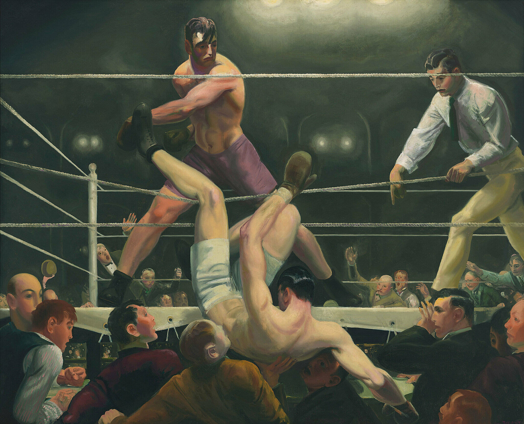
-
702
Robert Henri, Gertrude Vanderbilt Whitney, 1916
Kids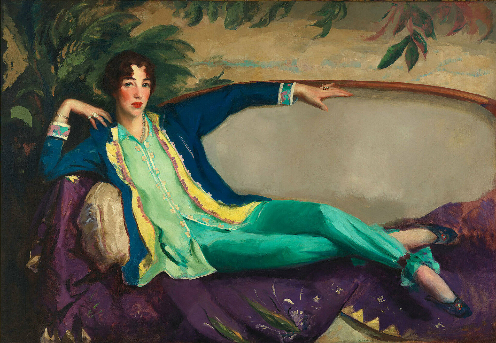
-
703
Madeline Shiff, Wiltz at Work, 1932
Verbal description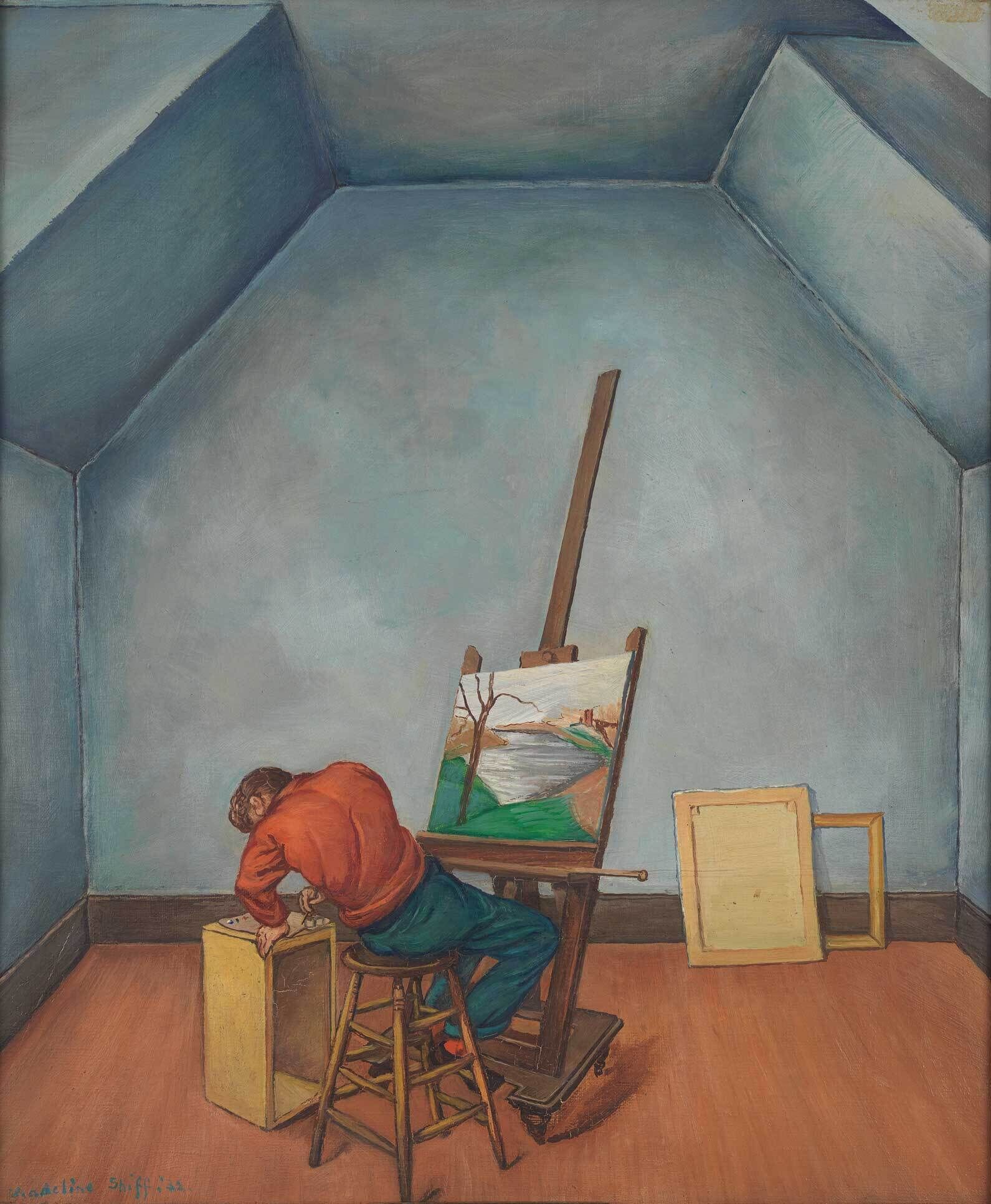
-
711
Elizabeth Catlett, Head, 1947
Audio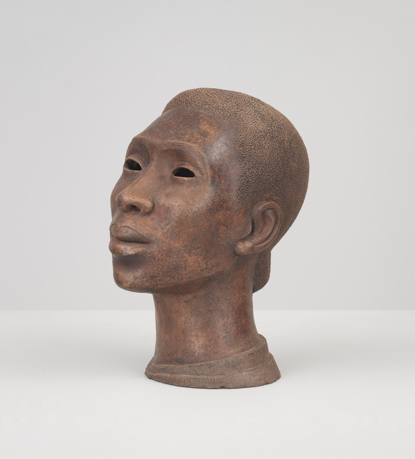
-
720
Joseph Stella, The Brooklyn Bridge: Variation on an Old Theme, 1939
Audio, Kids, ASL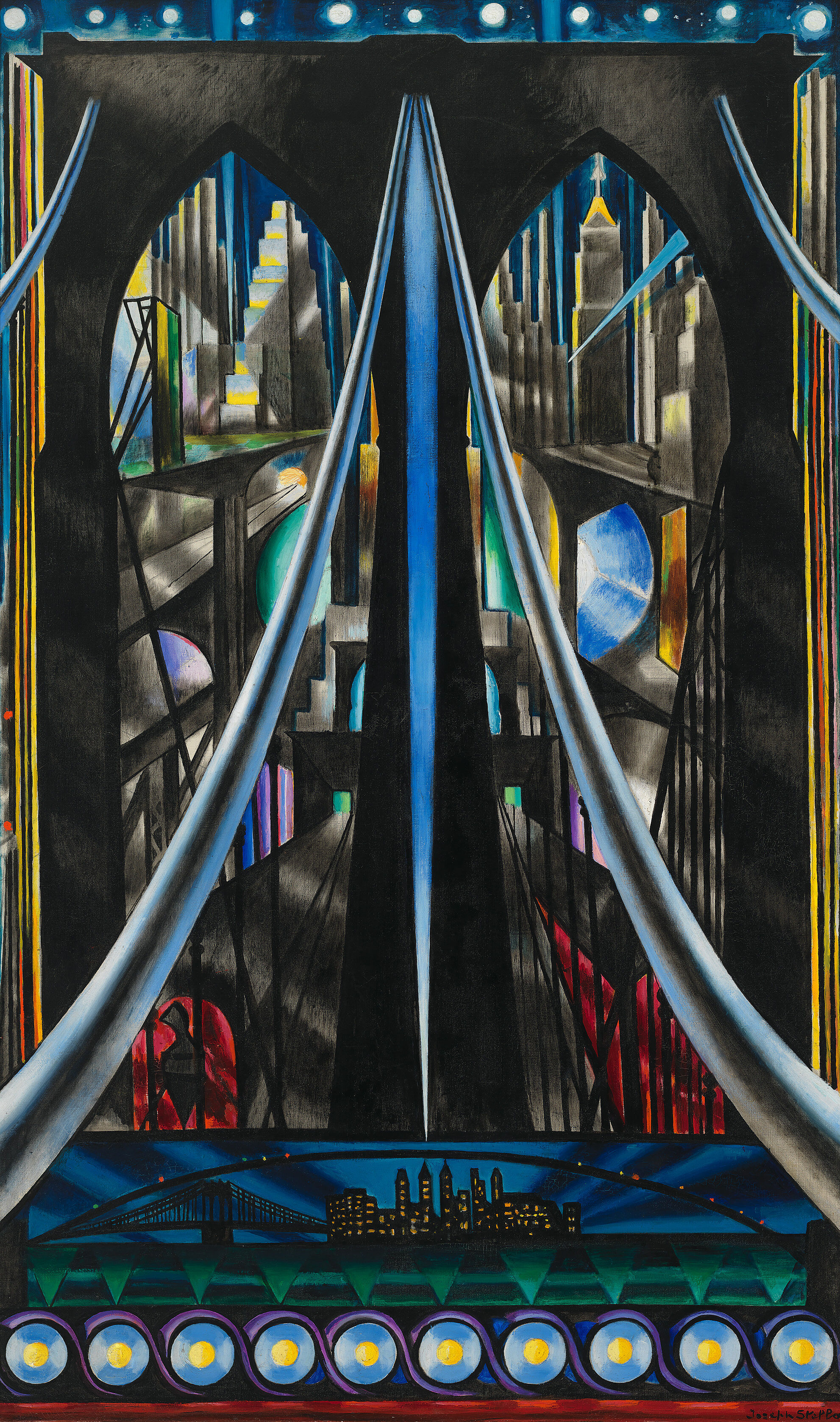
-
721
Elsie Driggs, Pittsburgh, 1927
Audio, Kids, ASL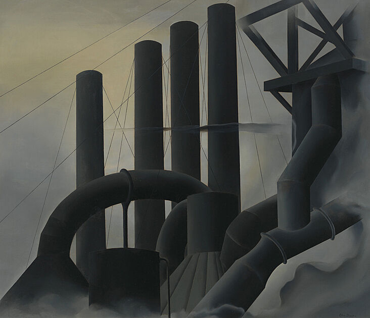
-
722
Charles Demuth, My Egypt, 1927
Audio, Kids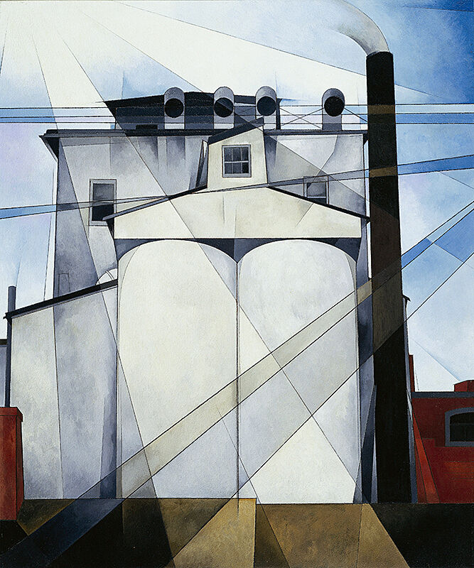
-
730
Alexander Calder, Calder’s Circus, 1926–31
Audio, Kids, ASL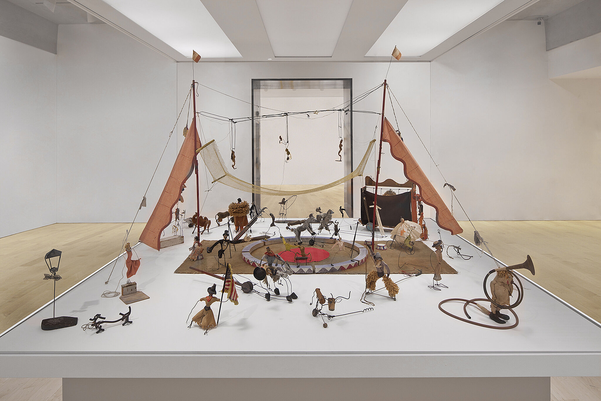
-
740
Georgia O'Keeffe, Music, Pink and Blue No. 2, 1918
Audio, Kids, Verbal description
-
741
Georgia O'Keeffe, Summer Days, 1936
Verbal description
-
742
Marsden Hartley, Painting, Number 5, 1914–15
Audio, Verbal description
-
750
Edward Hopper, Soir Bleu, 1914
Audio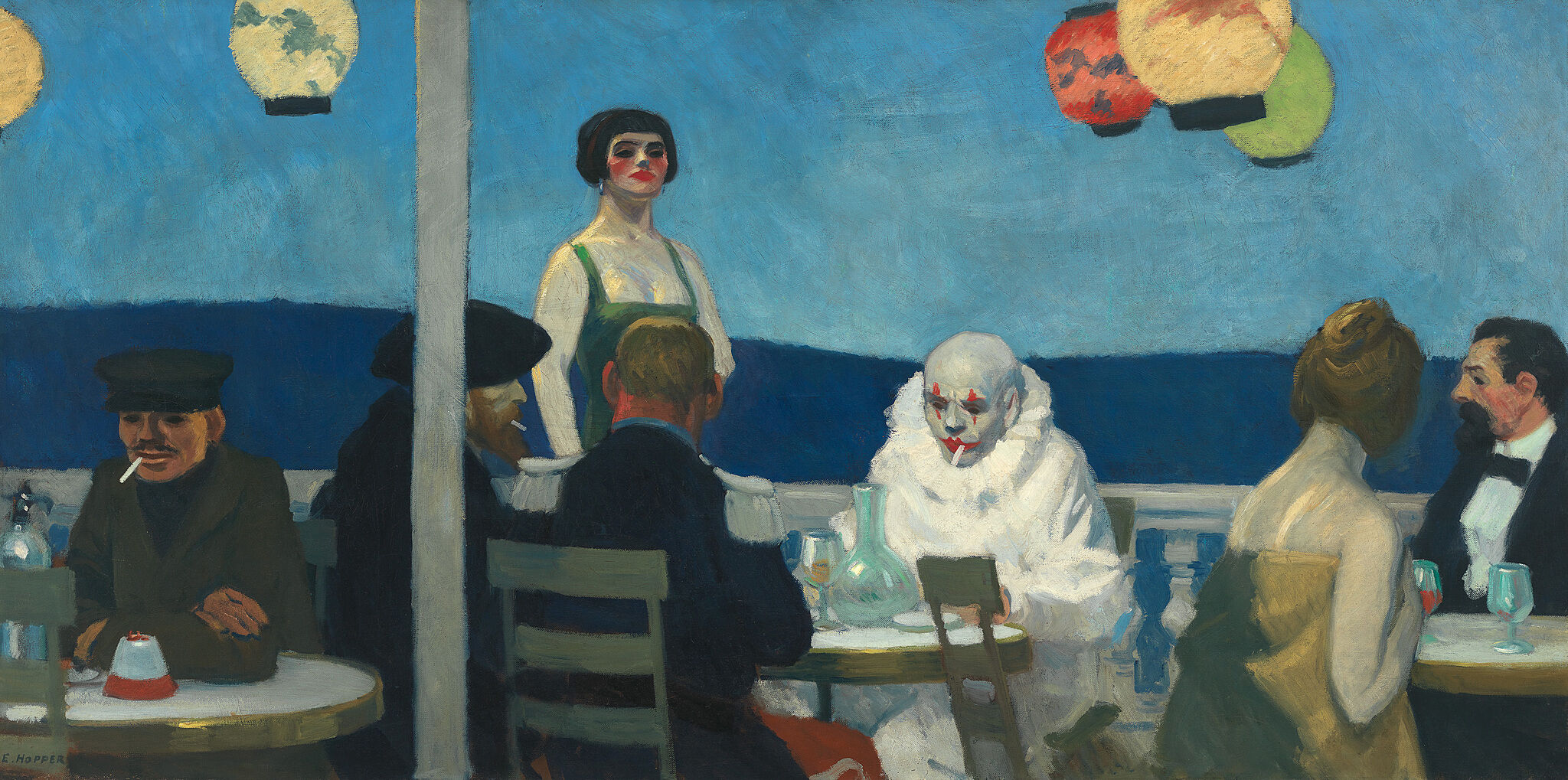
-
751
Edward Hopper, New York Interior, 1921
Audio, Kids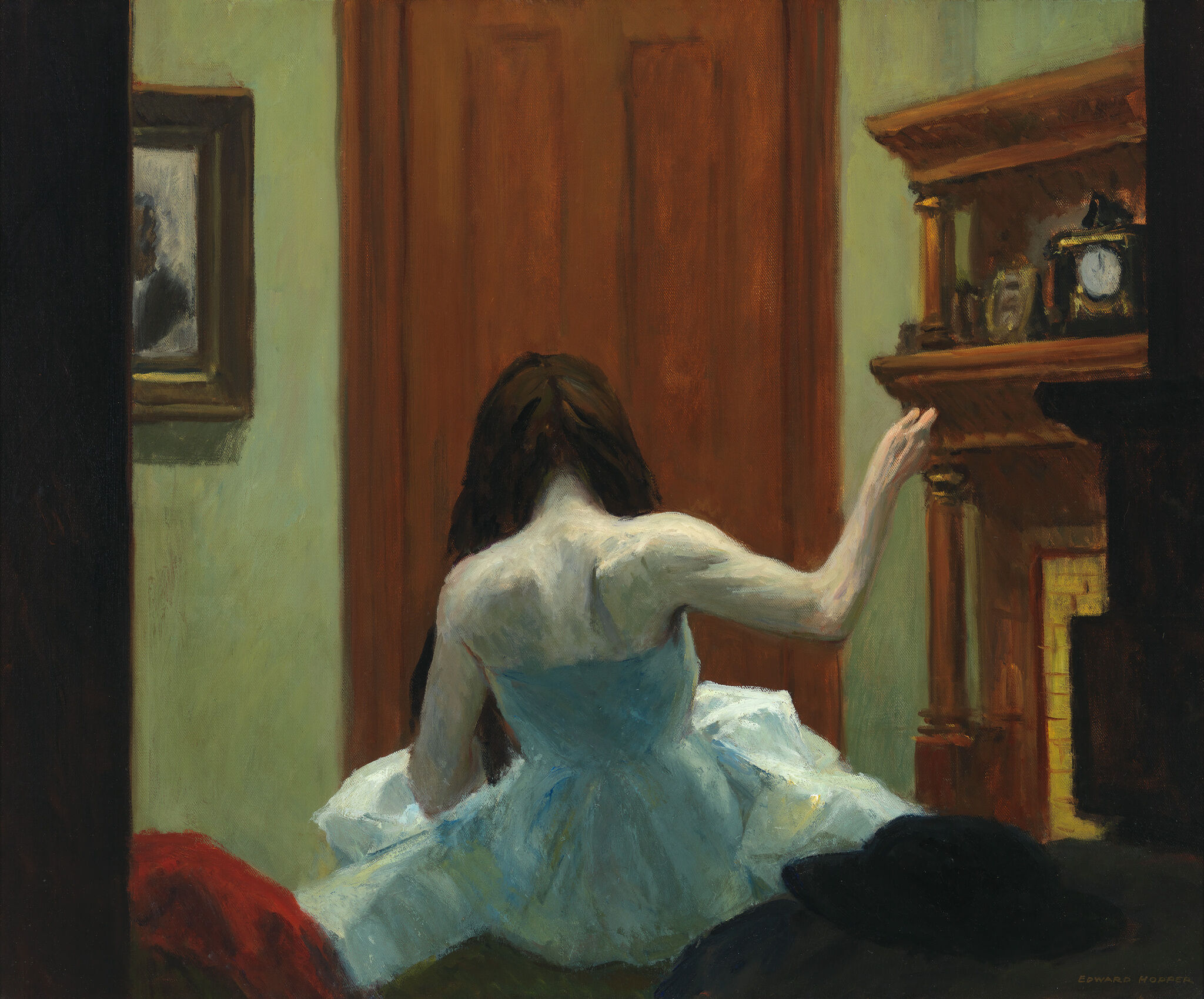
-
752
Edward Hopper, Early Sunday Morning, 1930
Audio, Kids, Verbal description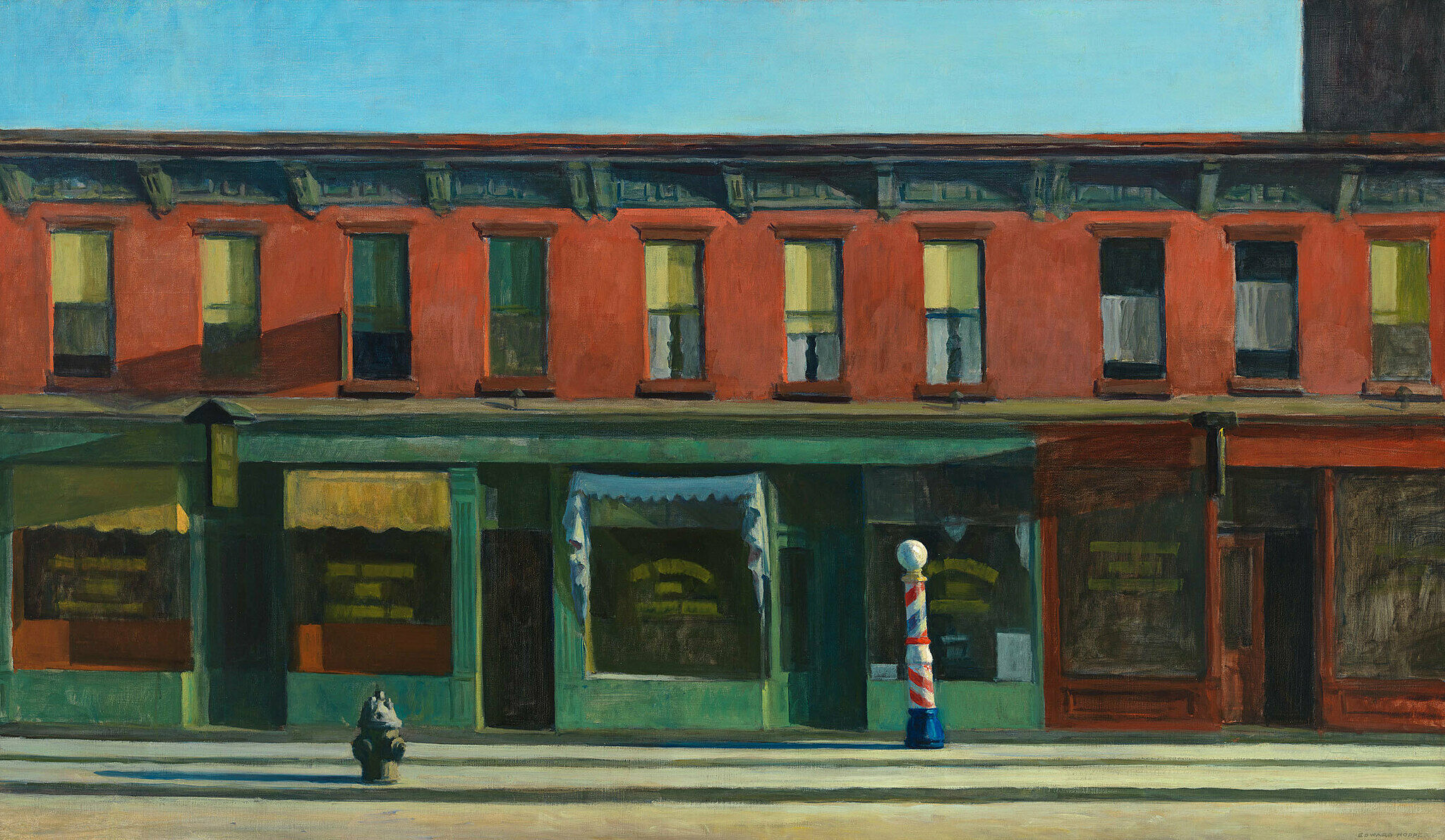
-
761
Man Ray, La Fortune, 1938
Audio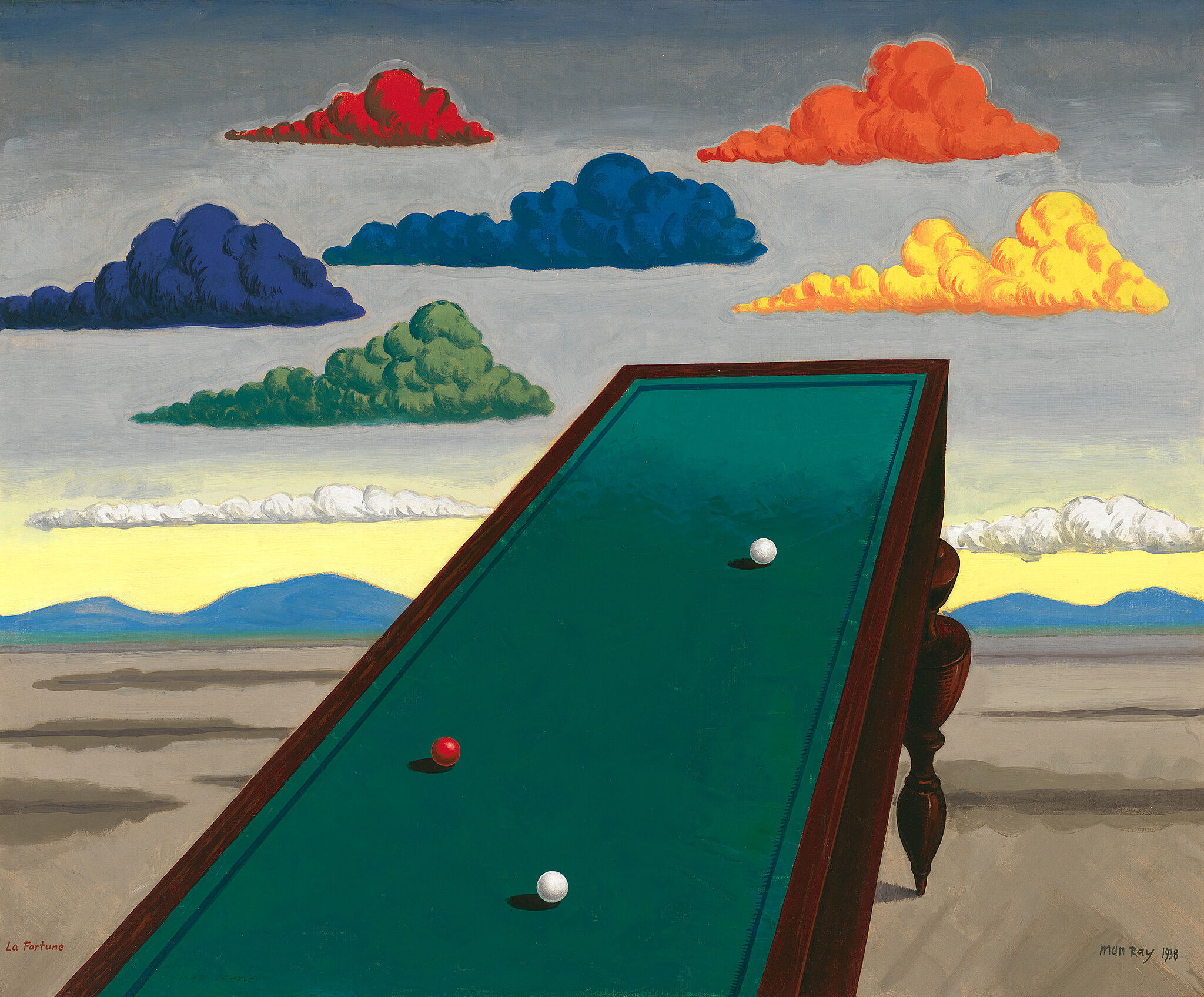
-
770
Jacob Lawrence, War Series, 1946-47
Audio, Verbal description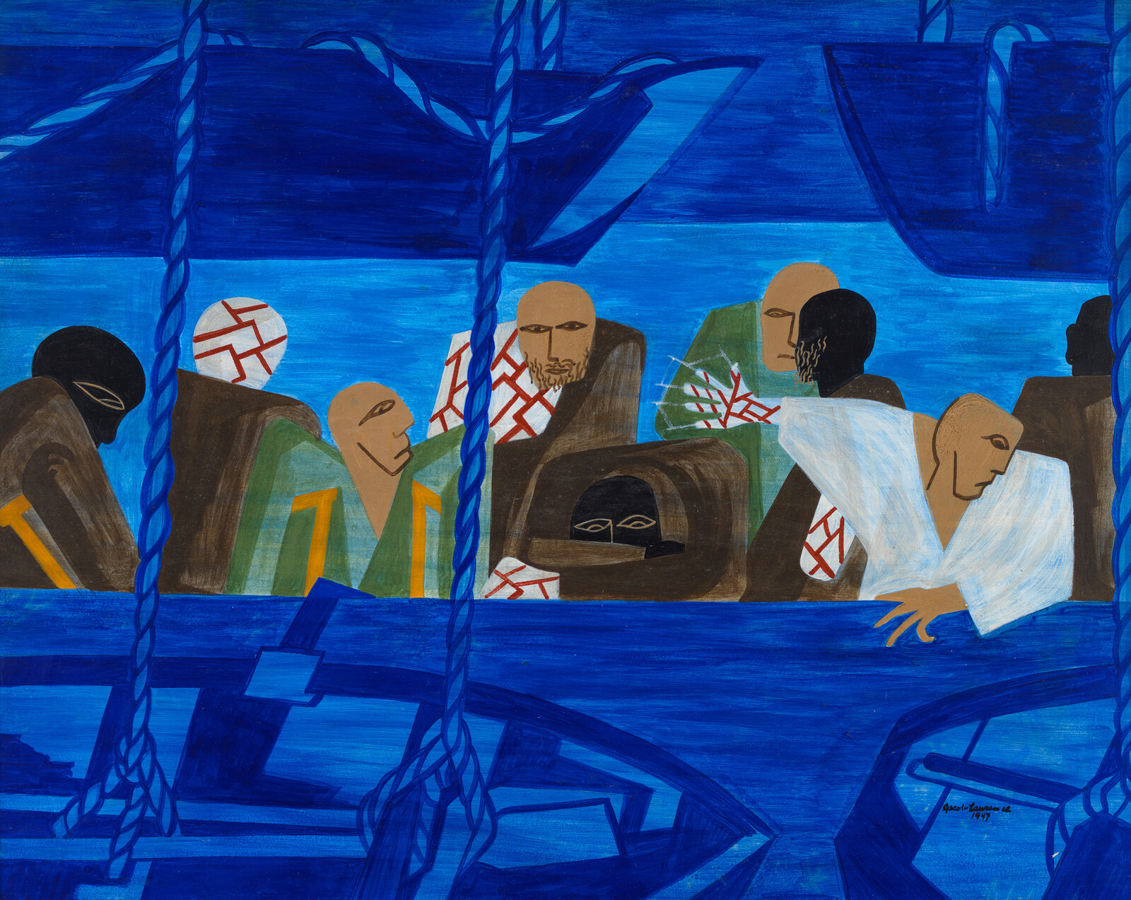
-
782
Jay DeFeo, The Rose, 1958–1966
Audio, Kids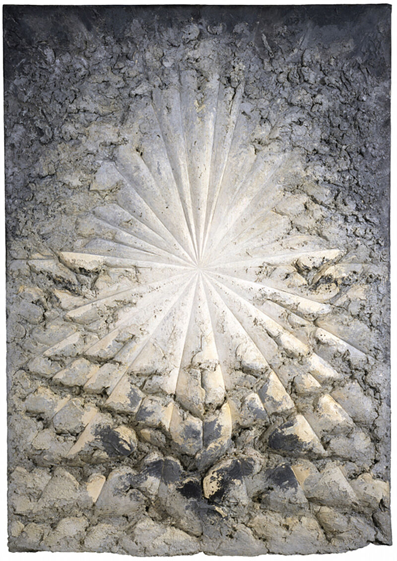
-
783
Norman Lewis, American Totem, 1960
Audio, Kids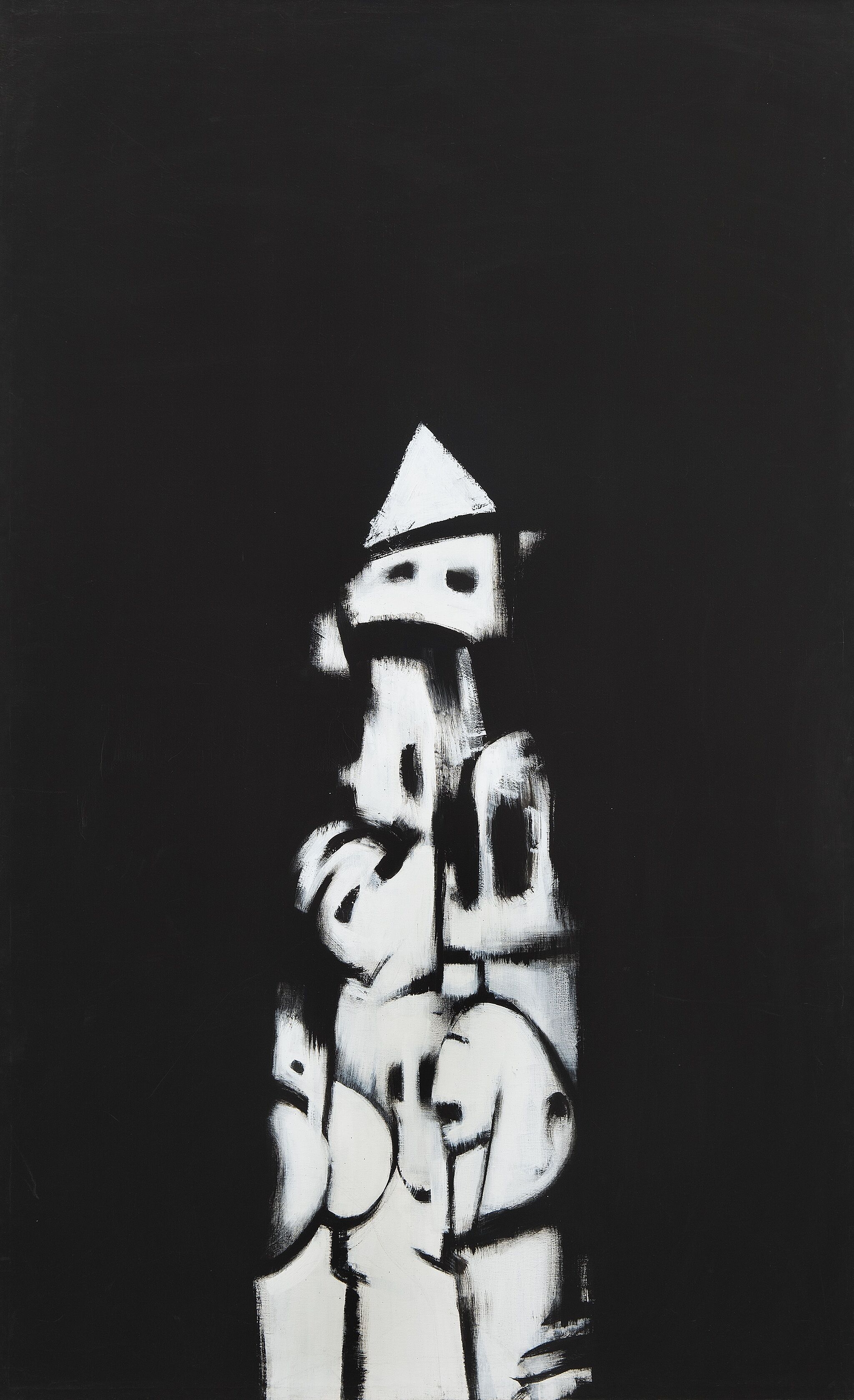
-
784
Ed Clark, Winter Bitch, 1959
Audio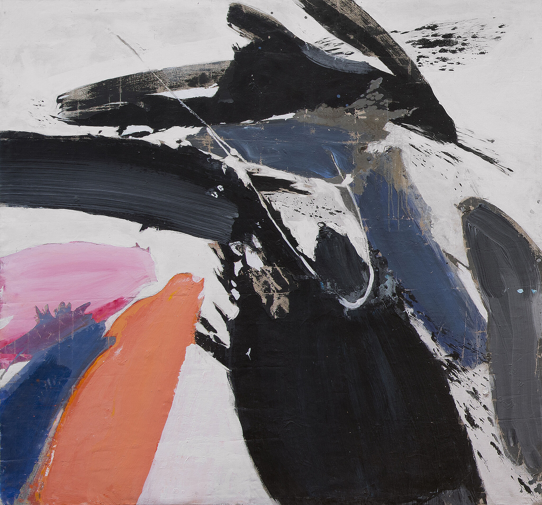
-
791
Jasper Johns, Three Flags, 1958
Audio, Kids, ASL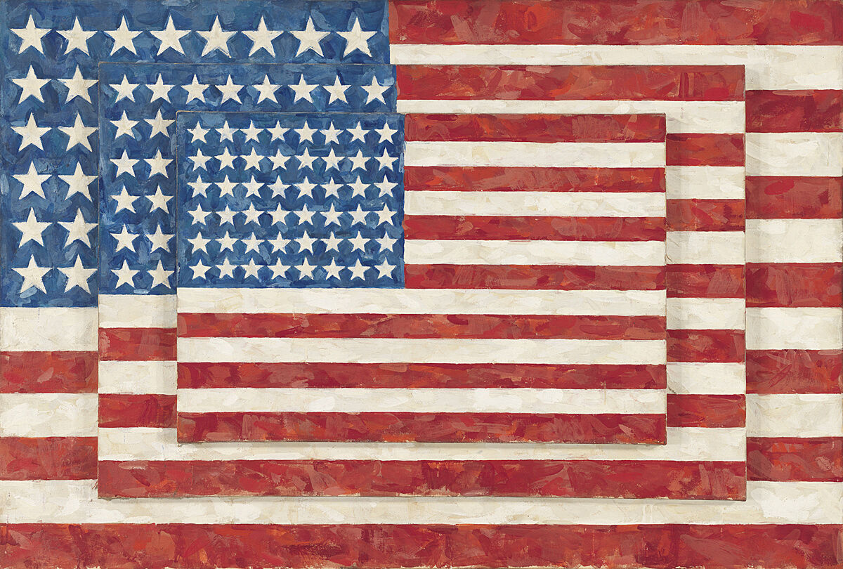
-
791-2
Jasper Johns, Three Flags, 1958
Audio
David Breslin: My name is David Breslin, I’m the DeMartini Family Curator and director of the collection here at the Whitney Museum of American Art. This exhibition, The Whitney’s Collection: Selections from 1900–1965, is one that is completely put together from the museum’s holdings.
What we wanted to do with this exhibition was really try to show the depth and the breadth of the Whitney’s collection—to show icons that people are familiar with, from great paintings by Edward Hopper and Calder’s Circus and Jacob Lawrence’s War Series, to new acquisitions, like Norman Lewis’s American Totem, and this great new painting by Ed Clark that really makes our holdings of abstract painting from the mid-twentieth century look as dynamic as it was. And I think that’s what our collection aims to be—to really ground people in the work of the particular moment, to show how all artwork was once contemporary, but also to show how historical work can have new resonance in our contemporary moment, and we bring our feelings, our politics, our emotions, to these artworks in new ways, and really re-engage them to make them new things. So this installation was really one put together with all those ideas in mind—how to make the old new, how to make contemporary ideas feel as resonant with the older works in our collection as one might see in other exhibitions at this museum, to show things that people might know and love but also to introduce other artworks that can be new favorites for when one comes back to the museum to encounter the collection and experience it anew.
Narrator: In 1923, artist George Bellows’ attended a boxing match on assignment for the New York Evening Journal. He made several drawings, on which this painting is based. The late writer George Plimpton described the painting.
George Plimpton: It shows Firpo, the Argentinian boxer--quite untutored, almost an amateur—in what is considered one of the most dramatic moments in fistic history, namely knocking the champion, Jack Dempsey, through the ropes. Dempsey was destroying Firpo when Firpo hit him with this left, as you can see and knocked him through the ropes. Dempsey was a killer. He was referred to as the Manassa Mauler. and simply destroyed people in the ring with him. It's the sort of painting that I think photography really does now.
It's overdramatic, this picture Dempsey was not a popular champion at all. He was famous for hitting low blows, hitting fighters when they were rising from the canvas. On this particular fight in the Polo Grounds everybody's sitting there—Babe Ruth, all these people, dignitaries. Great courses of booze. And I think they really wanted Firpo, this great amateur, to take him out. He was that unpopular, Dempsey was. Somewhat romanticized here, in Bellows' painting. Firpo looking like sort of a great god, looking indestructible tree-like limbs there, legs. And Dempsey of course looked like a beetle falling out of a tree here. But that wasn't the way it turned out, at all.
Narrator: The fight lasted only four minutes—and Dempsey was declared the winner. But the moment that became boxing legend was the one commemorated in this painting, when Firpo knocked Dempsey out of the ring.
Melanie Adsit: So this is a portrait of lots of people that shows a frozen moment in time. What's happening in this painting?
Student: What's happening in this painting is that there are two boxers, one of them has knocked the other wrestler out, and the one that got knocked out is falling into the crowd, and the crowd is going wild.
Student: The crowd is backing up. Their mouths are open, and they’re not going to be having their mouths open without any sound. It's obvious that they're yelping, screaming, roaring.
Melanie Adsit: Great, you guys. This is a painting made by George Bellows in 1924 of a very famous fight between Jack Dempsey, who was the heavyweight champion of the world, and Luis Firpo, who was his rival from Argentina. We see Dempsey in the white shorts and Firpo in the purple shorts. In the first round, Dempsey knocked Firpo down seven times, but then, Firpo landed a punch right on Dempsey's chin and knocked him out of the ring. How does that change the way that you think about this painting?
Student: This shows that some people never quit, even if their challenge is really hard and they get beat. But if you keep trying, you can throw in one little thing that can change the whole time.
Melanie Adsit: At the end of the fight, though, after this moment, Dempsey got back in the ring, and ultimately Dempsey won the fight. So even though he got knocked out, he came back and beat Firpo in the end.
George Bellows, Dempsey and Firpo, 1924. Oil on canvas, 51 1/8 x 63 1/4 in. (129.9 x 160.7 cm). Whitney Museum of American Art, New York; purchase with funds from Gertrude Vanderbilt Whitney 31.95
Narrator: This is a portrait of Gertrude Vanderbilt Whitney. She was an artist, and the founder of the Whitney Museum. Robert Henri made this painting in 1916—over a hundred years ago. Think about the choices that Whitney and Henri made about how she appears here. For one thing, she’s looking at us very directly. She rests on the sofa with a sense of ease—and she’s wearing elegant silk pajamas. At the time, she would have looked like a very modern woman. In fact, she looked too modern for her husband, who thought it was scandalous that she had herself depicted wearing pants! He wouldn’t let her hang the painting in their mansion uptown. Instead, she displayed it in her studio in Greenwich Village.
Robert Henri, Gertrude Vanderbilt Whitney, 1916. Oil on canvas, 49 15/16 × 72in. (126.8 × 182.9 cm). Whitney Museum of American Art, New York; gift of Flora Whitney Miller 86.70.3
Wiltz at Work is a painting by Madeline Shiff that is 18 inches tall and 15 inches wide. Shiff portrays her husband, painter Arnold Wiltz, with his easel in the center of a small, windowless painting studio. Wiltz is shown from behind sitting on a wooden stool, bent over a small light wooden table to his left in the act of mixing paint. Resting on the easel is a green landscape painting featuring a body of water and a bare tree in the foreground. The natural world depicted inside Wiltz’s painting is in contrast to his relatively blank and windowless surroundings.
The nearly empty room has warm, orange-brown wood floors and blue-gray walls. The back wall is a pentagonal shape, symmetrically framing Wiltz and his canvas in a manner that emphasizes the compact size and barrenness of the studio. The only other objects in the room are the stool Wiltz sits on, his table, and an empty frame leaning against the back wall. Wiltz’s clothes, blue pants and an orange shirt and socks, mirror the colors of the space; the limited color palette adds to the illustration-like quality of Shiff’s painting style and the restricted feeling that she creates in her depiction of this studio. The room’s undecorated walls have a dynamic texture comprising various shades of muted blue and gray paint. This simple, yet painterly wall is punctuated by the vivid landscape painting and the top of the easel.
Shiff, Madeline, Wiltz at Work, 1932. Oil on canvas, Overall: 18 × 15in. (45.7 × 38.1 cm). Whitney Museum of American Art, New York; Purchase 32.51
Dana Miller: This work by the artist Elizabeth Catlett is from 1947.
Narrator: Dana Miller, former curator of the permanent collection at the Whitney.
Dana Miller: She made this work in Mexico, shortly after she moved there to work on a fellowship. This work was made using a terracotta coil technique that was something she learned in Mexico shortly after she arrived, and was an indigenous form of art-making. And for Catlett, I think that was important. She often wanted to look towards this sort of indigenous and local way of making art as a means of inspiration. And for us, this sculpture is just so simple in it’s sort of content, but yet it conveys such depth of feeling. And the planes of the face are just so incredibly beautiful when the light hits them in a certain way.
Narrator: Catlett studied art at Howard University, and then at the University of Iowa. There, she worked with the painter Grant Wood.
Dana Miller: And it was Wood who had a tremendous impact on her. And he encouraged her to paint and sculpt and depict what she knew. And for her that was the experience of being an African American woman. And so much of her output focuses on a very beautiful, sort of dignified archetype of an African American woman.
Elizabeth Catlett, Head, 1947. Terracotta, overall: 10 3/4 × 6 1/2 × 8 3/4 in. (27.3 × 16.5 × 22.2 cm). Whitney Museum of American Art, New York; purchase, with funds from the Jack E. Chachkes Purchase Fund, the +6 Schmidt Shubert Purchase Fund, and the Wilfred P. and Rose J. Cohen Purchase Fund in memory of Cecil Joseph Weekes 2013.103. © Catlett Mora Family Trust / Licensed by VAGA at Artists Rights Society (ARS), New York
Narrator: Artist Joseph Stella first saw the Brooklyn Bridge when he arrived in New York from a small town in southern Italy. He was struck by the technological wonders of the city. The bridge was an iconic symbol of the possibilities of the new world—simultaneously grand and frightening. Many nights, Stella visited the vast expanse of the bridge’s walkway. He later wrote, “I felt deeply moved, as if on the threshold of a new religion.”
Henri Petroski is the Aleksandar S. Vesic Professor of Civil Engineering at Duke University.
Henri Petroski: The cables that dominate this picture are the suspension cables. The Brooklyn Bridge was really a ground-breaking suspension bridge. It was designed by John Roebling, the civil engineer who wanted to connect Brooklyn and New York, which were then separate cities across the East River.
Stella's perspective is essentially the impression you get as you walk along the bridge. The elevated walkway is cradled in these cables, so you’re caught in this net of cables and wires and it’s really a very spectacular setting.
The Brooklyn Bridge walkway provides one of the classic walks in the world. To walk across the bridge and to approach Manhattan at a walking pace is something that is hard to reproduce anywhere else. It gives you ample time to reflect upon the magnitude of the city, the achievements of the engineers and architects who made the city what it is. The people walking on the walkway coming towards you, walking with you, also remind you of the real diversity of the city. It’s just a spectacular, spectacular experience.
Narrator: Artist Joseph Stella moved to America from a small village in Italy and fell in love with the skyscrapers, subways, and bridges of New York City. They were all so impressive! Stella painted the Brooklyn Bridge several times over the years, visiting it like an old friend.
Here, he captures its sweeping cables, glittering lights, bustling traffic, and spectacular views. Imagine that you've just stepped into the painting—maybe with someone who’s never seen New York City before. This massive bridge is almost shaking with energy. Look around. Find the city sparkling ahead of you. Notice the different types of lights Stella added to the top and in between the openings of the bridge. They might remind you of the stars above. Or maybe the headlights of cars rushing across the bridge, or the bright lights of theater on Broadway.
Joseph Stella, The Brooklyn Bridge: Variation on an Old Theme, 1939. Oil on canvas, overall: 70 1/4 × 42 3/16 in. (178.4 × 107.2 cm). Whitney Museum of American Art, New York; Purchase 42.15
Narrator: The factory you see in this painting seems ominous. Look at the four dark cylinders in the center. These are smokestacks, and the thin lines that fill the air around them are support cables. If you think of them only as geometric shapes, they might be beautiful. But as an image of industrialization, they’re gloomy and menacing. They suggest that all is not well in the brave new world of technology. Clouds of toxic fumes drift up from the bottom of the painting and across the sky.
The artist, Elsie Driggs, saw this factory, a Pittsburgh steel mill, on a train trip she took as a child. When she went back in l927 to make a painting, the owners of the mill refused to let her in. They were afraid she was a labor agitator. Anyway, they said, a factory was no place for a woman. Driggs later recalled, “By the time they decided I was harmless, I didn't care if I went in there anymore. But walking up toward my boarding house one night, I found my view. The forms were so close. And I stared at it and told myself, "This shouldn't be beautiful. But it is."
Narrator: Cough, cough, splutter, choke. It’s a little hard to breathe here, outside the factory.
Elsie Driggs made this somber painting of one of the many steel mills in Pittsburgh, Pennsylvania. She liked the cylinder shapes of the chimneys and tubes and thought they had a “cool and classical” beauty. But she wasn't allowed to look inside the factory—the owners told her it was no place for a woman. Instead she found a view from a hill just above the mills. What do you think about that?
Take a look at the colors that Driggs used to make this painting. Why do you think she chose them? What kind of environment is Driggs showing you? It’s pretty dirty, right? But when Driggs made the painting, people didn’t realize what a problem pollution was going to cause. For her, this scene was beautiful.
Elsie Driggs, Pittsburgh, 1927. Oil on canvas, 34 1/4 × 40 1/4 in. (87 × 102.2 cm). Whitney Museum of American Art; gift of Gertrude Vanderbilt Whitney 31.177. © Estate of Elsie Driggs
Adam Weinberg: Enormous concrete grain elevators loom at the center of this painting by Charles Demuth.
At the right, we see an almost elegant-looking smokestack—its plume of smoke barely discolors the clear blue sky. At the bottom left, a small chimney suggests rooftops of buildings dwarfed by the concrete structure behind them—as if the giant silos are actually pushing the older structures right off the edge of the canvas.
What does the presentation of these grain elevators tell us about the ideology behind them? The image is oddly sterile—painted in a precise, machine-like way. The surface of this painting is so pristine, you can hardly find a single brushstroke. It almost looks like a photograph. Rays of light bifurcating the canvas spotlight the building, but the light is cold, almost harsh. The painting’s title provides another clue—it’s called My Egypt. The title and the monumentality of these grain elevators suggest that Demuth is placing the architecture of American industry on par with the great monuments of the past, like the pyramids of ancient Egypt. In this painting we can see both the optimism and the anxiety of the period.
Narrator: This building is an unusual subject for a painting. It’s a plain, industrial looking structure. The painter Charles Demuth filled the canvas with dynamic criss-crossing diagonal lines to make it more exciting to look at. He did something similar with the colors. He started with just a few, but made them more interesting by experimenting with different amounts of lightness and darkness in shapes throughout the painting.
But what kind of building is this? It’s called a grain elevator. In the early 1900s, the family farm began to be replaced by larger scale operations. Trains could move tons and tons of grain, so farmers needed new, modern storage sites. And so the grain elevator came about—and it was more like a factory than a barn. This one was in Lancaster, Pennsylvania, where the artist was born. The building is tipped back slightly, to give the feeling that we are looking up at something huge. By naming the piece My Egypt Charles Demuth lets us know that this building is as important to him as the great Egyptian pyramids.
Charles Demuth, My Egypt, 1927. Oil and graphite pencil on fiberboard, 35 3/4 × 30 in. (90.81 x 76.2 cm). Whitney Museum of American Art, New York; Purchase, with funds from Gertrude Vanderbilt Whitney 31.172
Narrator: Actor Bill Irwin.
Bill Irwin: Welcome, ladies and gentlemen, mes dames et messieurs, to the circus. Beginning in 1926, Calder combined his fascination with movement, animals, and caricature into Le Cirque Calder.
What you see here are a number of acts, each consisting of different characters—acrobats, a bearded lady, a lion tamer and his lion. When performed, Calder would manipulate the parts and figures before you—in one ring, one act at a time.
He would make bleachers from wood crates and planks; erect two tall poles for the high wire and trapeze; hand out cymbals and other noisemakers; cue up records on his gramophone and give his guests a full evening’s entertainment. It was what could be described as the first instance of performance art.
Through the Circus, Calder became good friends with an impressive list of artists, including Marcel Duchamp, Joan Miró, Fernand Léger, Edgar Varèse, Le Corbusier, and Piet Mondrian. These members of the Parisian avant-garde appreciated Calder’s love of play and spectacle—a performance of the Circus meant a very good time. But the artists were also drawn to the serious side of the Circus. Fun mixed with death and danger: the knife thrower aiming to hit a target perilously close to his favorite assistant sometimes missed—with tragic results. But Calder would use the same female figure in the next act, a clever touch his audiences appreciated.
In the first decades of the twentieth century, modernist artists across Europe were searching for ways to merge art and life, technology and design. As playful as Calder’s performance may seem, it beautifully exemplifies these avant-garde impulses. The fact that he put his objects in motion, the characteristic state of modernity, wouldn’t have been lost on any of his observers. And the individual acts were engineered with a great deal of technical skill.
Narrator: Welcome, ladies and gentlemen, Mesdames et messieurs, to the circus!
Alexander Calder built this tiny circus during his years in Paris. He created a complete troupe of performers—from acrobats and animals to clowns and tightrope walkers—using ordinary household materials. Look closely and you’ll see everything from bits of cloth, yarn, and paper to rubber tubes, buttons, and bottle caps.
Calder didn’t design his circus as a three-ring spectacle. It’s more like the intimate, one-ring circuses he saw in France. Now I’d like to introduce two guys who started a traditional, one-ring circus here in New York City. Here’s Michael Christensen, Cofounder and Creative Director of the Big Apple Circus, remembering his circus days in Paris with Founder and Artistic Director Paul Binder.
Michael Christensen: We were a juggling act, a comedy-juggling act. We threw juggling clubs, our hats, our shoes, a rubber chicken, and from time to time a squirting fish named Ronald. Do you remember Ronald?
Paul Binder: I do. And what was funniest about our act is we started where everybody else left off. We started by dropping things.
Michael Christensen: Then once we dropped them—then we had to pick them up.
Paul Binder: Yeah.
Michael Christensen: And that wasn't always easy, and there was a lot of comedy to be had in just picking up one club.
Paul Binder: Or one squirting fish.
Michael Christensen: Named Ronald. Anyway, we found our home in the Nouveau Cirque de Paris. We walked into that ring and felt like home.
And there's an image that always stays with me, Paul and I, behind the curtain, Nouveau Cirque de Paris, looking into this wonderful world of the circus, and we look at each other as if we're nine years old, and we say, “Do you believe it?"
Michael Christensen and Paul Binder: We're in the circus!
Narrator: We asked some more stars of the Big Apple Circus to explain what Calder’s performers are up to.
Alexander Calder, Calder's Circus, 1926–1931. Galvanized steel wire, fabric, rhinestones, thread, 13 3/8 × 6 × 8 1/2 in. (34 × 15.2 × 21.6 cm). Whitney Museum of American Art, New York; purchase with funds from a public fundraising campaign in May 1982. One half the funds were contributed by the Robert Wood Johnson Jr. Charitable Trust. Additional major donations were given by The Lauder Foundation; the Robert Lehman Foundation, Inc.; the Howard and Jean Lipman Foundation, Inc.; an anonymous donor; The T. M. Evans Foundation, Inc.; MacAndrews & Forbes Group, Incorporated; the DeWitt Wallace Fund, Inc.; Martin and Agneta Gruss; Anne Phillips; Mr. and Mrs. Laurance S. Rockefeller; the Simon Foundation, Inc.; Marylou Whitney; Bankers Trust Company; Mr. and Mrs. Kenneth N. Dayton; Joel and Anne Ehrenkranz; Irvin and Kenneth Feld; Flora Whitney Miller. More than 500 individuals from 26 states and abroad also contributed to the campaign. 83.36.22.1a‑c. © 2019 Calder Foundation, New York / Artists Rights Society (ARS), New York
Wanda Corn: When these paintings were seen for the first time, very often critics would see in them female forms. They would see in it allusions to the womb or to female reproductive organs. They would see womanly colors such as the pinks, the blues and the lavender. And it would be read as a painting that was one that could only have been made by a female intelligence.
This was a common way of talking about O'Keeffe's paintings in her early years. It was one that was prompted by her husband Alfred Stieglitz who liked to read in O'Keeffe's paintings an expression of the sort of eternal female.
O'Keeffe herself felt as if that was more a comment on the critic than what she intended. She often would say it's about natural forms, but it's not to be tied to exclusively the female body. And she would have you rather see in a work like this a kind of slipperiness of form where you can't tie it to any one thing, be it a flower or be it a female body or be it a landscape. But that it has poetic allusions to all of those.
Narrator: Georgia O'Keeffe was inspired by things she saw in nature. Even in an abstract painting like this one, she used curvy, flowing lines and brilliant colors that might suggest something natural, like a blooming flower or a shell.
In many of her paintings, O’Keeffe draws your eye from the edge to the center. Here, it moves from a pale billowy arc into deep blue.
Can you picture yourself in this painting? Would you cocoon yourself in the center? Slip along the outer edge? Or wrap the colors around you like a scarf?
O’Keeffe wanted her paintings to express feelings that she didn’t have words for. She called this painting Music, Pink and Blue No. 2. Music can express feelings even when it’s instrumental, and doesn’t have lyrics. O’Keeffe thought paintings could be the same way—they didn’t need to have identifiable images. They could communicate in other ways. Can you see the rhythms in this painting?
Georgia O’Keeffe’s Music, Pink and Blue No. 2 (1918) is an oil painting on canvas. It measures 35 inches in height and 29 15/16 inches in width. It measures 88.9 centimeters in height and 76 centimeters in width.
This is an abstract painting. The colors are pale and light with an emphasis on pinks and blues. Emerging from the bottom of the painting, near the right corner, vertically slanting to our left is a blue tongue shape. Softly curved, swaying to our left, the color of aqua tinted water—this shape can be seen as a hole or a void. It is surrounded by an outer ribbon of white space that is tinged with tones of mint green and pale pink. The way this outer shape folds over the blue area intensifies the sense that we are gazing into the opening of an interior space. The curved white outer area is rimmed with a thin edge of pink and red—the colors bear a relationship to blood and flesh. Beyond this area are petal forms of pale violet outlined in red. These petals rest upon each other and morph into soft hills on our left. Behind these lavender petals is a crack between folds of pink and peach that rise to the top of the painting—a little left of center. Surrounding these folds and the soft fluttering petals that surround the white ribbon that homes the blue void from which we started this description is a background of light blue that turns to a pink violet in some areas and into light ripples in the upper right corner. O’Keeffe uses thin translucent washes of oil paint to create her seductive abstraction.
Georgia O'Keeffe, Music, Pink and Blue No. 2, 1918. Oil on canvas, 35 x 29 15/16 in. (88.9 x 76 cm). Whitney Museum of American Art, New York; gift of Emily Fisher Landau in honor of Tom Armstrong 91.90. © The Georgia O'Keeffe Foundation/Artists Rights Society (ARS), New York
Narrator: Georgia O’Keeffe’s Summer Days is a vertical oil painting on canvas. It is about 3 feet tall by 2.5 feet wide. The paint handling is smooth and even across the surface of the work. It depicts a large deer skull with antlers and a bouquet of wildflowers floating in the clouds above a mountainous desert landscape.
A nearly life-sized skull dominates the work. The head is tilted forward — so that the viewer sees its top—and is painted in creamy white and beige tones. O’Keeffe paid particular attention to anatomical detail, such as eye sockets, ridges along the snout, and a fissure that runs from above the eyes to the nasal cavity, emphasizing the form’s symmetry. The skull is centered on the work’s vertical axis and stretches from the top edge of the canvas, which is grazed by the tip of its left antler, to just below the middle of the composition.
A few inches below the hollow nasal passage of the skull, there is a loosely arranged bouquet of five flowers. A red bloom floats on the clouds beneath the skull, and two pink and two yellow flowers stretch diagonally up toward the right, with the upper petals of the topmost yellow blossom at the same height as the skull’s nose.
The skull and the flowers appear to rest weightlessly atop the clouds, which are rendered in a soft white tinged with subtle grays and fill the composition from left to right. It is only in the bottom fifth of the canvas, beneath the flowers, that blue sky starts to peek through the clouds, just above the mountains. The undulating landscape, painted in a range of earthly orange hues, stretches across the bottom of the composition from left to right. The mountains appear to be far in the distance, occupying only a few inches of the lower register of the painting.
Georgia O'Keeffe, Summer Days, 1936. Oil on canvas, 36 1/8 × 30 1/8 in. (91.8 × 76.5 cm). Whitney Museum of American Art, New York; gift of Calvin Klein 94.171. © 2019 Georgia O'Keeffe Museum / Artists Rights Society (ARS), New York
Learn about the symbolism in this painting.
Painting Number Five, by Marsden Hartley, is an exuberant cacophony of color and pattern. Near the center of the canvas, two circles overlap—one contains the German Iron Cross, a medal of valor awarded to German soldiers for their courage in battle. The other contains a red cross. Look carefully and you can find references to flags, military insignia, and even an army uniform. The effect is like a collage, combining impressions of things Hartley encountered in Berlin, where he lived before the start of the First World War.
What is the real subject of this painting? Think about how you recall things that have happened to you in the past. Often, it’s hard to conjure up a sense of something in its entirety. We remember a person or an event in the details—a gesture, a smell, a color. Hartley’s paintings function that way too; it’s actually a portrait, although the literal image of an actual person is altogether absent. The painting commemorates a young German officer, Karl von Freyburg, who died in the early months of World War I. Hartley was in love with von Freyburg, and he made this painting after learning of his death.
Inspired by European avant-garde artists of the time, Hartley began to move away from direct representations of his subject matter toward more abstract, evocative imagery. Hartley once said that the artist’s challenge was to reveal what he called “the magic that is beneath the surface of what the eye sees.” In this painting, he captures a sense of an individual personality, and the emotional content of his relationship to Berlin and to von Freyburg.
Marsden Hartley’s Painting, Number 5 (1914–15) is an oil painting on linen. The work measures 39 1/4th inches in height and 32 inches in width. It measures 99.7 centimeters in height and 81.3 centimeters in width.
This painting is filled with fragments of military pageantry that include banners, flags, medals, buttons, epaulets and symbols that are incorporated into an abstract composition. The fragments are subsumed into the shapes, patterns and colors of the overall work. We focus first on a round shape, which sits a little off-center within the painting’s overall composition. In its black circular center is a red cross, whose four arms are of equal length that get wider at the ends. It is surrounded by two outer circular bands: one is white and wide followed by a thin green outline. This circular shape overlaps another circular shape containing a black iron cross. It is placed within a red circle with a wide, golden band around its circumference.
Partially obstructed by these two circular shapes is a pole—yellow and black in color—that rises to the top of the painting and angles to our right. The lower part of the pole does not extend to the bottom of the painting. Black and white lines are attached to the pole and fan out to our right; they bear a resemblance to a flag fluttering in the wind though its stripes are partially hidden by the circular framed crosses.
As we work our way to the bottom half of the painting below the crosses, we can see rectangular shapes of military medals, red ribboned with yellow medals. A fragment of the number “8” slides into view while to our right there is the checkered pattern of a chess board that we gaze down upon. (The artist has placed us in this position.) Epaulet-like shapes and designs that resemble military buttons are scattered and inserted in a composition dominated by curved bands of color and angled stripes that extend to the edges of the canvas. Vertical shapes reference flag poles. Imagine being inside a parade—jostled by military paraphilia—uniforms, flags, banners and crowds. The artist achieves this through his use of recognizable fragments and differing shapes that fill the canvas. Hartley’s palette employs bright reds, dirty yellows, milky whites set off by dark areas—all applied in a chewy painterly style.
Marsden Hartley, Painting, Number 5, 1914–1915. Oil on linen, overall: 39 1/4 × 32 in. (99.7 × 81.3 cm). Whitney Museum of American Art, New York; gift of an anonymous donor 58.65
Narrator: Dr. Rick Brettell is a professor of Aesthetic Studies at the University of Texas, and has written extensively about Hopper in Paris. He considers Soir Bleu the single most ambitious painting of Edward Hopper’s career.
Rick Brettell: Soir Bleu is an odd painting for Hopper, because Hopper’s oil paintings of any sort of decent scale, up until Soir Bleu were generally landscapes or cityscapes that were space positive and had tiny or nonexistent human figures. Soir Bleu is a figure painting. And it’s a figure painting that shows that Hopper had wanted to actually take on the big canvases of Matisse and Picasso. Even the title of Soir Bleu, which was, it is today, and when it was shown for the first time in 1915 in French. So he wants to make you think French and think of France. He doesn’t call it Blue Evening. He calls it Soir Bleu.
Narrator: Hopper depicts an odd assortment of people gathered under a tent at the end of a party. Among them: on the far left, a working-class man smoking a cigarette; in the center, a sex worker and a clown, and on the far right, a bourgeois or upper middle class couple.
Rick Brettell: No one is like anybody else. Everybody is separated from everybody else. Hopper kind of translates it into an everyman setting, in which most of the people in it, are part of a kind of world of alienated urban entertainment, in which one is always searching for a meaning somewhere else, in a costume or in a prostitute or in a drink or in a cigarette or in a party, And those sorts of worlds is the world that Hopper of course represents so importantly when he comes back to New York in 1910 and remains there until the end of his life.
Edward Hopper, Soir Bleu, 1914. Oil on canvas, Overall: 36 × 72 in. (91.4 × 182.9 cm). Whitney Museum of American Art, New York; Josephine N. Hopper Bequest 70.1208. © Heirs of Josephine N. Hopper/Licensed by VAGA, New York, NY
Narrator: Artist and art critic Brian O’Doherty.
Brian O’Doherty: We're looking at New York Interior. He was 39 when he did that. But Hopper lived long and he was a slow starter, determined. He was a long-distance runner and he paced himself. So, New York Interior proves something that he said to me. He said every artist has a core of originality, a core that is himself. And how does that come out in art? It comes out in the format of things. It comes out in the concerns, the themes, and the details of the paintings he does, even when he's young.
Narrator: In New York Interior, as is true in paintings from throughout his career, Hopper offers select details, but ultimately doesn’t reveal who or what we are looking at.
Brian O’Doherty: But she does seem to be a sort of ballerina or dancer. She's in a very flouncy dress. But as I look at it further I see that what she's doing is she's sewing something on her lap and the hand raised, as you may remember from watching your mother. She's sewing and in that hand there's probably—if we could see closely enough—a needle.
Now on the right there is some typical Hopper furniture, a clock that's rather unusual; time is present. On the left there's another picture. And I look at those things and they're incidentals which gradually tended to be burned away from his art as his vision got purer. But what I do look at as a very powerful thing is that big black vertical on the left which is holding the piece in and is like a kind of exclamation saying, "Look at this picture."
Jane Dickson: New York Interior, 1921, is somewhat unusual for Hopper compositionally in that it's absolutely centered, and it's one-point perspective as opposed to diagonals.
Narrator: Artist Jane Dickson.
Jane Dickson: So right in the center of the composition, we see the somewhat muscle-y shoulders and back. She's wearing a strapless dress, and she's sewing. And to me, she looks like an aging ballerina.
Narrator: He seems to be looking through a window.
Jane Dickson: You see black on either side, which really sort of locks her in there. And then there's these hillocks of fabric that are between us, the viewer, and her. So there's many obstacles to her, and she's in her own fantasy world.
So it's like, she's imagining a life that maybe she's already passed. And if you notice, her hand that's up pulling the thread is pointing to a clock on the mantelpiece, which is a medieval symbol for time passing.
Mark Joshua Epstein: Now we're here at New York Interior by the artist Edward Hopper.
Student 1: I notice that it's a woman in a very beautiful, elegant dress, but it kind of looks depressing because of how dark it is.
Student 2: Also, her hand is up in the air, and I was wondering why, and she's holding her dress up, so it almost looks like she's fixing it or something.
Student 3: I see in the top right corner there's a clock, and it looks like both of the hands are pointing at the twelve, so that shows it might be late at night.
Student 4: She kind of seems lonely. Maybe she was in a relationship of some sort and they decided to separate.
Mark Joshua Epstein: A lot of historians think that Edward Hopper was inspired to paint this scene by his travels on the El Train, which was a train in New York that had an elevated track, so he could see through people's windows when he was on the train.
Student 1: Well, now that you said that, I noticed that the sides are cut off so it looks like a window.
Student 2: I'm kind of thinking since he only really got a glimpse of what was happening, you can't really totally describe the significance of the moment, and so she might actually be really happy, because from that point of view, you can’t really see her face.
Mark Joshua Epstein: One other question I had just to think about our own experience for a moment, if you walked into the museum, and you saw a painting like this of you through a window of your apartment, how would you feel?
Student 1: I would feel kind of invaded, like somebody took a picture of me.
Student 2: I would also feel kind of like, why are you looking at me, and what's so interesting about me when I'm just sewing up my dress?
Student 3: Unpopular opinion. It would be cool to have a painting by a famous artist about you. I'd be kind of surprised, but I'd also be like, cool!
Edward Hopper, New York Interior, c. 1921. Oil on canvas, Overall: 24 1/4 × 29 1/4 in. (61.6 × 74.3cm). Whitney Museum of American Art, New York; Josephine N. Hopper Bequest 70.1200. © Heirs of Josephine N. Hopper/Licensed by VAGA, New York, NY
Narrator: Hopper once said that Early Sunday Morning was “an almost literal translation of Seventh Avenue.” But the painting is more complex than that description might suggest.
Andrew Berman: On the one hand you have this incredibly intimate view of this diminutively scaled row of stores with what seemed to be residences above them.
Narrator: Andrew Berman is Executive Director of the Greenwich Village Society for Historical Preservation.
Andrew Berman: But you have hints of the sort of bigger city around it, that kind of peek in from the edges of the frame of the picture, most notably on the right hand side, the larger building that looms overhead, which, in a lot of ways seems to be indicative of the sort of encroaching vertical scale of the city.
The choice of it being in this kind of early morning light, I think adds a forlornness to the image, where you can't help but look at it and say, “What's going to happen to these?” Much as in many of Hopper's paintings, you look at it and you say, “What's gonna become of this person?” There's something about how you've captured them in a moment in time, but you feel a sense of the change that preceded the image and the impending change. And I feel that this really captures that in a very specific way, particularly relating to how New York was developing around 1930, the enormous boom of the 1920s was cresting, and so much of early New York was really changing or disappearing at this time.
Art Spiegelman: Hopper's a regionalist and I've always liked the American regionalists like Reginald Marsh and Grant Wood. But the region that Hopper occupies is basically the desolate inner landscape of America.
And in Early Sunday Morning, I also was aware of how thoroughly related this is to my medium, comics. You know the word comics is kind of a misnomer and in Portuguese, I've discovered, they are called quadrenos, little boxes. And basically Hopper's a painter of little boxes. He takes his little box, he subdivides it into other boxes.
So I think of Early Sunday Morning as a comic strip before the Sunday sun comes up. The boxes before they're fully inhabited. Some people sleeping, some people just sort of brushing their teeth, at best. The stores not activated and therefore full of a kind of sad potential.
It looks like the barbershop pole is sort of already tipping its bulb to the little fire hydrant. It's kind of like the CP3O and R2D2 of 1930. This kind of mechanized urban, but very alive, possibly as least as alive as the people living behind those windows might be creatures.
And it kind of makes a mournful song, even though it's morning.
Narrator: All you’re looking at here is a block of brick storefronts with apartments above them. The title, Early Sunday Morning, may explain the emptiness of the street, but it can’t explain the emotional pull of the painting.
When Edward Hopper made this image in 1930, he based it on a real street he knew—Seventh Avenue South in Greenwich Village. But he’s made it look like any main street in any small town anywhere in America. Notice the storefront windows. They have lettering on them, yet Hopper doesn’t let you make out what the letters say. Hopper is an artist of universals, not particulars; he doesn’t want to be that specific.
Now look up at the windows on the second floor. Begin at the left. A yellow shade is drawn; another is half raised; further along, some of the windows are covered with darker window coverings; to the right, a few more have decorative curtains. Each is slightly different, hinting at a life being lived beyond our view. In this small detail, Hopper makes us acutely aware that the people are missing from the picture. As a result, the painting communicates a sense of loneliness.
At the upper right corner of the canvas, a small dark rectangle rises above the building—the suggestion of a skyscraper in the background. It doesn’t catch your eye at first, but once you notice it, the tall building changes the whole picture. A threat overshadows the otherwise quiet street. Sooner or later the juggernaut of commerce and technology will eradicate a small-town way of life.
Carter Foster: Early Sunday Morning was significant for this exhibition because in doing early research, I was able to identify the building that Hopper was looking at that inspired the painting, through old photographs.
Narrator: You can see one of those photographs on your screen.
Carter Foster: What's interesting about the painting is how Hopper both stretched out the building and condensed it the same time. It sounds paradoxical and it sort of is. But what he did was he added an extra bay, an extra window, so that sort of elongates the top of the structure. But he also added another shop opening in the bottom part, so that you get this compression. You get smaller doors and windows than were actually there.
He sets off that sense of compression with this very prominent barber pole, which I have to read as a stand-in for a human being, and perhaps a stand-in for Hopper himself, who was actually tall and, in fact, by this time, bald.
So you get this face-off between this solid, familiar but mundane building and this very brightly lit barber pole in this kind of masterful composition, perhaps of which the main subject is light and the way light plays off the built urban environment.
Narrator: One of the most important details in Early Sunday Morning is something you might not notice right away—the dark square in the upper right corner. A larger building was going up when Hopper was working on the painting. Its looming silhouette suggests the rapid urbanization and modernization that was transforming the city.
To hear more about Early Sunday Morning and its relationship to Nighthawks—the other painting in this room—please tap your screen.
Carter Foster: I was able to identify the building that Hopper was looking at that inspired the painting, through old photographs.
Narrator: Carter Foster is the Steven and Ann Ames Curator of Drawing at the Whitney.
Carter Foster: What's interesting about the painting is how Hopper both stretched out the building and condensed it the same time. It sounds paradoxical and it sort of is. But what he did was he added an extra bay, an extra window, so that sort of elongates the top of the structure. But he also added another shop opening in the bottom part, so that you get this compression. You get smaller doors and windows than were actually there.
He sets off that sense of compression with this very prominent barber pole, which I have to read as a stand-in for a human being, and perhaps a stand-in for Hopper himself, who was actually tall and, in fact, by this time, bald.
So you get this face-off between this solid, familiar but mundane building and this very brightly lit barber pole in this kind of masterful composition, perhaps of which the main subject is light and the way light plays off the built urban environment.
Narrator: One of the most important details in Early Sunday Morning is something you might not notice right away—the dark square in the upper right corner. A larger building was going up when Hopper was working on the painting. Its looming silhouette suggests the rapid urbanization and modernization that was transforming the city.
Carter Foster: A building very much like Early Sunday Morning forms the background of Nighthawks. Early Sunday Morning represents daytime. Nighthawks represents nighttime.
Here, the overarching subject matter would be times of day and the passing of time, day to night. It's also about memory and the way that the urban environment changes. I think that we can look at the paintings together and they enrich each other and give us a larger context that Hopper was thinking about when he made both works.
Mark Joshua Epstein: This painting is called Early Sunday Morning and it was made by Edward Hopper. What do you notice about it?
Student 1: Well, it looks like everything is closed, and all the shops and the windows are closed, and it doesn’t look like anybody is on the street.
Student 2: I think that it also really looks like a morning because of the way that the shadows are long.
Student 3: It shows the stillness of the morning when the sun just comes up, everybody is still in bed.
Student 4: I’m wondering if, I think the words were blurred on purpose to let you imagine what the shops would be.
Mark Joshua Epstein: Edward Hopper said that this painting was based on a part of Seventh Avenue, which is a north-south Street in New York, and I’m wondering if anyone notices something funny about the shadows.
Student 1: When the sun rises like east-west and when the street’s sky is north-south, it’s kind of weird, because you think the shadows would be going horizontally rather than vertical.
Mark Joshua Epstein: Does anyone think it’s possible that this painting is a result of a combination of observation with imagination?
Student 1: I think yes because the shadows aren’t very realistic. It’s like realistic but then some things are like a little bit off, almost.
Early Sunday Morning is a horizontal oil painting on canvas. It is 3 feet tall and 6 feet wide, so it is twice as wide as it is tall. It shows a block of three attached buildings, all two stories tall, with shops on the street level and apartments above them. The buildings extend horizontally across the painting from the left edge to the right edge. You see them as if you're standing across the street from them.
Above all the buildings is a strip of blue sky, darker blue on the left, becoming lighter and tinged with yellow toward the right side of the painting. Below the buildings is a sidewalk, a curb, and a thin slice of the street. The sidewalk, curb, and street also run from one edge of the painting to the other.
The buildings are in New York City, but Hopper leaves out details like street signs. So it could be any Main Street, in any small town in the United States, during the middle decades of the twentieth century. There’s nothing living or natural in this painting. No people, pets, birds, flowers or trees, though there are hints of human activity in the apartment windows above the stores. And the sunlight is strong.
About a third of the way in from the left there is a fire hydrant on the sidewalk. And slightly right of center on the sidewalk there is a barber’s pole with red, white, and blue diagonal stripes. Except for the barber’s pole, there is no way to know the business of the stores. The storefront windows have lettering on them, but you can’t make out the words. The storefronts on the left and in the center are painted green and have rolled up awnings above their windows. The store on the right is painted red.
The second floor above all the stores is painted deep brick red. There are ten apartment windows, all the same size, stretching across the stores below. Some windows are open, some have yellow shades pulled down to differing lengths. Some windows have dark window coverings. A few have white curtains. In this small detail, Hopper makes us acutely aware that people are missing from the picture.
The sunlight on the buildings is very bright, and it is shining into the painting from the right. You can tell by the shadows. Both the barber’s pole and the fire hydrant cast long, dark shadows to the left, as they block the sunlight coming from the right. The length of these shadows shows that the sun is still rising and low on the horizon. It’s the sunlight and the absence of people that suggest the time is early morning and that the day of the week is Sunday, when few people are outside working or shopping.
Edward Hopper, Early Sunday Morning, 1930. Oil on canvas, 35 3/16 × 60 1/4 in. (89.4 × 153 cm). Whitney Museum of American Art, New York; purchase with funds from Gertrude Vanderbilt Whitney 31.426. © Heirs of Josephine N. Hopper/Licensed by VAGA, New York, NY
Adam Weinberg: In this painting by Man Ray, from 1938, a billiard table stretches toward the horizon.
Above it float rainbow-colored clouds. The imagery defies simple explanation—this is a landscape of the mind, a product of the artist’s vivid imagination. The title, La Fortune, suggests luck. Games of luck and chance often appear in Man Ray’s work. Like other Surrealist artists, he regarded the creative process much like a game, requiring creativity, intelligence, and a playful approach to problem-solving. Man Ray was an American artist who spent most of his life in Europe, where he was a leading figure in the European avant-garde. In 1940, just before the Nazi occupation, he left Paris. He arrived in the United States, part of an enormous influx of exiled artists, writers, and intellectuals. Their presence had a tremendous impact on American culture, and a deep and lasting effect on American art.
Man Ray, La Fortune, 1938. Oil on linen, 23 11/16 × 28 13/16 in. (60.2 × 73.2 cm). Whitney Museum of American Art, New York; purchase, with funds from the Simon Foundation, Inc. 72.129 © 2015 Man Ray Trust / Artists Rights Society (ARS), NY / ADAGP, Paris
Narrator: Lawrence’s War Series originated during his service on a World War II navy transport ship.
Jacob Lawrence: I served on the USS Sea Cloud, which was a weather patrol ship, and I served on the United States Richardson, which was a troop transport. Again, I will never forget that experience. We would go over carrying 5,000 troops—young, American troops—and we would come back a hospital ship. Many of these cases were horrible. They were terrible to see, what can happen in war, especially what can happen to a person mentally, physically, psychologically. I don’t think I can verbalize that, because I would only cheapen the experience.
Narrator: Lawrence was initially given the rank of Steward’s Mate, a post that was often the only one available to African Americans. He soon rose to serve in an integrated regiment as a Coast Guard Artist, going on to document the war in Italy, England, Egypt, and India. After the war, Lawrence became an influential teacher and completed numerous public works and illustrations in addition to his painted works.
Jacob Lawrence’s War Series: Prayer is a horizontal painting measuring about 16 inches tall and 20 inches wide. The majority of the space is occupied by two abstracted human figures seen in profile in the foreground, both kneeling with their heads down and hands resting at their knees in prayer. The figure on the left’s body is rendered as a simplified, blocky, dark brown silhouette, with lighter brown shapes forming the coat-like garment draped over their shoulders. The body of the figure on the right, also rendered as a dark brown silhouette, wears a light green dress and green shoes; a color that is echoed in the fine streaks of paint indicating the sweep of their hair.
The background is a blue and green landscape of silhouetted mountains. The sky is shown as a hazy wash of horizontal strokes of lighter blue paint, delineated from the mountains by a royal blue contour. The outlined arch of the mountains frames the figures, precisely curving over the figure on the left to emphasize their bowed bodies. Along the bottom edge of the composition, a row of reed-like plants grow in short, diagonal sprigs. While the composition is simplified into planes of color, each facet of the picture has a great deal of variation in tone and texture. These variations create an energetic composition which balances the still nature of the scene. The matching shapes and parallel lines throughout this painting emphasize pattern and repetition, perhaps alluding to types of prayer. Lawrence often unified multiple works in a series through color choice, and in cthe deep blues and browns appear across many of the panels.
Jacob Lawrence, War Series: Going Home, 1947. Tempera on composition board, overall: 16 1/8 × 20 3/16 in. (41 × 51.3 cm) Image: 15 7/8 × 20 1/16 × 1/8 in. (40.3 × 51 × 0.3 cm). Whitney Museum of American Art, New York; gift of Mr. and Mrs. Roy R. Neuberger 51.17a-b. © The Jacob and Gwendolyn Lawrence Foundation, Seattle / Artists Rights Society (ARS), New York
Narrator: Dana Miller is the former curator of the permanent collection. She curated the Jay DeFeo retrospective that took place here at the Whitney in 2013.
Dana Miller: The Rose is DeFeo's landmark painting. She spent almost eight years working on it, from 1958 to 1966. When she began the work she had really no notion of what she was going to make. She said the only thing she knew was that she was going to create a painting that had a center. And that's what she began with.
She would apply paint using palette knives and trowels, and build it up in this very, very extensive manner and then carve it back and shape it.
There were days where she would walk into the studio in the morning and the paint had shifted overnight. While she had been happy with what it looked like when she left it the evening before, it had been completely ruined in the course of gravity shifting the paint just because of the thick application. And she would have to, in some cases, scrape it all the way back and start over. It was a sum of its destructions in many ways.
Narrator: Jay DeFeo in 1988.
Jay DeFeo: It reached really final stages. Kind of like a whole cycle of art history. It went through a primitive, archaic, classic, and all on up to baroque and then I realized how flamboyant the whole concept had gotten and I kind of pulled it back to a more classical stage. All of those stages were rather interesting and complete in themselves but just not what the final version was, what I intended. And I suppose, I don’t know whether it would have all gone on, on one canvas if I’d had the kind of studio that it could have spread itself out in a little bit. But I just had one big painting wall.
Narrator: What’s the longest you’ve ever worked on a painting? Jay DeFeo spent nearly eight years creating The Rose, by adding thick layers of paint and then scraping massive amounts away.
Layer then scrape—over and over! In between she added things from her day-to-day life: a barrette, bottle cap, keys, and wire.
Sometimes the thick layers of paint would shift overnight. When it did, DeFeo carefully carved the paint until it was back the way she wanted it. Sometimes, a week or even a month later, the paint would shift again! But DeFeo never gave up. She worked through her frustration until it looked exactly the way she wanted.
As you can probably imagine—eight years’ worth of paint makes for one heavy painting! It is 11 inches thick in places, and probably weighs about a ton. That's about twenty-seven fifth graders!
Jay DeFeo, The Rose, 1958–66. Oil with wood and mica on canvas, 128 7/8 × 92 1/4 × 11 in. (327.3 × 234.3 × 27.9 cm). Whitney Museum of American Art, New York; gift of The Jay DeFeo Trust and purchase, with funds from the Contemporary Painting and Sculpture Committee and the Judith Rothschild Foundation 95.170. © 2015 The Jay DeFeo Trust/Artists Rights Society (ARS), New York
Narrator: Norman Lewis made this artwork, American Totem, in 1960. Instead of addressing racial inequality through representational styles, Lewis turned to abstraction, like many of his contemporaries. He saw action painting, or Abstract Expressionism, as a way to speak to Civil Rights issues.
Norman Lewis: I used to paint Negroes being dispossessed, discrimination, and slowly I became aware of the fact that this didn't move anybody. I found the only way to solve anything was to go out and take some kind of physical action. I find that civil rights affects me, so what am I going to paint, what am I going to do. I don't know. I am sure it will have nothing to do with civil rights directly but possibly I just hope that I can materialize something out of all this frustration as a black artist in America. I think it has to come from black artists.
Narrator: The white, triangular shapes in this painting refer to hoods worn by members of the Ku Klux Klan, a white supremacist hate group.
Norman Lewis: I was born in New York, Harlem. Somebody said violence is as homogenous as apple pie to America. And this is true, you know, but we don't realize it. White America is so goddamn aggressive that it negates anything that gets in its way.
[Oral history interview with Norman Lewis, 1968 July 14. Archives of American Art, Smithsonian Institution.]
Narrator: Norman Lewis called this painting American Totem. You’ve probably heard of totem poles, sculptures made by the Indigenous peoples of the Pacific Northwest. But a totem can be anything that a group of people find spiritually meaningful, and use as a symbol of their identity. Usually, we think of a totem as being an animal or an object—something pretty easy to identify. But if this painting is a totem, it’s a pretty abstract one. A lot of its meaning lies in the shapes, and how Lewis chose to paint them. One thing you might notice is that some of the white forms fade into black, so it’s hard to tell where their edges are—which creates a sense of mystery. You could also observe Lewis packed a lot of irregular shapes into a tight outline. This might create a feeling of tension.
There may be some recognizable imagery in this painting. The two forms at the top look a bit like eyes peering out from beneath a white hood. Together they look like the costumes worn by the Ku Klux Klan, a violent white supremacist group. Lewis was an African American painter working at the height of the Civil Rights movement,which fought for racial equality. He believed that he could use abstraction to communicate his experience—including the frustration of being a Black man in segregated America.
Norman Lewis, American Totem, 1960. Oil on canvas, 73 1/2 × 44 7/8 in. (186.7 × 114 cm). Whitney Museum of American Art, New York; purchase with funds from the Laurie M. Tisch Illumination Fund in memory of Preston Robert and Joan Tisch, the Painting and Sculpture Committee, Director’s Discretionary Fund, Adolph Gottlieb, by exchange, and Sami and Hala Mnaymneh 2018.141. © Norman Lewis. Courtesy Michael Rosenfeld Gallery LLC, New York, NY
Ed Clark: I have a hard time with titling things. That one back there, is called Winter Bitch. That’s a hell of a name.
Narrator: The painter Edward Clark made this work after a five-year stay in Paris, including a particularly cold winter. In an interview with the artist Jack Whitten, Clark describes the city’s influence on his work.
Ed Clark: I mean New York at that very moment was not considered the capital of the art world—it was Paris.
Narrator: Clark began using a push broom instead of a brush to move paint around his canvases. He used them to create thick, gestural bands of color, like the blacks and pinks here.
Ed Clark: The main thing that influenced me in France was the color—the color of the great artists there were more memorable than American color for some reason. There’s something about France—the angle of the sun or something. It gets into your unconscious a little bit. Color was the French thing.
Narrator: This interview is the copyright of BOMB Magazine, New Art Publications, its Contributors, and Edward Clark. All rights reserved. Edward Clark’s oral history by Jack Whitten can be read in its entirety at bombmagazine.org.
Ed Clark, Winter Bitch, 1959. Acrylic on canvas, 77 × 77 in. (195.6 × 195.6 cm). Whitney Museum of American Art, New York; purchase with funds from the Painting and Sculpture Committee and partial gift of the artist 2019.307. © Ed Clark
Scott Rothkopf: We’re looking at a painting called Three Flags by Jasper Johns.
Narrator: Scott Rothkopf is the Alice Pratt Brown Director of the Whitney Museum.
Scott Rothkopf: It was painted in 1958, about four years after Johns made his first painting of a flag. He said that he painted a flag the first time because it was something that came to him in a dream and he also was interested in painting things that he said “are things the mind already knows.” That is, things that we see in our daily lives that the artist doesn’t make up. In that sense, the flag was also in a series that also included targets, numbers, and other forms that Johns didn’t invent, but could take right out of the culture and the images that were all around him.
At the time he did this, it was a really radical act because most of the painting that he would have seen in New York and admired were abstract expressionist canvases that were full of aggressive, exciting, something beautiful and diaphanous marks that painters supposedly made directly on the surface and invented as a way of thinking about picturing a new world. This, by contrast, was something we could all recognize, a flag, a really common symbol.
Mark Joshua Epstein: This is a painting called Three Flags that was made in 1958, by the artist Jasper Johns.
Student 1: It looks like since there are a lot of layers of the American flag, maybe it’s showing that there are a lot of different kinds of people and things in America.
Student 2: Well, first it looks like an optical illusion to me because it’s big, small, and then smaller.
Student 3: I think the artist had this idea, like I’m going to make something with the American flag. They just thought it would look cool, they just stacked a couple of American flags on top of each other. I don’t think it has an actual meaning.
Mark Joshua Epstein: Jasper Johns talked about the American flag as something we see, but that we don’t look at. What do you think he meant?
Student 1: Well, we just kind of just take it for granted. Oh! We see that every day.
Student 2: I think they layered it to make it interesting, so you actually look at it closely and read what the sign says and learn about it and actually get into it, rather than just being oh! that’s the American flag. Next picture.
Jasper Johns, Three Flags, 1958. Encaustic on canvas (three panels), 30 7/8 × 45 3/4 in. (78.4 × 116.2 cm) overall. Whitney Museum of American Art, New York; purchase, with funds from the Gilman Foundation, Inc., The Lauder Foundation, A. Alfred Taubman, Laura-Lee Whittier Woods, Howard Lipman, and Ed Downe in honor of the Museum’s 50th Anniversary 80.32. © 2021 Jasper Johns / Licensed by VAGA at Artists Rights Society (ARS), New York
Scott Rothkopf: A lot of people have debated whether this image is patriotic on the one hand or somehow critical of the American government, and part of its enduring appeal is that we just can’t decide. It’s interesting to think that seeing so many flags could recall parades, patriotism, a kind of festive embrace of American culture, and certainly this painting was made at a very interesting time in American history if we think of the triumphant feeling after World War II, as well as the fear of the Cold War, the repression of the 1950s era. In that way the flag could seem almost oppressive in this case, this kind of exaggerated image of American government, of patriotism, of jingoism, which sometimes stands for things that are not quite as positive as we would like them to be.
Jasper Johns, Three Flags, 1958. Encaustic on canvas (three panels), 30 7/8 × 45 3/4 in. (78.4 × 116.2 cm) overall. Whitney Museum of American Art, New York; purchase, with funds from the Gilman Foundation, Inc., The Lauder Foundation, A. Alfred Taubman, Laura-Lee Whittier Woods, Howard Lipman, and Ed Downe in honor of the Museum’s 50th Anniversary 80.32. © 2021 Jasper Johns / Licensed by VAGA at Artists Rights Society (ARS), New York
0:00
0:00