
Stuart Davis: In Full Swing
2016
-
500
Introduction to Stuart Davis: In Full Swing
Audio, Kids
-
501
Stuart Davis, Lucky Strike, 1924
Audio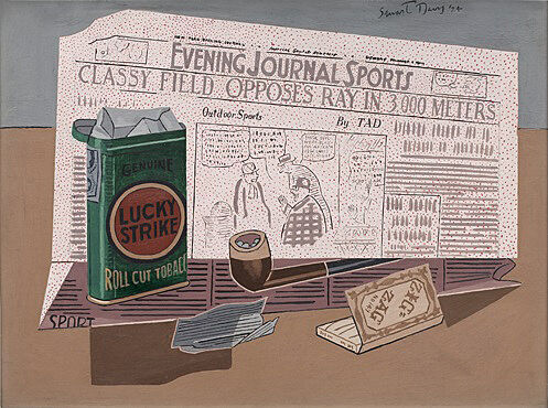
-
503
Stuart Davis, Edison Mazda, 1924
Audio -
504
Stuart Davis, Super Table, 1924
Audio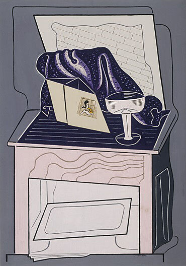
-
505
Stuart Davis, Egg Beater No. 4, 1928
Audio, Kids -
506
Stuart Davis, Rue Lipp, 1928
Audio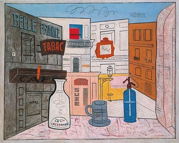
-
507
Stuart Davis, House and Street, 1931
Audio, Kids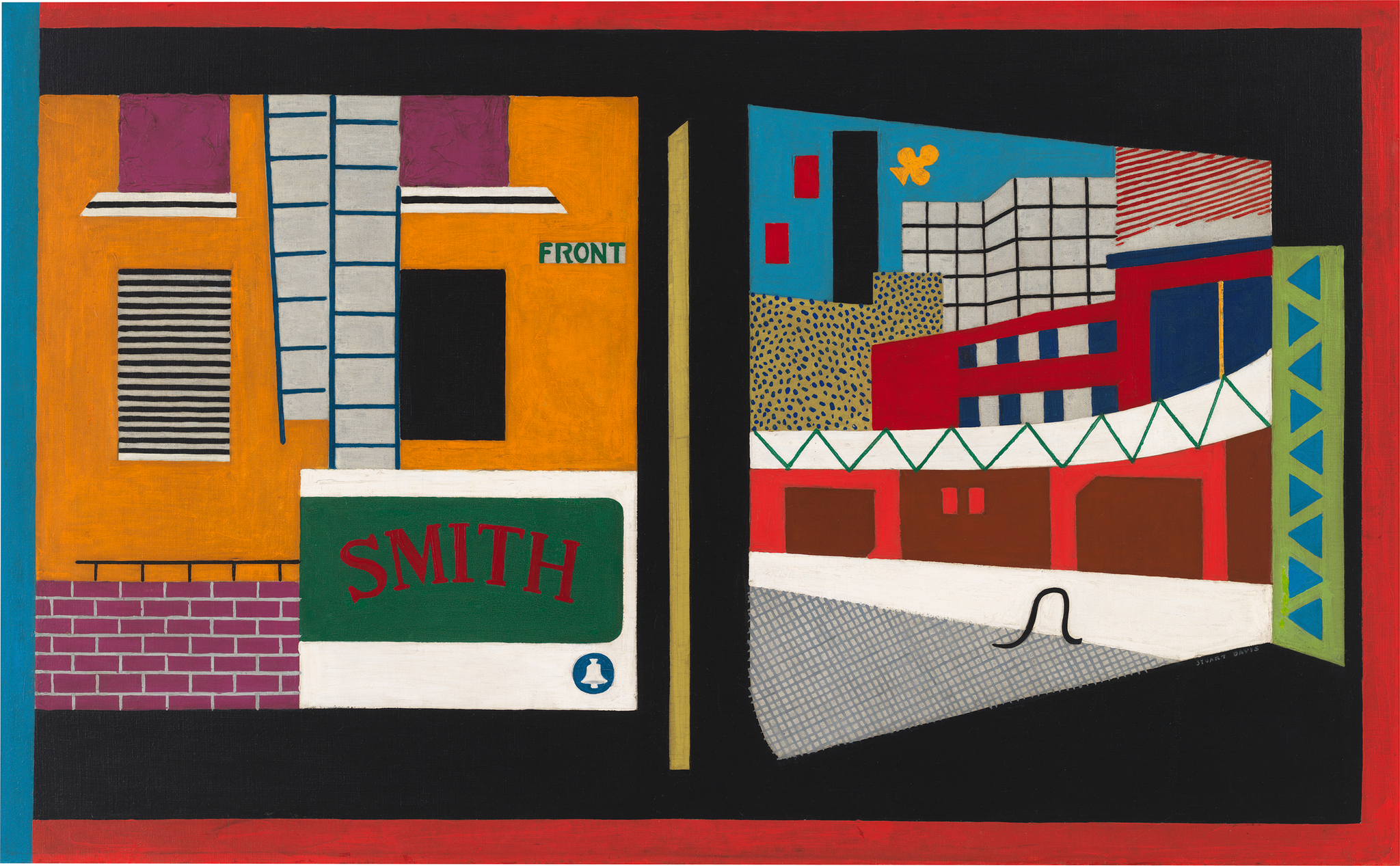
-
508
Stuart Davis, New York Mural, 1932
Audio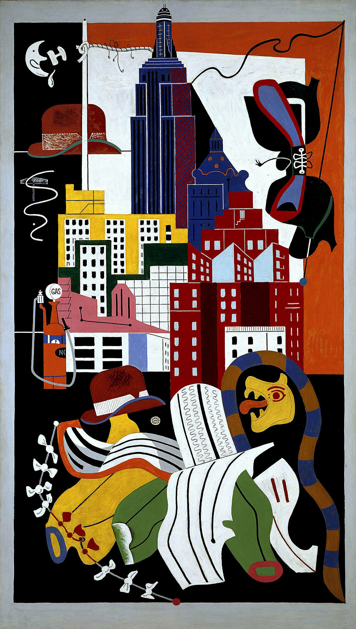
-
509-2
Stuart Davis, Swing Landscape, 1938
Audio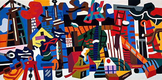
-
510
Stuart Davis, Mural for Studio B, WNYC, Municipal Broadcasting Company, 1939
Audio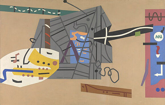
-
511
Stuart Davis, The Mellow Pad, 1945-51
Audio, Kids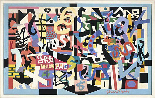
-
513
Stuart Davis, Little Giant Still Life, 1950
Audio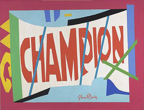
-
514
Stuart Davis, Owh! In San Pao, 1951
Audio, Kids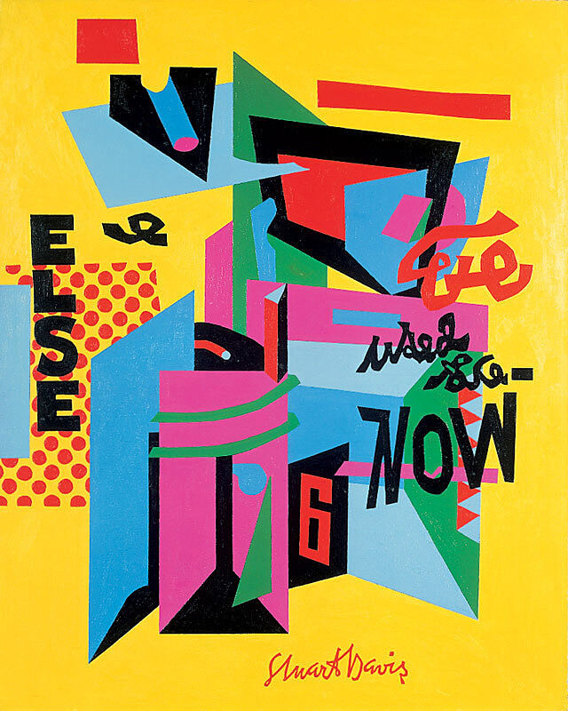
-
515
Stuart Davis, Rapt at Rappaport’s, 1951-52
Audio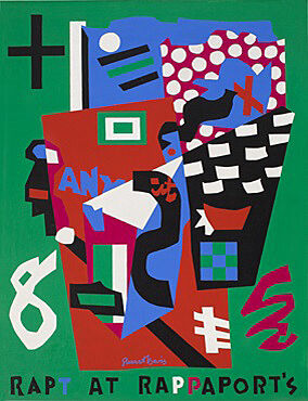
-
516
Stuart Davis, Memo #2, 1956
Audio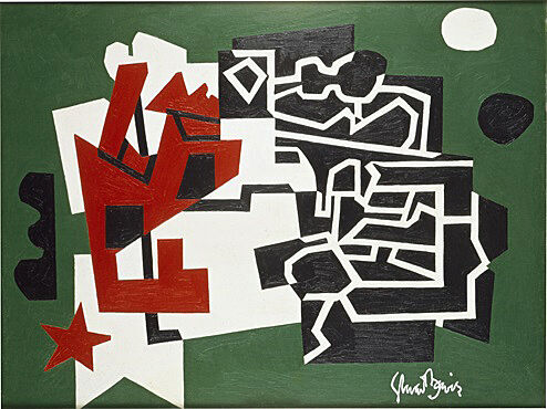
-
516-2
Stuart Davis, Memo #2, 1956
Audio
-
516-3
Stuart Davis, Memo #2, 1956
Audio
-
517
Stuart Davis, Premiere, 1957
Audio, Kids
-
518
Stuart Davis, American Painting, 1932/42-54
Audio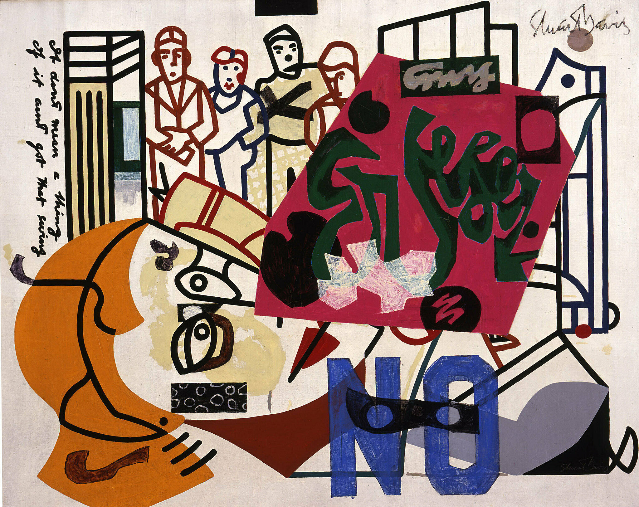
-
519
Stuart Davis, Fin, 1962-64
Audio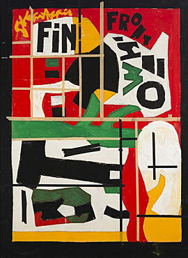
-
509
Stuart Davis, Swing Landscape, 1938
Audio, Kids
-
512
Stuart Davis, Colonial Cubism, 1954
Audio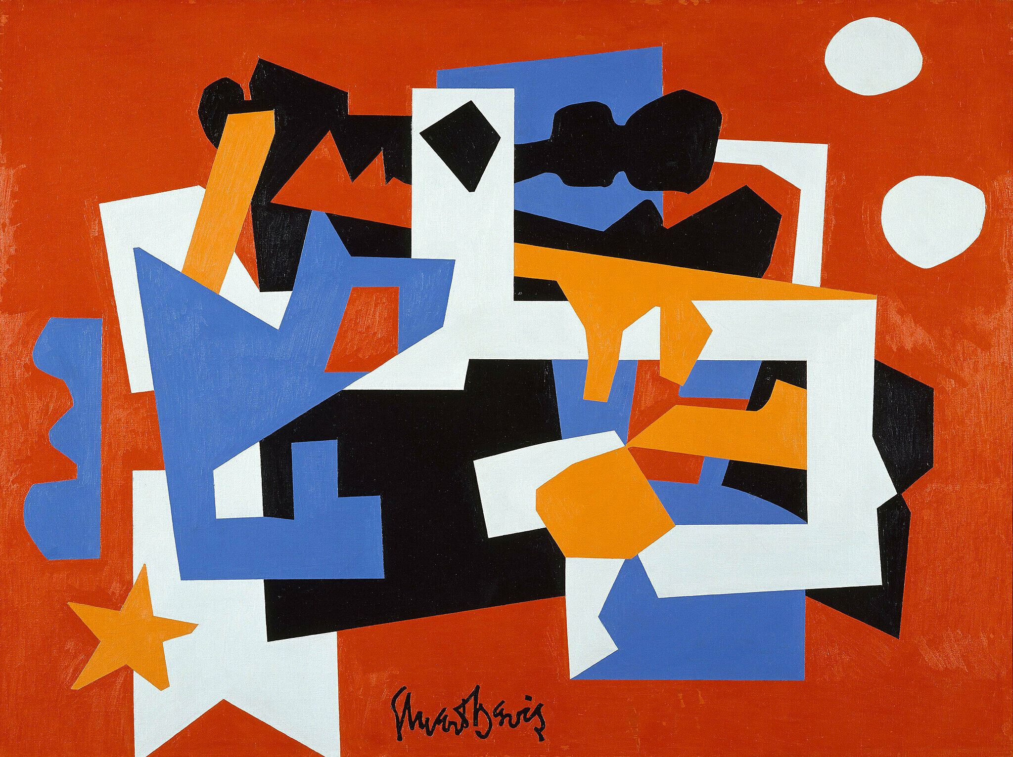
-
502
Stuart Davis, Odol, 1924
Kids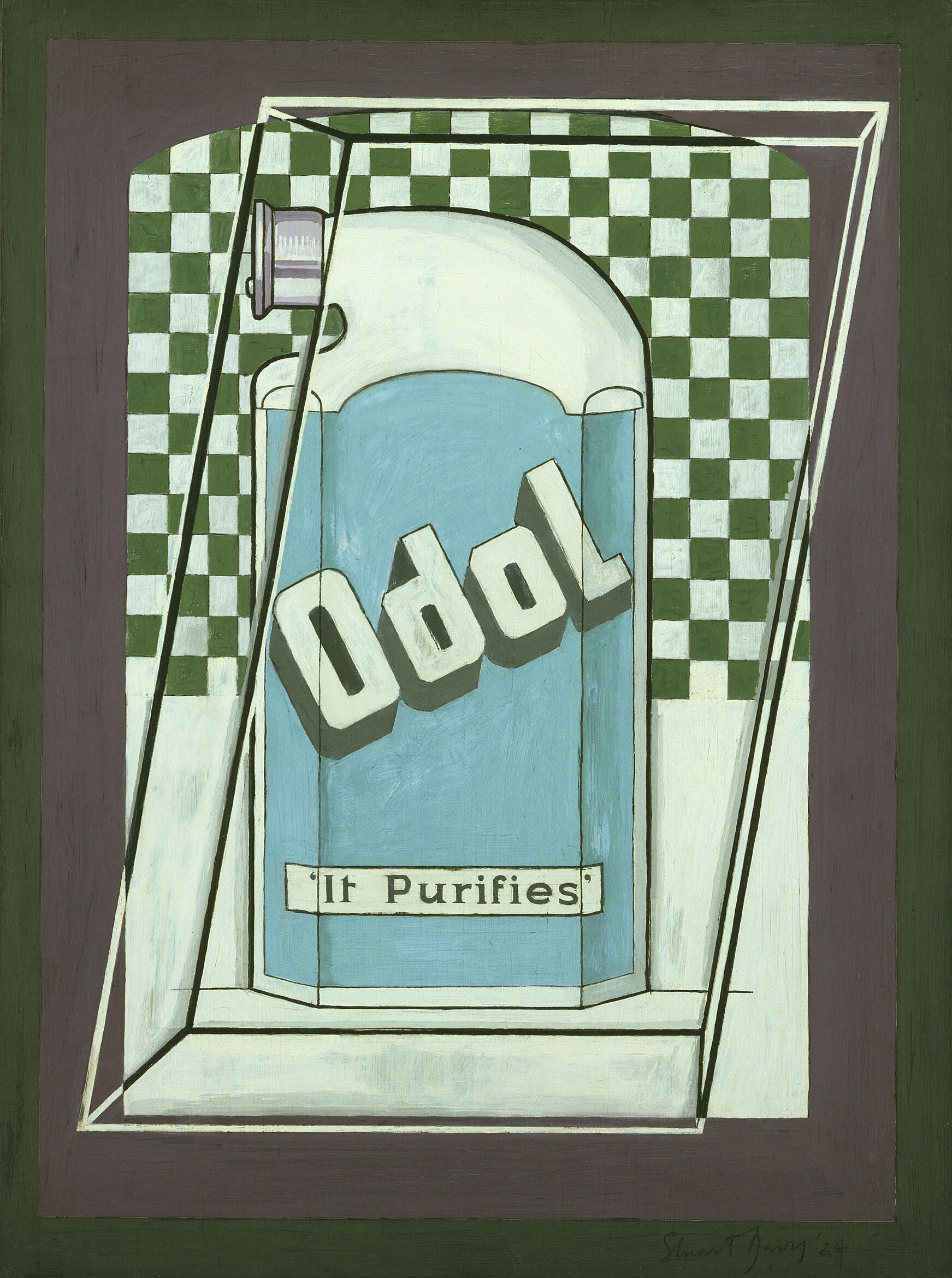
Barbara Haskell: One of the things people have always loved about Stuart Davis is his sense of America, that he really believed that artists should look to the local environment for inspiration.
Narrator: Curator Barbara Haskell organized this exhibition with Harry Cooper from the National Gallery of Art in Washington, DC, and Assistant Curator Sarah Humphreville. You’ll be hearing from them on this audio guide too—along with the jazz pianist Ben Sidran and archival interviews with Davis himself.
We’ll begin in the gallery straight ahead. Go on in, and take a look around. Davis made these paintings during the 1920s and early thirties, while living in New York. They’re all quite abstract. By the time he painted them, Davis had been experimenting with modernism—and especially Cubism—for about a decade. But he made modernist abstraction his own, using it to capture the excitement of popular culture. He often chose distinctly American subjects. For example, he made a series focused on packages of cigarettes—which at the time were considered a quintessentially American product. We’ll begin our tour with one of those paintings. It has a newspaper in the background.
Narrator: Hi! Welcome to the Whitney. Today we’re going to look at paintings by Stuart Davis. To start, let’s imagine what it was like when he began painting, about 100 years ago.
Try to remember a time from your own life when everything seemed totally new and exciting. Like you just found out something amazing existed, and you’d never even imagined it before.
In the 1920s almost everything seemed like that: cars, electricity, things made in factories, and Davis’s very favorite, jazz music. Davis thought it seemed wrong to paint all these new things in the same way people had painted for hundreds of years. He began to experiment, using abstract shapes and bright colors. He made modern paintings that matched the energy of the world around him. Let’s go take a closer look!
Stuart Davis, Première, 1957. Oil on canvas, 58 x 50 in. (147.3 x 127 cm). Los Angeles County Museum of Art; museum purchase, Art Museum Council Fund. © Estate of Stuart Davis/Licensed by VAGA, New York
Narrator: The cigarettes, pipe, matches, and newspaper in this still life all angle subtly away from the picture plane. The resulting space feels very shallow—almost flat, but with just enough sense of depth to create a sense of visual energy. Davis first discovered this kind of space in Cubist works on view at the 1913 Armory Show—the exhibition where most American artists first encountered European Modernism.
Davis spent much of the next decade exploring this visual vocabulary, finally making it his own in the 1920s—in part by focusing on elements of American popular culture, like Lucky Strike cigarettes. And even when he drew on some of the Cubists’ favorite subjects—like the newspaper—Davis gave them his own spin.
Mark Joshua Epstein: We know that Davis worked for a couple of years for a leftwing magazine called The Masses in the early 1910s, and that he was responsible for doing illustrations.
Narrator: Mark Joshua Epstein is a painter and an Educator at the Whitney.
Mark Joshua Epstein: And we also hear that he bristled against having people write captions for his illustrations. So in this painting what’s hilarious to me is that he’s taken on the role of both the illustrator and the caption writer, but the captions have become these abstract brush strokes.
Stuart Davis, Lucky Strike, 1924. Oil on paperboard, 18 x 24 in. (45.6 x 60.9 cm). Hirshhorn Museum and Sculpture Garden, Smithsonian Institution, Washington, DC. © Estate of Stuart Davis/Licensed by VAGA, New York. Photograph by Cathy Carver
Narrator: In Edison Mazda, Davis stands a bright blue light bulb against a flat, abstract background.
Barbara Haskell: He's elevating this banal object into an almost heraldic form, so that the still life becomes the icon of the picture. The whole idea of electric light was such a modern technology with which America was identified.
Narrator: For some artists and critics in the United States, abstraction was impossibly foreign—a French invention that didn’t translate in an American context. As Davis explained in a 1957 interview, that was never a concern for him.
Stuart Davis: When I went to art school in 1910-13, the modern movement in the United States was practically nonexistent, that is the opportunity to be familiar with it or to be a part of it was available only to people who’d been to Paris, and I wasn’t one of them. So the line of my development has always been in the realm of ideas, it’s always been sympathetic to what was actually being done in Europe, to put it frankly. At the same time I didn’t in any sense feel myself unrelated to my own surroundings as an American. I simply felt that the ideas which were intrinsic to modern art, and especially to the more structural aspects of it, which were first manifested in Cubism, I felt that that kind of attitude towards form corresponded to the dynamics which I lived in in New York, and in America in general.
Narrator: Davis has built this painting out of flat planes, with skewed and wavering lines. The resulting composition seems mobile, unstable, hard to pin down.
Harry Cooper: The title is a pun, a Davis pun, because we really think it should be, maybe, a supper table.
Narrator: Harry Cooper is curator and head of modern art at the National Gallery of Art, Washington, D.C.
Harry Cooper: What is a Super Table? What's super about it? Maybe he's playing with the idea of what's on top of the table is super and what may be below the table.
There we begin to see two very different kinds of things happening in the image, thinking on my feet here. What we see above the table are recognizable things. The cocktail glass, some drapery, a bit of a back wall, which seems to have some exposed brick, albeit it at a jaunty angle.
The most puzzling thing on the table is what looks to me like some kind of folded card, possibly with a stamp on it, which seems to depict some kind of surrealist woman or female anatomy—but I wouldn't bet on it.
That brings us below the table where we are entering a realm of abstraction. There seems to be a bright, white illumination of what? A parallelogram set inside a non parallelogram with connecting lines. I sometimes think of that as a treadle underneath a sewing machine. I really don't know. Is it part of a rug? Are we looking into a fireplace, and irons? Or is it simply a place where Davis felt free to experiment, maybe because it's under the table.
Stuart Davis, Super Table, 1925. Oil on canvas, 48 x 34 1/8 in. (122.2 x 86.7 cm). Terra Foundation for the Arts, Chicago; Daniel J. Terra Collection 1999.37. © Estate of Stuart Davis/Licensed by VAGA, New York
Narrator: On this wall, you’ll see four works with very similar compositions. Davis made them all during one very intense year. A stipend from Gertrude Vanderbilt Whitney—the founder of the Whitney Museum—allowed him to focus on nothing but painting. He narrowed in on three objects: an egg beater, a rubber glove, and a fan.
Barbara Haskell: The Eggbeater Series is based really on the cubist idea of fragmentation and that one can see an object from different points of view, different aspects of an object.
Narrator: Davis used his limited subject to rich effect. Take a moment to compare this painting to the one Davis made right before it, Egg Beater No. 3. It’s to the left.
Mark Joshua Epstein: If you let your eye go back and forth between Egg Beater No. 3 and Egg Beater No. 4, you realize that the structures of the paintings are distinctly similar, but there are a bunch of differences. If we focus in on this kind of ochre-gold shape that is on the bottom right of both paintings, in Egg Beater No. 3, the horizontals are actually horizontals. We are led to a corner that makes more or less sense. And if we look at No. 4, we’re led up and out.
For me, Egg Beater No. 3 is lighter; it’s more open. But at the same time, it’s less vibrant. He’s desaturated a bunch of the colors by adding a little bit of gray, and a little bit of the complement to them. On the right, because we get these pops against the darker blue and the darker green, everything is singing a little bit more shrilly.
Narrator: Have you ever said a word so many times that it started to sound like nonsense? That’s kind of what Stuart Davis did to make this painting and the ones nearby, only he used his sense of sight, not sound. He spent a full year looking really closely at three things—an eggbeater, a rubber glove, and a fan. After a while, he stopped seeing them as tools that had been made to do certain jobs. To him, they just looked like shapes. He painted those shapes over and over again, turning them this way and that, trying to find all of the interesting ways to arrange them on the canvas.
In this gallery, there are four Egg Beater paintings. Take a moment to find them all. Do you see any shapes that repeat from one painting to the next? Think about the ways those shapes change as Davis puts them in new arrangements. How do you think those changes affect the mood of the paintings?
Barbara Haskell: Davis went to Paris in 1928 courtesy of a purchase by Gertrude Vanderbilt Whitney of two of his paintings. When he was there, he extended the geometric angularity that he had introduced in his Eggbeater paintings, but made it much more lyrical, much more delicate in keeping with his sense about the city. The picture, like many of the paintings from Paris, has this very confectionary palette, very linear detailing. For the first time he introduces his line as an independent element which becomes very prominent in his later work.
He presents the viewer as if we're sitting at a restaurant on the second floor overlooking a city street. In front of us are various objects used in drinking, which apparently Stuart Davis did a great deal of when he was in Paris.
Stuart Davis, Rue Lipp, 1928. Oil on canvas, 32 × 39 in. (81.3 × 99.1 cm). Michael and Fiona Scharf. © Estate of Stuart Davis/Licensed by VAGA, New York
Barbara Haskell: Stuart Davis in House and Street is presenting two simultaneous views of the same scene, the intersection between Front Street and Coenties Slip.
Mark Joshua Epstein: Stuart Davis gives us two distinct zones in this painting, but he’s really careful to put them inside these very obvious borders. We get the black border, and then outside of the black border, the red border with the blue on the left side. To me, that’s his way of saying, “This is the city. We encounter these things together all of the time. And I as an artist want to contain them all in one picture plane.” So on the left we have something that’s right in front of us, something we would walk by on the street, a fire escape that we can see right up close, and on the right side we have something else in the distance that’s a little more elusive. We don’t exactly know what’s around that curve, or what’s in that gridded building in the back.
Barbara Haskell: In this piece, Davis is presenting his idea that the experience of modernity has to do with simultaneity. And that we're bombarded by images and see multiple images all of the time. Davis returned from Paris in 1929 and was originally horrified by the enormity of New York. He said, "How can anyone make art in the face of this enormous city?" And then as he become more acclimated, he came to see that that, in fact, was the quality of modernity, that speed and simultaneity that were exactly what characterized modern urban life. He embraced that notion.
Narrator: Stuart Davis split this painting of lower Manhattan right down the middle. Why do you think he might have done that?
Let’s start with the left-hand frame. What kinds of lines do you notice? The ladders of the fire escape are a little skewed, but mostly Davis has given us straight horizontals and verticals—so the whole thing is pretty flat and two-dimensional. Everything is just right there on the surface.
What’s different on the right? For one thing, there are a lot more curves and diagonals. These lines create a feeling of movement. Take a look at the form that arcs across the center of the composition. When Davis painted House and Street, everyone would have recognized it as an elevated train—like the High Line near the Whitney.
Put together, the images give us two ways of taking in the energy of the modern city. On the left, Davis gives us a busy scene in a single glance. On the right, he paints a city that’s full of action, motion, and change—even when there are no people in the picture.
Stuart Davis, House and Street, 1931. Oil on canvas, 26 1/8 x 42 1/8 in. (66.4 x 107 cm). Whitney Museum of American Art, New York; purchase 41.3. © Estate of Stuart Davis/Licensed by VAGA, New York
Barbara Haskell: Davis made New York Mural in response to a call from the Museum of Modern Art for a show they were doing of murals by painters and sculptors. So it was the largest painting he'd made to date. It shows New York City, but in a sense it's also an object portrait of Al Smith who was the four term governor of New York who had lost the bid for the presidency in 1928.
Narrator: Davis with a big fan of Smith, a populist who—crucially, from Davis’s perspective—opposed the Prohibition. Davis pictures objects associated with the governor: derby hats and the Empire State Building, for example. In the upper left corner, the moon throws back a glass of champagne. And a tiger with a serpent’s tail alludes to Tamany Hall, the Democratic political machine that dominated New York City Politics.
Murals were perhaps the definitive art form of the Great Depression, as government agencies hired artists to adorn public buildings and inspire a downtrodden public. Most of them portrayed grand figures in a classical style. Modernist works like this one were out of favor. Davis painted relatively little through much of the 30s. During this time he became very active in left-wing politics, especially labor organizing for artists.
Stuart Davis, New York Mural, 1932. Oil on canvas, 84 × 48 in. (213.4 × 122 cm). Norton Museum of Art, West Palm Beach, Florida; purchase, R. H. Norton Trust. © Estate of Stuart Davis/Licensed by VAGA, New York
Narrator: Davis addressed jazz in this 1957 interview.
Stuart Davis: Jazz music has always been very important to me, from the time I was a little boy. As soon as I was old enough to go around to places where they played it, which to put it briefly was saloons, and more specifically negro saloons, well I went there. To listen. For no other reason except that I liked it. And this enthusiasm and response for jazz has continued without interruption to the present day.
And in regard to its effect on my painting, I would say that it’s been a continuous source of inspiration in my work, from the very beginning. For the simple reason that I regard it as the one American art, up until now, which seemed to me to have the same quality of art without ulterior motive that I found in modern European painting. And I always quite naturally equated the two as a source of real art. Even though the conditions under which it is made and the purpose for which it is used, I mean jazz, are very different from that of painting.
Stuart Davis, Swing Landscape, 1938. Oil on canvas, 86 3/4 x 173 1/8 in. (220.3 x 400 cm). Indiana University Art Museum; allocated by the U.S. Government, commissioned through the New Deal Art Projects. © Estate of Stuart Davis/Licensed by VAGA, New York
Harry Cooper: What are we looking at? [laughs] Again, the title and the context give us a few hints. This is about radio broadcasting. We're before the age of television. It's WNYC radio station, very important station, broadcasting all kinds of things, including jazz, including the music that Davis loved.
The saxophone, if we follow it to the right, gets linked to this central gray area, with what looks like a bit of sky, maybe a mast and some rigging.
His art is based in large part on sharp contrast. He loved contrast. He did not want to blend, he didn't want to meld, it's in his technique and in his composition. We see it very clearly here, putting things next to each other that may be very different, not only in subject, but in treatment.
The centerpiece here is largely about line. There's not so much color. There's gray, black, a little bit of blue and orange. The saxophone area is all about color, color shapes, not so much about line.
He's put them next to each other. The saxophone is on top of, or entering into, the other space. There's a spark that happens that he's interested in when compositions don't all fit together. Many of his paintings, we see a half and half structure almost aligned down the middle, two separate halves.
We see that in other paintings in the exhibition. Here you don't quite have that, but you have distinct areas which then raise these questions about how they are, or are not, related.
Stuart Davis (1892–1964), Mural for Studio B, WNYC, Municipal Broadcasting Company, 1939. Oil on canvas, 84 x 132 in. (213.4 x 335.3 cm). The Metropolitan Museum of Art, New York; lent by the City of New York, 1965. © Estate of Stuart Davis/Licensed by VAGA, New York
Narrator: Stuart Davis worked on The Mellow Pad for six years.
Stuart Davis: I was learning things and doing things that I hadn’t done before. I don’t like to use the word “trouble,” but if you want to be factual, I did have trouble with it. But the main point about it is that I kept at it until all the trouble had disappeared.
Sarah Humphreville: He’s treating each individual shape as an individual. You don't see as many repeated colors weaving in and out. Everything is just right on the surface and humming.
Narrator: Sarah Humphreville is a Curatorial Assistant at the Whitney.
Sarah Humphreville: He had this idea of serial centers, that there wouldn't be one center focus as in a typical painting but instead these serials of centers. So when you're looking at it, your eye really has that vibrating—it's almost chaotic to look at. You don't really know where to pause or how to understand it.
And this is a radical breakthrough in not just American art but in painting as a whole, it's really not until 1947 when Pollock was doing his drip paintings that you get this kind of bam in your face. This is everything all at once.
Narrator: Here’s a trick question: can you find the center of this painting? The middle of the painting is a black bar, which cuts the composition in half. But does that really seem like the center of attention? Stuart Davis wanted the focal point of this composition to be everywhere—and nowhere. He wanted every shape to grab our attention, and for our eye to move all over the composition. As you might imagine, Davis had a hard time with this—he worked on the painting for six years! A few years later, he explained.
Stuart Davis: I was learning things and doing things that I hadn’t done before. I don’t ever like to use the word “trouble,” but if you want to be factual, I did have trouble with it. But the main point about it is that I kept at it until all the trouble had disappeared.
Narrator: One clue that Davis overcame his difficulties with this painting is the title—The Mellow Pad. This is an old musical slang term—it means the sweet spot that really great music can get you to. As a painter, Davis probably hoped you could get to that sweet spot from looking at art, too.
Stuart Davis, The Mellow Pad, 1945–51. Oil on canvas, 26 1/4 x 42 1/8 in. (66.7 x 107 cm). Brooklyn Museum; bequest of Edith and Milton Lowenthal 1992.11.6. © Estate of Stuart Davis/Licensed by VAGA, New York
Stuart Davis: Well this first “Champion,” called Little Giant Still Life, that was made from a—I just had a package of paper matches on the table alongside of me. And I made a drawing without any intention of doing anything with it; I just drew, looking at this package of matches. It had the word “champion” on it. And it seemed interesting, so I just drew it on a canvas and made, developed it from there on, without reference to any matches or anything like that.
Barbara Haskell: It was the first time he had really elevated words to a position of prominence.
He begins to invest color with spatial properties, so he very much controls the properties of color to advance and recede so that there's a back and forth motion in all of his pictures, but they nevertheless stay very much on the surface, so that the paintings are perceived in a single glance, and he was very conscious that a single impression painting was what he wanted to create which, of course, is what advertising does.
He's very much considered the father of Pop art, but was always very different. Pop artists generally, Pop painters use two dimensional media images. Davis never did that. He was not concerned about commenting on culture or consumer society.
Stuart Davis, Little Giant Still Life, 1950. Oil on canvas, 33 x 43 in. (83.8 x 109.1 cm). Virginia Museum of Fine Arts, Richmond; The John Barton Payne Fund 50.8. © Estate of Stuart Davis/Licensed by VAGA, New York, NY
Ben Sidran: When you look at something like Owh! In San Pao, first you see these incredibly bright-key colors.
Narrator: Ben Sidran is a jazz piano player and author of a two-volume oral history called Talking Jazz.
Ben Sidran: And there’s an analogue in jazz to the advanced harmonies that jazz players used, kind of like shining, shining harmonies, bright flashy harmonies. And similarly, he loved the rhythmic thrust of barrelhouse piano players. And when you look at the planar surfaces in Owh! In San Pao, you get the sense of a rhythm of a kind of almost floating or a tumbling feeling. There’s sort of a freedom in it that kind of feels like jazz feels. And you can also look for example in the use of little cryptic phrases, “else” and “now,” I like to think of that as sort of how a jazz fans in a bar would shout out to musicians, you know, like “get it!” “do it!”
Barrelhouse piano was this kind of free-swinging piano that was played in these saloons. You’d go into these rough bars and there’d be a piano player there, and sometimes, you know, Davis reported that the piano would be covered in barbed wire, so that people wouldn’t lean against it, or bother the piano player. Barrelhouse was a kind of dance music where the piano player’s left hand was like taking the place of the drum beating the rhythm, and the right hand was the melody and kind of the flashing entertainment part of it.
Narrator: Davis called this painting Owh! In San Pao. The name doesn’t mean anything very specific—Davis said he just made it up. But like the painting itself, the rhyme is fun and playful—Owh! In San Pao!
Take a look at the painting next to it. Davis painted it more than twenty years earlier, and called it Percolator. A percolator is a kind of old-fashioned coffee pot. This work is pretty abstract too, but maybe you can find shapes that could hold or pour coffee.
Now take a moment to compare the two paintings. Notice anything? They’re different versions of the same subject. As Davis got older, he really liked to recycle—returning to earlier works that he liked, and seeing what new ideas he could find in them. Often, the later versions would be really abstract. But Davis liked all of his paintings to have some roots in the real world—he felt it made them more meaningful.
Stuart Davis (1892–1964), Owh! in San Paõ, 1951. Oil on canvas, 52 1/4 × 41 3/4 in. (132.7 × 106 cm). Whitney Museum of American Art, New York; purchase 52.2. © Estate of Stuart Davis / Licensed by VAGA, New York, NY
Narrator: Davis called this painting Rapt at Rappaport’s. It’s based on an earlier work called Landscape with Saw. The saw is barely recognizable, with its red-and-white polka-dotted handle and patterned blade. But as abstract as this painting may appear, it was important to Davis that it, like all his paintings, was rooted in reality.
Stuart Davis: I have never regarded myself as an abstract artist. Personally I felt that talking about “abstract” art had many dangerous and misleading implications. That it cut off the real fact that what is interesting in any painting is its specific references, which however they may differ with different people that look at the painting, are nevertheless specific. And to call those specific things abstract always worked the wrong way with me. And as to the content of it, I regard the fact that I give importance to simple things that give me pleasure, I think that is the content that has validity with me.
Stuart Davis, Rapt at Rappaport’s, 1951–52. Oil on canvas, 52 x 40 in. (131.8 x 101.4 cm). Hirshhorn Museum and Sculpture Garden, Smithsonian Institution, Washington, DC. © Estate of Stuart Davis/Licensed by VAGA, New York. Photograph by Cathy Carver
Narrator: Throughout this exhibition, there are families of paintings—groups that treat composition as a process of theme and variation that might take place over decades. This painting, Memo, is the fourth version of a composition that Davis first devised in 1930s.
Harry Cooper: We think of modern artists as always looking for something new, trying to be original, wanting to innovate. That's what we value about modern art, but there's always a pull in the other direction, a pull of tradition. Davis studied art of the past, especially the great modern masters of the last couple of generations behind him. He also studied his own work, and I think he became his own master in a way. The process of recycling his own work was the means by which he was able to move ahead.
Narrator: To take a close look at the development of these four paintings, please find the earliest one—it’s a black-and-white composition called Landscape. Then tap the button on your screen.
Stuart Davis, Memo #2, 1956. Oil on canvas, 24 x 32 in. (61 x 81.3 cm). Private collection. © Estate of Stuart Davis/Licensed by VAGA, New York
Harry Cooper: The first painting, Landscape, from 1932 and 1935, is very much the sketch. It's a sketch he made in Gloucester, looking at the harbor. We see rigging, we see some kind of a shack with some steps on the left, maybe some cleats and some levers in the foreground. It's not easy, but it's certainly not totally abstract. It's a landscape, in fact it's a harbor landscape.
A few years after that, he makes it into something that looks much more like a painting.
Narrator: That work, Shapes of Landscape Space, is to the left.
Harry Cooper: He uses about six or eight colors. What's he doing? [laughs] I think what happens from that sketch, he actually makes it much more realistic. It's much easier to read. He gives us that sign on top of the shack. It's a fish house, so maybe a place where fish are being processed. It's easier to read because of the variety of color. We feel we can move around in the image and explore it a little bit. He gives us a little more detail on those levers in the foreground.
I like to think of this painting as offering us some controls with which to operate it. He loved this idea that space was dynamic, flexible, uncertain, a lot of different ways to read it. By giving us those levers in the foreground, it's almost like we're working this machine along with him. We can see it very flat; we can see a lot of space in it; we can read it in a lot of ways. That's the excitement of that second painting. It's maybe the friendliest painting in the group.
We move on a big jump in time, about 15 years to the painting called Tournos from 1954.
Narrator: If you’d like to hear about Tournos, please tap the button on your screen.
Stuart Davis, Memo #2, 1956. Oil on canvas, 24 x 32 in. (61 x 81.3 cm). Private collection. © Estate of Stuart Davis/Licensed by VAGA, New York
Harry Cooper: This is a lot tougher for those who are looking for nice color harmonies, for those who are looking for an easy subject.
If we came upon this painting without the other two, we really wouldn't know what was going on, but because we have the other two, we can still read the subject, but we don't have a lot of the cues. It's partly because there are very few lines here.
It's a jigsaw puzzle of shapes that seem to be interlocking, overlapping, a much more limited palette, now reduced really to black, blue, green, red, and white. This is the abstract Davis, really interested in a kind of creased, folded, and very complicated space, full of energy, but not pinned down to any particular subject.
Then we jump ahead to another two years, to the final painting in the series called Memo. I like this one a lot. I think it's my favorite one of the group. A lot of people can't stand it. I know. I've taken surveys!
It's very challenging because it's really two paintings in one, and they don't seem to fit together. For the upper right half, we have a kind of reversed out drawing, white on black, very chunky thick lines. Some elements of scene certainly seem to be set at night. Hard to fathom.
Then at bottom left, really are no lines at all, colored shapes, and we start to get something that Davis loved, that hasn't really been in the series before, which is letters, symbols. So, part of the word "Any," lying along bottom, the figure eight, an X.
Some of these were symbols in his art theories. X is a symbol of expansion. "Any," he said at one point suggests the idea that subject is not important. You can paint anything. You just have to do it right and make it good in itself.
For me, this final painting is something of a declaration that the different elements of painting do not all have to fit together. There is tension. There is a lot of tension in his work, in particular between line and color. Sometimes it's better just to acknowledge it rather than try trying to solve it. [laughs]
Stuart Davis, Memo #2, 1956. Oil on canvas, 24 x 32 in. (61 x 81.3 cm). Private collection. © Estate of Stuart Davis/Licensed by VAGA, New York
Barbara Haskell: Davis based Première on a gouache that he'd made in 1956 in response to a commission by Fortune Magazine to create a painting on the glamour of packaging. He was one of seven artists who was hired by Fortune. He chose to go into a grocery store, bought a package of groceries and laid them all out on his studio and began to work with the images.
What he ended up doing was not creating an image of the packages themselves. He extracted words to stand for the products so that you have in this painting bag, cow, pad, free, any, cat, hundred percent, new, juice. Again, this is very unlike Pop art. A Pop artist might have replicated the product itself. Davis chose to be much more abstract, and in a sense more universal that by taking words, which he believed introduced the human element into pictures, he created something very familiar but at the same time very abstract.
Narrator: In this painting, Stuart Davis created an off-kilter checkerboard inside a sunny yellow border. Using just a handful of intense colors, he combined bold fonts with all kinds of geometric and curvy shapes. The composition is dynamic, bouncing our eyes this way and that.
In 1957, a magazine hired Davis to respond to the packages that products were sold in. He went to the store, bought a big bag of groceries, and began painting. He made an interesting choice. He didn’t paint the objects themselves. Instead he pictured their names in bright, contrasting colors with bold lettering. The painting doesn't actually make a sound, but it becomes almost like the voice of a radio or television advertisement, inviting us to buy certain things. This is one of Davis’s later paintings, and it’s the last stop on our tour. But Davis worked until the end of his life, and he kept making paintings of the world around him. If he were still working today, what kinds of exciting new things do you think he'd be painting? Thanks for joining me. Enjoy your visit!
Stuart Davis, Première, 1957. Oil on canvas, 58 x 50 in. (147.3 x 127 cm). Los Angeles County Museum of Art; museum purchase, Art Museum Council Fund. © Estate of Stuart Davis/Licensed by VAGA, New York
Harry Cooper: This is one of Davis's most complicated, most unusual paintings, American Painting. You can tell, from the dates alone, that it went through several campaigns of work, starting in 1932, and continuing in 1942 and 1954, all on that one canvas.
He painted this for the Whitney Museum, for its first annual show, the series of shows that went on to become the Biennials. The Whitney is a museum of American art, and he's, I think, rising to the occasion and making what he calls an American Painting.
Davis has become very active, very involved in artists' organizations, struggling, working to get better pay for artists, get more federal programs for artists.
It's possible that he's representing himself and several of his colleagues in those four males figures. It was also a time when abstract art was struggling. The great popular art of the '30s was so called American Scene painting, very rural, very nostalgic painting. And that was the painting that was selling, and Davis was not selling. In fact, his dealer suggested that they title one of his shows American Scene simply in order to try to get a little more attention for it.
Davis might have felt a pull, given this difficult context, back towards representation, maybe in an effort to make his painting relevant to everything that was going on, all the trouble. The men up there, their hands crossed, hand in pocket, they're not employed. They're hanging out. The revolver, the woman who may be a socialite, a lot of suggestion of class is maybe jostling in this painting as much as all the shapes and colors.
Davis was working on behalf of his class, the working class. We don't always think of painters as working class, but that's certainly how Davis thought of himself. Painters were among the groups leading the struggle for workers' rights.
Stuart Davis (1892–1964), American Painting, 1932 and 1942–54. Oil on canvas, 40 × 50 1/4 in. (101.6 × 127.7 cm). Joslyn Art Museum, Omaha; on extended loan from the University of Nebraska at Omaha Collection. © Estate of Stuart Davis / Licensed by VAGA, New York, NY
Barbara Haskell: Fin is the most personal of Davis's paintings. For one thing, it's unfinished. It shows his working method where he would use masking tape to define certain areas of the picture, while he studied them in the course of working out their composition and their color. The masking tape remains on in this picture, giving it a sense of the tactility, the intimacy that other pictures don't have.
He was working on it one night. He had had had a series of heart troubles. He and his wife saw a French film on television that night which ended with the word, "Fin," meaning, "The End." He painted the word on his canvas that evening before going to bed and died that night.
By 1962, when Davis began this picture, he was being heralded as a major figure of modern art. Artists like Don Judd, for example, were celebrating his achievements. He was beginning to be considered a father of pop art and of geometric color abstraction. These bold areas of color that so defined his work were being executed by younger artists. He was in the forefront of contemporary currents in art.
Narrator: This is the last stop on our tour. Thank you for joining us. Please enjoy the rest of your visit at the Museum.
Stuart Davis, Fin, 1962–64. Casein and masking tape on canvas, 53 7/8 x 39 3/4 in. (136.8 x 101 cm). Private collection. © Estate of Stuart Davis/Licensed by VAGA, New York, NY
Stuart Davis: I must say that in the major part of my career, when I wanted inspiration from American art, I went to jazz music.
Narrator: In Swing Landscape, Davis openly declared one of his greatest loves, jazz. The composition is vibrant and rhythmic, patterns seeming to dance across its surface. Davis did depict some identifiable objects, most of them inspired by the fishing boats around Gloucester, Massachusetts—one of his favorite subjects. But he painted the spaces between the objects using equally intense hues. As a result, the individual parts play into the whole like instruments in big band jazz.
If you’d like to hear more of what Davis had to say about jazz, please tap the button on your screen.
Narrator: Look closely at the shapes in this painting. Do they remind you of anything? See if you can find some that look like ships. Davis loved to paint the fishing boats that he saw around Gloucester, Massachusetts, where he often spent the summer. He returned to their forms again and again over the years. He improvised on them like a jazz musician plays with different tunes. And in fact, have you noticed that we’ve played a lot of jazz on this tour? Davis loved jazz—he said it was really important to his painting.
Stuart Davis: I must say that in the major part of my career, when I wanted inspiration from American art, I went to jazz music.
Narrator: Davis called this painting Swing Landscape. Swing is big-band jazz, a kind of dance music. If you listened to this painting, what would it sound like? In Swing, the rhythms really move. Can you find shapes that seem to dance across the canvas?
Stuart Davis, Swing Landscape, 1938. Oil on canvas, 86 3/4 x 173 1/8 in. (220.3 x 400 cm). Indiana University Art Museum; allocated by the U.S. Government, commissioned through the New Deal Art Projects. © Estate of Stuart Davis/Licensed by VAGA, New York
Narrator: In the 1950s, Davis began to make abstract paintings on a grand scale. In part, he was influenced by his experience painting murals. But after a retrospective at the Museum of Modern Art in 1945, he was also commercially and critically successful for the first time. And with the rise of Abstract Expressionism, abstraction moved to the center stage in American art. Davis’s status shifted from outsider to trailblazer. He also began reacting to the work of younger artists.
Sarah Humphreville: I think one of the things that really impacts him in the '50s is seeing paintings by Abstract Expressionists. A lot of the history that's written about Davis talks about him as having an antagonistic relationship with these artists. But it's actually much more complicated than that. He didn't agree with the idea that art should only be about art, or that art should be this really emotional experience and about the inner psyche of the artist. But he didn't think that that meant they had bad painting.
He knew a lot of these artists personally. And he also exhibited with them in group shows. One of the things I think that particularly he notes in these group shows is that if he's going to compete with them and look to be an equivalent or better artist, that he needs to compete with their monumental scale. It's not like he sees a Pollock painting and says, "Oh, I'm going to make it big now." It's not that direct. It's this continuous process of not only looking but also making his own, and figuring out what he can pull out from there and collage into his own voice. You see that here, that it's this painted collage in a way with all these different layers.
Stuart Davis (1892–1964), Colonial Cubism, 1954. Oil on canvas, 45 1/8 x 60 1/4 in. (114.6 x 153 cm). Walker Art Center, Minneapolis; gift of the T. B. Walker Foundation, 1955. © Estate of Stuart Davis/Licensed by VAGA, New York
Narrator: In the 1924 painting Odol, Stuart Davis pictured a bottle. . .mouthwash? Why do you think he’d want to do that?
For one thing, the bottle is a pretty cool shape, with its mouth spouting off to the side. And Davis liked it so much he showed it twice in this painting—once from the front, and once in the mirror. Notice the way the image in the mirror is a little flatter, and a bit out of focus. Maybe the fact that this object was so simple helped Davis examine it really closely.
Davis was often playful in his paintings. Maybe he just liked the word “Odol,” or the slogan on the front of the bottle—“it purifies.” Traditionally, painters had focused on grand, important subjects. Many modern artists—like Davis—felt liberated by the idea that not everything had to be such a big deal. It could be interesting to focus on small, everyday objects. If you were going to make a picture of something from your own house, what would you choose?
Stuart Davis, Odol, 1924. Oil on cardboard, 24 x 18 in. (60.9 x 45.6 cm). The Museum of Modern Art, New York; Mary Sisler Bequest (by exchange) and purchase, 1997. © Estate of Stuart Davis/Licensed by VAGA, New York, NY
0:00
0:00