Frank Stella:
A Retrospective
2015
Listen to an audio guide highlighting selected works in Frank Stella: A Retrospective with narration by students from PS 33 Chelsea Prep and Whitney Museum educator Mark Joshua Epstein.
-
500
Introduction to Frank Stella: A Retrospective
Audio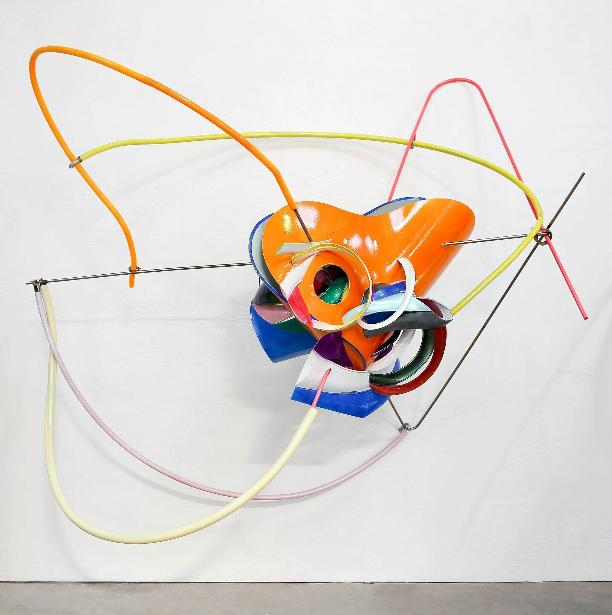
-
501
Frank Stella, Das Erdbeben in Chili [N#3] (The Earthquake in Chile), 1999
Audio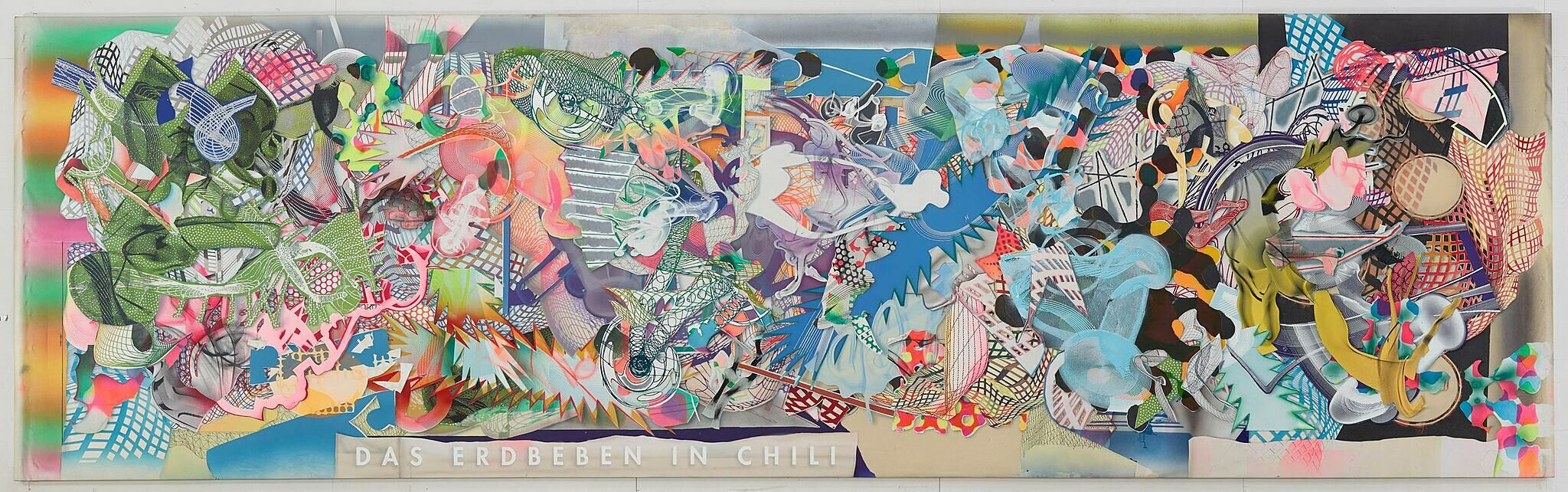
-
502
Frank Stella, Delta, 1958
Audio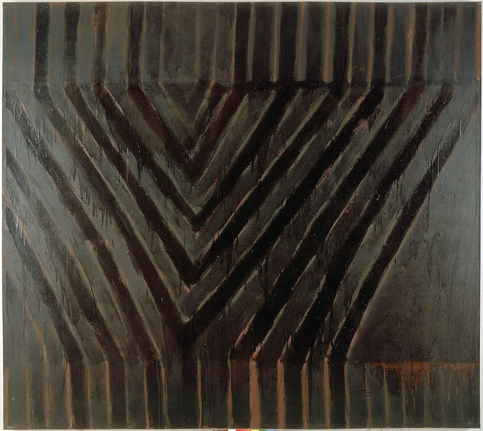
-
503
Frank Stella, Die Fahne Hoch!, 1959
Audio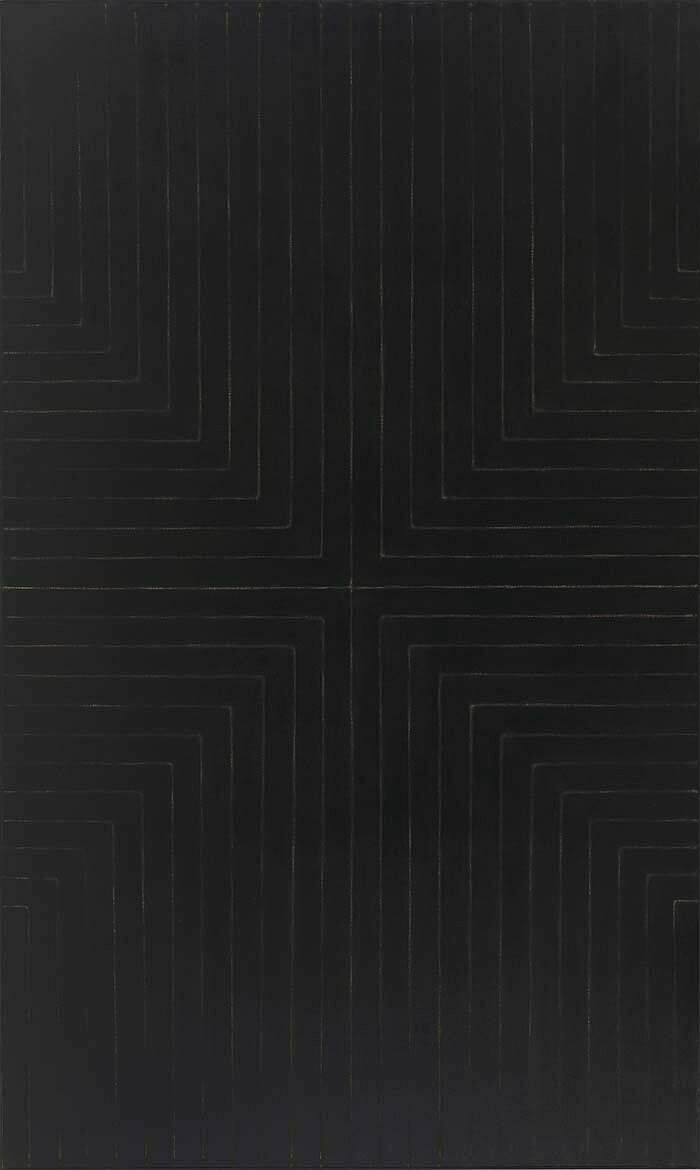
-
504
Frank Stella, Astoria, 1958
Audio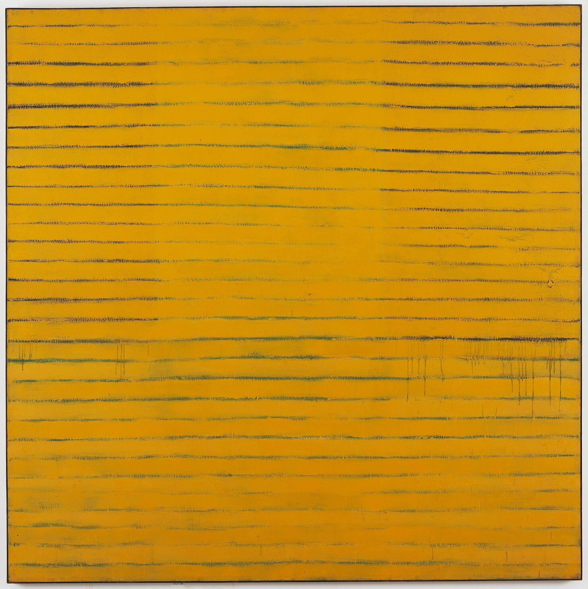
-
505
Frank Stella, Avicenna, 1960
Audio
-
506
Frank Stella, Creede I and Creede II, 1961
Audio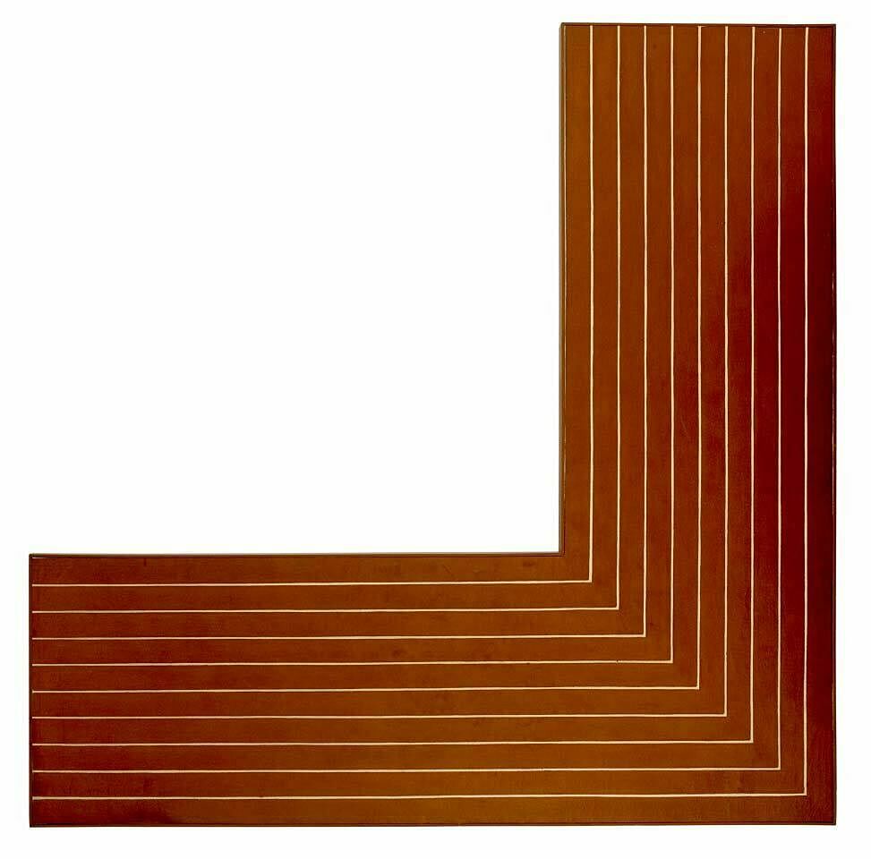
-
507
Frank Stella, Loomings (S-7, 3X – 1st version), 1986
Audio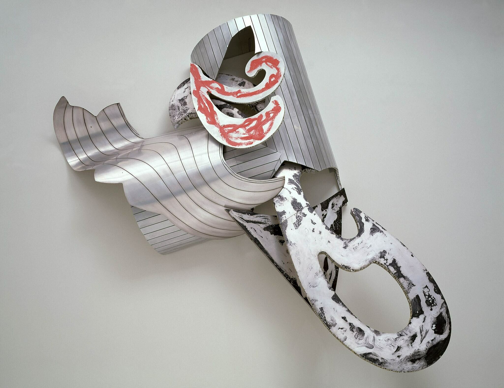
-
508
Frank Stella, The Whiteness of the Whale (IRS-1, 2X), 1987
Audio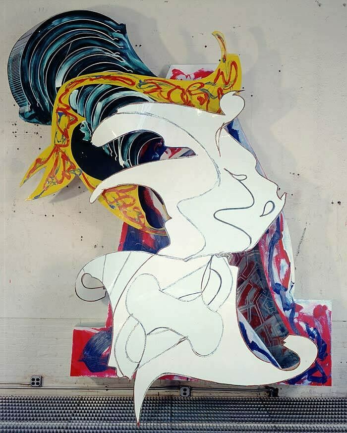
-
510
Frank Stella, Harran II, 1967
Audio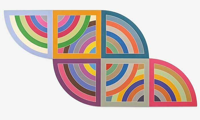
-
509
Frank Stella, Effingham II, 1966
Audio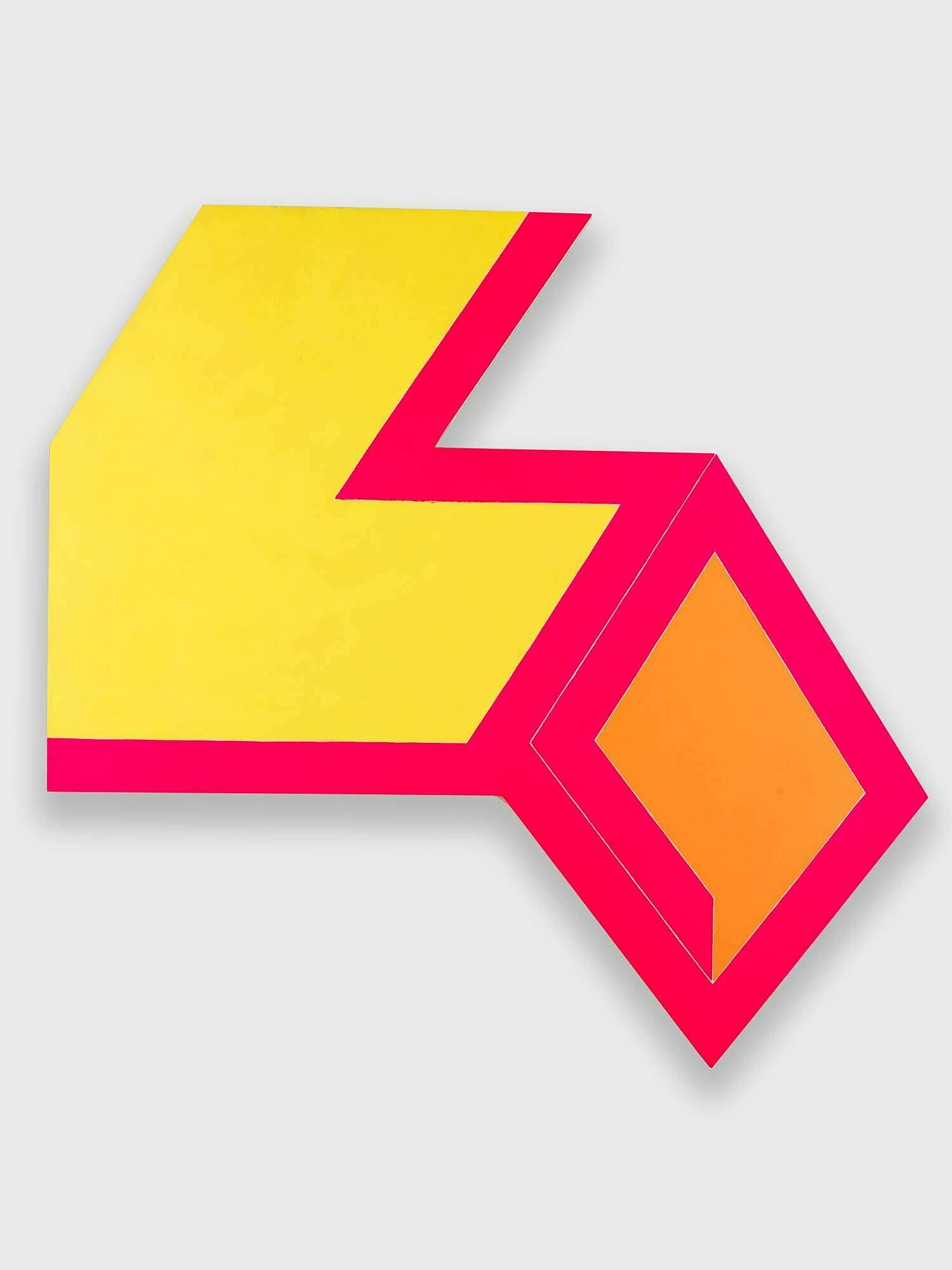
-
511
Frank Stella, Jasper’s Dilemma, 1962
Audio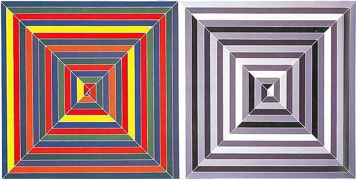
-
512
Frank Stella, Jarmolince III, 1973
Audio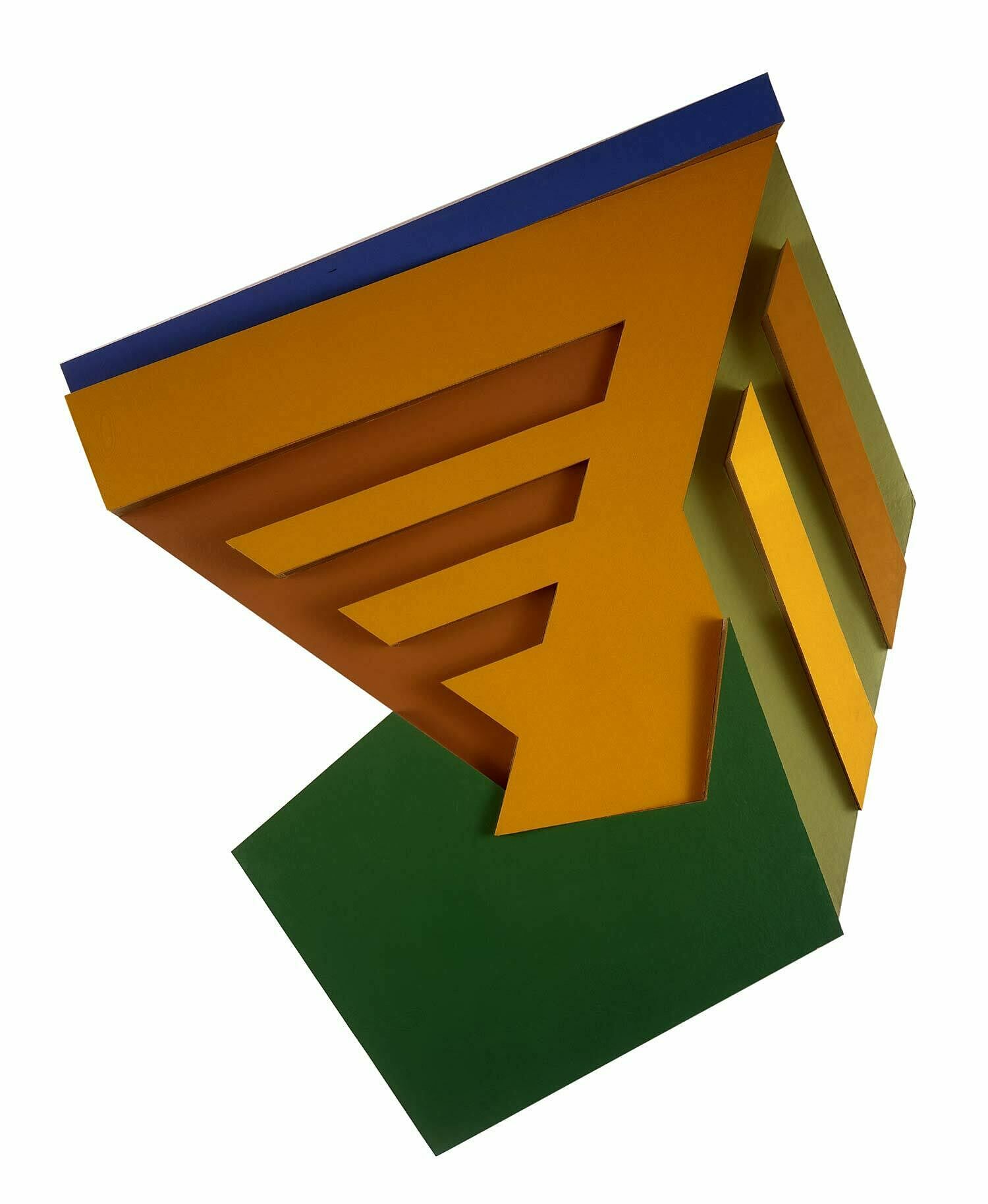
-
513
Frank Stella, Gobba, zoppa, e collotorto, 1985
Audio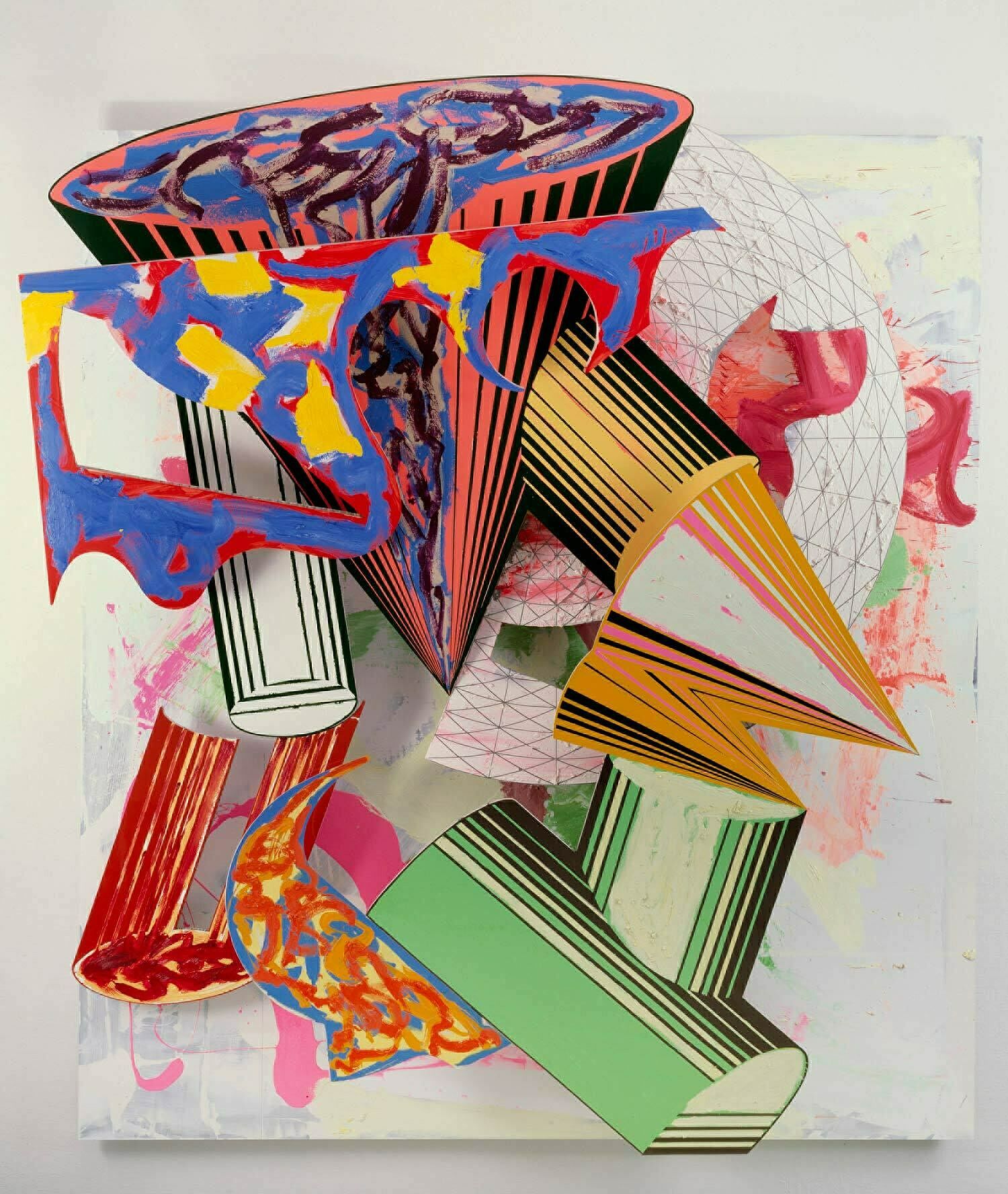
-
514
Frank Stella, Inaccessible Island Rail, 5.5x, 1976
Audio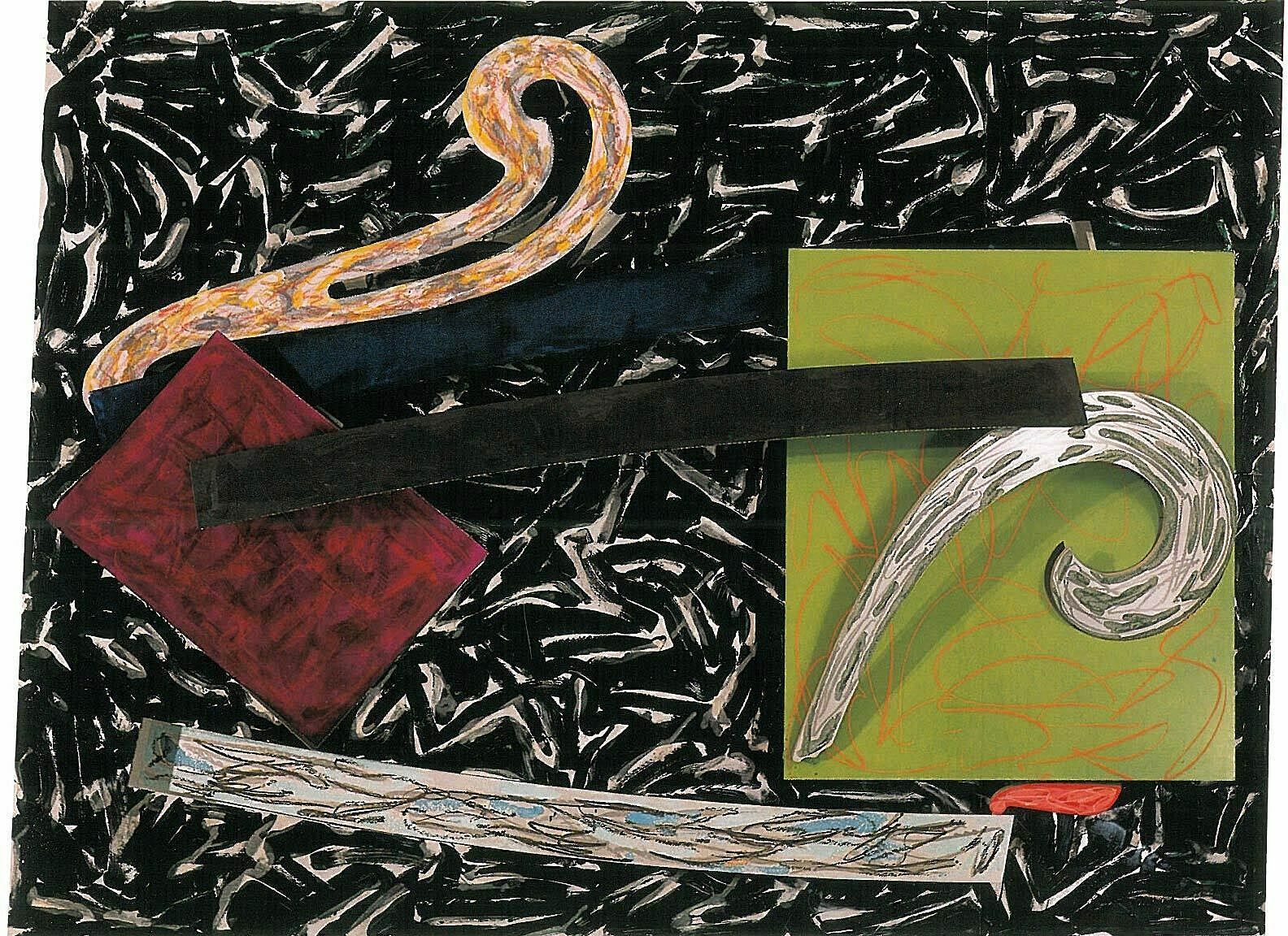
-
515
Frank Stella, Zeltweg, 1982
Audio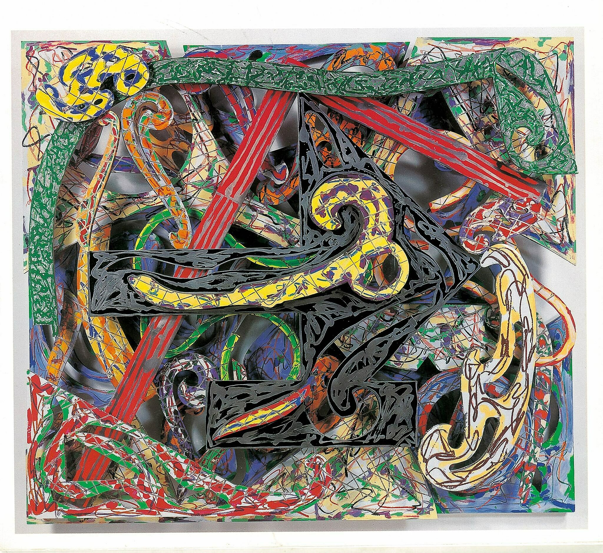
-
516
Frank Stella, Eskimo Curlew, 1976
Audio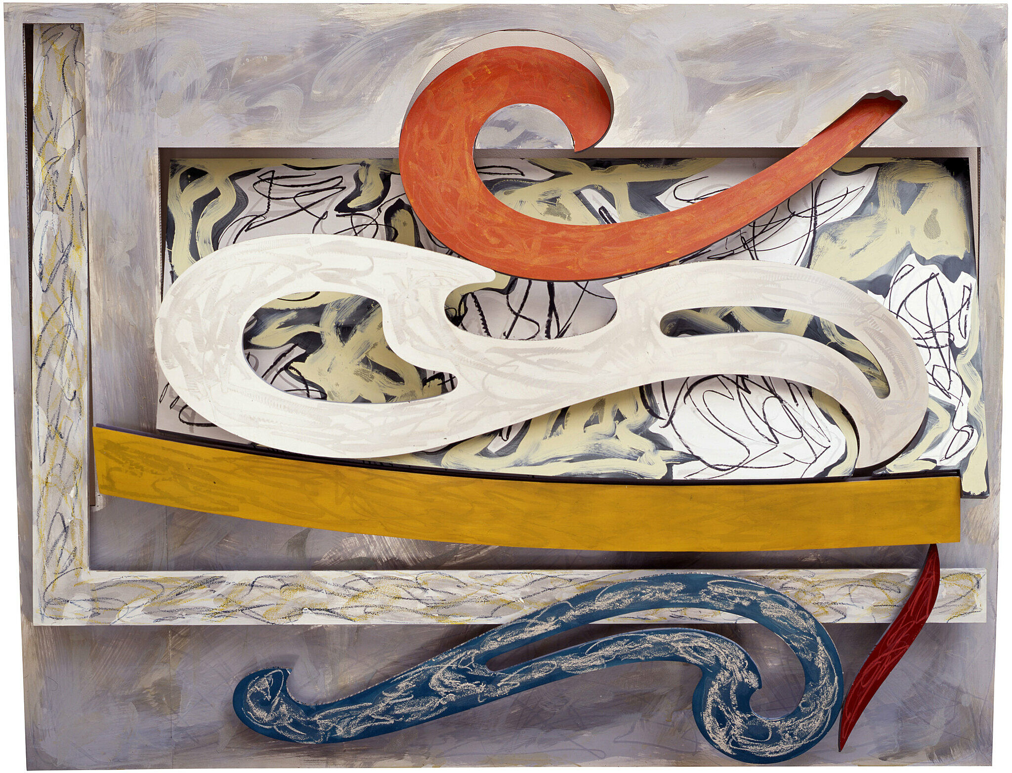
-
519
Frank Stella, Raft of the Medusa (Part I), 1990
Audio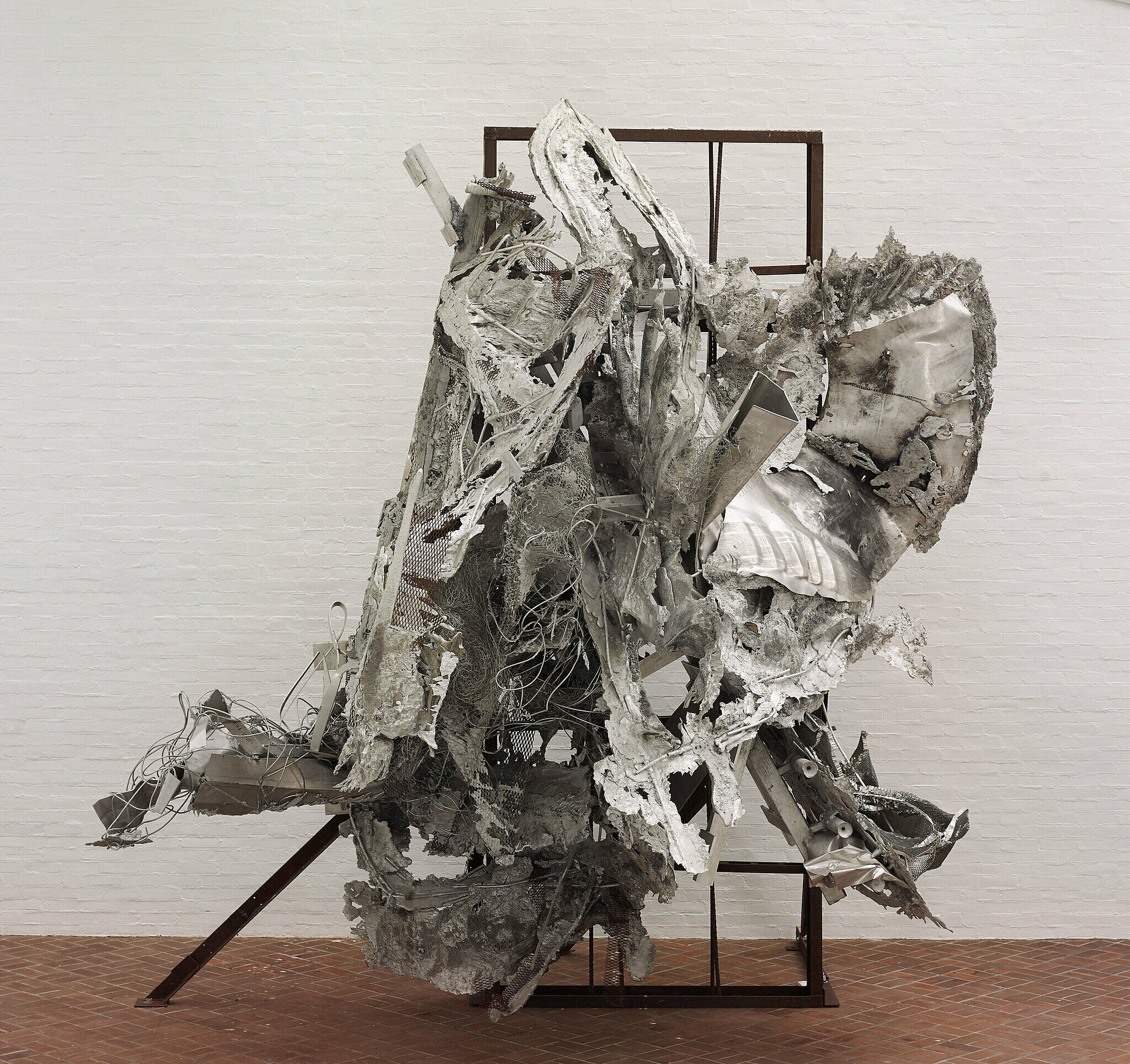
-
521
Frank Stella, K.144, 2013
Audio
-
518
Frank Stella, Damascus Gate (Stretch Variation III), 1970
Audio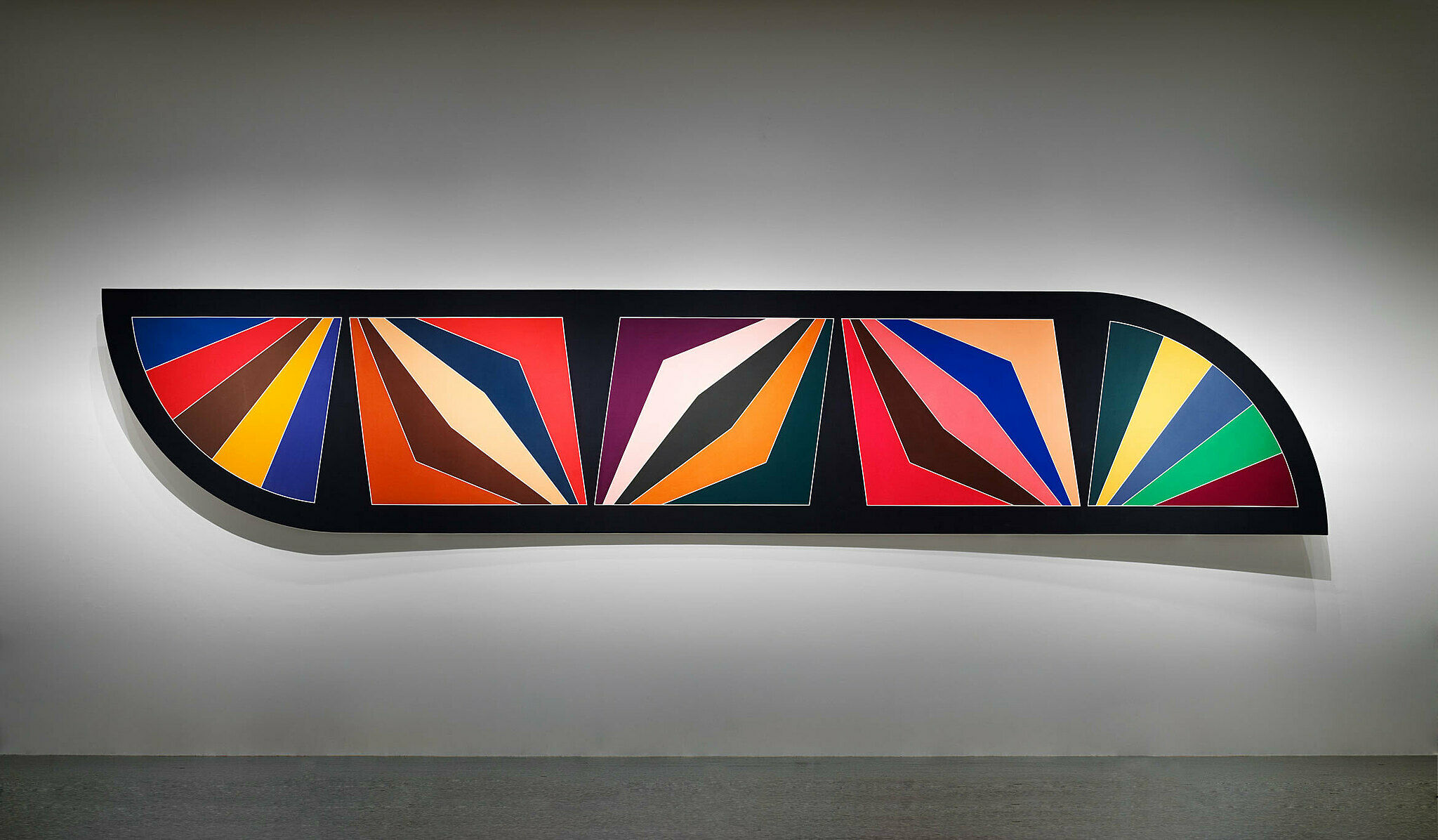
-
520
Frank Stella, Circus of Pure Feeling for Malevich, 4 Square Circus, 16 parts, 2009
Audio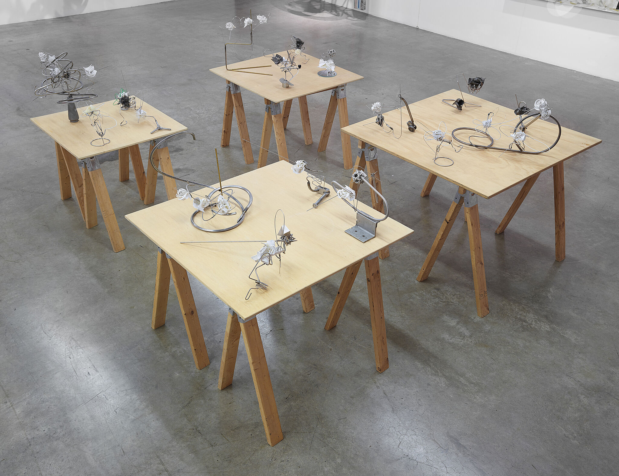
-
522
Frank Stella, K.81 combo (K.37 and K.43) large size, 2009
Audio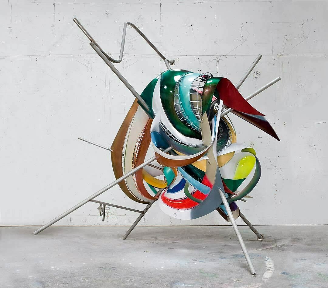
-
530
Introduction to Frank Stella: A Retrospective
Kids -
531
Frank Stella, Das Erdbeben in Chili [N#3] (The Earthquake in Chile), 1999
Kids
-
532
Frank Stella, Die Fahne Hoch!, 1959
Kids
-
533
Frank Stella, Empress of India, 1965
Kids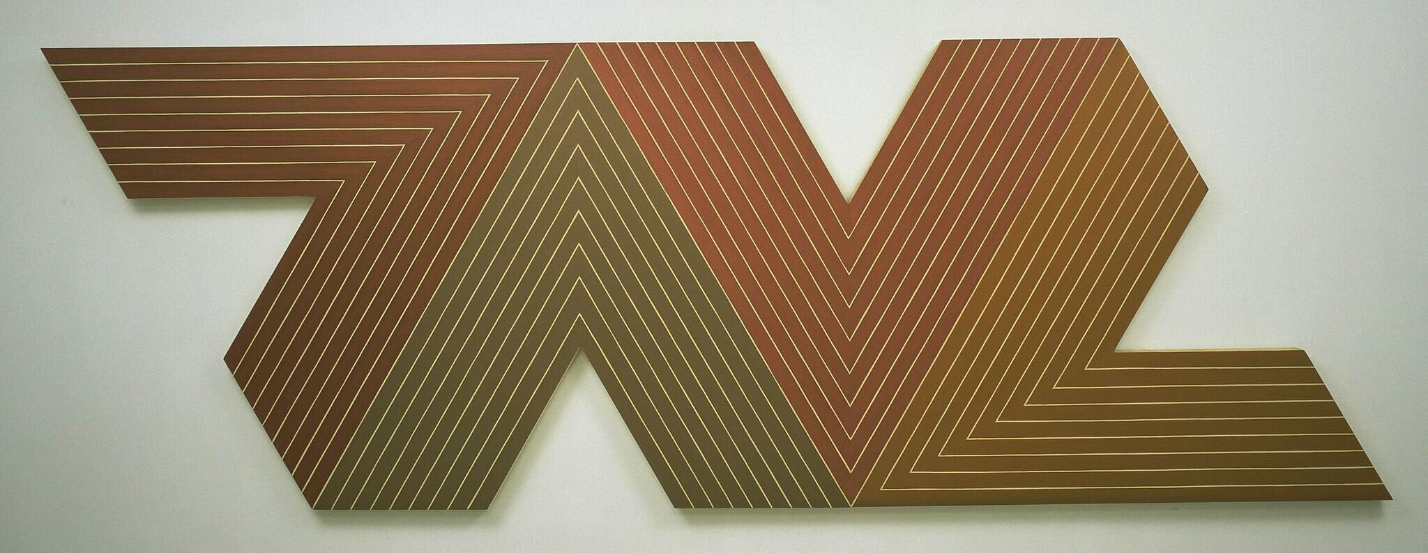
-
534
Frank Stella, Effingham II, 1966
Kids
-
535
Frank Stella, Jasper’s Dilemma, 1962
Kids
-
536
Frank Stella, Gobba, zoppa e collotorto, 1985
Kids
-
537
Frank Stella, Zeltweg (V), 4.75X, 1982
Kids
-
538
Frank Stella, Khar-pidda, 1978
Kids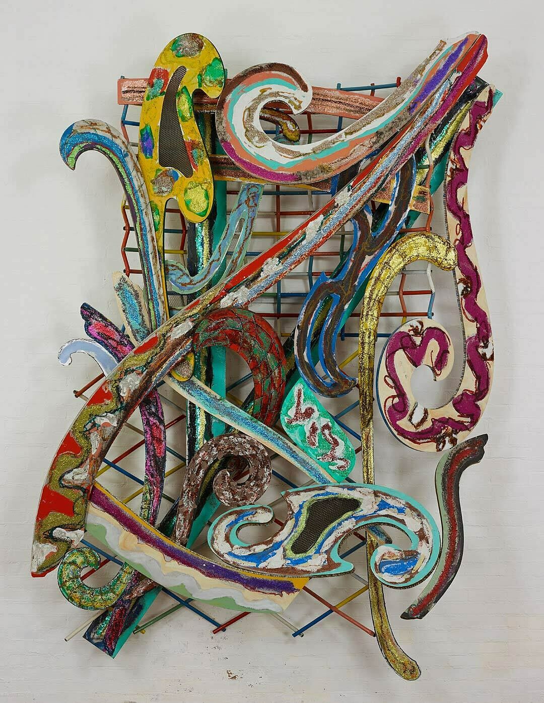
-
539
Frank Stella, The Fountain, 1992
Kids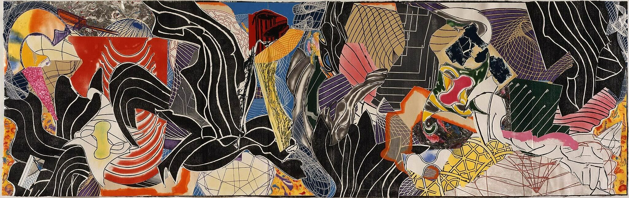
-
541
Frank Stella, Circus of Pure Feeling for Malevich, 4 Square Circus, 16 parts, 2009
Kids
-
542
Frank Stella, K.81 combo (K.37 and K.43) large size, 2009
Kids
-
540
Frank Stella, Raft of the Medusa (Part I), 1990
Kids
Narrator: Welcome to Frank Stella: A Retrospective. Stella came to New York as a young man in 1958. Since then he has gone from Minimalism to an expansive form of expressionism, making thousands of works over almost sixty years.
The artist has worked closely with the exhibition’s curators to select and install his own work. The exhibition, which begins in the room on the left, proceeds roughly chronologically—and demonstrates Stella’s overall shift from symmetry and geometry to almost explosive energy. But there are instances where early and late works appear together, showing continuities between different stages of his career.
On this guide, we’ll be looking closely at a selection of works, focusing on Stella’s approach to line, shape, color, and space. We’ll hear from Stella himself, as well as scholars, writers, artists, and the retrospective’s curators. Michael Auping, Chief Curator of the Museum of Modern Art of Fort Worth, organized the exhibition in association with the Whitney’s Alice Pratt Brown Director, Adam Weinberg.
Please enjoy your visit.
Frank Stella (b. 1936), K.144, 2013. ABS RPT with stainless steel, 80 × 97 × 53 in. (203.2 × 246.4 × 134.6 cm). Collection Martin Z. Margulies. © 2015 Frank Stella/Artists Rights Society (ARS), New York
Narrator: This exhibition opens with a juxtaposition of two works. The enormous 1999 painting Earthquake in Chile appears next to Pratfall, from 1974. The contrast between them indicates the vast range of Stella’s production. At the same time, their similarities—which are less obvious—speak to some of the painterly concerns that have driven him throughout his career.
Adam Weinberg: This opening wall basically shows you the two sides of Frank Stella.
Narrator: Adam Weinberg.
Adam Weinberg: It shows you the baroque, the labyrinthine nature of his work, the complexity on one hand and the simplicity, symmetry, classical nature as you see in Pratfall on the left. What's interesting is that there is, if you really looked at the Pratfall painting with the squares, actually has some theatrical qualities, because it seems like the squares have ring or vibrating. Also, when you look at Earthquake in Chile, it looks very random but what you see as you study it is the repeated patterns, and that there's actually a structure and a framework that underlies it.
So I think what you find in these two works is something that he plays out over and over again in fifty years that interplay between structure, and concept and very, very tight form and something that is totally expansive and has almost a chaotic and random quality which is something that you also see in the show. That tension between structure, the grid, and things which just seem to be almost natural, like overgrown.
Frank Stella, Das Erdbeben in Chili [N#3], 1999. Acrylic on canvas. 144 x 486 in. (365.8 x 1234.4 cm). Private collection. © 2015 Frank Stella/Artists Rights Society (ARS), New York. Photograph by Steven Sloman.
Narrator: Stella has described this work, Delta, as the first Black Painting.
Frank Stella: While I was working on it, something wasn’t working out. I don’t remember exactly what it was. And I just got tired of it and so I painted it all out. I followed what was there, but I painted it all out in black. The next day when I was looking at it, it seemed to have a kind of quality―being all black, although there were plenty of color and stuff showing through from between the bands, but the sort of darkness, the blackness, and the repetition of the bands seemed to work. So I started thinking about not waiting until I had a painting that wasn’t going anywhere and painting it out, and to make something more direct and just working in that way.
Megan Luke: One of the things that I find very interesting about Delta is, he's really playing with the different kinds of texture that the paint can have.
Narrator: Megan Luke.
Megan Luke: Some of the paint, if you look at it in a raking light, you see quite clearly that every other stripe is sort of soaked into the canvas, and the alternating stripes are shiny and glossy. He's playing around with the material makeup of the paint to give it through its physical texture, what he had obtained in color in earlier paintings.
Instead of alternating it red and black stripes, he's now alternating between shiny and matte, for example. That effect forces us to move around the painting almost as if it were a sculpture. It starts to change quite drastically in the light, and it's very receptive to the environment.
Frank Stella (b.1936), Delta, 1958. Enamel on canvas, 85 3/8 x 97 in. (216.9 x 246.4 cm). Private collection. © 2015 Frank Stella/Artists Rights Society (ARS), New York
Narrator: In 1959, Stella began covering his canvases in straight, symmetrical, centrally organized black stripes. His radical, influential series of Black Paintings was the result. Frank Stella.
Frank Stella: I had this notion that, not so much the flatness, but the surface of the paintings would have a kind of integrity. They would uphold themselves and then you couldn’t move around inside the painting or follow the gestures or anything like that. It was a kind of all-or-nothing gesture.
Basically what I grew up with was anti-illusionistic bias. There was a lot of talk about truth to materials and having the sense that the surface was what it was, flat. The idea was to make paintings available―you know the cliché at the time was “eyesight alone,” but direct. So it was kind of like a visual imprint, so that when you saw something you reacted. Actually the feeling was, giving feelings to your eyesight, as it were, rather than taking one more step back into your psyche.
Narrator: Stella called this painting Die Fahne hoch! or “the flag on high.” The phrase comes from the first line of a Nazi anthem. Stella gave other works titles that explicitly recalled the Holocaust. To hear him talk about these titles, please tap your screen.
Frank Stella, Die Fahne hoch!, 1959. Enamel on canvas, 121 5/8 x 72 13/16 in. (308.9 x 184.9 cm). Whitney Museum of American Art, New York; gift of Mr. and Mrs. Eugene M. Schwartz and purchase with funds from the John I. H. Baur Purchase Fund, the Charles and Anita Blatt Fund, Peter M. Brant, B. H. Friedman, the Gilman Foundation, Inc., Susan Morse Hilles, The Lauder Foundation, Frances and Sydney Lewis, the Albert A. List Fund, Philip Morris Incorporated, Sandra Payson, Mr. and Mrs. Albrecht Saalfield, Mrs. Percy Uris, Warner Communications Inc., and the National Endowment for the Arts 75.22. © 2015 Frank Stella / Artists Rights Society (ARS), New York. Digital Image © Whitney Museum
Megan Luke: This is an overwhelmingly monochromatic work, although between the yellow stripes, we see a lot of different kinds of color and incident.
Narrator: Megan Luke, Assistant Professor of Art History at the University of Southern California.
Megan Luke: We also see buried underneath the stripes this kind of rectangular form that might read as a window or a door if we were to turn this painting upside down.
Nevertheless, Stella has obliterated that form with this repetitive motion of these stripes, and this is quite a daring painting when we compare it to other works that he's exploring at this time, precisely because of its monochromatic color palette, this overwhelming impression that we get of him working with a single color, and trying to make a painting out of that single color.
I think that there's a physical force that we see by having our field of vision overwhelmed by this very bright, very shrill yellow color, and at the same time it works upon us in terms of our memory. Where have we seen this color before? We might recognize it in taxi cabs, we might associate it with other things in our past. Stella is definitely courting those kinds of associations as well, especially with his titles.
Narrator: As you look around this room, you’ll see other works that Stella painted soon after his arrival to New York. There, he found an extremely exciting art scene―one that was still dominated by Abstract Expressionists such as Jackson Pollock and Willem de Kooning, but was changing quickly with the rise of younger artists like Jasper Johns.
Megan Luke: I think when we look at these paintings, we have to remind ourselves, and in fact it's impossible not to see, the audaciousness and hubris of a young man.
Narrator: To hear more about why Stella’s early paintings were so innovative, please tap your screen.
Frank Stella (b.1936), Astoria, 1958. Enamel on canvas, 96 3/4 x 96 3/4 in. (245.7 x 245.7 cm). The Museum of Modern Art, New York; gift of Philip Johnson. © 2015 Frank Stella/Artists Rights Society (ARS), New York
Narrator: In 1960, Stella began working with aluminum paint, an industrial material intended for painting public railings and radiators.
Frank Stella: The shininess and the metallic quality seemed, I don’t know, to make a surface that was not exactly repellent, but resistant to your perception, or to the way you felt about it. And I felt that, you know, although the Black Paintings, they were sort of thicker and heavier. These paintings seemed lighter and more fragile, and in that sense they seemed to me more abstract, they were less physically present in a way.
Narrator: Stella’s stripe paintings were all based on diagrams. The ones he used for the Aluminum Paintings were a bit more complex than the ones for the Black Paintings. They didn’t follow the rectangular form of the canvas. But Stella found that he did want the stripes to repeat the canvas’s overall form―so he shaped the canvas to line up with the painted design. In this painting, Avicenna, he cut a hole in the center that allowed the wall to show through.
Michael Auping: This was a very new thing for painting to have a hole in the center of your painting that was as much about the wall almost as it was about the painting.
Narrator: Michael Auping.
While these designs moved in your eye back and forth as an illusion, these lines moving inward or outward, then you saw the wall in this hole and it stopped everything. It stopped you in your tracks to see the painting almost less as a painting and more as an industrial painted object.
Frank Stella (b.1936), Avicenna, 1960. Aluminum oil paint on canvas, 74 1/2 x 72 in. (189.2 x 182.9 cm). The Menil Collection, Houston. © 2015 Frank Stella/Artists Rights Society (ARS), New York
Narrator: In his Copper Paintings, Stella took the idea of the shaped canvas in increasingly radical directions. Michael Auping.
Michael Auping: He begins to ask himself the question, "How much of a painting could I take away and still have it read as a painting?"
Narrator: With their eccentric shapes, the Copper Paintings seem to exist on the border between painting and sculpture. The paint itself contributes to this feeling.
Michael Auping: The copper paint, it's a metallic paint. It's very thick and it's heavy. When you read these paintings in person and particularly at the time when people were first experiencing them, the metallic aspect of the paint, it's basically sparkly metal mixed in with a medium, looks very, very physical and makes the painting look like an object. It does an opposite thing as well, which is it makes the surface a little more indeterminate because it has a slight sparkle to it. You can't quite tell where the surface is on these. With the lines, the empty lines, the canvas showing through in some cases, this also confused your reading of the thing from being an object or a painting or an illusion, etcetera.
Frank Stella (b.1936), Creede I, 1961. Copper oil paint on canvas, 82 1/2 x 82 1/2 in. (209.6 x 209.6 cm). Collection Martin Z. Margulies. © 2015 Frank Stella/Artists Rights Society (ARS), New York
Narrator: In this construction from 1986, Stella recycled from earlier works―a frequent practice of his. For example, the form projecting off the lower right comes from a French curve, a drafting tool whose outlines Stella often appropriated during the mid-1970s.
Jordan Kantor: I think that this idea of reusing previous aspects of your old production as an engine to create new works is something that can be positioned in the moment of the mid '80s very concretely.
Narrator: Jordan Kantor is a San Francisco-based artist.
Jordan Kantor: In terms of discussion around originality and invention in advanced art practice of the time in which artists are cognizant, suspicious, and rightfully wary of some of the ideology that comes with this idea of inventing a composition from scratch. And I think that one way to work around that or accommodate that sort of critical directive is to have work that incorporates things that were previously made, and may even refer back to the history of the readymade that goes back to Duchamp, for example. To do that in a way in which you're still able to move forward and have formal discovery for yourself seems to be a very interesting tension that we can identify in a lot of Stella's practice, not just in this work.
Frank Stella (b.1936), Loomings (S-7, 3X—1stversion), 1986. Ink and oil paint on etched magnesium and aluminum, 142 1/8 x 162 1/2 x 44 in. (361 x 412.8 x 111.8 cm). Walker Art Center, Minneapolis; gift of Joan and Gary Capen, 1987. © 2015 Frank Stella/Artists Rights Society (ARS), New York
Narrator: Stella made this work, The Whiteness of the Whale, in 1987―almost three decades after the Black Paintings. In the time that passed, his orientation had changed dramatically. He never rejected his radically reductive early abstractions, but he began to see their limits. He wanted to bring new spatial complexity to painting. He began building his works so that they would project off the wall, combining illusionistic painted space with real space. He also worked to inject abstraction with new meaning by responding to literature. This work―like others nearby―comes from his most extensive series, Moby-Dick. It was initially inspired by a trip to New York Aquarium in Coney Island.
Frank Stella: They did have, near the entrance, a pretty big tank with Beluga whales in it, when you just walked in the entrance. They were white, obviously, and there’s the whiteness of the whale in Melville. But it was really the movement and the force of them and really everything about them made me go back to reading Moby-Dick again.
Narrator: Stella admired Rockwell Kent’s classic illustrations for Moby-Dick, and thought it could be interesting to illustrate the book. He did end up making a work for each of the novel’s 135 chapters. But they are not illustrations. They respond to the narrative in purely abstract terms.
Frank Stella: I felt that I could work in a way that expressed some kind of feeling that I had about the story, basically. And the idea is that abstract forms can be put together in such a way as to have a narrative sense, or tell a story. That seemed to be enough to really mobilize me.
Frank Stella (b.1936), The Whiteness of the Whale (IRS-1, 2X), 1987. Paint on aluminum, 149 × 121 3/4 × 45 1/4 in. (375.5 × 309.2 × 114.9 cm). Private collection. © 2015 Frank Stella/Artists Rights Society (ARS), New York
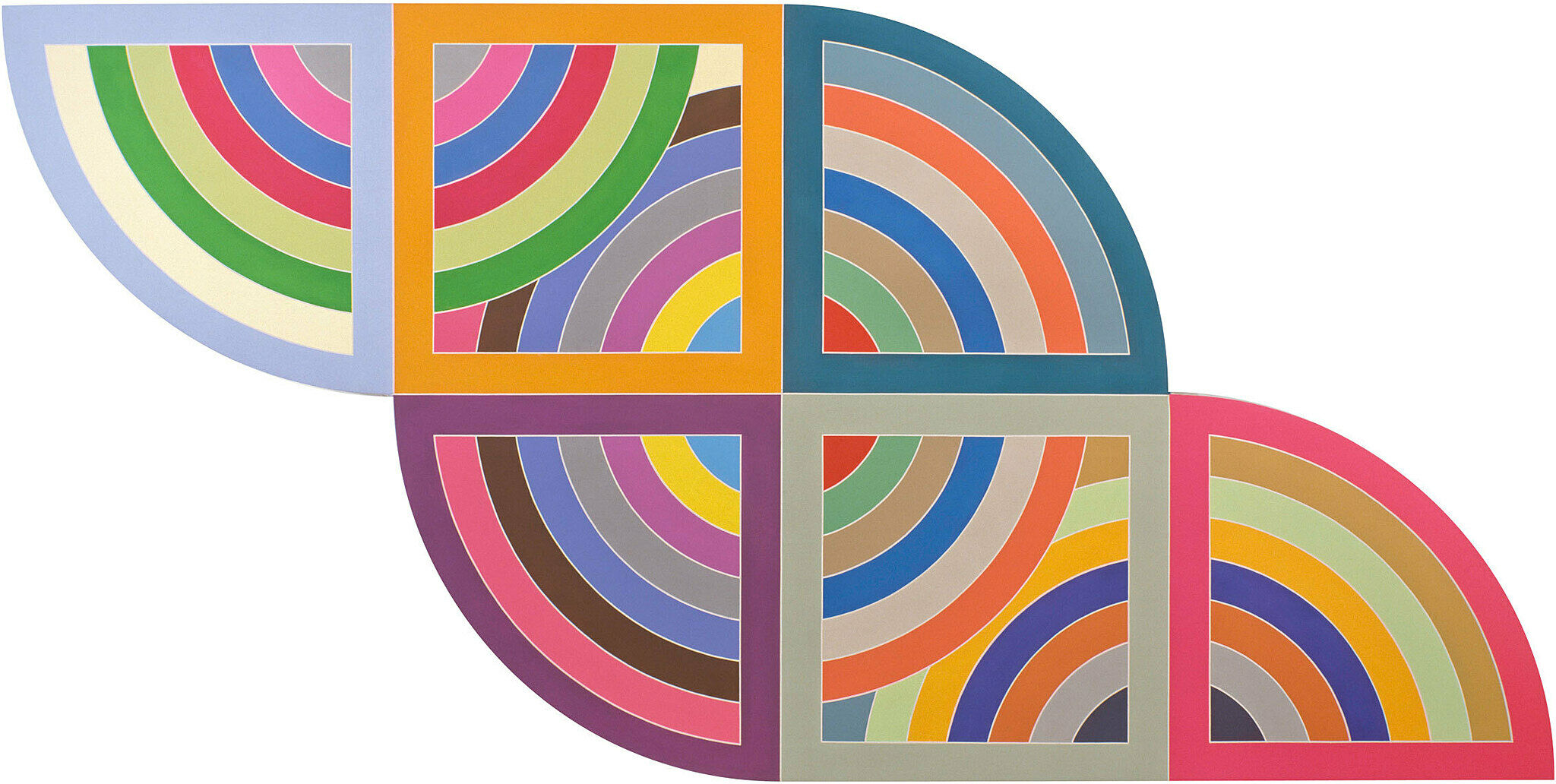
Narrator: Stella based the Day-Glo curves of Harran II on the form of a protractor. Michael Auping.
Michael Auping: I think the Protractor paintings―the effect that these colors have in the form of these interlaced curves―is like colored circles that roll across the wall. And in Harran, you can almost imagine these interlacing colored circles rolling through these static squares that are positioned all along the painting. It's named after an ancient Mesopotamian city in what is now Turkey. And it's an early reference by Stella to architectural form. One of the things Frank was trying to do with the Protractor paintings was challenge architecture with painting. Make architecture actually seem smaller, or make painting seem equally muscular to the architecture that framed the paintings.
Frank Stella (b.1936), Harran II, 1967. Polymer and fluorescent polymer paint on canvas, 120 x 240 in. (304.8 x 609.6 cm). Solomon R. Guggenheim Museum, New York; gift, Mr. Irving Blum, 1982. © 2015 Frank Stella/Artists Rights Society (ARS), New York
Adam Weinberg: If you look at the Irregular Polygon, Effingham, what I love about that is you have a parallelogram form that turns the corner. I mean, it's the most idiosyncratic shape of the painting.
Narrator: In his earlier paintings, Stella relied on symmetry and formal simplicity. But by the later 1960s, he began experimenting more broadly. Adam Weinberg.
Adam Weinberg: When you think about it, paintings had always been squares and rectangles or sometimes―as in churches―they were made to fit into the architecture. This is something that's not determined by any architecture. It is determined completely by the artist as a form. And what he does to this, he created a kind of L‑like shape or something that somehow, it almost feels like the painting is about to separate or about to cascade down the wall. But yet in effect, he has created something that is an entity that holds together visually. The parallelogram that is completely bounded by the red line actually holds together and hangs on to the rest of the painting. It doesn't fall. He's seeing how far can he push shape? How far can he push color and still make it a unified satisfying entity?
Frank Stella, Effingham II, 1966. Fluorescent alkyd and epoxy paint on canvas. 127 1/2 x 132 x 4 in. (323.9 x 335.3 x 10.2 cm). The Glass House, A Site of the National Trust for Historic Preservation, New Canaan, Connecticut. © 2015 Frank Stella/Artists Rights Society (ARS), New York
Michael Auping: Jasper's Dilemma refers to something that Jasper Johns said. And that is, "The more I work with color, the more I start to see gray."
Narrator: Michael Auping.
Michael Auping: And in Jasper's Dilemma, you see two squares butted next to each other, one of colored concentric bands and one of black, white, and gray concentric bands.
It's a reference to the fact that color is―well, as Ad Reinhardt said, "color is irrational." And I think Frank believes that. He sometimes likes the irrationality of color, along with its aggression. So to see something like Harran across from Jasper's Dilemma is to understand how Frank uses color, not as a nuanced thing creating small, gentle stages of space but how he uses color as an aggressive and illusionistic thing that bounces backwards and forwards.
And so what happens is color begins to fight against color. You really do, when you look at these pictures and you really stare at them, in a funny way, you do begin to see gray. It doesn't just confuse your eye. It disrupts how you see color. It isn't as though he's trying to balance a soft yellow with a bright red. It's more like he is using color in a combative way.
Frank Stella, Jasper’s Dilemma, 1962. Alkyd on canvas, 77 x 154 in. (195.6 x 391.2 cm). Collection of Irma and Norman Braman, Miami Beach. © 2015 Frank Stella/Artists Rights Society (ARS), New York
Narrator: In 1970, Stella began a series of paintings called the Polish Villages. He based them loosely on a book he’d been given by his friend, the architect Richard Meier. It documented Polish synagogues that had been destroyed by the Nazis during World War II.
Frank Stella: There was a way in which the structure, which, I made up a word called interlockingness―I mean I don’t know why I had to make that up! But anyway the parts and everything were locked together and it was just basically a kind of refined and complicated woodworking.
Narrator: The book inspired Stella to construct canvases that projected subtly forward, and to build up their surfaces with felt and other materials.
Frank Stella: It was a notion of, actually I was going to build the painting, I really wasn’t going to paint a painting anymore. So I could build these paintings and then in a sense paint them or decorate them or put collage on them or do whatever I wanted with them.
Frank Stella (b.1936), Jarmolince III, 1973. Mixed media on board, 116 x 90 x 8 in. (294.6 x 228.6 x 20.3 cm). Private collection. © 2015 Frank Stella/Artists Rights Society (ARS), New York
Narrator: This painting comes from a series Stella called Cones and Pillars.
Adam Weinberg: The Cones and Pillars series I find particularly fascinating because you have those basic structural forms of cones and pillars which have classical references to them because they remind one, of course, of classical pillars on Greek temples, cones being your basic Archimedes geometric forms.
Yet, what he's doing with them spatially is using them in a very whimsical way. Even though you have the structures of the linear elements, you also have these incredible calligraphic, brightly colored elements which fight against and work against the more structured forms of the cones and pillars themselves.
The combination between what seems to be purposeful and what seems to be random, what seems to be structured and what seems to be disordered is really, really balanced within this work. In a way, it becomes a universe unto itself.
Narrator: Around the time that Stella began the Cones and Pillars series, he was also urging painters to draw inspiration from their medium’s rich history. To hear more about this, please tap your screen.
Frank Stella, Gobba, zoppa e collotorto, 1985. Oil, urethane enamel, fluorescent alkyd, acrylic, and printing ink on etched magnesium and aluminum. 137 x 120 1/8 x 34 3/8 in. (348 x 305 x 87.5 cm). The Art Institute of Chicago; Mr. and Mrs. Frank G. Logan Purchase Prize Fund; Ada Turnbull Hertle Endowment 1986.93. © 2015 Frank Stella/Artists Rights Society (ARS), New York
Narrator: Stella’s approach to painting grew increasingly extravagant in the middle of the 1970s. He began producing swooping forms based on French curves and other technical drafting tools. And he began pushing painting into the third dimension, working to expand the medium’s possibilities.
Michael Auping: In the mid‑1970s, there was a great deal of critical dialogue about the so‑called death of painting.
Narrator: Michael Auping.
Michael Auping: There were critics who had said that painting had basically run its course. And Frank's career has always been about continuing painting. And I think his reaction to keeping it relevant was reengineering the technology of painting. It wasn't just a matter or dipping a brush into paint and applying it to a ground. It was a matter of taking physical parts and building a painting which you then painted, and then you built something over that, and painted that. He felt that that's where abstraction had to go in order to stay relevant. Painting needed new materials. It couldn't simply exist with oil on canvas.
Frank Stella (b.1936), Inaccessible Island Rail, 5.5x, 1976. Mixed media on aluminum, 117 x 153 in. (297.3 x 388.7 cm). Grinstein Family Collection. © 2015 Frank Stella/Artists Rights Society (ARS), New York
Narrator: Stella named this painting, Zeltweg, after a racetrack in Austria.
Michael Auping: These curves are actually based on the shape of Formula One and Grand Prix race tracks.
Narrator: Michael Auping.
Michael Auping: He uses curves, found curves as it were, as a form of gesture. Frank's interest in car racing has led him to designing images for the bodies of racecars. He's also driven racecars on occasion. He's someone you really don't want to drive with on the freeway. He drives 100 miles an hour.
What I think he's trying to impart in a painting like Zeltweg is this sense of speed and how these curves from the race tracks or curves that he has made up catapult your eye around and through the painting, which is what a curve does. You follow a line. If it curves, it zips your eye around the picture. That's what he's trying to do in these paintings along with the physical nature of them, in which these curves are made up of various sheets of metal that are then painted. And they're at different distances from your eye. Frank has said on some occasions that when you're driving a race car, following the line and the curve is something you have to really concentrate on. That's what he's trying to get the viewer to do with these so‑called circuit paintings.
Frank Stella, Zeltweg (V), 4.75X, 1982. Mixed media on etched magnesium, 114 x 128 x 20 in. (289.6 x 325.1 x 50.8 cm). Private collection. © 2015 Frank Stella/Artists Rights Society (ARS), New York
Adam Weinberg: Eskimo Curlew is a beautiful, lyrical painting.
Narrator: The painting comes from a series that Stella called the Exotic Birds.
Adam Weinberg: So here, you have the idea of birds being the most natural and non-formal structure.
Narrator: At the same time, the painting’s swooping forms come from the technical realm―they’re drawn from French curves and other tools for mechanical drawing.
Adam Weinberg: What you see is elements floating above a picture plane. A picture plane that then is actually recessed as well. You have the sense of objects floating in an almost slightly surrealist fashion against the rectangle of the aluminum. And now, replacing canvas, which he had been using for several decades, he is now going into the use of metal and cut metal. Seeing how other materials can be the support for painterly activities. And what you find is that he's having fun painting.
You could see that the surfaces, the linear qualities, the wave‑like qualities, colors come back into it. These are exotic paintings especially by virtue of thinking of where Stella had come from in terms of the Black Paintings, the Aluminum Paintings, the Copper Paintings. These almost, for some people, start to go off the deep end.
Frank Stella (b. 1936), Eskimo Curlew, 1976. Litho crayon, etching, lacquer, ink, glass, acrylic paint, and oilstick on aluminum. 8 ft. 2.75 in x 10 ft. 7 in. (2.5 × 3.2 m). Portland Art Museum, Portland, Ore.; museum purchase: funds provided by Mr. and Mrs. Howard Vollum. © 2015 Frank Stella/Artists Rights Society (ARS), New York
Adam Weinberg: Raft of the Medusa is a sculptural work that is actually very painterly in many ways, because although it's hard to believe, it actually is more related to what he did early on in the Black Paintings than you might think.
Narrator: Please take a moment to walk around the work, and see it in its entirety.
Adam Weinberg: First of all, you have the grid‑like structure that holds the more fluid qualities of the junk‑like material that floats on the surface of this. He is really playing with the idea of a front of a picture and the back of it.
He calls it Raft of the Medusa which is named after a very famous painting by Théodore Gericault, the French painter called Raft of the Medusa with these figures that has very dramatic space where the figures are falling off or clinging to this raft for dear life. There is a sense that this piece that the molten metal and wire is clinging to that grid for dear life. It's as if things are falling off, exploding, hanging on to what might be seen as the raft which is that rectilinear structure behind it.
Most people would call this a sculpture, but in many respects, this is still painting for Frank. This is really about using three‑dimensional form for almost two‑dimensional purpose. He's very interested in the surfaces, the light, and reflection, and the idea that these elements though then spring forward, and yet stay clinging to the raft of the grid.
Frank Stella (b. 1936), Raft of the Medusa (Part I), 1990. Aluminum and steel. 167 × 163 × 159 in. (424.2 × 414 × 403.9 cm). The Glass House, A Site of the National Trust for Historic Preservation. © 2015 Frank Stella/Artists Rights Society (ARS), New York
Narrator: Stella has long used digital imaging software. In many works, including the more recent ones in this room, he has also used a 3-D printer. Artist Jordan Kantor.
Jordan Kantor: What’s interesting here is we see the artist working with some compositional principles and dynamic spaces that we can recognize from works that he made as many as twenty-five years before, such as in the Circuit Series with this emphasis of moving your eye all the way around the composition.
He’s kind of, I believe wittingly, updating a dynamic language maybe associated with earlier painting all the way back through Abstract Expressionism to maybe even something like Rubens in the way that he's moving our eye around through the space. But he's doing it through lines that have been mediated by some degree of digital technology.
We know that in order for these things to be fabricated this way, at some point they had to arrive into a computer, and they had to come out of a machine. That is a really interesting twist on this idea of gesture. Specifically, as it might relate to a moving arm in space that we could associate with a practice like Jackson Pollock's, for example. Which is something, at the early part of his career, he certainly was cognizant of and responding to.
Frank Stella (b. 1936), K.144, 2013. ABS RPT with stainless steel, 80 × 97 × 53 in. (203.2 × 246.4 × 134.6 cm). Collection Martin Z. Margulies. © 2015 Frank Stella/Artists Rights Society (ARS), New York
Michael Auping: The Protractor Paintings are arguably Frank's best known and most popular paintings. They made abstraction popular with the non‑art public. There are thousands of posters reproduced of Frank's Protractor Paintings.
Narrator: Many of Stella’s contemporaries regarded with horror the possibility that abstract painting might be decorative. But during the 1960s, Stella moved dramatically away from the avant-garde idea that art needed to be difficult to be good. He wanted visual appeal, even beauty. At the same time, he was extremely rigorous in his development of the Protractor series. He produced thirty-one different formats. He began with simple quarter circles and semi-circles, then began making them more complex, one added form at a time. He made three versions of each format, making one where the arcs made a kind of rainbow, one in which they were interlaced, and one―as in this work―where they broke apart into fans.
Michael Auping: The Protractor Paintings, many of which are very large, though today, a lot of artists make large works, it's hard to understand how large these works seemed in the mid and late '60s. I mean, they were gigantic.
Frank Stella (b.1936), Damascus Gate (Stretch Variation III), 1970. Alkyd on canvas, 120 x 600 in. (304.8 x 1524 cm). The Museum of Fine Arts, Houston; museum purchase funded by Alice Pratt Brown. © 2015 Frank Stella/Artists Rights Society (ARS), New York
Narrator: Stella titled this work Circus of Pure Feeling for Malevich. On its most obvious level, the title refers to one of the most purist and extreme practitioners of early abstraction—the Russian avant-garde artist Kazimir Malevich.
Jordan Kantor: There's a way in which these works really speak to the ethos of truth to materials that I think was very central to that Constructivist approach that Malevich represents in art history.
Narrator: Artist Jordan Kantor.
Jordan Kantor: This feels like a playful way in which Stella is just working through how these different metals of different gauges bend and the different shapes they can make in his hands. It just seems like we're given sort of a snapshot of his mind at work, working through formal invention on a small, intimate scale. It's almost like looking at a sketchbook.
Narrator: In a way, the title Stella gave this work announces his intention to be playful with the modernist tradition. It’s the Circus of Pure Feeling―a reference to a work installed on Floor 7 of the Whitney.
Jordan Kantor: Obviously in the context of the Whitney Museum, which has in its collection Alexander Calder's famous Circus, there is another valence here that has to do with a kind of playfulness and an American tradition that has nothing to do with Malevich, or very little to do with Malevich. The way that Stella is working to synthesize these different histories is something that's really compelling to me to think through. I think that they will create a nice feedback loop of form, of energy, and of playfulness, and will create an occasion for us to read one through the other.
Frank Stella, Circus of Pure Feeling for Malevich, 4 Square Circus, 16 parts, 2009. Stainless steel tubing, wire, and Protogen RPT. Various measurements. Audrey and David Mirvish, Toronto, Canada. © 2015 Frank Stella/Artists Rights Society (ARS), New York. Photograph by Craig Bokyo.
Narrator: Stella based this relief―and many more in the Scarlatti K series, including two nearby―on the sonatas of the Baroque harpsichordist Domenico Scarlatti. The works respond to Scarlatti’s compositions in visual terms.
Frank Stella: If you followed the forms, or if you did something that you’re not allowed to do usually, if you put your finger on the edge and followed the edge of the forms, you’d keep moving. And you’d run into things and loop around, and you’d do all of the things that the sound does in the course of a performance. And so it’s not so different. Because your eyes have to do a version of the same thing.
Narrator: The architect Richard Meier has been friends with Stella since the late 1950s.
Richard Meier: Frank just keeps moving on. Every time I see his new work I marvel at what it is, because it’s not like it’s based on anything he’s done before. It’s like he’s sort of starting again. You know, I don’t know many artists whose work is as varied and continually exciting the way Frank’s is.
Narrator: This is the last stop on our tour. Thank you for joining me today.
Frank Stella, K.81 Combo (K.37 and K.43) large size, 2009. Protogen RPT with stainless steel tubing, 180 x 192 x 120 in. (457.2 x 487.7 x 304.8 cm). Private collection. © 2015 Frank Stella/Artists Rights Society (ARS), New York
Mark Joshua Epstein: My name is Mark Joshua Epstein. I’m an educator at the Whitney Museum and I’m here with some fifth grade students to take a look at the Frank Stella retrospective today.
Shumit: Hi. My name’s Shumit.
Isabella: Hi. My name is Isabella.
Natalya: Hi. I’m Natalya.
Uma: Hi, my name is Uma. And we’re all in the fifth grade at PS 33 Chelsea Prep.
Mark Joshua Epstein: The Frank Stella retrospective covers about sixty years of Stella’s career. It’s over ninety works of art, and it gives us sort of an in-depth look at a bunch of different series that he’s done over the decades.
Student: This clearly looks abstract, and it clearly would’ve taken some time to design this.
Mark Joshua Epstein: Shumit, will you tell us what the word “abstract” means?
Student: It’s when you’re not drawing to make it look like something in particular; it’s just sort of like random.
Student: I also noticed that this painting or collage, because it’s kind of 3D, is mixed media, because there—it has, like, paints and—but it has—it looks like it has some pencil lines and some collage and multiple other things.
Student: I’m wondering something, if this artist actually cut the canvas, because it seems as if he—someone took scissors and cut an outline of a drawing, so it seemed to pop out as if he actually—he painted stuff and then he actually glued it onto the canvas.
Mark Joshua Epstein: Let me give you a little information about the painting. So, I love that we noticed these words at the bottom there in German. Does anybody speak German? No? Me neither. It translates in English to “Earthquake in Chile.” And Frank Stella was really inspired by a book that was actually written in the 1800s that was about an earthquake that had happened in Chile in the 1600s. So, it’s kind of—we get the event, we get the book, and now we get the painting. And I’m wondering, now that we know that, what do we think about the painting? What do we notice?
Student: I think this resembles an earthquake by, like, the chaos and the ripping of, like, artwork that you can see, like you can see some parts cut off, like an earthquake usually rips up, like, the Earth.
Student: Well, I also think this resembles an earthquake. But I think that he didn’t actually want to draw the earthquake and just the plain colors and the dullness of everything. But I think he just wanted to take that idea and make his own, like, earthquake of arts and different ways to make art, like colored pencil and pastel and paints and stuff.
Student: I think, like, in my view, it looks like the aftermath of an earthquake, because normally after an earthquake you see destruction, chaos, trees knocked over, things are broken.
Student: I think that he might not have thought it was a disaster. He wanted to make it from something very depressing into something colorful and, like, soft, if you know what I’m saying.
Mark Joshua Epstein: I love that idea that Frank Stella has taken inspiration from something that maybe wasn’t that positive, and made it into this beautiful, very chaotic, very colorful, kind of enticing artwork.
Frank Stella, Das Erdbeben in Chili [N#3], 1999. Acrylic on canvas. 144 x 486 in. (365.8 x 1234.4 cm). Private collection. © 2015 Frank Stella/Artists Rights Society (ARS), New York. Photograph by Steven Sloman.
Narrator: [Frank] Stella painted these large, abstract paintings when he was a young man.
Mark Joshua Epstein: I think these early works take a lot of extended looking. The white lines that Stella has left showing through the black paint take a long time to find themselves to your eyes. It’s almost as if you’re trying to look at something in pitch black and you need to give your eyes time to adjust so that you can really see the details. There’s all of this brushwork that comes through. These lines aren’t exactly—they don’t look like they’re made by machines. They’re definitely made by humans, and you see his brushwork and the evidence of the artist’s hand, which I think is really cool in this work.
You also notice that the paint that he’s using shines in certain spots more than others, and that’s because it was household paint. It was paint from a hardware store, and sometimes the finish was a little bit uneven.
I think this work looks kind of plain because Frank Stella was really getting to the basics of painting, and he’s trying to really narrow it down to see, if I take out almost everything, can I still make a picture? And what will that picture look like?
Frank Stella, Die Fahne hoch!, 1959. Enamel on canvas, 121 5/8 x 72 13/16 in. (308.9 x 184.9 cm). Whitney Museum of American Art, New York; gift of Mr. and Mrs. Eugene M. Schwartz and purchase with funds from the John I. H. Baur Purchase Fund, the Charles and Anita Blatt Fund, Peter M. Brant, B. H. Friedman, the Gilman Foundation, Inc., Susan Morse Hilles, The Lauder Foundation, Frances and Sydney Lewis, the Albert A. List Fund, Philip Morris Incorporated, Sandra Payson, Mr. and Mrs. Albrecht Saalfield, Mrs. Percy Uris, Warner Communications Inc., and the National Endowment for the Arts 75.22. © 2015 Frank Stella / Artists Rights Society (ARS), New York. Digital Image © Whitney Museum
Narrator: This work comes from a group of paintings Stella called the Notched Vs.
Mark Joshua Epstein: It’s as if Frank Stella has taken a letter and made an abstract painting out of a letter. So we see one of these forms is the letter V, standing upright, like we’re used to seeing in the alphabet or in a book, and then he’s playing around with three other forms of the same letter, kind of leaning on the other one, upside down, and sort of, in the same space, making up the composition.
My eye interacts with this painting as if it’s a sentence. I start on the left side and go to the right side and sort of follow it all the way over, kind of starting in that warm brown corner at the top, and then following the lines all the way through ‘til it sort of drops me out at the end on the bottom.
The diagonal lines in this painting are really energetic. They really shoot your eye over to one spot and then over to another spot. And the only kind of horizontal lines we have are really on the top left and the bottom right, and otherwise, even the edges, the side edges, of this painting are diagonal, so they almost shoot you out to another artwork or whatever else might be in the room.
Narrator: In the first room of this exhibition, we saw that Stella wanted to make paintings that were as simple and straightforward as possible. Here he lets things get a little more complicated. In the rest of the exhibition, we’ll see that his work gets a lot more complex!
Frank Stella, Empress of India, 1965. Metallic powder in polymer emulsion paint on canvas, 77 x 224 in. (195.6 x 569 cm). The Museum of Modern Art, New York; gift of S. I. Newhouse, Jr. 474.1978. Digital image © The Museum of Modern Art/Licensed by SCALA / Art Resource, NY. © 2015 Frank Stella/Artists Rights Society (ARS), New York
Mark Joshua Epstein: What I see when I look at this work is Day-Glo colors jumping out at me. So we get this amazing, sharp shape of bright, bright yellow in the left-hand top corner, and we get this pink line that goes almost all the way around the painting but can’t contain in that top corner of yellow, and the pink line curls in on itself around this beautiful, orange shape. So we’ve not just got one color that’s kind of popping out and maybe even punching us in the face, really singing to our eyes. We’ve got these three colors that are all doing it at the same time.
And there’s this part on the right side that might be a parallelogram that looks like it’s hanging onto the painting for dear life. We have this thin, white line that almost goes all the way through, cutting it off, but it stops a few inches from the edge, and it almost feels like, if we were to walk away and come back, that parallelogram would just have tumbled off, onto the floor.
Frank Stella, Effingham II, 1966. Fluorescent alkyd and epoxy paint on canvas. 127 1/2 x 132 x 4 in. (323.9 x 335.3 x 10.2 cm). The Glass House, A Site of the National Trust for Historic Preservation, New Canaan, Connecticut. © 2015 Frank Stella/Artists Rights Society (ARS), New York
Mark Joshua Epstein: I’m going to ask you a tricky thing, which is that I’m going to ask you what you notice just with your eyes, what you can see just with your eyes.
Student: And I notice that it kind of—like, at first glance, it looks like it’s kinda just squares around it, but it just goes in a square-y spiral.
Student: It seems like two paintings of the same shape, but one’s black and white, and one’s full of color. But yeah, it’s sort of like fused together as one painting.
Student: I notice that, if you have a painting, it’s just flat on the wall. But it’s got some sort of illusion going on. And so, like, if you—at first glance, it just looks like a bunch of squares going on in the picture. But if you look closer, it can actually look like a tunnel that’s leading you somewhere you don’t know.
Student: It does look like a tunnel, but another way to look at it is, if you’re in the inside of, like, a pyramid, and you’re looking up at the ceiling of a pyramid, it looks like that you’re inside a pyramid.
Mark Joshua Epstein: I like that we’re talking about squares and rectangles, because actually, when Frank Stella started his career, he was making paintings that were mostly squares and rectangles. And then, when he goes later in his career, he starts to change that around a little bit.
Frank Stella, Jasper’s Dilemma, 1962. Alkyd on canvas, 77 x 154 in. (195.6 x 391.2 cm). Collection of Irma and Norman Braman, Miami Beach. © 2015 Frank Stella/Artists Rights Society (ARS), New York
Student: So, one thing that I notice is, in so—like, it’s very pop-out. It literally pops out. And in some places, the painting is neat, though you can still see the brushstrokes. And then in other places, it looks like he kinda just scooped up a bunch of paint and, like, kinda splattered it on, and then made it neater.
Mark Joshua Epstein: Is this still a painting? What do you guys think?
Student: Well, I think it is still a painting, ‘cause he uses paints, like, everywhere. And a painting could be anything.
Mark Joshua Epstein: So, you’re noticing that there’s a couple of different levels of three dimensions with this painting, right? We have this thing in the background that has this more white and the pink and the yellow that seems like it’s just a—maybe he started with just a painting. And then he’s got this cut-out stuff. And then what you’re noticing, which is really amazing, is that then he uses the paint itself to even be more textural. So, we have all of these levels of three dimensions.
Student: I think it, like, is a painting and a sculpture at the same time, because it’s got a canvas, and it’s got paint on the canvas, so that would technically be a painting. But then it’s got all these structures, like, popping out, which makes it sort of a half-sculpture, because sculpture is made of a totally different material. It’s like this whole thing that’s 3D.
Mark Joshua Epstein: One thing I also wanted to mention is that, in this painting, Frank Stella starts to use what’s called honeycomb aluminum as his support, instead of canvas. So, all of the stuff that we’re looking at is actually on metal, which I think really supports Uma’s idea that we’re between painting and sculpture.
Frank Stella, Gobba, zoppa e collotorto, 1985. Oil, urethane enamel, fluorescent alkyd, acrylic, and printing ink on etched magnesium and aluminum. 137 x 120 1/8 x 34 3/8 in. (348 x 305 x 87.5 cm). The Art Institute of Chicago; Mr. and Mrs. Frank G. Logan Purchase Prize Fund; Ada Turnbull Hertle Endowment 1986.93. © 2015 Frank Stella/Artists Rights Society (ARS), New York
Mark Joshua Epstein: The title of this piece, Zeltweg, comes from a car-racing track in Austria. Stella is really interested in this idea of movement and of cars kind of shooting around.
We can imagine it almost as if toy cars are shooting around this painting, going on the curves, falling off, finding a ramp, finding a straight road, and what I notice is actually that the only really straight things in the painting besides the edges are these red things that shoot up from the bottom left corner and then turn ninety degrees and go down again. So, if we’re a car, we’re really in danger in this painting.
Something that’s really interesting is also that Frank Stella is using so many different ways to get the paint onto this piece. So he’s scribbling, he’s using maybe a ruler to do some grids, he’s drawing really fast and then in some parts, maybe he’s drawing a little bit more carefully, but he’s playing with this idea of what can I do with the material?
Frank Stella, Zeltweg (V), 4.75X, 1982. Mixed media on etched magnesium, 114 x 128 x 20 in. (289.6 x 325.1 x 50.8 cm). Private collection. © 2015 Frank Stella/Artists Rights Society (ARS), New York
Mark Joshua Epstein: The title for this work is Khar-Pidda, and kharpidda is an Indian name for a bird that in English, we call a common stonechat, and it’s a bird that migrates to India in the winter, and Frank Stella did a trip to India in the 1970s, and saw some of these birds. What’s really interesting about this bird and the connection to the title for me is that the common stonechat is not a beautiful bird. It’s not a colorful bird. It’s sort of brown and grey and has maybe some orange on its throat.
So, I find it fascinating that Frank Stella can look at something that maybe isn’t beautiful, isn’t full of beautiful colors, and make something as dynamic as this, and I wonder if he was thinking a little bit about flight and this idea of migration and of birds moving around because this piece really feels like it’s flying around the wall, almost.
Frank Stella, Khar-pidda 5.5x, 1978. Mixed media on aluminum, metal tubing, and wire mesh, 122 x 88 x 35 in. (309.9 x 223.5 x 88.9 cm). The Glass House, A Site of the National Trust for Historic Preservation. . © 2015 Frank Stella/Artists Rights Society (ARS), New York
Mark Joshua Epstein: What draws me in with this work is these white lines which are floating on top of these black, dynamic shapes, which are everywhere. There’s one to the left of the middle that kind of goes up and out the top and also curves over to the left. To me, it starts to feel like water. It starts to feel like it’s living, and maybe the water is kind of covering up something else. And the black and white lines lead us to all of these other colors. There’s red with black, there’s this dynamic geometric line stuff in the background, all sorts of things are going on.
This piece is called The Fountain and it’s from a large group of works that Frank Stella did about the book Moby-Dick.
And why it’s called The Fountain is because in the chapter, whalers are arguing about what’s coming out of the spout of a whale. Is it water? Is it air? It’s kind of a mystery that, even after thousands of years of whaling, people still haven’t really solved. And I see the mystery in this work. I see the kind of unknowable thing in this work. It’s all kind of caving in on itself, it’s all of these different shapes and colors and I feel like I can’t take it all in just with one view.
Frank Stella, The Fountain, 1992. Woodcut, etching, aquatint, relief, drypoint, collage, and airbrush. 91 x 275 3/4 in. (231.1 x 700.4 cm). Whitney Museum of American Art; gift of Marabeth Cohen-Tyler and Kenneth Tyler 2015.97a-c. © 2015 Frank Stella/Artists Rights Society (ARS), New York. Photograph by Steven Sloman.
Mark Joshua Epstein: When I look at this work, I notice that it has all of these really small sculptures that look almost like toys or experiments. I notice materials like wire and other kinds of metal that are twisted together. I can start to imagine these things coming to life when the lights of the Museum go off. They almost look like they’re ready to untwist or bend or start walking across the tables and then onto the floor across the galleries. Some of them seem like they’re springs, and like they’re waiting to explode, whereas some of them seem like they would open up more slowly, almost like a flower.
When Frank Stella was making this work, he was thinking of another artist, Alexander Calder, who has a piece called the [Calder’s] Circus up on the seventh floor of this Museum. I definitely want to encourage you to go up to the seventh floor and look at what Alexander Calder calls his circus. You’ll see some similarities with the material. Calder’s also using wire and he’s also making small-scale sculptures.
Frank Stella, Circus of Pure Feeling for Malevich, 4 Square Circus, 16 parts, 2009. Stainless steel tubing, wire, and Protogen RPT. Various measurements. Audrey and David Mirvish, Toronto, Canada. © 2015 Frank Stella/Artists Rights Society (ARS), New York. Photograph by Craig Bokyo.
Mark Joshua Epstein: Take a moment to look at the sides of this sculpture. Walk around so you can see all the details and then find a comfortable spot where you’re not too close to the artwork.
What I notice about this piece is that we get this repeated shape. If you look right at the middle of the sculpture, we get this kind of waveform which comes over and over and over again, almost radiating out from the middle. But they’re all in different colors, so we get colors that we think of with water and then we get colors that definitely we don’t think of with water.
This piece was actually inspired by a musician named Domenico Scarlatti, who lived in the seventeenth century. What’s interesting to me about this sculpture is, as an artist, how do you make something musical into something visual? How can you take sounds and tones and notes and make them into something that’s mostly for the eyes instead of the ears?
I also love with this work that it almost feels like it’s going to topple over on you. It’s attached to the floor and to the wall, but it looks like a whirlwind of energy.
Frank Stella, K.81 Combo (K.37 and K.43) large size, 2009. Protogen RPT with stainless steel tubing, 180 x 192 x 120 in. (457.2 x 487.7 x 304.8 cm). Private collection. © 2015 Frank Stella/Artists Rights Society (ARS), New York
Mark Joshua Epstein: So, we have arrived at a different artwork, called Raft of the Medusa. And I’m wondering what you guys notice about this artwork.
Student: I notice that it’s, like, totally made of metal. And it kind of looks like that they—this artist—is this still Frank Stella? Okay—that Frank Stella melted a bunch of aluminum foil and waited till it cooled—well, maybe he actually put it together while it was still melting, so that it cooled and it was stuck together.
Student: The—this thing looks like something you’d find in a junkyard or a landfill. But he somehow put it together to make it artwork.
Mark Joshua Epstein: Let’s talk a little bit more about the thing we noticed in the back that’s holding up the piece. Could anyone else share a thought about that rectangle?
Student: So, it holds it up, but it’s still part of the art itself. And I think it’s really cool that he did that, ‘cause most artists would just, like, kind of have a painting or a sculpture, a small sculpture, not this crazy and enormous.
Mark Joshua Epstein: This artwork was inspired in part by an older artwork by an artist named Géricault. And that artwork shows us a shipwreck, actually. So, a shipwreck happens. And as the ship is going down, people quickly make a raft out of wood from the ship, and they get on the raft, and they sail away from the ship. And the ship is called The Medusa.
Student: Maybe this is like the—Frank Stella showing the remains of the raft of Medusa, because it sort of looks like, if you build a boat, you normally need a lot of metal. And this kind of looks like the metal has been corroded, and it’s been through a lot of journey. I feel pity for the metal.
Mark Joshua Epstein: Is this still a painting?
Student: No, because it doesn’t—I don’t think it has any paint at all. I think it’s just melted metal, all melted together. So, I think it’s more of a sculpture than a painting.
Mark Joshua Epstein: Can someone argue that it is a painting?
Student: Maybe it could be a painting because, you know, that looks like an empty canvas board holding up, like, a painting. It’s like this is the empty canvas, and it’s full of itself.
Frank Stella (b. 1936), Raft of the Medusa (Part I), 1990. Aluminum and steel. 167 × 163 × 159 in. (424.2 × 414 × 403.9 cm). The Glass House, A Site of the National Trust for Historic Preservation. © 2015 Frank Stella/Artists Rights Society (ARS), New York
0:00
0:00