America Is Hard to See
2015
-
000
Introduction to America Is Hard to See
Audio, Kids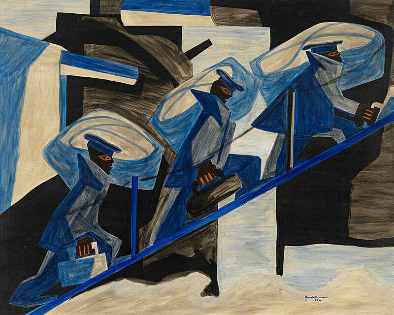
-
523
Sherrie Levine, Knot Paintings, 1987–2002
Audio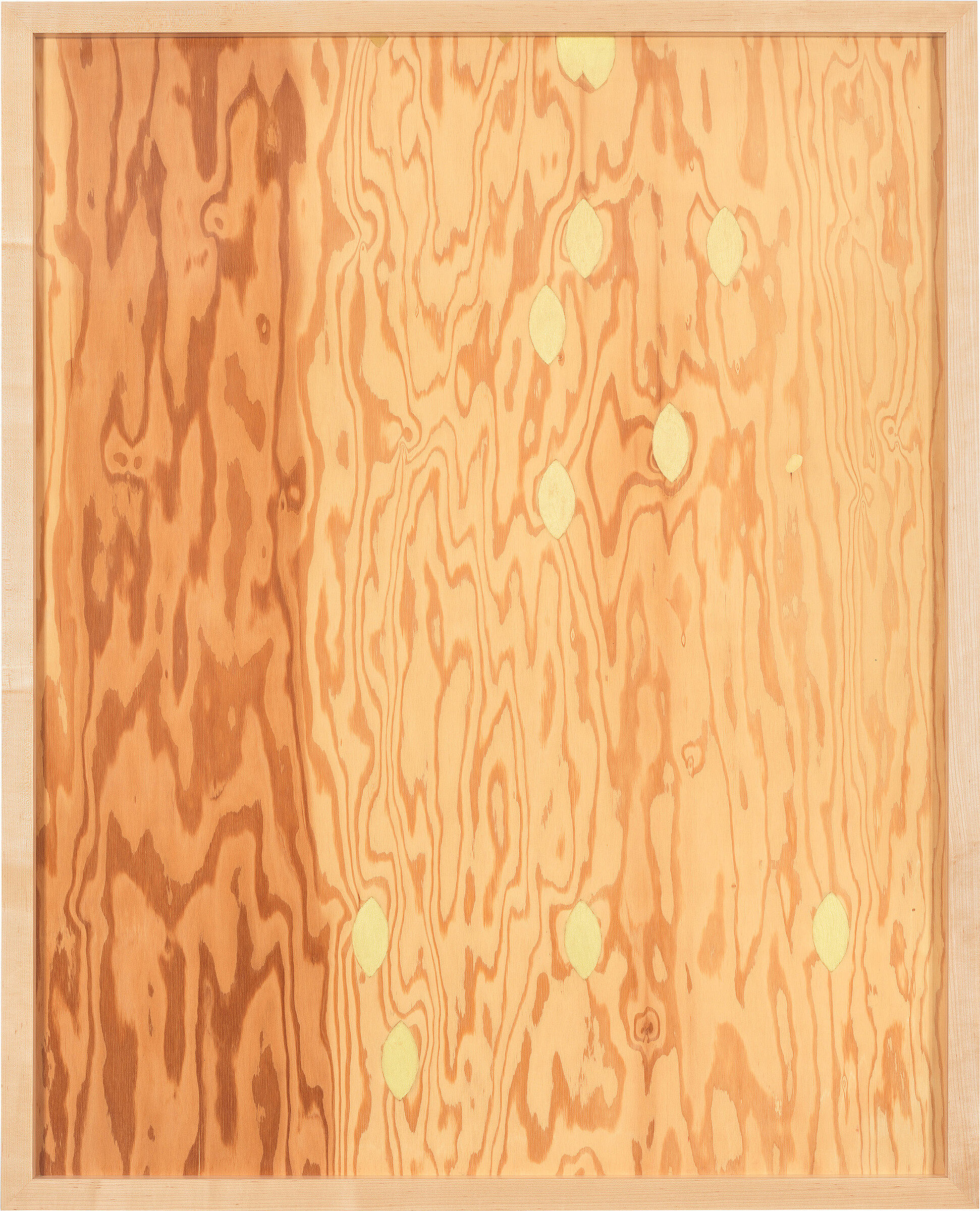
-
524
Jean-Michel Basquiat, Hollywood Africans, 1983
Audio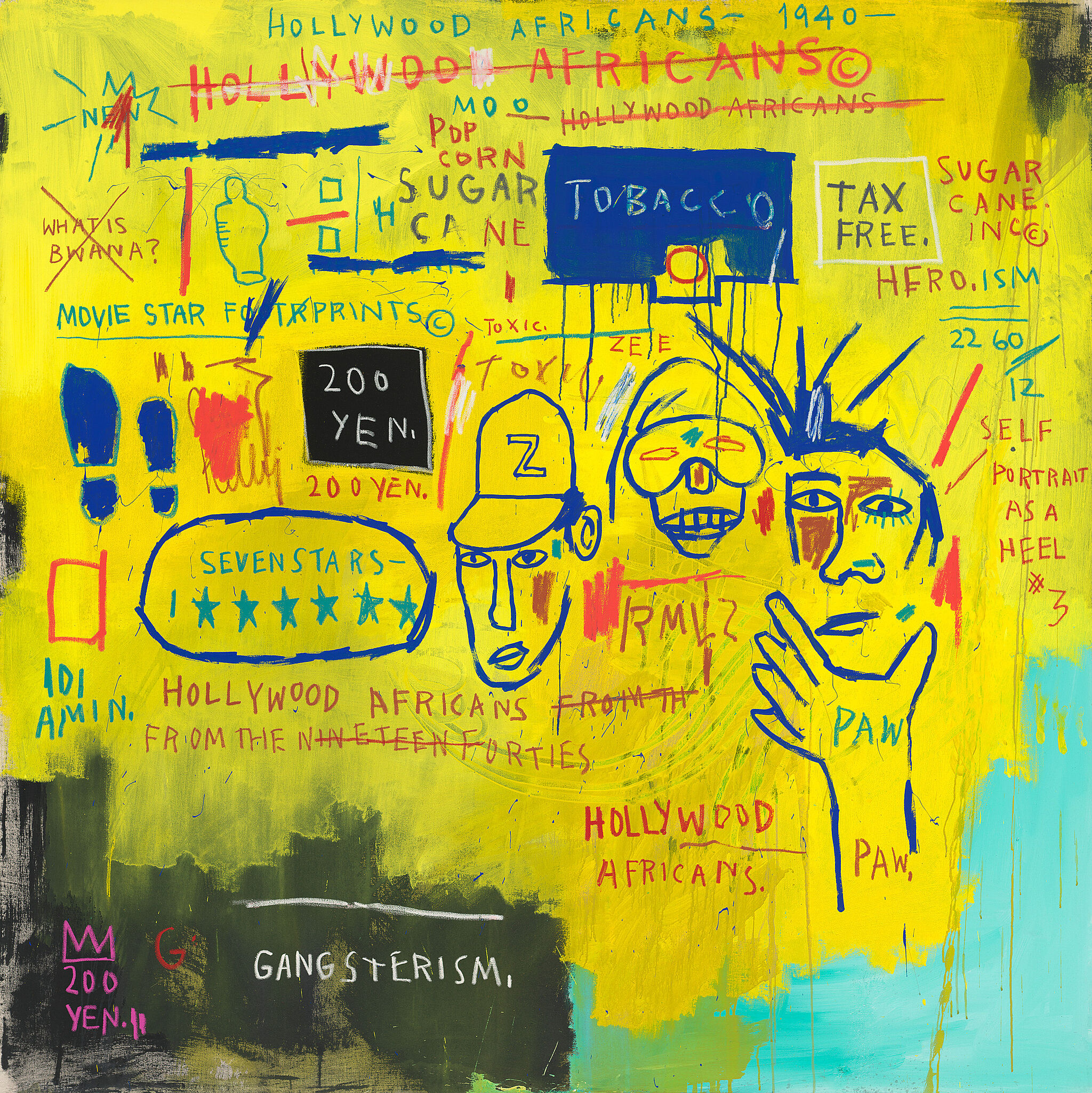
-
530
Martin Wong, Big Heat, 1988
Audio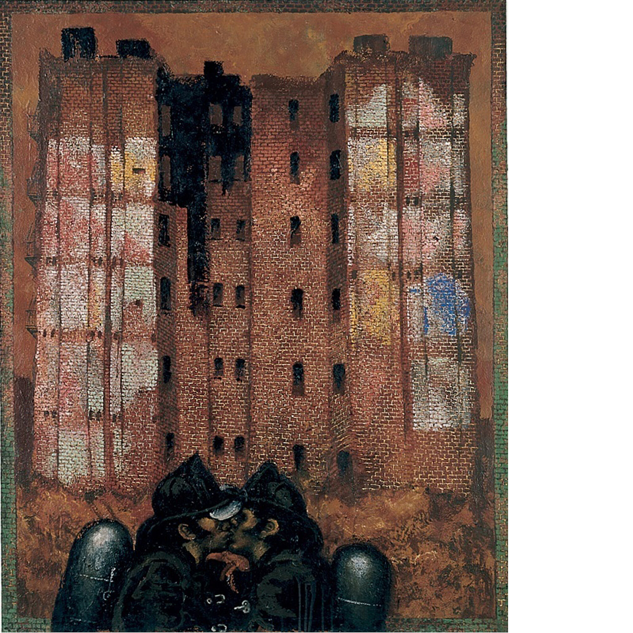
-
541
Paul Pfeiffer, Fragment of a Crucifixion, 1999
Audio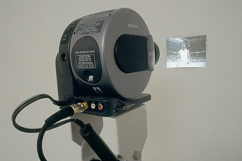
-
544
David Hammons, Untitled, 1992
Audio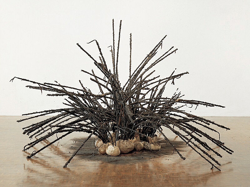
-
550
Paul Chan, 1st Light, 2005
Audio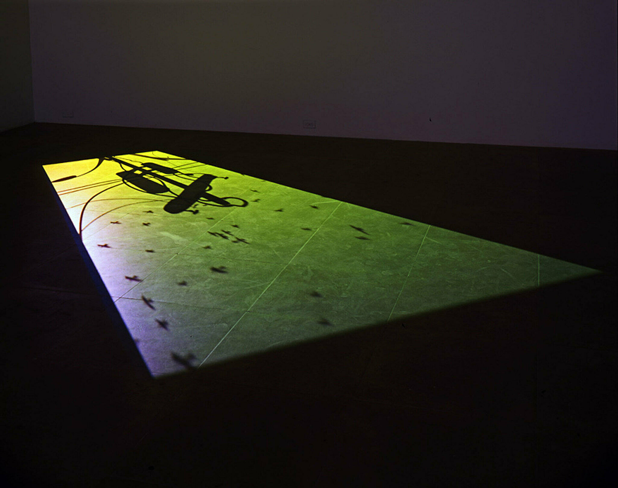
-
551
R.H. Quaytman, Distracting Distance, Chapter 16, 2010
Audio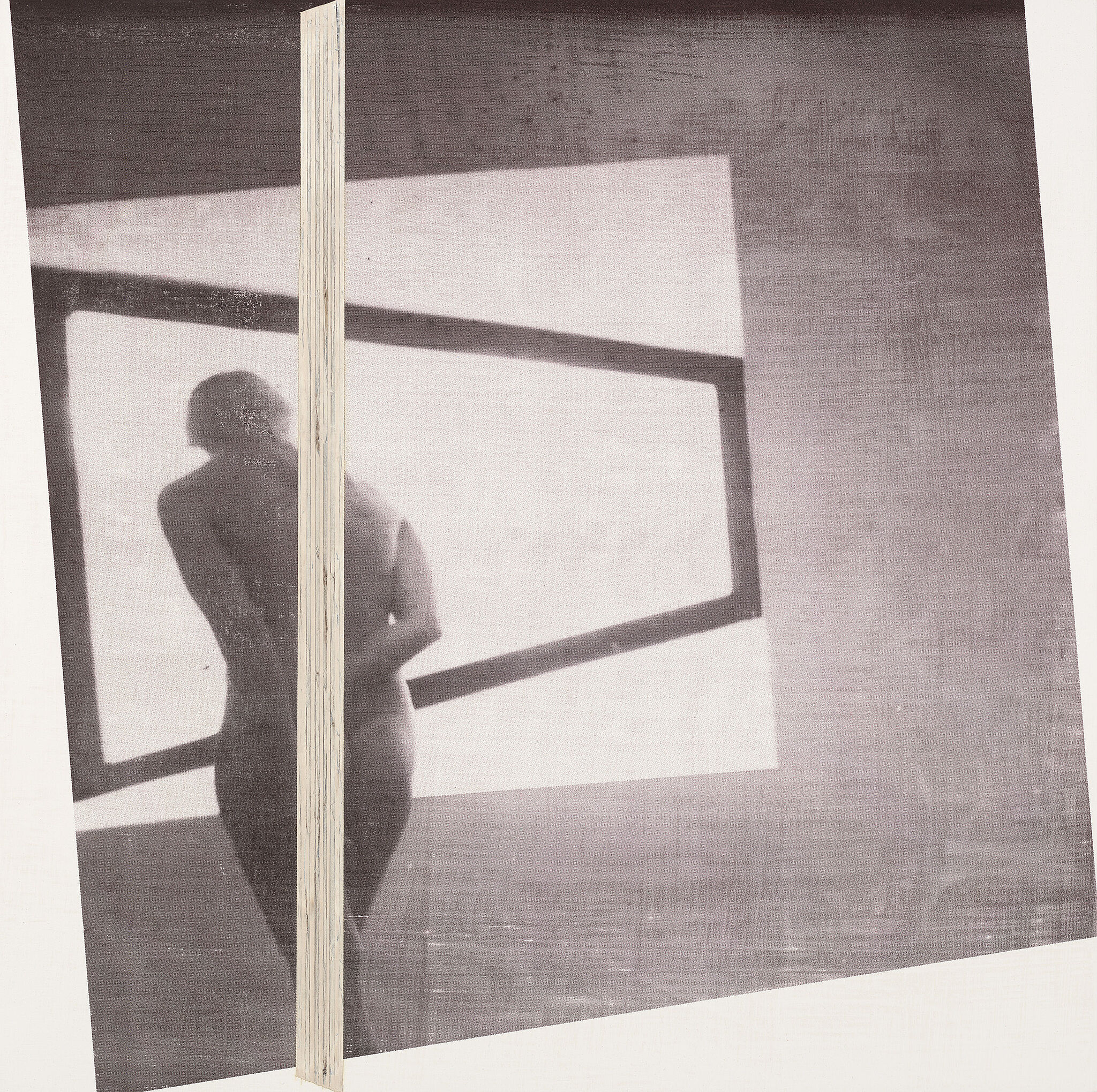
-
565
Adam McEwen, Untitled (Jeff), 2004
Audio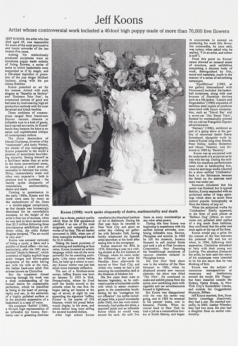
-
602
Ad Reinhardt, Abstract Painting, 1960–66
Audio
-
611
Bruce Conner, PORTRAIT OF ALLEN GINSBERG, 1960
Audio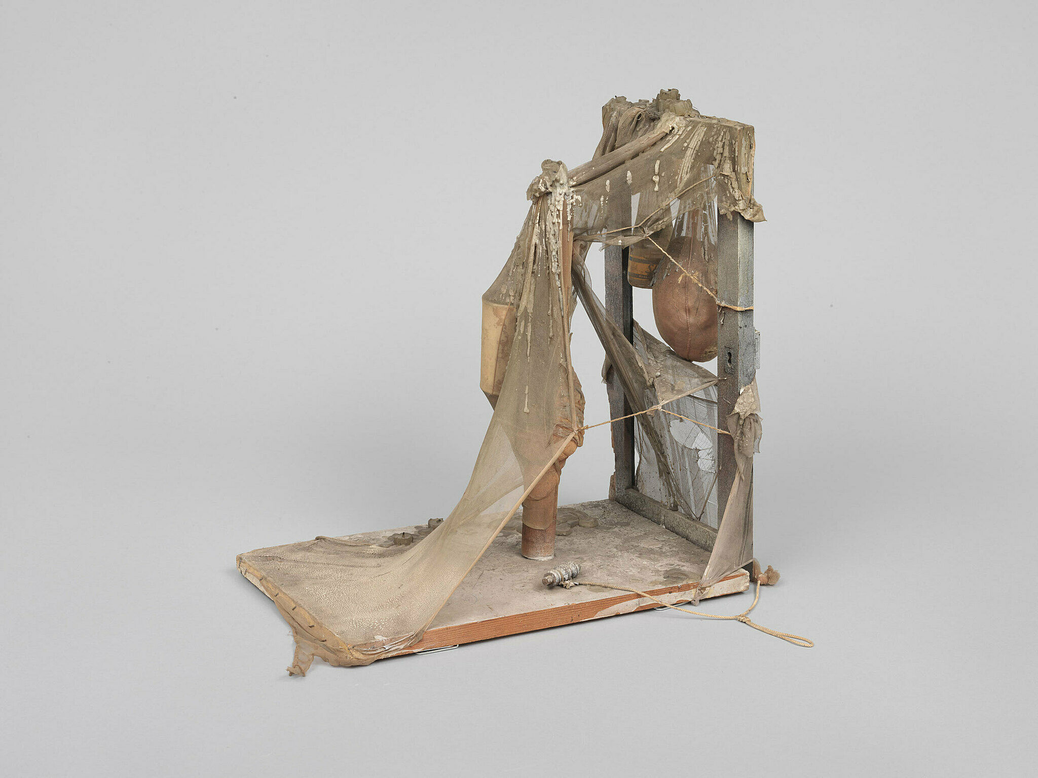
-
621
Marisol, Women and Dog, 1964
Audio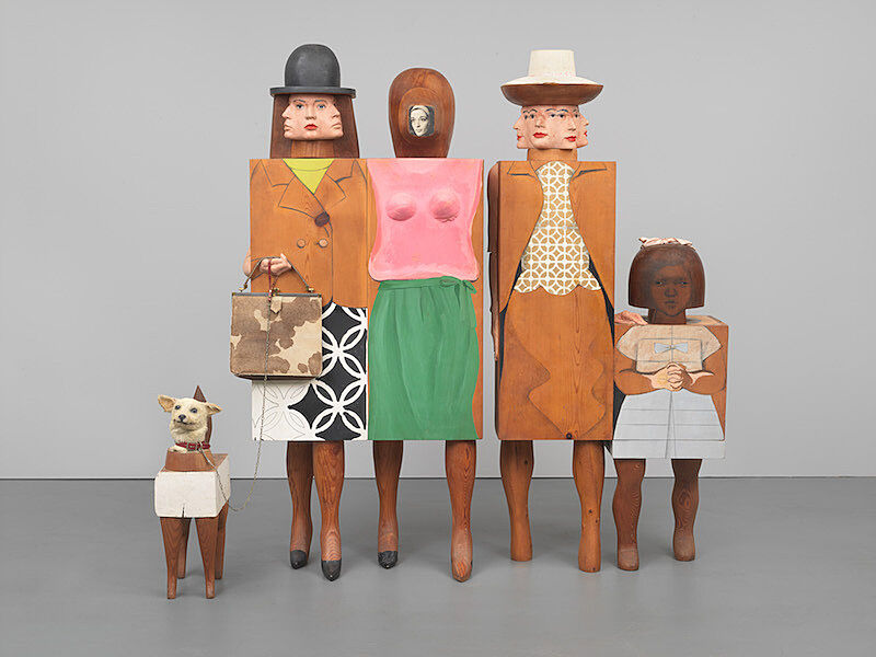
-
793
Roy Lichtenstein, Little Big Painting, 1965
Audio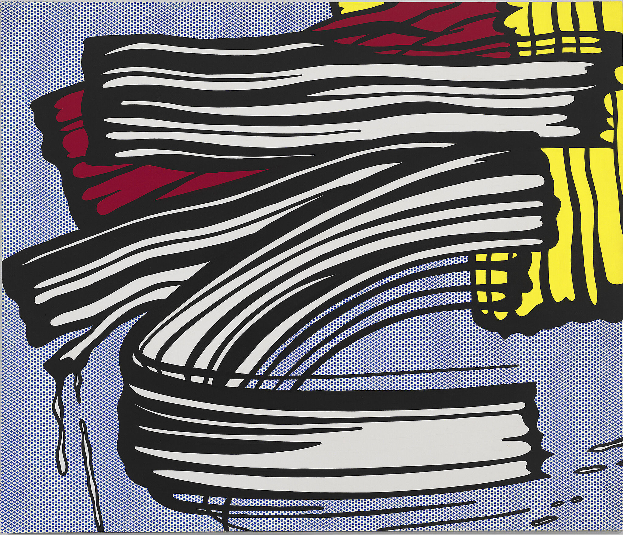
-
627
Jasper Johns, Three Flags, 1958
Audio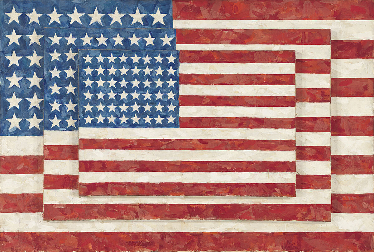
-
625
John Baldessari, An Artist is Not Merely the Slavish Announcer, 1966–68
Audio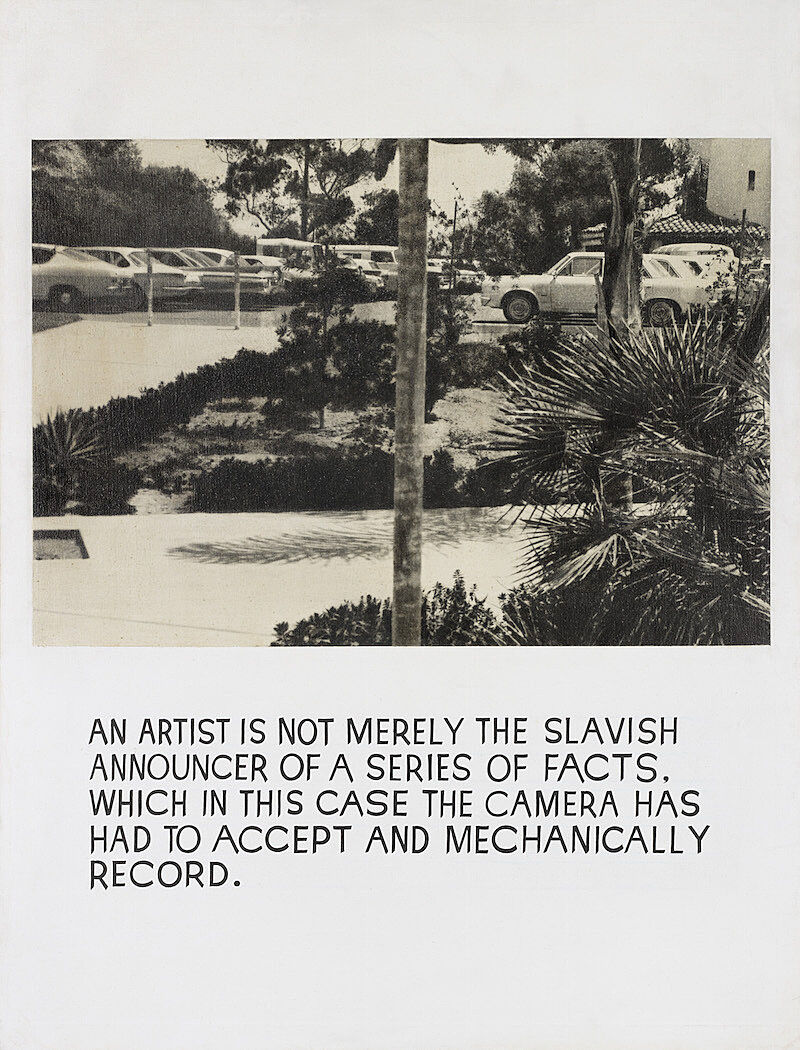
-
645
Anne Truitt, Triad, 1977
Audio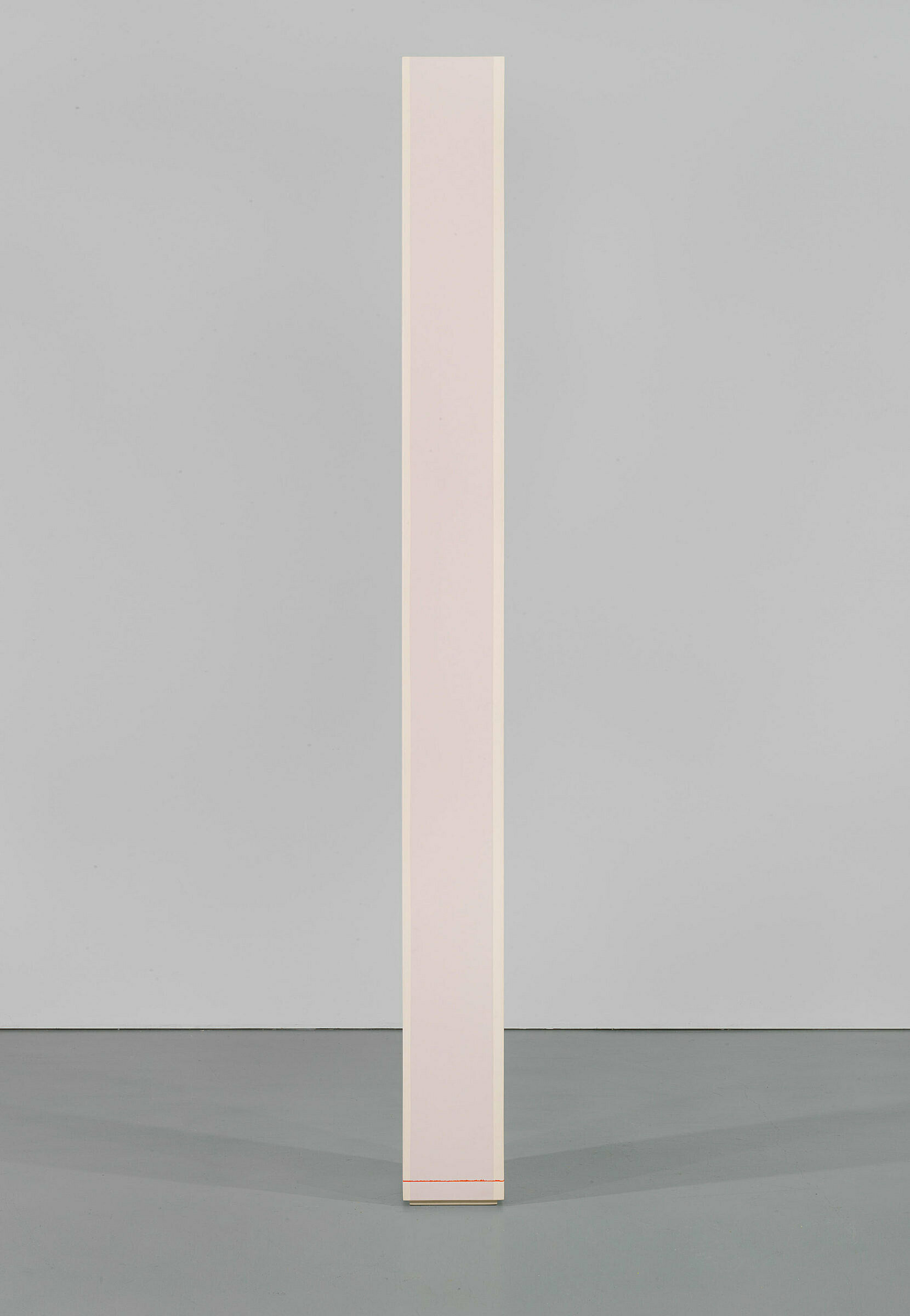
-
701
Alexander Calder, Calder’s Circus, 1926–31
Audio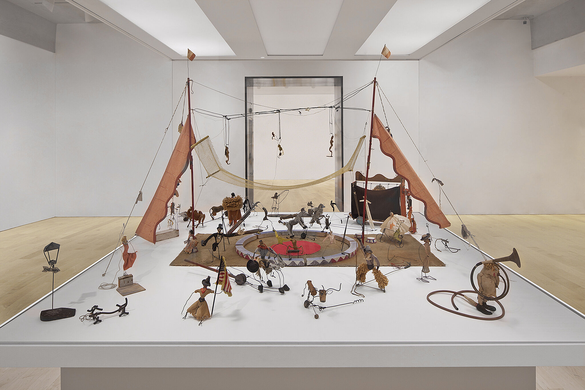
-
741
Georgia O’Keeffe, Summer Days, 1936
Audio
-
720
Edward Hopper, Early Sunday Morning, 1930
Audio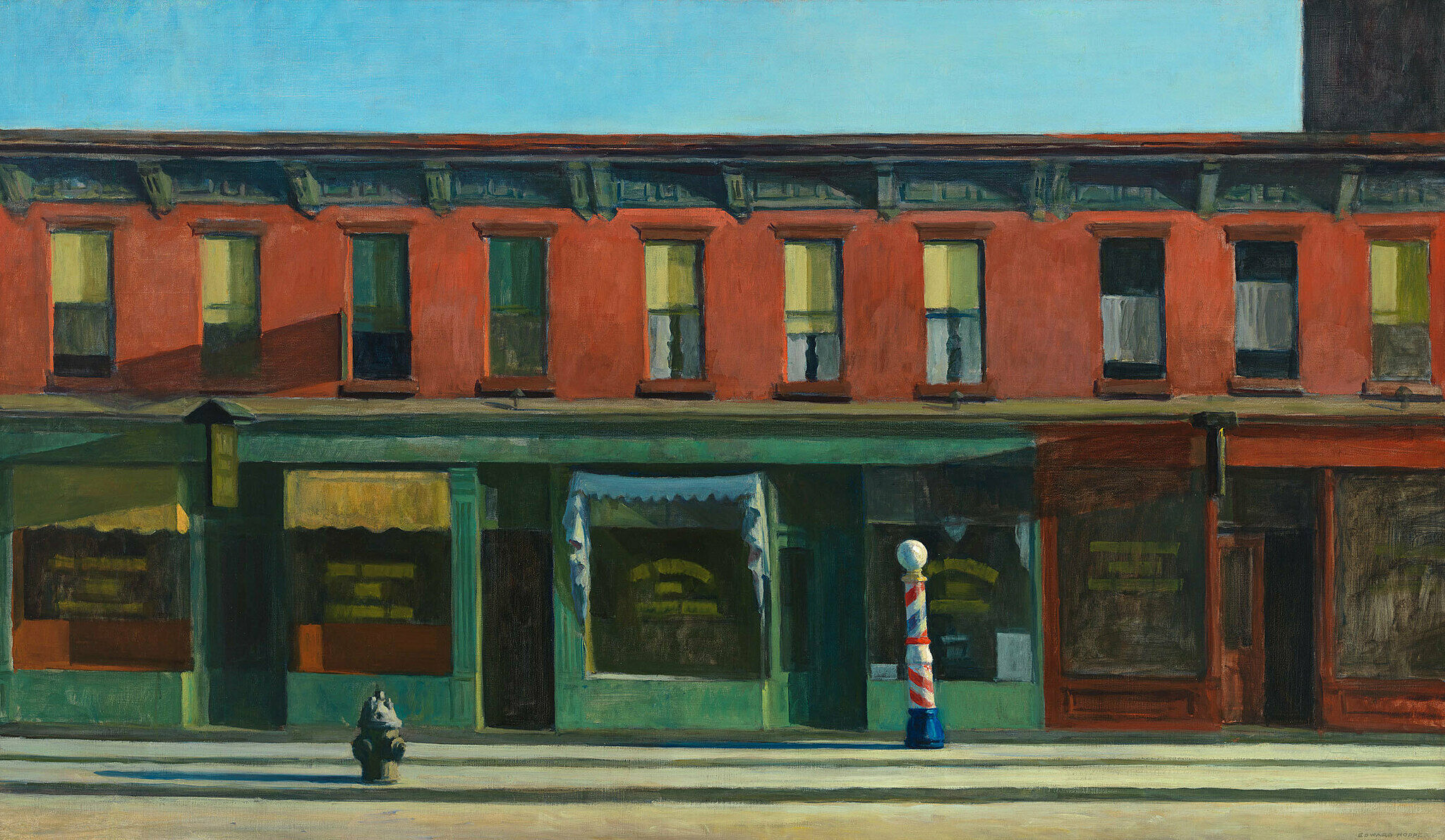
-
722
Jared French, State Park, 1946
Audio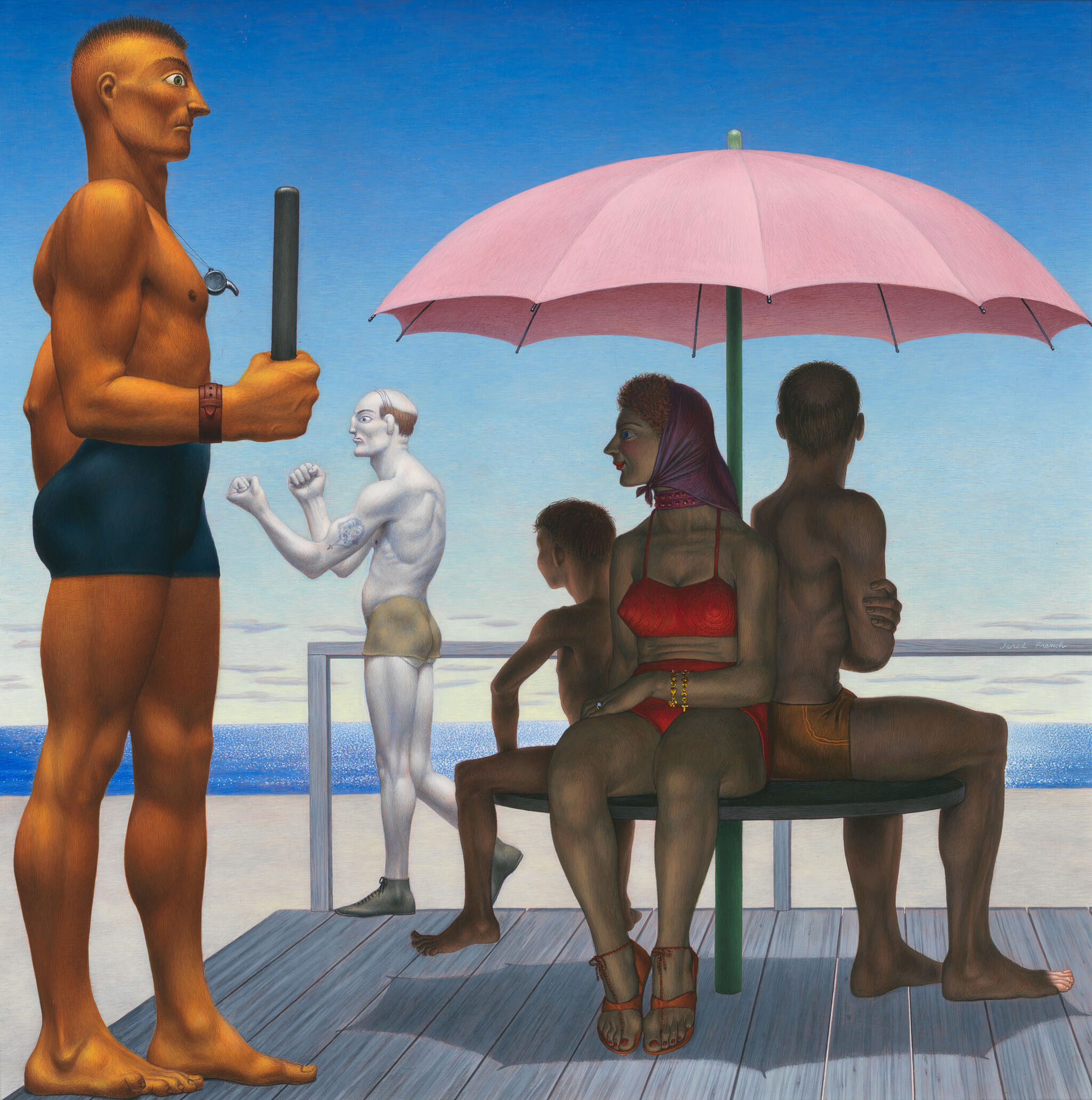
-
740
Willem de Kooning, Woman and Bicycle, 1952–53
Audio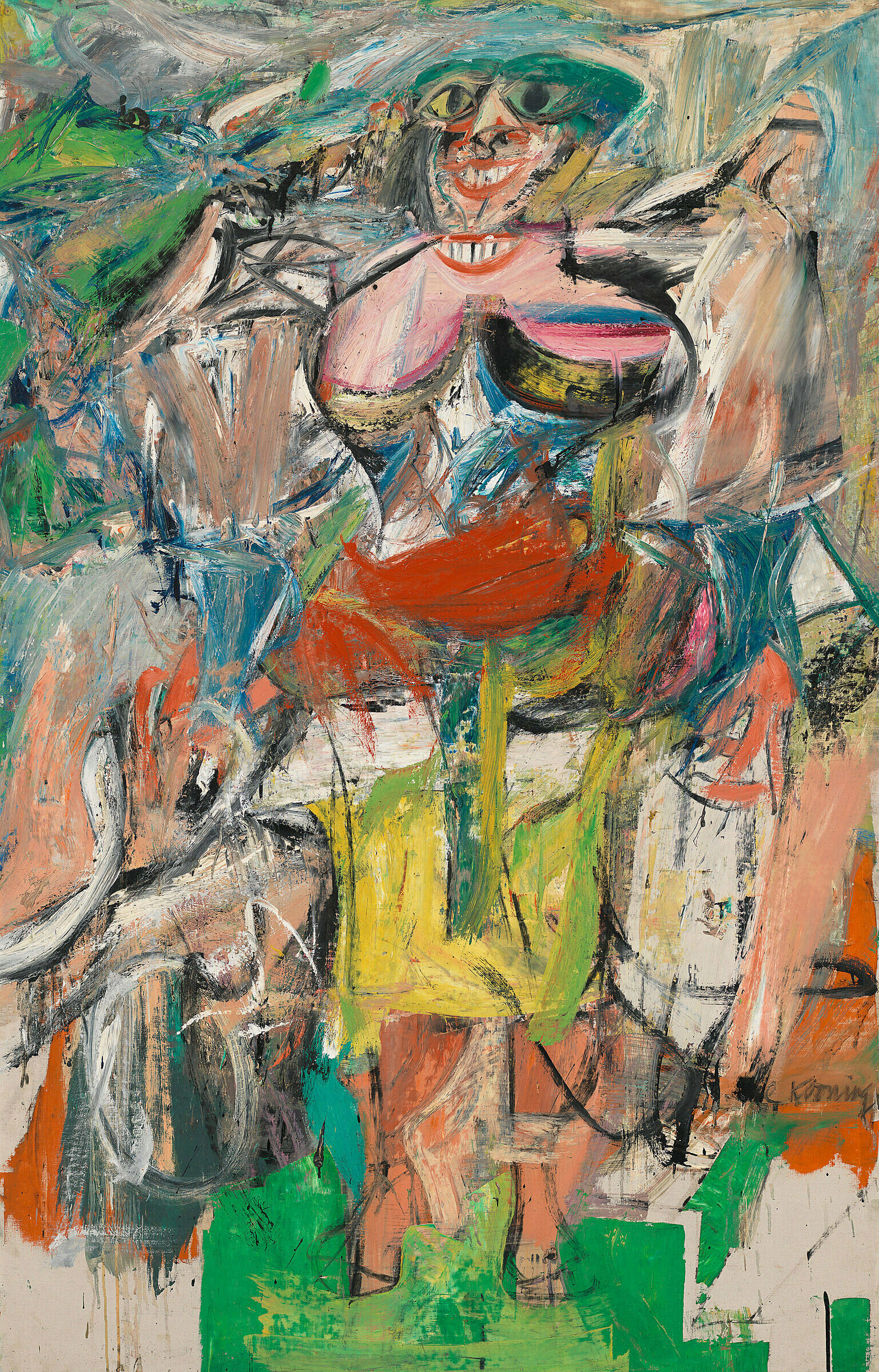
-
714
Arshile Gorky, The Artist and His Mother, c. 1926–36
Audio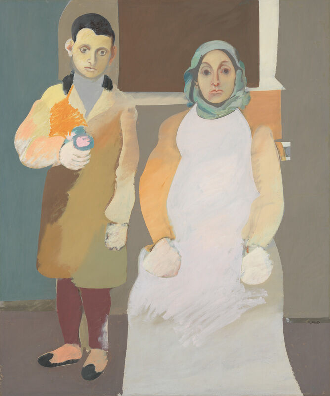
-
742
Arshile Gorky, The Betrothal II, 1947
Audio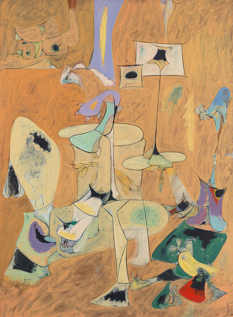
-
745
David Smith, Hudson River Landscape, 1951
Audio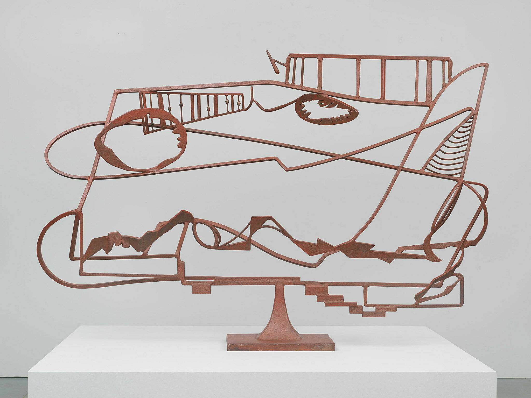
-
743
Mark Rothko, Four Darks in Red, 1958
Audio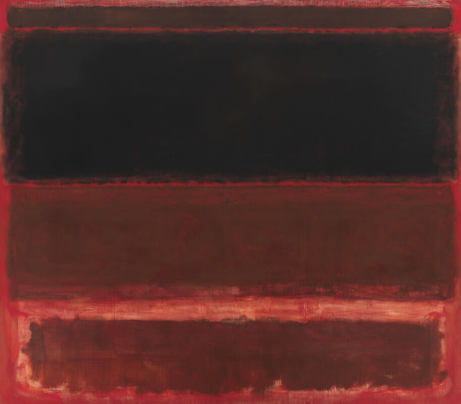
-
811
Charles Burchfield, Cricket Chorus in the Arbor, 1917
Audio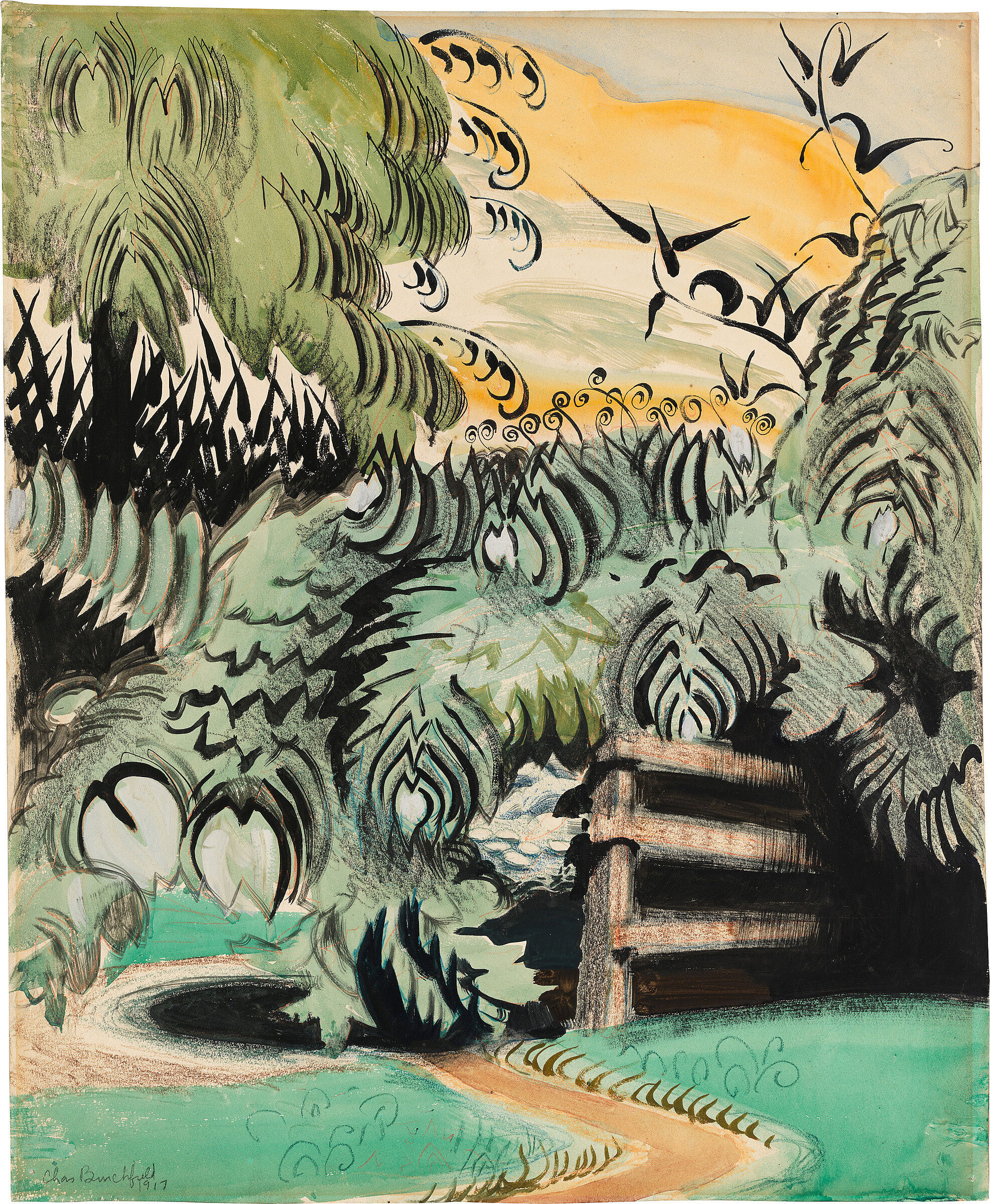
-
820
Joseph Stella, The Brooklyn Bridge: Variation on an Old Theme, 1939
Audio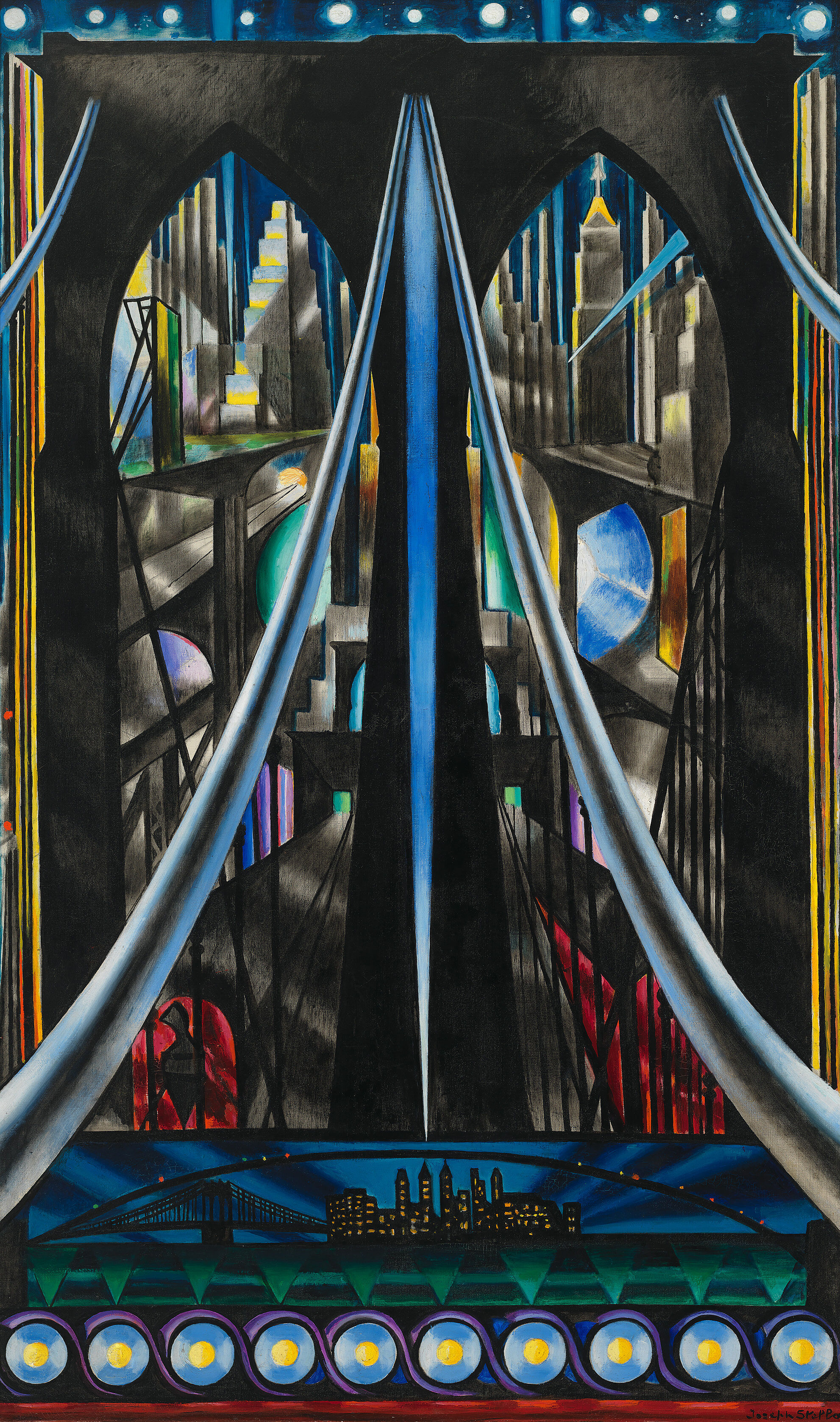
-
821
Man Ray, New York, 1917
Audio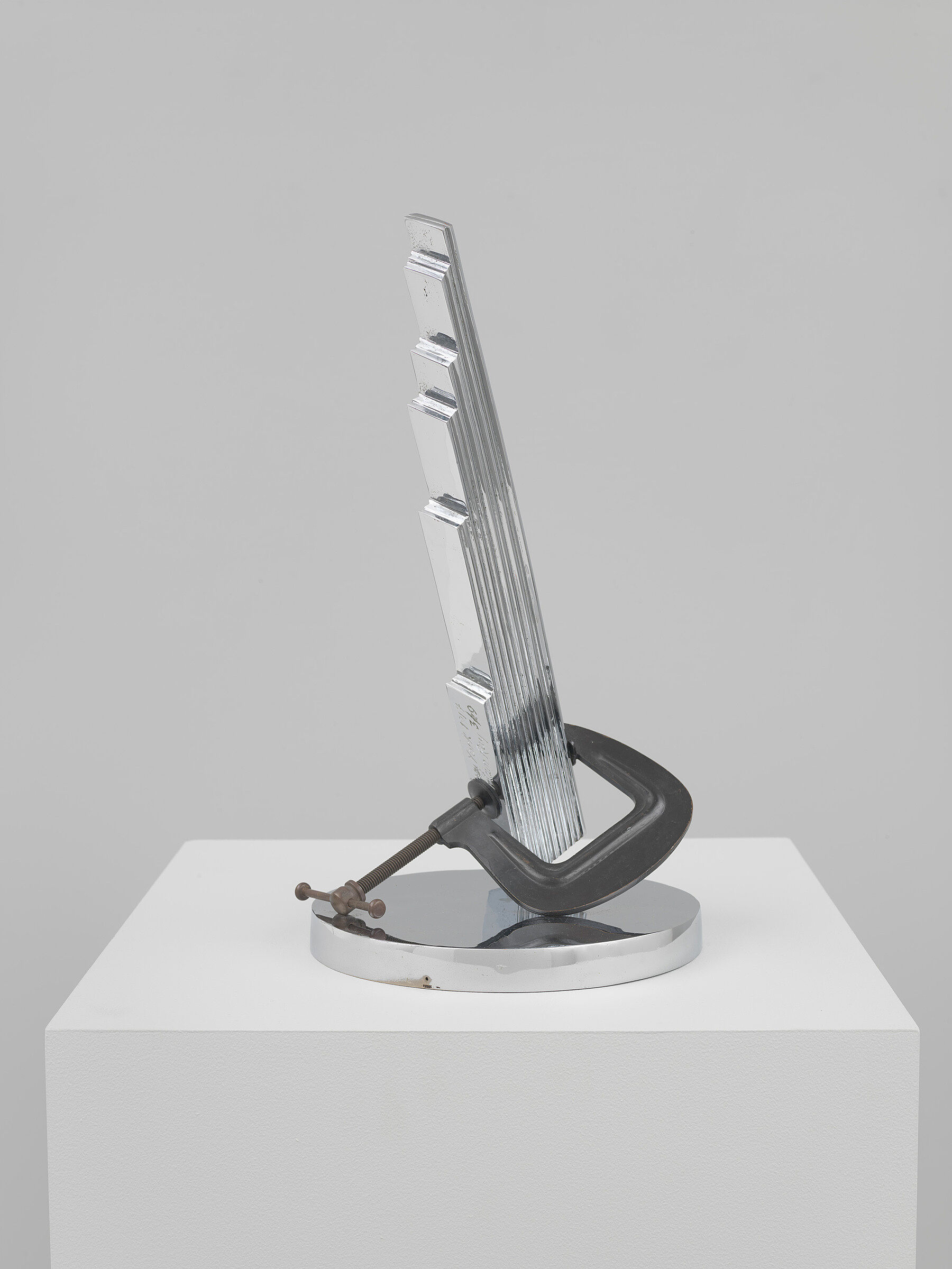
-
822
Charles Demuth, My Egypt, 1927
Audio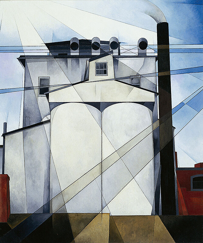
-
823
Jacob Lawrence, War Series, 1946–47
Audio
-
102
Edward Hopper, Life Studies
Audio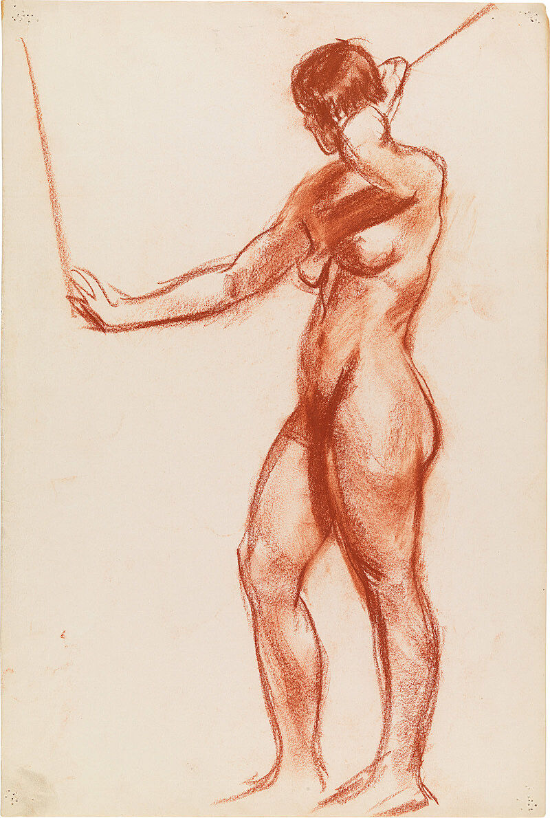
-
103
John Sloan, Backyards, Greenwich Village, 1914
Audio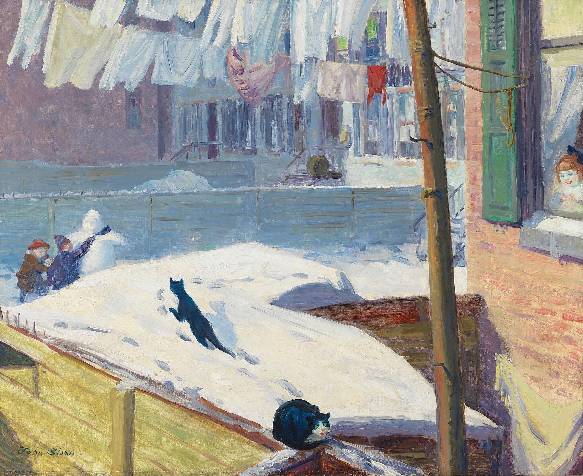
-
705
George Bellows, Dempsey and Firpo, 1924
Audio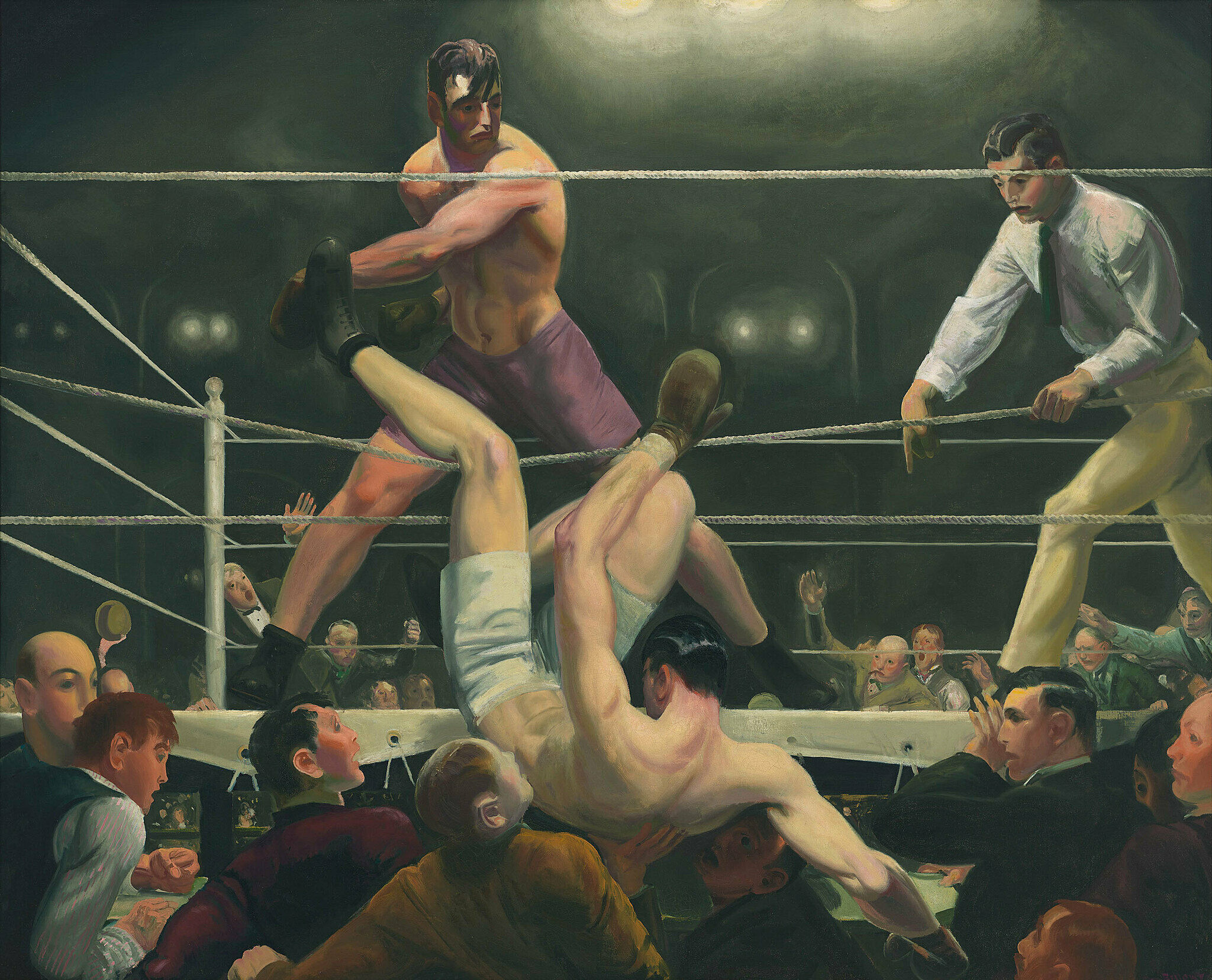
-
703
Reginald Marsh, Twenty Cent Movie, 1936
Audio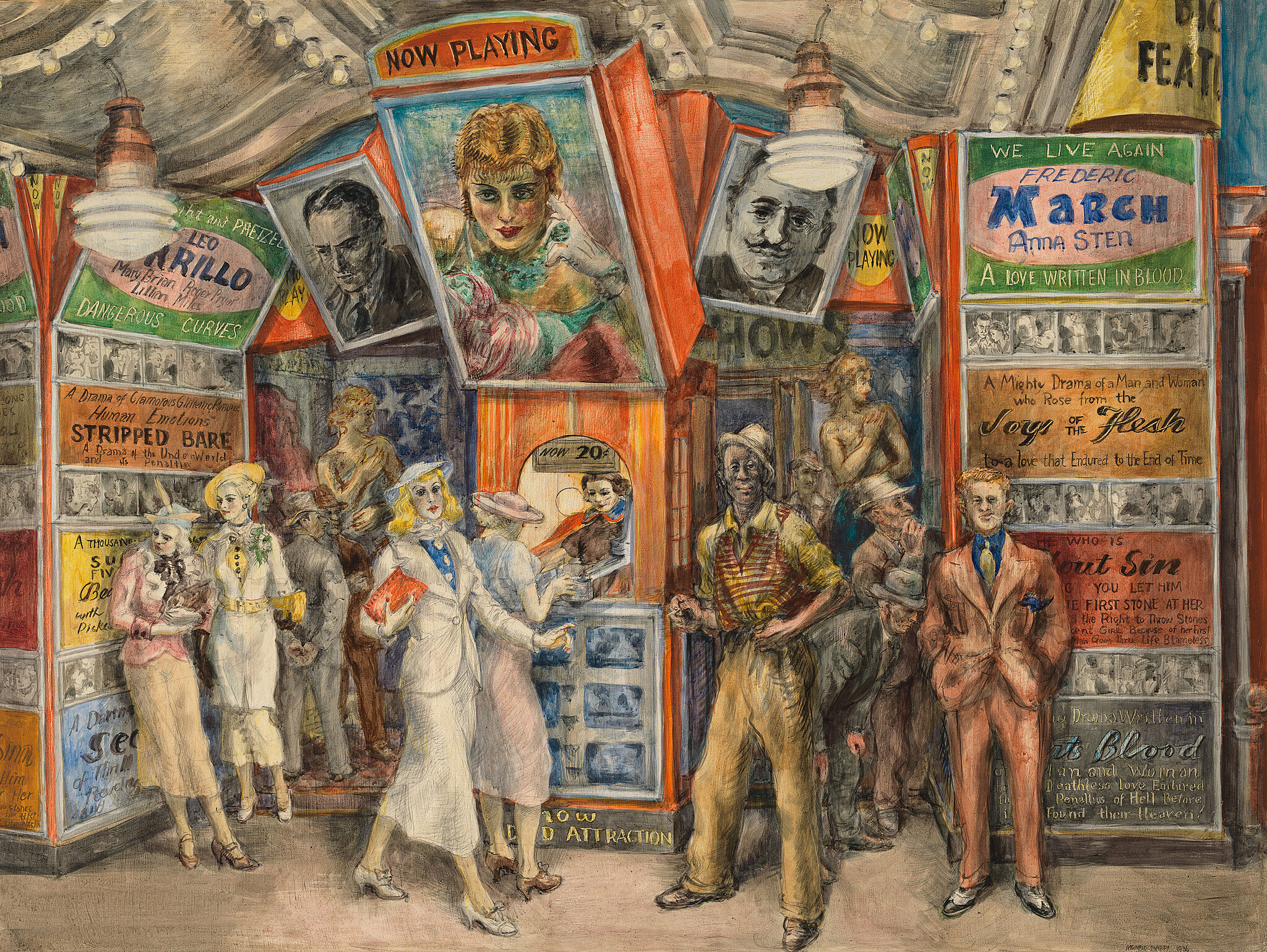
-
733
Ben Shahn, The Passion of Sacco and Vanzetti, 1931–32
Audio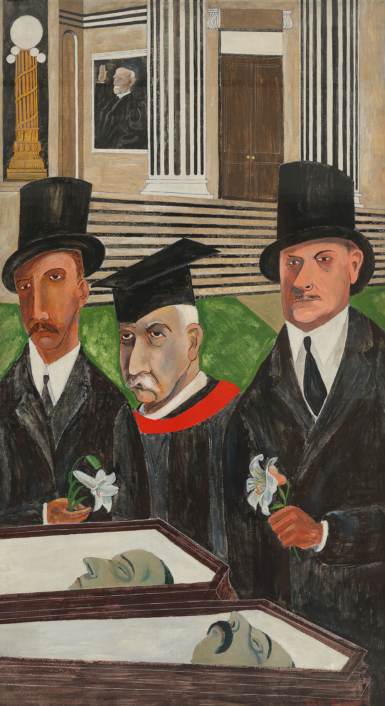
-
721
George Tooker, The Subway, 1950
Audio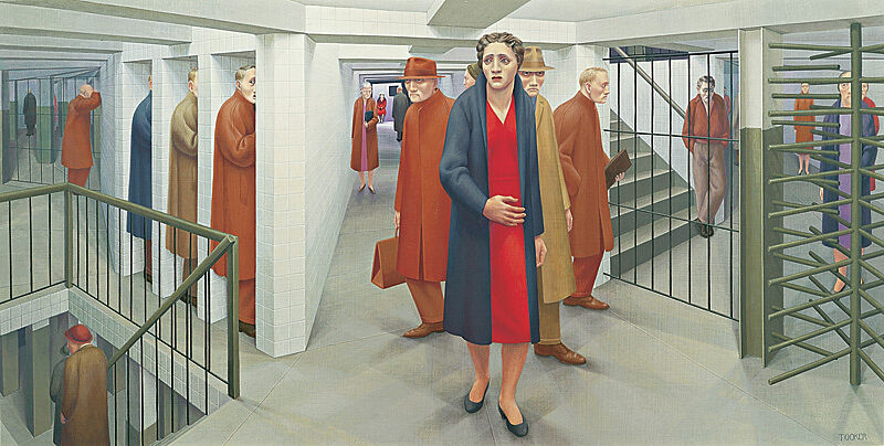
-
612
Lee Bontecou, Untitled 1961, 1961
Audio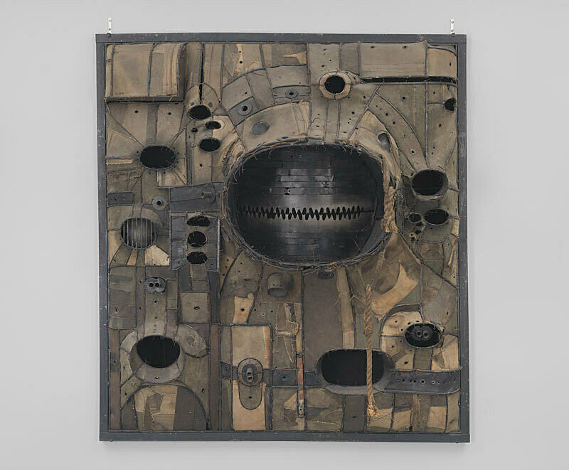
-
642
Richard Serra, Prop, 1968, refabricated 2007
Audio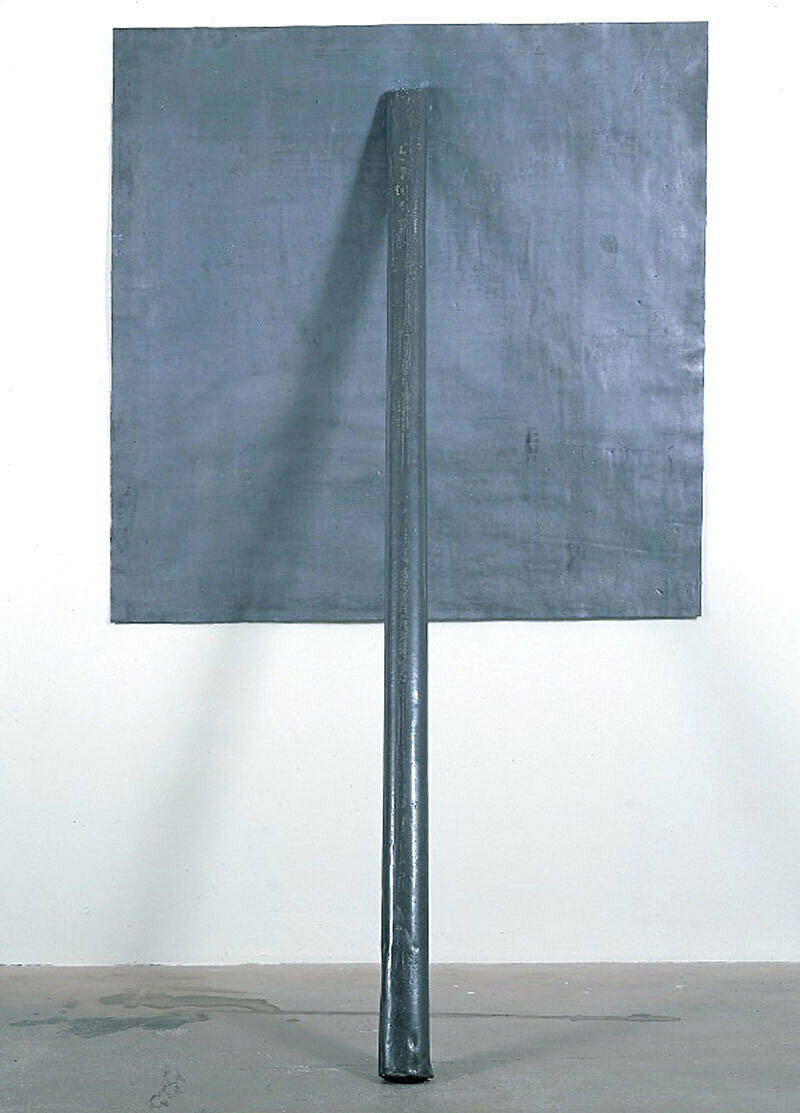
-
502
Chuck Close, Phil, 1969
Audio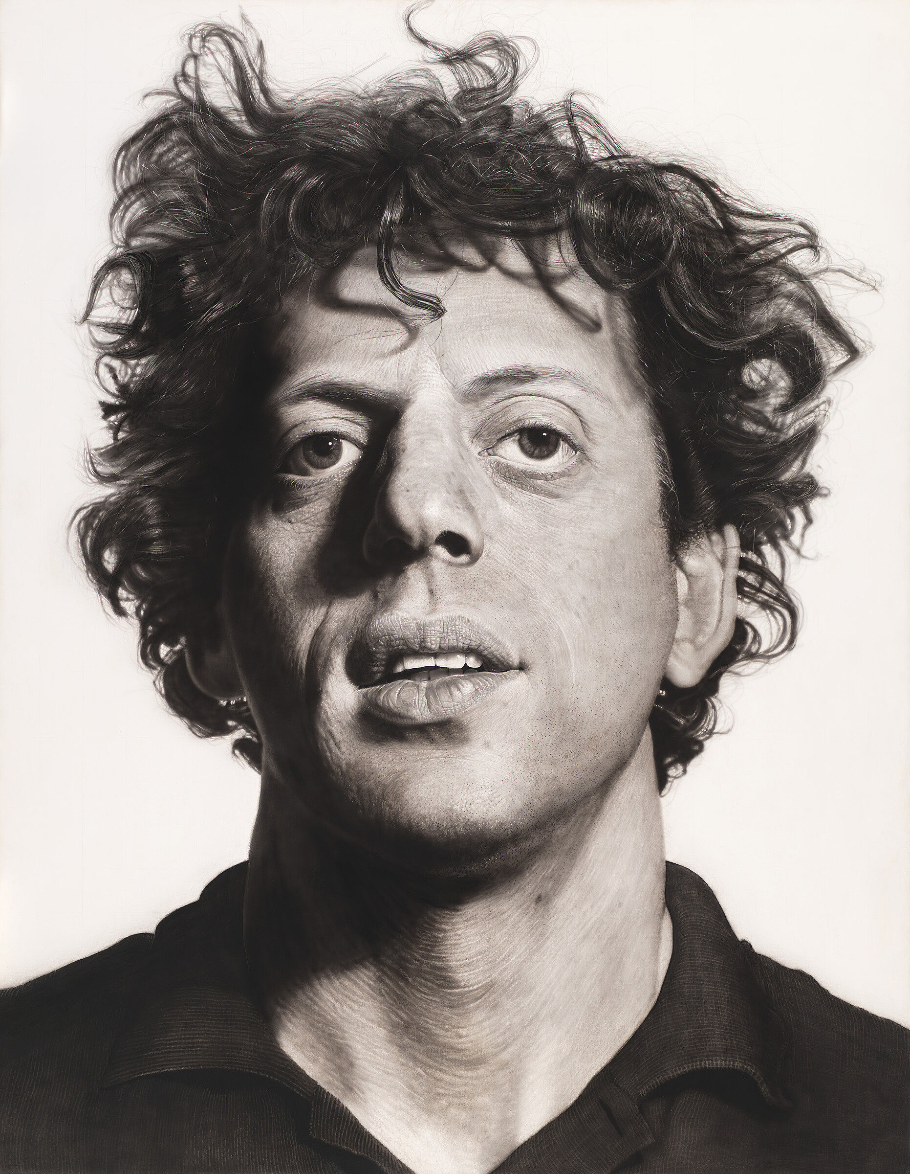
-
613
Louise Nevelson, Dawn’s Wedding Chapel II, 1959
Audio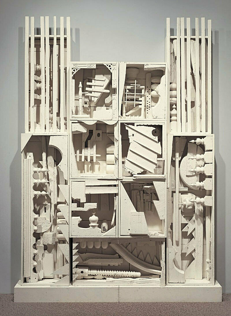
-
723
Man Ray, La Fortune, 1938
Audio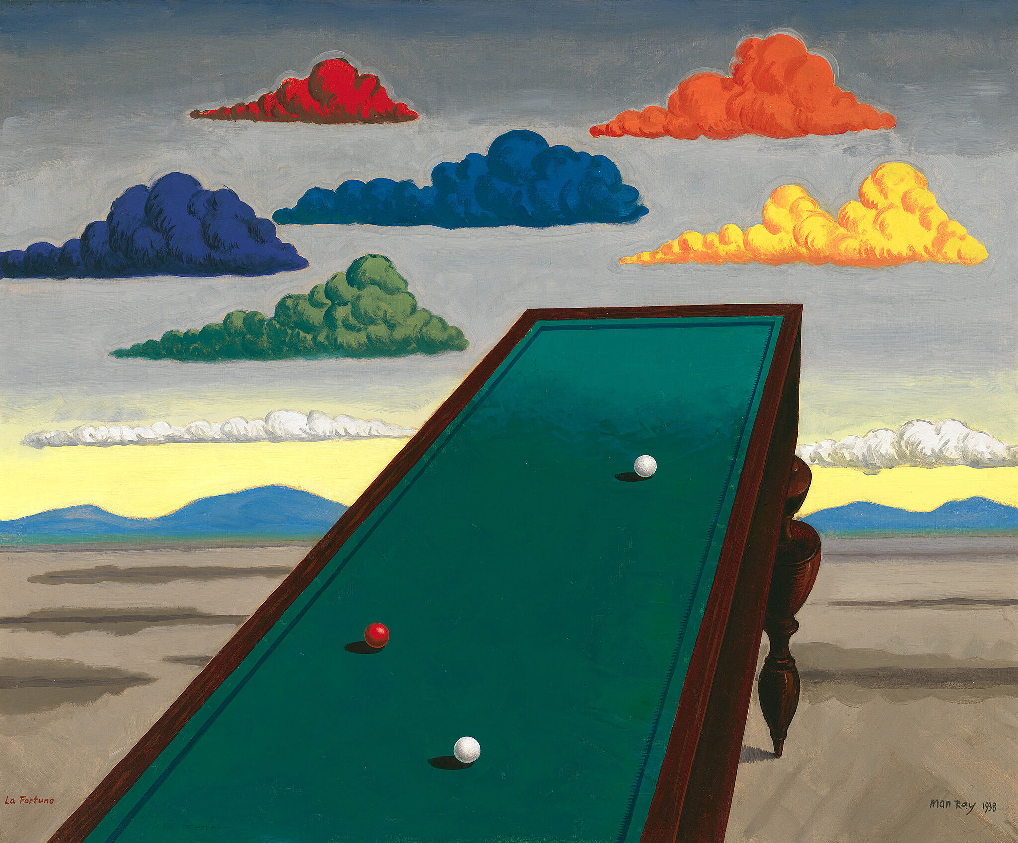
-
561
Richard Serra, Abu Ghraib, 2004
Audio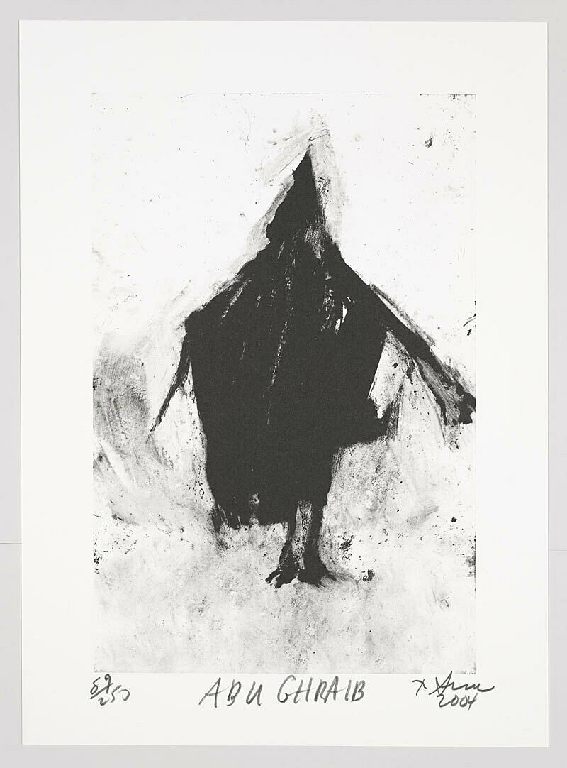
-
810
Georgia O’Keeffe, Music, Pink and Blue No 2, 1918
Audio
-
101
Robert Henri, Gertrude Vanderbilt Whitney, 1916
Audio
-
511
Liliana Porter, Untitled (with Cube – tall), 1974
Audio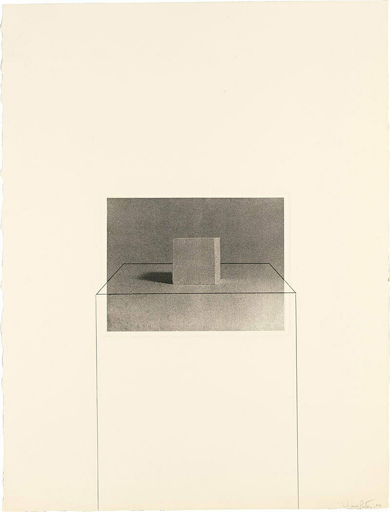
-
514
Hans Haacke, Shapolsky et al. Manhattan Real Estate Holdings, a Real-Time Social system, as of May 1, 1971, 1971
Audio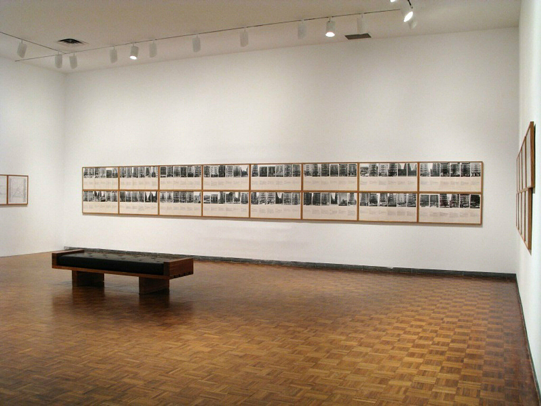
-
540
Karen Kilimnik, The Hellfire Club Episode of the Avengers, 1989
Audio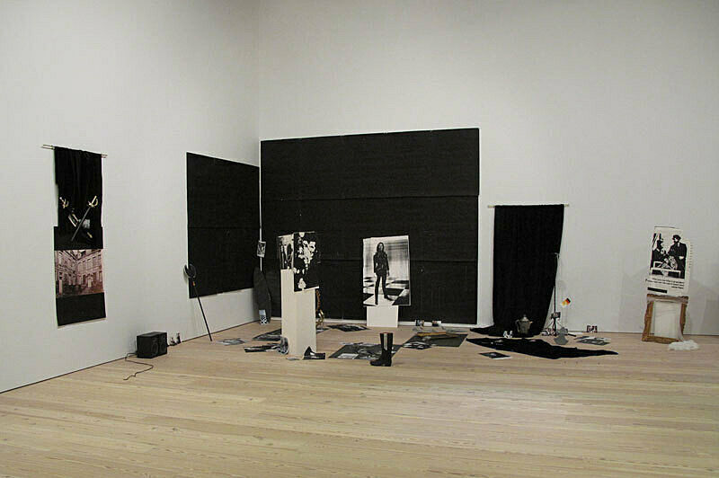
-
601
Frank Stella, Die Fahne Hoch!, 1959
Audio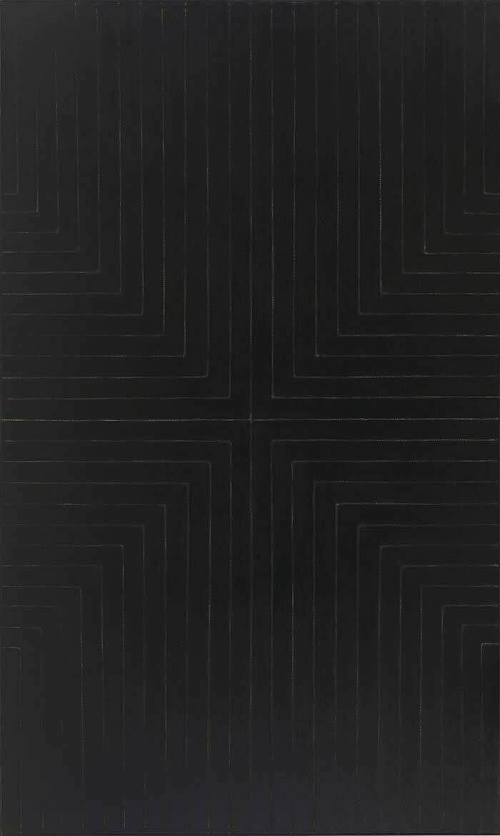
-
646
Robert Morris, Untitled (3 Ls), 1965
Audio
-
503
Philip Guston, Cabal, 1977
Audio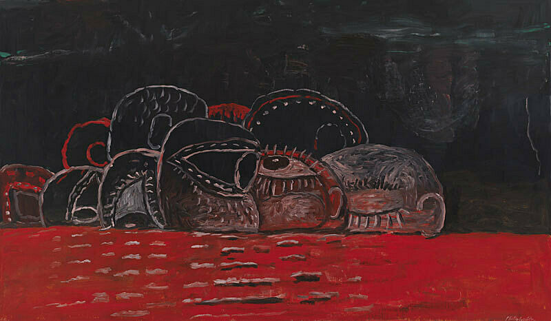
-
702
Thomas Hart Benton, Poker Night (from A Streetcar Named Desire), 1948
Audio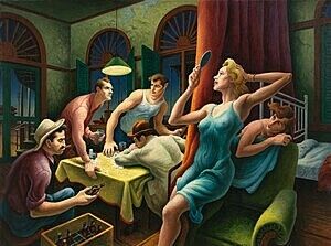
-
521
Jeff Koons, New Hoover Convertibles Green, Blue, New Hoover Convertibles Green, Blue Doubledecker, 1981–87
Audio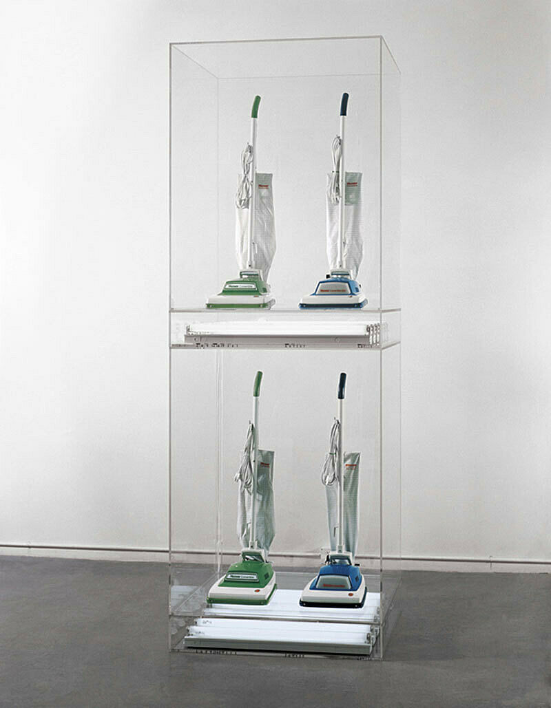
-
560
Glenn Ligon, Rückenfigur, 2009
Audio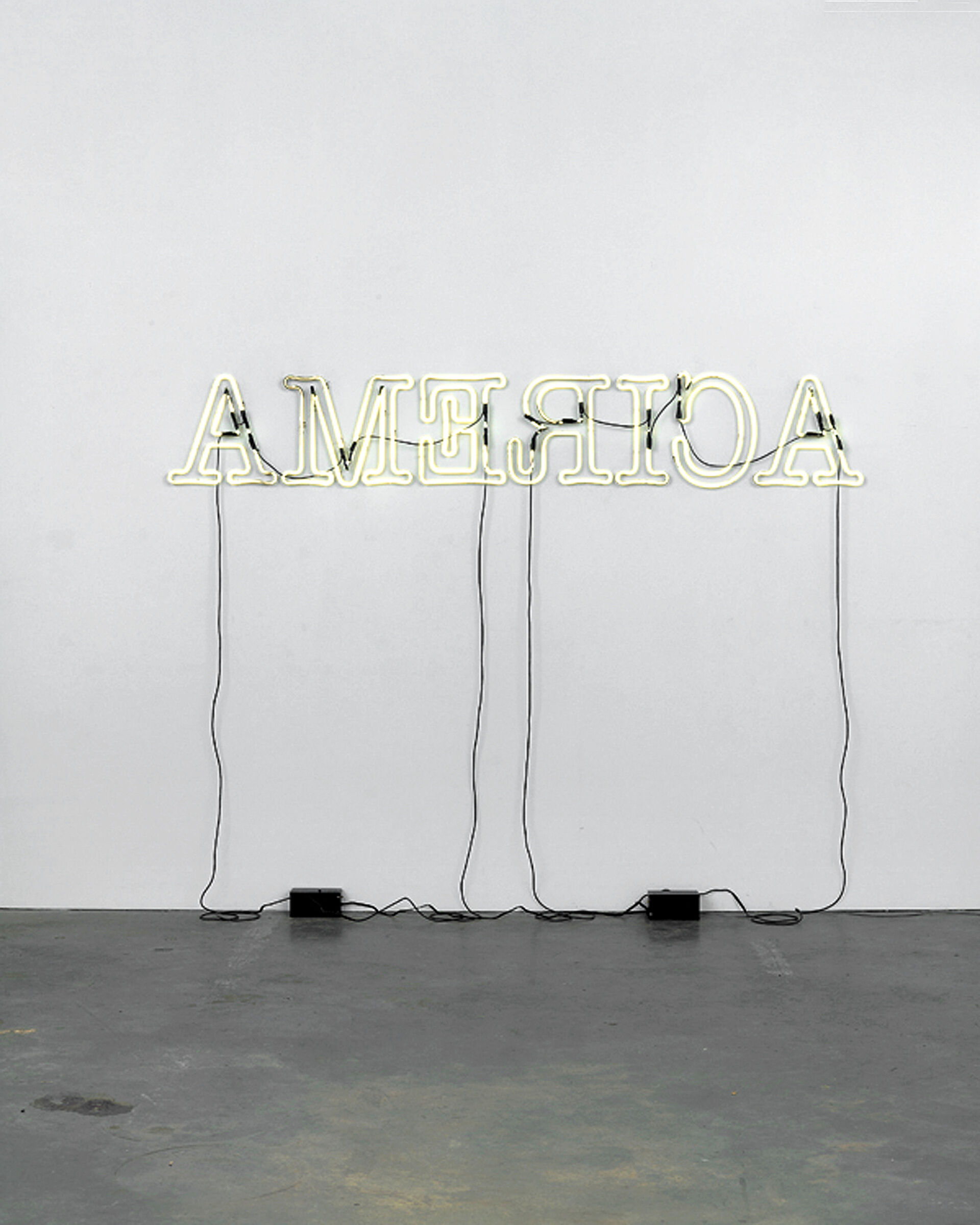
-
542
Mike Kelley, More Love Hours than Can Ever Be Repaid and Wages of Sin, 1987
Audio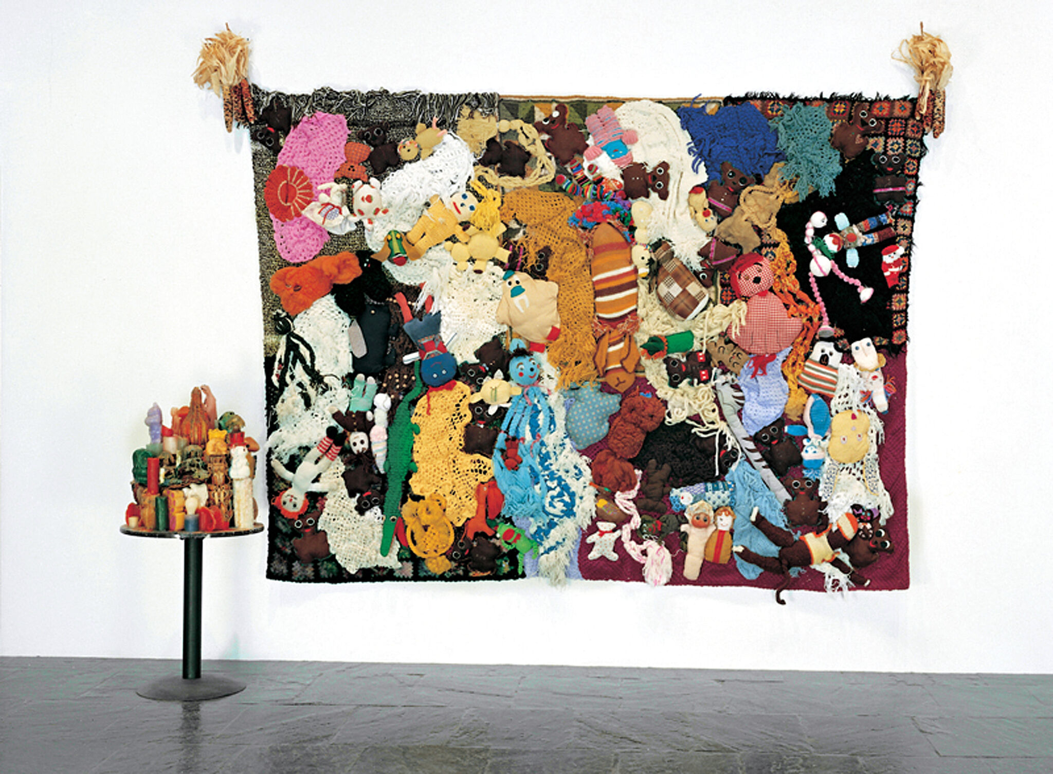
-
532
Robert Gober, Untitled, 1991
Audio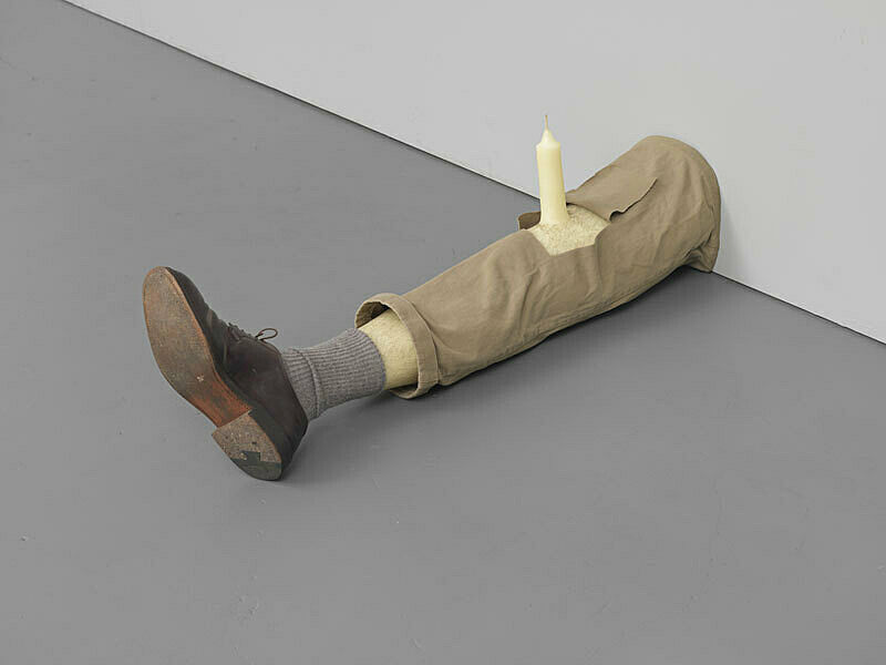
-
510
Joan Jonas, Vertical Roll, 1972
Audio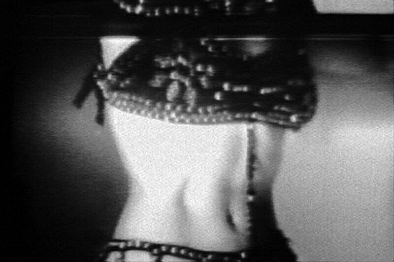
-
732
Louis Lozowick, Hooverville, 1932
Audio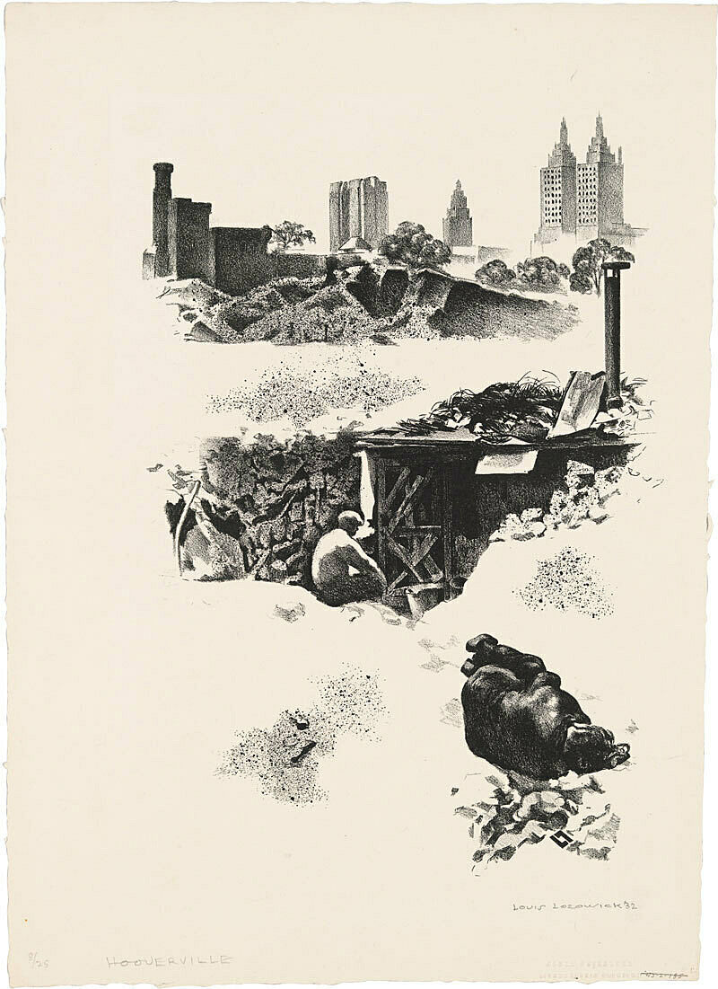
-
610
Jay DeFeo, The Rose, 1958–66
Audio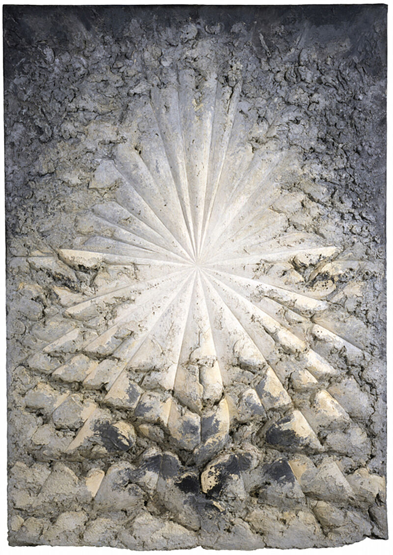
-
632
Milton Glaser, Don’t Eat Grapes, 1969
Audio
-
643
Richard Tuttle, Grey Extended Seven, 1967
Audio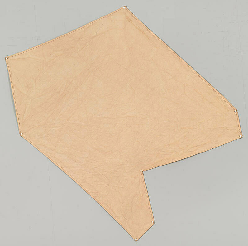
-
647
Tony Smith, Die, 1962
Audio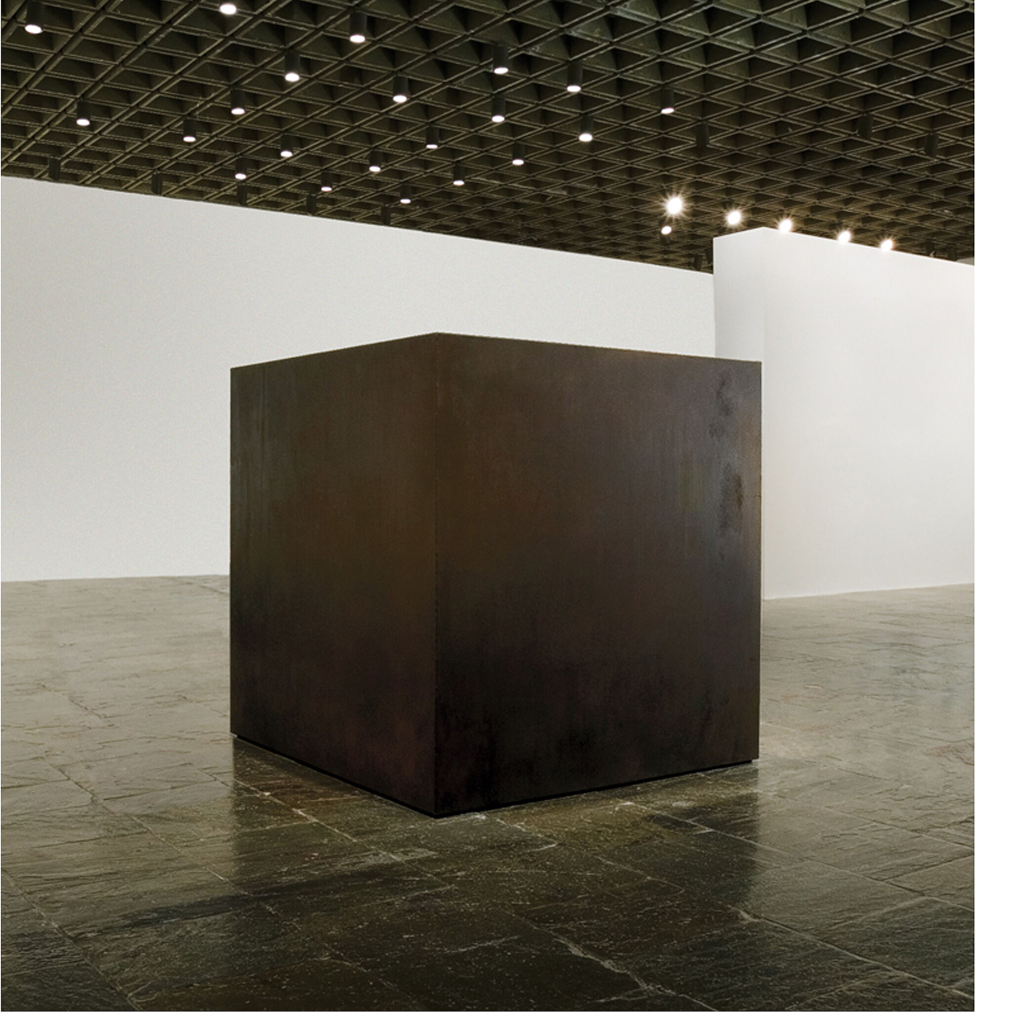
-
520
Richard Prince, Spiritual America, 1983
Audio -
531
David Wojnarowicz, Untitled, 1989
Audio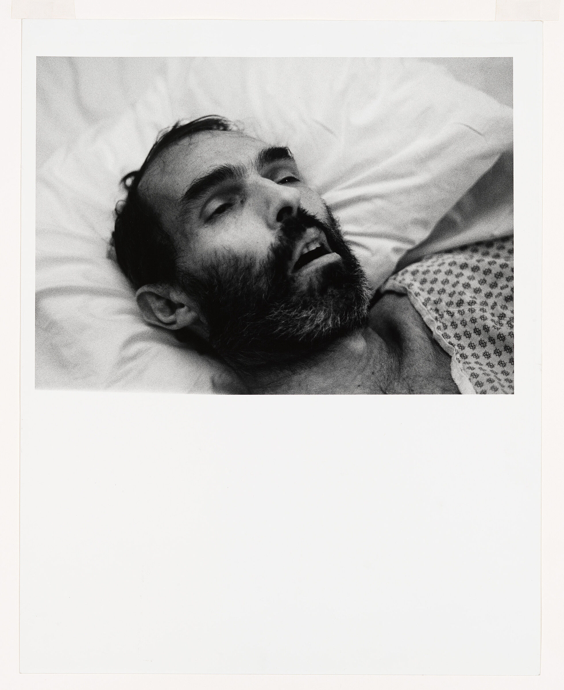
-
824
Alexander Calder, Hanging Spider, c. 1940
Audio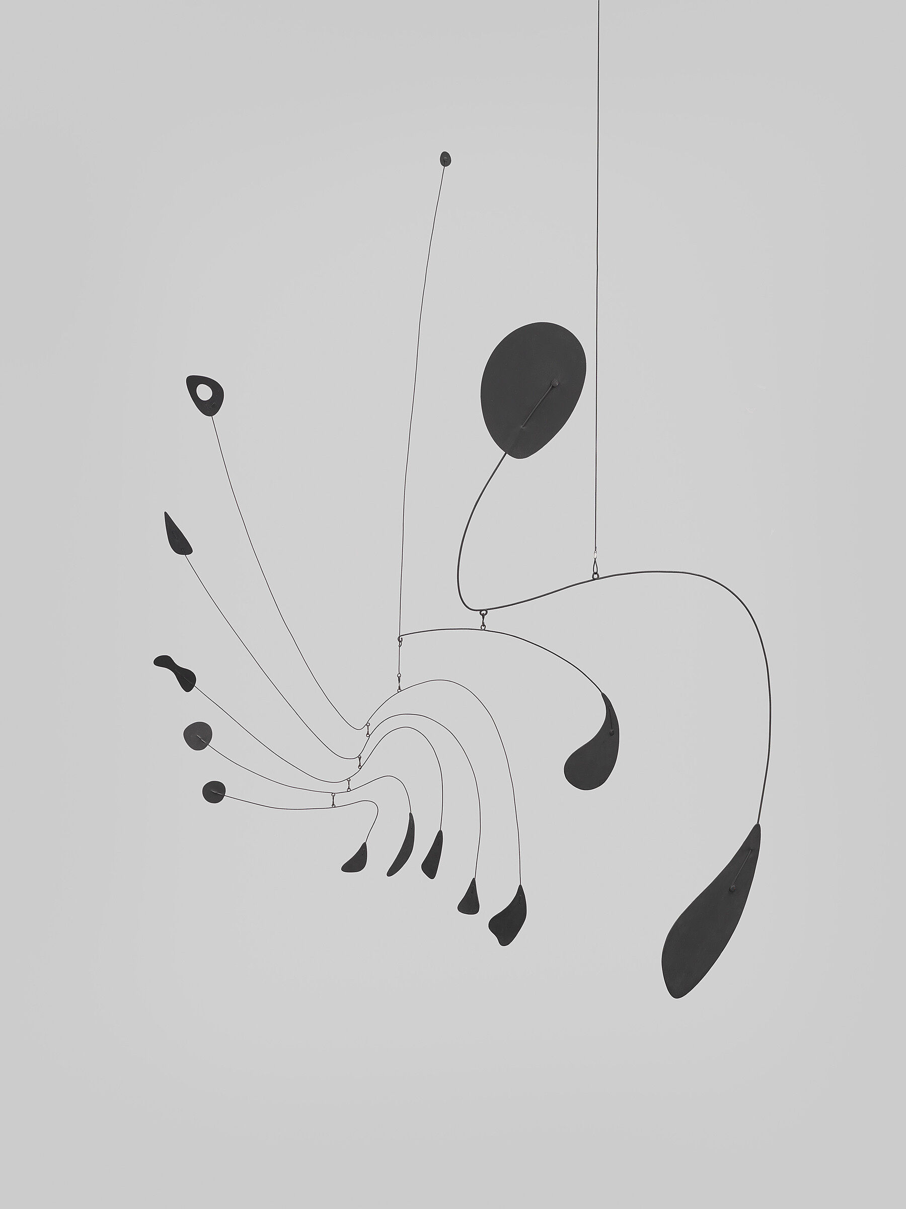
-
704
Paul Cadmus, Sailors and Floosies, 1938
Audio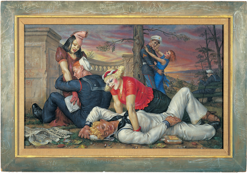
-
713
Elizabeth Catlett, Head, 1947
Audio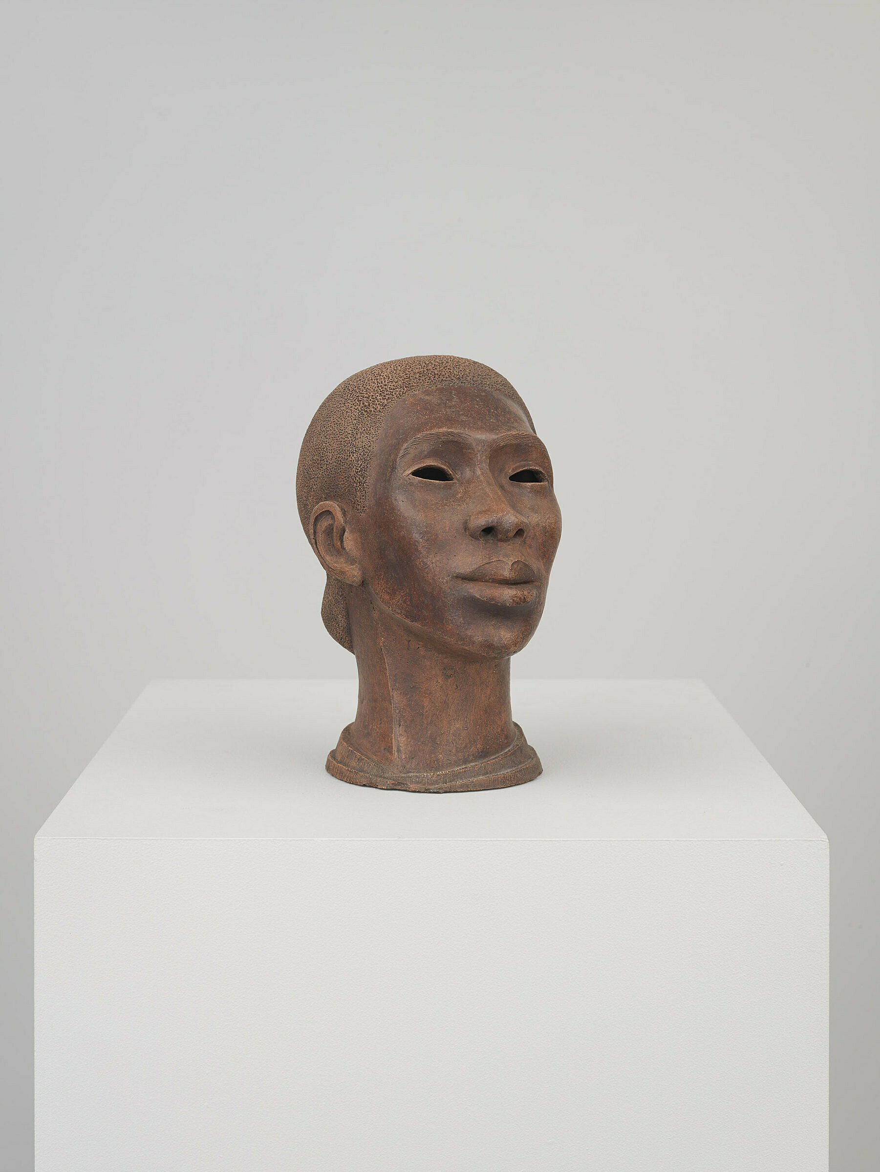
-
746
David Smith, Running Daughter, 1956
Audio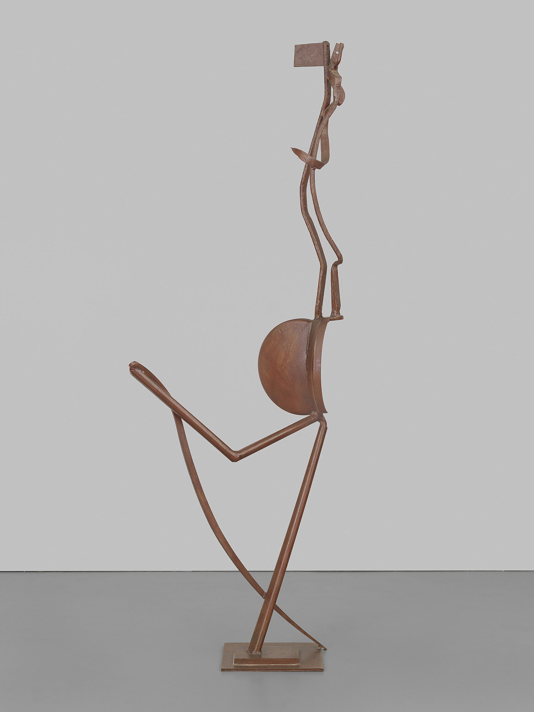
-
622
Yayoi Kusama, Air Mail Stickers, 1962
Audio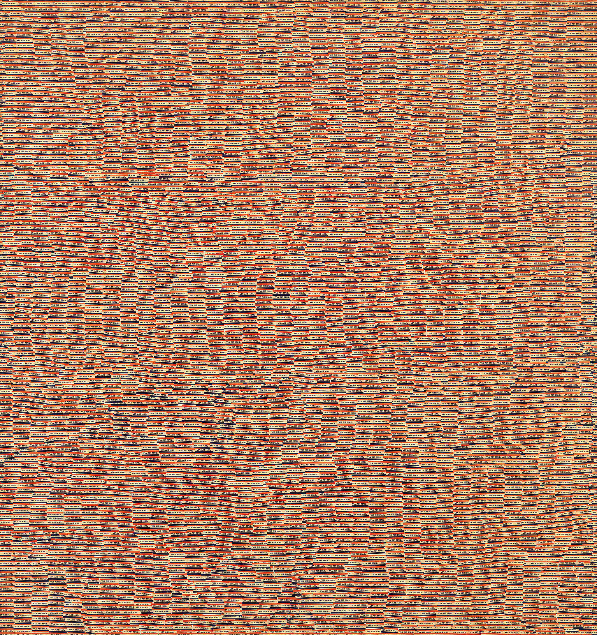
-
620
Andy Warhol, Before and After, 4, 1962
Audio
-
603
Carmen Herrera, Blanco y Verde, 1959
Audio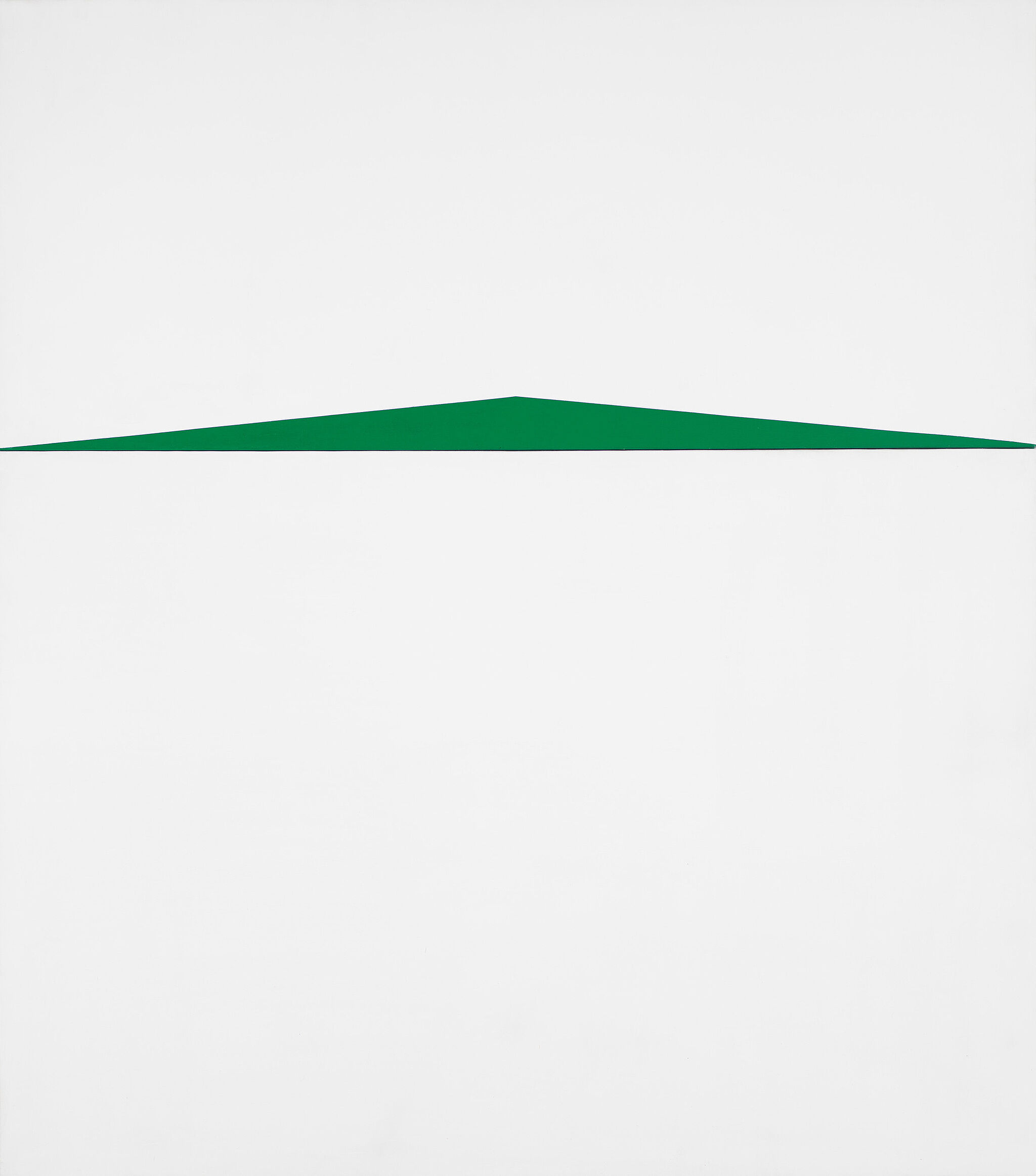
-
543
Fred Wilson, Guarded View, 1991
Audio, Kids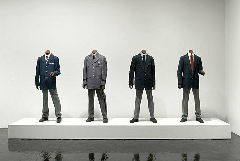
-
553
Josh Kline, Cost of Living (Aleyda), 2014
Kids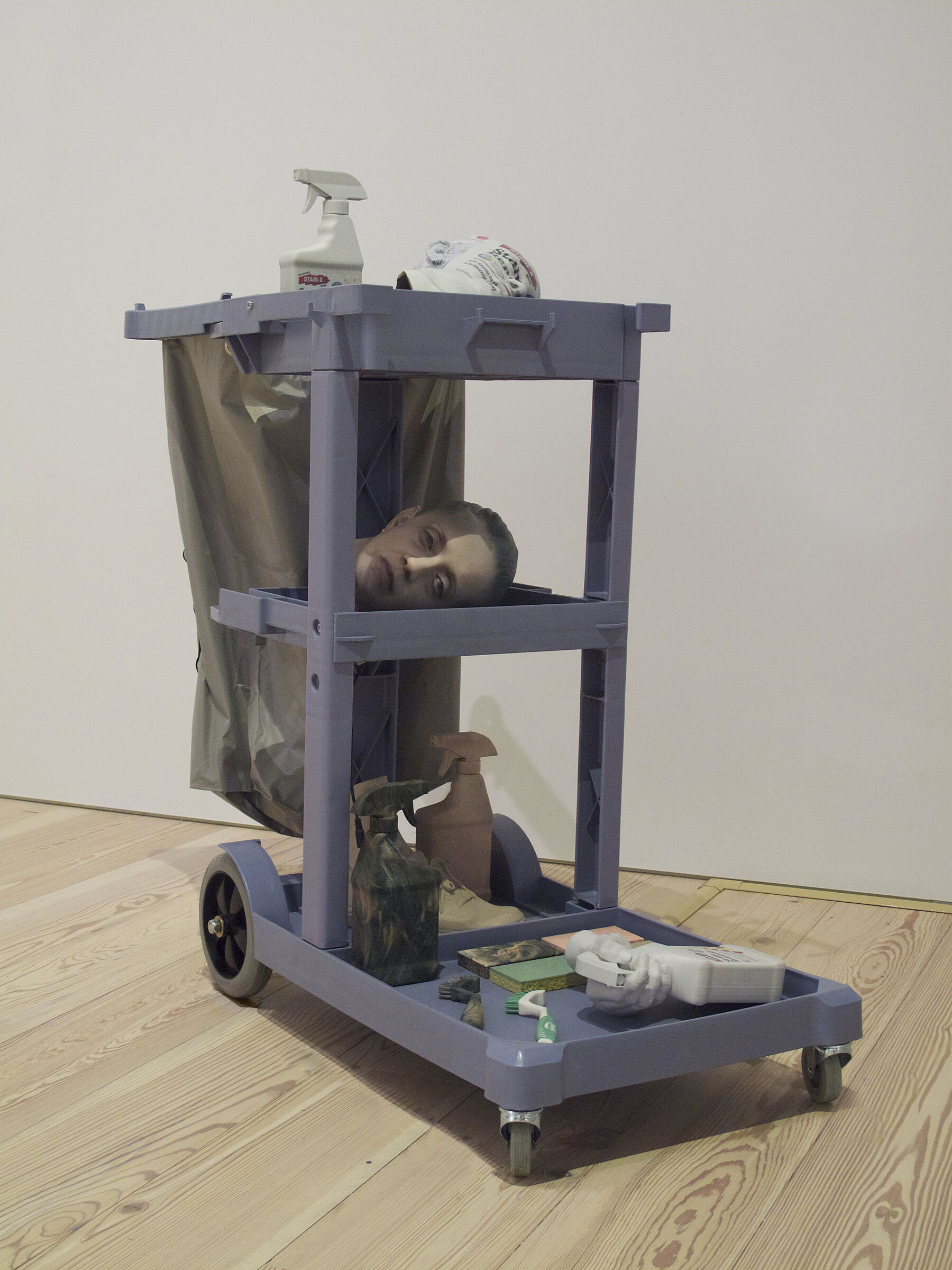
-
554
Cory Arcangel, Super Mario Clouds, 2002
Kids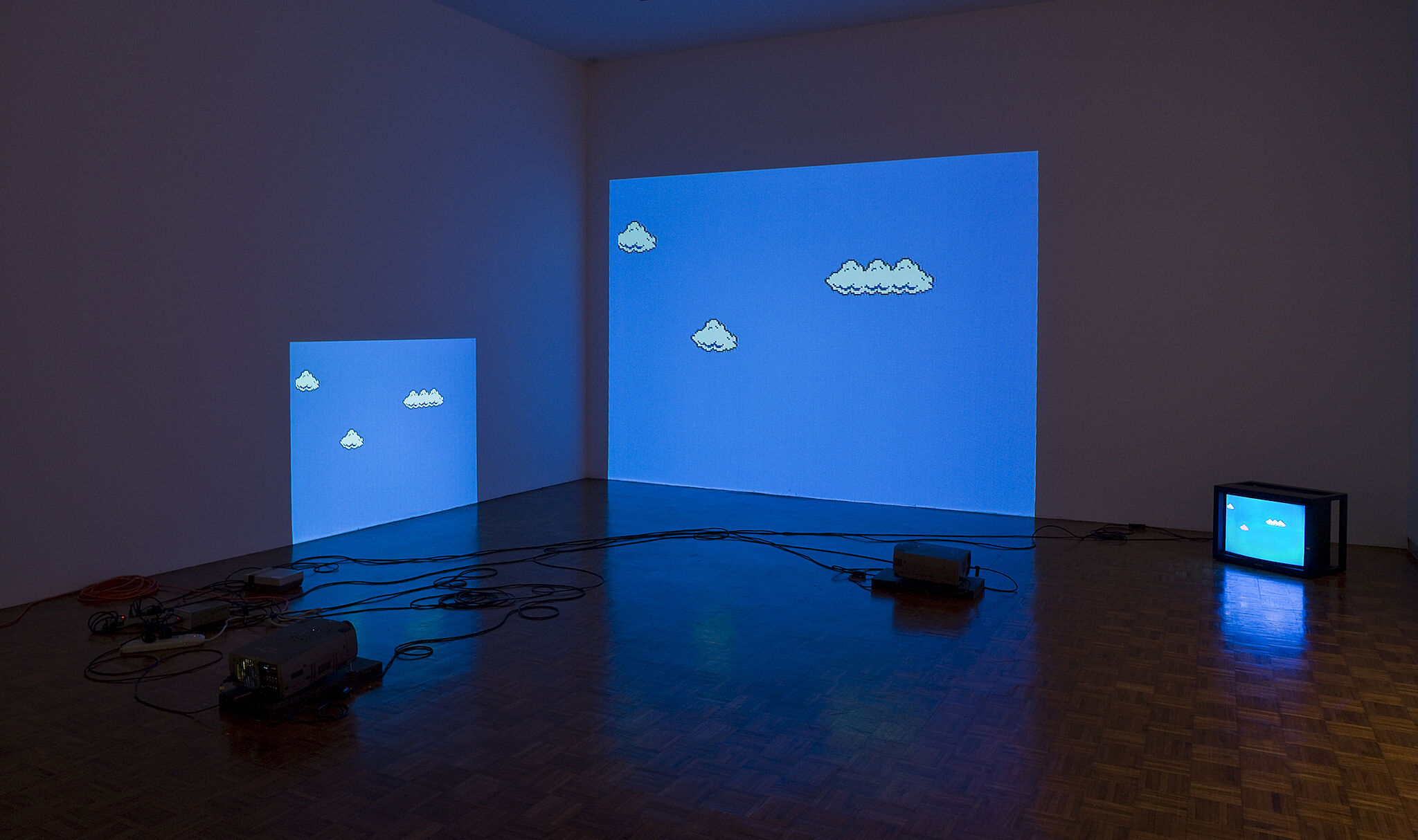
-
566
Mark Bradford, Bread and Circuses, 2005
Kids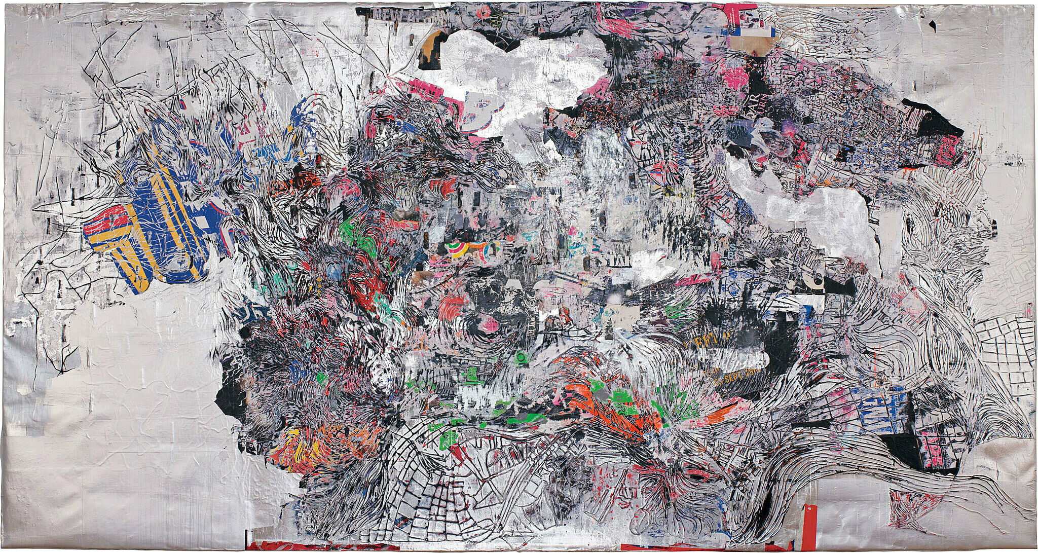
-
522
Charles Ray, Boy, 1992
Kids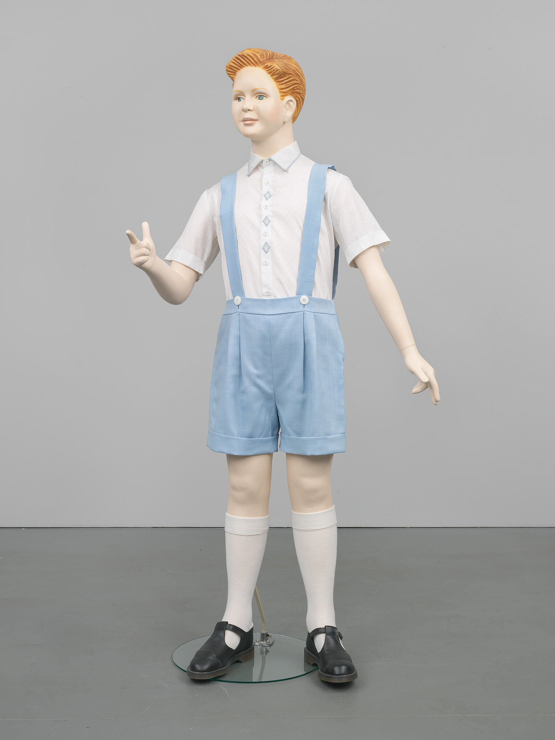
-
804
Max Weber, Chinese Restaurant, 1915
Kids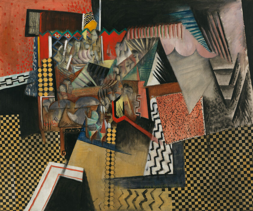
-
731
Walker Evans, Tengle Children, Hale County AL, 1936
Kids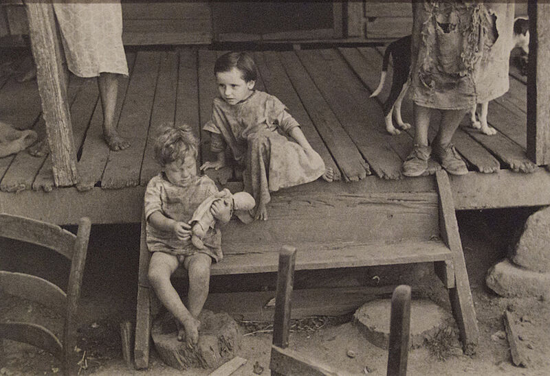
-
712
Charles White, Preacher, 1952
Kids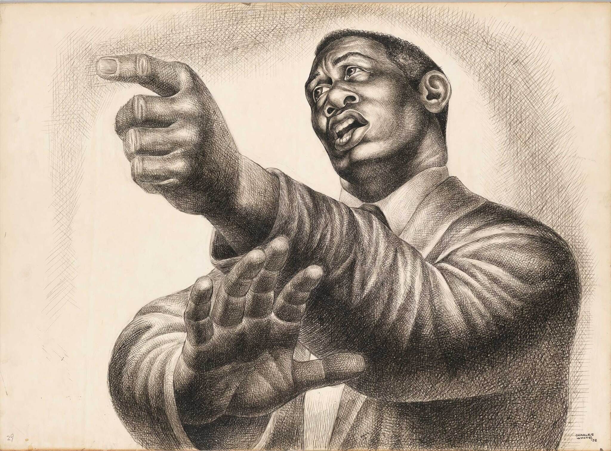
-
744
Lee Krasner, The Seasons, 1957
Kids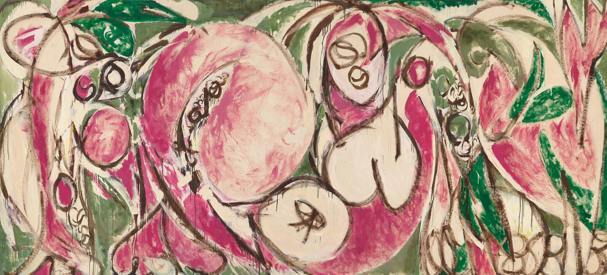
-
626
Andy Warhol, Green Coca-Cola Bottles, 1962
Kids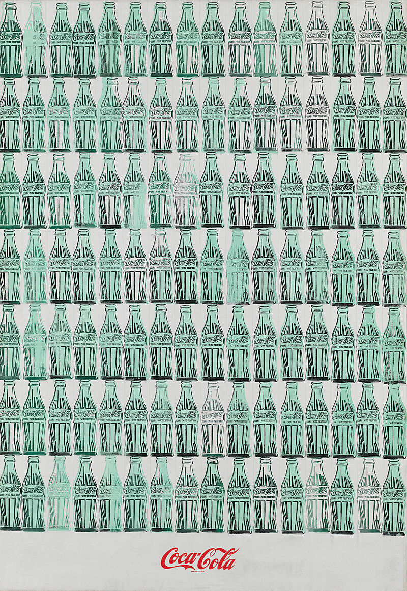
-
615
Raphael Montañez Ortiz, Archaeological Find, Number 9, 1964
Kids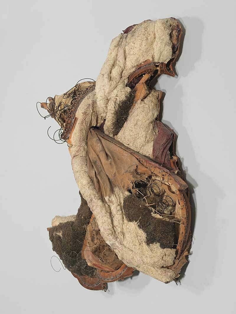
-
624
Robert Bechtle, ’61 Pontiac, 1968
Kids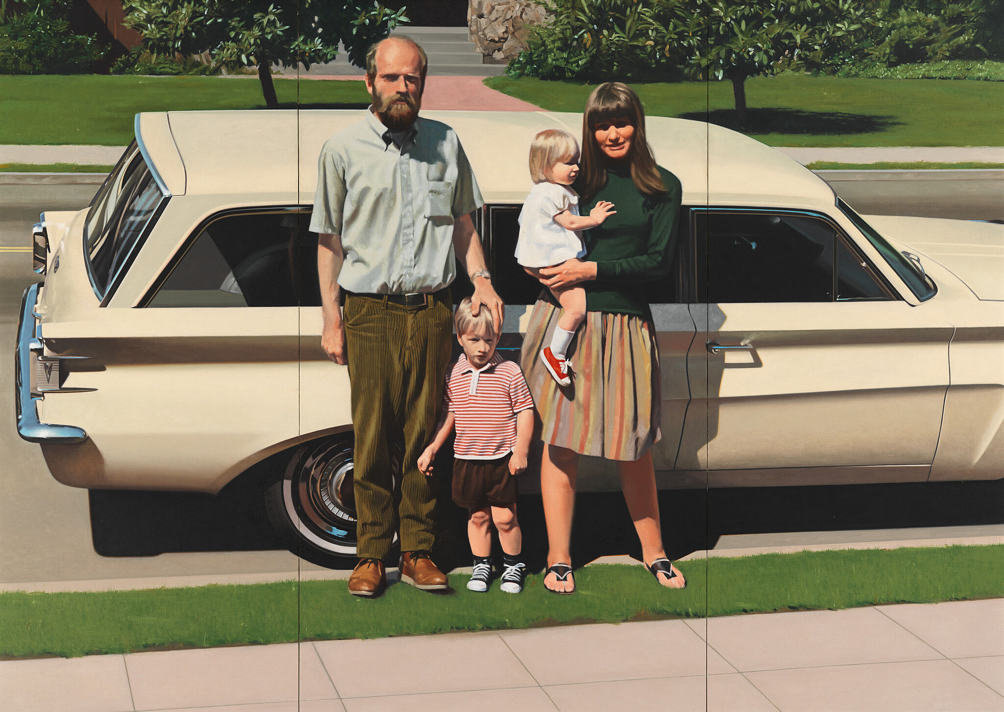
-
628
Malcolm Bailey, Untitled 1969, 1969
Kids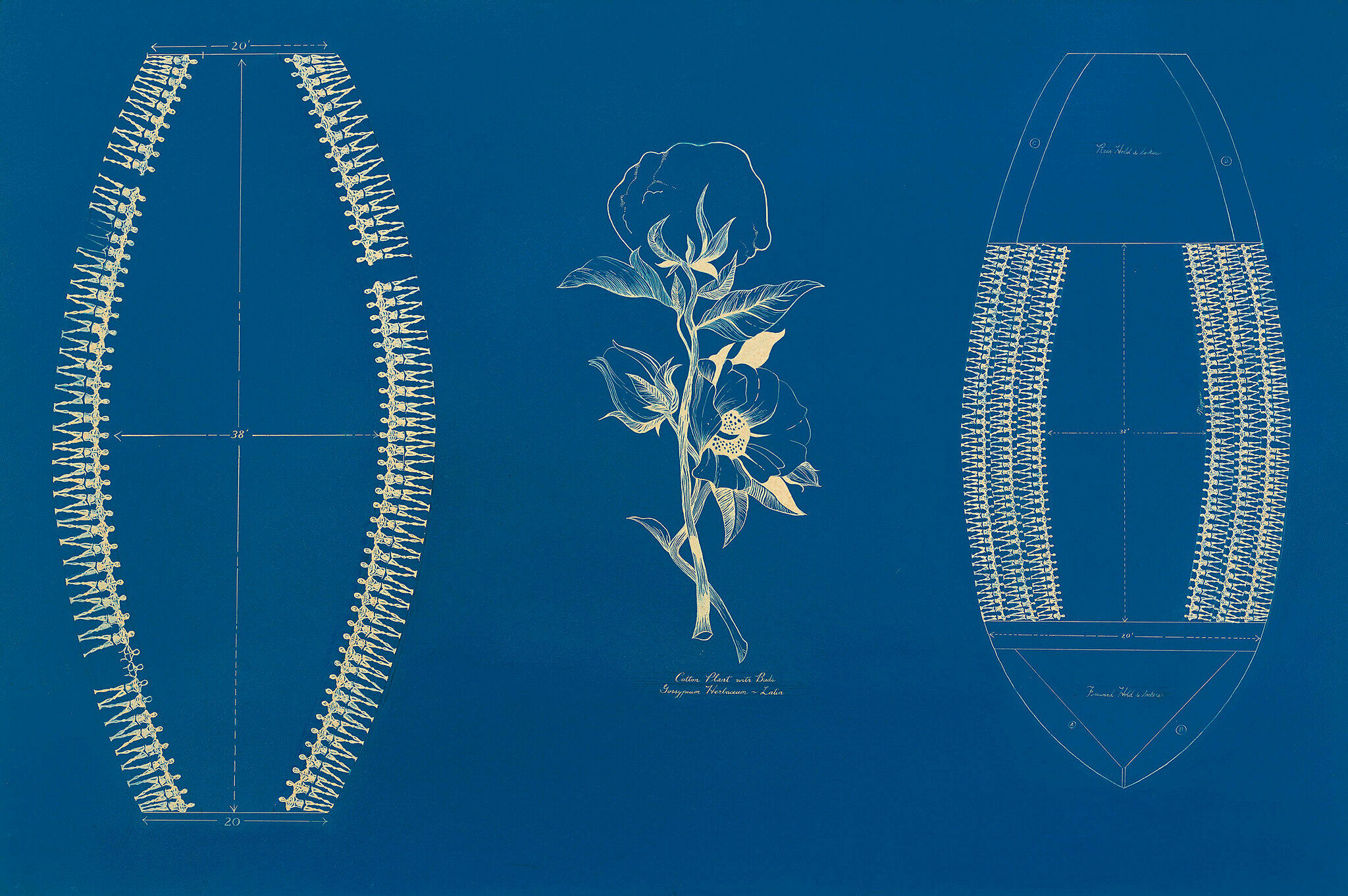
-
640
Eva Hesse, No Title, 1970
Kids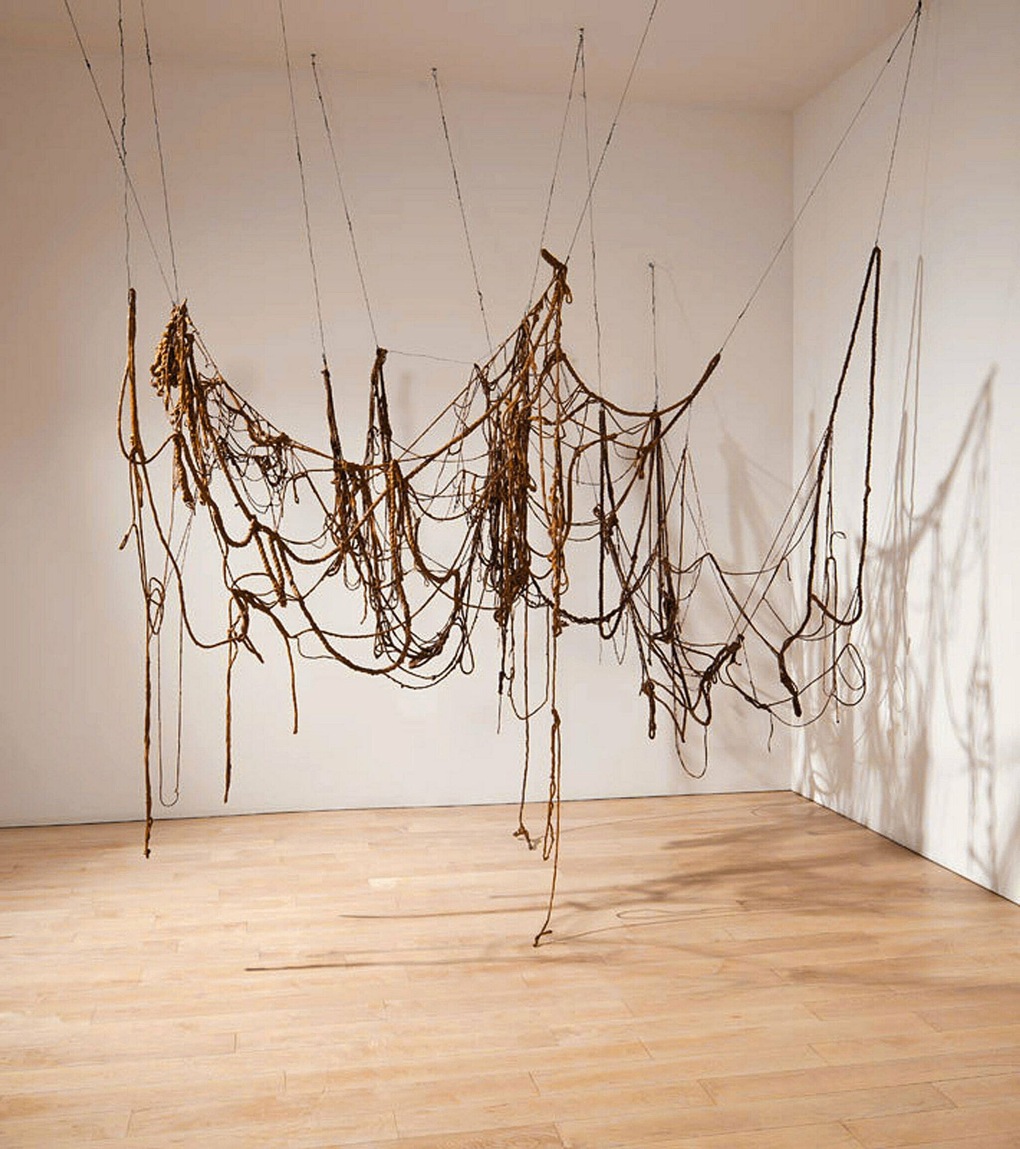
-
630
George Segal, Walk, Don’t Walk, 1976
Kids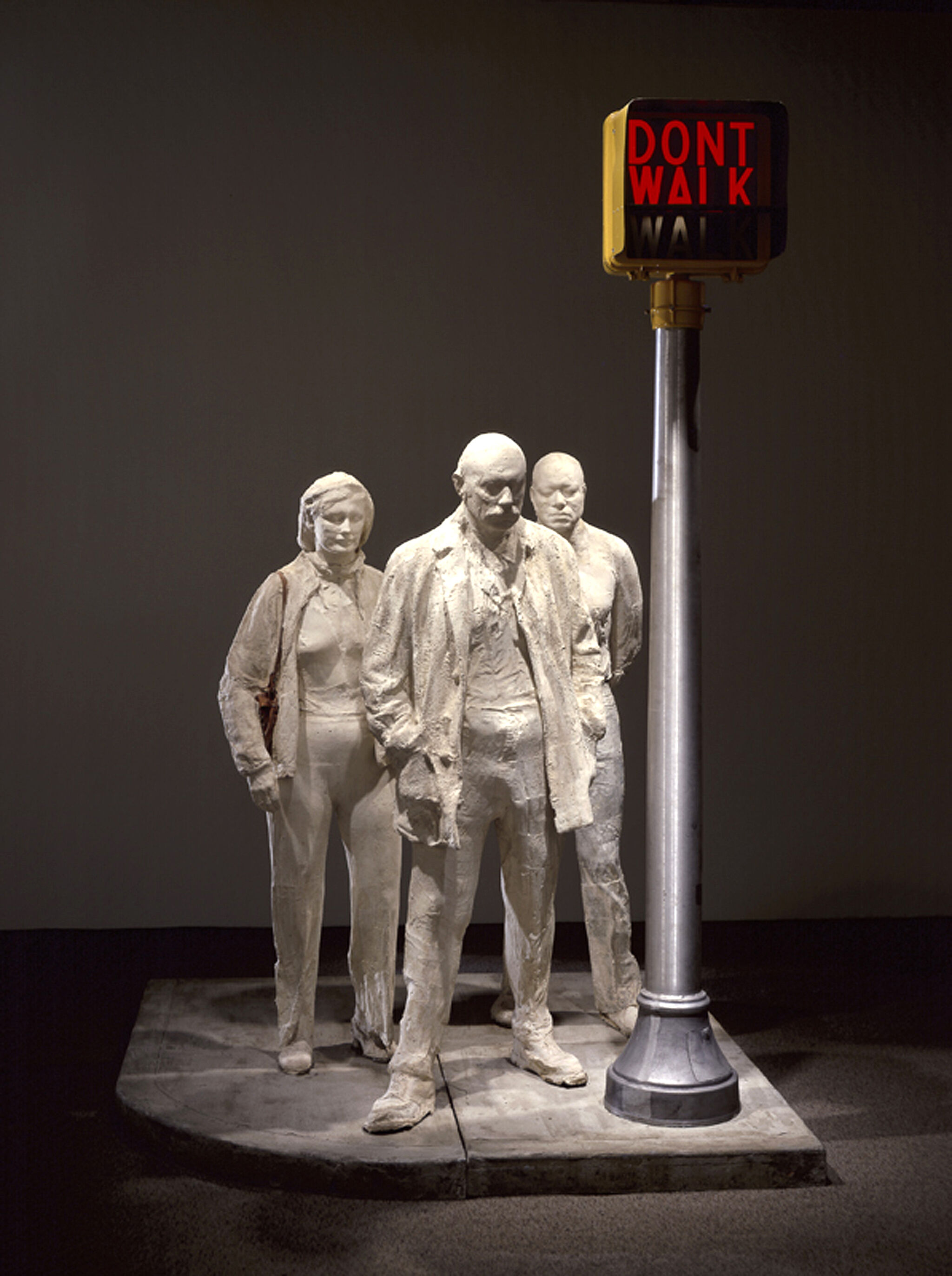
-
527
Nam June Paik, V-yramid, 1982
Kids
-
648
Scott Burton, Pair of Two-Part Chairs, Obtuse Angle, 1984
Kids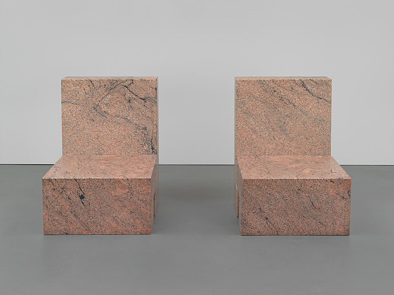
-
505
Elizabeth Murray, Children Meeting, 1978
Kids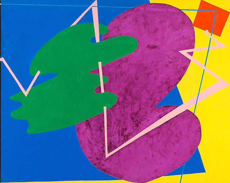
-
526
Barbara Kruger, Untitled (We Don’t Need Another Hero), 1987
Kids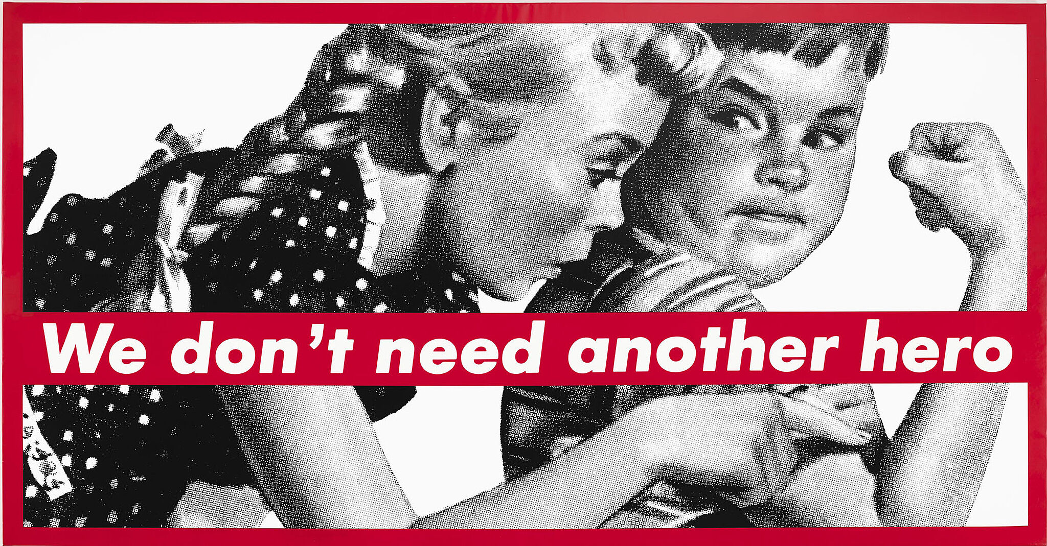
Adam Weinberg: Welcome to the Whitney Museum of American Art. I’m Adam Weinberg, Alice Pratt Brown Director of the Museum. This inaugural exhibition, America Is Hard to See, is drawn entirely from the Whitney’s own collection—and it celebrates the rich, complex, surprising history of American art.
The exhibition’s title proposes that there is no single history of American art. American history itself is a subject of debate, and artists’ approaches and viewpoints are constantly evolving. Even what might define an American artist has changed many times since the Museum was founded. This exhibition works to honor that multiplicity and depth, taking its organizational cues from the works themselves—not from neat textbook examples of movements or styles. Each gallery has been conceived as a chapter in a new history of art in the United States, and takes its name from the title of an artwork in that gallery.
You can explore the exhibition in any order you choose. If you’d like to go chronologically, please begin on the Eighth Floor and work your way down. This is the first of many stories that we look forward to telling in the new Whitney Museum through its collection. Please enjoy your visit.
Adam Weinberg: I’m Adam Weinberg, Director of the Whitney Museum. I’d like to welcome you to our new building and to our opening exhibition of American Art from the Museum’s collection. You’ll find art everywhere in the building—inside, outside…even the elevators are works of art. As you explore, you can use this guide to learn about the art on view. The main exhibition begins on the 8th floor—if you’d like to go in chronological order, start there and work your way down. Thank you for visiting, and enjoy the show!
Jacob Lawrence, War Series: Another Patrol, 1946. Tempera on composition board. 16 1/8 × 20 1/4 in. (41 × 51.4 cm) Image: 15 7/8 × 20 × 1/8 in. (40.3 × 50.8 × 0.3 cm). Whitney Museum of American Art, New York; Gift of Mr. and Mrs. Roy R. Neuberger 51.8 © artist or artist’s estate
Richard Flood: With the Knot Paintings, I always tend to think of them in a funny sort of way as the Levine lexicon, that they are such a perfect representation of something that is incredibly essential in the way that the artist makes her work. I think it's one of those things that is so easy for people to disregard. "Oh, it's a piece of plywood, and look, she's filling in the knots."
Narrator: We spoke to Richard Flood, then chief curator at the New Museum, in 2011.
Richard Flood: They're totally what they are. They're completely pragmatic, and at the same time the pragmatism is what contains the poetry.
Even when you start looking at the varieties of board that Sherrie's used over the years, they're all quite different, and every time she introduces another kind of ply, there's a different rhythm in the wood. There's a different way in terms of how she's picking out those knots to create the pattern, to create the bytes in the story. I mean so you could also think of these really almost as computer notations—it's up to you what they put together. Are they, you know, is it a kind of Morse code for, "Have a great day," or Morse code for, "It's always rougher than you think it's going to be." The possibilities for all of these interpretations are there, and yet they are simply a fact. You know, wood is a fact. A knothole in a piece of wood is a fact. And then Sherrie just does one tiny thing, and the fact becomes a poem.
Sherrie Levine, Large Gold Knot: 1, 1987. Metallic paint on plywood, 60 x 48 in. (152.4 x 121.9 cm). Whitney Museum of American Art, New York; purchase with funds from the Painting and Sculpture Committee 88.48a–b. © Sherrie Levine. Photograph by Sheldan C. Collins
Thelma Golden: Hollywood Africans is somewhat of a typical Basquiat painting, because the first thing you see is that it’s covered with words. And the words have a hierarchy: some of them are circled, some of them are crossed out, some of them are highlighted in different colors, but really the most important thing is you see the words.
Adam Weinberg: Thelma Golden is director and chief curator of the Studio Museum in Harlem.
Thelma Golden: At the core of this painting is a self-portrait of Basquiat himself and his two friends, Toxic and Ramellzee, who were also artists of that era who had traveled with him to L.A., so in many ways, the painting is a document of this trip that they made out to California, encountering out there both the art world as well as the music world, that they were hanging out in. I think it’s obvious to look at Hollywood Africans as a critique of the way in which black people have been portrayed in Hollywood film.
But I think, given when this painting was made in 1983, Basquiat was making a more complicated comment about the ideas of freedom and ownership as it related to the Hollywood arena. I often think of this painting, Hollywood Africans, as referring not just to those portrayals of Africa, the stereotypes of Africa in films like Tarzan and the way in which Africans were portrayed, but more a contemporary comment about the role of black people in the film world, right? That they are stars, but yet still, culture defines the way in which they’re understood. So it, to me, seems often like he wasn’t just making a comment about the past, but he was really making—not a comment or a critique—but a statement about the present.
Jean-Michel Basquiat, Hollywood Africans, 1983. Acrylic and oil stick on canvas, 84 1/16 x 84 in. (213.5 x 213.4 cm). Gift of Douglas S. Cramer 84.23. © 2015 The Estate of Jean-Michel Basquiat/ ADAGP, Paris/Artists Rights Society (ARS), New York
Narrator: This 1988 painting by artist Martin Wong is called Big Heat. Andrew Castrucci was a friend of the artist. During the 1980s, he and Wong were both residents of the Lower East Side.
Andrew Castrucci: I knew him as a character of the neighborhood. He used to walk around with this, the firemen's uniform, actually. So he was kind of very theatrical. Martin lived, I believe on Attorney Street in a tenement there and he did have an obsession and love for, for bricks.
The tenements were beautiful to Martin, no matter how empty it was or, or so forth. It was like a Roman ruin or a Greek ruin or an Egyptian ruin, the pyramids. What Martin was part of, what I was part of, we were trying to hold on to. . .the whole tradition of what the Lower East Side was about. The diversity of it. . .It's very gentrified now and so forth.
Artists are constantly redefining what beauty is. So I think this is just another perspective of redefining beauty—the kissing firemen. It certainly celebrates gay life, but it's also, I think, more abstract than that. It's just about human contacts, somehow. I mean it's part of the nature of the city is this beautiful chaos, somehow. And I really see this in this painting even though it's very calm and still.
Martin Wong, Big Heat, 1988. Synthetic polymer on canvas, 60 1/8 × 48 in. (152.7 × 121.9 cm). Whitney Museum of American Art, New York; purchase with funds from the Painting and Sculpture Committee 99.89. © Estate of Martin Wong; courtesy The Estate of Martin Wong and P.P.O.W. Gallery, New York, NY
Adam Weinberg: Artist Paul Pfeiffer talks about this video work, entitled Fragment of a Crucifixion (After Francis Bacon).
Paul Pfeiffer: It's an image taken from a commercial video of a basketball game. And it's a moment right after a particular player slam dunks. So he looks into the camera and kind of screams. And that image is digitized and looped and then edited on the computer, so that all the other players on the basketball court are edited out. Actually, all the evidence of the basketball game, all the corporate logos and all of the team jersey numbers are all edited out. And its kind of, you know, indeterminate what he's screaming about, it kind of looks like, a little bit like rage, or it could be some kind of ecstasy or it could be some kind of humiliation.
I thought of it as being in a way somewhat like the treatment of the Pope in Francis Bacon's painting, where the guy's recognizable as the Pope, or as a Pope. But there's something about the gesture that makes it not just the Pope but kind of almost like an archetypal image of a kind of human condition.
It's an amazing spectacle to be in an arena with tens of thousands of people and to have everything focused on this one, what is it, 50 square meter piece of ground, where this drama is going on. Then it's even more intense to think about what that must be like from the court itself, and to be an athlete that's attempting to play a game, and kind of call all of their strength and precision and talent into play while being surrounded completely by cameras and lights and tens of thousands of people screaming. And in a way, there's something about that I think of as being almost an archetypal image of our time.
Paul Pfeiffer, Fragment of a Crucifixion (After Francis Bacon), 1999. Videotape, VHS player, projector and metal armature, 20 x 5 x 20 in. (50.8 x 12.7 x 50.8 cm). Whitney Museum of American Art, New York; purchase, with funds from Melva Bucksbaum and the Film and Video Committee 2000.150. © Paul Pfeiffer. Photograph by Jerry L. Thompson
Narrator: Art historian Kellie Jones.
Kellie Jones: Some people describe it as like a tarantula; some kind of animal; some kind of bug; but huge. But if you go close to it, of course, what the main thing about it is that it’s this huge construction that’s made with African American hair, I mean not solid tendrils of hair, but hair that’s been affixed to wires, that’s been strung on wires.
Of course probably the most direct comparison in that case, is dreadlocks.I think it’s just, like I said, a kind of monumental homage to the body. But again, as David usually does, at this point, after the ‘70s, the body is only made reference to, and it’s not a figurative work, necessarily.
David starts out in LA, in the mid sixties, working with a group of artists, African American artists who are kind of right in the middle of the kind of California interest in assemblage that came out of the Beat movement of the fifties and early sixties.
So there’s an African American movement at that time, in the sixties, which is using castoff materials in the same way, but actually with a different slant, in that they’re using materials that have a significance for African American life.
And you know as he always says, you know, these items are free. That’s why I use whatever there’s a lot of that’s free. So he’s used bottle caps. He used hair in the same way, because he goes to barbershops, and this is garbage. This is the refuse that’s thrown away. And he also talks about, particularly in the case of hair, you can think of all the magical properties that it also has as well in so many cultures.
David Hammons, Untitled, 1992. Copper, wire, hair, stone, fabric, and thread, height 60 in. (152.4 cm). Whitney Museum of American Art, New York; purchase with funds from the Mrs. Percy Uris Bequest and the Painting and Sculpture Committee 92.128a-u
Narrator: The artist Paul Chan.
Paul Chan: The whole piece functions with the idea that if you walk into the room, where this piece is, you’ll look on the floor to this, non-square of light, and think to yourself, at some point, where is the window? That there’s a window, somewhere in this room that’s casting light onto this floor.
Narrator: The work is on a fourteen-minute loop. For most of that time, you will see things floating upwards—a subway train, a bicycle, and an ipod, for example. But at some moments, there are human bodies falling down. For many, these figures recall the sight of tumbling victims from the World Trade Center attacks. They also perhaps suggest a tradition of apocalyptic images in western art. In Christian doctrine, the apocalypse is associated with the rapture, or the ascension of believers to heaven. Here we see humans fall to earth and it is our possessions—everyday objects—that rise upwards.
Paul Chan: You must be a fool to not see the era of the twenty-first century infused with a kind of religiosity, whether from Eastern or Western. This idea of a need for a kind of order that comes from high above us, right? So when people talk about it in terms of apocalypse, I think it’s not necessarily because of the piece, but because the air in which we live now. . .the language is there, and so we grab it. I’ve certainly been invested in looking into, or using, or even perhaps hallucinating, why it is that we’re reaching for this, higher order.
Paul Chan, 1st Light, 2005. Video installation, black and white and color, silent, 14 min., 103 × 245 × 283 in. (261.6 × 622.3 × 718.8 cm). Whitney Museum of American Art, New York; purchase, with funds from the Film and Video Committee 2007.4 © Paul Chan; courtesy of the artist and Greene Naftali, New York
Narrator: The work you see here, by R.H. Quaytman, isll part of a larger group of paintings, each of which the artist considers "a chapter." The chapters relate to the place where the work will first be shown. This one was first shown in the 2010 Whitney Biennial, which took place in the Upper East Side museum designed by Marcel Breuer. Quaytman’s work hung next to one of the building’s distinctive windows.
R. H. Quaytman: Because I really have always loved those Breuer windows. And they also refer to a concept I use a lot in my work, which is pushing the picture plane back into one point perspective.
And then I started thinking about just the history of the Whitney. And I went to the library. I did some research on Breuer, the collection. In the end, I just saw this painting of the Hopper, Woman in the Sun. And I've always just really admired this painting a lot because I felt that the woman in it was very powerful and authoritative, and you wonder what she's thinking more than you wonder how she looks. And also to me [it] is the quintessential Whitney collection painting.
Narrator: Quaytman photographed a friend and colleague next to the Breuer window, in a composition that strongly recalls the Hopper painting. Quaytman then silkscreened the image onto gessoed wood panels.
R. H. Quaytman (b. 1961), Distracting Distance, Chapter 16, 2010. Screenprint and gesso on wood, 24 5/8 x 39 7/8 in. (62.5 x 101.3 cm). Whitney Museum of American Art, New York; purchase with funds from the Painting and Sculpture Committee 2010.54. © R. H. Quaytman
Narrator: Adam McEwen made a series of obituaries for people who were unmistakably alive—including Bill Clinton, Kate Moss, and Jeff Koons.
Adam McEwen: My name is Adam McEwen and I live in New York. I used to have a job, a part-time job in London, writing obituaries for a big British newspaper and these are written in a style of that paper. So the only lie is in the first line where it says so-and-so who has died, age 47 or whatever. Everything else in these pieces is written from press clippings, from books, from the internet, everything else has been published, so it’s up for grabs as fact, as history.
Obviously I really don’t know anything about any of these people, the only thing I know about them for sure is that they’re going to die and I don’t mean that in a morbid sense. I just mean it’s the only reliable fact, its a parameter, so for me its useful, it’s like a tool…First of all it allows me to hook the viewer in with the fact that this person isn’t dead. Secondly it allows me to make this art piece, that when this person dies, this art piece is going to become redundant because an obituary very like this is going to be published.
It’s very hard to find people who I find interesting and admire in a sort of strange way, and at the same time have their flaws visible.
They are narratives of people making decisions throughout their lives. Generally you’re making decisions you are hoping to make the right decision, so for me these are about the idea that you can make a decision.
Adam McEwen, Untitled (Jeff), 2004, from a suite of seven. Chromogenic print, 52 3/4 × 37 in. (134 × 94 cm). 1/2 Artist Proof, edition of 3. Published by the artist. Whitney Museum of American Art, New York; purchase with funds from the Print Committee 2006.94.1
Narrator: At first glance, this painting by Ad Reinhardt looks like a field of solid black. On closer inspection, you can see that there are subtle variations of tone. After 1953, Reinhardt made only black canvases. His simple, meditative works are the antithesis of the action paintings of the Abstract Expressionists like Jackson Pollock.
Contemporary artist Byron Kim talks about Reinhardt’s work:
Byron Kim: Often I’m surprised and overwhelmed by how beautiful they are. . . And I love Reinhardt’s black paintings more probably than any other artwork that I’ve come across. I think he meant them to be contentless. So he really wanted them to be nothing. So what happens when, you know, nobody wants to accept that something is about nothing, or that art is only about art. So once you say that, then people inevitably start to relate these paintings to something, or try to make them metaphysical, try to relate them to something outside of the painting somehow. You don’t know what you’re looking at. And so they don’t look like anything.
The thing that makes Reinhardt interesting to me is that he was deadly serious and it was all a big joke at the same time. But you know, you don’t get the humor in the black paintings. But to me, they’re really funny because they’re exactly that kind of humor, that kind of deadpan humor, that’s not knee-slapping humor, but because it isn’t, it’s sort of more funny to me. I’m laughing inside my brain.
Ad Reinhardt, Abstract Painting, 1960-66 (Installation view, Whitney Museum of American Art). Oil on linen, 60 x 60 1/8 in. (152.4 x 152.7 cm). Whitney Museum of American Art, New York; purchase with funds from The Lauder Foundation, Leonard and Evelyn Lauder Fund 98.16.3. Photograph by Ron Amstutz
Narrator: This small assemblage—made of nylon stockings, a tin can, candle wax, and other unorthodox materials—is a portrait of the Beat poet Allen Ginsberg. Made by artist Bruce Conner in 1960, the work deliberately flouts convention with its unheroic scale and use of junk materials. Here, Conner rejects the traditional notions of art as representational, refined, and permanent, and captures the questioning, anti-establishment spirit of Ginsberg and the 1960s.
Take a moment to listen to this excerpt of Ginsberg reading from Howl, his famous 1956 poem, which begins, “I saw the best minds of my generation destroyed by madness.”
Allen Ginsberg: who created great suicidal dramas on the apartment cliff-banks of the Hudson under the wartime blue floodlight of the moon & their heads shall be crowned with laurel in oblivion,
who ate the lamb stew of the imagination or digested the crab at the muddy bottom of the rivers of Bowery,
who wept at the romance of the streets with their pushcarts full of onions and bad music,
who sat in boxes breathing in the darkness under the bridge, and rose up to build harpsichords in their lofts. . .
Bruce Conner (1933–2008), PORTRAIT OF ALLEN GINSBERG, 1960. Wood, fabric, wax, metal can, glass, feathers, metal, string and spray paint. Overall: 19 15/16 × 11 5/16 × 21 3/8 in. (50.6 × 28.7 × 54.3 cm). Whitney Museum of American Art, New York; Purchase, with funds from the Contemporary Painting and Sculpture Committee 96.48 © artist or artist’s estate
Narrator: The four figures in this group of lifesize sculptures by Marisol are self-portraits of the artist. Attached to the wooden head of the woman with the green skirt and pink blouse is a black and white photograph of the artist. The two women with revolving faces are plaster casts of the artist’s face.
Marisol: They’re a casting of my face. It’s plaster. They always come out different. But this is myself as a child, the small one.
Narrator: In addition to the wood, plaster, and the black and white photograph, Marisol used found objects—such as the little girl’s pink bow or the handbag of the woman on the far left. And, of course, it’s hard to miss the taxidermed dog’s head. She particularly enjoys working with wood and continues to create sculpture made out of pieces she buys or finds on the street.
Marisol: There’s no end to gluing and cutting and sanding. [Laughs]
Marisol, Women and Dog, 1963–64. Wood, plaster, synthetic polymer, taxidermied dog head and miscellaneous items, 73 9/16 × 76 5/8 × 26 3/4 in. (186.8 × 194.6 × 67.9 cm). Whitney Museum of American Art, New York; purchase, with funds from the Friends of the Whitney Museum of American Art 64.17a-i. © Estate of Marisol / Albright Knox Art Gallery / Artists Rights Society (ARS), New York
Michael Lobel: What really interests me, what I find compelling about the painting is that he has found a way to have his cake and eat it, too.
Narrator: Michael Lobel is an art historian, and author of the book Image Duplicator: Roy Lichtenstein and the Emergence of Pop Art.
Michael Lobel: What Lichtenstein has given us is a kind of, set of images which look like the kind of painting that had been so recognizable to American audiences by the mid-1950s, called action painting or Abstract Expressionism. But it's an image of that work of course. It's a completely flat canvas. If you look at the surface of it, there's no kind of brush stroke there, there's no trace of the artists' hand there at all.
And there's that dot screen in the background of the painting, so we know this is a kind of work of art that makes reference to mechanical printing. And that was the last thing the Abstract Expressionists wanted. They resisted mass culture. They resisted this kind of culture that was produced by machines and reproduced endless times and disseminated and transmitted through the mass media.
At the same time that this looks like an image of an abstract painting, he's made a very successful kind of abstract painting with these wonderful tones of white and red and yellow. So he's doing both at once. He's able to parody the work of the generation that preceded him. But he's also found a way in that process, to make his own really powerful abstract composition.
Roy Lichtenstein, Little Big Painting, 1965. Oil and acrylic on canvas, 68 × 80 in. (172.7 × 203.2 cm). Whitney Museum of American Art, New York; purchase with funds from the Friends of the Whitney Museum of American Art 66.2. © Estate of Roy Lichtenstein
Narrator: This painting by Jasper Johns, called Three Flags, was made in 1958. Todd Gitlin is a professor at the Columbia School of Journalism and a scholar of American culture of the 1960s.
Todd Gitlin: . . .he's neither celebrating the flag nor. . .stabbing it in the heart. He's. . .to use a later term, deconstructing it. . .[A]nother way to put it is that he's inviting you to become innocent. He's inviting you to look at these things as if you were a Martian. . .And just to stare at them and to take them as natural artifacts.
[T]he question is not just why is Johns painting these flags and numbers and letters but. . .why are other people buying them, exhibiting them, find them interesting. . .
[T]here is an argument to be made that he is retailing. . .in the fifties
a sort of soft aestheticizing of the sacred national symbol in a way that. . .flatters or honors the nation. . .but without genuflection. That is, he's appropriating with. . .a frisson of individuality. . .an attitude of approval which incorporates a brief moment of disapproval and so he's sort of. . .signing on to Americanism. . .as a graceful dissenter.
And in a world that's increasingly cluttered by symbols. . .cluttered with. . .artifacts that are mass produced. Cluttered. . .with noise and. . .slogan. . .and so on.. .that the proper attitude to take toward all of that is a kind of. . .amused, distant, as Rolling Stone would later put it, cosmic giggle.
But in the meantime I think he's also saying. . .and it's part of his appeal to the zeitgeist that he's saying to the world of. . .intellectuality, shut up. Just shut up. Shut up and look.
Jasper Johns, Three Flags, 1958. Encaustic on canvas (three panels), 30 7/8 × 45 3/4 in. (78.4 × 116.2 cm) overall. Whitney Museum of American Art, New York; purchase, with funds from the Gilman Foundation, Inc., The Lauder Foundation, A. Alfred Taubman, Laura-Lee Whittier Woods, Howard Lipman, and Ed Downe in honor of the Museum’s 50th Anniversary 80.32. © 2021 Jasper Johns / Licensed by VAGA at Artists Rights Society (ARS), New York
Narrator: The text at the bottom of this canvas came from an art book that proclaimed the superiority of painting to photography. The artist, John Baldessari.
John Baldessari: And it kind of bothered me that photography had one history and, and art had another history or, or more specifically painting. And to me it was all kind of the same. It was just different materials, photographic materials versus paint and canvas. And so I think that, it was that argument I was addressing.
Narrator: The photo in this piece is of an anonymous parking lot in San Diego, with a tree randomly dividing the picture in half.
John Baldessari: I was. . .trying to counter that I just would go around taking snapshots and trying to, to really violate rules of photography. And I thought, Well, what would be more violative of a photograph than just having this post come down in the middle of it, just splitting the image left and right? Some of them are just driving around in my VW bus and holding the camera out the window and shooting without even looking through the viewfinder. Basically I was just trying to avoid the conventional ideas of art.
Narrator: Towards this end, Baldessari was trying to downplay the role of the artist, both in his non-choice of photographic subject matter and his mechanical, impersonal approach to painting this work. He hired a professional sign painter and had him print the featureless script on the canvas rather than paint it. Baldessari coated the canvas with emulsion—the chemical mixture used to make photo paper light sensitive—using a photographic process to develop a painting. By doing so, Baldessari ironically challenges the authority of the reproduced text, and its insistence that photography is somehow a less artistic and more mechanical medium than painting.
John Baldessari, An Artist is Not Merely the Slavish Announcer, 1966-68. Photographic emulsion, varnish, and gesso on canvas, 59 1/8 × 45 × 7/8 in. (150.2 × 114.3 × 2.2 cm). Whitney Museum of American Art, New York; Purchase, with funds from the Painting and Sculpture Committee and gift of an anonymous donor 92.21 © John Baldessari
Narrator: Anne Truitt called this 1977 sculpture Triad, meaning "a group of three." Art historian James Meyer was friends with the artist.
James Meyer: If you look at the work, it consists of two different but similarly valued planes of a kind of pale, sort of lavender. And at the corners is a sort of band of peach. And at the bottom you see a very slender red stripe. ...So you have three visual terms on the surface of the piece. Triad has references of a kind of tense balance. It's not two terms, but three. So it's almost as if that red little stripe at the bottom is holding the whole thing together in a kind of intensity. It's almost like a package being held together by a little string that could suddenly get pulled apart.
Narrator: Truitt belonged to the same generation as the Minimalist sculptors. She shared their interest in precise, geometrical forms—like the column. But the Minimalists wanted the viewer to respond to the object only as a physical fact. By contrast, Truitt found expressive qualities even in something as simple as the elongated proportions of this column.
James Meyer: That height and that slimness, which is something Truitt becomes very keen on in her later work, renders it less and less an object, and more and more something elusive, something pointing to a subject matter beyond its own physical materiality.
Anne Truitt, Triad, 1977. Acrylic paint on wood, 90 9/16 × 8 × 8 in. (230 × 20.3 × 20.3 cm). Whitney Museum of American Art, New York; gift of Ann and Gilbert Kinney 2006.33 © Estate of Anne Truitt / Bridgeman Images
Narrator: Actor Bill Irwin.
Bill Irwin: Welcome, ladies and gentlemen, mes dames et messieurs, to the circus. Beginning in 1926, Calder combined his fascination with movement, animals, and caricature into Le Cirque Calder.
What you see here are a number of acts, each consisting of different characters—acrobats, a bearded lady, a lion tamer and his lion. When performed, Calder would manipulate the parts and figures before you—in one ring, one act at a time.
He would make bleachers from wood crates and planks; erect two tall poles for the high wire and trapeze; hand out cymbals and other noisemakers; cue up records on his gramophone and give his guests a full evening’s entertainment. It was what could be described as the first instance of performance art.
Through the Circus, Calder became good friends with an impressive list of artists, including Marcel Duchamp, Joan Miró, Fernand Léger, Edgar Varèse, Le Corbusier, and Piet Mondrian. These members of the Parisian avant-garde appreciated Calder’s love of play and spectacle—a performance of the Circus meant a very good time. But the artists were also drawn to the serious side of the Circus. Fun mixed with death and danger: the knife thrower aiming to hit a target perilously close to his favorite assistant sometimes missed—with tragic results. But Calder would use the same female figure in the next act, a clever touch his audiences appreciated.
In the first decades of the twentieth century, modernist artists across Europe were searching for ways to merge art and life, technology and design. As playful as Calder’s performance may seem, it beautifully exemplifies these avant-garde impulses. The fact that he put his objects in motion, the characteristic state of modernity, wouldn’t have been lost on any of his observers. And the individual acts were engineered with a great deal of technical skill.
Alexander Calder, Calder's Circus, 1926–1931. Galvanized steel wire, fabric, rhinestones, thread, 13 3/8 × 6 × 8 1/2 in. (34 × 15.2 × 21.6 cm). Whitney Museum of American Art, New York; purchase with funds from a public fundraising campaign in May 1982. One half the funds were contributed by the Robert Wood Johnson Jr. Charitable Trust. Additional major donations were given by The Lauder Foundation; the Robert Lehman Foundation, Inc.; the Howard and Jean Lipman Foundation, Inc.; an anonymous donor; The T. M. Evans Foundation, Inc.; MacAndrews & Forbes Group, Incorporated; the DeWitt Wallace Fund, Inc.; Martin and Agneta Gruss; Anne Phillips; Mr. and Mrs. Laurance S. Rockefeller; the Simon Foundation, Inc.; Marylou Whitney; Bankers Trust Company; Mr. and Mrs. Kenneth N. Dayton; Joel and Anne Ehrenkranz; Irvin and Kenneth Feld; Flora Whitney Miller. More than 500 individuals from 26 states and abroad also contributed to the campaign. 83.36.22.1a‑c. © 2019 Calder Foundation, New York / Artists Rights Society (ARS), New York
Narrator: Like a mirage, a deer skull hovers in the sky above wild flowers. The artist, Georgia O’Keeffe, didn’t like to explain her paintings. To her, they were simple records of what she saw around her. Walking in the desert, she collected bones that had been bleached by the New Mexico sun.
Georgia O'Keeffe: The bones do not symbolize death to me. They are shapes that I enjoy. It never occurs to me they have anything to do with death. They are very lively. They please me. And I have enjoyed them very much in relation to the sky.
Narrator: O’Keeffe, who began her career in New York, eventually began living in the American Southwest in 1929.
Georgia O'Keeffe: When I got to New Mexico that was mine. As soon as I saw it that was my country. I’d never seen anything like it before but it fitted to me exactly. Like something that’s in the air—it’s just different. The sky is different, the stars are different, the wind is different.
Georgia O'Keeffe, Summer Days, 1936. Oil on canvas, 36 1/8 × 30 1/8 in. (91.8 × 76.5 cm). Whitney Museum of American Art, New York; gift of Calvin Klein 94.171. © 2019 Georgia O'Keeffe Museum / Artists Rights Society (ARS), New York
Carter Foster: I was able to identify the building that Hopper was looking at that inspired the painting, through old photographs.
Narrator: Carter Foster is the Steven and Ann Ames Curator of Drawing at the Whitney.
Carter Foster: What's interesting about the painting is how Hopper both stretched out the building and condensed it the same time. It sounds paradoxical and it sort of is. But what he did was he added an extra bay, an extra window, so that sort of elongates the top of the structure. But he also added another shop opening in the bottom part, so that you get this compression. You get smaller doors and windows than were actually there.
He sets off that sense of compression with this very prominent barber pole, which I have to read as a stand-in for a human being, and perhaps a stand-in for Hopper himself, who was actually tall and, in fact, by this time, bald.
So you get this face-off between this solid, familiar but mundane building and this very brightly lit barber pole in this kind of masterful composition, perhaps of which the main subject is light and the way light plays off the built urban environment.
Narrator: One of the most important details in Early Sunday Morning is something you might not notice right away—the dark square in the upper right corner. A larger building was going up when Hopper was working on the painting. Its looming silhouette suggests the rapid urbanization and modernization that was transforming the city.
Edward Hopper, Early Sunday Morning, 1930. Oil on canvas, 35 3/16 × 60 1/4 in. (89.4 × 153 cm). Whitney Museum of American Art, New York; purchase with funds from Gertrude Vanderbilt Whitney 31.426. © Heirs of Josephine N. Hopper/Licensed by VAGA, New York, NY
Narrator: Jared French’s painting of a day at the beach seems straightforward enough at first. But the painting’s narrative is ambiguous. Art historian Richard Meyer is the author of Outlaw Representation: Censorship and Homosexuality in Twentieth-Century American Art.
Richard Meyer: The figure in the foreground is holding up a billyclub or nightstick and the figure in the background is holding up his fist. And it's almost as though even though they're distanced from each other by the family they're engaged in some kind of combat or confrontation with each other. And what stands between– … what stands between…them is the family. But the family does not look at each other.
This is by no means a picture of the American dream. And there is a kind of alienation which is also. . .very much a part of postwar American culture. This idea that maybe things aren't so great in the suburbs or, and maybe, you know, things aren't so happy with the nuclear family—mom, dad, and little boy.
There is a real strangeness about the issue of relationality, about what it means to be with another person or persons and what it means to be alone. And I think that that's part of what's strange and compelling about the picture.
Narrator: The muscular men are somewhat threatening. But their heavily muscled physiques are also very much eroticized. The scene is probably meant to be set on Fire Island, a popular destination for gay men. French spent the summers there with two other artists—his wife Margaret and his lover, the painter Paul Cadmus. To hear about this unconventional arrangement, press the “play” button.
Jared French, State Park, 1946. Egg tempera on composition board, 24 7/16 × 24 1/2in. (62.1 × 62.2 cm). Gift of Mr. and Mrs. R. H. Donnelley Erdman
Elizabeth Murray: It’s a catastrophe, really. It’s a kind of catastrophe painting.
Narrator: The late artist Elizabeth Murray described Willem de Kooning’s painting, Woman and Bicycle from the perspective of a fellow painter.
Elizabeth Murray: The thing about this painting that’s so amazing is to see the woman form kind of emerge from underneath, almost as though she’s coming out of water, kind of emerging with the two mouths and the amazing eyes. And of course she’s a very strange woman. She probably has like a kind of evening dress on, and I think—I think it is like the Marilyn Monroe smile. And then there are these hands that can flail around inside of the painting. The hands are flailing. There is the bicycle in there somewhere which is torn apart and ripped apart.
I think the thing that struck me the most about this painting was the intensity of the paint. You feel like he’s rubbing it and he’s stirring it up from the bottom, and he’s also pressing it back down. He takes newspaper and he presses it against the paint. Then he takes his knife, or anything, and scrapes the paint back up. And then he takes his brush, and pushes it into a kind of shape.
So it’s all about this clear sexuality and exposure. And yet, like a lot of catastrophes, it comes together in this extremely positive way. And I think that’s what makes it such an amazing experience to look at it.
Willem de Kooning, Woman and Bicycle, 1952–53. Oil, enamel, and charcoal on linen, 76 1/2 × 49 1/8 in. (194.3 × 124.8 cm). Whitney Museum of American Art, New York; purchase 55.35. © The Willem de Kooning Foundation/Artists Rights Society (ARS), New York
Narrator: This painting of artist Arshile Gorky and his mother is based on a photograph from 1912. A few years after the photo was taken, Gorky and his family were among more than a million ethnic Armenians who were victims of the Armenian genocide. The artist and his sister survived the ordeal. Geoffrey Hartman is Professor of Comparative Literature at Yale University.
Geoffrey Hartman: We know that this painting was done when the mother was dead. She died close to him, he says in his arms of starvation when he was, then he would have been, what, sixteen years old.
It's clear in the picture that there may have been some, a painting of actual hands, at least the right hand. But there does seem to be a violence in erasing the two hands. So I am struck by the muteness here. If you wanted to bring that muteness back to the actual features of the painting, you would probably mention the very tightly closed mouths.
Of course, we know that trauma often produces muteness. Sometimes psychologists call it elective silence. . . often especially in the young child. There's a refusal to speak or a difficulty of speaking. That is when you begin to stutter, for instance. What one could very metaphorically say there is some stuttering there, around the hands. You know, the painting begins to stutter, shake and stutter around the hands.
Arshile Gorky, The Artist and His Mother, 1926-c. 1936. Oil on canvas, 60 × 50 1/4 in. (152.4 × 127.6 cm). Whitney Museum of American Art; gift of Julien Levy for Maro and Natasha Gorky in memory of their father 50.17 © 2017 The Arshile Gorky Foundation/Artists Rights Society (ARS), New York, NY
Narrator: Curator Barbara Haskell.
Barbara Haskell: Arshile Gorky's Betrothal acts as a bridge between realism and abstraction. It incorporates realistic subjects but so camouflages them as to hide them from the viewer. The title, Betrothal, suggests that it has something to do with the relationship between a man and a woman.
Although the images in the painting itself are not suggestive enough to either rule out one explanation or to suggest that another predominates, so that in some ways it's a very open ended picture that he's created, one that allows the viewer, him or herself to read it and interpret the different images in a way that seems fit.
Gorky treats his paint almost as if it's a watercolor medium. He lays down an initial coat of paint and then applies these almost translucent layers of paint on top of that so that one reads his paint as if one is seeing through an atmosphere.
He also leaves the accidental drips and marks of the paint on the canvas, uses them to create other forms. And in that way, very much served as a precursor to the Abstract Expressionists who followed and who took advantage of the accidental markings of the paint as, in fact, the subject matter, in some cases, of their art.
Arshile Gorky, The Betrothal II, 1947. Oil and ink on canvas. 50 3/4 × 38 in. (128.9 × 96.5 cm) Frame: 51 3/16 × 39 × 1 15/16 in. (130 × 99.1 × 4.9 cm). Whitney Museum of American Art, New York; Purchase 50.3 © artist or artist’s estate
Candida Smith: I am Candida Smith. I'm reading from a passage my father David Smith wrote on points of departure, in particular points of departure for the sculpture Hudson River Landscape.
"Hudson River Landscape started from drawings made on a train between Albany and Poughkeepsie. A synthesis of drawings from ten trips, going and coming over this seventy-five mile stretch. On this basis I started a drawing for a sculpture. As I began, I shook a quart bottle of India ink. It flew over my hand, it looked like my landscape. I placed my hand on the paper, and from the image this left, I traveled with the landscape to other landscapes and their objectives, with additions, deductions, directives which flashed past too fast to tabulate but whose elements are in the finished sculpture. No part is diminished reality. The total is a unity of symbolized reality, which to my mind is far greater reality than the river scene.
Is my work Hudson River Landscape, the Hudson River, or is it the travel, the vision, the ink spot? Does it matter? The sculpture exists on its own. It is the entity. The name is an affectionate designation of the point prior to travel. My objective was not these words or the Hudson River, but to create the existence of a sculpture. Your response may not travel down the Hudson River, but it may travel on any river, or on a higher level."
David Smith, Hudson River Landscape, 1951. Welded painted steel and stainless steel. Overall: 48 3/4 × 72 1/8 × 17 5/16 in. (123.8 × 183.2 × 44 cm). Unique edition. Whitney Museum of American Art, New York; Purchase 54.14 Art (c) Estate of David Smith/Licensed by VAGA, New York, NY
A.M. Homes: And I think for me, looking at Mark Rothko paintings was, for lack of a better description, the first time I saw myself in art.
Narrator: Novelist A.M. Homes.
A.M. Homes: I also think it’s an incredibly compressed field which always amazes me that he is able to take everything from horror and ecstasy and pure, sheer rage and the most sublime, delicate, wonderful experience and boil it all down and render it as indivisible. Each element is there and you can't even begin to break apart which one is which.
I think that he achieves in his paintings what I'm trying to achieve in fiction. Which is that expression of the things that go unseen and unsaid and unarticulated. And I'd never seen anything—color, gesture, texture—represent an emotional experience so fully. So that meant an incredible amount to me.
The story of me and Mark Rothko is that when I was a kid, my father, who's a painter, used to go every weekend and look at art in Washington. And every weekend, I would eventually go with him. Because in addition to being a lover of art, my father was also incredibly picky about what foods we ate and what we could have in the house. And he was a real health food fanatic early on. So we had no cookies, we had no cake, we had no twinkies or hohos. We also couldn’t have grapes that weren’t picked by union workers and no iceberg lettuce and no soda. But if you went with my father to look at art, at a certain point he could break down and he would take you to the cafeteria. And in addition to not allowing sweets he also kind of got overwhelmed in the cafeteria because I think it was his big moment as well and so you could pick out whatever you wanted. And you could usually pick out more than one thing. So you could have pie AND Jello which I think was almost anti-religious in our family. And I would go with him, and I would sit in museums all over Washington, looking at art for hours and hours and hours, and having this accidental art education where I would just stare at the painting sitting on benches waiting for him. And in the end it turned out it was really incredibly marvelous. And I discovered Mark Rothko among many other artists. And had very nice pie at the end of the day. And I think it's in a large part how I became who I became.
Mark Rothko, Four Darks in Red, 1958. Oil on canvas, 102 × 116 in. (259.1 × 294.6 cm). Whitney Museum of American Art, New York; purchase with funds from the Friends of the Whitney Museum of American Art, Mr. and Mrs. Eugene M. Schwartz, Mrs. Samuel A. Seaver, and Charles Simon 68.9. © 1998 Kate Rothko Prizel & Christopher Rothko / Artists Rights Society (ARS), New York
James Welling: Cricket Chorus seems to depict a hedge or a thick foliage with the sounds of crickets so it must be later in the summer when crickets come out, say in August.
Narrator: Photographer James Welling.
James Welling: It appears to be a sunset image with heavy shadows, deep shadows, and sunlit clouds in the background. Burchfield was extremely interested in representing sound in his work and for him the way to represent sound was through repetitive patterns. So this work starts out probably with a pencil drawing done on location and then the more ornate parts of the foliage, the repetitive patterns done in black watercolor or gouache, for Burchfield seemed to represent the sound patterns that the crickets are making.
Narrator: This painting is from a period that Burchfield later described as his “golden years”—an enormously productive stretch from 1916 to 18 when he was working for a machine parts company by day and making vast numbers of watercolors before and after work. He had recently finished art school and returned to his home in Salem, Ohio. In this painting and others he tried to express his childhood memories of nature. His focus on transitional moments—when evening turns to night, or summer to fall—suggests that with beauty comes loss.
Charles Burchfield, Cricket Chorus in the Arbor, 1917. Transparent and opaque watercolor, brush and ink, and wax crayon on paper mounted on board: 22 1/8 × 18 3/16 × 1/8 in. (56.2 × 46.2 × 0.3 cm); sheet (irregular), 22 1/16 × 17 15/16 in. (56 × 45.6 cm). Whitney Museum of American Art, New York; gift of Anne and John Straus 2009.203 Reproduced with the permission of the Charles E. Burchfield Foundation
Narrator: Artist Joseph Stella first saw the Brooklyn Bridge when he arrived in New York from a small town in southern Italy. He was struck by the technological wonders of the city. The bridge was an iconic symbol of the possibilities of the new world—simultaneously grand and frightening. Many nights, Stella visited the vast expanse of the bridge’s walkway. He later wrote, “I felt deeply moved, as if on the threshold of a new religion.”
Henri Petroski is the Aleksandar S. Vesic Professor of Civil Engineering at Duke University.
Henri Petroski: The cables that dominate this picture are the suspension cables. The Brooklyn Bridge was really a ground-breaking suspension bridge. It was designed by John Roebling, the civil engineer who wanted to connect Brooklyn and New York, which were then separate cities across the East River.
Stella's perspective is essentially the impression you get as you walk along the bridge. The elevated walkway is cradled in these cables, so you’re caught in this net of cables and wires and it’s really a very spectacular setting.
The Brooklyn Bridge walkway provides one of the classic walks in the world. To walk across the bridge and to approach Manhattan at a walking pace is something that is hard to reproduce anywhere else. It gives you ample time to reflect upon the magnitude of the city, the achievements of the engineers and architects who made the city what it is. The people walking on the walkway coming towards you, walking with you, also remind you of the real diversity of the city. It’s just a spectacular, spectacular experience.
Joseph Stella, The Brooklyn Bridge: Variation on an Old Theme, 1939. Oil on canvas, overall: 70 1/4 × 42 3/16 in. (178.4 × 107.2 cm). Whitney Museum of American Art, New York; Purchase 42.15
Narrator: Man Ray called this sculpture New York, 1917, because he made the first version of the work in that year. It was a time of rapid change in the city. And like many early twentieth-century artists, Man Ray was in love with the energy of modern urban life—and the upward thrust of New York's skyline.
Francis Naumann: So there was an absolute fascination with the whole subject of skyscrapers. And to render them or to address them on any level was to render the modern. Render what was new.
Narrator: Francis Naumann is an independent scholar, curator, and art dealer, and author of Conversion to Modernism: The Early Work of Man Ray.
Francis Naumann: Man Ray lived. . .right next to what is today's Grand Central Station, in a building he said was constantly under construction. And he could hear them building Grand Central Station across the street from him and he loved the sound and the noise of the streets of New York City, because for him, that symbolized modernity, that symbolized what was new.
Narrator: Some of the city's chaotic spirit is captured in this work's origins. The work you see here is stainless steel. But the first version, from 1917, was made from some wood slats that Man Ray picked up off his studio floor and held together with a C-clamp. He noticed that it resembled a skyscraper, and so he named it New York.
Man Ray, New York, 1917/1966. Nickel plated and painted bronze, 17 × 9 5/16 in. (43.2 × 23.7 cm). Whitney Museum of American Art, New York; purchase, with funds from the Modern Painting and Sculpture Committee 96.174 © 2015 Man Ray Trust / Artists Rights Society (ARS), NY / ADAGP, Paris
Narrator: Adam Weinberg is Alice Pratt Brown Director of the Whitney Museum.
Adam Weinberg: Enormous concrete grain elevators loom at the center of this painting by Charles Demuth. At the right, we see an almost elegant-looking smokestack—its plume of smoke barely discolors the clear blue sky. At the bottom left, a small chimney suggests rooftops of buildings dwarfed by the concrete structure behind them—as if the giant silos are actually pushing the older structures right off the edge of the canvas.
What does the presentation of these grain elevators tell us about the ideology behind them? The image is oddly sterile—painted in a precise, machine-like way. The surface of this painting is so pristine, you can hardly find a single brushstroke. It almost looks like a photograph. Rays of light bifurcating the canvas spotlight the building, but the light is cold, almost harsh. The painting’s title provides another clue—it’s called My Egypt. The title and the monumentality of these grain elevators suggest that Demuth is placing the architecture of American industry on par with the great monuments of the past, like the pyramids of ancient Egypt.
In this painting we can see both the optimism and the anxiety of the period.
Charles Demuth, My Egypt, 1927. Oil and graphite pencil on fiberboard, 35 3/4 × 30 in. (90.81 x 76.2 cm). Whitney Museum of American Art, New York; Purchase, with funds from Gertrude Vanderbilt Whitney 31.172
Narrator: Artist Jacob Lawrence.
Jacob Lawrence: This is owned by the Whitney Museum of American Art—it’s the War Series. There are 14 paintings in the series, and these are several of those paintings.
Narrator: Lawrence’s War Series originated during his service on a World War Two navy transport ship. It depicts a range of emotional experiences, from the fear and confusion of combat to the tragedy of loss. Lawrence made a point of showing black and white servicemen together. This reflects part of his experience in World War II. He served with the US Coast Guard, which was then part of the navy.
Jacob Lawrence: I served on the USS Sea Cloud, which was a weather patrol ship, and I served on the United States Richardson, which was a troop transport.
Narrator: Like most African American sailors, Lawrence was initially classified as a steward’s mate—essentially, a servant for white officers. But his first captain, Lieutenant Commander Carlton Skinner, made his ship, the Sea Cloud the first fully integrated vessel in the US Navy. Captain Skinner helped Lawrence obtain a public relations rating. This allowed him to paint on duty, as ship’s artist.
Lawrence began the War Series soon after he was discharged in December, 1945. It was his way of coming to terms with what he’d witnessed. If you’d like to hear more about his experience, tap the button to continue.
Jacob Lawrence, War Series: Another Patrol, 1946. Tempera on composition board. 16 1/8 × 20 1/4 in. (41 × 51.4 cm) Image: 15 7/8 × 20 × 1/8 in. (40.3 × 50.8 × 0.3 cm). Whitney Museum of American Art, New York; Gift of Mr. and Mrs. Roy R. Neuberger 51.8 © artist or artist’s estate
Narrator: This wall is dedicated to the life drawing sessions that were held at the Whitney Studio Club. For a nominal fee, artists could get together and draw from a nude model. Two of the works—by Mabel Dwight and Peggy Bacon—depict the sessions themselves. These images are surrounded by drawings that Edward Hopper made during the life drawing sessions.
Carter Foster: You can see the great skill that Hopper brought just to the tonality of light falling on a surface. And see how he did it in different mediums—mostly red and black chalk.
Narrator: The Whitney has over six hundred drawings that Hopper made during these sessions. Carter Foster is Stephen and Ann Ames Curator of Drawing.
Carter Foster: Hopper forced himself into a master class on the human form for five years, when he was already a mature artist, developing his career as a painter, as a watercolorist, et cetera. But for whatever reason, and partly it has to do with maybe the fact that he wasn’t super-successful at this point, and had time. But he practiced in drawing the nude figure over and over again hundreds of times, and he didn’t do that again ever.
It’s fascinating to me—you know, his art is so much about human empathy, and so for him to feel like he had mastered the human figure, may have been really important for him so he could focus on other things when he was making his paintings. And he wasn’t necessarily trying to render the human figure with great accuracy later. He was trying to render it with some expressive force. And people who don’t know a lot about Hopper, or who misread Hopper, sometimes say, well his figures are awkwardly painted. But that is completely intentional, as far as I am concerned. His life drawings prove that he was certainly capable of beautifully rendering the human figure if he so desired.
Edward Hopper, (Standing Female Nude with Hand Behind Head, Profile View), (1920–1925). Fabricated chalk on paper, Sheet: 17 7/8 × 12in. (45.4 × 30.5 cm). Whitney Museum of American Art, New York; Josephine N. Hopper Bequest 70.483 © Heirs of Josephine N. Hopper, licensed by Whitney Museum, N.Y.
Narrator: This painting by John Sloan is called Backyards, Greenwich Village.
Adam Weinberg: I’m Adam Weinberg, the Alice Pratt Brown Director of the Whitney Museum of American Art.
The painting is a wonderful view out of his studio window on Perry Street, just eight blocks from the current site of the Whitney Museum. And this is a view of a rather poor neighborhood, but he shows it with a sense of energy and glee. You have children who are building a snowman sketched in the background, a cat who has actually the most remarkable shadow painted next to it, that’s trudging lithely through the whiteness of the snow. But probably the highlights of this painting are the little girl in the window with this great smile and her ruby lips and her bright eyes, and the cat who is dead center in the foreground, who actually looks a lot like the little girl in the window, with an equally big smile.
Narrator: To modern eyes, this painting may almost seem sentimental. But at the time, American artists typically painted more “elevated” subjects—like society portraits, landscapes, and classical scenes. Sloan’s focus on life in the tenements—laundry and all—was quite progressive for his time. Many of the artists that Gertrude Vanderbilt Whitney championed shared this focus on the realities of urban life. Their subject matter—as well as the dark, smoky palette they often favored—prompted critics to call them The Ashcan School.
John Sloan, Backyards, Greenwich Village, 1914. Oil on canvas, 26 × 31 15/16 in. (66 × 81.1 cm). Whitney Museum of American Art, New York; purchase 36.153. © Delaware Art Museum / Artists Rights Society (ARS), New York
Narrator: In 1923, artist George Bellows’ attended a boxing match on assignment for the New York Evening Journal. He made several drawings, on which this painting is based. The late writer George Plimpton described the painting.
George Plimpton: It shows Firpo, the Argentinean boxer—quite untutored, almost an amateur—in what is considered one of the most dramatic moments in fistic history—namely knocking the champion, Jack Dempsey, through the ropes. Dempsey was destroying Firpo when Firpo hit him with this left, as you can see and knocked him through the ropes. Dempsey was a killer. He was referred to as the Manassa Mauler. and simply destroyed people in the ring with him. It's the sort of painting that I think photography really does it now.
It's overdramatic, this picture, Dempsey was not a popular champion at all. He was famous for hitting low blows, hitting fighters when they were rising from the canvas. On this particular fight in the Polo Grounds everybody's sitting there—Babe Ruth, all these people, dignitaries. Great courses of booze. And I think they really wanted Firpo, this great amateur, to take him out. He was that unpopular, Dempsey was. Somewhat romanticized here, in Bellows' painting. Firpo looking like sort of a great god, looking indestructible tree-like limbs there, legs. And Dempsey of course looked like a beetle falling out of a tree here. But that wasn't the way it turned out, at all.
Narrator: The fight lasted only four minutes—and Dempsey was declared the winner. But the moment that became boxing legend was the one commemorated in this painting, when Firpo knocked Dempsey out of the ring.
George Bellows, Dempsey and Firpo, 1924. Oil on canvas, 51 1/8 x 63 1/4 in. (129.9 x 160.7 cm). Whitney Museum of American Art, New York; purchase with funds from Gertrude Vanderbilt Whitney 31.95
Narrator: Adam Weinberg is Alice Pratt Brown Director of the Whitney Museum.
Adam Weinberg: In October of 1929, the stock market crashed, and with it went the optimism of the 1920s.
Eddie Cantor: Nowadays, when a man walks into a hotel, and requests a room on the 19th floor, the clerk asks him, ‘for sleeping or jumping?’
Adam Weinberg: Movie theaters—like the one in this painting by Reginald Marsh—offered a temporary escape from the hardships of everyday life. In the 1930s, more than half of all Americans went to the movies every week.
This is the Lyric Theater. At the theater’s entrance, colorful posters appeal to popular fantasies—“Stripped Bare,” “Joys of the Flesh.” Glamorous Hollywood film stars hover overhead. On the sidewalk, the artist has captured a representative cast of characters, who are themselves straight out of the movies—the glamorous blonde, the Don Juan with a rakish hat, a gangster-type smoking a cigar, and a pair of working girls.
American artists like Marsh took a new interest in the small dramas of city life.
Reginald Marsh, Twenty Cent Movie, 1936. Carbon pencil, ink, and oil on composition board, 30 × 40 in. (76.2 × 101.6 cm). Whitney Museum of American Art, New York; purchase 37.43a-b © 2015 The Estate of Reginald Marsh/Art Students League, © 2015 Estate of Reginald Marsh/Art Students League, New York/Artists Rights Society (ARS), New York, NY
Adam Weinberg: Alan Dershowitz is the Felix Frankfurter Professor of Law at Harvard Law School.
Alan Dershowitz: Felix Frankfurter was the lawyer who in fact tried to save the lives of Sacco and Vanzetti after they had been falsely convicted, falsely in the sense that the evidence used against them was questionable.
The Passion of Sacco and Vanzetti, by Ben Shahn, shows four villains, judges, very distinguished Massachusetts citizens, standing over the coffins of the recently executed victims of the injustice, Sacco and Vanzetti. The people standing over the coffin, in the center, A. Lawrence Lowell, the bigoted president of Harvard University, who was appointed by the governor of Massachusetts to be the chairman of the commission to review the Sacco-Vanzetti case. Lowell was an admitted racialist. He believed in racial quotas. He established them at Harvard. His two compatriots were the president of MIT and a retired judge named Grant.
Standing over them, almost hovering above them, is the Judge Webster Thayer who presided over the trial, and made a mockery of justice. He told people he was out to get these radical Italians, and he would not rest until they were in their graves.
The case itself was a simple armed robbery in Braintree, Massachusetts. A paymaster was shot and killed. Nobody will ever know whether Sacco and Vanzetti, or Sacco or Vanzetti, were responsible for the killings. That’s become lost in the evidence that was distorted and destroyed by the state.
They were sentenced to death, and the execution was carried out after many many protests and much turmoil. And the legacy of Sacco and Vanzetti will live on. And we will long understand the real villains of the case were the judges and the university presidents who lent the legitimacy and the legitimacy of their institutions to a case of racism and injustice.
Ben Shahn, The Passion of Sacco and Vanzetti, (1931–1932). Tempera and gouache on canvas mounted on composition board, 84 × 48in. (213.4 × 121.9 cm). Whitney Museum of American Art, New York; gift of Edith and Milton Lowenthal in memory of Juliana Force 49.22 Art © Estate of Ben Shahn, Licensed by VAGA, New York, N.Y.
Narrator: Have you ever had the feeling, as you enter a subway station, that you might somehow never get out again? This painting by George Tooker is full of entrances and exits, yet the people in the image appear trapped. Look at the woman in the center of the painting with the grey overcoat. You can see she’s put one foot in front of the other, but her body seems frozen. The anxious expression on her face suggests she knows she’s going nowhere.
Notice how much this subway scene resembles a labyrinth or a prison with its bars and gates. Look to the left side of the painting. Note the three figures in overcoats standing inside narrow cubicles. They could be people using public telephones, but they seem mysterious and even sinister. For Tooker, the subway is a symbol for the anxiety and estrangement of modern life. Tooker made this image not with oil paints but with egg tempera. In this technique, pigments are mixed with egg yolk so that the paint dries very quickly. Tooker liked the medium because he felt it suited the careful realism of his paintings.
George Tooker, The Subway, 1950. Egg tempera on composition board, 18 1/8 × 36 1/8 in. (46 × 91.8 cm). Whitney Museum of American Art, New York; purchase with funds from the Juliana Force Purchase Award 50.23. © George Tooker
Narrator: Like most of Lee Bontecou’s work from the 1960s, this object functions as both a sculpture and a painting. To make it, Bontecou stretched canvas salvaged from old conveyor belts over a welded steel frame, fastening the fragments of cloth in place with bits of copper wire. Her first experiments with this technique were boxes, but she soon discovered that she could achieve a greater sense of depth if she hung her constructions on the wall at eye level. In dark, receding insets like the ones you see here, she used black velvet or the soot from her welding torch to create a sense of endless darkness. Some critics saw these openings as mouths or vaginas, but Bontecou insisted that this was not her intention. For her, they represented the darkness and mystery of outer space.
Bontecou had taken an early interest in space exploration and the ideas it evoked—the unknown, the infinite, and the limits of technology. At the same time, this work also points to something more sinister. The sharp-toothed void in the center of this composition suggests the dark side of human nature: war, violence, cruelty, and fear.
Lee Bontecou, Untitled, 1961, 1961. Welded steel, canvas, wire and rope, 72 1/2 × 66 × 24 3/4in. (184.2 × 167.6 × 62.9 cm). Whitney Museum of American Art, New York purchase 61.41 © Lee Bontecou
Adam Weinberg: This five-foot square sheet of lead is held in place with a large lead tube propped against the wall.
Narrator: Adam Weinberg is Alice Pratt Brown Director of the Whitney Museum.
Adam Weinberg: At first you may be tempted to think of this work as a study in geometric forms. Notice how the tube casts shadows on the wall and the floor. Some viewers see the flat wall sheet as a reference to a painting.
Yet the artist, Richard Serra, claimed he was mainly concerned with the process of making sculpture. In l967, the year before he created this piece, he began composing a list of verbs: "to roll, to cut, to tear, to shorten, to chip, to force. . ." and so on. The verb here is "to prop." The wall is propping up the tube, and the tube props up the sheet. The sculpture, then, is a way of acting out the verb “to prop” in the medium of lead.
The arrangement points to the forces of gravity, weight, and motion that are constantly present in the world around us. The sculpture creates a direct, physical awareness in us as we contemplate its precarious position.
Richard Serra, Prop, 1968, refabricated 2007. Lead antimony and steel, 89 1/2 × 60 × 54 in. (227.3 × 152.4 × 137.2 cm). Whitney Museum of American Art, New York; purchase, with funds from the Howard and Jean Lipman Foundation, Inc. 69.20a b © 2015 Richard Serra / Artists Rights Society ( ARS), New York
Narrator: Chuck Close has used the photograph this painting is based on many times over the years. It is of the artist’s friend, Philip Glass. But the painting, from 1969, was his first portrait of Glass, who later became one of America’s best-known composers.
Philip Glass: My reaction to the picture? I never really think of me as the picture, in fact it’s always just been an image, I don’t feel attached to it at all. Though other people might say, there’s Phil, but I never say that. I don’t think, when Monet was doing haystacks, the haystacks thought, hey I’m the haystack, it’s just another haystack [LAUGHS].I don’t think it was a portrait in the sense that when Rembrandt did a portrait or when Van Gogh did a portrait those portraits were partly to reveal some character of the person, the portraits were about the person. If these are portraits at all and I don’t think they are they’re not about revealing the portrait of the person they’re about revealing the artist.
Narrator: To hear Glass describe sitting for the photograph that Close used to make the painting, please tap the button to continue.
Chuck Close, Phil, 1969. Acrylic and graphite pencil on canvas, 108 1/4 × 84 in. (275 × 213.4 cm). Whitney Museum of American Art, New York; purchase, with funds from Mrs. Robert M. Benjamin 69.102 © Chuck Close, 1969
Narrator: In this large wood sculpture made of found objects painted white, Louise Nevelson has transformed prosaic materials into an evocative shrine. The artist filled stacked compartments with discarded items she found on the streets—scraps of wood, parts of furniture, ornate architectural moldings, and banister railings. Nevelson had an intuitive approach to making art, perhaps influenced by her early training in modern dance. Here, she created a rhythmic composition through her use of light and shadow, and juxtapositions of different shapes and textures.
This work was originally part of a larger installation called Dawn’s Wedding Feast, which Nevelson created for an exhibition at The Museum of Modern Art in 1959. The work consisted of hundreds of stacked boxes and wooden forms—all painted white. Prior to this exhibition, her sculptures had almost always been black. Nevelson described her new installation as “a white wedding cake, a wedding mirror. . .a pillow. . .a kind of fulfillment, a transition to a marriage with the world.” After the exhibition closed, the artist dismantled the installation and reshuffled the individual boxes to form new discrete sculptures like this one—creating a miniature world of geometry and magic.
Louise Nevelson, Dawn's Wedding Chapel II, (1959). Painted wood, 115 7/8 × 83 1/2 × 10 1/2 in. (294.3 × 212.1 × 26.7 cm). Whitney Museum of American Art, New York; purchase, with funds from the Howard and Jean Lipman Foundation, Inc. 70.68a m © 2015 Estate of Louise Nevelson / Artists Rights Society (ARS), New York
Adam Weinberg: In this painting by Man Ray, from 1938, a billiard table stretches toward the horizon.
Above it float rainbow-colored clouds. The imagery defies simple explanation—this is a landscape of the mind, a product of the artist’s vivid imagination. The title, La Fortune, suggests luck. Games of luck and chance often appear in Man Ray’s work. Like other Surrealist artists, he regarded the creative process much like a game, requiring creativity, intelligence, and a playful approach to problem-solving. Man Ray was an American artist who spent most of his life in Europe, where he was a leading figure in the European avant-garde. In 1940, just before the Nazi occupation, he left Paris. He arrived in the United States, part of an enormous influx of exiled artists, writers, and intellectuals. Their presence had a tremendous impact on American culture, and a deep and lasting effect on American art.
Man Ray, La Fortune, 1938. Oil on linen, 23 11/16 × 28 13/16 in. (60.2 × 73.2 cm). Whitney Museum of American Art, New York; purchase, with funds from the Simon Foundation, Inc. 72.129 © 2015 Man Ray Trust / Artists Rights Society (ARS), NY / ADAGP, Paris
Narrator: Richard Serra used this image as the basis of a poster that he produced for the 2004 presidential election. It’s an interpretation of the most famous photograph to emerge from Abu Ghraib, the Iraqi prison where members of the American military were found to be torturing prisoners of war. In the poster that relates to this drawing, the text read “STOP BUSH.”
Richard Serra: The Stop Bush image was made as a political poster that anyone could download. And I went on to distribute it—we made a couple hundred thousand for both the conventions and for marches and rallies. And then I went on, actually, to make a signboard on 10th Avenue.
If you look at the original image, the original image is in color, the person is balanced on a box, he has a dahiki on, and it’s very, very colorful. The image is easy to almost consume as an advertisement, and I think that’s how it has been consumed.
I think with all appropriation you can’t add to an image, that only devalues the image. You have to subtract from the image and try to find what its sign and symbolic value is, to turn the image in—transfigure it or mutate it. And that was my concern. My concern wasn’t aesthetic at all. My concern was completely political.
Richard Serra, Abu Ghraib, 2004. Lithograph: sheet, 20 × 14 9/16 in. (50.8 × 37 cm); image,16 × 10 9/16 in. (40.6 × 26.8 cm). Whitney Museum of American Art, New York; gift of Susan and John Hess in memory of Norma Hess 2012.203 © 2015 Richard Serra/ Artists Rights Society(ARS),New York
Narrator: With its soft, petal-like folds, this painting by Georgia O’Keeffe seems floral—but it doesn’t depict any particular flower. It’s an abstraction that the artist has rooted in natural form. When O’Keeffe painted this canvas in 1918, abstract art was very new and radical: the first fully abstract paintings had been made only eight years earlier. But the title that O’Keeffe has given this work—Music Pink and Blue—hints that the ideas behind abstract art were already part of western culture. It had long been understood that music was expressive—even when it had no narrative or representational content. By likening her painting to music, O’Keeffe suggests that pure form and color can have expressive power too.
Wanda Corn: One of the features of this painting is the beautiful sense of movement that you have where nothing is static in the picture.
Narrator: Wanda Corn is a historian of American Art.
Wanda Corn: You feel as if every form is breathing and opening up to the form next to it. This was a very important concept of keeping forms in the stage of becoming. This was something that artists tried to do in their abstractions in the late '10s, and O'Keeffe is responding to that notion of time not stopping, of there being a constant movement in the work itself.
Georgia O'Keeffe, Music, Pink and Blue No. 2, 1918. Oil on canvas, 35 x 29 15/16 in. (88.9 x 76 cm). Whitney Museum of American Art, New York; gift of Emily Fisher Landau in honor of Tom Armstrong 91.90. © The Georgia O'Keeffe Foundation/Artists Rights Society (ARS), New York
Adam Weinberg: I’m Adam Weinberg, the Alice Pratt Brown Director of the Whitney Museum of American Art.
This is a painting by Robert Henri of the Whitney’s founder, Gertrude Vanderbilt Whitney, which was painted in 1916. We use it in such a way as to welcome you to this first gallery of the exhibition, which is devoted to the artists that Mrs. Whitney collected and championed in the years just before and just at the opening of the Whitney Museum.
Narrator: You’ll see more images of Mrs. Whitney and the Studio Club—the precursor to the Whitney Museum—on the wall behind you to the right.
Adam Weinberg: Mrs. Whitney was an accomplished sculptor who had her studio, actually just blocks from the current Whitney Museum, in MacDougal Alley, in Greenwich Village. And she never actually intended to create a museum for American art. Her great interest was in supporting and encouraging artists, American artists, who didn’t have opportunities to show their work in the United States, and to encourage a market for their works so that they could be self-sufficient.
Narrator: As you explore this gallery, you’ll see the work of many of these artists—including a more typical painting by Mrs. Whitney’s portraitist, Robert Henri. It’s a beautiful painting of a small boy, called Laughing Child.
Robert Henri, Gertrude Vanderbilt Whitney, 1916. Oil on canvas, 49 15/16 × 72in. (126.8 × 182.9 cm). Whitney Museum of American Art, New York; gift of Flora Whitney Miller 86.70.3
Donna De Salvo: I’m Donna De Salvo, Chief Curator and Deputy Director for Programs at the Whitney Museum of American Art.
This is a work by Liliana called Untitled (with Cube – tall), 1974. When you look at this work, you see what appears to be a photograph of a cube sitting on a form. In addition, there are a series of drawn lines. So on one level, the photograph, which always implies something that lives in the world, that’s realistic. And then the drawn line, which is an allusion to something that is not there but added on. And it’s how she brings these two together, and if you really—this work forces you to study it, to engage with it, to really meditate, to a certain extent on the tension that exists between these two kinds of forms and the way it plays with perceptual reality. What’s real? Is it the photograph of the cube? Is it the line that’s drawn, that’s added to the print? It’s these two sort of systems of representation that she brings together in this work, in an extremely beautiful way.
Liliana Porter, Untitled (with Cube – tall), 1974. Photoetching and graphite pencil: sheet (irregular), 31 3/4 × 24 3/8 in. (80.6 × 61.9 cm); image (composition), 19 1/2 × 12 1/2 in. (49.5 × 31.8 cm); image, 8 7/8 × 11 5/8 in. (22.5 × 29.5 cm). Whitney Museum of American Art, New York; purchase, with funds from the Print Committee 2011.89 © Liliana Porter courtesy of Barbara Krakow Gallery, Boston, MA
Donna De Salvo: I’m Donna De Salvo, Chief Curator and Deputy Director for Programs at the Whitney Museum of American Art.
In this work, Haacke used existing, public records to construct the history of a series of buildings owned by a single family. One hundred and forty-six photographs, maps of Harlem and the Lower East Side, where these properties were located, and charts documenting the real estate transactions over the period of ownership of these works.
In many ways, it’s a highly objective document, in that it puts forward a series of facts about these various properties, owned by a real estate, owned by a landlord who was not perceived as reputable in the way that he dealt with his tenants. And this is something that is very consistent throughout Haacke’s work, is looking at systems of exchange, systems of ownership of works of art, and at the heart of it is really laying bare the kinds of transactions that are often obscured. The kinds of movement and exchanges that one thinks of in terms of economic systems, market systems, and social systems.
This work garnered enormous controversy when it was scheduled for presentation in 1971 at the Guggenheim Museum. And in fact, not only was Haacke’s show canceled, but the curator who had organized the exhibition was terminated from their position.
Hans Haacke, Shapolsky et al. Manhattan Real Estate Holdings, a Real-Time Social System, as of May 1, 1971, (1971). Nine photostats, one hundred and forty two gelatin silver prints, and one hundred and forty two photocopies, Dimensions variable. Whitney Museum of American Art, New York; purchased jointly by the Whitney Museum of American Art, New York with funds from the Director's Discretionary Fund and the Painting and Sculpture Committee, and the Fundació Museu d'Art Contemporani de Barcelona 2007.148a gg © 2015 Artists Rights Society (ARS), New York / VG Bild-Kunst, Bonn
Narrator: With its soundtrack, black velvet curtains and backdrop, this installation by Karen Kilimnik is part theater, part devotional alter. She’s filled the space with pictures of Patrick Macnee and Diana Rigg—the actors who played the stylish, flirtatious detectives John Steed and Emma Peel in the 1960s TV show The Avengers. Props strewn around the space allude to one episode of the show, in which the stars infiltrate the Hellfire Club, a secret society of decadent aristocrats.
Ingrid Schaffner: Everybody dresses up in period costume for nights of debauchery and rakish behavior, and there’s wenching and drinking and wrestling and bloody oaths.
Narrator: Ingrid Schaffner is a curator and writer.
Ingrid Schaffner: When you are engaged with this work you are, you’re sort of standing at the edge of this theater and it’s like you’re invited to view the work like a detective at the edge of the scene of a crime. The gilded frames, the mirrors, and the plastic props, and things that are very precious and beautiful but they’re also just blatantly fake and raw.
Narrator: On the floor to the right, there’s a plastic axe resting on a tiny green pea.
Ingrid Schaffner: In one scene, Steed has to pass an initiation test that involves him plucking a pea out from under the blow of an axe. And instead of grabbing for it, he very coolly just blows the pea off the table.
Narrator: Steed and Peel were icons of 60s cool—the kinds of riveting figures who have captured the imaginations of celebrity-obsessed artists like Andy Warhol and Joseph Cornell.
Ingrid Schaffner: So we’re talking about iconic power of pop culture and celebrities. Cornell, and Kilimnik and Warhol all have this capacity to take images that seem almost emptied out by their ubiquity in mass culture and packing them full of this intensely personal sense of emotion and yearning and projection and desire.
Karen Kilimnik, The Hellfire Club Episode of the Avengers, 1989. Fabric, photocopies, candelabra, toy swords, mirror, gilded frames, costume jewelry, boot, fake cobwebs, silver tankard, audio media player, and dried pea, dimensions variable. Whitney Museum of American Art, New York; gift of Peter M. Brant, courtesy The Brant Foundation 2014.106 © Karen Kilimnik
Adam Weinberg: When artist Frank Stella first showed this painting at the Museum of Modern Art in 1959, people were baffled by its austerity.
Narrator: Adam Weinberg is Alice Pratt Brown Director of the Whitney Museum.
Adam Weinberg: Stella responded “What you see is what you see. Painting to me is a brush in a bucket and you put it on a surface. There is no other reality for me than that.” He wanted to create work that was methodical, intellectual, and passionless. To some, it seemed to be nothing more than a repudiation of everything that had come before it—a rational system devoid of pleasure and personality. But other viewers saw that the black paintings generated an aura of mystery and solemnity.
The title of this work, Die Fahne Hoch, literally means, “the banner raised.” It comes from the marching anthem of the Nazi youth organization. Stella pointed out that the proportions of this canvas are much the same as the large flags displayed by the Nazis.
But the content of the work makes no reference to anything outside of the painting itself. The pattern was deduced from the shape of the canvas—the width of the black bands is determined by the width of the stretcher bars. The white lines that separate the broad bands of black are created by the narrow areas of unpainted canvas.
Frank Stella, Die Fahne hoch!, 1959. Enamel on canvas, 121 5/8 x 72 13/16 in. (308.9 x 184.9 cm). Whitney Museum of American Art, New York; gift of Mr. and Mrs. Eugene M. Schwartz and purchase with funds from the John I. H. Baur Purchase Fund, the Charles and Anita Blatt Fund, Peter M. Brant, B. H. Friedman, the Gilman Foundation, Inc., Susan Morse Hilles, The Lauder Foundation, Frances and Sydney Lewis, the Albert A. List Fund, Philip Morris Incorporated, Sandra Payson, Mr. and Mrs. Albrecht Saalfield, Mrs. Percy Uris, Warner Communications Inc., and the National Endowment for the Arts 75.22. © 2015 Frank Stella / Artists Rights Society (ARS), New York. Digital Image © Whitney Museum
Narrator: This 1965 work by Robert Morris consists of three L-beams. They're bigger than we are, but their scale is easy to relate to our bodies: their sides are eight-feet long, about the height of a door. They sit directly on the floor.
Annette Michelson is Professor Emerita of Cinema at New York University. She was one of Morris’s earliest advocates.
Annette Michelson: Traditionally it was felt that the space inhabited by a sculpture was other, totally other. It created its own space as it were. But with this kind of composition, the spectator became aware that he and this very simple form inhabited the same space.
Narrator: Exploring this shared space means moving around the work, gauging the three elements in relation to your body.
Annette Michelson: The idea actually of placing these three totally similar objects at different angles is to constitute three very, very different forms, to which the spectator can respond and, indeed, will respond differently.
Narrator: One unit lies on its side, having entirely given in to gravity. Another rests on two edges, arching more energetically into the air. The third stands erect, assuming an almost assertive posture. Rationally, we know the L-beams are identical—but we experience them as being different. Morris deliberately foregrounds this disparity between abstract knowledge and lived experience. As a result, this visually simple work is a complex philosophical exploration of the way we know the world.
Robert Morris, Untitled (3 Ls), 1965, refabricated 1970. Stainless steel, 96 × 96 × 24 in. (243.8 × 243.8 × 61 cm). Whitney Museum of American Art, New York; gift of Howard and Jean Lipman 76.29a-c. © 2015 Robert Morris/Artists Rights Society (ARS), New York
Narrator: Artist Carroll Dunham talks about Philip Guston’s painting titled Cabal.
Carroll Dunham: It seems pretty grim. You know? Piles of heads in a very desolate setting. The fact that there's so much white used to delineate the shapes seems like it reinforces this idea of nocturnal atmosphere, and ghostliness. I really think that all his paintings, even the ones that appear to deal with the most particular subjects, are all about evoking a kind of mood space. You know, a psychological and emotional weather, that is carried by the methodology, as much as it is by the images.
Narrator: To hear Dunham talk about public reaction to Guston’s work and his influence on other artists, please tap the button to continue.
Philip Guston, Cabal, 1977. Oil on linen, 68 × 116 1/8 in. (172.7 × 295 cm). Whitney Museum of American Art, New York; 50th Anniversary gift of Mr. and Mrs. Raymond J. Learsy 81.38 © The Estate of Philip Guston
Kathryn Potts: As you look at this painting by Thomas Hart Benton, I think you can't help but be aware of the incredible sense of artificiality.
Narrator: Kathryn Potts is Associate Director, Helena Rubinstein Chair of Education at the Whitney.
Kathryn Potts: However, the theatricality of the painting is totally appropriate because what we're looking at is a scene from the theatre and these are actors on a stage. The play is Tennessee Williams's Pulitzer Prize winning A Streetcar Named Desire, which would later become a movie. This painting was painted on commission. It was intended as a surprise gift for Irene Selznik, who was the producer of Streetcar.
What's really interesting about the story, however, is that Jessica Tandy, who plays the Blanche Du Bois character was incredibly offended by the way that Benton portrayed her. She looks actually like she 'd be the prize contestant in a wet T-shirt contest. Her dress reveals more than it covers up. What's also interesting is that you compare the painting, as presented by Benton, to photographs that were actually made of the stage version of the play, Jessica Tandy never wore a dress like this. She in fact wore these kind of flouncy costumes with ribbons and bows on them, and southern-lady type hats, and she wasn't at all somebody who would have tried to catch the attention of Stanley.
And Benton kind of creates his own interpretation. And it was really this reason that Tandy as an actress felt that it was very inappropriate, and the way we would probably describe this today was that she felt that Benton was blaming the victim.
Thomas Hart Benton, Poker Night (from A Streetcar Named Desire), 1948. Tempera and oil on linen mounted on composition board. Sheet (sight): 36 × 48 in. (91.4 × 121.9 cm). Whitney Museum of American Art, New York; Mrs. Percy Uris Bequest 85.49.2 Art (c) Thomas Hart Benton and Rita P. Benton Testamentary Trusts/Licensed by VAGA, New York, NY
Narrator: Artist Jeff Koons.
Jeff Koons: My father was an interior decorator, so I grew up around objects being displayed. And I think that influenced me very much, and that's how I could envision and make a work like this.
I’ve always enjoyed display. And the New Hoover Convertibles, Doubledecker, it's just displaying itself. It’s like an individual displaying themselves. My work I believe is always directed toward what it means to be alive, what it means to be a human being in the world we live. And these are breathing machines. They are like individuals. And the first thing that we do when we come into this world to be alive is to breathe. I also enjoy the sexual quality of the work where some vacuum cleaners may read more feminine, others more masculine. I’ve created some double deckers, it's almost like a family unit, like a momma bear, a poppa bear and a baby bear.
I think the work has a form of visual beauty, but I think that the work’s really more about a philosophical and psychological ideal. These vacuums—these vacuum cleaners are like eternal virgins. They’re brand new. The object has its greatest amount of integrity before it ever participates in the world. Their cords are wrapped up just as they came out of the box. [T]hey've never been turned on. They’re never participated.
I’ve always kind of enjoyed the idea of showing Hoover vacuum cleaners. When
I grew up there were still people coming door to door selling vacuum cleaners.
And I felt that I was kind of doing that with my artwork. I was a young artist saying, look here, I have something, and I'd like to participate. I'd like to get my foot in the door.
Jeff Koons, New Hoover Convertibles, Green, Blue; New Hoover Convertibles, Green, Blue; Doubledecker, 1981–87. Four vacuum cleaners, acrylic, and fluorescent lights, 116 × 41 × 28 in. (294.6 × 104.1 × 71.1 cm). Whitney Museum of American Art, New York; purchase, with funds from The Sondra and Charles Gilman, Jr. Foundation, Inc., and the Painting and Sculpture Committee 89.30a-k © Jeff Koons
Narrator: The painted neon sculptures depicting the word “America” in this gallery were inspired by the opening of Charles Dickens’s A Tale of Two Cities: “It was the best of times. It was the worst of times.” Glenn Ligon spoke to us about it on the occasion of his retrospective at the Whitney in 2011.
Glenn Ligon: The first neons that I did were at the moment when our economy was booming, but we were in a war in Afghanistan. Well, we're still in a war with Afghanistan, but since then Barack Obama, the first black President of the United States, was elected.
Narrator: Ligon began to think of America in terms of dichotomies, contrasts, and light and dark. Neon, sometimes painted black to seal in the light, became his new medium. In this work, Rückenfigur, it takes a moment to realize that Ligon hasn’t spelled AMERICA backward. Each individual letter is flipped to face the wall. But because the “A”, the “M,” and the “I” are symmetrical, they still seem to face out towards us.
Scott Rothkopf is the Nancy and Steve Crown Family Curator and Associate Director of Programs at the Whitney.
Scott Rothkpof: And that's one of the really interesting things about this piece, I think, this idea of America, this country, this word facing away from us but at the same time addressing us. There's a sense of vulnerability in this piece—you see the back of this sign in a way, these wires that dangle down. You see the fragile connections between these letters, which I think suggests the sense of America, this country, as a confederacy that's both united and sometimes divided. And I think that all of those things, in a way, function metaphorically for where this country is at this moment.
Adam Weinberg: This work’s title, Rückenfigur, is a German term that describes a figure in a painting who is seen from the back contemplating a grand landscape. In many ways, Glenn Ligon puts us in that position—through his work we are confronted with the vast and contradictory landscape that is America today.
Glenn Ligon (1960-), Rückenfigur, 2009. Neon and paint, Overall: 24 × 145 1/2 × 5 in. (61 × 369.6 × 12.7 cm). AP 1/2, Edition of 3. Whitney Museum of American Art, New York; Purchase, with funds from the Painting and Sculpture Committee 2011.3a-I Courtesy of the artist and Regen Projects, Los Angeles
Narrator: Mike Kelley’s work More Love Hours than Can Ever Be Repaid is made out of stuffed animals, afghans, and other craft objects.
Mike Kelley: They were all used items that I bought at thrift stores and yard sales. And they're all handmade objects. So they're not the kind of objects that would generally be sold—they’re the kind of objects that would be given away.
Narrator: The work’s surface is tightly packed with objects, suggesting an almost compulsive desire to fill the picture plane. Kelley was interested in the huge amount of time it took people to make all of these craft objects.
Mike Kelley: It had an accumulative effect. If you saw these things as representing love, then it was a massive amount of love. If you saw the things as being inducers of guilt or repayment, then it was more than you could ever pay back. So depending on your point of view, you either see it as super-lovable or super-creepy. And you know, so people tend to see it either way. Like, some people are really repulsed by it, and some people love it to death.
Narrator: Kelley paired this work with the piece on the floor, called Wages of Sin. More Love Hours than Can Ever Be Repaid, Wages of Sin is a massive accumulation of a material we don’t usually associate with high art—candle wax.
Mike Kelley: [It’s] like the kind of sculpture that a teenager would make in their pot smoking room or something like that. And by titling it The Wages of Sin, it gives this kind of morbid overtone, you know, some pseudo-ritualistic kind of thing.
Narrator: In the 1960s, many artists became interested in repetition and accumulation as almost mechanical techniques that downplayed the role of individual expression. In More Love Hours than Can Ever Be Repaid and Wages of Sin, Kelley questions that impulse. With the materials he uses, accumulation doesn’t result in just more of the same. Instead, it creates layers of association, feeling, and meaning.
Mike Kelley, More Love Hours Than Can Ever Be Repaid and The Wages of Sin, 1987. Stuffed fabric toys and afghans on canvas with dried corn; wax candles on wood and metal base, 120 3/4 × 151 3/4 × 31 3/4 in. (306.7 × 385.4 × 80.6 cm). Whitney Museum of American Art, New York; purchase with funds from the Painting and Sculpture Committee 89.13a-d. © 2019 The Mike Kelley Foundation for the Arts / Licensed by VAGA at Artists Rights Society (ARS), New York
Narrator: This untitled work by Robert Gober consists of a leg, cast in wax, with a candle emerging from it.
Paulina Pobocha: And there are many biographical stories that kind of fed into this work.
Narrator: Paulina Pobocha is an Assistant Curator at the Museum of Modern Art. She was one of the organizers of the 2014 exhibition Robert Gober: The Heart is Not a Metaphor.
Paulina Pobocha: One of the most prominent, that sticks in my mind, was a story that he heard from his mother, who used to be a nurse when he was a child. She would tell them stories about the operating room where she worked. And one of her first days on the job, a doctor handed her a leg to dispose of. So she came home and told her children about that. So, you know, that must have stayed with the artist [laughs] when returning to the subject many, many years later. Another story was his seeing a man’s leg on airplane and thinking about how, both how vulnerable that little bit of skin the between the sock and the pant cuff was, and also how alluring. Typically when you think of legs in art, it’s women’s legs that are fetishized.
And the candle, he was raised Catholic. The candle has religious overtones and there’s a hopefulness to the image.
And I don’t think that you can look at these objects, which are made from, in this case made in 1991, without thinking of the AIDS epidemic. Especially when you’re seeing truncated male bodies lying on the floor.
The artist Zoe Leonard said something, she was very close with Gober at the time, and she said that when these objects first appeared, everyone saw them as these surreal objects. And what she interpreted that was not as a kind of reference to art history, but a reflection on the surreal times in which they were living, where all of these people were just allowed to die. And, that it was in fact a surreal moment, where you’re walking around downtown New York and there are many in their thirties acting like they’re in their 80s or 90s, with walkers, barely able to function, and no one taking care of this large group of people. And so in some ways, this is not Gober’s own interpretation, but certainly how some of his work was read, and interpreted by others.
Robert Gober, Untitled, 1991. Wax, cloth, wood, leather and human hair, 12 5/16 × 10 1/4 × 37 1/2 in. (31.3 × 26 × 95.3 cm). Whitney Museum of American Art, New York; purchase, with funds from Robert W. Wilson 92.6 © 1991 Robert Gober
Narrator: The image in Joan Jonas’s video Vertical Roll jumps continually. Jonas created this effect by disrupting the electronic signal so that there would be a “vertical roll”—a common problem on early television monitors. The roll obscures our view of the scene Jonas is taping. We have to peer through the screen’s surface to see into its imaginary depths. In this way, Jonas disrupts our ordinary viewing habits, reminding us that that the flatness of the televisual image is an illusion.
Jonas made this video in 1972—soon after becoming committed to the rising feminist movement. And it’s significant that she uses the technology of video to play upon the female form. The vertical roll obscures the image of the artist herself as she comes in and out of focus—sometimes nude, sometimes masked or costumed. Over time, the vertical roll’s effect can be disorienting, even slightly nauseating. Near the end of the video, Jonas appears in the costume of a belly dancer, and the camera lingers over her exposed middle. But by this time, it may have become very difficult to keep looking. The technology both invites our gaze and repels it—mediating our access to the image of the woman onscreen.
Joan Jonas, Vertical Roll, 1972. Video, black-and-white, sound, 19:38 min. Whitney Museum of American Art, New York; purchase, with funds from the Film and Video Committee 2000.189 © Joan Jonas
Narrator: Louis Lozowick’s Hooverville depicts the shantytown that grew in Central Park during the Great Depression. Hundreds of homeless men lived in the camp, which was named for the president many people held responsible for the Depression. The encampment was on the site of an abandoned reservoir, which was later converted into the Great Lawn—one of the park’s grandest spaces. In this print, recently opened luxury apartment buildings rise above a man who seems to inhabit a space that is almost underground—stark reminders of the income inequality that characterized the Depression. In the lower right, a man lies on the ground—passed out or asleep.
Louis Lozowick, Hooverville, 1932. Lithograph: sheet (irregular), 14 15/16 × 10 7/8 in. (37.9 × 27.6 cm); image (irregular), 11 3/4 × 8 in. (29.8 × 20.3 cm). Whitney Museum of American Art, New York; purchase, with funds from The Lauder Foundation, Leonard and Evelyn Lauder Fund 96.68.203 © Estate of Louis Lozowick; courtesy Mary Ryan Gallery, New York
Narrator: Curator Dana Miller.
Dana Miller: The Rose is DeFeo's landmark painting. She spent almost eight years working on it. From 1958 to 1966. When she began the work she had really no notion of what she was going to make. She said the only thing she knew was that she was going to create a painting that had a center. That's what she began with.
She would apply paint using palette knives and trowels, and build it up in this very, very extensive manner and then carve it back and shape it.
There were days where she would walk into the studio in the morning and the paint had shifted overnight. While she had been happy with what it looked like when she left the evening before, it had been completely ruined in the course of gravity shifting the paint just because of the thick application.
She would have to, in some cases, scrape it all the way back and start over. It was a sum of its destructions in many ways.
Narrator: Jay DeFeo in 1988.
Jay DeFeo: It reached really final stages. You know, kind of like a whole cycle of art history. It went through a primitive, archaic, classic, and all on up to baroque and then I realized how kind of flamboyant the whole concept had gotten and I kind of pulled it back to a more classical stage. All of those stages were rather complete and interesting in themselves but just not what the final version was, what I intended. And I suppose, I don’t know whether it would have all gone on, on one canvas if I’d had the kind of studio that it could have spread itself out in a little bit. But I just had one big painting wall.
Jay DeFeo, The Rose, 1958–66. Oil with wood and mica on canvas, 128 7/8 × 92 1/4 × 11 in. (327.3 × 234.3 × 27.9 cm). Whitney Museum of American Art, New York; gift of The Jay DeFeo Trust and purchase, with funds from the Contemporary Painting and Sculpture Committee and the Judith Rothschild Foundation 95.170. © 2015 The Jay DeFeo Trust/Artists Rights Society (ARS), New York
Milton Glaser: I’m Milton Glaser. I’m a graphic designer by profession.
The grape workers’ union approached me and they asked me if I would do a poster for them.
Well it’s a rather simple-minded image of a bunch of grapes that is also perceived as a skull.
The farmers in California and elsewhere were being terribly exploited at the time, and it became a national scandal. And there was a significant movement where people stopped eating grapes as a protest to these conditions.
The idea of making a skull out of grapes was not too difficult to arrive at. It’s a little corny. But in this particular case being popular, and being obvious, and being almost comic in that kind of reference was not inappropriate. I mean you wanted to do something that had the simplicity and impact of a comic image without being funny, and one that would be easily recognized and memorable.
Milton Glaser, Don’t Eat Grapes, 1969. Offset lithograph, sheet: 36 1/2 × 26 1/2in. (92.7 × 67.3 cm). Whitney Museum of American Art, New York; purchase 2000.90. © Milton Glaser. Image © Whitney Museum of American Art
Narrator: Richard Tuttle’s cloth pieces—like Gray Extended Seven—are made of canvas. But they’re different from traditional paintings in a number of ways. Painters stretch canvas over wooden bars to keep it taut, and then prime it with a base coat in order to make the surface smooth. The canvas acts as a support—as a painting’s background, something we don’t usually give much thought. By contrast, Tuttle has worked with the material qualities of the canvas itself. He dyed the cloth, instead of painting it—so the work gets its texture from the wrinkles in the fabric, and from irregularities in the way the cloth absorbs the dye. And instead of then stretching the canvas, Tuttle has hemmed it so that it drapes easily on the wall—or on the floor. He does not dictate how or where the work should be installed, or even which side should be facing outward.
Richard Tuttle: Some people characterize my work as a visual poetry.
Narrator: Richard Tuttle.
Richard Tuttle: And when it comes to: "Well, is it painting? Is it sculpture? Is it drawing? Is it big? Or is it small? Which kind of bore me, I come and say, well, why can't someone just simply make something. I mean, it doesn't matter if it's on paper, or out of concrete, or what have you. It's the fact that something is made where there had been nothing before.
Richard Tuttle, Grey Extended Seven, 1967. Dyed, shaped, and sewn canvas, 56 1/4 × 55 1/2in. (142.9 × 141 cm). Whitney Museum of American Art, New York; purchase, with funds from the Simon Foundation, Inc. and the National Endowment for the Arts 75.7 © Richard Tuttle.
Narrator: Architectural historian Michael Hays.
A. Michael Hays: It would be correct to think of Die as a defining work of Minimalist art. But it's not Minimalist only. We tend to think of Minimalist art as having minimal content, being devoid of extrinsic references or extrinsic meanings. With Die we get something different. We get a piece that engages the viewer in a physical way, in a bodily way. There's something about the dimensions of course, it's a six-by-six cube—that is, it's roughly the height of a person. You can’t see over it, but at the same time it's not a building, it's not huge. It’s raised slightly off the floor, so in fact even the sixth side, even the bottom, is important. So I think the viewer walks around it engages it as a presence, and not just an idea—it's not the idea of a cube, it is a thing.
Also, the material. It’s made of steel, but unlike a lot of Minimalist sculpture it's not painted, it's oiled. And there's therefore a depth to the surface, a kind of complexity to the surface that you would expect almost more from a painting.
The title is important. The title is Die. And of course "die" is one of a pair of dice, and it is a cube, a black cube. But Die also for Smith meant “die,” dealing with death. He sometimes talked about the chapels carved into the mountains in Greece as being part of a reference. He almost thought of it like a kind of inverted room almost, so it may be a chapel. Smith wanted his works to invoke or to demand thinking about—I would even say spiritual things on the part of the viewer.
Tony Smith, Die, 1962. Steel, 72 3/8 × 72 3/8 × 72 3/8 in. (183.8 × 183.8 × 183.8 cm). Edition no. 3. Whitney Museum of American Art, New York; purchase with funds from the Louis and Bessie Adler Foundation Inc., James Block, The Sondra and Charles Gilman Jr. Foundation Inc., Penny and Mike Winton, and the Painting and Sculpture Committee 89.6. © 2009 Estate of Tony Smith / Artists Rights Society (ARS), New York
Narrator: Richard Prince’s Spiritual America is a work of appropriation art. It is a photograph of a photograph. Art historian Johanna Burton.
Johanna Burton: It's a picture of a young girl who is immediately recognizable as Brooke Shields, I think for most people in America. But something is strange with the image in the sense that her face looks like the Brooke Shields that we know, but the body is that of a ten-year-old prepubescent girl and it's strangely androgynous.
So the photograph was originally taken in 1976 by Gary Gross who was a commercial photographer. And he took it for a 1976 book that was published actually by Playboy Press.
Narrator: The book was called Sugar and Spice: Surprising and Sensuous Images of Women. Shields was becoming a star, and her mother wanted to get her as much publicity as possible. She signed a release granting Gross unlimited rights to publish the picture in his book in return for a fee of $450. When the teenage Shields became famous a few years later, she and her mother wanted the image out of circulation. They sued Gross and won, but then lost upon appeal.
Johanna Burton: What was interesting was that this was the controversy that made Prince interested in the image. He was drawn to the strange sexuality of the image and the ambiguity, but more than that I think he was drawn to the way in which ownership of images and especially overdetermined sexual images seemed to be reaching a new high. He stole the image in 1983, or appropriated it, merely re-framing it in a gold frame and hanging it by itself in a temporary makeshift gallery that he opened, actually called also Spiritual America, on the Lower East Side on Rivington Street.
Narrator: Arguably, Prince is having it both ways here. He brings this kind of commodified sexual image into question. At the same time, he profits from the titillation or shock prompted by this particular image. Not surprisingly, Spiritual America has been one of Prince’s more controversial works.
Richard Prince, Spiritual America, 1983. Chromogenic print, sheet: 23 15/16 × 19 15/16 in. (60.8 × 50.6 cm)
Image: 23 7/16 × 15 13/16 in. (59.5 × 40.2 cm)
Frame: 30 7/8 × 78 3/8 in. (78.4 × 199.1 cm). Whitney Museum of American Art, New York; gift of an anonymous donor 91.86.2. "Spiritual America" by Richard Prince, copyright 1982, based on a photograph by
Gary Gross, copyright 1979
Cynthia Carr: My name is Cynthia Carr. I wrote a biography of David Wojnarowicz called Fire in the Belly.
David did not really identify as a visual artist. He was a writer. And then when he met Peter Hujar, it was Hujar who said, “you have to become a visual artist.” Peter truly was a great photographer, specializing in portraits. He and David were lovers for maybe a month, but they began to form a different kind of relationship, where they were like family to each other. They were like kindred souls. By, I’d say, ’87, the AIDS crisis was starting to get worse and worse. Peter died on Thanksgiving of that year. And David was with him. Moments after Peter died, he took pictures of his face, and his hands, his feet. You see his love for Peter. That’s Peter’s foot. It’s important. And he’s going to record it, because Peter’s going to disappear now.
David Wojnarowicz (1954–1992). Untitled, 1989. Three gelatin silver prints, Sheet: (each): 30 l/2 x 24 ¾ in. ( 77.5 x 62.9 cm). Whitney Museum of American Art, New York; purchase, with funds from the Robert Mapplethorpe Foundation and the Photography Committee 2007.122a © Courtesy of The Estate of David Wojnarowicz and P.P.O.W. Gallery, New York
Narrator: Alexander Calder called this sculpture Hanging Spider. It doesn’t represent a spider in any straightforward way—for one thing, it seems to have more than eight legs. But as it moves with the breeze, it suggests a kind of spindly daddy longlegs elegance. In the 1930s, Calder had absorbed the Surrealists’ love of biomorphic forms—shapes that suggested life, but were still somewhat abstract. He also picked up on their idea that accident had a role to play in art. This sculpture, with its almost-natural movements and subjugation to the vagaries of air currents, reflects both interests.
Calder invented this form of kinetic sculpture in 1932. He began calling such works mobiles—French for “moving”—at the suggestion of the artist Marcel Duchamp.
Alexander Calder, Hanging Spider, c. 1940. Painted sheet metal and wire, 49 1/2 x 35 1/2 in. (125.7 x 90.2 cm). Whitney Museum of American Art, New York; Mrs. John B. Putnam Bequest 84.41. © Calder Foundation, New York / Artists Rights Society (ARS), New York
Paul Cadmus: Some of these sailors are rather sympathetic, as well as one of the girls, the one in the ridiculous hat. I don’t know where I invented that hat.
Narrator: Artist Paul Cadmus. He called this painting Sailors and Floosies. It’s set in Manhattan’s Riverside Park, near a monument called the Sailors and Soldiers Memorial. Art historian Richard Meyer.
Richard Meyer: One of the things that Cadmus did, which is quite amazing about this painting, is that he created a unique frame. . .And what he did in the painted frame is, he continued some of the graffiti that is depicted on. . .the [Sailors and Soldiers] Memorial, within the painting, that graffiti continues around the frame of the painting. So he’s sort of bringing a decorative element, but also, some part of the story, of the fiction of the painting, out onto the frame of the painting.
Narrator: Notice that the sailors here aren’t really paying attention to the floosies.
Richard Meyer: Cadmus, whenever there is heterosexual pairing in his paintings, something goes wrong. . .What he seems more interested in is a certain homoeroticism. . .
Narrator: Some critics were upset by this image when it was first shown. They called it tawdry— repulsive—unpatriotic. Ironically, it wasn’t the homoerotic content per se that caused the controversy. Rather, critics were offended by the depiction of Navy sailors drunk and carousing on the eve of World War II.
Paul Cadmus: I replied to them, "I think the picture portrays an enjoyable side of Navy life. I think it would make a good recruiting poster. I will raise my prices."
Paul Cadmus, Sailors and Floosies, 1938. Oil and tempera on linen mounted on composition board, with wood frame, 33 11/16 × 48 1/2 in. (85.6 × 123.2 cm). Whitney Museum of American Art, New York; gift of Malcolm S. Forbes 64.42a–b Art © Jon F. Anderson, Estate of Paul Cadmus / Licensed by VAGA, New York, N.Y.
Dana Miller: This work by the artist Elizabeth Catlett is from 1947.
Narrator: Dana Miller, former curator of the permanent collection at the Whitney.
Dana Miller: She made this work in Mexico, shortly after she moved there to work on a fellowship. This work was made using a terracotta coil technique that was something she learned in Mexico shortly after she arrived, and was an indigenous form of art-making. And for Catlett, I think that was important. She often wanted to look towards this sort of indigenous and local way of making art as a means of inspiration. And for us, this sculpture is just so simple in it’s sort of content, but yet it conveys such depth of feeling. And the planes of the face are just so incredibly beautiful when the light hits them in a certain way.
Narrator: Catlett studied art at Howard University, and then at the University of Iowa. There, she worked with the painter Grant Wood.
Dana Miller: And it was Wood who had a tremendous impact on her. And he encouraged her to paint and sculpt and depict what she knew. And for her that was the experience of being an African American woman. And so much of her output focuses on a very beautiful, sort of dignified archetype of an African American woman.
Elizabeth Catlett, Head, 1947. Terracotta, 10 3/4 × 6 1/2 × 8 3/4 in. (27.3 × 16.5 × 22.2 cm). Whitney Museum of American Art, New York; purchase, with funds from the Jack E. Chachkes Purchase Fund, the Katherine Schmidt Shubert Purchase Fund, and the Wilfred P. and Rose J. Cohen Purchase Fund in memory of Cecil Joseph Weekes 2013.103. © Estate of Elizabeth Catlett/Licensed by VAGA, New York, NY
Narrator: Candida Smith, the youngest daughter of artist David Smith, describes this welded iron sculpture that her father made over the course of several years, between 1956 and 1960:
Candida Smith: Running Daughter, as the name suggests, comes from his experience of watching his daughters run. It relates to a group of photographs, mostly, actually of my sister Rebecca running. But it indicates “daughter” in a larger sense. Obviously, this is not a toddling child, but an adult, with a sense of motion, but a motion that’s released, uninhibited, in the way that a child moves, but [on] the scale of an adult. The weight in the belly shape is a more adult shape.
Narrator: In a single work, David Smith alluded to different stages of life, and multiple moments in time.
Candida Smith: And I think all of those moments are integrated into this sculpture, as well as his love of motion. Motion that’s released, that’s free, that’s casual. He was fascinated by the marks that birds left on the snow in the morning when he got up. The marks of motions. . .what is past. . .watching the path of clouds in the sky. And this informed many, many of his sculptures. You’ll see in many, the same kind of running legs, the one leg extended in the rear.
It teaches me actually something about. . .that I feel as a parent, which is that sense of watching a child in all stages of their life, at one moment, in a way that you don’t really watch, you can’t really see other people’s children in the same way. All that they contain, all that they could be, all the possibilities. And motion is inherent in that process of metamorphosis through life..
David Smith, Running Daughter, 1956/1960. Painted steel, 100 1/2 × 34 × 20 1/4 in. (255.3 × 86.4 × 51.4 cm). Whitney Museum of American Art, New York; 50th Anniversary Gift of Mr. and Mrs. Oscar Kolin 81.42. Art © Estate of David Smith, Licensed by VAGA, New York, N. Y.
Narrator: Air Mail Stickers has the physical presence of a painting. Its ground is a canvas, almost six feet square. Step back, and it seems like an abstraction—a jittery grid with jumpy cream-colored verticals and wavering red-and-black horizontals. Move closer, though, and this reading of the work becomes a kind of joke. As its title suggests, it’s a collage, covered in hundreds of airmail stickers. In the late fifties and early sixties it was not uncommon for critics to describe large-scale abstract paintings as “heroic.” By comparison, the act of applying stickers to a surface may seem simple, even childish. There’s something topsy-turvy about insistently repeating such a modest gesture. It’s anti-heroic—even comically dumb in its repetition—via air mail, via air mail—yet it’s intense and ambitious at the same time.
Yayoi Kusama was never part of any artistic movement. Yet she was on the forefront of more than one. Her early sculpture was in an exhibition of Pop art. And with its grid-like structure and one-thing-after-another construction, Air Mail Stickers anticipates Minimalism.
Yayoi Kusama, Air Mail Stickers, 1962. Collaged paper on canvas, 71 7/8 × 67 7/8 in. (182.6 × 172.4 cm). Whitney Museum of American Art, New York; gift of Mr. Hanford Yang 64.34 © Yayoi Kusama
Donna De Salvo: I’m Donna De Salvo, Chief Curator and Deputy Director for Programs at the Whitney Museum of American Art.
This is a work by Andy Warhol called Before and After, 4. It was made in 1962. It’s one of a series of works that Warhol made, which are based on an image for nose surgery that appeared in The National Enquirer.
Warhol, we know, actually had surgery on his nose in the late 1950s, and was also very self-conscious about his own appearance. On another level, this work really speaks to the fundamental notion of American assimilation. Warhol understood the power of consumption, and how we fit in by consuming. And to the extent that one can even think about buying a new nose.
Narrator: The way Warhol painted this work dovetails with its subject.
Donna De Salvo: He wanted to achieve what he said was an art that could be “noncommittal and anonymous.” And if one looks at this work, the evidence of the hand is extremely limited. Of course we know Warhol, by ’62, became someone who used photography, and used silkscreen to make his paintings, and moved away from this kind of hand-painted image.
So the combination of the kind of anonymity one might see, or the fitting in that this kind of nose change could imply is certainly in keeping with the actual removal of the hand that Warhol pursued in the making of these pictures.
Andy Warhol, Before and After [4], 1962. Acrylic and graphite on linen, 72 1/8 × 99 3/4 in. (183.2 × 253.4 cm). Whitney Museum of American Art, New York; purchase with funds from Charles Simon 71.226. © 2018 The Andy Warhol Foundation for the Visual Arts, Inc. / Licensed by Artists Rights Society (ARS), New York
Dana Miller: I’m Dana Miller, Curator of the Permanent Collection here at the Whitney.
This painting, Blanco y Verde, from 1959, is one of several works that Carmen Herrera made from the Blanco y Verde series.
So if you look carefully, you can see that this painting is actually made from two different canvases, and they meet at the bottom of the green triangle. So she’s using the physical structure of the canvas, the edge of the canvas, to reinforce the form. So the color, the green shape, the structure of the canvas where the two meet, and the line, the shape of the triangle are working in concert here to create the total image.
I think one of the interesting things about Herrera’s background is that she went to architecture school. And her paintings, if you look at them carefully, can often be seen as almost like cuts in space. If you think of the green triangle as being a slice taken out of the painting, and when you look at her sculptural works and her drawings, you see that’s very much the way she’s thinking. She’s often thinking in three-dimensional terms, and then translating that image into a two-dimensional form, using green and white. So almost imagine the green as being a negative space that’s sort of a cut into the white plane of the canvas.
Carmen Herrera (b. 1915), _Blanco y Verde_, 1959. Acrylic on canvas, 68 1/8 × 60 1/2 in. (173 × 153.7 cm). Whitney Museum of American Art, New York; purchase, with funds from the Painting and Sculpture Committee 2014.63 © Carmen Herrera; courtesy Lisson Gallery, London
Fred Wilson: I was invited by the Museum to give a tour of the exhibitions that they had on at that moment. I told them that I wasn't a scholar. But I went to visit the Museum and I realized there were things I had to say about it. And they thought that was a great idea. so, I had lunch with the staff in the Museum, and then I said, "Okay, excuse me. I'm going to change into my costume and I'm going to meet you in the galleries by the sign that says "Fred Wilson speaks at 2 pm."
I changed into a guard's uniform and stood by my sign. And then a few minutes later, they all came downstairs and stood around in front of me waiting for me to show up. Literally, just, you know, just sort of relaxing, waiting for me to show up, right in front of me. And then, I said, "Well, okay, let's get this thing going." And, of course, the people that I'd known for a long time, were embarrassed.
And this group followed me around. Of course, this was kind of interesting for the public to see a guard speaking in art historical terms and critiquing the exhibition. And then the guards came off their station to hear me do this, and every once in a while, they'd say things like, "I always wanted to say that about that artwork, you know.”
Narrator: These mannequins are wearing actual uniforms that were worn in the early 1990s by real guards at four New York Museums: the Jewish Museum, The Metropolitan Museum of Art, the Whitney, and the Museum of Modern Art. (You’ll see that the guards here wear different clothes today.
The uniforms may be easily identifiable, but the faceless, headless figures of the security guards are totally anonymous. They only have one identifying feature, their brown skin.
The artist, Fred Wilson, also worked as a museum guard in college. He remembers how strange it was—people mostly ignored him. He once said, “You’re on display, just like everything else. But, unlike the artwork, you’re invisible.”
This installation reflects a belief that no person should be ignored or treated like they are invisible—not because of their job, and not because of their race.
Fred Wilson, Guarded View, 1991. Wood, paint, steel and fabric, dimensions variable. Whitney Museum of American Art, New York; gift of the Peter Norton Family Foundation 97.84a-d © Fred Wilson
Narrator: Take a minute and look closely at all of the parts of this sculpture by Josh Kline. I wouldn’t blame you if you had a hard time taking your eyes off of the head on the middle shelf of this cleaning cart. It looks so real! What do you think of the look on her face? Did you notice the dark circles under the eyes?
This sculpture is based on a real woman. Her name is Aleyda. When Kline made this sculpture, she had a job cleaning rooms in the Rivington Hotel in Manhattan. The artist made two copies of her head using a three-dimensional scanner, and then printed it. He had one painted realistically, and one so that it matched the label of her cleaning fluid. He’s also scanned and printed a copy of her foot, and some other cleaning supplies.
Josh Kline makes a lot of art about workers. He thinks our society sometimes focuses so much on how work gets done that we forget about the real people who are doing it. What do you think this sculpture has to say about that?
Josh Kline (1979-). Cost of Living (Aleyda), 2014. 3D printed sculptures in plaster, inkjet ink and cyanoacrylate, with janitor cart and LED lights, 44 1/2 × 36 × 19 1/2in. (113 × 91.4 × 49.5 cm). Whitney Museum of American Art, New York; promised gift of Laura Rapp and Jay Smith P.2014.118a o
Narrator: Have you ever played a video game? What about Super Mario Brothers? If so, did it look like this? Probably not! For one thing, there's no Mario in this version. No coins, no bricks. And no SOUND. What else is missing?
To make this installation, Cory Arcangel hacked into the version of Super Mario Brothers he played when he was a kid and took out everything except the background. Now, just the pixilated clouds scroll across, slowly, quietly.
If you were to hack into this—or your favorite video game—what would you take out? The heroes? The prizes? The challenges?
How much could you take out and still recognize the original game?
Look at the rest of the installation. See the tangled cords. The projections, and the video screens. It’s all on display as part of the artwork.
Cory Arcangel (b. 1978). Super Mario Clouds, 2002. Handmade hacked Super Mario Brothers cartridge and Nintendo NES video game system, Edition no. 2/5. Dimensions variable. Whitney Museum of American Art, New York; purchase, with funds from the Painting and Sculpture Committee 2005.10.© Cory Arcangel. Courtesy of the artist and Team Gallery, New York
Narrator: This collage by Mark Bradford is so big—at first, it might seem as if you should step back in order to see the whole thing. But come in close. It’s most interesting when you dig into the details.
Bradford found the materials for this work on the streets of a neighborhood in Los Angeles called South Central, where he grew up. There are advertisements, posters, and scraps of paper from all over. It’s kind of hard to tell exactly what any of them are, because Bradford pasted so many layers on top of each other. Then he painted over some of them, or sanded down their surfaces. He also put twine all over the surface, and sanded that down—which creates a network of lines all over. Everything ends up seeming very mixed together. For Bradford, that mix tells a kind of story about South Central, a neighborhood where people of many races and ethnicities live together. As he says, you might find a “Mexican taqueria next to the black wig shop across the street from the Korean nail shop.”
Mark Bradford (b. 1961). Bread and Circuses, 2007. Found paper, metal foil, acrylic, and string on canvas, Overall: 134 1/4 × 253 1/2 in. (341 × 643.9 cm). Whitney Museum of American Art, New York; purchase, with funds from Patrick and Mary Scanlan 2008.42 © Mark Bradford
Narrator: There is SOMETHING weird about this boy….what is it? Well, yes—no one really dresses like that anymore. But is that all? Look at his face. How old would you guess he is? Would a boy that looks this young…be this TALL? He’s just under six feet tall—exactly the height of the artist, Charles Ray. But even though his body is the size of a grown-up’s, it’s kind of chubby and rounded—childlike. And Ray didn’t pose this sculpture like a real kid. He used a posture similar to the ones found in ancient sculptures of politicians giving speeches. He seems like he’s about to say something—but what?
Charles Ray, Boy, 1992. Painted fiberglass, steel, and fabric, 71 1/2 x 39 1/4 x 20 1/2 in. (181.6 x 99.7 x 52.1 cm). Whitney Museum of American Art, New York; purchase with funds from Jeffrey Deitch, Bernardo Nadal–Ginard, and Penny and Mike Winton 92.131a–h
Narrator: It’s hard to know where in this kaleidoscopic painting to look first! What do you notice? What do you think it’s showing us?
Well. . .those black-and-gold squares along the bottom look like tiles—we must be in some kind of room.
And up near the top-middle of the painting you can just spot the eyes and nose of a person. A person moving so quickly that his face repeats in a blur of activity.
Finally: you may notice lots of red and gold—colors that are very important in Chinese culture.
In fact, the artist Max Weber called this painting Chinese Restaurant. When he made this painting in 1915, Chinese restaurants were brand new in the United States.
To show how exciting and new this type of dining experience was at the time, Weber used a modernist style of painting called Cubism—started by French painters like Pablo Picasso. He broke the different parts of the restaurant into many splintered forms—so it’s like you are looking at everything all at once.
Max Weber, Chinese Restaurant, 1915, Oil, charcoal, and collaged paper on linen Dimensions, 40 × 48 1/8in. (101.6 × 122.2 cm)
Narrator: Walker Evans took this photo of the Tengle family in 1936, in the middle of the Great Depression. During this time, many Americans didn’t have jobs. And many couldn't afford the basic necessities of life, like heat for their homes, new clothes, or three square meals a day. The family in this picture were sharecroppers—farmers who gave a landlord some of their crop as rent. Sharecroppers were some of the people who struggled most during the Great Depression.
It was Evans’s job to document the day-to-day life of families struggling in the Deep South. He would take pictures with a small camera until they got comfortable with him, and then begin using a larger, more imposing camera that took better pictures. But he didn’t capture them in formal poses. Instead he captured ordinary aspects of their day: at rest, with each other, and finding comfort in a doll.
Walker Evans, Tengle Children, Hale County AL, 1936. Gelatin silver print, 6 3/4 × 9 1/2 in. (17.1 × 24.1 cm). Whitney Museum of American Art, New York; promised gift of Sondra Gilman Gonzalez Falla and Celso Gonzalez Falla to Whitney Museum of American Art, New York and The Gilman and Gonzalez Falla Arts Foundation P.2014.65 © Walker Evans Archive, The Metropolitan Museum of Art, N.Y.
Narrator: Charles White called this drawing Preacher—so we know this man is talking to a group of people. Of course, we can’t hear what he’s saying. But take a look at his eyes. Where are they looking? They might be gazing out at a big crowd of people, or up at the heavens—or both. And notice his hands. He reaches forward dramatically—one hand projects out so much that it’s almost bigger than his head! He’s using his whole body to get his point across. White, who was African American, made this drawing in 1952—when activists were just beginning to fight for racial equality. Religious leaders like this preacher were important figures in this struggle. How do you think White felt about this one?
Look closely at the drawing. White used both pen and pencil to make it. The lines are woven together, lightly in some areas and darker in others. This technique is called crosshatching. White uses it to create darker and lighter tones, and to make the image feel even more vivid and alive.
Charles White, Preacher, 1952. Pen and ink and graphite pencil on board: sheet, 22 13/16 × 29 15/16 in. (57.9 × 76 cm); image, 22 13/16 × 29 15/16 in. (57.9 × 76 cm). Whitney Museum of American Art, New York; purchase 52.25. © The Charles White Archives
Narrator: Stand right in front of Lee Krasner’s The Seasons. Take a long look and follow those brightly colored, sweeping lines with your eyes.
Lee Krasner once said, "I like a canvas to breathe and be alive.” What kind of living, organic thing does The Seasons remind you of? Do you see fruit or vegetables?
Next, pick up an imaginary paintbrush. Slowly move your arm as if you were painting The Seasons. Lift your arm up and bring it around the full edge of the big round shapes. Let the rhythm of the brushstrokes move your arms wide and full. If you kept your arm close to your side you would get a very different painting.
Now, look around at the other works in this gallery. Can you find another painting where you can imagine the movement that the artist made? How about one where the artist moved fast? Or very carefully?
Lee Krasner, The Seasons, 1957. Oil on canvas, 92 3/4 × 203 3/4 in. (235.59 x 517.53 cm). Whitney Museum of American Art, New York; purchase with funds from Frances and Sydney Lewis (by exchange), the Mrs. Percy Uris Purchase Fund and the Painting and Sculpture Committee 87.7. © 2011 The Pollock-Krasner Foundation/Artists Rights Society (ARS), New York
Narrator: I bet you've seen one of these before—and drank one too. Who hasn't? That familiarity was part of Andy Warhol's thinking when he made Green Coca-Cola Bottles.
“The President drinks coke,” said Warhol, “and you can drink Coca-Cola, too. . .A coke is a coke and no amount of money can get you a better Coke.”
The Coke seems to make a promise. Each of us has access to everything our neighbor has—we just go to the store! But, can everyone, really? And is that actually so great? Do you really want the EXACT same thing as everyone around you?
Warhol created this piece by silkscreening ink onto canvas, the same method used to mass-produce products like T-shirts. But, while each of the Cokes in Warhol’s silkscreen looks nearly identical, there are subtle variations. Some bottles are askew, some are darker green. What other variations can you spot? Do these variations make this look more machine-made, or handmade?
Andy Warhol, Green Coca-Cola Bottles, 1962. Silkscreen ink, acrylic, and graphite on canvas, 82 3/4 × 57 1/8 in. (210.2 × 145.1 cm). Whitney Museum of American Art, New York; purchase with funds from the Friends of the Whitney Museum of American Art 68.25. © 2018 The Andy Warhol Foundation for the Visual Arts, Inc. / Artists Rights Society (ARS), New York
Narrator: Take a close look at the materials in this sculpture. You’ll find a bunch of bent and broken springs. There’s a bit of intricately carved wood—where would you expect to find something like that? Now notice the dark brown curly material at the lower left. It’s horse hair—a material that used to be used to stuff furniture. In fact, this was once a sofa. The artist, Raphael Montañez Ortiz, burned, chopped, and ripped it, then coated it in thick glue. He chanted while he was doing it, as if it were a kind of ritual.
Ortiz described works like this one as “destructivist”—he created them by destroying objects. In part, he was objecting to American materialism—the tremendous value that we place on owning things. For Ortiz, this violent approach to art-making was a kind of liberation—he talked about it releasing anger, and also setting the inner spirit of the object free.
Raphael Montañez Ortiz, Archeological find, Number 9, 1964. Wood, steel, plastic glues, rope, fabric, and horse hair. 76 3/4 x 66 3/4 22 in. (195 x 169.6 x 55.9 cm). Gift of George and Lillian Schwartz 65.33 © artist or artist’s estate
Narrator: This is a picture of the artist Robert Bechtle’s own family. Maybe your family has posed for a photo recently.
BUT, unlike your family photos, this one is 5 feet tall and 7 feet across. Bechtle has taken an ordinary moment and immortalized it—making it into a really big painting. The size is extraordinary, even if the situation is not.
Traditionally, artists made portraits where the subjects were posed and all dressed up. But Bechtle has done nearly the opposite: his family is so casual that the little boy in stripes could be about to walk or turn away.
To make his paintings, Bechtle projected snapshots he had taken onto a canvas, traced the outlines, and then looked at the photo to fill in the colors.
Robert Bechtle, ’61 Pontiac, 1968-69. Oil on canvas, 59 3/4 × 84 1/4 in. (151.8 × 214 cm). Whitney Museum of American Art, New York; purchase, with funds from the Richard and Dorothy Rodgers Fund 70.16 © Robert Bechtle
Narrator: This painting has three parts. In the middle, there’s a plant. The artist, Malcom Bailey, has painted it very straightforwardly—like a scientific diagram. It seems kind of humble, and ordinary.
Now look at the other two shapes. They’re made to represent old-fashioned sailing ships. Look closely. What do you see? There are many, many human forms—almost like paper dolls. These images were based on diagrams of ships used to transport human cargo from Africa to the United States during the 1800s—showing the way people were packed in like sardines, hardly able to move or breathe. The original diagrams were made by abolitionist activists who wanted to end slavery, and thought everyone should know the horrible conditions slaves suffered.
Now look again at the plant: it’s cotton, the main crop that slaves were brought to the United States to harvest. What do you think of it now that you know the whole picture?
Malcolm Bailey. Untitled, 1969, 1969. Acrylic on composition board. Overall: 48 × 71 15/16 in. (121.9 × 182.7 cm). Whitney Museum of American Art, New York; Purchase, with funds from the Larry Aldrich Foundation Fund 69.77. © artist or artist’s estate
Narrator: Chose one point in Eva Hesse’s sculpture and follow that thick piece of tangled rope for as long as you can. Did you get very far?
To make this piece, Hesse dipped two knotted pieces of rope into liquid latex. You've probably seen this type of rubber used as a special effect in movies, where it’s used to imitate skin. When Hesse first made this piece, the soft latex gave the rope a life-like quality.
You might think of sculptures as being made from materials like stone or metal, which last a long time. But latex gets weaker and weaker over time: it becomes brittle and loses its form.
So while this sculpture might look soft and flexible, you wouldn’t be able to bend it—or really even touch it. The hard, fragile rope could easily crumble.
Eva Hesse (1936–1970). No Title, (1969–1970). Latex, rope, string, and wire, dimensions variable. Whitney Museum of American Art, New York; purchase, with funds from Eli and Edythe L. Broad, the Mrs. Percy Uris Purchase Fund, and the Painting and Sculpture Committee 88.17a-b © The Estate of Eva Hesse, courtesy Hauser & Wirth
Narrator: Walk, Don’t Walk. Walk, Don’t Walk. George Segal included a real street sign in this sculpture—something we see every day. Take a look at the people standing underneath the sign. To make these figures, Segal used plaster-soaked medical bandages, which he wrapped right onto real people’s clothes, faces, and bodies. When the bandages harden he’d peel them off, and shape them into molds that he filled with plaster to make a sculpture. This means that these figures’ eyes, noses, and mouths come directly from real people’s features. But there’s almost no color, which gives them a kind of ghostly, anonymous feeling. Can you tell what’s on their minds? Do you think they’re doing anything special? Segal paid close attention to the way people walked around cities—he thought they seemed like they were hypnotized.
George Segal, Walk, Don't Walk, 1976. Plaster, cement, metal, painted wood and electric light, 109 1/8 × 72 × 74 3/8 in. (277.2 × 182.9 × 188.9 cm). Whitney Museum of American Art, New York; purchase, with funds from the Louis and Bessie Adler Foundation, Inc., Seymour M. Klein, President, the Gilman Foundation, Inc., the Howard and Jean Lipman Foundation, Inc. and the National Endowment for the Arts 79.4a-f Art © The George and Helen Segal Foundation, Licensed by VAGA, New York, NY
Narrator: By now you’ve probably seen a lot of sculptures, but I bet this is the first one you’ve seen made entirely out of old television sets.
Nam June Paik could have arranged these forty TVs along the floor. Instead, he stacked them so they tower over you! He called this work V-yramid—to sound like PYramid. He once said “The Egyptian pyramids are the first example of a combination of high art and high tech, because they used many of the cutting edge technologies of their time.”
When Paik was born, there was no Internet and TVs had just been invented—his parents didn’t grow up with one, and not many of his friends had one either. Now we watch TV on phones, computers, tablets—it’s all over the place. What kind of a sculpture can you imagine making with TVs today? Would it be this big?
Nam June Paik (1932–2006). V-yramid, 1982. Two channel video installation, color, sound, with forty television sets, 186 3/4 × 85 × 74 in. (474.4 × 215.9 × 188 cm). Whitney Museum of American Art, New York; purchase, with funds from the Lemberg Foundation, Inc. in honor of Samuel Lemberg 82.11 © Estate of Nam June Paik
Narrator: This sculpture is also a pair of chairs. Hard, granite chairs, but chairs you can actually sit in. Don’t worry—the artist wants you to!
Scott Burton wanted art to ''place itself not in front of, but around, behind, underneath (literally) the audience.''
Take a look at the position of these two chairs. Doesn’t it seem as if Burton is inviting you in, saying, “Come on, have a seat, let’s talk.”
Maybe he wants you to be part of the art. Come to think of it, you—just like a chair—have a back, legs, and a bottom, too.
The back of this chair is just like the seat. Both are made from the same L-shape; they fit neatly together, like a puzzle.
So, now that you’re sitting, what do you see? Who are you going to talk to? And what do you want to talk about?
Scott Burton, Pair of Two Part Chairs, Obtuse Angle, 1984. Polished granite, each: 33 × 24 × 33 in. (83.8 × 61 × 83.8 cm). Whitney Museum of American Art, New York; purchase, with funds from the Lemberg Foundation, Inc. 84.32a-d © 2015 Estate of Scott Burton / Artists Rights Society (ARS), New York
Narrator: Zip, zoom, boing!
Even before looking at the title of Elizabeth Murray’s oil painting, the bright, zany colors probably give you a joyous feeling. This is NOT the mood you’d have after being stuck inside on a horrible, rainy day.
Instead, Murray’s color blocks, blobs and zigzags show the exuberance of Children Meeting—maybe on a playground—just as the title says.In fact, imagine these shapes were kids—what would the pink line say as it ricocheted past the goofy purple shape?
Hey! Hi there! Gotta go!
Elizabeth Murray, Children Meeting, 1978. Oil on canvas, 101 3/16 × 127 in. (257 × 322.6 cm). Whitney Museum of American Art, New York; purchase, with funds from the Louis and Bessie Adler Foundation, Inc., Seymour M. Klein, President 78.34 © 2015 The Murray-Holman Family Trust / Artists Rights Society (ARS), New York
Narrator: Wow. This picture is HUGE. It's practically the size of a billboard advertisement. To make it, Barbara Kruger took a picture that had been printed in a magazine or book and blew it up to a MUCH larger scale. This kind of print is made with small dots of ink—like pixels on a computer. Kruger made THESE dots so big that if you’re standing really close, the picture might almost be a little unclear.
But still—it’s not too hard to see that the picture shows a boy and a girl. He’s flexing his bicep and making a VERY serious face. She’s poking his arm and looking at him in a way that seems admiring? Teasing? What do the words on the canvas tell you about their relationship? “We don’t need another hero.”
Kruger’s work often gets you thinking about stereotypes—unfair and untrue beliefs about groups of people, like all boys are this way, or all girls are that way. What are some stereotypes about girls and boys? Or about who can be a hero? What do you think this artwork has to say about that?
Barbara Kruger (1945-), Untitled (We Don’t Need Another Hero), 1987. Photoscreenprint on vinyl. Overall: 108 7/8 × 209 3/16 × 2 1/2 in. (276.5 × 531.3 × 6.4 cm). Whitney Museum of American Art, New York; Gift from the Emily Fisher Landau Collection 2012.180 © Barbara Kruger. Courtesty Mary Boone Gallery, New York
0:00
0:00