Roy Lichtenstein: Like New
2026
On view
Floor 5
-
Introduction and Greene Street Mural
Audio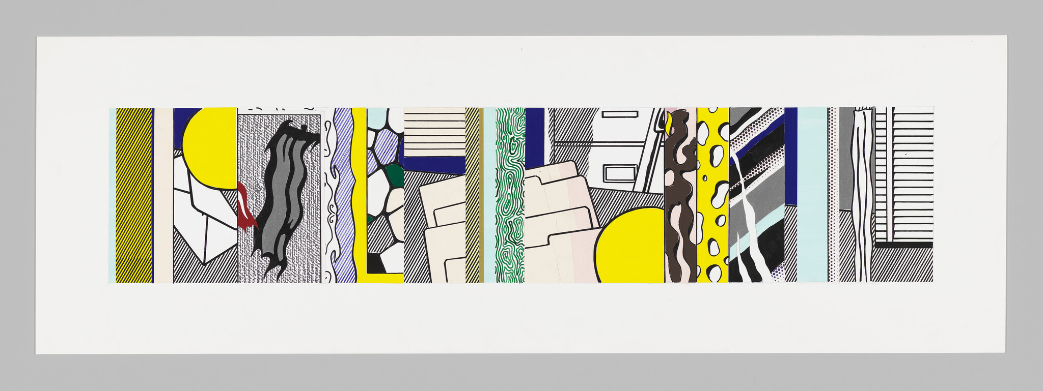
-
Image Duplicator
Audio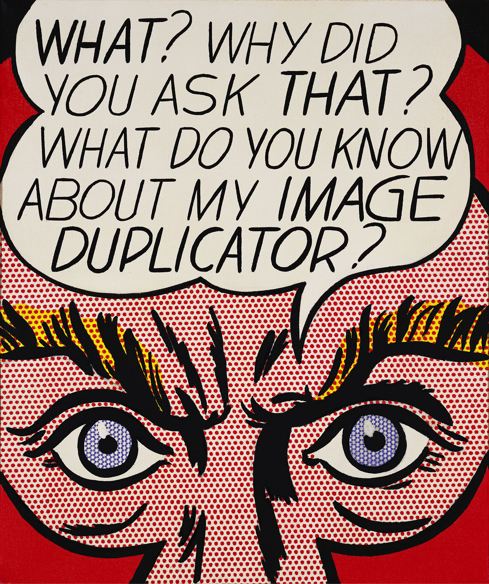
-
Alex Da Corte, Drawing by Seeing
Transcription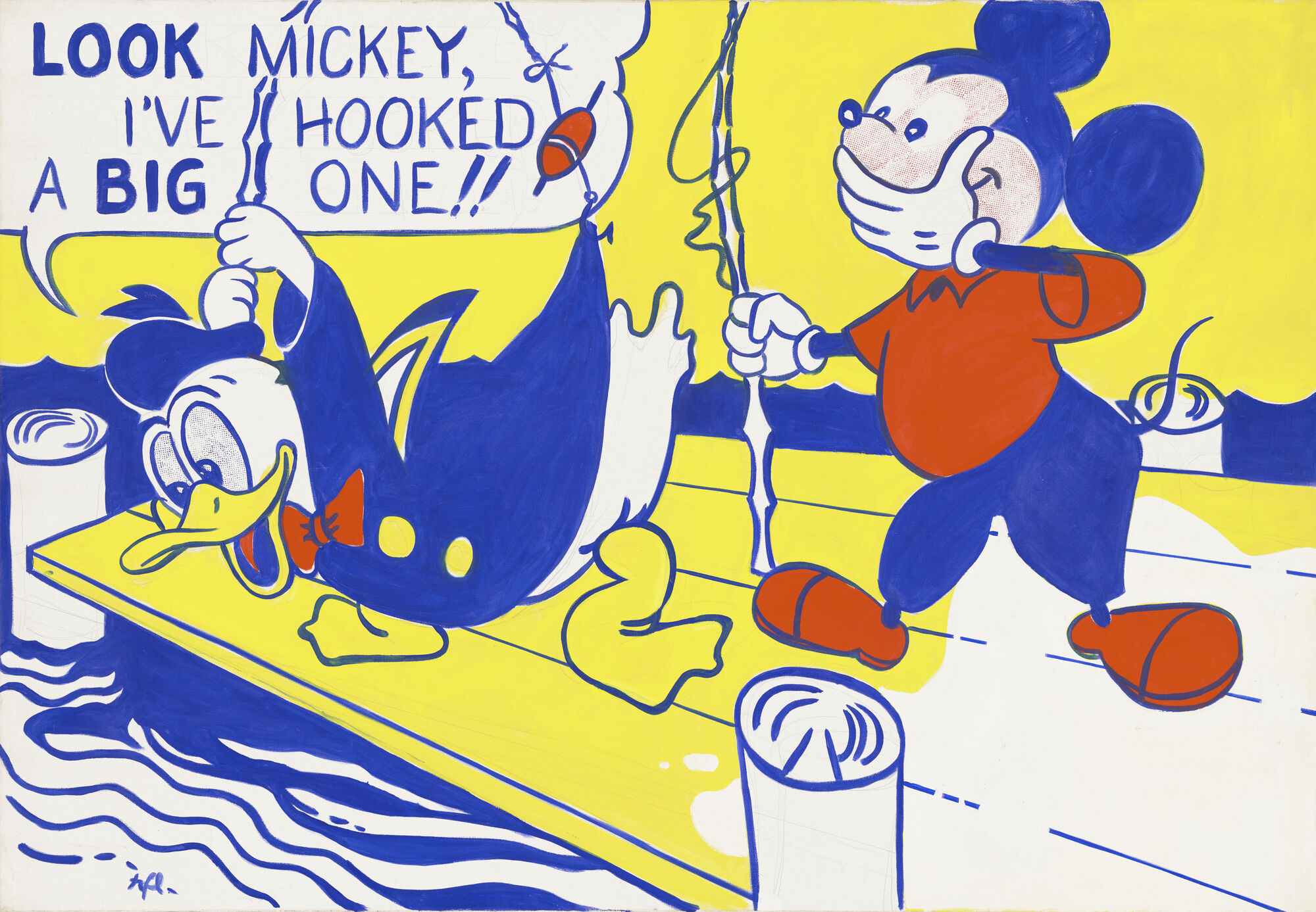
-
Tire
Audio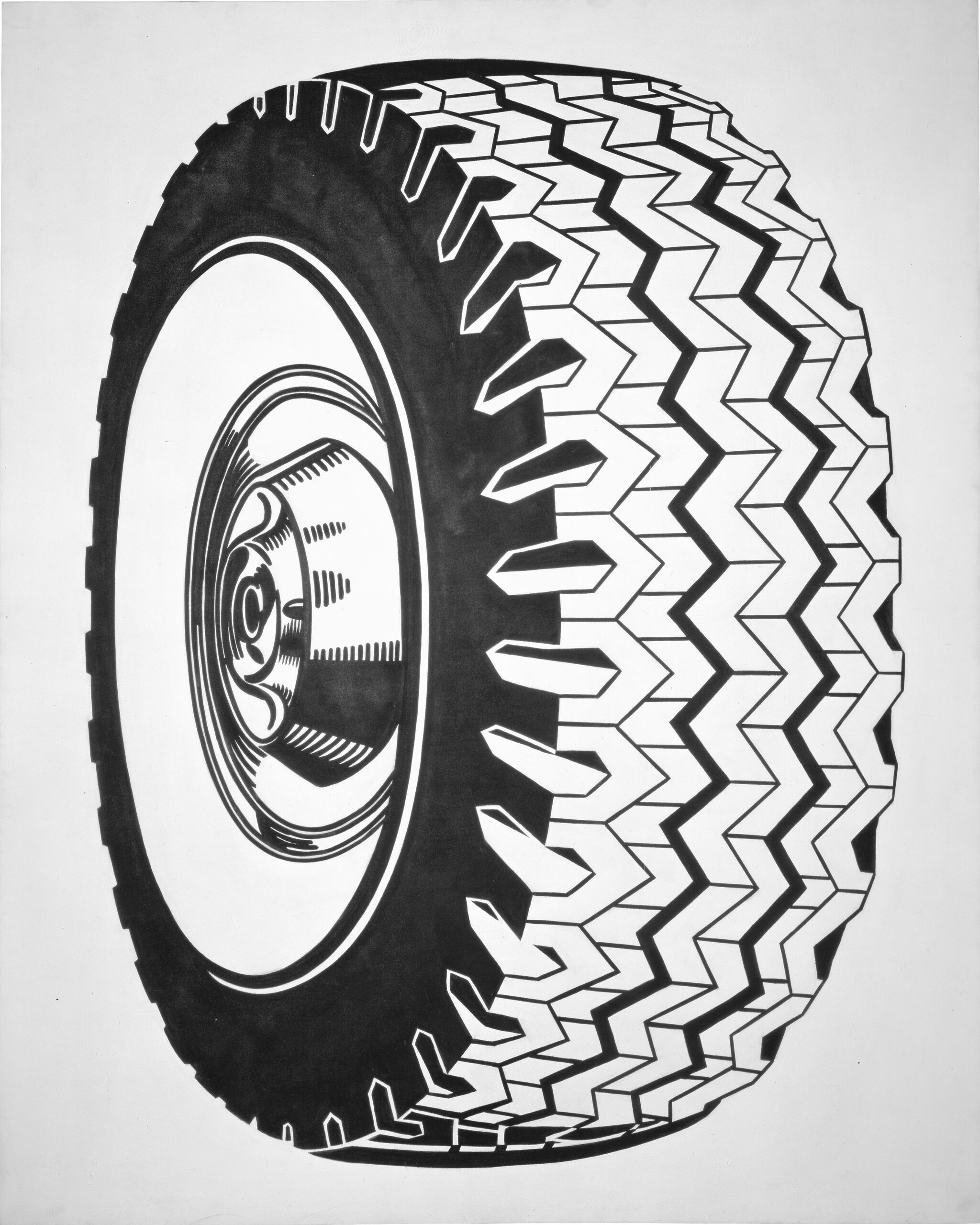
-
Portrait of Madame Cézanne
Audio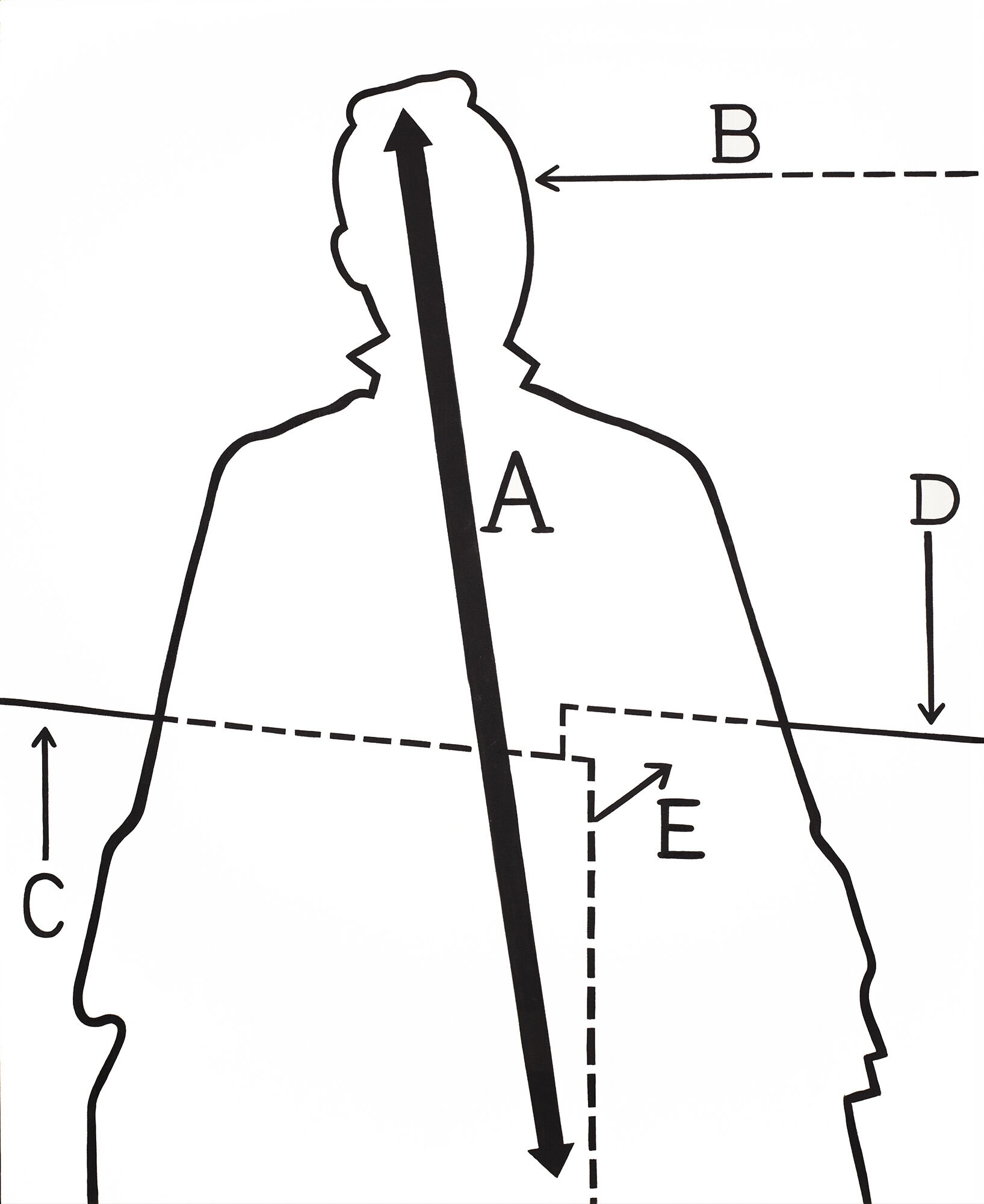
-
Compositions I
Audio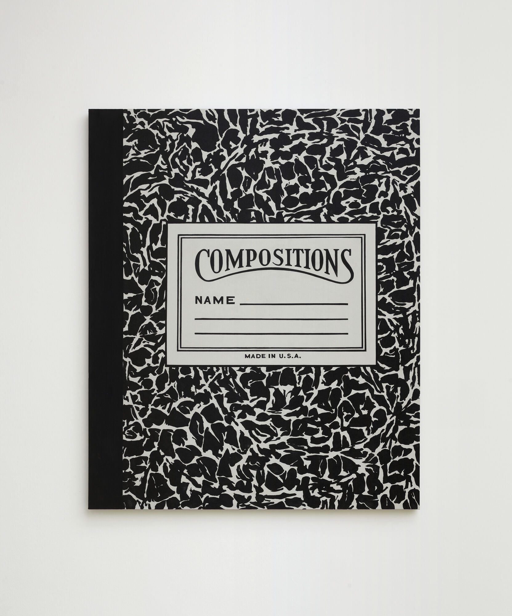
-
Girl with Ball
Audio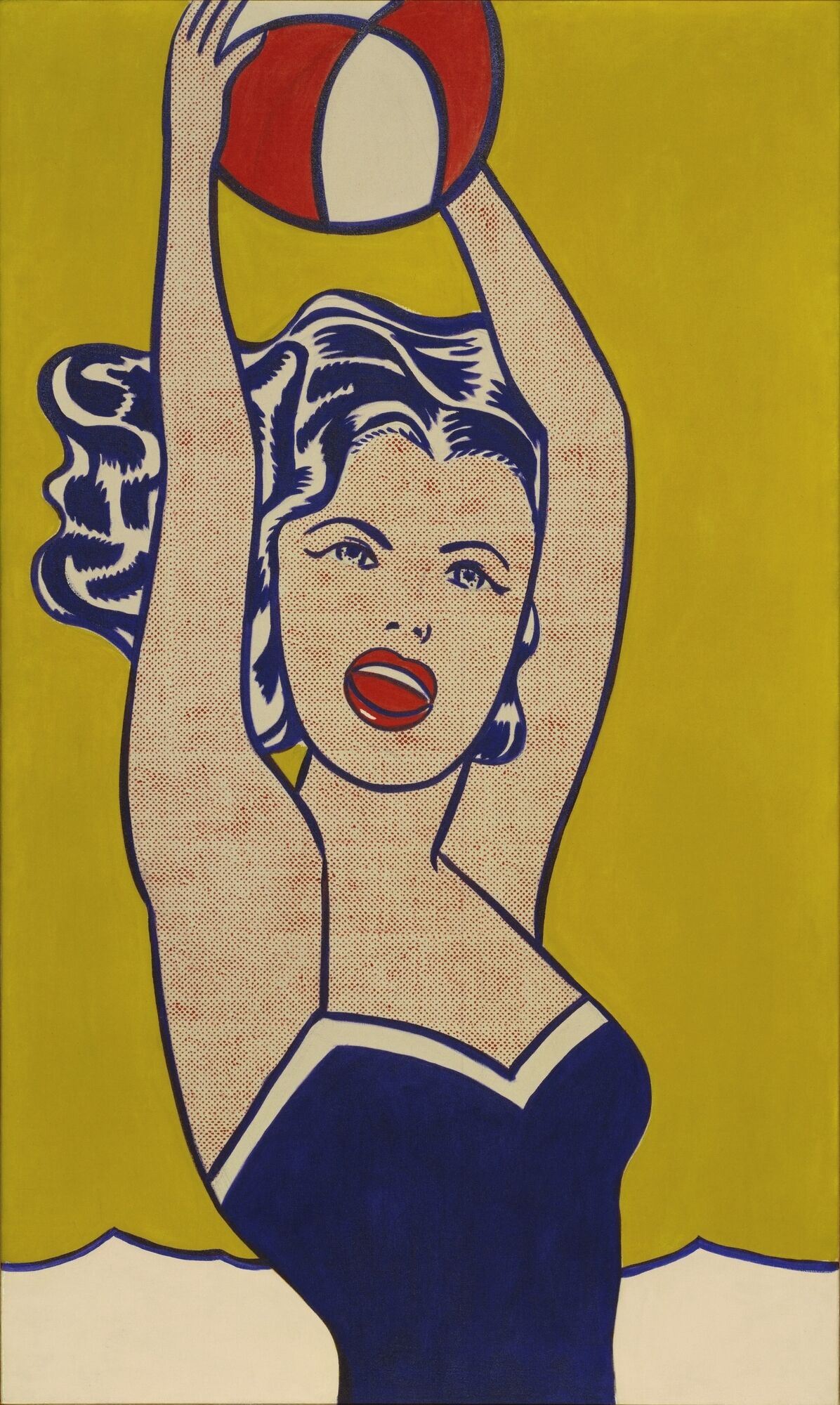
-
Laughing Cat
Audio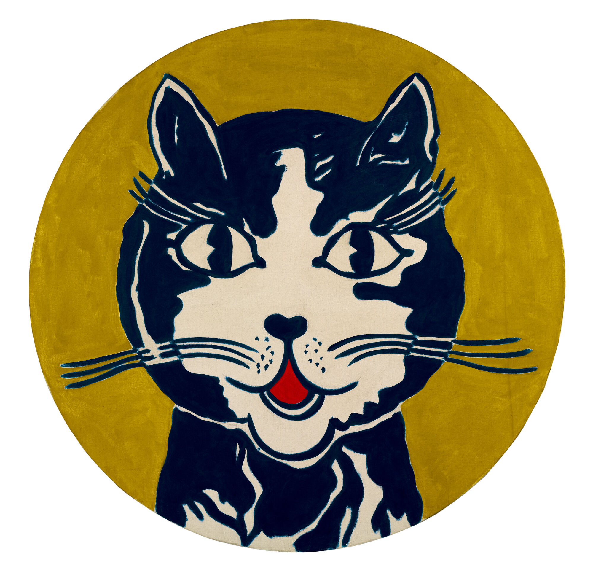
-
Untitled
Audio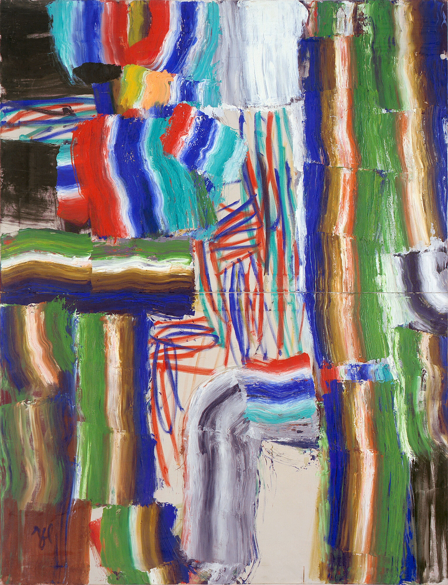
-
Masterpiece
Audio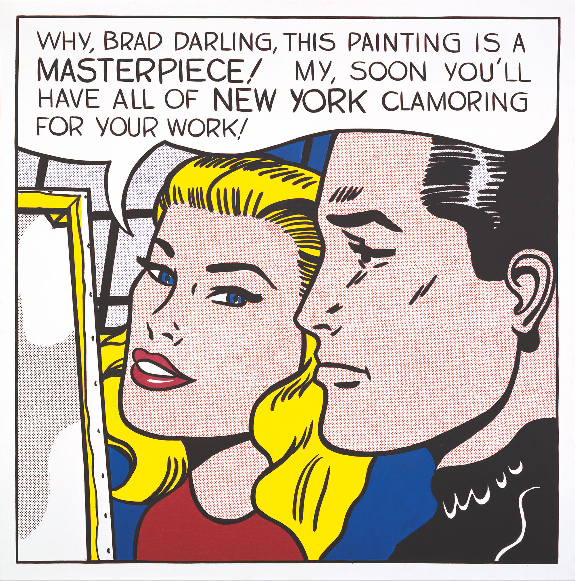
-
Girl in Window (Study)
Audio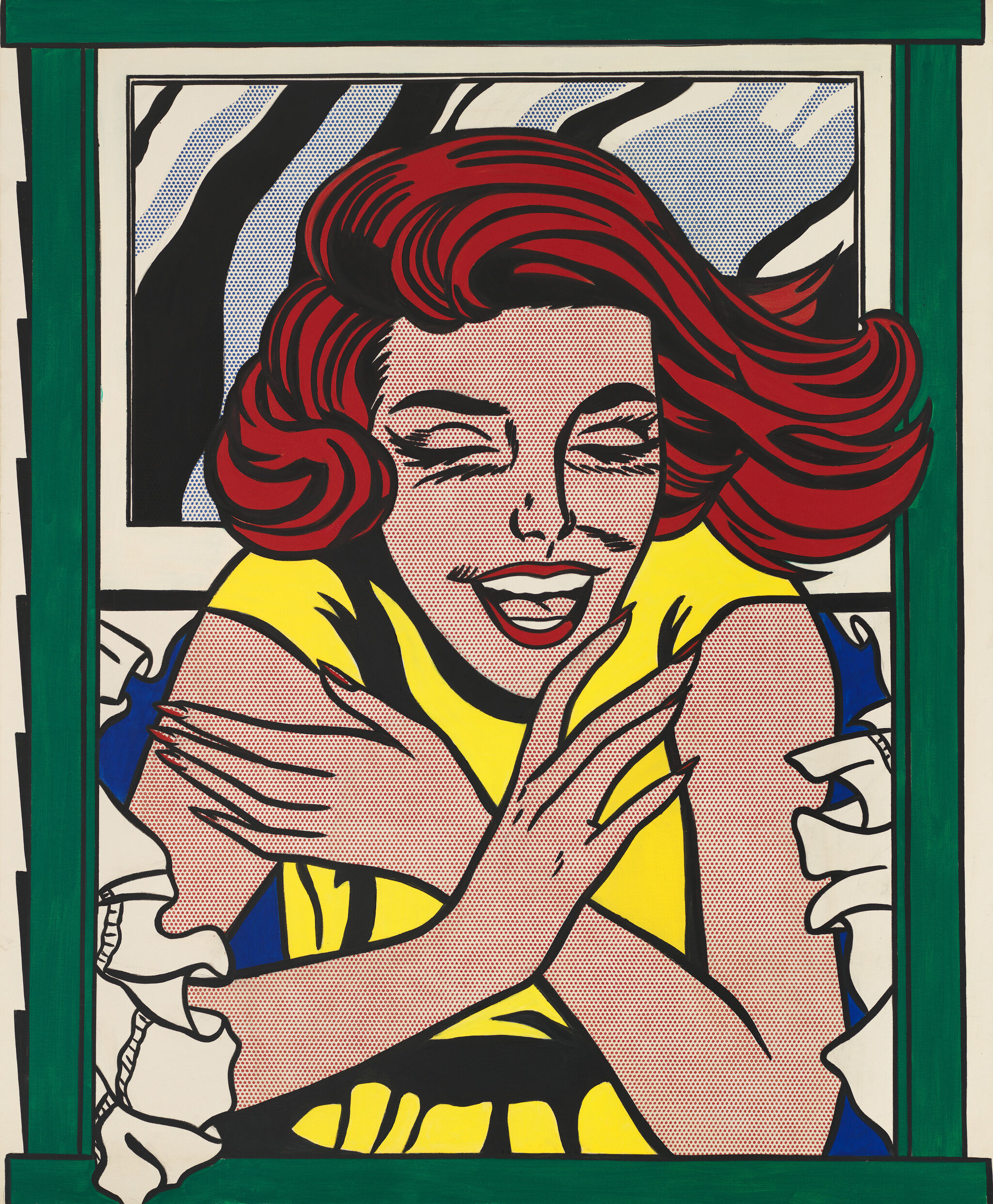
-
Drowning Girl
Audio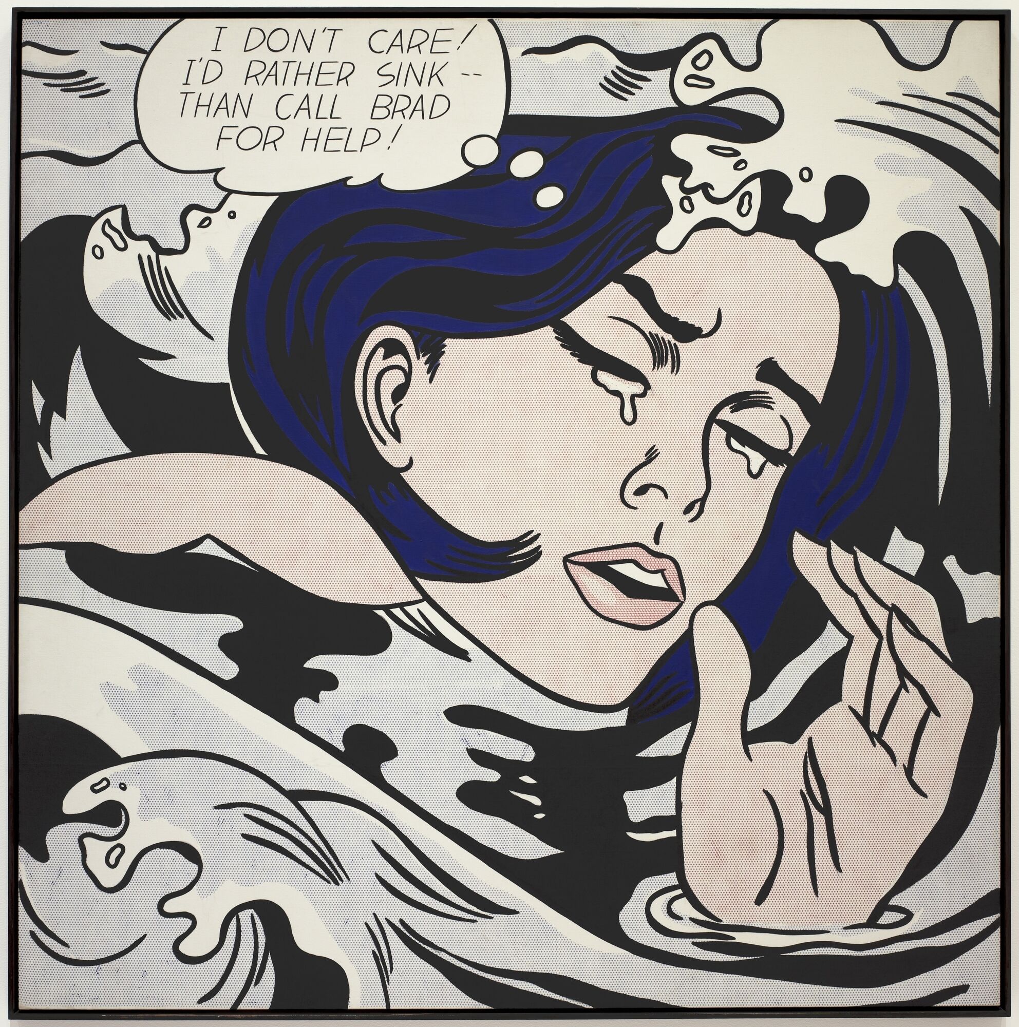
-
Rouen Cathedral, Set III
Audio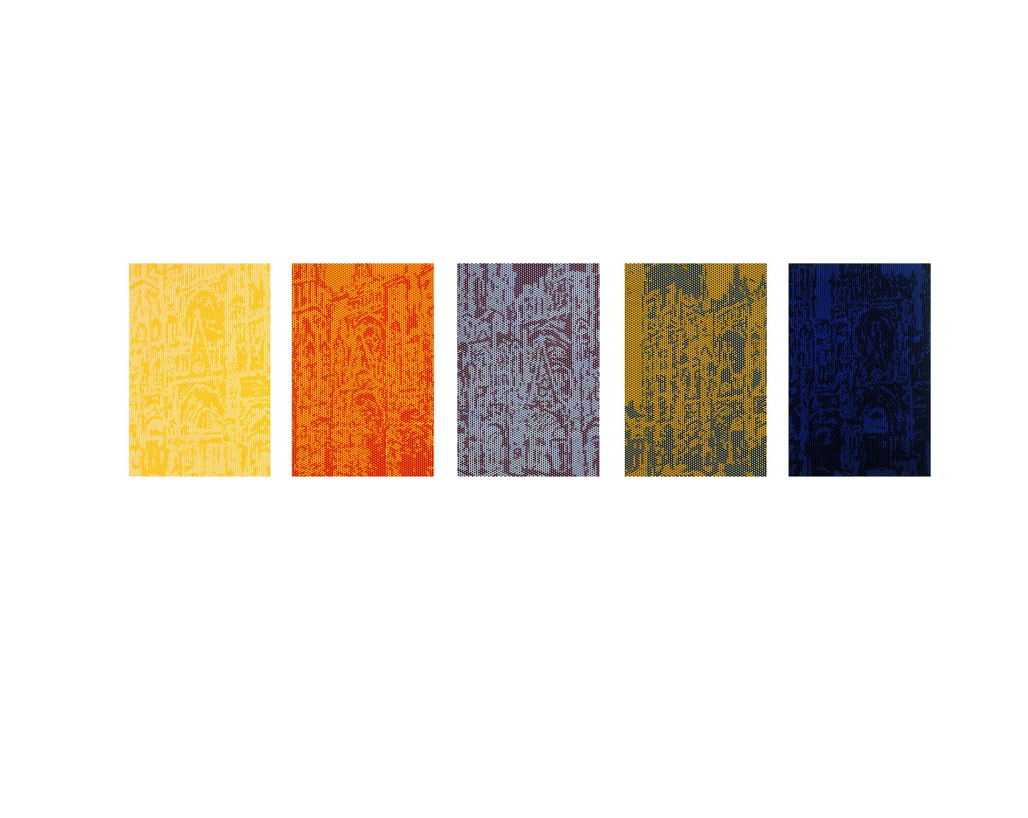
-
Mirror #1
Audio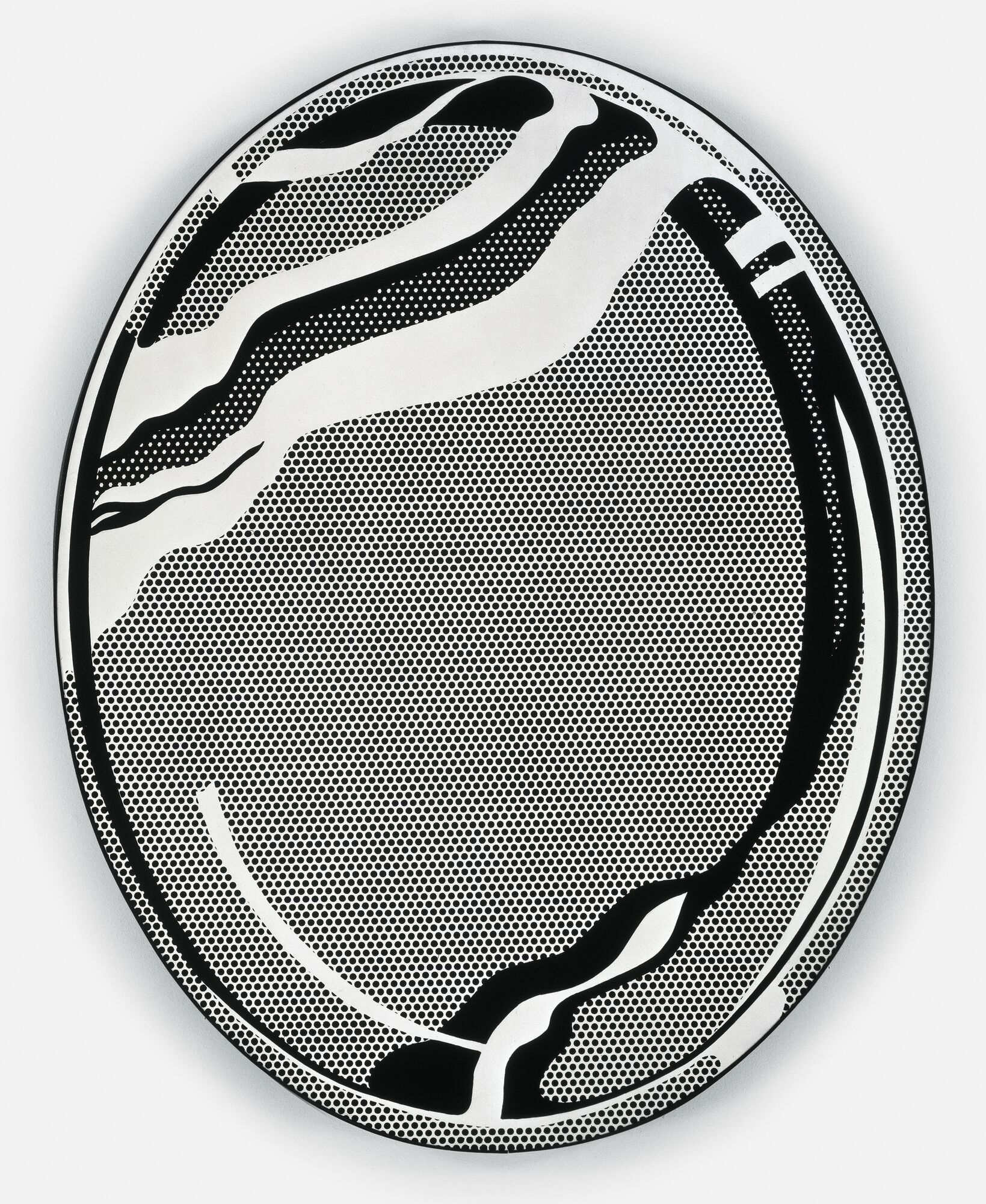
-
Look Mickey
Audio
-
Super Sunset Billboard
Audio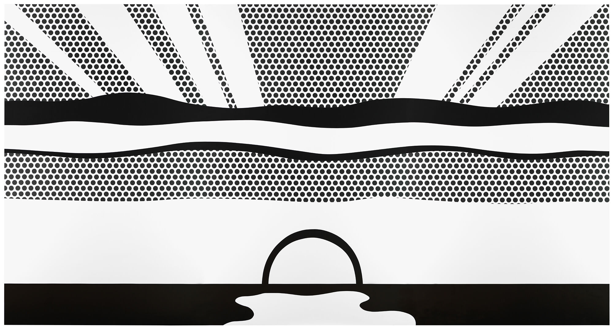
-
Treetops Through the Fog
Audio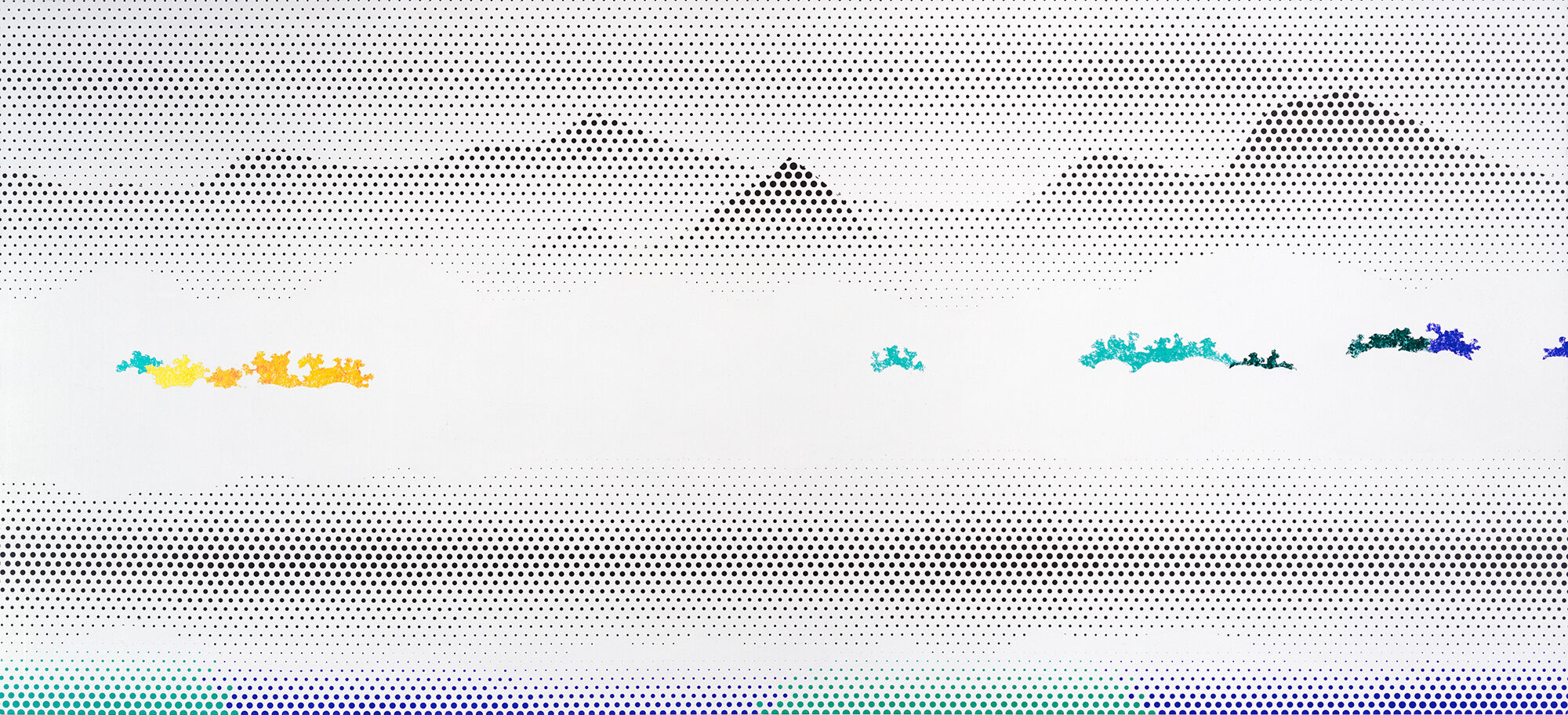
-
Lichtenstein Touch Table
Verbal description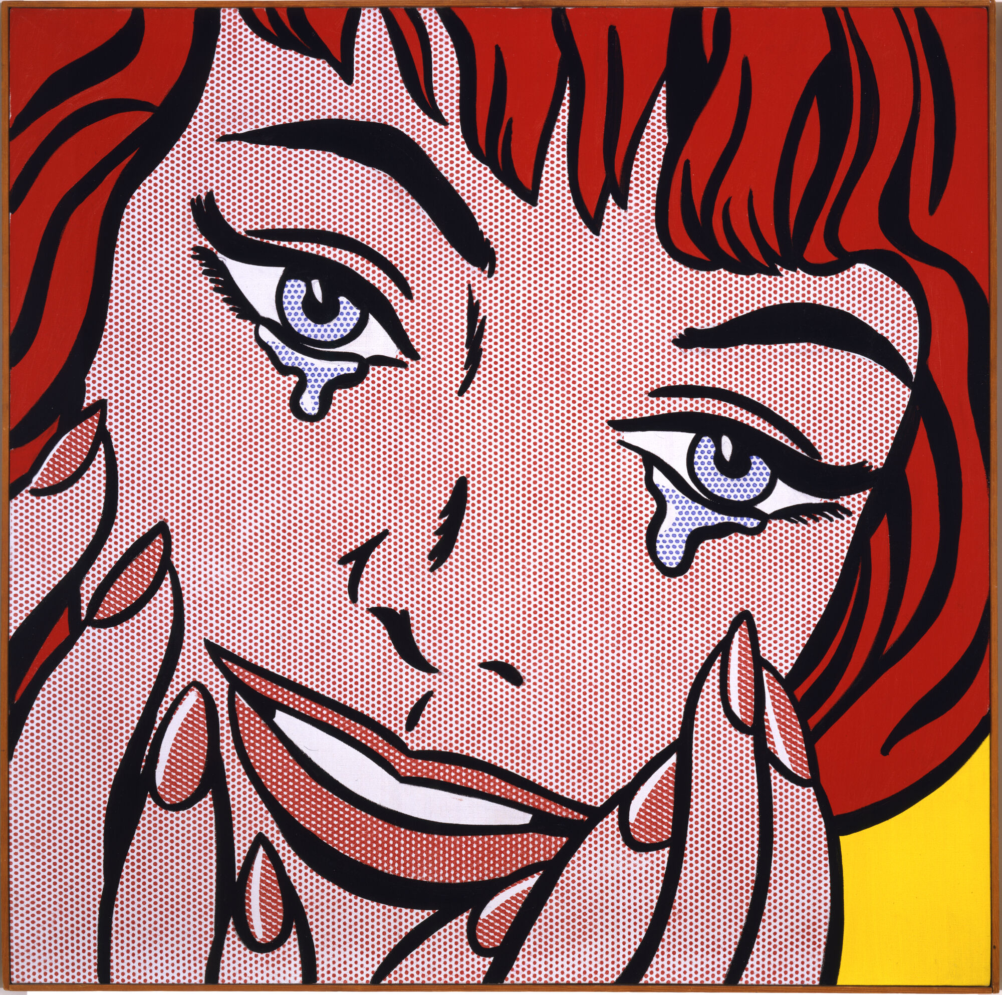
Meg Onli: Welcome to Roy Lichtenstein: Like New. I’m Meg Onli. I’m the Nancy and Fred Poses Curator here at the Whitney Museum, and I’m one of the co-curators on this exhibition. What is greeting you as you get off the elevators is a 96-foot mural re-created by hand. The work is called Greene Street Mural, and it was originally painted by Roy Lichtenstein and his team in 1983 at Leo Castelli’s recently—at the time—opened gallery on Greene Street, which is where the title is coming from.
There’s a story that goes, Leo Castelli brought Roy Lichtenstein into this early Greene Street space as it was being renovated. And he said, “Roy, look at the space. Do something.” And Lichtenstein said, “I don’t know, Leo. The space is huge. I’m not really sure what I would do.” And they walk around the space together. And at some point Lichtenstein says, “I guess I’m going to have to use everything I’ve ever painted to fill this space.” And he says, “Aha, that’s what I'll do.”
Narrator: The result was like a kind of retrospective of Lichtenstein’s work—but not a traditional story with a beginning, a middle, and an end. For Onli and her co-curator, artist Alex Da Corte, that made it a perfect work to put at the beginning of this exhibition.
Meg Onli: I think for many people, we’ve understood Lichtenstein as a style. You understand that he is working with Ben-Day dots, bold outlines; all of those things are represented here. But I think one of the things that is often overlooked is that Lichtenstein himself was really interested in the reuse of his own images, the remixing of his own images, and the circulation of his own images. But we’ve also made our own intervention for the very first time into Greene Street Mural.
Narrator: Those interventions are embedded in glass cases in the mural’s surface. They contain some of Lichtenstein’s drawings, and other works showing his process.
Meg Onli: You have a chance to see this tension between the process in which he was making these small, meticulous drawings that are very much hand drawn, and then you have this mural that is emphatically handmade while also at the same time deceivingly sort of looking like vinyl.
Roy Lichtenstein, Greene Street Mural (Study), 1983. Collage, fiber-tipped pen, graphite pencil, brush and ink on board, sheet (sight): 9 × 42 1/4 in. (22.9 × 107.3 cm). Whitney Museum of American Art, New York; The Roy Lichtenstein Study Collection, gift of the Roy Lichtenstein Foundation 2019.65. © Roy Lichtenstein Foundation, all rights reserved
Alex Da Corte: When looking at Image Duplicator, one wouldn't first think of it as a self-portrait. And yet it has long been considered one of Roy Lichtenstein's self-portraits.
Narrator: Alex Da Corte is an artist based in Philadelphia, and the co-curator of this exhibition. He’s also made new works of his own for the show, exploring throughlines in Lichtenstein’s art and thought that feel productive today–more than sixty years after the creation of paintings like this one.
Alex Da Corte: What you see when you look at this painting is a person in a panic asking about their image duplicator–“my image duplicator.” In an interview with John Coplans, Roy Lichtenstein said, "I want my painting to look as if it's programmed. And what better representation of a programmed painting is a painting about an “image duplicator?” A painting about a machine that makes images on its own without the need for a human hand. And what a prescient thing to say at a time when in post-war America, things were being made in the multiple, en masse, by machines. There was still an artist who was interested in where these images came from, and interested in communing with how they were made, even if it meant painting them by hand, dot by dot–only to say that the hand still matters.
Roy Lichtenstein, Image Duplicator, 1963. Acrylic, graphite pencil on canvas, 24 × 20 in. (61 × 50.8 cm). The Simonyi Collection, Medina. © Estate of Roy Lichtenstein/DACS 2026.
Alex Da Corte, Drawing by Seeing, 2026
Running Time: 00:14:43
Running Time: 00:14:43
Male voice: Sometimes living in eternity means stopping time.
Hoyt Sherman: The promise and purpose of our methods calls for an explanation of the point of view from which they evolved. Every image occupies a certain space on the retina.
Male voice: If we shut our eyes immediately after looking at the sun, we would be surprised to find that the image remains the afterimage. We will discover that such an image, when its impression is no longer observable, may grow or change over time, and so too our relationship to it.
♪ The music transitions into a brighter tone, adding notes that blend together ♪
Male voice: By shutting the eye, it can be revived again and again on the retina, exciting or resting it. We receive visions of persons or things, objects of love or aversion, connecting our senses to our thoughts and memories of what we have seen.
♪ The music shifts to a low stringed instrument, with long strums. Synth sounds build ♪
Male voice: What was once powerful may weaken, and what was once small may become greater in one’s mind’s eye.
Hoyt Sherman: It is evident then that clear-sightedness, which is essential to the artist, not only relies on the act of actively, or as I like to say, aggressively seeing, but simultaneously the act of remembering how one sees.
Male voice: Your eyes must be trained to see with perceptual unity. You must accept that seeing is an artificial form of understanding the world in three dimensions. You must develop a sense for positional relationships and learn to experience other qualities of space and form in terms of such positions. You must develop an ability to see familiar objects in terms of their visual qualities, and you must develop this ability to the degree that prior associations with such objects will have only a secondary or submerged role during the act of seeing.
♪ The music transitions into a brighter tone, adding notes that blend together with higher-pitched notes ♪
Male voice: As seeing moves into drawing during the seeing and drawing act, you must have a clear opportunity to convert visual relations and reactions into kinesthetic and tactile relations and reactions. The whole body must be free to participate in such kinesthetics. Drawing by seeing relies on so much more than one unique and purposeful organism, but rather considers all perceptual mechanisms.
The present purpose or action of looking in such a manner shapes the character of the transaction, wherein factors like the past, its biological continuum, the temporal future, and our present point of view actively responds to surrounding stimuli, controlled or otherwise.
♪ The music changes to a rhythmic, repetitive melody ♪
Male voice: It is a psychological fact that if a person looks attentively at an object without moving their eyes, they will see it as a perceptual unit. If one is exposed to an object for such a short time that their eyes cannot move, they are automatically required to see it with perceptual unity. The time span for such a flash is one-tenth of a second or even less. The darkness required by such flash lab procedures offers many advantages. The eyes, when adapted to darkness, are many times more sensitive and are in greater readiness for new experiences. In the flash lab, one cannot see what they are drawing and are forced to use their hands as a chief means of control, thereby arriving at a greater faith in their muscular movements. All apparent subject matter disappears, for the darkness does not cover what is not there.
♪ The melody softens, with stringed instruments and alternating piano notes ♪
Male voice: The lights are turned off and the students sit in darkness for about ten minutes while their eyes become adapted to the darkness. The following demonstrations should tend to satisfy the general public. Even scientists who are so often loathed to consider matters other than those which can be demonstrated by what they term the material world
♪ The rhythm changes into a steady drum-like cadence with techno elements ♪
Male voice: and who require that such demonstrations be repeatable by others other than the original demonstrator. You will find the dislocation of letters may so redefine their meanings and so to the movement of images and our relationship to them, much like the mercurial cat. And what is a cat anyway, if not for its meow and the magic of being in simultaneous possession of its name and shape? For added optical darkening, black cardboard shields may be worn to heighten the seeing and drawing act.
♪ The rhythm changes into a thumping drumbeat with techno elements ♪
Male voice: A warning is given shortly before each slide is flashed. Twenty slides are exposed and drawn during a period. About four hundred slides are necessary for the complete project. The shapes are drawn in an increasing complexity and position, size, configuration, and value.
♪ The rhythm adds tapping feet to the beat ♪
Male voice: The dominant activity during this period is the tapping of feet. At about the twelfth drawing period, an old master color reproduction is placed before the students.
♪ The melody changes to quiet piano notes with string notes ♪
Male voice: They’re instructed to continue the pattern of reaction used for the slide drawings. As a further step, the students are asked to draw from images projected on the floor and on the ceiling. When they are able to solve these problems well, the students are ready to truly see with purpose. The visual demonstration center aims to drive your purpose, deploying varying stimuli to any object situation to allow your reality of the object under view to be integrated into one’s past experience while simultaneously reordering that current reality to establish new ground, self-perpetuating in nature.
Male voice: However, there may be cases when a degree of disjunctiveness arises and a failure to find purpose presents itself. For when we try to penetrate the factual truth of nature, like in a mirror, we meet ourselves in all our distortions.
♪ The music shifts into a synth tone in a major key ♪
Hoyt Sherman: Plastic art discloses what science has discovered, that time and subjective vision veil the true reality. Such plasticity at an elementary level reveals itself when the stimulus pattern, say a series of dots as seen in a comic strip, cause thousands of readers to identify these circles as a particular character at times to identify themselves as the character.
Male voice: Distortions are inevitable and essential, here allowing dots to become more than holes, but instead gather mass teleporting one from perceived biological givens to fantastical temporal realities. A primary requirement for sustained attention is change. Attention cannot be fixed at one end and with the same focus for more than a few seconds at a time. It is a highly mobile and restless mechanism. Ours may be devoted to a single problem, but during this time, the mind is roving constantly from thought to thought, examining each facet and detail of the issue, viewing the whole from every angle. It is when this flux ceases that attention begins to wander. It is when we become hopelessly stuck and no new alternatives and possibilities suggest themselves that distraction becomes potent and we get off track. While the investigator of nature may find that the appearances one sees may contradict a received theory, the philosopher can calmly continue to operate in their abstract apartment on a false result.
♪ The music shifts into a lively tempo with a pulsing background beat ♪
Male voice: It is against nature to perceive of a spider the size of a building or a grasshopper the size of a dragon, and yet this phenomenon, so induced by the coincidence of edges on seemingly coinciding planes, demonstrates that the appearance of any given element is dependent upon its structural context. Therefore, a total field in drawing, whether plastic or concrete, balances between the leaf of grass and the work of the stars.
♪ The music transitions to an upbeat orchestral arrangement ♪
Male voice: It is only then as an active, purposeful participant that our world becomes bigger than the content of our actual lived experience. Our sensations are only prognosis of the significance to us of otherness, not disclosures as are commonly believed. The reliability of their prognosis is disclosed only by our action. Our actions are determined by our purposes. Let the sun’s image pass through us and our shadows fall on the page. If we look at a dazzling altogether colorless object, it makes a strong, lasting impression and its afterimage is accompanied by the appearance of color. Let a room be made as dark as possible. Let there be a circular opening in the window shutter, which may be closed or not at pleasure. With the sun being sent to shine through this on a white surface, let the spectator from some little distance fix their eyes on the bright circle thus admitted, the hole being then closed.
♪ The music changes to a slow high pitch melody ♪
Male voice: Let them look towards the darkest part of the room.
A circular image will appear bright, colorless, and somewhat yellow, but slowly the border will begin to appear red. After a time, this red increasing towards the center covers the whole circle and at last, the bright central point. No sooner, however, is the whole circle red than the edges begin to be blue and the blue gradually encroaches inward on the red. When the hole is blue, the edge becomes dark and colorless. The dark edge slowly encroaches on the blue till the whole circle becomes colorless. The image becomes gradually fainter and again diminishes in size. Here then, in blindness that touches perfection, a hand is like anything else.
Roy Lichtenstein, Look Mickey, 1961. Oil, graphite pencil on canvas, 48 1/8 × 69 3/16 in. (122.2 × 175.7 cm); Frame: 48 5/8 × 69 5/8 × 2 in. (123.5 × 176.9 × 5.1 cm). National Gallery of Art, Washington, D.C. Gift of Roy and Dorothy Lichtenstein in Honor of the 50th Anniversary of the National Gallery of Art. © Board of Trustees, National Gallery of Art
Alex Da Corte: Tire for me is a curious painting because it is immobile.
Narrator: Artist and curator Alex Da Corte.
Alex Da Corte: And tires move, and tires make marks. And this is a painting of a tire or a proposition for an object that would make marks or could make marks. And indeed, when you look at the painting, it is in a void on a white ground, and there are treads that are clear and still.
Narrator: Lichtenstein’s approach to art was profoundly shaped by his time at Ohio State University.
Alex Da Corte: Ohio is the rubber capital of the world. And Akron, Ohio, is a great producer of tires, specifically tires made and painted by an artist named June Adair Black, who was a tire sculptress and made the tire treads for a lot of the tire makers of the time, Goodyear and Firestone. When I look at Tire, I think it's a consideration of these kinds of makers, the kind of invisible marks one leaves from moving through the world, be it in a car or by foot. We leave histories, we leave traces of ourselves. And I believe that for Roy, that was of great interest to him where he situated himself between the handmade and the machine-made.
Roy Lichtenstein, Tire, 1962. Oil, graphite pencil on canvas, 68 × 56 in. (172.7 × 142.2 cm). The Museum of Modern Art, New York. © Estate of Roy Lichtenstein/DACS 2026 © The Museum of Modern Art/Licensed by SCALA / Art Resource, NY
Avis Berman: For such a deceptively simple-looking work, the Portrait of Madame Cézanne is densely layered and its roots are connected to Lichtenstein’s own past as an artist.
Narrator: Avis Berman, Lichtenstein’s biographer.
Avis Berman: To define the appearance of the picture, it's a black-and-white rendering of a line drawing by the artist and teacher Erle Loran who wrote a much reprinted book titled Cézanne's Composition. The diagram is an outline of one of the twenty-seven portraits that [Paul] Cézanne painted of his wife, Hortense. So this painting is not from Cézanne at all. It’s from an illustration by Loran for his book. And Lichtenstein—and this was his word—described it as “silly” because the diagram seemed to be in complete opposition to the feeling that Cézanne wanted to convey and communicate. There was no color. There was no texture. There was no shading. Now, Lichtenstein also quoted Cézanne saying, “The outline escapes me.” And here Lichtenstein said, “Here was the diagram of a Cézanne with very hard and heavy outlines.” So he wanted to satirize it.
The artists Lichtenstein most revered were Cézanne, [Pablo] Picasso, and [Piet] Mondrian. And Cézanne had a special place in his pantheon because he was the supreme painter and favorite of Hoyt Sherman, Roy’s professor and mentor at Ohio State University.
Narrator: It’s typical of Lichtenstein that he would express reverence through satire. Loran, for his part, tried to sue Lichtenstein. A court found that he had no standing to do so because his publisher was the copyright holder.
Avis Berman’s biography is titled Becoming Roy Lichtenstein: The Path to Pop.
Roy Lichtenstein, Portrait of Madame Cezanne, 1962. Acrylic, graphite, and pencil on canvas, 67 3/4 × 55 3/4in. (172.1 × 141.6 cm). Collection of Jason Blum. © Estate of Roy Lichtenstein/DACS 2026.
Alex Da Corte: When I look at Compositions, I think about the secret life of a painter, the secret life of an artist or a poet.
Narrator: Artist and curator Alex Da Corte.
Alex Da Corte: I see an abstract landscape, but I also see a black-and-white version of a [Jackson] Pollock painting. And Pollock famously said, “When I’m painting, I’m not aware of what I’m doing.” And yet here, if I consider Compositions as a bird’s-eye view of a Pollock painting, right in the center is where the artist goes under compositions where it says “name.” This is a very generous painting, as is so many of Lichtenstein’s paintings, where you have the space to project yourself into the painting. It is in some ways a “how-to.” How to make an Abstract Expressionist painting. How to compose a painting at all. How to be an artist.
Roy Lichtenstein, Compositions I, 1964. Oil, magna and pencil on canvas, 8 1/8 × 56 1/4 in. (173 × 142.8 cm). Museum für Moderne Kunst. © Estate of Roy Lichtenstein/DACS 2026. Photograph by Axel Schneider.
Narrator: Lichtenstein’s source material for Girl with Ball was an ad for a resort in the Pocono Mountains, in Pennsylvania, that ran in the New York Times.
Avis Berman: This is a real departure because it’s a black-and-white photograph, and he turned it into a very assertively painted comic strip heroine. I mean, the original advertisement does not look comic at all. So he was making things comic-strip-oriented when they weren’t.
Narrator: Lichtenstein’s biographer, Avis Berman.
Avis Berman: Lichtenstein was playing with abstraction here. No hair looks like that. It really is a mini abstraction. And the other really interesting thing going on here is a key tenet of Lichtenstein’s art: he was always exploring the process of perception, which is what you see versus what you think you see. Now the nose here is made up of two dots and a line. Now, a nose doesn’t look like that, but we've all been trained to recognize the signs for the nose, the cliché for the nose. So you think you see a nose, but you really don’t. And the mouth is even more amazing because that is certainly not anatomically accurate. And it’s really a red. In the middle of the page, it’s kind of a red clone of the beach ball to strangely balance the picture. So through this painting, he looks at perception and the mass media communication of beauty.
Roy Lichtenstein, Girl with Ball, 1961. Oil on canvas, 60 1/4 × 36 1/4 in. (153 × 91.9 cm). The Museum of Modern Art, New York. Gift of Philip Johnson. © Estate of Roy Lichtenstein/DACS 2026 © The Museum of Modern Art/Licensed by SCALA / Art Resource, NY
Narrator: Curator Meg Onli talks about Lichtenstein’s Laughing Cat.
Meg Onli: This is a painting that is a little unlike other of Lichtenstein’s paintings. The rumor is that it came from either kitty litter or that it was coming from cat food. I like to think kitty litter. It feels right to me. This was originally painted in 1961. So this is very early in his Pop career but not early in his painting career. And you have more of a wash in the background. It’s almost like this golden brownish wash as well as this very inky rendition of a cat that is kind of navy-ish black.
I think of it actually as an early cat meme [laughs]. And a fun fact is that it was actually owned by Andy Warhol.
Narrator: When Lichtenstein made this painting, he’d been teaching and making art for about fifteen years, first in Oswego, New York, and then in New Jersey. He’d tried to make his way into the New York art world making paintings in an Abstract Expressionist style. But in 1961, the year he made Laughing Cat, he suddenly landed on his comic-inspired Pop style. Take a look around this room—you’ll see other works he made at this moment. They were all in his first, life-changing exhibition at the Leo Castelli Gallery. Later on, he’d work in sustained series. But as you’ll see here, this early Pop work is pretty varied in its subject matter.
Meg Onli: At this time, he’s really looking at the visual culture of the late 1950s, early 1960s. And anything from a hero comic of a person blowing up an airplane to a romantic melodramatic kiss to engagement ring can then be met with something that could be cat litter packaging.
Roy Lichtenstein, Laughing Cat, 1961. Oil, graphite pencil on canvas, 31 7/16 in. (79.8 cm) (diameter). Private collection. © Estate of Roy Lichtenstein/DACS 2026.
Narrator: Lichtenstein’s biographer Avis Berman describes the way that the artist made this untitled abstract painting.
Avis Berman: He squeezed rows of pigment on a glass palette. And after they were there, he would take a clean white rag and wrap it around his forearm. And then he would put his forearm on the palette and swoop across and pick up the columns of paint. And then he would whoosh that column onto the canvas and he would keep doing that until he filled up the surface.
He constructed these paintings with real deliberation. He makes the surfaces even more lively by scribbling with what looks like a crayon but is paint. I don’t know if he used a brush or not for this, but it looks like he probably put the rag on his fingers and went across with his fingers and did something like finger painting to get the scribbles. The painting is supposed to feel improvisational, but it’s not.
Roy Lichtenstein, Untitled, c. 1960. Oil on canvas, Overall: 91 3/8 × 69 9/16 in. (232.1 × 176.7 cm), Both panels: 45 11/16 × 69 9/16 in. (116 × 176.7 cm) (approx.). Judd Foundation. © Estate of Roy Lichtenstein/DACS 2026.
Meg Onli: Masterpiece is sort of his credo, his artist manifesto in certain ways.
Narrator: Curator Meg Onli.
Meg Onli: It’s a painting that depicts two people originally drawn by Ted Galindo for a Marvel comic in which a woman says, “Why, Brad, darling, this painting is a masterpiece! My, soon you’ll have all of New York clamoring for your work.” So there’s a real sense of humor in tongue-in-cheek that’s already happening with Lichtenstein here. He had been working for years sort of in anonymity in Ohio, in Oswego, in New Jersey. And so for him, he’s positioning himself. And one of the things I think is really strong and maybe undervalued about his practice is that it’s not simply his prowess as an “image duplicator,” and I’m using air quotes here, as replicating this machinelike imagery. It’s also his way of re-contextualizing images.
I think for someone like Lichtenstein, we can see him as this precursor to our very moment. So if you think about online visual culture, oftentimes images that we’re seeing are not in their original context. They’re not authored, necessarily. Let’s say something like a meme or a GIF. But what really happens with Lichtenstein’s work is he’s not only interested in the recontextualization of images; he’s also interested in what it means to use the imagery that looks mass-produced but to then create, in this incredibly fastidious and tedious way, through his own hand.
Roy Lichtenstein, Masterpiece, 1962, 1975. Acrylic and silkscreen on canvas, 7 1/2 × 7 1/4in. (19 × 18.4 cm). Collection of Beth DeWoody. © Estate of Roy Lichtenstein/DACS 2026.
Narrator: This painting is a study for the towering mural on the M and O Terrace, which you’ll find around the corner from the introduction to this exhibition. The original was one of ten paintings on architect Philip Johnson’s World’s Fair Pavilion.
Mitchell Lichtenstein: That was in 1964.
I do remember very well his painting this mural on the front of our garage in New Jersey when I was a child. And it took up more than the face of the garage.
Narrator: Mitchell Lichtenstein, one of the artist’s two sons.
Mitchell Lichtenstein: And I do wonder what the neighbors in this suburban New Jersey thought of this giant comic strip being painted in view of all the neighboring houses.
Given the kind of 1960s American conventional role of women at that time, you might think of her as a kind of a Rapunzel who is not necessarily seeking a suitor to escape from the prison, but just an escape from this prison of her time. And I do think my father was aware of the conventions at the time. I think that a lot of his work from this period is drawing attention to those conventions, whether it’s about masculinity or femininity or the place of the war paintings, the aggressive macho figures in those versus the very conventional femininity of, say, this woman.
Roy Lichtenstein, Girl in Window (Study for World’s Fair Mural), 1963. Oil and acrylic on canvas, 68 1/8 × 56 in. (173 × 142.2 cm). Whitney Museum of American Art, New York; gift of The American Contemporary Art Foundation, Inc., Leonard A. Lauder, President 2002.254. © Estate of Roy Lichtenstein
Narrator: Look closely at the surface of this painting, Drowning Girl. You’ll notice that the fields of dots that Lichtenstein has used to fill in the colored areas are very regular. Lichtenstein did lay them down by hand. But compared to works he’s made just a year or two earlier, this one looks crisp and mechanical. He’d developed his approach to the content as well.
Avis Berman: Lichtenstein had become expert in heightening the atmospheric tension and conveying a sense of an action interrupted, but an action nonetheless, and one involving an extreme situation.
Narrator: Lichtenstein’s source for the image was Secret Hearts, a romance comic book illustrated by Tony Abruzzo and published by DC Comics in 1962. Avis Berman.
Avis Berman: You can also see that Lichtenstein heightened the emotional impact if you compare it with the original source cartoon, which was a lot less fraught because the audience could see that a happy ending was imminent. Because help in the form of a male savior is on the way. Lichtenstein crops anything that gives us those kinds of clues to the story, and he isolates the drowning girl herself. You don’t know what’s going on narratively because he’s eliminated anything from the scene that suggests an episode, and he’s edited the dialogue too. He destroys the anecdote. He sweeps away any detail that registers as clutter, and he deprives us of a resolution.
Roy Lichtenstein, Drowning Girl, 1963. Oil and acrylic on canvas, 67 5/8 × 66 3/4 in. (171.6 × 169.5 cm). The Museum of Modern Art, New York. Philip Johnson Fund (by exchange) and gift of Mr. and Mrs. Bagley Wright. © Estate of Roy Lichtenstein/DACS 2026. Digital Image © The Museum of Modern Art/Licensed by SCALA / Art Resource, NY.
Narrator: In these five paintings, Lichtenstein responded to a series that Impressionist Claude Monet made in 1895. Monet painted Rouen Cathedral in Normandy, France, many times to explore how changing light and atmosphere affect our perception. Lichtenstein chose one of those images and re-created it five times over, using just two colors per canvas.
Alex Da Corte: The order of the color in this particular suite is meant to be from sunrise to sunset. And so yellow signals the break of day, and oranges, purples, and greens a transition from midmorning to high noon to the afternoon, and rounding out the evening with dark blues and blacks, where what you see and what you don’t see ride a fine line.
It’s a common misconception that Roy Lichtenstein used Ben-Day dots. Ben-Day dots, which are a very common machine-made printing process invented by Benjamin Day.
Narrator: In that process, dots of different opacities are overlapped or spread apart to create various hues. Lichtenstein used dots like a cartoonist: by taking out or adding dots to solid fields of color. Even so, many people still describe his marks as Ben-Day dots.
Alex Da Corte: And so what we see here in the cathedral suite is two colors, side by side, and one a field of dots, and one a field without dots. And for the viewer to understand that this is an image of anything at all, one must look both close and far away to see the positive and negative at play.
Roy Lichtenstein, Rouen Cathedral, Set III, 1968-69. Acrylic, oil, graphite pencil on canvas (five panels), Left panel: 62 7/8 × 42 in. (159.7 × 106.7 cm); Left middle panel: 63 × 42 in. (160 × 106.7 cm); Middle panel: 62 15/16 × 42 in. (159.9 × 106.7 cm); Right middle panel: 62 15/16 × 42 in. (159.9 × 106.7 cm); Right panel: 62 15/16 × 42 in. (159.9 × 106.7 cm). The Eli and Edythe L. Broad Collection (The Broad). © Estate of Roy Lichtenstein/DACS 2026.
Narrator: Find the largest black-and-white painting to the right. Lichtenstein called it Mirror #1. He began his series of mirror paintings in 1969, after he saw a brochure from a mirror fabrication company. Curator Meg Onli.
Meg Onli: He was really intrigued by this idea that these airbrush mirrors signified reflection, but never actually reflected anything. And so he began doing photographs in his own studio, and he tried out making mirror paintings. And sometimes when you’re standing in front of these mirror works, your eyes are really trying to focus and figure out exactly what is happening on the surface. They’re purely abstract.
In Mirror #1, actually the largest work that he ever makes in this series, is majority just black and white. It’s gradated with his dots; you can see some black outlines that are a little more traditional to Lichtenstein. But you also get this sense of kind of a wave of light coming by. You also never see a reflection. And so for today, I think to myself, I’m often thinking about these works in relationship to the screen and thinking about ideas of alienation, surveillance. It’s a very contemporary reading on these works, but the fact that you’re never being directly reflected by them, but they also have this kind of domineering presence at the same time. And in the gallery that we’re standing in, it’s painted completely silver and you’re surrounded by these. So it feels almost like an aperture or camera focusing on you.
Roy Lichtenstein, Mirror #1, 1969. Acrylic, oil, graphite pencil on canvas, 61 1/4 × 48 1/4 in. (155.6 × 122.6 cm). The Eli and Edythe L. Broad Collection (The Broad). © Estate of Roy Lichtenstein/DACS 2026.
Narrator: Look Mickey is the first painting Lichtenstein made using imagery drawn from cartoons. Artist and curator Alex Da Corte.
Alex Da Corte: What I think is interesting about positioning a painting from 1961 near the end of the show is actually looking back to an animation technique that has been deployed in this painting that has not really been discussed so much in all of the literature around this painting, which is that of anticipation. You don’t see the active action of fishing per se, or the active act of giggling per se, but you see steps before these actions occur. Here, Roy has baked in anticipation to what would then become a new path for his whole making stylistically and conceptually.
Alex Da Corte: So what then is interesting about Look Mickey is that it is made in 1961. It is shared with his peers. It is shared with his gallery dealer, Leo Castelli, but it is never officially shown until much later at the National Gallery [of Art] in a group show in the early eighties.
Narrator: And yet, Lichtenstein did in some ways anticipate the painting’s public display. Turn around, and take a look at the long wall of paintings opposite Look Mickey. One of them on the left comes from 1973, and shows an imaginary version of the artist’s studio, covered in real and imagined works of art. One of the imagined works is a painting of nothing but a text bubble. One of the real ones is Look Mickey.
Alex Da Corte: From my understanding, Roy recognized that this painting mattered to him and the ways in which painting and where source imagery would come from in time would forever be changed, not only by just him, by other artists as well, but this participation in all kinds of media and that high and low would be flattened and that richness and things that are interesting could be born out of anything. So in the artist studio painting, which embodies so many ways of making and so many modes of looking, it seems righteous then that the artist studio is the site where things from the past or things from the future can coexist. Things that are real and things that are experimental or imaginary are all okay and welcome. This is how one makes anything new.
Roy Lichtenstein, Look Mickey, 1961. Oil, graphite pencil on canvas, 48 1/8 × 69 3/16 in. (122.2 × 175.7 cm); Frame: 48 5/8 × 69 5/8 × 2 in. (123.5 × 176.9 × 5.1 cm). National Gallery of Art, Washington, D.C. Gift of Roy and Dorothy Lichtenstein in Honor of the 50th Anniversary of the National Gallery of Art. © Board of Trustees, National Gallery of Art
Alex Da Corte: Super Sunset Billboard here in the galleries is a simplistic, flattened, cartoonlike, pointillist version of what is outside the window.
Narrator: Artist and curator Alex Da Corte.
Alex Da Corte: The sun floating above the skyline, setting over the Hudson River. Aristotle wrote about the persistence of vision and proposed that if we shut our eyes immediately after looking at the sun, we would be surprised to find that the image remains—the afterimage. We will discover that such an image, when its impression is no longer observable, may grow or change over time, and so too our relationship to it. I propose that our relationship to the sun changes every day, as our wrinkles and freckles evidence this, as our perspiration or lack of perspiration is evidence of this. What is blinding one day is beautiful the next. And Super Sunset Billboard here offers an opportunity to consider the ways in which the sun is changing and how we remember it changes too.
Roy Lichtenstein, Super Sunset Billboard, 1967. Paint on six plywood panels, Plywood mounted to tennis backboard, 132 × 336 in. (335.3 × 853.4 cm). Whitney Museum (to be reproduced by ADC). © Estate of Roy Lichtenstein/DACS 2026.
Narrator: Mitchell Lichtenstein has said that he is struck by the economy his father brought to this painting.
Mitchell Lichtenstein: You see the way he tried to represent the most with the least . . . I don’t want to say . . . effort [laughs], but the least seemingly artistic effort. So by taking a sponge soaked in paint, he could create foliage. He's taken a screen of graduated Ben-Day dots to indicate the mountains. And just by changing the color at the bottom of the screen, we see what is presumably water and maybe some plants where the green is. But it’s all done super economically.
Narrator: Lichtenstein’s series inspired by Chinese landscape paintings turned out to be among his final works.
Mitchell Lichtenstein: I think of this series as his most pared down, visually, but at the same time, his most expansive. It’s an example of the humor always at play in his work that has taken this ancient genre that evokes nature with such subtle brushstroke work that nature is elevated to a spiritual realm. And here, cheekily attempts the same result using a very opposite technique: the mechanical shading device of the Ben-Day dot. My father did not have a spiritual bent, but I feel that this painting achieves a spiritual presence, perhaps despite him.
Roy Lichtenstein, Treetops Through the Fog, 1996. Acrylic, oil, graphite pencil on canvas, 70 3/16 × 154 3/16 in. (178.3 × 391.6 cm). Private collection. © Estate of Roy Lichtenstein/DACS 2026.
Narrator: These tactile designs illustrate the progression of Lichtenstein’s signature dot over the course of his career. From left to right, this evolution is demonstrated by details of four works from this exhibition presented in chronological order.
Lichtenstein’s dots were not a fixed formula, but a technique he continually refined from the early 1960s until his death in 1997. He made Portrait of Allan Kaprow in 1961 by making the dots by hand, using a fine-tooth comb to paint rows of repeated marks. The painting is a highly stylized depiction of a man against a dark red background. Lichtenstein used dark red dots for shading across Kaprow’s face. The detail of this work zooms in on the figure’s left eye.
The next detail, second in from the left, is of Happy Tears, from 1964. By the time Lichtenstein made it, his process had become more controlled, relying on commercial templates to evoke the look of mass-media printing while remaining handmade. The painting is a similarly stylized portrait of a red-haired woman smiling with tears in her eyes. The detail of this work focuses on the blue dots that make her right eye and the tear coming out of it.
The next tactile graphic, second in from the right, is from a set of paintings titled after the Rouen Cathedral. Lichtenstein made the work from 1968 to ‘69, and it shows the front of the cathedral in red and yellow dots. The detail of this work zooms in on the upper center part of the cathedral, made up of dots that blend with and connect to each other. In both this work and the next one, farthest right, he used custom-made dot templates that allowed for greater variation in scale, density, and atmosphere.
In Treetops Through the Fog, for example, made in 1996, the dots seem to dissolve into mist, showing how a technique associated with graphic clarity also produces subtlety and depth. This painting shows a pared-down and abstracted view of a mountain range with small, multicolored treetops peeking through white fog, in front of a vast mountain range. The detail of this work shows one mountain made of black dots with a teal treetop in the bottom right corner.
These tactile designs were created by Clovernook Center for the Blind and Visually Impaired.
If you’d like to give us feedback about these tactile designs, please email accessfeedback@whitney.org.
Roy Lichtenstein, Happy Tears, 1964. Magna on canvas, 38 × 38 in. (96.5 × 96.5 cm). Private Collection. © Estate of Roy Lichtenstein/DACS 2026.
0:00
0:00