Whitney Biennial 2014
2014
Hear directly from artists as they talk about the thoughts, processes, and ideas behind their work in the 2014 Whitney Biennial.
-
100
Introduction to Whitney Biennial 2014
Audio, Kids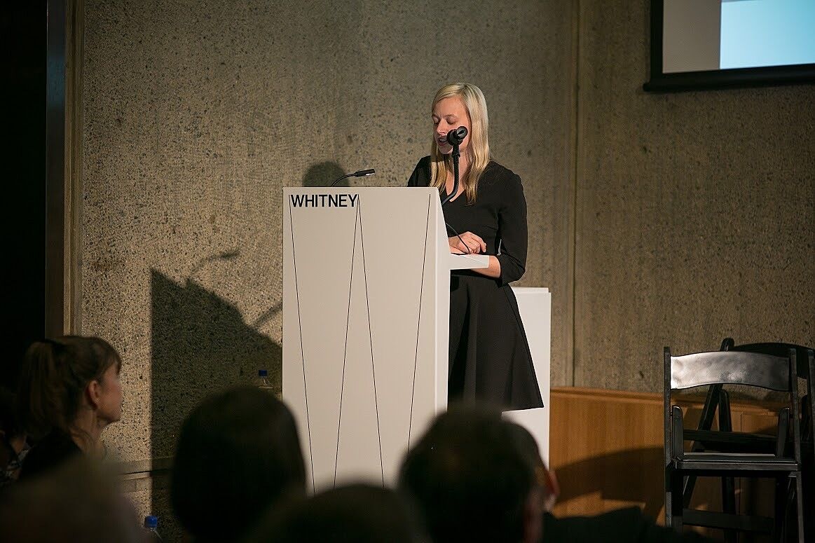
-
101
Sergei Tcherepnin
Audio, Kids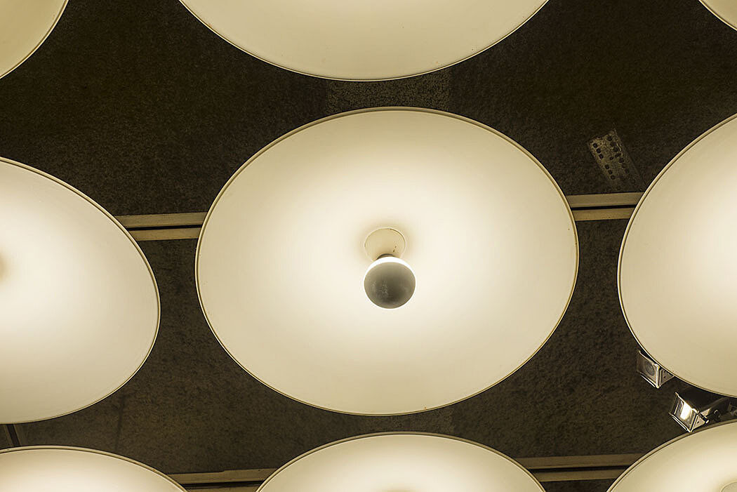
-
102
Charlemagne Palestine
Audio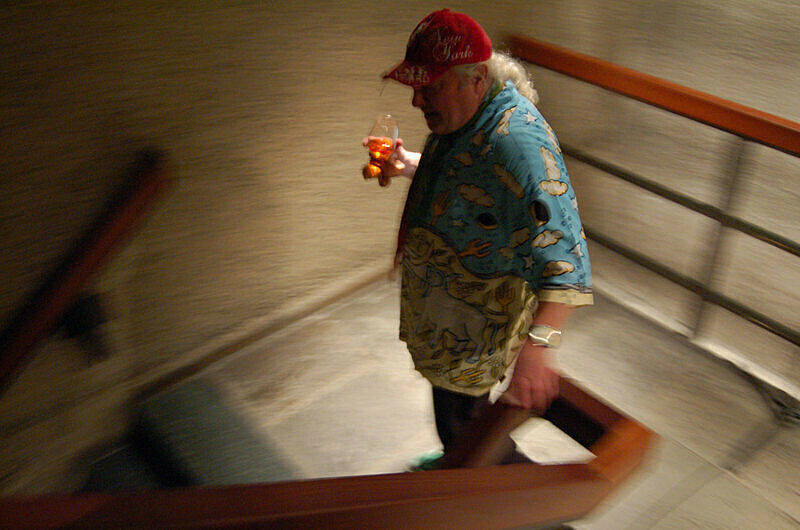
-
205
Academy Records and Matt Hanner
Audio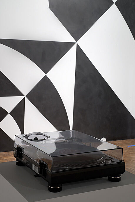
-
210
Terry Adkins
Audio, Kids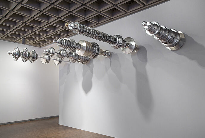
-
203
Elijah Burgher
Audio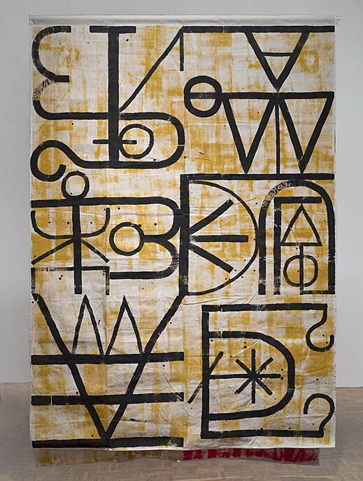
-
201
Jimmie Durham
Audio, Kids
-
209
Susan Howe
Audio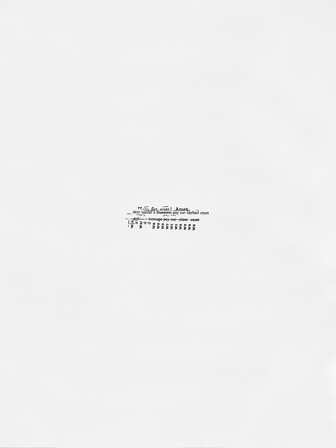
-
202
Carol Jackson
Audio, Kids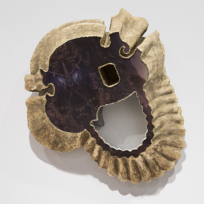
-
212
Rebecca Morris
Audio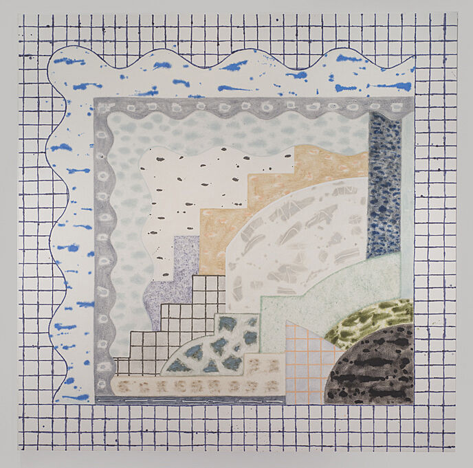
-
204
Paul P.
Audio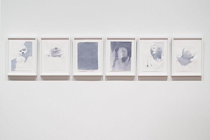
-
208
Public Collectors
Audio
-
213
Martha Rosler on Allan Sekula
Audio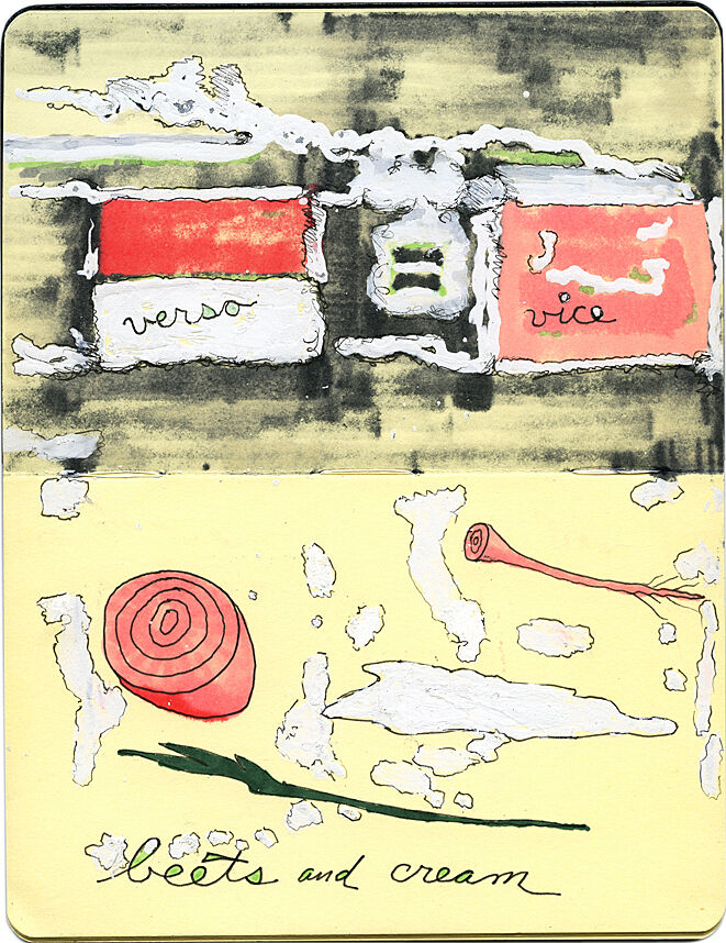
-
213-2
Anthony Elms on Allan Sekula
Audio
-
302
Etel Adnan
Audio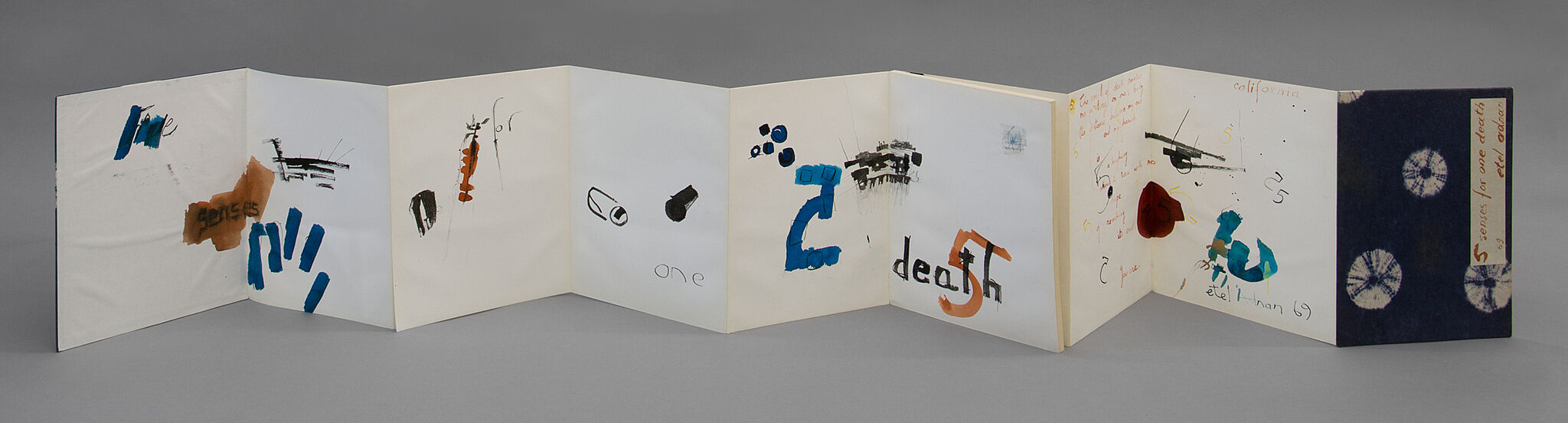
-
315
Ei Arakawa and Carissa Rodriguez
Audio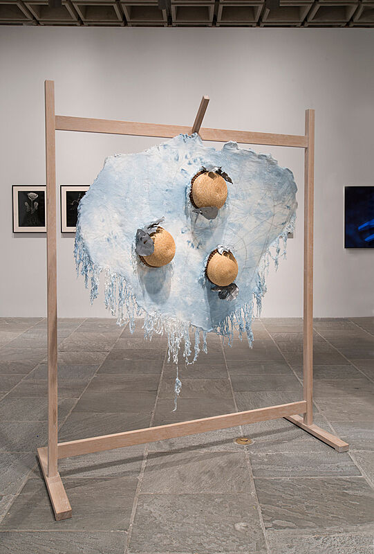
-
315-2
Stuart Comer on curating project-based art
Audio
-
304
Lisa Anne Auerbach
Audio, Kids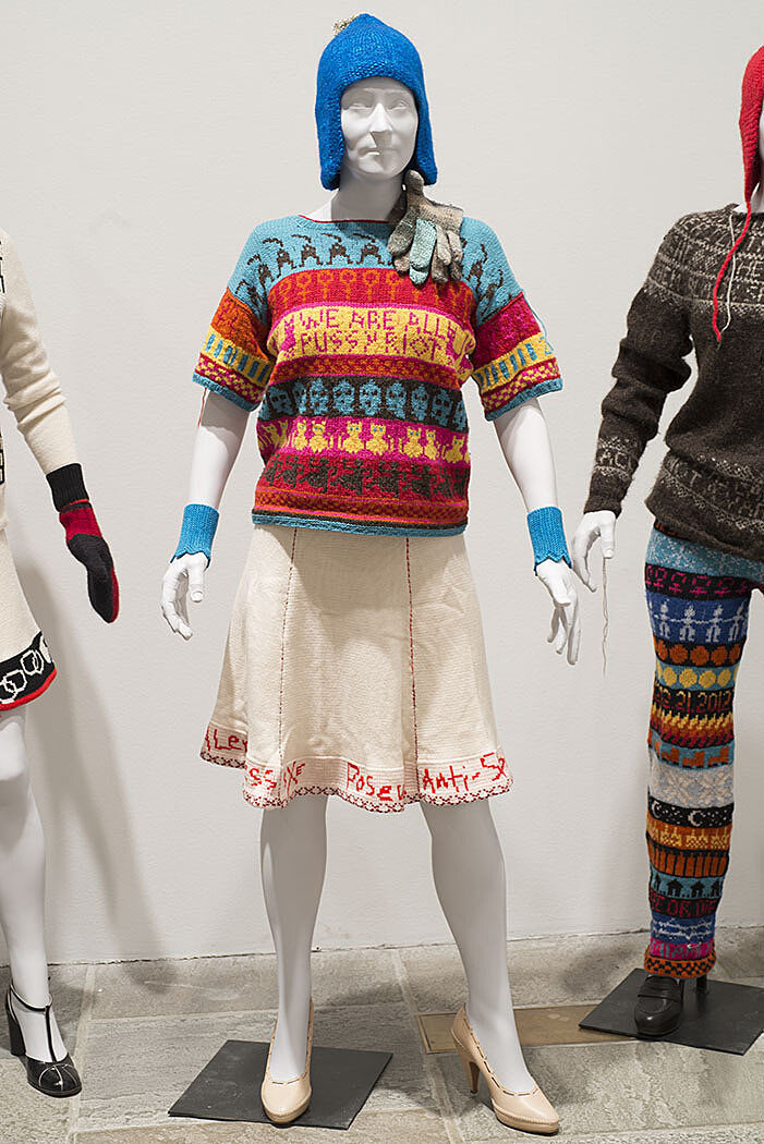
-
306
Julie Ault
Audio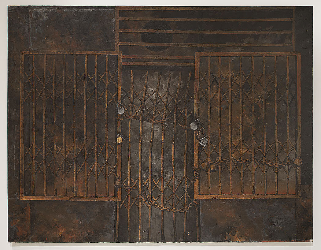
-
312
Kevin Beasley
Audio, Kids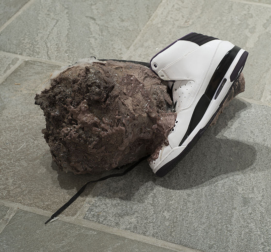
-
309
Zackary Drucker and Rhys Ernst
Audio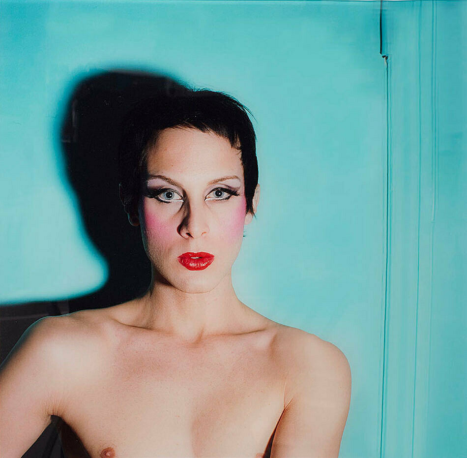
-
308
Morgan Fisher
Audio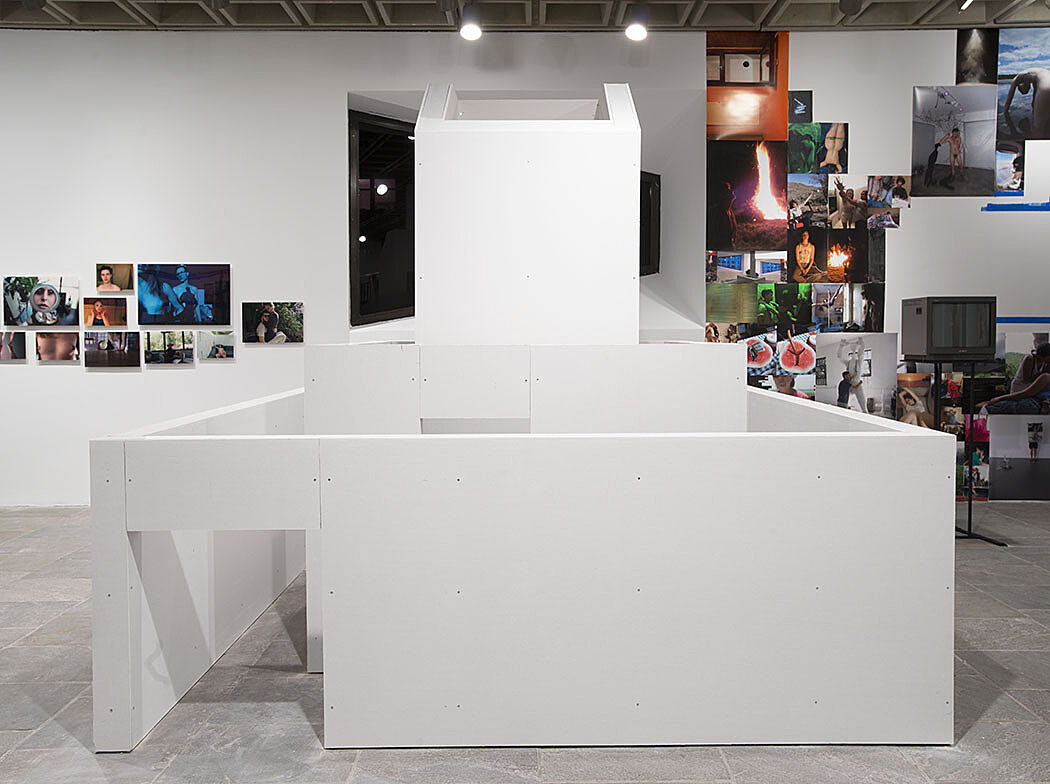
-
313
Tony Greene
Audio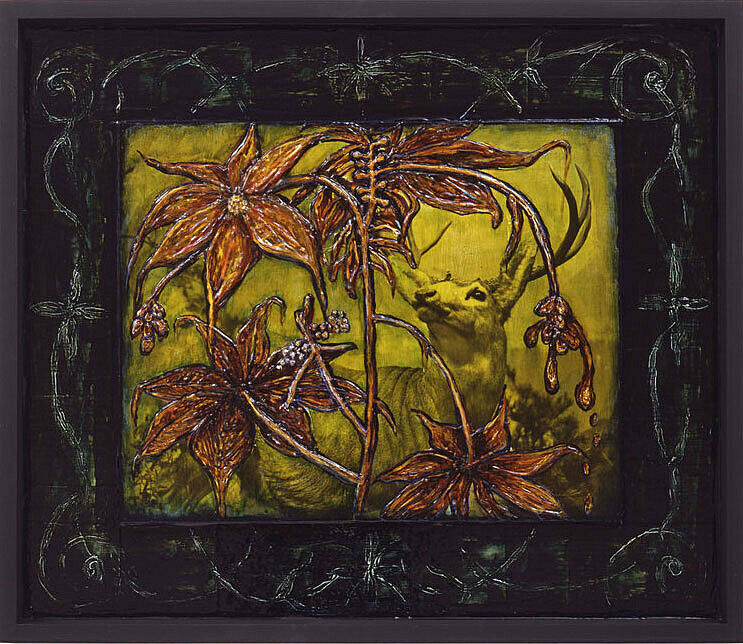
-
318
Fred Lonidier
Audio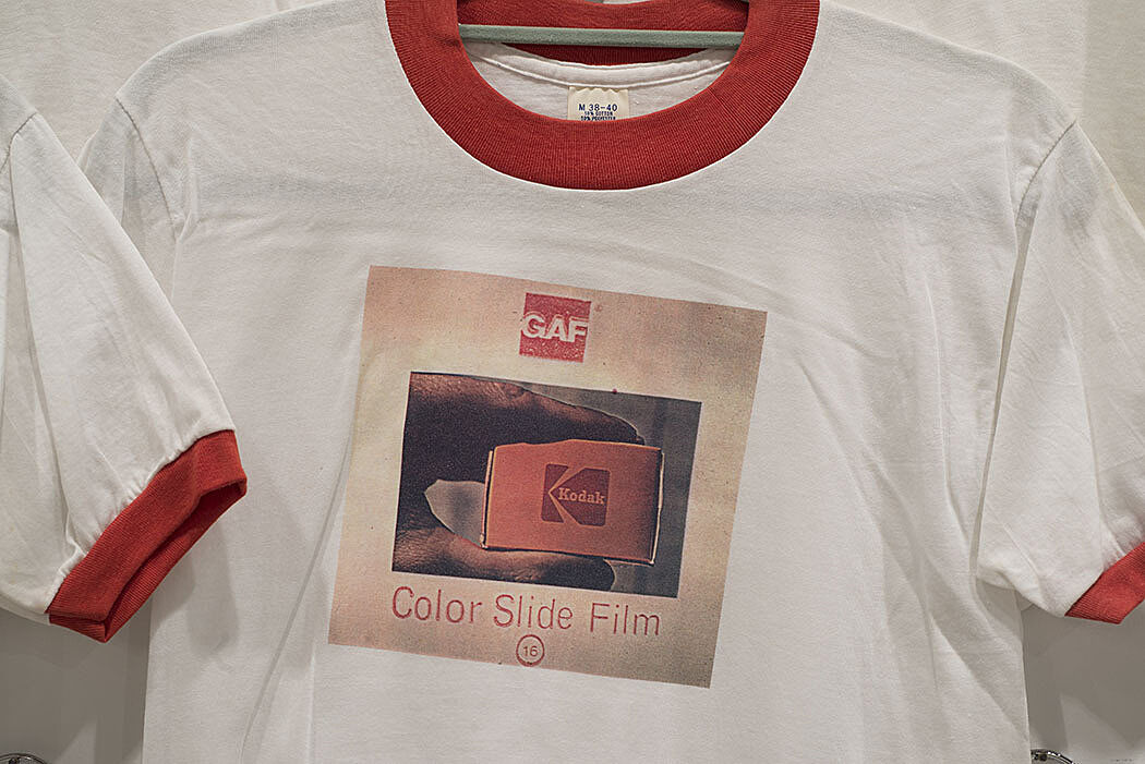
-
319
Dashiell Manley
Audio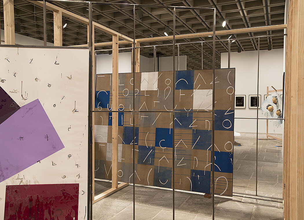
-
305
Keith Mayerson
Audio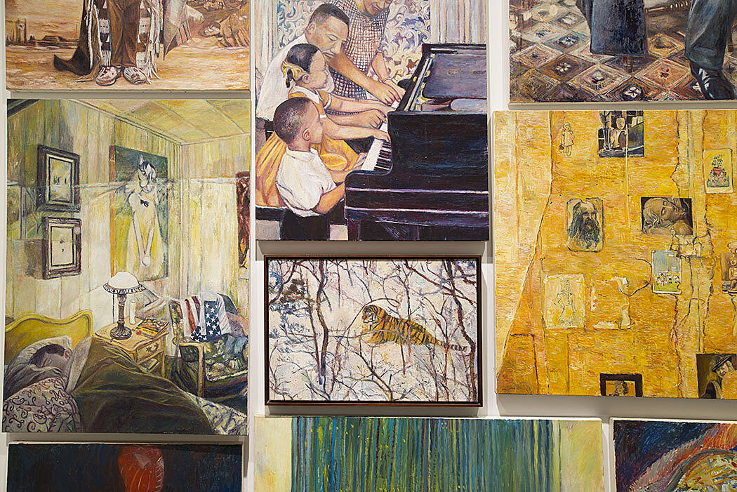
-
301
Ken Okiishi
Audio, Kids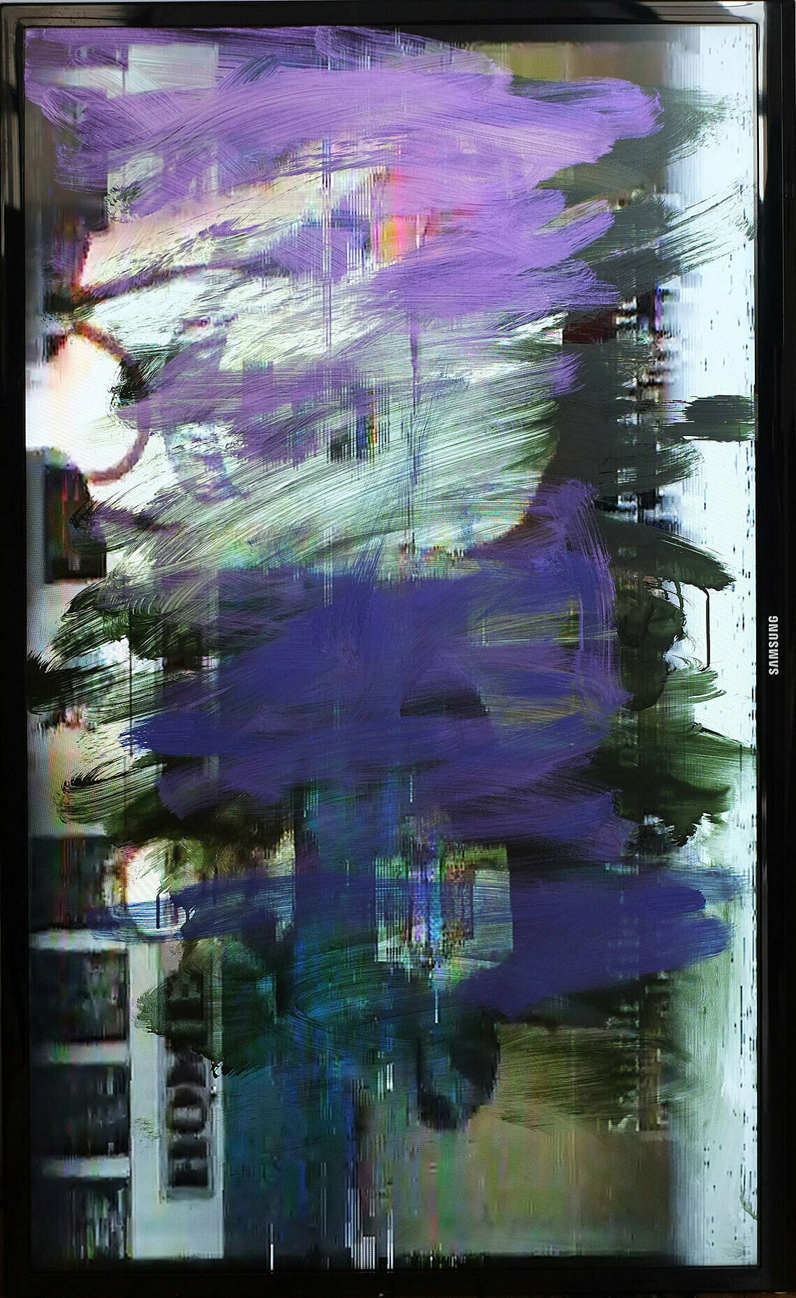
-
317
Semiotext(e)
Audio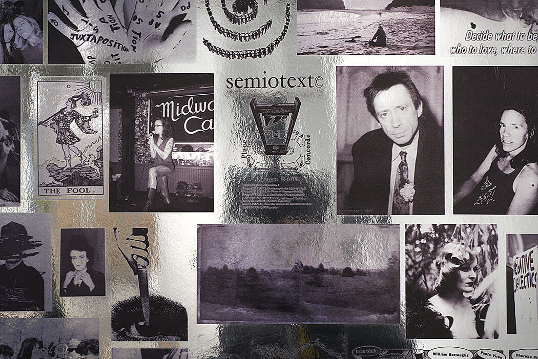
-
404
Gretchen Bender, People in Pain, 1988
Audio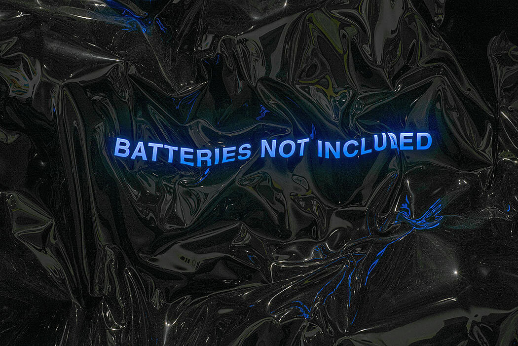
-
404-2
Philip Vanderhyden on re-making Gretchen Bender’s People in Pain, 1988
Audio
-
402
Dawoud Bey, The Birmingham Project, 2012
Audio, Kids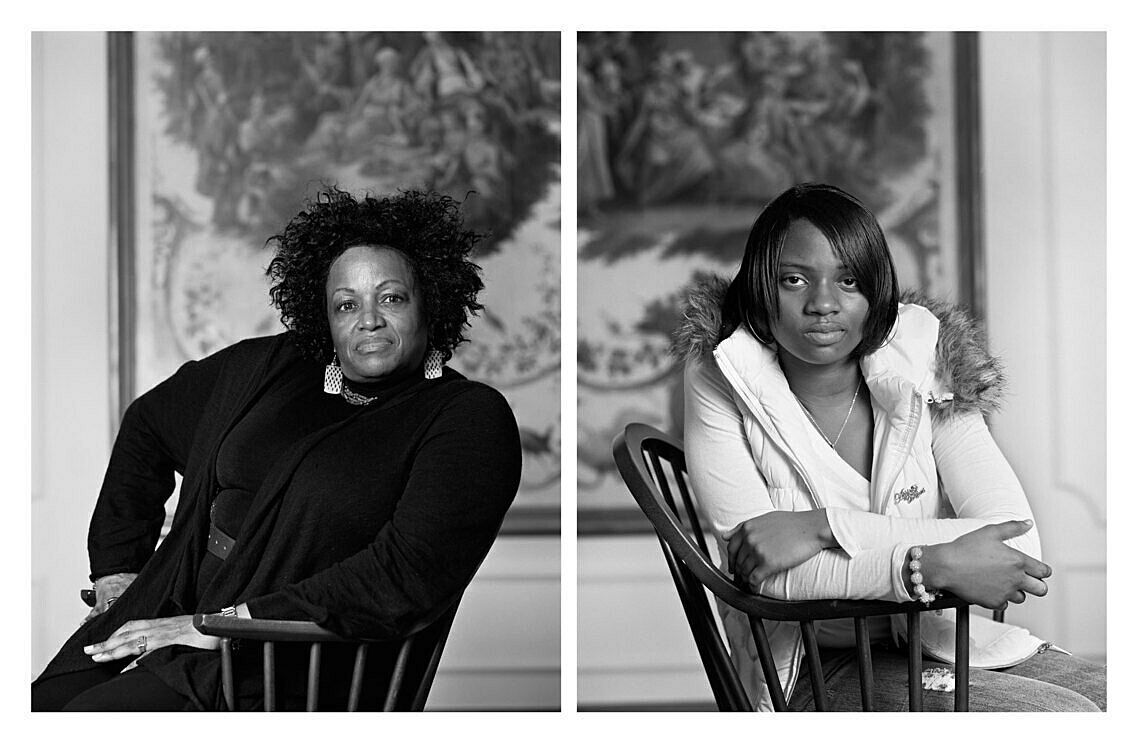
-
402-2
Dawoud Bey, Barack Obama, 2008
Audio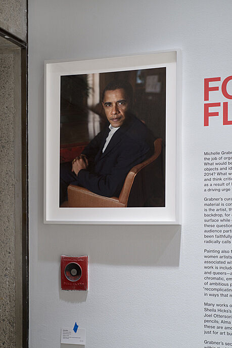
-
406
David Diao
Audio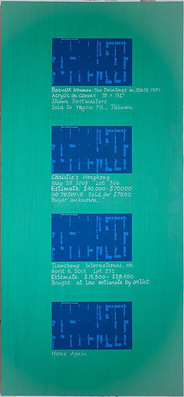
-
409
Louise Fishman, Ristretto, 2013
Audio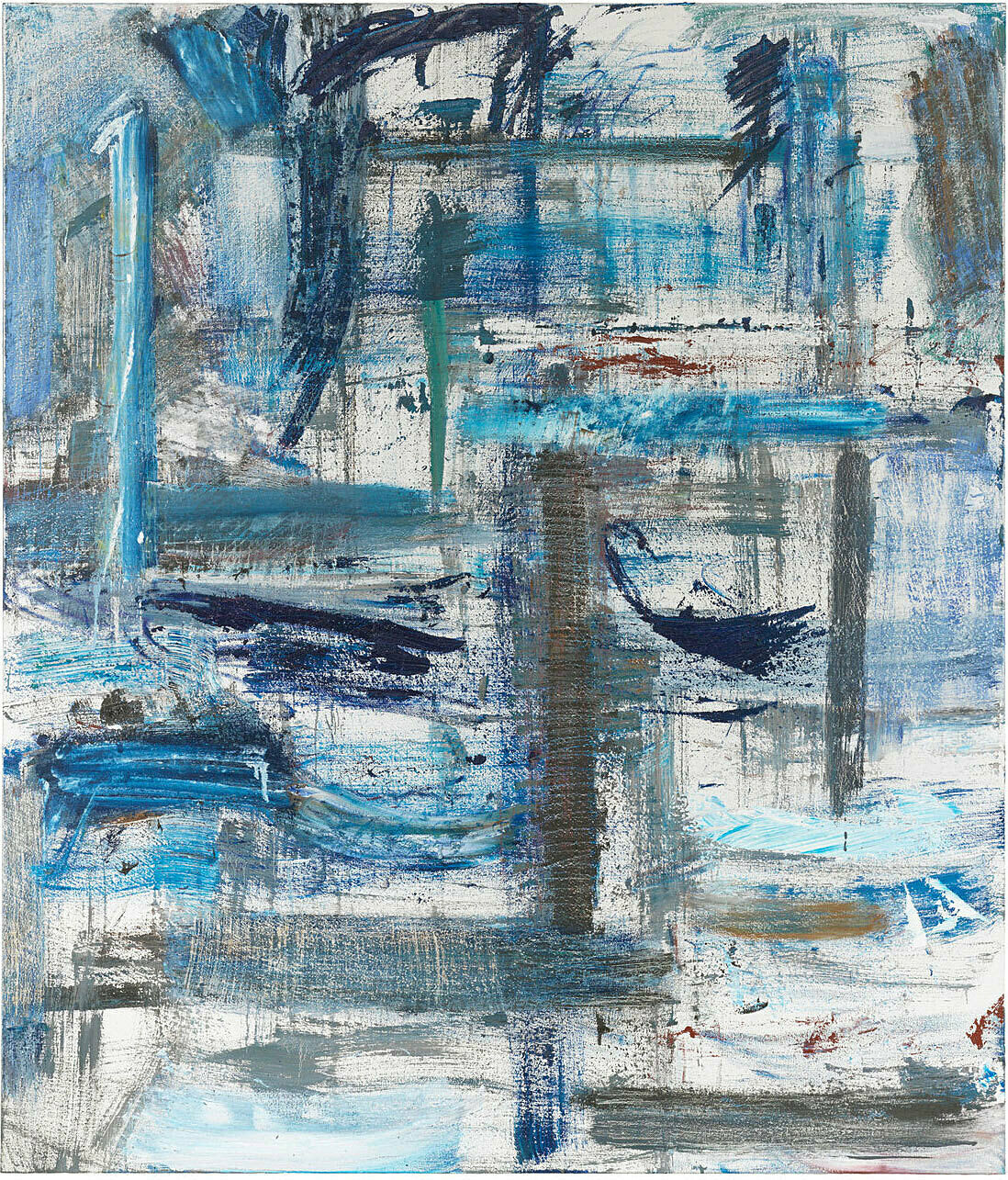
-
401
Gaylen Gerber, Backdrop, n.d.
Audio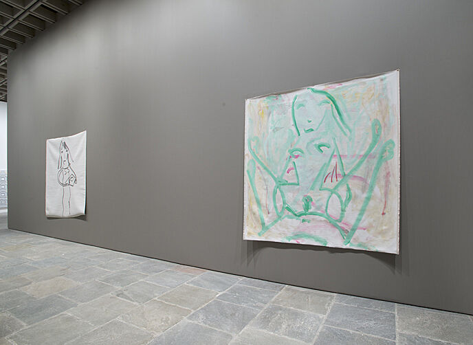
-
401-2
Gaylen Gerber on working with other artists
Audio
-
405
Karl Haendel
Audio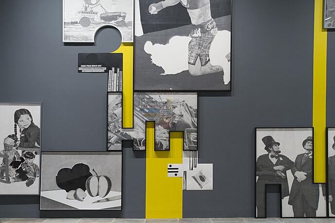
-
411
Sheila Hicks
Audio, Kids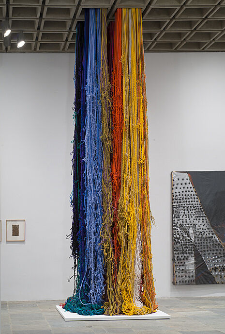
-
421
Ben Kinmont
Audio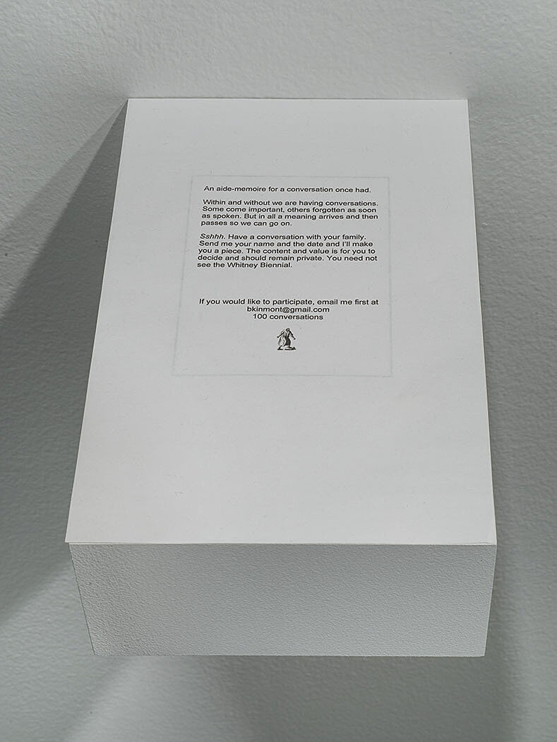
-
419
Zoe Leonard
Audio, Kids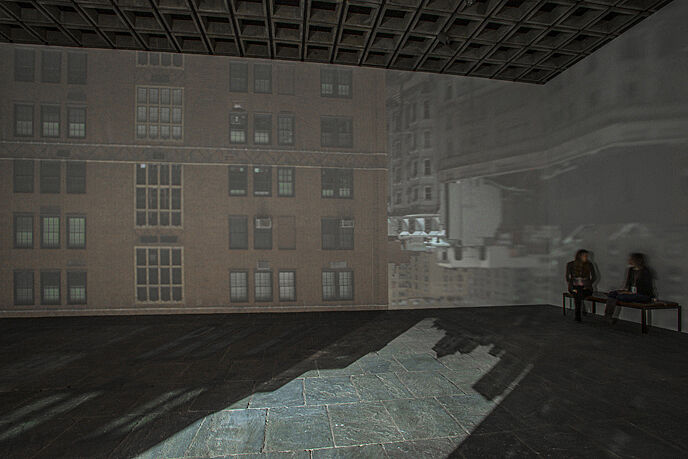
-
424
Tony Lewis
Audio
-
407
Ken Lum
Audio
-
403
Shana Lutker
Audio
-
420
Joshua Mosley
Audio, Kids
-
417
Dona Nelson, String Beings, 2013
Audio, Kids
-
418
Joel Otterson, Curtains Laced with Diamonds Dear for You, 2014
Audio, Kids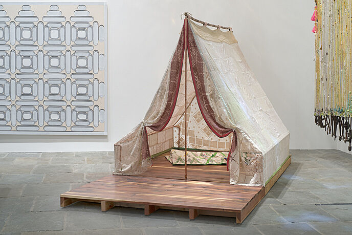
-
425
Peter Schuyff
Audio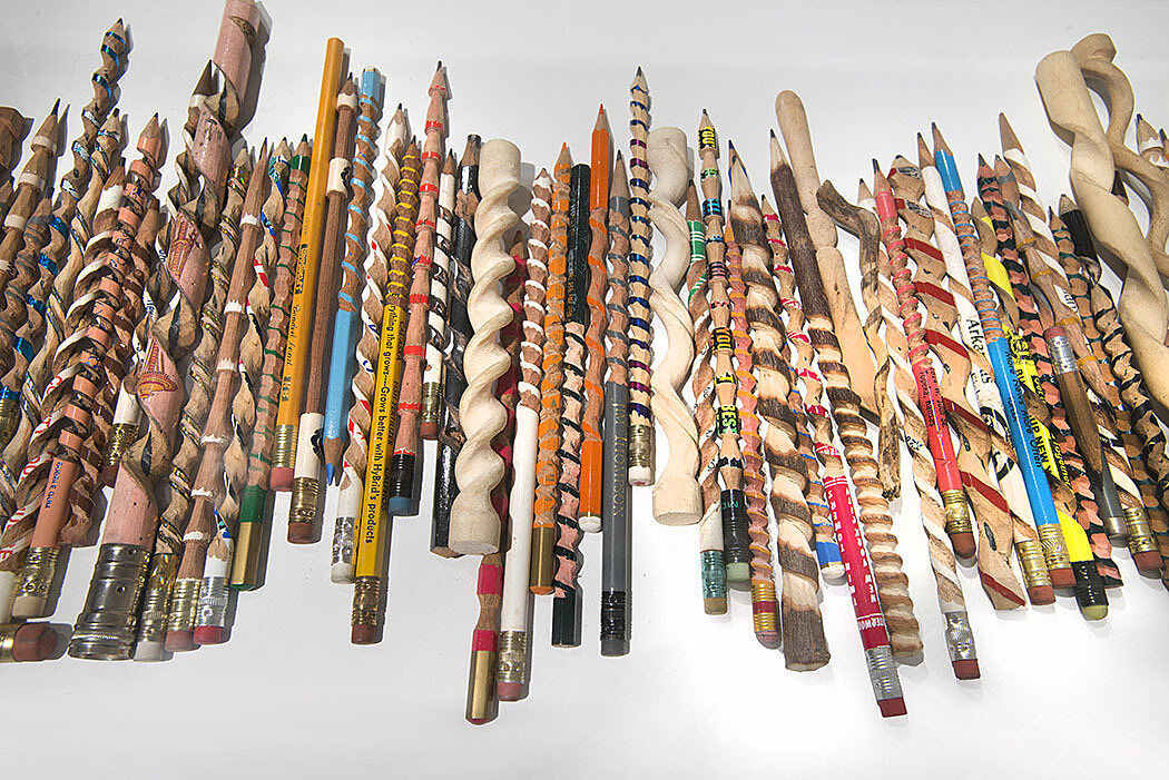
-
415
Amy Sillman, Mother, 2013–14
Audio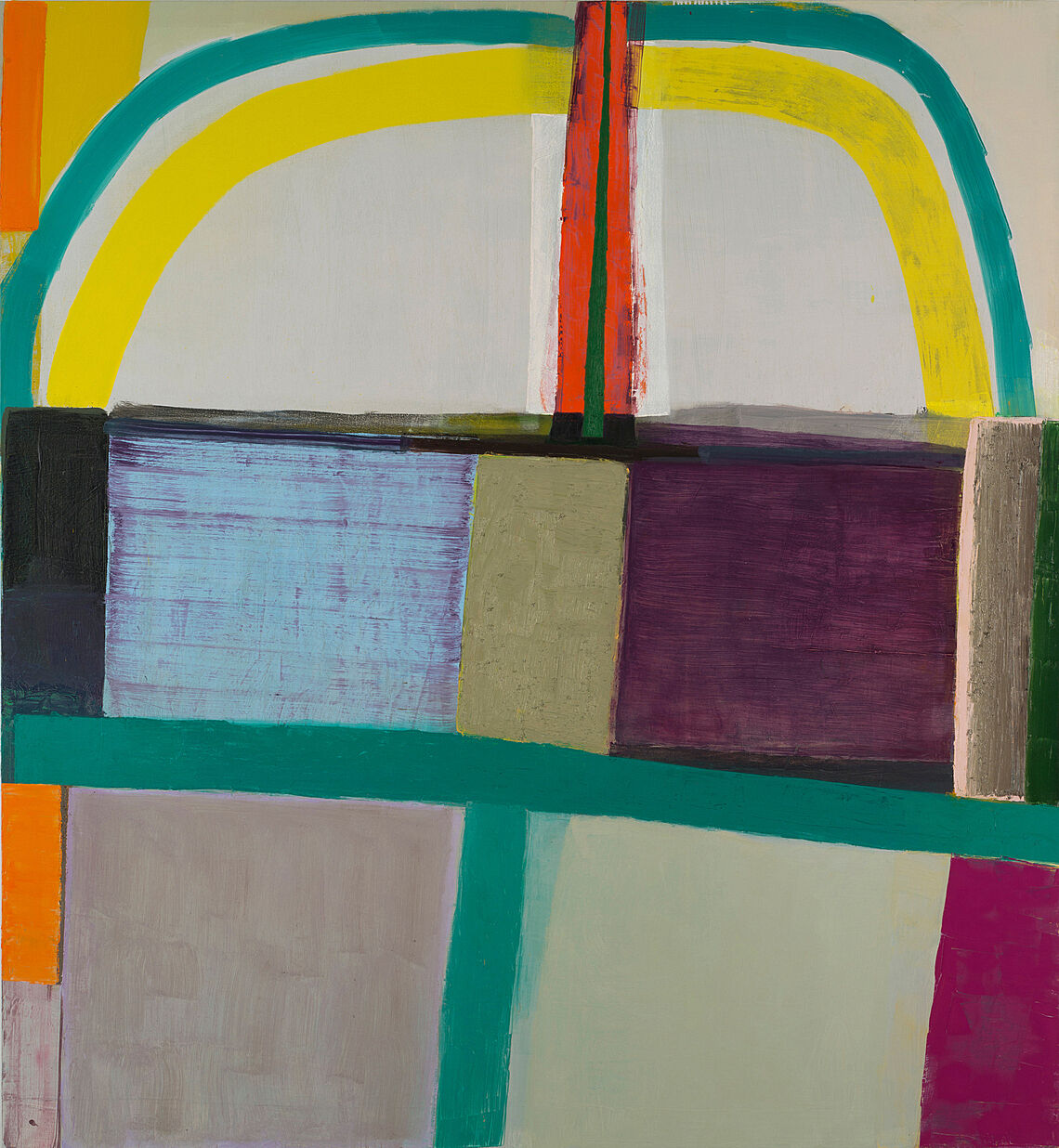
-
416
Amy Sillman and Pam Lins, Fells, 2013–14
Audio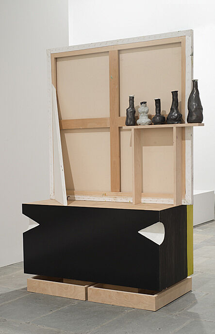
-
426
Ricky Swallow
Audio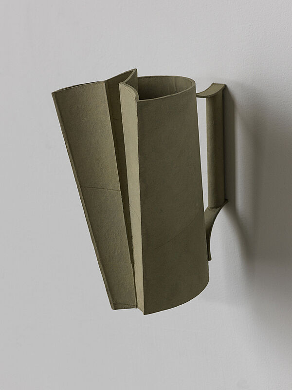
-
422
David Foster Wallace
Audio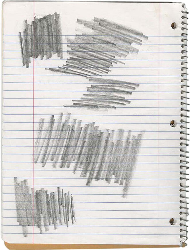
-
413
Donelle Woolford
Audio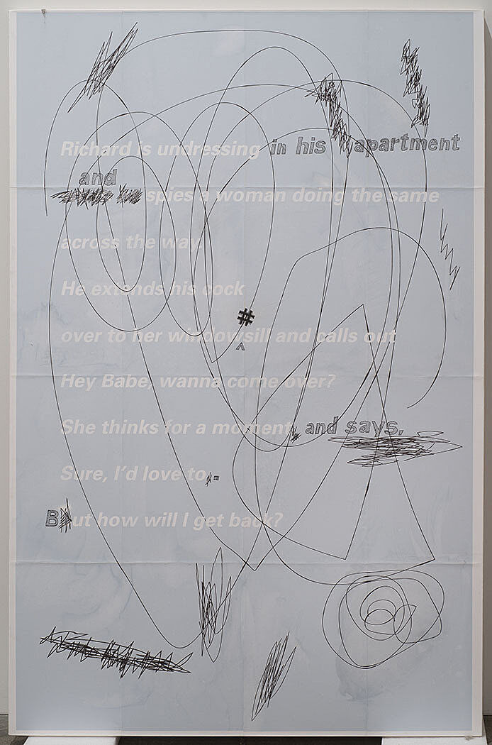
-
410
Molly Zuckerman-Hartung, Notley, 2013
Audio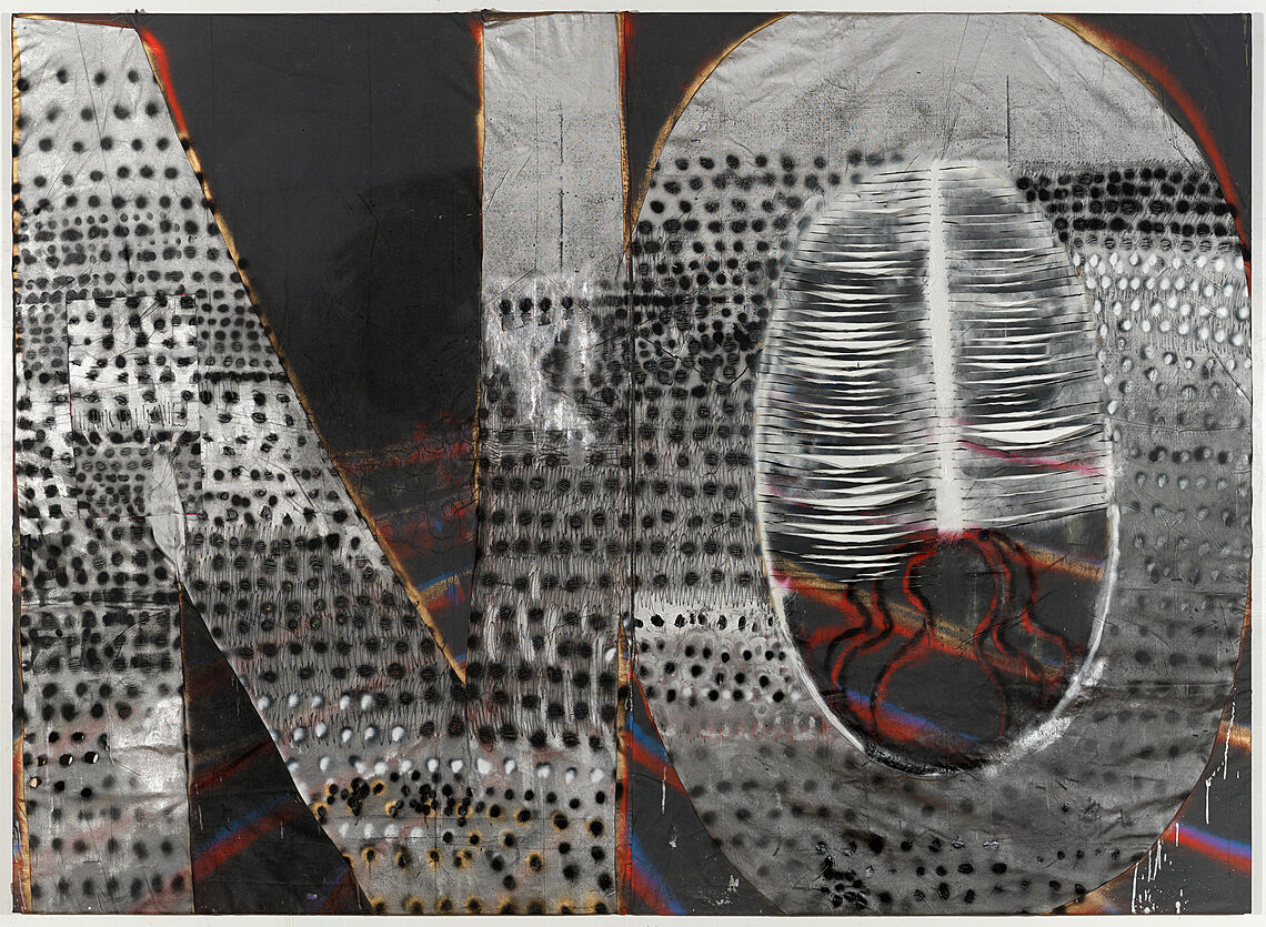
-
410-2
Molly Zuckerman-Hartung on painting and sewing
Audio
-
408
Sterling Ruby
Kids
Narrator: Welcome to the 2014 Whitney Biennial, and to the new Whitney Guide. You can use this Windows Phone App to explore the Museum on your own or to take a guided tour. There’s one tour that focuses on the voices of the artists themselves, and a shorter tour that will give you a taste of what this year’s Biennial is all about. As you explore, you’ll also hear behind-the-scenes commentary from the curators. This guide also contains information about daily performances and other events that you won’t want to miss.
For this year’s Biennial, the Whitney Museum invited three curators from outside the museum—Stuart Comer, Anthony Elms, and Michelle Grabner—each to organize a floor of the Biennial. At the time they were invited to curate the exhibition, they were all based outside of New York, and had very different professional backgrounds and institutional affiliations. Their collaboration has allowed each curator to be adventurous, exploring his or her own passions. As a result, the three floors have distinct personalities, focusing on different artistic media, and representing a diverse spectrum of contemporary ideas.
Please enjoy the exhibition—you can begin on any floor you like.
Support for the Whitney Guide is provided by Microsoft.
Narrator: Welcome to the Whitney! Every two years, the Whitney presents the Biennial—an exhibition of what’s new in contemporary American art. This time around, the Whitney invited three curators from outside the museum to organize the exhibition. After a lot hard work and many discussions, the curators picked 103 artists. The Biennial has taken over the whole Museum. You’ll see and hear art in all kinds of unexpected places—the stairs, elevator, as well as in the main galleries on floors two, three, and four. Each curator was given a floor to install works with the artists they chose for the exhibition.
It’s your turn to be an art critic. As you visit, see which floor or artwork you like best! Think about how it is different than other art you’ve seen before.
Support for the Whitney Guide is provided by Microsoft.
Lauren Cornell. Photograph by Oresti Tsonopoulos
Sergei Tcherepnin: My name is Sergei Tcherepnin.
Narrator: Tcherepnin has used the grid of lights overhead in the Lobby to produce a musical composition. It’s seven hours long, and includes periods of silence.
Sergei Tcherepnin: I am actually transforming eight of the lights that light the Lobby into speakers.
They're speakers, but they're like speaker instruments.
I don't know the exact amount, but there's around three or 400 lights. You don't necessarily look up all the time, but if you do, you might notice that they kind of look like UFOs.
Narrator: Depending on where you’re standing, you might hear the composition moving overhead—especially near the bookstore and in the ticket line there may be a spatialized sound, with notes playing all around. People standing nearer the benches or the elevators will hear the composition come together as more of a whole.
Sergei Tcherepnin: I'm less interested in the spatialization but more interested in the lights becoming instruments and the lights becoming carriers of sound themselves. And, I think given the quantity of lights in the Lobby, I wanted the lights to feel like there's a network of sounding lights spread throughout the gallery that is running through like a spider web.
Narrator: Find a place to stand in the lobby. Close your eyes and listen to the sounds you hear around you. What do you notice? Look up! The artist Sergei Tcherepnin transformed eight different lights in the Whitney’s lobby into speakers, so that different music comes from each one. Together they make a musical composition! Sometimes it is silent, so it doesn’t make the guards and museum staff crazy, but it should be on most of the time. He wants to make you more aware of the space you are in.
This is the artist, Sergei Tcherepnin.
Sergei Tcherepnin: You don't necessarily look up all the time, but if you do, you might notice that they kind of look like UFOs. They're interesting lights that were part of the original design of the Museum.
Sergei Tcherepnin, Ambient Marcel (Waiting, Working, Erupting), 2014 (detail). Marcel Breuer lights, transducers, amplifier, and high definition media player, dimensions variable. Collection of the artist; courtesy Murray Guy, New York
Anthony Elms: I reached out to Charlemagne Palestine because I think he’s one of the most under-recognized artists, media-makers, composers, anything, across the board.
Narrator: Curator Anthony Elms discusses Palestine’s sound installation in the stairwell.
Anthony Elms: We brought him in for an evening, and he sort of ran, stomped up and down the stairs, and sang and sort of found a tone and found a level of singing and a level of resonance that he was happy with, and then sort of simply went up from the opening landing up to the fifth floor and sang and passed these microphones that recorded him as he went past each landing. And then where those microphones were placed are now speakers. And so the speakers play back his voice exactly as he passed that space. Then as a composer he took those tapes back and tweaked a little bit the pacing of his recording, and added an electronic drone to it, and put it together so that the composition is a piece that moves up and down the space, sort of ghosting his original performance.
Narrator: Palestine’s compositions are typically playful, excessive, and spiritual at the same time.
Anthony Elms: He didn’t want to have just the raw technology be there. It was important to him that, since his voice has a presence―and his voice has like this spiritual resonance―that he wanted the speakers to also have that physically, and so the stuffed animals and his little bestial friends sort of sit there to watch over his voice.
Charlemagne Palestine, hauntteddd!! n huntteddd!! n daunttlesss!! n shuntteddd!!, 2013. Twelve-channel sound installation on stairwell landings, performance (Whitney Museum of American Art, New York, August 31, 2013). Photograph by Olivia Ciummo
Steve Lacy: The Specter is the title of the piece. I’m working with an artist who has passed away. I knew Matt; he was a very close friend of mine.
Narrator: Steve Lacy, the founder of Academy Records, an organization that provides a platform for performances, exhibitions, and sound works, collaborated with Hanner.
Steve Lacy: The audio recording on vinyl record is Matt’s, and the wall drawing and the film will be mine. The piece was recorded in Chicago on 9/11, 2001, right after the government had grounded all flights. So Matt at the time was living on a flight path to O’Hare, and it was not uncommon to hear these jets.
And so Matt just had the wherewithal to record the sound of his backyard with this sound of no jets. And when you listen to the piece there’s long minutes where you don’t hear anything except maybe the sound of the recording device. And then you’ll hear a dog bark in the background, or you’ll hear a car door, then you’ll hear a neighbor walking down the sidewalk or something. So it is a very minimal piece that plays with your attention, I guess. It begs your attention. Cause it could be easily dismissed. So even that piece itself, I thought, because it’s the sound of—the sound of absence, that it could make its presence known as this physical vinyl record.
Academy Records and Matt Hanner, Installation view, No Jets disc III parts 1 and 2, 2001 (pressed 2013). Vinyl record. Edition of 500, AP. Courtesy of Academy Records. Licensed by Erika Hanner; _The Spectre (full of stars)_, 2014. Graphite on wall. Collection of Academy Records
Anthony Elms: Terry Adkins’s sculptures are five aluminum and then silver-plated brass sculptures that are physical, three-dimensional representations of birdcalls.
Narrator: Curator Anthony Elms.
Anthony Elms: And so they take a sonographic recording of a birdcall and sort of turn that simple sonar graph into a three-dimensional shape.
The idea was to keep these things that are very large, very heavy, very sculptural. But then all along he’d wanted them to have some sort of sense of being above you, like being birdcalls, like being perched—not quite so literally as to be perched in a tree, but they’re in the air, sounds that are in the air, that are over you, that are hovering over you, that are sort of reaching out past you.
Narrator: Adkins was a musician, and often played percussion. Many of his works were about sound or music—though they were sometimes silent, like this one. Here, the individual forms in the waves look like cymbals.
Anthony Elms: He’s made several works in the past with percussion instruments, because they are quite physical, and you can sort of tell that they are a shape that has a sound. And so ultimately when he was working through the ideas, he just went back to a material that he knows and loves, which [are] cymbals, or things that are sort of cymbal-shaped.
Narrator: Terry Adkins passed away in February of this year. This was his final project.
Narrator: How can you make sound visible? Can you make a work about sound that is totally silent? Look closely at the metal sculptures by artist and musician Terry Adkins. What you see here are 3D representations of the sound waves of birdcalls. Starting from the wall, you can follow the pattern of the birdcall. The thicker parts represent the loudest part of the birdsong and the narrowest part is the quietest part. Notice how some of the birds sing continuously, while others pause or repeat their songs.
Terry Adkins, Installation view, from left to right: Aviarium (Dickcissel), Aviarium (Mourning Dove), Aviarium (Seaside Sparrow), Aviarium (Grasshopper Sparrow), and Aviarium (Broad-winged Hawk). All works: 2014. Steel, aluminum, silver-plated brass cymbals, and trumpet mute, dimensions variable. Estate of Terry Adkins; courtesy Salon 94, New York
Elijah Burgher: I started making the large drop cloth paintings in the context of rituals that I was performing.
Narrator: Elijah Burgher.
Elijah Burgher: So I wanted to paint something like a temple floor on which to perform a given ritual. I reference a system of magic developed by this early-twentieth century occultist whose name is Austin Osman Spare.
Narrator: Spare advocated the creation of magical symbols called sigils.
Elijah Burgher: You write down a specific wish or desire—and it can be really mundane, it can be, “my desire is to find my lost iPod.” And you take each of the letters that spell out that desire and you recombine them into a new form, just based on your own sensibility, your sense of invention. He then thought you had to charge your sigil, basically you have to cast a spell, by visualizing your sigil, or staring at it, during a no-mind experience, such as might be obtained through meditation. Spare, though, thought that the most expedient method for charging a sigil was to visualize it during a moment of orgasm. So my initial interest in them was as abstractions to which one masturbated.
There might have been something of the allure of the transgressive when I first became interested in these things. But it’s also the case that I became interested in magic and the occult via art.
Narrator: Burgher was struck, for example, by the words of William S. Burroughs.
Elijah Burgher: He said something to the effect of, “all art is magical in origin. It was made in order to produce specific results.” And I liked that idea because it seems like a way to focus intentions in the studio. And also to ground what was being made in the studio in daily-life and real-life anxieties and hopes.
Elijah Burgher, The Pattern of all patience 1, 2013-14. Acrylic on canvas drop cloth, 108 x 72in. (274.3 x 182.9 cm). Collection of the artist; courtesy Western Exhibitions, Chicago
Narrator: Jimmie Durham’s Choose Any Three is the tall wooden sculpture opposite the elevators.
Anthony Elms: It’s sort of like, I find it a wayfaring sign. It has a little skull with wings that sort of welcomes you in.
Narrator: Second-floor curator, Anthony Elms.
Anthony Elms: It says "choose any three" and then there’s a list of like, Ho Chi Minh, Christ, etcetera.
To make a bad analogy, if you think of like a choose-your-own-adventure path, where you end up by choosing any three from his list, [it] puts you in a radically different position relative to society, relative to somebody else, relative to political power structures, relative to somebody next to you who’s picked a different three. Like you become enemy, friend, provocateur, saboteur, saint. So I think that choice―it sort of lands you, socially.
Narrator: Durham was born in Arkansas, and has been living outside the United States—refusing to return for political reasons—since the 1980s. Anthony Elms invited the artist to be in the Biennial, and Durham chose to include this sculpture. It’s an older piece, from 1989. Durham picked Choose any Three partly in playful response to the fact that this year’s Biennial has three different curators.
Narrator: Look at the tall wooden sculpture that is opposite the elevators. This is by the artist and activist Jimmie Durham. The title of this work is Choose Any Three, which the artist has painted across the wings of the hand-carved bird. The artist has written names of different kinds of famous people, including Native Americans, political revolutionaries, and writers. Do you recognize any of the names? Pick three and discuss them with your adult. By showing us a sculpture that looks a little like a totem pole, but that isn’t a totem pole, what is he asking us to consider?
Jimmie Durham, Choose Any Three, 1989. Carved and painted wood, metal, and glass, 99 3/16 × 49 3/16 × 48 in. (251.9 × 124.9 × 121.9 cm), kurimanzutto, Mexico City. Courtesy the artist and kurimanzutto, Mexico City. © Jimmie Durham. Photograph by Jean Christophe Lett
Anthony Elms: Susan Howe has been a poet for decades and a well respected poet, and I know many artists turn to her and see her as a kindred spirit to follow her every sort of book and reading. And she actually has an MFA in art. She started as an artist, and became a poet.
Narrator: Anthony Elms has included a series of Howe’s poem collages in the Biennial. They’re meant to be looked at as much as read. Howe made a recording of related works with the musician David Grubbs. It’s called Frolic Architecture.
Susan Howe, Untitled (from Tom Tit Tot), 2013. Letterpress print, 12 × 9 in. (30.5 × 22.9 cm). Collection of the artist. © Susan Howe
Carol Jackson: Youthful Beast—It's so grand, and it's so gold, but it's an impoverished set of materials.
Narrator: Carol Jackson.
Carol Jackson: It's papier mâché. It's a cheap digital print from Staples, five dollars. It’s trying to get away with grandiosity, but it can't quite get there.
Narrator: The sculpture was inspired in part by John Milton’s poem Paradise Lost.
Carol Jackson: The Beast—as soon as Satan fell from grace, he was represented in this grandiose way. This is when he's the most beautiful and the most elaborate. But he's already starting to decay. That’s what I’m—I get that from the poem.
Narrator: Jackson has also used photographs from National Park Service webcams in the sculpture.
Carol Jackson: When I was looking at them there was just something almost terrifying to look at these cameras that are focused on nothing—I mean, they're focused on something, but it's just atmosphere. There's not really anything happening. But there's this omnipresence. I really felt it like it was kind of chilling. I don't know. I'm very attracted to it.
Most of my work is really romantic—I mean, I've got [laughs] to admit. But I'm really interested in the idea that we're at the beginning of our decay as a culture, and I just function from there.
Paradise Lost, they talk about how many similes it contains. The poem itself is a kind of simile for me for Western culture, specifically American.
Narrator: Find Carol Jackson’s sculpture called BLEHH. Why do you think she called it that? This sculpture is made of leather, enamel, brass, and paint and looks kind of like a fancy, empty picture frame. It has a circle that looks like a mouth that it is vomiting up leather strands! Kind of gross!
There are two other sculptures by this artist, Carol Jackson, on this floor. They hang up on the wall—see if you can find them. They also contain interesting materials, like a combination of papier-maché, wood, and photographs of nature that were taken from webcams of national parks. What do you think Jackson is saying with this unusual combination of materials?
Carol Jackson, Youthful Beast, 2013. Acrylic, papier-mâché, and inkjet print, 35 x 32 x 16 in. (88.9 x 81.3 x 40.6 cm). Collection of the artist
Rebecca Morris: My name is Rebecca Morris.
In the large painting titled Fifteen Thirteen, which is the very tall vertical, the much larger of the two, that painting has a border with a dashy, slate-blue paint line. The dashy line grew out of some watercolors that I did maybe even eight years ago. I just started doing it in a few paintings in little areas. And then there was a painting in 2013 that had a dashy background and it was just black paint on white gesso. It’s hard to say what I like about it; it just seems to capture some feeling. It’s sort of regular but irregular, and it’s—I think in this painting it’s this really nice horizontal moment in a very strong tall vertical and then I like that tension.
Both of these paintings have interlocking forms inside of them. I’ve done this quite a bit. There’s a really specific kind of pressure when I make those paintings, because everything has to fit into itself. So its edges are conscribed by the shape that’s next to it and is almost intertwined within it and depending on how I paint it, I can create flatness, as if it’s more like a puzzle where things just fit into each other, or I can create a layering feeling, where these shapes are in front or behind each other.
Rebecca Morris, Untitled (# 14-13), 2013. Oil on canvas, 101 x 101 in. (256.5 x 256.5 cm). Collection of the artist; courtesy Corbett vs. Dempsey, Chicago and Galerie Barbara Weiss, Berlin
Paul P.: Hi, my name is Paul P.
There are two material parts in the exhibition. The first is a sculpture in the form of a desk and a stool made out of mahogany, and the other are a series of ink drawings. Both of those things have their initial―at least superficial―motivation in a connection to the writer Nancy Mitford. The British writer who was born in 1904 and died in 1973 and my fascination with her.
Narrator: Paul P. has used these works to connect what he thinks of as a series of aesthetic high points throughout history. He is deeply interested in Nancy Mitford’s historical milieu—a group of young, brilliant thinkers who shook off the proprieties of their aristocratic backgrounds in the years following the First World War. The artist finds this period especially moving because the aesthetic and personal experiments of these so-called “Bright Young Things” were curtailed by the Second World War, which destroyed the lives of many of Mitford’s peers. For Paul P, Mitford’s generation resonates with that of gay men after Stonewall, who came out into the open and began exploring new freedoms only to run headlong into the AIDS crisis. This analogy makes Mitford’s status as a survivor of her circumstances all the more powerful.
Paul P.: The desk is, in my imagination, a desk perhaps for her or perhaps her successor, even perhaps her ghost.
I've also thought about Nancy Mitford's experience during the war, particularly being in London during the blitz and surviving the bombing of the city. I've studied a lot of pictures of London at that time. The way in which buildings have been ripped apart and their armatures, their twisted armatures have given me a little bit of further inspiration in terms of the lines of the desk.
Paul P., Installation view, all works: Untitled, 2013. Ink on paper, 11 3/4 x 8 5/8 in. (30 x 22 cm). Collection of the artist; courtesy Broadway 1602, New York, and Maureen Paley, London
Marc Fischer: Public Collectors is an initiative that I started in 2007.
Narrator: Marc Fischer.
Marc Fischer: And a lot of it is just me functioning as a reference librarian of my own stuff, sharing things digitally, doing things in event format, where maybe things only come out of storage for a couple of days or even a few hours, but in that time many people are able to see something that normally they just can’t really see very easily.
Narrator: For the 2014 Biennial, Fischer is presenting sound recordings made by Malachi Ritscher, as well as posters and other things Ritscher owned.
Marc Fischer: He was an incredibly rabid attender of live music, and recorded basically five to seven nights a week for many, many years. He went out and most of those nights he recorded concerts. Mostly he was recording improvised music, experimental music, free jazz, underground rock. In the case of a lot of this stuff, a lot of these things were attended by very few people, so there would not be much record of them otherwise. He also ran a website with the url savagesound.com, which acted as a cultural calendar for this music community. He had this presence in this community that was just incredibly supportive and generous. And I wanted to think about the Biennial as a way of calling attention to a different kind of creative person, whose involvement in a scene basically enables art to happen.
The other really complicated aspect of Malachi Ritscher is that he was also a very strong anti-war activist. This gradually seeped into the concert listings and things like that, that he put on his website. He started dividing his time quite a bit more between protesting, attending anti-war actions, he was arrested a couple of times, and finally on November 3rd, 2006, committed suicide in a very public way, immolating himself on the side of the Kennedy Expressway. He displayed a sign with a very explicit political message. It was quite clear that he was trying to inspire some kind of outcry against the war. I think how he participated in the world as an artist is important. And I think he made very deliberate decisions in how he went about things, very deliberate creative decisions. Even very deliberate creative decisions in how he killed himself. He wrote his own obituary, he left a mission statement for people to find on his website. Whether he inspired the action that he may have hoped to—I think that there was a level of thought and consideration and criticality that I responded to really positively in thinking about him.
Joeff Davis, Malachi Ritscher, Iraq War Protest, Chicago, 2003. Courtesy the artist. Included in the project Malachi Ritscher by Public Collectors
Martha Rosler: My name is Martha Rosler. I’m an artist. Allan and I were students together at UC San Diego in the early 1970s.
Narrator: Rosler and Allan Sekula were part of a group that included Fred Lonidier, whose work is exhibited on the third floor of the Biennial. They sought to change art—especially photographic media—and the art world itself.
Martha Rosler: In one way or another, together with the rest of us and separately, Allan helped devise, develop, and think through new ways of using photography, film, video, and writing to renegotiate the meaning of documentary, to return the question of politics and geopolitics to the image.
Narrator: Sekula died in August 2013. The drawings shown here are casual images he made during his final years. They were relatively private expressions, not originally intended for exhibition.
Martha Rosler: These drawings evidence Allan’s wry sense of humor at the fact that nobody in the space of a lifetime can actually hope to see the arc of social justice bending quite along the direction we all would have liked to see. It represents an acknowledgement that we might as well also have some fun with our imagery along the way, while using that spur of energy to get back in the fray with works that have a larger purchase on these very serious issues in the world.
Allan Sekula, Sketch from Allan Sekula’s notebook “PF poland 2009 (1),” 2009. Ink, correction fluid, and colored marker on paper, 3.5 × 5.5 in. (9 × 14 cm). The Estate of Allan Sekula; © the Estate of Allan Sekula
Anthony Elms: Allan Sekula has for decades been a clear moral voice, and an ethical voice in the art world.
Narrator: Curator Anthony Elms.
Anthony Elms: Either trying to look and sort of critique them and get into the facts of a situation, but also trying to get into them personally, deal with them on a personal level. So it’s not simply—his work has never been critique at an arm’s length.
Sadly he died this year.
I didn’t know how extensive or how many, but I knew he had had some sketchbooks with these little sort of drawings―these more—you could say, maybe next to his other work you could say that they’re more whimsical, but I think they’re just sort of imbued with the same sort of investigation as his work was, just at a different level. Which I felt that, sadly, now that he’s gone, the work still remains, the work is still here, but what is gone is the person. So I was interested in seeing if we could display some of these notebooks that display maybe a little bit more the humor before these pieces became these large multi-panel video/writing projects, but the sort of, the going through the thoughts, the going through the paths that maybe didn’t get to the end, and actually look at the material with his own hand, in his own writing.
Allan Sekula, Sketch from Allan Sekula’s notebook “PF poland 2009 (1),” 2009. Ink, correction fluid, and colored marker on paper, 3.5 × 5.5 in. (9 × 14 cm). The Estate of Allan Sekula; © the Estate of Allan Sekula
Stuart Comer: I’m Stuart Comer, and I have been asked to curate the third floor here at the Whitney Museum. When I was asked to be a part of this exhibition I was still living in London, where I had been based for the last thirteen years until I returned to New York in September 2013. And maybe because of this, I became particularly interested in slightly external points of view to the United States. And Etel Adnan emerged as a figure who really became very important for how I began to think about the exhibition.
She herself was born in Beirut but has always been fairly migratory. She’s lived all over the world, but primarily in Beirut, Paris, and northern California, where she taught for several decades, until recently, when she’s been primarily based in Paris. And Etel is largely better known as a writer, she’s a major figure in Arab poetry and literature, but in the last few years there’s been a strong rediscovery of her painting practice as well.
And because Etel occupies that threshold between writing and painting she became particularly interesting for me at a moment when I think our lives have been conditioned by iPhones and computer screens and situations in which language and image are coming closer together than they ever have been before. And so this whole show is, in some ways, beginning to kind of sketch out the changing role of images, how mark-making, brushstrokes, drawings, and writing can all converge into images and actions, and how the relationship between an image, a word, a space, or an action might be completely rethought.
Etel Adnan, Five Senses for One Death, 1969. Ink and watercolor on paper. 11 × 255 in. (27.9 × 647.7 cm), Collection of the artist; courtesy Callicoon Fine Arts, New York, Photograph by Chris Austen
Narrator: An installation—and performance set—by Ei Arakawa and Carissa Rodriguez occupies the middle of this room. The installation includes a freestanding wall with paintings on either side—these are made out of Hawaiian volcanic salt. There are also two vitrines, one holding a clock and the other its case, and three custom-made hat racks. Arakawa and Rodriguez use these objects in a creative examination of the Pacific Rim’s role in the politics, economics, and imaginative life of the United States.
Stuart Comer: They began to really think about the Pacific, the Pacific Islands, in a slightly fun and slightly critical way.
Narrator: Curator Stuart Comer.
Stuart Comer: To maybe think about our expectations and our clichés and our stereotypes about those cultures, ranging from the tropical island fantasy to maybe lingering political ideas about Pearl Harbor. And to really play with those ideas through a series of objects, paintings, and performances that will happen throughout the show.
There will also be a series of mobile display structures housing hats that have been produced for Ei, and each hat represents either one of the Hawaiian islands or the island of Manhattan. The hats themselves will be worn by performers at different points throughout the show, and they will be animated in a pretty crazy way. Ei has also been working closely with a woman who has expertise in histories of Hawaiian chanting, dance, and performance. So a group of performers will be chanting, drawing on these Hawaiian traditions, to begin to move through the space wearing these island hats and then gradually will interact with the painting in a very surprising way—but I don’t want to give away the surprise.
So he really turns the gallery into a performance forum or an arena for action. So it was always important to me to have this idea that images can be more kinetic. And we often think of moving images as simply films and videos, but I love the way in Ei’s work that the image takes on a much more dynamic role.
Installation view of Hawaiian Presence (Kauaii), by Ei Arakawa. Whitney Biennial 2014, Whitney Museum of American Art, New York, March 7-May 25, 2014. Collection of the artist; courtesy Overduin & Co., Los Angeles. Photograph by Bill Orcutt.
Stuart Comer: I really enjoy collaborating with artists. I think curatorial practice has changed a lot, and it’s not so much anymore about trophy hunting, going to studios and galleries and just selecting things for display in the museum. But it’s really about working constantly with the artist to kind of really think through how their project will unfold over the course of the production and potentially also the exhibition. I think because so many artists now are working in film and video and in performance, these are by their nature more collaborative processes that often involve many more people than painting or sculpture.
Installation view of Hawaiian Presence (Kauaii), by Ei Arakawa. Whitney Biennial 2014, Whitney Museum of American Art, New York, March 7-May 25, 2014. Collection of the artist; courtesy Overduin & Co., Los Angeles. Photograph by Bill Orcutt.
Lisa Anne Auerbach: I’m Lisa.
For the Biennial I’m going to be exhibiting a large knitted banner that has advice from psychics on it, a Megazine, which has photographs of places where psychics work, and transcripts of my meetings with psychics, three mannequins that have sweaters and other knitted garments on them, and I’m going to be coming out with a new issue of Bookshelf zine, which is a zine about the books on my bookshelf.
I met with a lot of psychics over the course of producing the Megazine that I made. When I was seeing all these psychics I started thinking about how they’re really closer to artists than people give them credit for. They’re just trying to put their ideas out there, one person at a time.
This is what one of the psychics told me―which I love this idea―is that we’re now in the Age of Aquarius, we’re no longer in the Piscean Age. And the Piscean age was about the age of reason and intellect and now we’re in this age of intuition and information.
I think that a sweater has a real different feel than a T-shirt because with a sweater the text is part of the fabric and you can’t, can’t wash it off. If you try to take the text off, if you decided you didn’t believe in whatever it said anymore, and you wanted to remove it, you would destroy the whole fabric and the whole sweater would just be a pile of yarn.
I’ve also made a lot of zines and I think that a lot of my work is about publishing in some way, and so this would be another mode of publishing, and a lot of the work is personal and political, in that kind of nexus between the personal and political. So to me it all feels kind of the same.
Narrator: Look at the knitted clothes and wall hanging in this gallery. Lisa Anne Auerbach knits sweaters, pants, and banners, which often include phrases or words. In the large wall-hung work you see here, she has woven advice she has gotten from psychics or fortune tellers. What do you think of these fortunes? Pick one. What would you think if that was your fortune? Auerbach thinks it’s funny that some of these pronouncements don’t add up to much. She also printed a magazine so giant that she called it a megazine! It has more information about psychics and places where you can connect with spirits or the beyond.
Check out the pants on the mannequins. Auerbach says that they are kind of like a journal. The different stripes you see represent different episodes in her life. There’s an airplane that represents a flight she took. She spent some time in New Hampshire during the winter. Can you signs of cold weather? What else can you learn by looking at her pants?
Lisa Anne Auerbach, (sweater) We Are All Pussy Riot, We Are All Pussy Galore, 2013. Wool, Size Medium; (skirt) SxE Poseur, 2005. Wool, Size Medium. Collection of the artist; courtesy Gavlak Gallery, Palm Beach
Julie Ault: My name is Julie Ault, and we’re here during installation.
My contribution to the Biennial is a kind of a hybrid artistic/curatorial/editorial/archiving project. I don’t produce the objects that you see here. I bring them together and select and combine things that will articulate a set of issues and themes and relationships. So David Wojnarowicz and Martin Wong are the starting points of the installation.
Narrator: Ault has installed two works by these artists, both of whom died in the AIDS crisis. There’s a large painting by Wong showing a locked storefront on the Lower East Side. A Wojnarowicz photograph shows ants crawling on clocks and Mexican coins. Both works come from the Whitney’s collection.
Julie Ault: There’s a sense in both of these of closure and decay.
I wanted to bring together with those works some of the artifacts and traces of everyday life from these artists. Both of these artists are no longer living. So in the case of David Wojnarowicz there’s this wonderful object called Magic Box, which is a box of lots of different items that David saved, and is a private endeavor. He didn’t share it with people, it was something that we understand that he kept under his bed, and within that box there are over eighty items and probably a lot more. But there’s charms, there’s amulets, there’s figures, cartoon figures, small jewels, beads, photographs, notes, all kinds of material, and a lot of it relates to the iconography that Wojnarowicz used in his work.
And of course I am in some way―particularly with making a point of borrowing something like David’s magic box, which was a very personal object, and then putting it in a very public space of the Whitney Biennial―I’m making a point about the effectiveness, say, of highlighting the personal, and the personal process in relation to broadcasting an artist’s work.
Narrator: As you look around, you’ll see other threads running through Ault’s installation, which is intuitively rather than didactically organized. She explores diaries, archives, and other material histories, both public and private.
Martin Wong, Closed, 1984-1985. Whitney Museum of American Art; gift of Diane and Steven Jacobson
Kevin Beasley: My name is Kevin Beasley.
For the Biennial, I have a pair of sculptures that will exist on the floor that are comprised of a pair of size 18 Jordans and sleeve inserts from an old coat that I had from an art handling company. And polyurethane foam and other miscellaneous materials from the studio.
Narrator: There is something odd and evocative about the sculptures’ placement on the floor.
Kevin Beasley: It's funny, because the selection for the shoes came from, for me, this time I was walking to the train from my apartment and I saw a pair of Air Force Ones, this pair of Nike shoes that were sitting on these grates. I guess they were like heat grates that go down to the subway.
They were just odd to me, because they didn't feel like they were abandoned, but they felt like it was like a temporary thing, that someone was heating them up, or doing something with them, but they didn't feel alone which was a strange experience to me. Maybe that was just my interpretation.
But I'd always been thinking about shoes, and I'm constantly working with material that relates to the body, or the extremities, like hats, and gloves, and jeans and socks and shoes. I've been also using polyurethane foam as a basis in my work, primarily because of its relationship to the body, like it's foam, it’s used for padding and cushioning. It's a common material, but it's not that easily recognizable.
All these materials, for me, have some relationship, really some type of closeness to the body.
Kevin Beasley: For the Biennial, I have a pair of sculptures that will exist on the floor that are comprised of a pair of size 18 Jordan's and sleeve inserts from an old coat that I had, from an art handling company, and polyurethane foam and other miscellaneous materials from the studio.
Narrator: Kevin Beasley’s materials may be industrial, but sometimes he imagines that they’re organic—like plants or other living forms. At other times, he sees them as being geological, like rocks. He likes mixing raw materials like the foam with super-clean ones like the shoes, because he thinks their feelings might get mixed up in interesting ways. This is the first pair of Air Jordan sneakers that Beasley has ever bought. And they don’t even fit him! He ordered the biggest ones he could find.
Kevin Beasley, Untitled (Jumped Man), 2014 (detail). Polyurethane foam, resin, soil, coat sleeve liners, and pair of Nike Jordan size 18 shoes, 2 pieces: 24 x 16 x 11 in. (61 x 40.6 x 27.9 cm) each. Collection of the artist
Zackary Drucker: My name is Zackary Drucker.
Rhys Ernst: This body of photographs is called Relationship, and it's a series of photos that Zackary and I, Rhys, have taken of ourselves and of each other and of our romantic relationship over the last five-and-a-half years.
It's also a documentation of our mutual separate transitions, gender transitions in opposite directions, myself from female to male and Zackary from male to female.
Zackary Drucker: One of the first photographs in the exhibition is a photograph of us in the mirror. I'm wearing a bra, and I have short, blond hair, and Rhys is standing behind me. I'm holding the camera. It's the first image that we took of ourselves. It was probably two weeks after we met, and that's where the project begins. As the photographs progress, a whole spectrum of human experience is captured, from this sort of honeymoon of falling in love, and finding somebody that you're totally aligned with in that moment, to all of the tensions and complexities that emerge.
Rhys Ernst: I think one of the things about this body of work is there's kind of a duality between a caught unawares intimacy in a diaristic quality that's very in the moment and naturalized, and then there's also, on the other side of the spectrum, more of a self-awareness, and more of a performativity in seeing how we like to play with gender and ideas, and how we are creating images with an intentionality, and there's a range between those two modes of working.
Zackary Drucker and Rhys Ernst, Relationship, 2008-13 (detail). Forty-six chromogenic prints dimensions variable. Edition no. 1/10. Collection of the artist; courtesy Luis De Jesus, Los Angeles
Morgan Fisher: I love the idea of people in the old museum being able to have a preview, so to speak, of the new museum, or at least some aspects of it.
Narrator: This work by Morgan Fisher presents three rooms from the Whitney’s new downtown building, which is under construction. The outer form is a quarter-scale replica of a gallery in the lobby that will be open to the public. In the middle there’s a copy room, which Fisher has presented at half scale. The interior room is the curators’ coat closet, presented at full scale.
Morgan Fisher: One of the things we all know about museums, is there's this world that the viewer in the gallery doesn't ever see, and yet we all know that it's there to make things function.
Narrator: By offering us an “exclusive” view of a closet, Fisher gives us access to that space, but in an almost comically limited way.
Morgan Fisher: I don't think it's too much of a reach to be reminded a little of The Wizard of Oz. When Dorothy and her friends arrive at the seat of power, so to speak, it turns out that that power is exercised by someone who is rather smaller than the image of him that they first see.
And I like the idea that this scene of privilege which is how to characterize the upper floors where the curators are, that this scene of privilege and power, let's face it, is represented by a closet, which is this humble and entirely marginal space.
Morgan Fisher, Installation view, Ro(Ro(Room)om)om, 2014. Drywall on metal studs, 105 x 144 1/4 x 122 1/16 in. (266.7 x 366.4 x 310 cm). Collection of the artist, courtesy Bortolami Gallery, New York; China Art Objects Galleries, Los Angeles; Galerie Buchholz, Cologne/Berlin; Maureen Paley, London
Catherine Opie: I’m Catherine Opie with Richard Hawkins, and we’ve curated the work of Tony Greene for the Whitney Biennial.
We went to school with Tony at Cal Arts, as well as remained friends with him up to the time that he died of AIDS in 1990.
Richard Hawkins: It was about mid-88 that Tony really hit his stride. Things changed at that point and all of a sudden blossomed into these photographic substrates that are covered with either glaze or kind of amber or green resin with sunken moats around them, because he always called them moats, and then put within these kind of stained modernist frames.
Catherine Opie: In terms of Tony’s work―one of the things I started really looking at and being aware of it―was the notion of beauty in decay, incorporated in a visual language in a way that I hadn’t thought about it before.
Richard Hawkins: Tony was the first one out of all of us making work specifically about HIV. He’s like the first one that I know that kind of said, Hmm, I’m sick, I’m going to die, I’m going to do whatever the hell I want to do.
Catherine Opie: Yeah.
Richard Hawkins: And what I want to do was like integrate these ideas of how gay men have traditionally used photographs in order to communicate with each other.
Catherine Opie: Tony was really trying to kind of tackle desire in relationship to HIV.
Richard Hawkins: An interesting thing to me about Tony was that he still wanted to be a painter and work with the paint and the history of painting, but at the same time, be able to incorporate an activist dialogue into the work.
Catherine Opie: I don’t think that Tony in his mind ever wanted to be the political artist in relationship to his own body, and the politics for me within Tony’s work is the politic of permission to reach deep inside of yourself to fulfill your own desires. And I think that that that’s part of the incredible beauty and legacy of Tony’s work in my mind.
Tony Greene, His Puerile Gestures, 1989. Mixed media, 25 1/2 x 29 3/4 in. (64.8 x 75.6 cm), Collection of Ray Morales from the estate of Norm MacNeil. Copyright Ray Morales. Courtesy Ray Morales
Narrator: Fred Lonidier had the idea for this work when he found an advertisement for customized T-shirts, produced by the GAF Corporation. GAF manufactured photographic film, but it was a large corporation that worked across many other sectors as well. Lonidier objected to many of its labor practices.
Fred Lonidier: So what I decided to do was to research this company and type up my research—obviously I have to crunch it down into sort of sound bytes—onto note cards, because that’s what you do when you’re a student. I’ve done lots of those—term papers! And I would make slides of those note cards, and I would send them in to have them print them on their t-shirts. So this is a way of getting them to do a critique, do an end run of their own public relations, and produce a critique.
Fred Lonidier, GAF Snapshirts, 1976 (detail). Thirty-two photo- and text-printed T-shirts. Collection of the artist; courtesy Tomwork, Los Angeles
Dashiell Manley: My name is Dashiell Manley.
Narrator: Manley used the canvas side of the large panels on view here as sets for the stop-motion video that plays on a monitor nearby. On the other side of the panels, he’s attached drawings, props, lighting gels, and other detritus from the process of making the video. Together, the sets and video are a kind of remake of the 1903 film The Great Train Robbery.
Dashiell Manley: I’d had the desire to remake a film for a very long period of time. I’ve been interested in the remake as not only a strategy but interested in the idea of Western culture telling the same story over and over again. And making that story contemporary, by either technology―the technology used to make the film or tell the story―or altering the story to kind of fit into the current moment.
Narrator: Mixing painting, video, and other media, Manley almost seems to create his own technological solution to the problem of remaking the film. The results don’t really add up either, from a technological or from a narrative perspective—this Great Train Robbery is more remix than remake. But questions about what it means to revisit an old film permeate the work down to its details. Take a look at the canvases that serve as backgrounds for the actions performed in Manley’s video.
Dashiell Manley: Also on the canvas side is an over-painting of these characters or glyphs, and these are an early twentieth-century form of shorthand that has been slightly abstracted for this purpose.
I was interested in what shorthand signified, the attempt of the human being to become a machine in order to record and the potential parallel that could exist between that and some of the aspirations of movie cameras and how obsolete that technology is today.
I made a connection between obsolescence and contemporary popular filmmaking today.
Oftentimes the driving force behind the remake in a Hollywood film, (at least being that the prior version of, say, an action film had become obsolete), the reason being the technology that we watch these things on today is too advanced, so the film literally visually falls apart in front of your eyes. Therefore it needs to be remade.
Dashiell Manley, Installation view, The Great Train Robbery (Scene 3 version C), 2013. Installation of 5 paintings and steel stretchers - gouache, ink, watercolor, linen, wood, acrylic sheet, lighting gels, paper, tape, steel, 102 x 288 x 120 in. (259 x 731.5 x 304.8 cm) overall. Collection of the artist; courtesy Redling Fine Art, Los Angeles, and Jessica Silverman Gallery, San Francisco
Keith Mayerson: My name is Keith Mayerson.
My American Dream is a body of work that I've been building over the last few years. As I get older, I realize that my whole entire artistic output, in many ways, has been about my American dream in a more personal fashion, coming into my own as an artist, as a gay man, describing my own individual agency to the world, and having the world catch up to it.
Keith Mayerson: The installation starts out on the left-hand side with Andrew, my husband, falling asleep at our cabin. You can see a salon-style, micromanaged array of works from my earlier years. As he's sleeping, the reflection in the window reflects hopefully the surreality―the surreal abstraction―of where he's maybe thinking.
Slightly next to that is a picture of Anne Frank's Wall. This is really important to me. When I first went to Anne Frank's house right after college, I realized that to survive she pasted up images of fine art next to pop cultural images and stars next to Michelangelo and Rembrandt because it gave her hope. I realize in this high low conflation we see all these kinds of things in our world, and they all are meaningful to us.
Narrator: The panorama of images reads somewhat like the comics, with each painting impacting the next. It’s a non-linear narrative that Mayerson asks us to complete ourselves, linking historical and cultural figures, icons, scenes representing struggles for civil rights, and more personal images. At the far right, there’s a portrait of Mayerson’s family in 1970.
Keith Mayerson: We had just gotten a large TV set from my great-grandmother who hated our tiny TV set. My sister had a dollhouse that we turned upside-down, because she didn't use it anymore, to use as a pedestal for the television. We're watching the first day of our first new TV. I love this painting because I feel it's like Bedknobs and Broomsticks. It's my family looking to our future. The future of our own personal lives, but also maybe, vicariously, the future of America, at the hopefully dizzying array of everything that's to come.
Keith Mayerson, Installation view, from left to right: Sleeper, 2011. Oil on linen, 48 x 36 in. (121.9 x 91.4 cm). Collection of Robert Crabb; Tiger in the Snow, 2007. Oil on linen, 21 1/4 x 31 1/4 in. (54 x 79.4 cm) framed; Drum Majors (Martin Luther King, Jr., and Family), 2008. Oil on linen, 40 × 30in. (101.6 × 76.2 cm); Anne Frank’s Wall, 2007 (detail). Oil on linen, 40 x 60 in. (101.6 x 152.4 cm). Collection of Zach Feuer
Ken Okiishi: My name is Ken Okiishi.
Narrator: In his gesture/data series, Okiishi has made paintings on digital flat screen TVs. They’re playing VHS tapes recorded fifteen or twenty years ago―long enough that the magnetic, analog tapes have begun to degrade.
Ken Okiishi: The way a magnetic tape degrades, when you play it back,I find quite beautiful. The colors start to lose their stability. So they hover inside of these grays and yellows and pinks. Colors that are not supposed to be there, appear and become very luminescent.
What I actually did was take these old tapes that I had found, and record over them while I was watching television, fast-forwarding and rewinding. That produced even a different kind of color range.
I have no nostalgia for TV back in the day, but I think there is something very beautiful about having the simultaneity of these different histories of technology all being compressed together in this one work.
Narrator: Okiishi painted the screens while the videos were playing, thinking about the relationship between the paint color and the on-screen color. His paint handling―and the works’ vertical format―were inspired in part by the experience of taking an iPhone picture of a painting by Joan Mitchell. Mitchell’s paintings are generally large, lush, and heavily brushed.
Ken Okiishi: You know when you take a picture with your phone, you're doing all these gestures on the screen. You can see these little bits of grease that reflect or refract colors in these weird rainbow ways. There was something about that smeary screen that also was relating to these gestural paintings, even though the scale was totally different.
Narrator: Take a minute to look at these wall-hung works of art. Do you think they are videos or paintings? Would you get in trouble if you painted on your TV? To make this, Ken Okiishi used flat screen TVs, which play old videos that he found in his parents’ basement and altered. What do you notice about the brushstrokes? Because of the kind of paint and the fact that videos are playing on the screen, the brushstrokes almost look like they are moving!
Ken Okiishi, gesture/data, 2013. Oil on flatscreen, VHS transferred to .mp4 (Color, sound), 35 1/3 × 21 × 3 7/10 in. Collection of the artist; courtesy the artist and Reena Spaulings Fine Art, New York. © Ken Okiishi
Stuart Comer: A lot of people keep asking, you know, how can I consider Semiotext(e) an artist, and I don’t think of Semiotext(e) as an artist. They’re definitely a publisher.
Narrator: Curator Stuart Comer.
Stuart Comer: But they have held such a primary and central role within a certain corner of the art world that’s been very important for me. In the 1970s when Sylvère Lotringer founded the press, it was very much within the context of the art world or the art community in downtown New York City. And really thinking about links between certain kinds of theoretical writing and the art that was being produced at that time.
And so, for me, it really is about the artist’s voice. How the artist’s voice can not only be presented through painting and sculpture and other conventional objects, but how through the act of publishing, and writing, and rethinking the distribution of ideas, we can start to really rethink about how artist’s voices are entering our world. So that the museum is just not conventionally a display case, but that it becomes a site of knowledge production.
I love the idea that Semiotext(e) could somehow become central here, because they always produce small scale pocket books that you would take with you, and you would read on your lunch break, and that somehow were always with you. It seems more important than ever to me to really champion that model and remember it, and not treat it as history but in fact acknowledge that it’s very active and alive, and for that reason we’ve asked them to produce twenty-eight new booklets on the occasion of the Biennial.
Semiotext(e), Semiotext(e): New Series, 2014 (Installation view, Whitney Museum of American Art, New York)
Phil Vanderhyden: Hi, I'm Phil Vanderhyden.
Narrator: For this year’s Biennial, Vanderhyden has recreated People in Pain, a 1988 installation by Gretchen Bender, an artist who passed away in 2004.
Phil Vanderhyden: When this piece originally appeared in 1988, most of the titles for the movies were soon to be released titles or they were titles that were currently in theaters, or they were titles that had recently left movie theaters.
The idea—Gretchen's idea—was that as the piece moves through the world, the movie titles will gradually leave theaters, and what began as a piece that indexed your anticipation would be a piece that would index the trash heap of Hollywood production.
One of the things that I think interests Gretchen, if I can speak for her as well as me, is kind of a conversation that happens through time and how a piece's meaning changes and unfolds through time.
Her brother, for example, said that she was always worried about the fact that as she made a piece, that it was getting old already even as she was making it. She tried to make work that worked with that aging process. I as an artist work from a similar perspective, I guess. Maybe I reach backwards in time, whereas I think she tried to reach forward in time to work on how something made contact with the world.
Gretchen Bender, People in Pain, 1988 (detail). Paint on heat-set vinyl and neon, 84 x 560 x 11 in. (213.4 x 1422.4 x 27.9 cm). Remade by Philip Vanderhyden, 2014. Estate of Gretchen Bender
Philip Vanderhyden: In terms of actually making it, it is a really simple process, it is just sitting in the studio with a heat gun and you take a sheet of this vinyl, you just sort of aim the heat gun at it and you try not to start up the vinyl on fire. You melt it. The idea is that, you want it to look a little bit like a burnt film celluloid or a garbage bag.
If you can approximate that form, as you are doing them you weave the panels together and you backlight those panels of little pieces of neon tube and voila! Four months later, you have the piece.
Gretchen Bender, People in Pain, 1988 (detail). Paint on heat-set vinyl and neon, 84 x 560 x 11 in. (213.4 x 1422.4 x 27.9 cm). Remade by Philip Vanderhyden, 2014. Estate of Gretchen Bender
Narrator: These portraits by Dawoud Bey are part of a series titled The Birmingham Project. They refer to the racially motivated bombing of a Birmingham church in 1963. Four young girls died in the church, and two boys were shot later that day. The events marked a turning point in the Civil Rights movement.
Dawoud Bey: So I started with this idea of history, trying to figure out how to engage with and visualize something that happened almost fifty years ago.
Narrator: Dawoud Bey.
Dawoud Bey: How do you in some kind of way, through one’s work, collapse the past and the present? I wanted to figure out how to bring the experience of those girls, bring them in some kind of way physically and evocative into the present moment.
I thought that if I could photograph African American girls in Birmingham who were the ages of those four girls, that would make the idea of an eleven- or fourteen-year-old girl being tragically killed that kind of way much more evocative.
And then as a way of alluding to both the fifty years that had passed from that moment to the present, as well as alluding to the lives that those four girls never got to live, I sought out African American women in Birmingham who are the ages that they would have been.
It was a deeply moving and sometimes difficult experience making the work, because each time for example a young girl would come in to be photographed, my heart would catch. Because you look at this little eleven-year-old girl and imagine her going to church on a Sunday morning and being killed in a blast of dynamite. And my heart would catch, because for me they could have been, and at that that moment they were, in fact, the girls who were in that church.
Narrator: Spend a few minutes looking closely at Dawoud Bey’s photographs. What do you notice about these people’s expressions? These photographs were inspired by an event that took place in Birmingham, Alabama in 1963, when six African American children and teenagers were killed in acts of racial violence. This event was so horrible that it helped to pass the Civil Rights Act of 1964, which outlawed discrimination. Bey, who is African American, said that he wanted to engage with this event that happened fifty years ago but that should never be forgotten. In 2012, he asked people from Birmingham to pose for the photographs. The kids you see here are the same age as the kids who were killed in Birmingham. The adults are the age that the kids would have been today, if they had lived. By showing us pairs of older and younger people together, what does Bey want us to think about?
Dawoud Bey, Maxine Adams and Amelia Maxwell (from The Birmingham Project), 2012. Archival pigment prints mounted on dibond, 40 × 64 in. Courtesy the artist. © Dawoud Bey
Dawoud Bey: The Obama photograph came about because I know Barack Obama.
Narrator: Dawoud Bey.
Dawoud Bey: We’re neighbors and friends and we have a lot of friends in common. One of the things that I wanted to do, especially at that moment—the photograph was made shortly before he announced that he was going to run for president—and there was a growing buzz around him. Things were still quiet but they were not going to be for long.
I have to say that in making that photograph of him, and actually a photograph that I make of anyone, regardless of who it is, I do the same thing. Because I’m looking for the same thing. That quality of momentary interiority, that sense of some complex aspect of the person coming momentarily to the surface. I’m trying to situate the subject in a very particular space. I want the space to be part of the conception and the narrative of the photograph. That portrait of Obama just kind of stands alone as a particular moment in history, when things were about to change dramatically both for that individual and for the country. And I’m hoping that at the end of the presidency that I’ll be able to make another portrait of him.
Dawoud Bey, Barack Obama, 2008. Pigmented inkjet print, 40 x 32 in. (101.6 x 81.3 cm). Collection of the artist; courtesy Stephen Daiter Gallery, Chicago
Narrator: In this painting by David Diao, titled Home Again, you see four images of one of his earlier paintings, a blue geometric canvas called Barnett Newman: the Paintings in Scale. Each image of the painting is carefully annotated. Home Again traces the circuitous path of this earlier painting from Diao’s studio, through two auctions, and finally back into the artist’s own possession—back home, as the title suggests. The work’s first owners took it to an auction house fourteen years after buying it, and sold it without a reserve—meaning that there was no minimum price that needed to be met before the painting could be sold.
David Diao: So instead of achieving a high price that the estimate would have assumed you to get, it only achieved like seven thousand dollars, which is about one seventh of what the painting had originally sold for.
Narrator: When an artist’s work sells for less than its estimate, it can hurt the artist financially. David Diao.
David Diao: I found out about this and was of course immediately amazingly angry, and wrote to the people and said how could you do this? And of course they don’t respond.
Narrator: A few years later, Diao found out that the painting had come up for auction yet again.
David Diao: I zoomed in and decided this was a chance for me to get the painting back because it would be at a price I could probably afford. And lo and behold, I got it back. And I was so astounded that I achieved this, that I decided to make a painting of the history of this painting, beginning with when it was made, the first auction, the second auction, and the final frame, Home at Last.
David Diao, Home Again, 2013. Acrylic and oil on canvas, 108 × 50 in. (274.3 × 127 cm). Collection of the artist; courtesy Postmasters Gallery, New York. © David Diao
Louise Fishman: I’m Louise Fishman.
Narrator: Fishman discusses her painting Ristretto.
Louise Fishman: This painting, it's more fragmentary than a lot of the other paintings. I like it particularly because of that quality. It still has the essence of the grid in it, and there's a lot of sanding, and a little bit of scraping. But it has a fleeting presence, which is slightly different than most of my paintings which tend to have more opacity.
Narrator: Both Ristretto and Crossing the Rubicon, the other painting shown here, are rooted in Fishman’s response to Venice. The artist has likened her experience of the Italian city to a religious conversion. In part, she was referring to the powerful experience of walking the same streets as the Renaissance masters. But the idea of conversion resonates in more subjective ways for her as well, opening up a chain of associations.
Louise Fishman: It’s funny, religious conversion is a phrase that an ex partner of mine, Ester Newton who's a cultural anthropologist, used to describe a feminism, the women's movement, as being a kind of religious conversion experience. The consciousness-raising group. That phrase comes from my own history because I, of course, spent a lot of time in those groups and getting a good feminist education.
Narrator: Fishman sees these paintings as existing on a continuum with that experience.
Louise Fishman: I mean, well, I got married. That's a pretty dramatic thing for someone who is—I’m seventy-five now, to be married to another woman, and to feel like it's just nothing special, but it is a kind of conversion experience to be going through that.
It's hard not to have things like that enter into my work. I'm susceptible to everything that comes my way. I mean, it's not that I'm not disciplined and selective in what I allow to be there, but there's so much of—I mean, just romance, for instance. There's a great deal of romance in these paintings.
Louise Fishman, Ristretto, 2013. Oil on linen, 70 x 60 in. (177.8 x 152.4 cm). Private collection; courtesy Cheim & Read, New York
Gaylen Gerber: There’s a kind of confusion between the literal and the figurative, that the painting is made literally the size of the institutional wall and stands as a representation in front of it, and on top of that there are other artists’ work.
Narrator: Gaylen Gerber.
Gaylen Gerber: In rotating the artwork on top of my painting, it becomes apparent that my painting is a kind of more stable ground. In some way that’s a big part of the content, that it becomes an institutional ground in some way.
Narrator: Gerber invited three artists to exhibit their work on Backdrop. Two paintings by Trevor Shimizu will be up the first portion of the Biennial. Later on, there will be one work each by Sherrie Levine and David Hammons. In different ways, all three artists create distinct personas and investigate questions of authorship.
Michelle Grabner: The idea of authorship is very interesting when I think about Gaylen, that he creates this backdrop or platform for other artists.
Narrator: Michelle Grabner, curator of the fourth floor of the Biennial.
Michelle Grabner: And it’s interesting because it’s a generous position, he’s offering up a backdrop, a wall in which other artists can hang their work. At the same time authorship works the other way, where if he’s hanging a Sherrie Levine or a David Hammons on it, he absorbs some of their understanding, their history, their work, how we come to know them within the contemporary art landscape.
Gaylen Gerber: And it has to do with the permeability between artists, the idea that sometimes things add up to more than the sum of the parts.
Michelle Grabner: My favorite moment is when you walk around the corner of the painting and you realize it is a painting, it is a stretched canvas. It may look like a wall, architecture. And even its grayness looks as if it could be reflected color from the slate floor or from the concrete coffers in the ceiling and then you realize that there’s fabric that’s stretched over a support, a giant painting support, it’s kind of a wonderful thing.
Gaylen Gerber with Trevor Shimizu, Backdrop/Untitled, n.d., Untitled, n.d., n.d. Latex on canvas, oil on canvas, and oil on canvas, 208 x 528 in. (528.3 x 1341.1 cm). Collection of the artist; courtesy Wallspace. Trevor Shimizu, Untitled, n.d. Collection of Jessica Macias; Untitled, n.d. Collection of the artist; courtesy 47 Canal, New York
Narrator: For the first portion of the Biennial, Gaylen Gerber's Backdrop will be hosting two paintings by Trevor Shimizu. Shimizu’s paintings are fictions—made-up “late” works by an artist who has passed away. When Gerber invited him to participate in this project, he only knew Shimizu’s art—not the artist.
Gaylen Gerber: So we arranged to have dinner, and we were talking and he told me this very nice story that his studio mate had had a visit from Michelle when she was considering artists for the Biennial.
Narrator: Gaylen Gerber.
Gaylen Gerber: And she’d come, I can’t remember if he met her or simply saw her, she visited with his studio mate and then left. And as she was leaving he thought to himself, like, I guess I’m not in the Biennial. And so a couple of months later when I called him and invited him to be in the Biennial one of his questions to me was can you do that? Do you have agency to do that? It just struck me as kind of surprising and humorous, and I thought that’s actually one of the questions my work proposes, that whether I actually have agency to do this and under what circumstances. And it was important. I think that when I invited Hammons and Levine and Shimizu, I was doing it as an artist, I was doing it under the agency of my work, and it wasn’t through the normal channels of the Biennial.
Gaylen Gerber with Trevor Shimizu, Backdrop/Untitled, n.d., Untitled, n.d., n.d. Latex on canvas, oil on canvas, and oil on canvas, 208 x 528 in. (528.3 x 1341.1 cm). Collection of the artist; courtesy Wallspace. Trevor Shimizu, Untitled, n.d. Collection of Jessica Macias; Untitled, n.d. Collection of the artist; courtesy 47 Canal, New York
Karl Haendel: I call them theme-time drawings.
Narrator: Karl Haendel.
Karl Haendel: A few years ago I started listening to this Bob Dylan internet radio show called Theme Time Radio Hour. And every week Bob Dylan played a bunch of songs from sort of the canon of American music, 1930s to like 70s, based on a certain theme. Ideas, lyrics, concepts that come up again and again in song.
And in my own practice for a number of years since I’ve started making drawings I’ve always been interested in these sort of like categories or types of images. And building my own kind of language with which to explore how images make meaning for us. I sense that like certain images or ideas keep getting reiterated throughout culture, and I thought that I would take each of his categories or his themes every week and I would make a drawing based on that same theme. He did one on food, he did one on coffee, he did one on alcohol.
Usually I photograph the things to make the drawings to sort of provide an outline and sort of a reference for making a drawing. And sometimes I photograph things like a newspaper article, sometimes I photograph objects, sometimes I photograph things that I draw and then re-photograph, so it can be like anything goes on this.
Karl Haendel, Installation view (detail), Theme Time—Colors (version 2), 2013. Pencil and enamel on cut paper, 71 x 52 in. (180.3 x 132.1 cm) framed; Theme Time—Danger, 2014. Pencil on cut paper with shaped frame, 36 x 52 x 2 in. (91.4 x 132.1 x 5.1 cm) framed; Theme Time—Fruit, 2013. Tarpaper, matboard, pencil on cut paper, 45 1/4 x 60 1/4 x 2 in. (114.9 x 153 x 5.1 cm) framed; Theme Time—Blood, 2013. Pencil and enamel on cut paper, 104 x 73 1/2 x 2 in. (264.2 x 186.7 x 5.1 cm) framed; Theme Time—Weather, 2013. Pencil on paper with shaped frame, 45 1/4 x 68 in. (114.9 x 172.7 cm) framed; Theme Time—Food (peas & carrots) [version 2], 2014. Pencil and enamel on paper, 30 x 33.75 in. (76.2 cm x 85.73 cm); Theme Time—Questions [version 2], 2014. Pencil and enamel on cut paper, 30 x 33.75 in. (76.2 cm x 85.73 cm); Theme Time—Presidents Day, 2013. Two drawings: pencil on paper with shaped frames, 69 x 52 in. (175.3 x 132.1 cm) each framed. All works: Collection of the artist; courtesy Susanne Vielmetter Los Angeles Projects
Sheila Hicks: My work is reliant on material, and most generally and most often, fiber.
Narrator: Sheila Hicks.
Sheila Hicks: Not the kind of fiber you eat, but the kind of fiber that comes from plants or is man made, and is twisted and plied, and made into thread.
Let's not consider this a weaving, and let's not consider it a textile. Because if you look at it closely, you realize it's just a long, long, long line that twists and moves around, and connects within itself.
I invite you to look upward, and then slowly look downward. I want my work to hit the floor in a very emphatic way so it hits the floor, spills, puddles, and looks as though it's alive.
Narrator: Hicks thought carefully about the Museum building when designing the installation.
Sheila Hicks: The floor is a very solid floor. It's not carpeted. It's not wood. It's no agglomeration of who knows what. It's a very solid, real material. Everything in that space gives you the feeling of authenticity of material. Therefore I wanted to bring in fiber, my material, and work with it in contrast and in compliment to those materials.
Narrator: Walk around Sheila Hicks’s large, colorful fiber sculpture. The artist made this specifically for this space at the Whitney―she wanted to create a sculpture that would pour from the ceiling, hit the floor, and seem like it was alive. Here is how Hicks describes the process of making her oversize sculpture:
Sheila Hicks: I work with lines, and I draw in space. I walk around and pull the lines, and intersect the lines, sometimes attach the lines to each other, physically. It is amazing. It's almost like the flight of a bee that flies around and gathers pollen. I move around and gather ideas, and then lock them together in a linear, moving, crisscrossing, weaving.
There are many colors, and as the colors swim in and out of each other, watch and see if you can find where they swim in and where they swim out.
Sheila Hicks, Pillar of Inquiry/Supple Column, 2013-14. Acrylic, linen, cotton, bamboo, and silk, 204 x 48 x 48 in. (518.2 x 121.9 x 121.9 cm). Collection of the artist; courtesy Sikkema Jenkins & Co., New York
Narrator: In his interactive Sshhh archive, Ben Kinmont invites you to email him with the date and time—but not the content—of a conversation you’ve had privately. For the first one hundred people to respond, he will use this information to produce two letterpress prints—Conversation Sheets that document the event. One will be on view here, and one will go to you.
Ben Kinmont: Museums are wonderful locations because they're set up with our feeling of anticipation that we are going to see something meaningful. That alone causes us to pay greater attention, which causes us to have a greater chance at having an experience of something which could be called art.
But I would argue that in fact the, the creation of meaning and the awareness of the creation of meaning occurs also outside of art institutions and one of the zones in which these things, these moments can occur is in the domestic zone. But interestingly, a lot of the meaningfulness and a lot of these moments that are created in the domestic space need to remain private, for various reasons.
They might be about interpersonal space, they might be about something which will somehow be destroyed or dealt with unethically, if it were taken outside of that domestic space and put into a museum setting or into the press or this sort of thing.
Narrator: Kinmont addresses this problem by creating both the private and the public Conversation Sheets.
Ben Kinmont: So in its own way, it's a way in which an object can occupy two different value structures, or two different meaning structures. It operates in one sense within the art world, as it circulates and is presented within the exhibition space. But then it operates and means something different for the family who has that Conversation Sheet in their home where it functions as an aide memoir for a conversation that they once had.
Ben Kinmont, Sshhh, 2002 – (detail). Mixed media, dimensions variable. Collection of the artist; courtesy Air de Paris, Paris
Narrator: Zoe Leonard's contribution to the Biennial asks the viewer to slow down, to look with close attention, and to listen to the ambient sound in the space. The artist requests that visitors not use this guide in her installation.
Narrator: Zoe Leonard hates audio guides! She wants you to listen to this outside her work so when you enter, you can really experience her art with all your senses. So take some time to slow down, look closely, and explore. What do you see? What sounds can you hear?
Zoe Leonard, 945 Madison Avenue, 2014 (installation view, Whitney Museum of American Art, New York). Collection of the artist; courtesy Murray Guy, New York; Galleria Raffaella Cortese, Milan; and Galerie Gisela Capitain, Cologne
Tony Lewis: My name is Tony Lewis.
This is one project that is based off of a sentence, a made-up sentence, it’s sort of like an epigrammatic sentence that doesn’t really mean anything; it doesn’t really make any sense. But it brings together two phrases, one of which is “people of color” and the other one is “colored people.”
Narrator: Following a set of evolving rules that he generates himself, Lewis has worked with that sentence to make sixty or seventy of these large drawings.
Tony Lewis: I was definitely interested in the relationship between the two of phrases, “people of color” and “colored people.” They’re quite close, but they mean different things at different times, and they refer to very different people. And so I kind of wanted to—I’d been looking at language for a long time and I wanted to see language, I wanted to see how they could work together or be put in the same space, more or less trying to take the two phrases and put them, quite honestly, in the same frame.
Narrator: The process of reworking the language has become a compositional force within the drawings.
Tony Lewis: I’ve been able to get shapes that I kind of—I don’t think I would be able to get otherwise.
When I first started doing the project there was one thing I was trying to attack—the deconstruction of that sentence, or the breaking apart of whatever the meaning could have been. The motivation shifts from that to now being much more interested in the new language that I’m pulling from.
Tony Lewis, peoplecol, 2013. Pencil, graphite powder and tape on paper, 84 × 60 in. Collection of the artist; courtesy the artist and Shane Campbell Gallery, Chicago. Photograph by Robert Chase Heishman
Narrator: Ken Lum has been making artworks based on signage since the 1980s. This is a sign for an imaginary strip mall—though, as he explains, it responds to a real one near Lum’s home in South Philadelphia.
Ken Lum: Beside the sign there's this huge South Vietnamese flag flying proudly and, I would say, somewhat defiantly too.
Narrator: Ken Lum.
Ken Lum: Defiantly in the sense of it representing a country that no longer exists politically.
I often ask myself who the people are behind each of these shops. I always try to imagine the subjectivities that are constituted behind these signs, behind the public façade of these signs.
I also think about how it breaks all the rules of proper, so called good design because it's so cacophonous. It transcends the question of taste. These slats representing each shop have to embody a lot of information.
All the names of each of the shops that are here like Pho 459 or Phan Thi Kim Phuc Apothecary, and so on are actually names of principles and events and battles of the Vietnam War.
It's almost an allegory of what transpired, and how all those issues, all those signifiers amassed themselves onto this boat, I guess, that arrived on the shores of America and started this very vibrant and successful shopping plaza for this community of Vietnamese people, boat people, in South Philadelphia.
Ken Lum, Midway Shopping Plaza, 2014 (detail). Powder-coated aluminum and enameled plexiglass, 204 x 150 in. (518.2 x 381 cm). Collection of the artist; courtesy Marc Jancou Gallery, New York
Michelle Grabner: The Surrealists were notorious for fighting, infighting amongst themselves.
Narrator: Curator Michelle Grabner speaks about Shana Lutker’s installation, a poetic re-presentation of one of the Surrealist’s fights. In 1926, Joan Miró and Max Ernst contributed costumes and set designs to a Ballet Russe performance in Paris. The Surrealist’s self-proclaimed leader Andre Bretón thought they were selling out.
Michelle Grabner: So Bretón ended up getting a gang of supporters and they all sat up in the balcony, and when the ballet started at the premiere, they all started to whistle and shout and drop these red sheets of paper detailing the problems with their kind of selling out and participating in this stage set. So that’s what Shana’s stage set deals with. It kind of looks back to this very specific history. So you can see all the elements. You can see these very beautiful lead feet of the ballerinas, you can see a reference to a skirt, you can see Miró’s drawings of the ballerinas themselves. So that’s all part of this stage set.
Narrator: Lutker’s work is grounded in historical research. Like the other works in this room, it has a strong intellectual underpinning.
Michelle Grabner: I think about that room as kind of the heady room. The room in which one is doing a lot of reading, whether you’re reading images or you’re reading literally text. And there’s a lot of sampling that’s going on, there’s a lot of appropriation, there’s a lot of self-reflexivity. So it’s the room I really think of that really deals with a criticality on all accounts.
Shana Lutker, Installation view, Protestation!, 2014. Collection of the artist; courtesy Susanne Vielmetter Los Angeles Projects
Joshua Mosley: Hi, I’m Joshua Mosley.
Narrator: For this stop-motion animation, Mosley has re-imagined a seventeenth-century court designed for jeu de paume, a precursor to tennis.
Joshua Mosley: The space is asymmetrical in the length and in the width. If you hit it in some of the windows, you'll immediately score the point. If you hit it in the other windows, it changes the game in another way. The players have to predict two or three bounces ahead where the ball will end up. So they have this back and forth kind of motion as their minds process and readjust where they should be in relation to the ball.
One of the things that I've been interested in my work is how a person understands the environment that they're in and how they feel separated from it when they start thinking about something. When you're thinking about something, environment kind of disappears. It recedes and pushes back.
I noticed in this game that because of the design of the court, there's this tension between focusing on the environment that you're in but then also trying to simultaneously be in a zone where you're maybe not even looking at the ball, but you're playing and you're focused on the trajectory of the ball.
Narrator: Mosley is interested in the way we experience similar kinds of focus when we’re perceiving artworks.
Joshua Mosley: I think that there's some kind of relationship to looking at the film in the exhibition, looking at any work of video or animation. There's something that happens where you're watching it and you forget that you're watching it after a certain number of shots or seconds. You're somewhat conscious of what you're doing, but you're also. . .you're experiencing the film directly.
Narrator: Artist Joshua Mosley talks about his video.
Joshua Mosley: What I've made is an animation . . . that has two players. They're playing a game called jeu de paume. One player serves it. It has to bounce off of the roof and along the roof, and then the other player receives it. They play out the points.
Narrator: To make this video, the artist first created a model of a tennis court. It was about 4 feet high, 5 feet wide, and 12 feet long. He crouched in this tiny room for four months, moving a puppet a tiny bit, taking a photograph and then moving it again and taking another photograph—a process called stop motion animation. He even has an invisible armature, which holds the puppets so that they can jump or turn in the air.
Joshua Mosley, Jeu de Paume, 2014. Video, color, sound; 3 minutes. Collection of the artist
Narrator: Both of these paintings by Dona Nelson are suspended from the ceiling, making both sides visible. In each case, the back is as important as the front. Here, Nelson talks about making the predominantly red-and-orange one, String Beings.
Dona Nelson: I have an assistant that stands on the other side of the canvas. I have painted a lot of string, all different colors, and then I take an ice pick, and I'll just randomly punch a lot of holes through the canvas, which is very fun to do and scary, kind of [laughs].
Then my assistant, in this case it was Christine Mills, who's a video artist, she stood on the other side, and I would push the painted string, which is stiff through the hole, then she takes it, and then she pushes it through another hole. This is very random and very much dependent on what hole she pushes it through [laughs].
It kind of comes off, as if—I think—from the back, as if the string is actually holding the canvas together.
One thing that interests me the most is color. When color becomes material, I'm really interested in that. I'm really interested in color the way it is in the world, like red brick, gray concrete sidewalks.
When you put a bunch of string into a mess of paint, and the string takes on the color, the canvas also takes the color in unpredictable ways. The color is not separate from the canvas, from the string, from the essential materials of the painting. The color is not just on the surface of the canvas.
Narrator: Walk around Dona Nelson’s paintings and take a careful look. How are these different from paintings you’ve made? She uses paint, dye, string, a spatula, and charcoal to make her work and loves the idea of unpredictability. Can you see where she has let the paint soak through the canvas so it shows up on both sides?
The artist talks about her process.
Dona Nelson: . . . I have an assistant that stands on the other side of the canvas. I have painted a lot of string, all different colors, then I take an ice pick, and I'll just randomly punch a lot of holes through the canvas, which is very fun to do and scary, kind of.
Then my assistant. . .stood on the other side, and I would push the painted string―which is stiff―through the hole, then she takes it, and she pushes it through another hole.
Narrator: Compare the two sides of the painting. Which one looks more like the front to you?
Dona Nelson, Installation view, String Beings, 2013. Acrylic and painted string on canvas, 82 x 82 in. (208.3 x 208.3 cm); Okie Dokie, 2008. Acrylic on canvas, 78 x 83 in. (198.1 x 210.8 cm). Both works: Collection of the artist; courtesy Thomas Erben Gallery, New York
Joel Otterson: My name is Joel Otterson.
The curtain is an idea that I've had for a long time. When Andy Warhol went and visited the Shah of Iran, and he came back and in Interview magazine he talked about in the basement in the Shah's palace were strings of diamonds. I've always thought how marvelous that would be, like, "Oh my God, strings of diamonds for curtains."
A portion of the materials came from a lady's jewelry collection. Her name was Stormy Parker. A friend of mine had to go clean her house out. He worked for 1 800 GOTJUNK. It was sixty years of her jewelry I got to recycle into this piece.
Narrator: Otterson also purchased some of the beads at bead stores. He’s attached old farm tools to the bottom of the curtain, demonstrating its surprising strength. He’s interested in the fact that the jewels and tools are both meant to be handled—though obviously in different ways and by different people.
Nearby, there’s a lace tent that Otterson has described as a “transgender object” due to its surprising combination of materials and function.
Joel Otterson: The object, it's strange, I think it's about the imagination. It's about imagining what it might be like to be inside of it, without ever entering inside of it. It is big enough to sleep two people. It's either a little girl's tea party, or it's about making love. What else can you do in that thing, you know?
Narrator: Look up! Can you tell what these chandeliers are made of? Artist Joel Otterson used old goblets or glasses from his own collection to make these. They’re called Bottoms Up, something we say to encourage someone to finish their drink to the very last drop.
Look at the unusual tent. How is this different from other tents you’ve seen? This one is made of lace and vintage silk from a friend's house. Some of the lace was originally used as curtains. Otterson wanted to create a tent out of beautiful fabrics that would make you think of things other than camping. Peek inside it. Can you see the quilt? Can you imagine what you’d like to do in this tent?
Otterson also collects colorful beads and old-fashioned hand tools which he has strung together to make the colorful curtain on view nearby. Otterson talks about hand-crafting this work:
Joel Otterson: I want control over all of it. What my ten fingers can do, no other ten fingers can do. My hands are amazing.
Joel Otterson, Installation view, Camp, 2014. Cotton and polyester lace, silk, copper plumbing pipe and fittings, redwood, aromatic cedar, and bamboo, 68 x 129 x 64 in. (172.7 x 327.7 x 162.6 cm). Collection of the artist; courtesy Maloney Fine Art, Los Angeles
Peter Schuyff: I’m Peter Schuyff.
Well, the pencils, they really are just something to do with my fingers. I have very busy, busy fingers.
As a painter, at least once a year I thought to get absolutely as far away from painting as I possibly could. On one of those occasions I ended up in the highlands of New Guinea, really weeks’ walk from civilization. And at night I really didn’t have much to do, and there wasn’t a lot of light, so I carved these pencils. Every night I would make a stick and then in the morning I would climb a tree, bore a hole, and stick the corkscrew shaped sticks in these holes.
When I got back to New York, I had really nothing else to do. I was still basically as far from painting as I could possibly get. That kind of came hand in hand with a moment of great insecurity. And one of the things that I thought about with these pencils was, it could almost be a form of busking. I could almost imagine myself in some post-apocalyptic landscape. You know sitting on a street corner and making those for a couple of bucks a piece.
Peter Schuyff, Sans Papier, 2004-14 (detail). Carved pencils and sticks, dimensions variable. Private Collection
Amy Sillman: It’s structured around a grid.
Narrator: Amy Sillman on her painting, Mother.
Amy Sillman: The grid kind of implies that you could actually literally read it either as a completely abstract grid. Or you could read it as a figure with two legs and a shoe and an arm out and a thing in their hand. Or as though it had a big head sitting on a shelf. I mean, there's ways you could read it anthropomorphically.
And yet, the color relations do not conform to that figuration. They almost contradict it completely. So where the person seems to have legs, their legs are see-through, like a window. And where the person, should they be a person, seems to have blockages, it's where you would have your head.
It doesn't really make any sense, and I like the contradictory relations between color, pure abstraction, and possible figure.
Narrator: Mother is related to Fells, Sillman’s collaboration with the sculptor Pam Lins, which is on view nearby.
Amy Sillman, Mother, 2013-14. Oil on canvas, 91 × 84 in. (231.1 × 213.4 cm) Collection of the artist; courtesy Sikkema Jenkins Co., New York. Photograph by John Berens
Narrator: Pam Lins is a sculptor, and Amy Sillman a painter. Here, they’ve collaborated to make a work that draws on both media. The piece grew out of a feeling Lins had that it was very difficult to make a sculpture that integrated painting in a complex, visually satisfying way.
Pam Lins: I'd been having that conversation with Amy.
Narrator: Pam Lins.
Pam Lins: She was like, "Well, maybe if you used like somebody who was just involved with painting, you know, it would just sort of happen within the work," and so she gave me one of her paintings, and you know, shoved one in the back of my car, and I drove off to my studio and I started a sculpture.
Amy Sillman: I think we were engaged in mutual form of improvisation, which is really probably how jazz musicians work, or something.
Narrator: Amy Sillman.
Amy Sillman: We had a structure, but we were free forming inside that. So we didn't know what we were doing, and we didn't really understand what they were.
Amy Sillman and Pam Lins, Fells, 2013-14. Plywood, oil paint, plaster, Medium-density fiberboard, and ceramics. 73 x 55 x 24 in. (185.4 x 139.7 x 61 cm). Collection of the artists; courtesy Rachel Uffner Gallery, New York, and Sikkema Jenkins Co., New York
Narrator: Ricky Swallow makes cast bronze sculptures—a form that goes back to ancient times. But Swallow plays with the tradition, using readymade cardboard forms to cast the material. Ricky Swallow.
Ricky Swallow: Some of the cardboard forms, particularly the cardboard packing tubes, they come in different scales and they, again, they’re cut and combined. But certain scales of the tubes suggest certain domestic forms like a lamp or a pitcher or a cup, and I’ve utilized them in that way. But often, there’s other times where I’m trying to use the material in a way that’s maybe against what it’s suggesting or against the form that it wants to be initially. So some of the tubes are cut up to produce these kind of fan forms or curtain forms that are darted, sort of sections.
Narrator: Most casts can be used over and over again, and bronze sculptures are often produced in editions. Swallow’s casts are unique—the molten bronze destroys the cardboard even as it takes on aspects of the cardboard’s form.
Ricky Swallow:There are ways to make these thing so they truly resemble cardboard. And that’s never my intention—like, it’s to use that material for its, for its texture and kind of everyday quality or its studio logic, if you like. But I’ve never made anything in this way and sort of left it at cardboard. So the preservation of it into bronze and into a more permanent state has always been a kind of objective from the outset.
Ricky Swallow, Reversed Pitcher 1, 2013. Patinated bronze, 10 × 6 × 7 1/2 in. (25.4 × 15.2 × 19.1 cm), unique. Collection of the artist. Photograph by Fredrik Nilsen
Michelle Grabner: I think the Biennial itself—the Whitney Biennial anyways―has opened itself up to expanding on what we consider visual art.
Narrator: Curator Michelle Grabner.
Michelle Grabner: I think we’re looking at―in my case anyways with David Foster Wallace―I think a lot of curators are looking at building context for contemporary art, and I think David Foster Wallace does that.
First of all, just thinking about an artist and how they draw from different bodies of knowledge. And I think Foster Wallace is an extraordinary example of that, where he uses mathematics, philosophy, not only the English language but also ideas of entertainment, whether that’s professional sports or media such as television. So this is the man who pulls in so much, just volumes and volumes of knowledge into his form.
Narrator: David Foster Wallace committed suicide in 2008.
David Foster Wallace, page from the Pale King materials, “Midwesternism” notebook, undated. Manuscript notebook, 10 1/2 × 8 1/4 in. (26.7 × 21.0 cm). Harry Ransom Center, The University of Texas at Austin. Image used with permission from the David Foster Wallace Literary Trust.
Michelle Grabner: Donelle stretches the idea of how we think about authorship.
Narrator: Curator Michelle Grabner on Donelle Woolford.
Michelle Grabner: So we have Joe Scanlan―I think a quite brilliant artist who lives here in New York―one of his projects is Donelle Woolford. Donelle Woolford is an African American artist. She has her own career. She has her own gallery. And on the fourth floor, Donelle is represented by two Dick Joke paintings. And these paintings poke at a lot of things. They poke at the idea of the name Dick itself, but then how it’s referenced. The idea that Dick is a word that we use for men, men in general, and also a body part, but then also perhaps Richard Prince, who’s known for his joke paintings as well. So Donelle is interesting. She’d kind of a take-no-prisoners artist. She will kind of punch at things in front of her. And she’s powerful that way.
Donelle Woolford, Detumescence, 2013. Ink, paper, glue, and gesso on canvas, 68 x 44 in. (172.7 x 111.8 cm). Collection of the artist; courtesy Wallspace, New York
Narrator: Molly Zuckerman-Hartung’s painting Notley is structured around a very large “no.” But the painting isn’t simply an act of refusal. Zuckerman-Hartung’s use of language is complicated by other kinds of imagery. There are references to the body—in the middle of the “O” for example. Molly Zuckerman-Hartung.
Molly Zuckerman-Hartung: I was totally thinking about a rib cage and I was even thinking about a kind of vagina going on at the base of the rib cage [laughs]. I think there's a kind of ridiculousness to the level of references that I'm trying to get out of it, I was thinking about landscape in terms of the sort of perspectival lines.
I hope that people will just sort of have an experience of it. It's 11 by 8 feet, so it quickly stops being language, and you quickly have a much more material or touch-based relationship to it.
The mark making process is a process of spray painting these dots, and then using a Dremel to cross them out with a jagged mark. This simple dichotomy of a zigzaggy line, versus a circle, which is basically what a "no" is composed of. And so reducing what looks like language to gesture, to a very simple binary of gestures—zigzag versus dot, zigzag versus dot—and the roundness versus angularity, these are really simple dichotomies within abstraction that I have been engaging with for many years. In terms of whether you're painting a triangle, or you're painting a curvy line, and how they feel. Maybe one acts more cerebral, one is more bodily.
Narrator: The painting is named after Alice Notley, a poet whose book Disobedience questions poetic traditions that have long been associated with masculinity. Zuckerman-Hartung’s painting Notley is, in some ways, also an act of disobedience against the tradition of abstract painting.
Molly Zuckerman-Hartung, Notley, 2013, Latex housepaint, enamel, and spray paint on dropcloth (hinged, in two attached parts), 96 × 132 inches, Courtesy of the artist and Corbett vs. Dempsey, Chicago. Photography by Tom Van Eynde
Narrator: Molly Zuckerman-Hartung painted Notley on heavy drop cloths, which she sewed together.
Molly Zuckerman-Hartung: I have this giant industrial sewing machine, it's called a Juki . . . it's huge. It's the kind of sewing machine they use in sweatshops in East Asia.
Sewing huge painted drop cloths back together, especially when they have been cut in weird shapes, is really hard and unwieldy, it involves carefully aligning the two edges and simultaneously monitoring the enormous rest of the material, which is a bulky, powerful, counter weight of chaos [laughs] to the pointed and specific task at hand. I came up with an analogy; it would be like trying to manage a 200-pound drunk man, who is eager [laughs], while driving a car.
You can see my failure to get things to not just line up, but hold together even. There are gaps. It's actually, literally, busting open at the seams.
Narrator: When she completed the painting, Zuckerman-Hartung stretched the drop cloth onto the rectangular frame of a canvas.
Molly Zuckerman-Hartung: I actually find it less beautiful, as a painting, stretched like this. I stretched it on purpose, because I wanted to force all that languid, sloppy, sexiness into a tight painting. I wanted it on the frame. I wanted it stretched tight. That's an awkwardness, and that's a really different effect of edge that I was thinking about. So sewing, being feminine, being fibers, being textile versus painting, being masculine historical. I was really interested in setting those two things up against each other. Nobody may ever experience that in looking at it, but I want those things there.
Molly Zuckerman-Hartung, Notley, 2013, Latex housepaint, enamel, and spray paint on dropcloth (hinged, in two attached parts), 96 × 132 inches, Courtesy of the artist and Corbett vs. Dempsey, Chicago. Photography by Tom Van Eynde
Narrator: Have you ever made something in art class that turned out not as good as you wanted? Look at the bits and pieces inside each of the giant basins. Some of these materials were originally part of other ceramic sculptures, which blew up during the ceramic firing process or came out in a way Sterling Ruby didn’t like. He combined all of these mistakes into new works, which he then glazed and fired again and again. What do you think about that? Talk to your adult about a time you tried something that didn’t quite work but had an unexpected consequence.
Sterling Ruby, Basin Theology/Butterfly Wreck, 2013, Ceramic, 28 1/8 × 39 3/8 × 41 inches (71.4 × 100 × 104.1 cm). © Sterling Ruby. Photograph by Robert Wedemeyer
0:00
0:00