
“Untitled” (America)
2025
On view
Floor 7
-
701
Alma Thomas, Mars Dust, 1972
Audio, Kids
-
702
Georgia O'Keeffe, Summer Days, 1936
Audio, Verbal description
-
703
Jasper Johns, Three Flags, 1958
Audio, Kids, ASL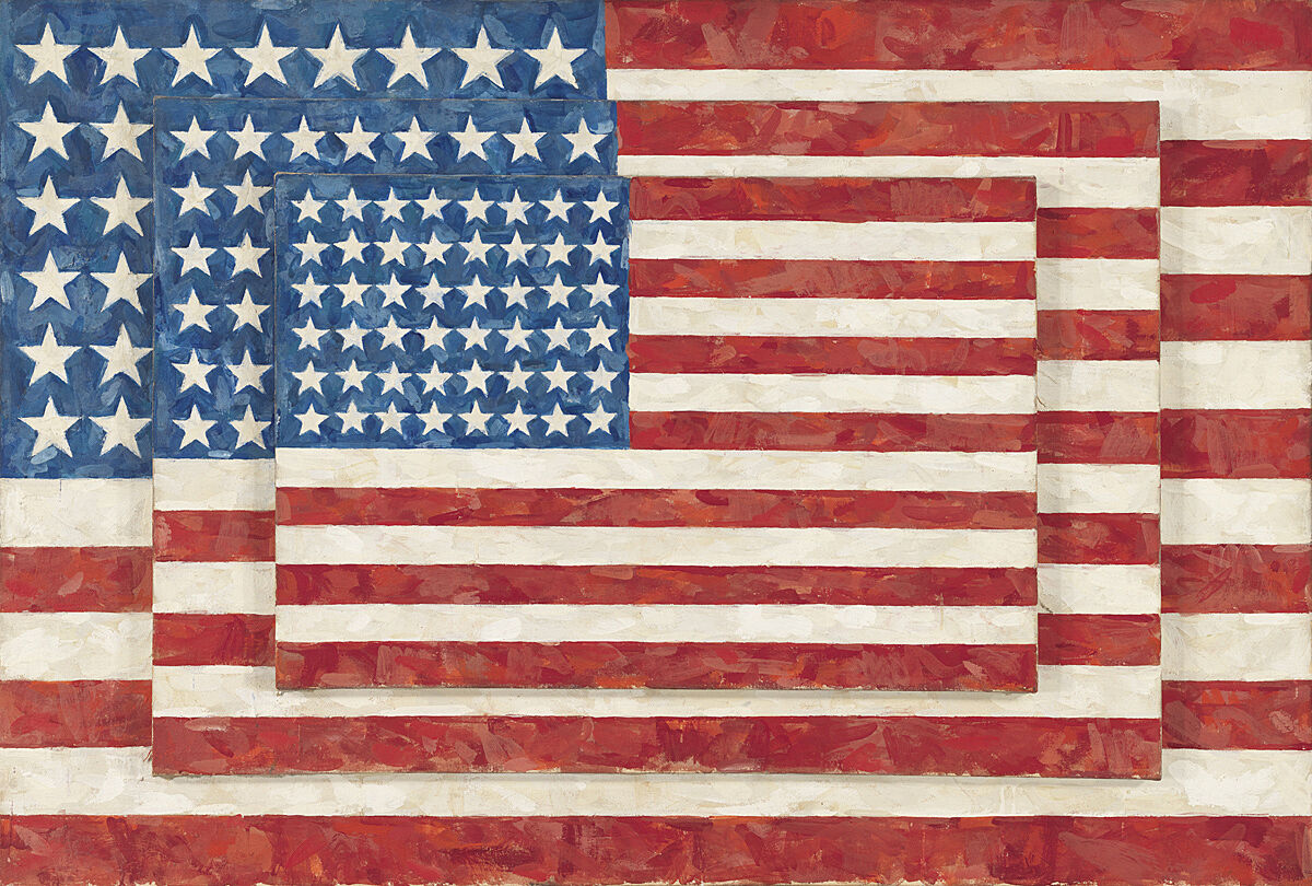
-
704
Kay WalkingStick, April Contemplating May, 1972
Audio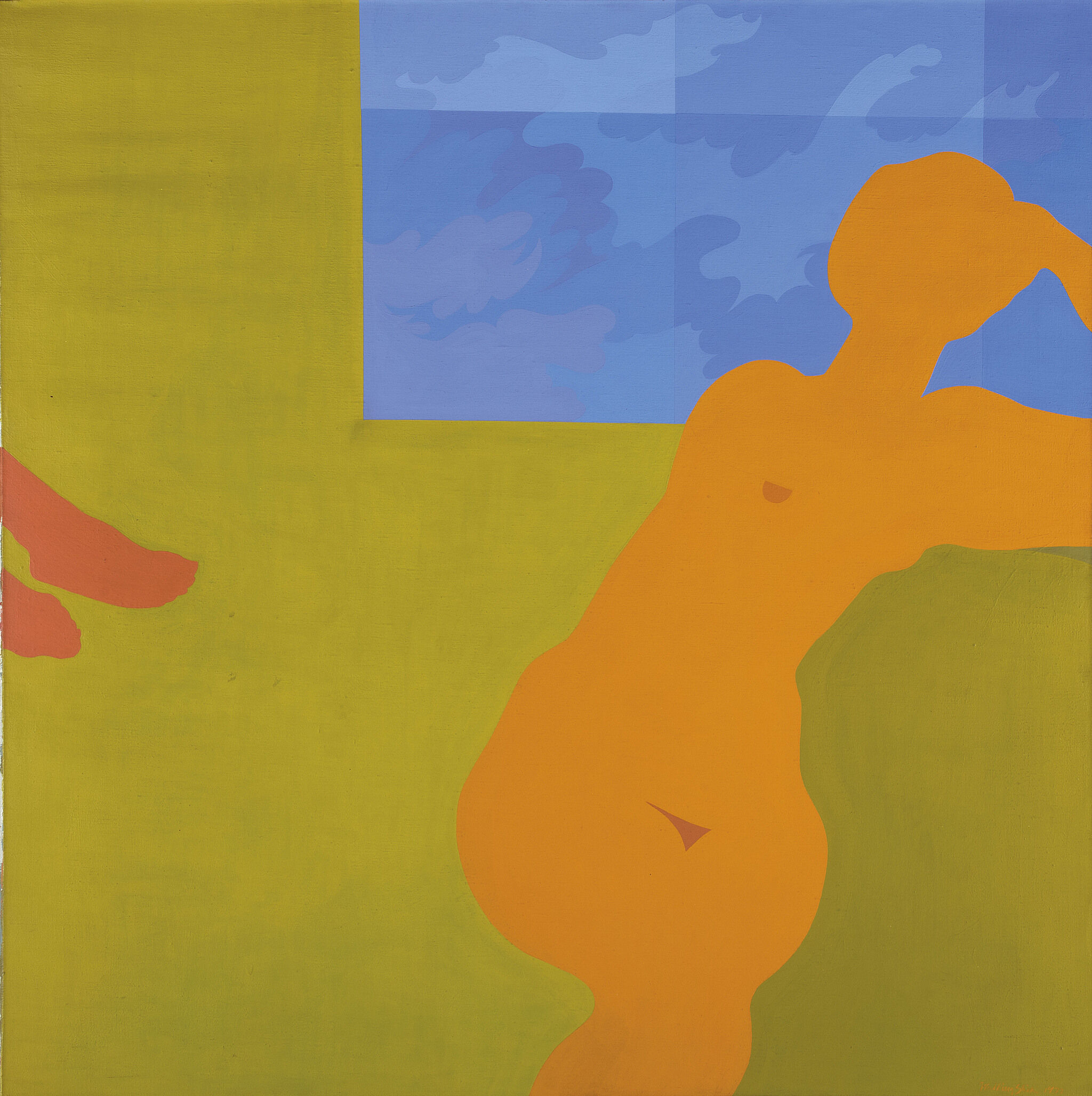
-
710
Robert Henri, Gertrude Vanderbilt Whitney, 1916
Audio, Kids, ASL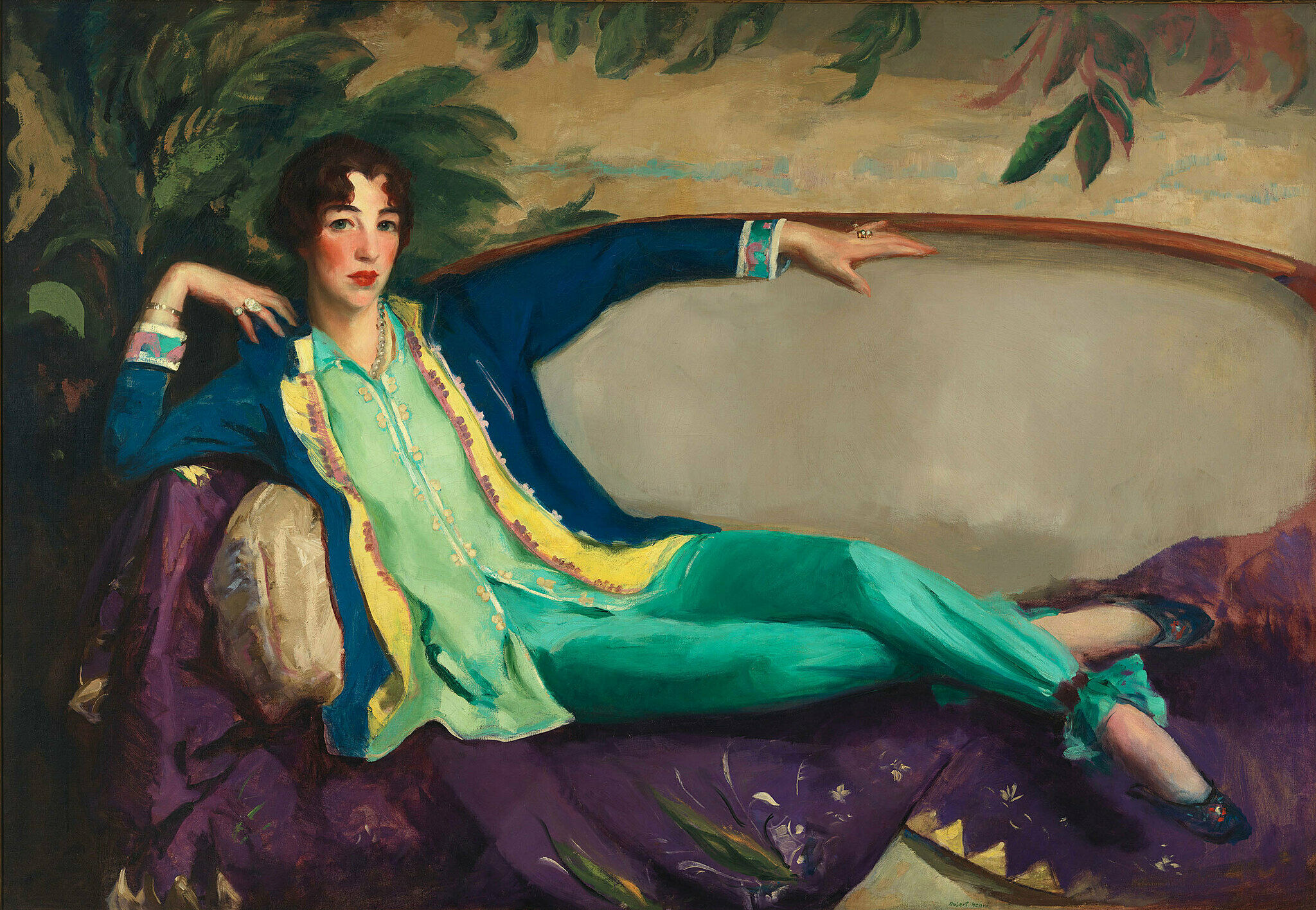
-
711
Edward Hopper, Early Sunday Morning, 1930
Audio, Kids, ASL, Verbal description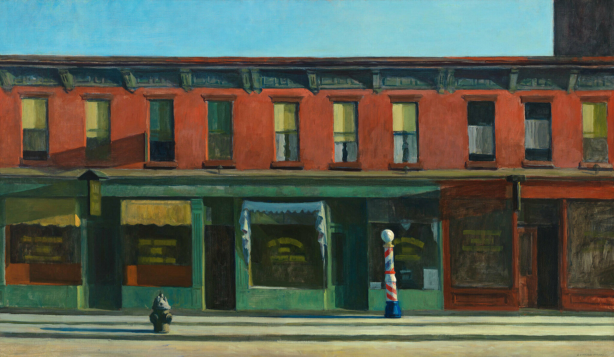
-
712
Arshile Gorky, The Artist and His Mother, 1926–36
Audio, ASL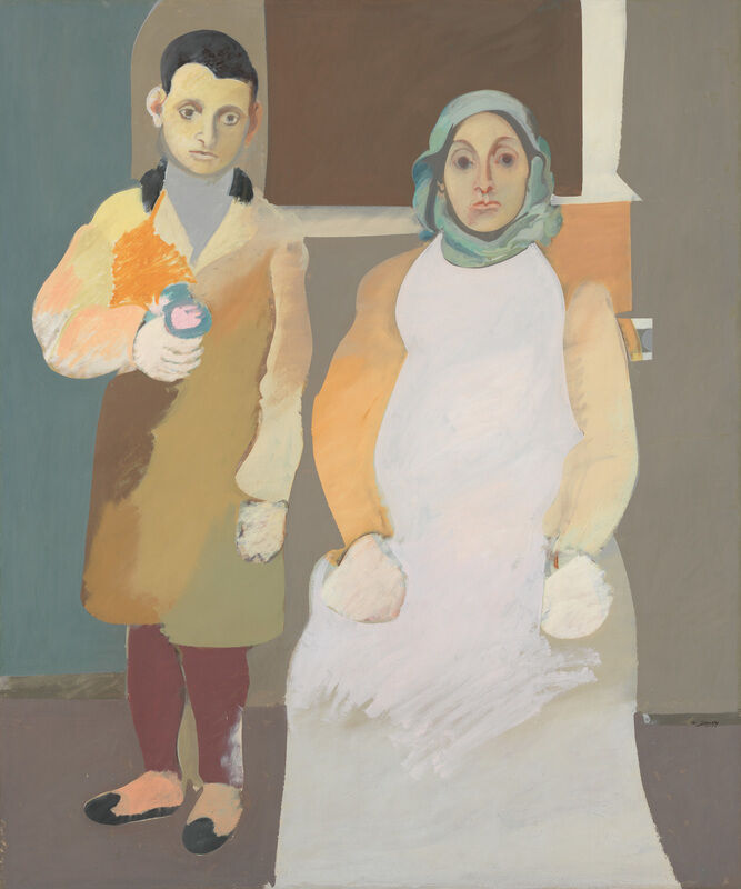
-
713
Alice Neel, Andy Warhol, 1970
ASL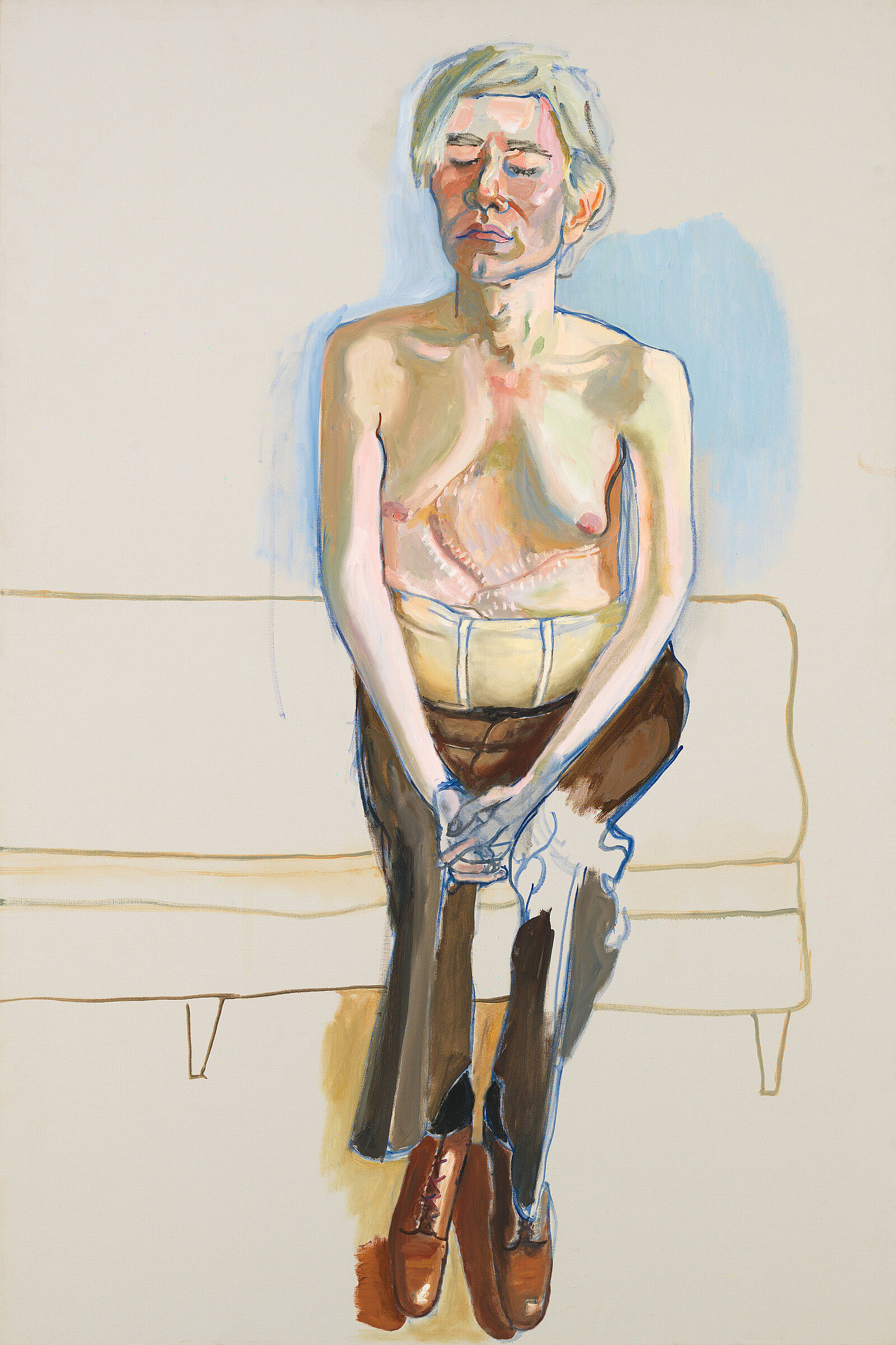
-
714
Archibald John Motley Jr., Gettin' Religion, 1948
Audio, Verbal description, ASL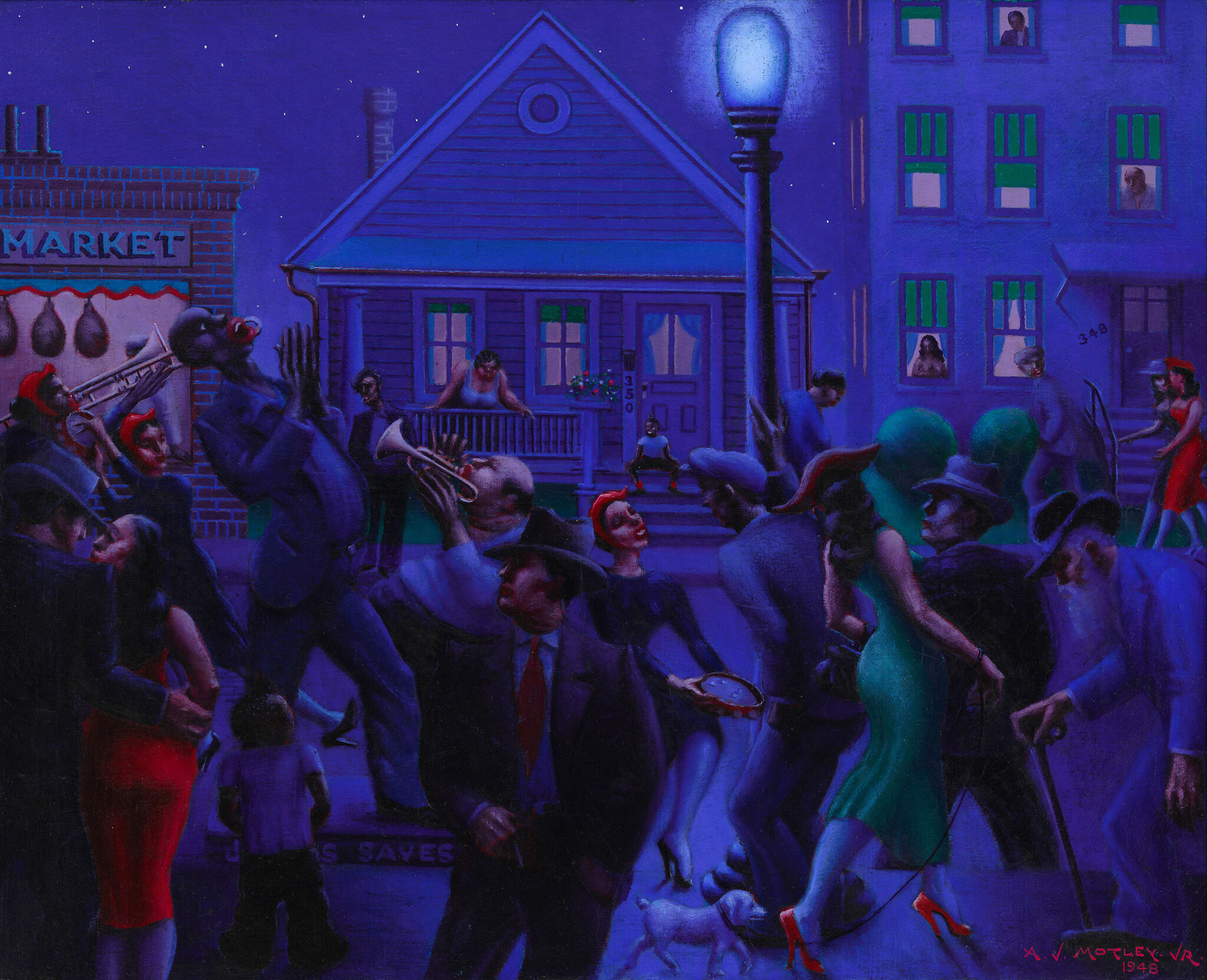
-
715
George Bellows, Dempsey and Firpo, 1924
Audio, ASL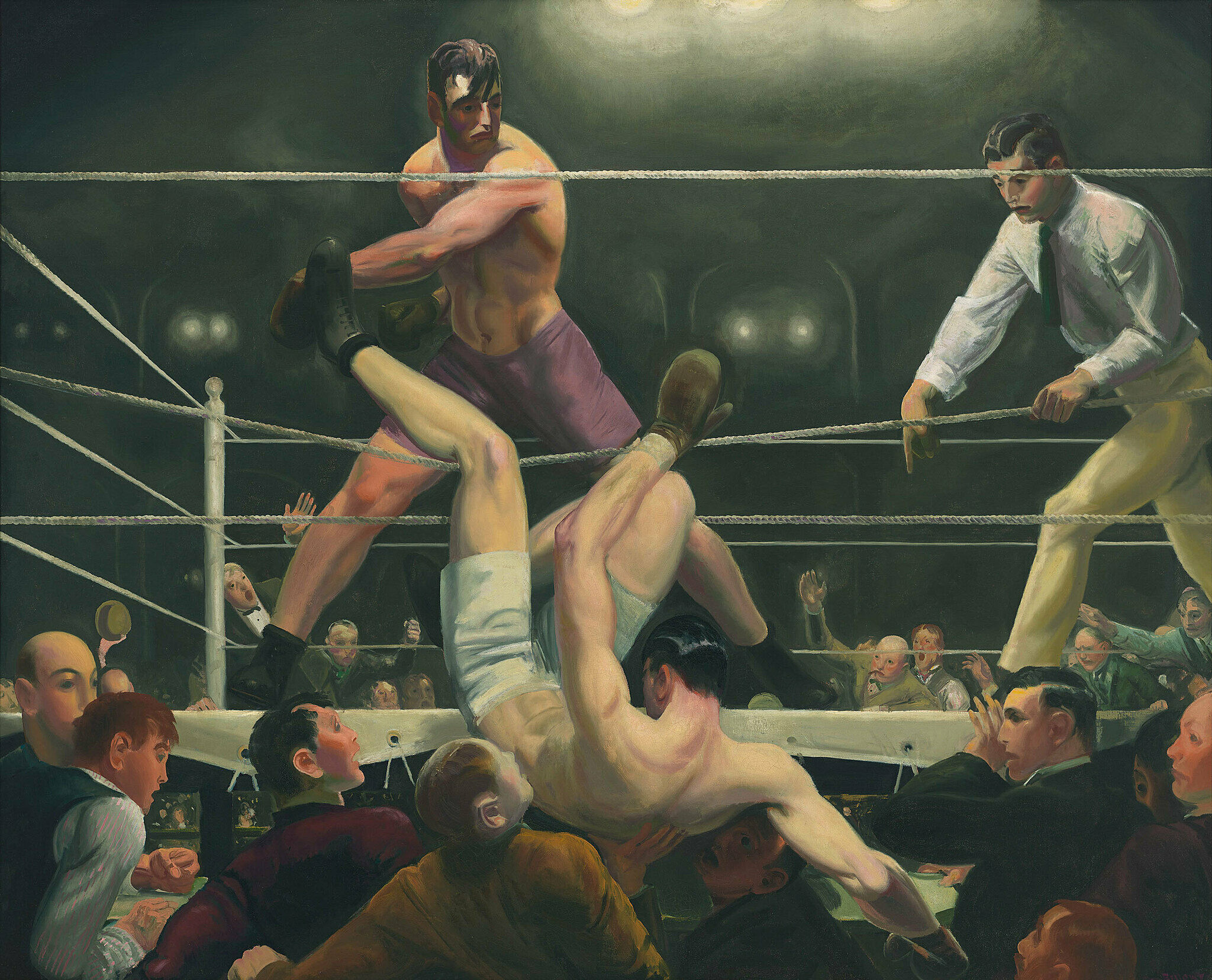
-
716
Isamu Noguchi, Humpty Dumpty, 1946
Kids, Verbal description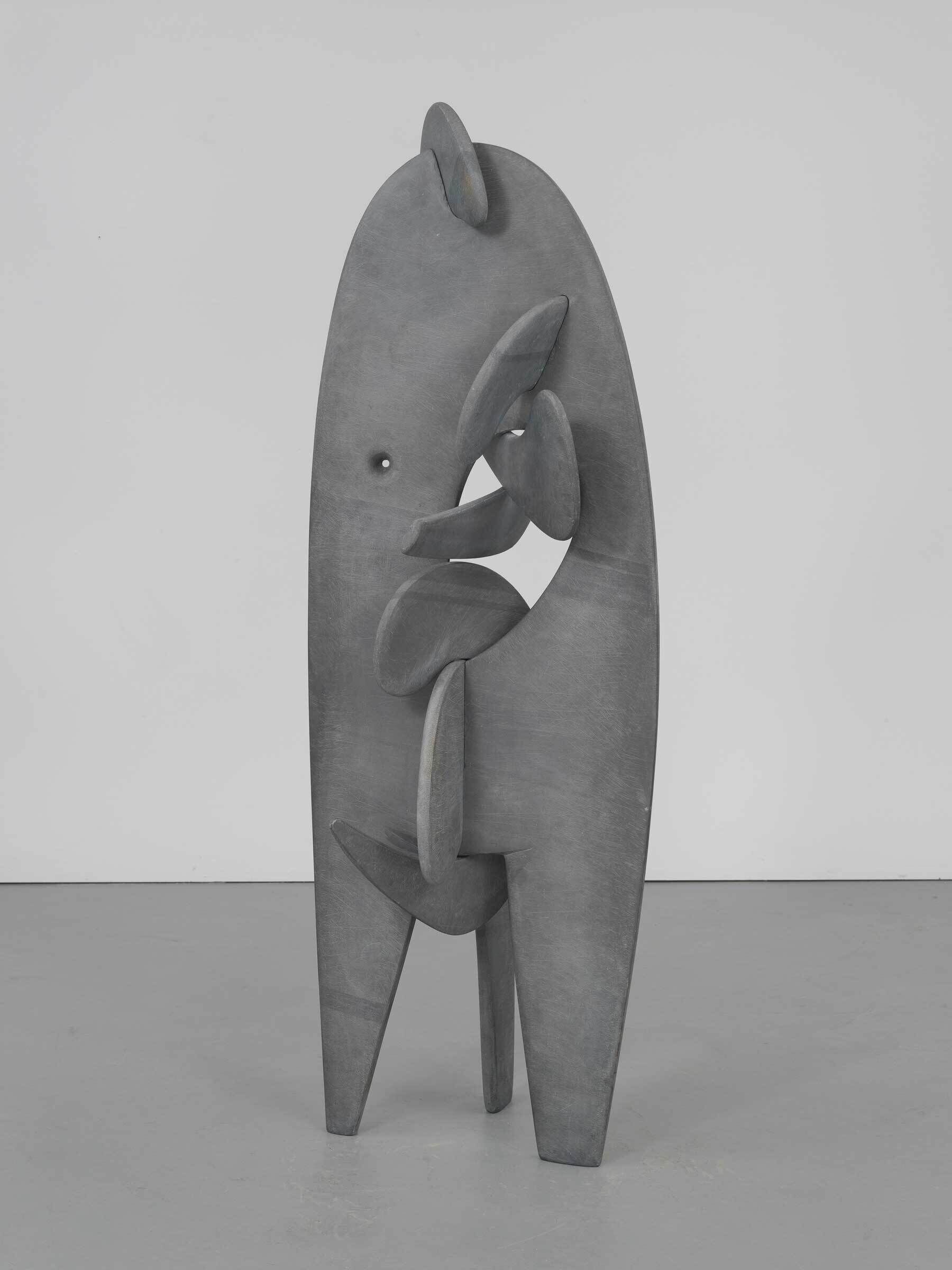
-
717
Georgia O’Keeffe, White Calico Flower, 1931
Audio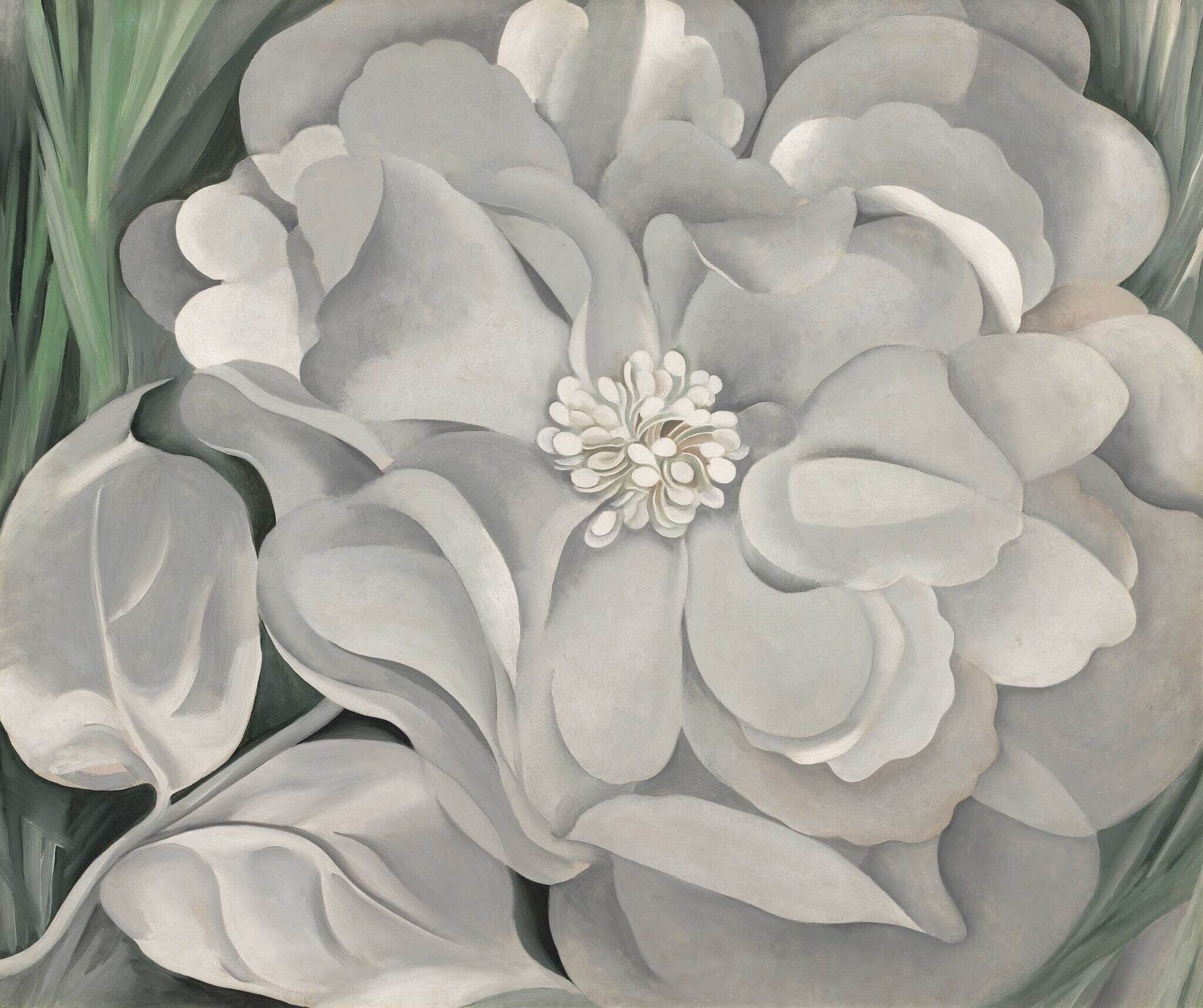
-
718
Richmond Barthé, African Dancer, 1933
Audio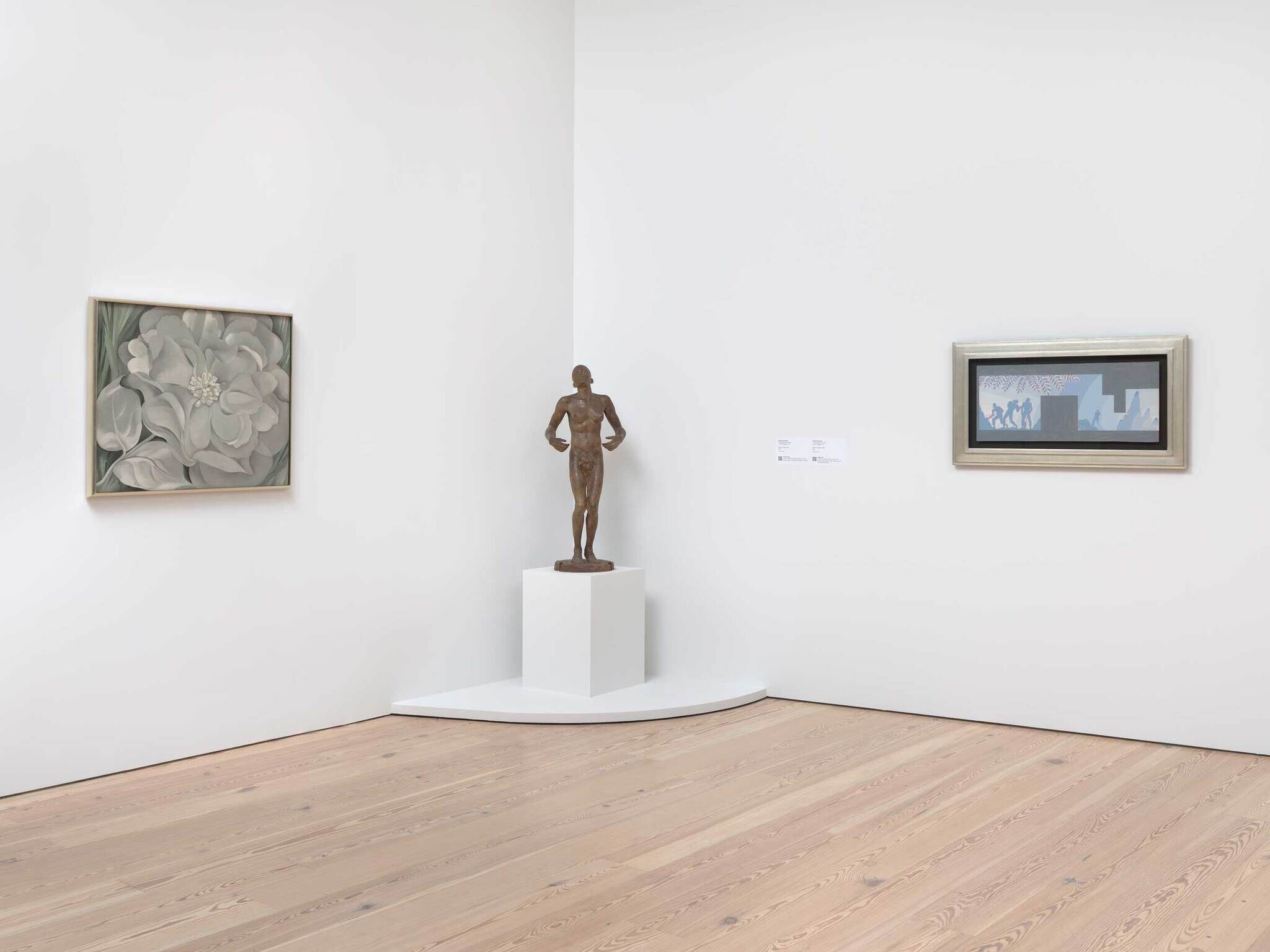
-
719
Elsie Driggs, Pittsburgh, 1927
Audio, Kids, ASL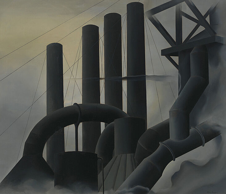
-
720
Joseph Stella, The Brooklyn Bridge: Variation on an Old Theme, 1939
Audio, Kids, ASL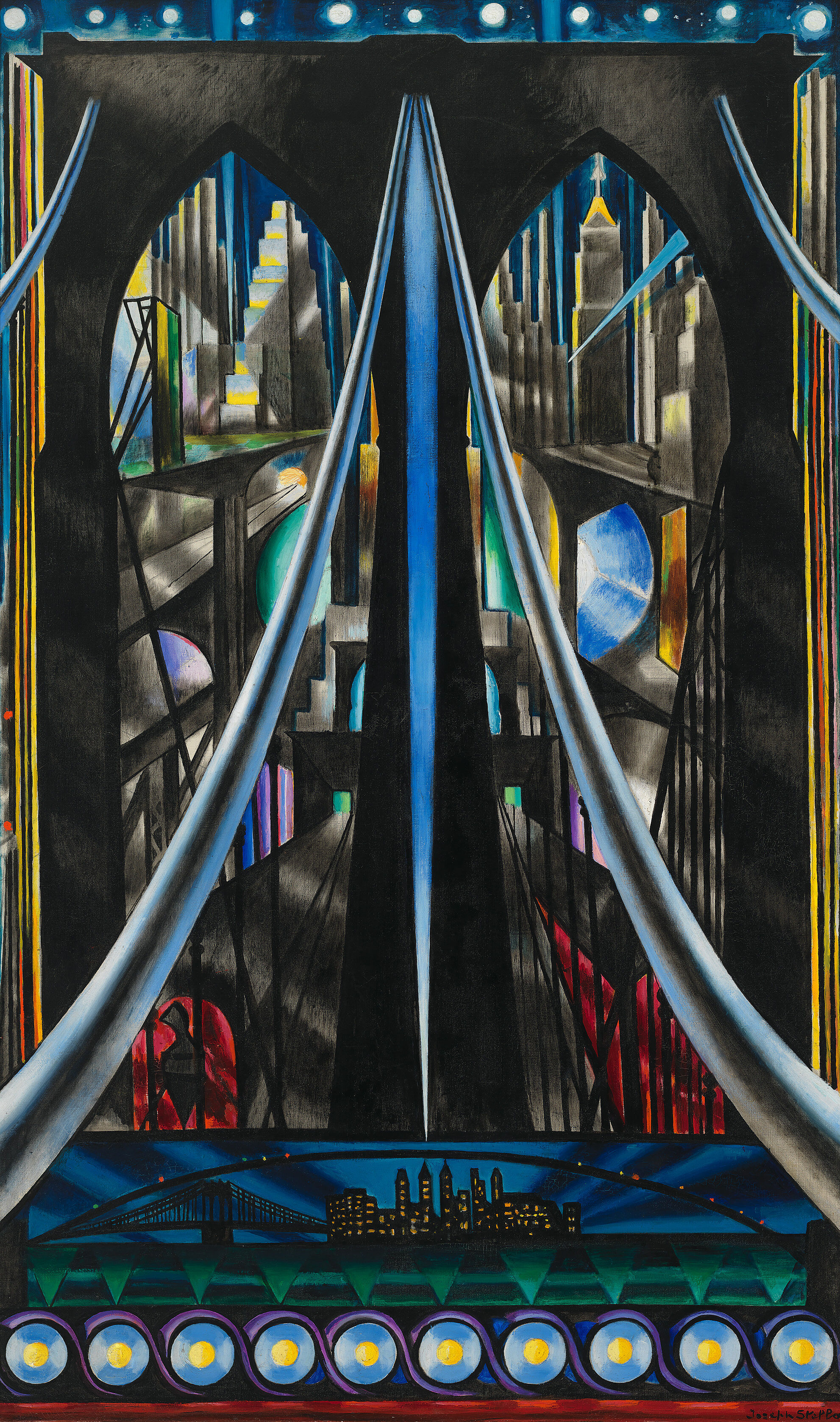
-
721
George Tooker, The Subway, 1950
Kids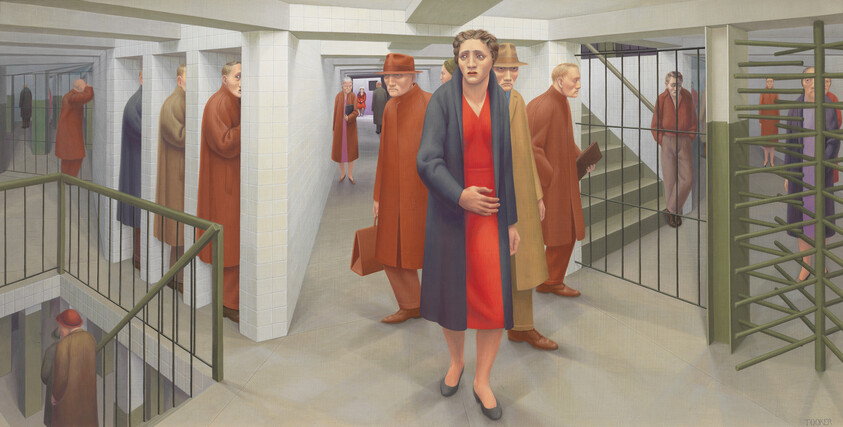
-
722
Fritz Scholder, Massacre at Wounded Knee II, 1970
Audio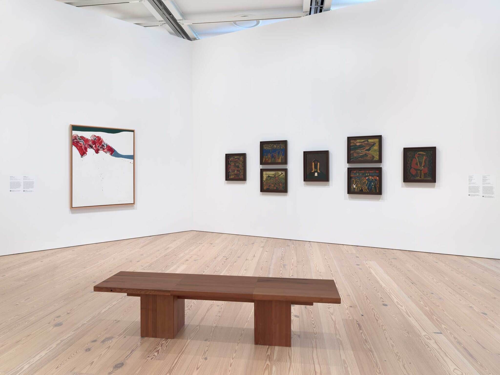
-
723
Jacob Lawrence, War Series, 1946
Audio, Kids, ASL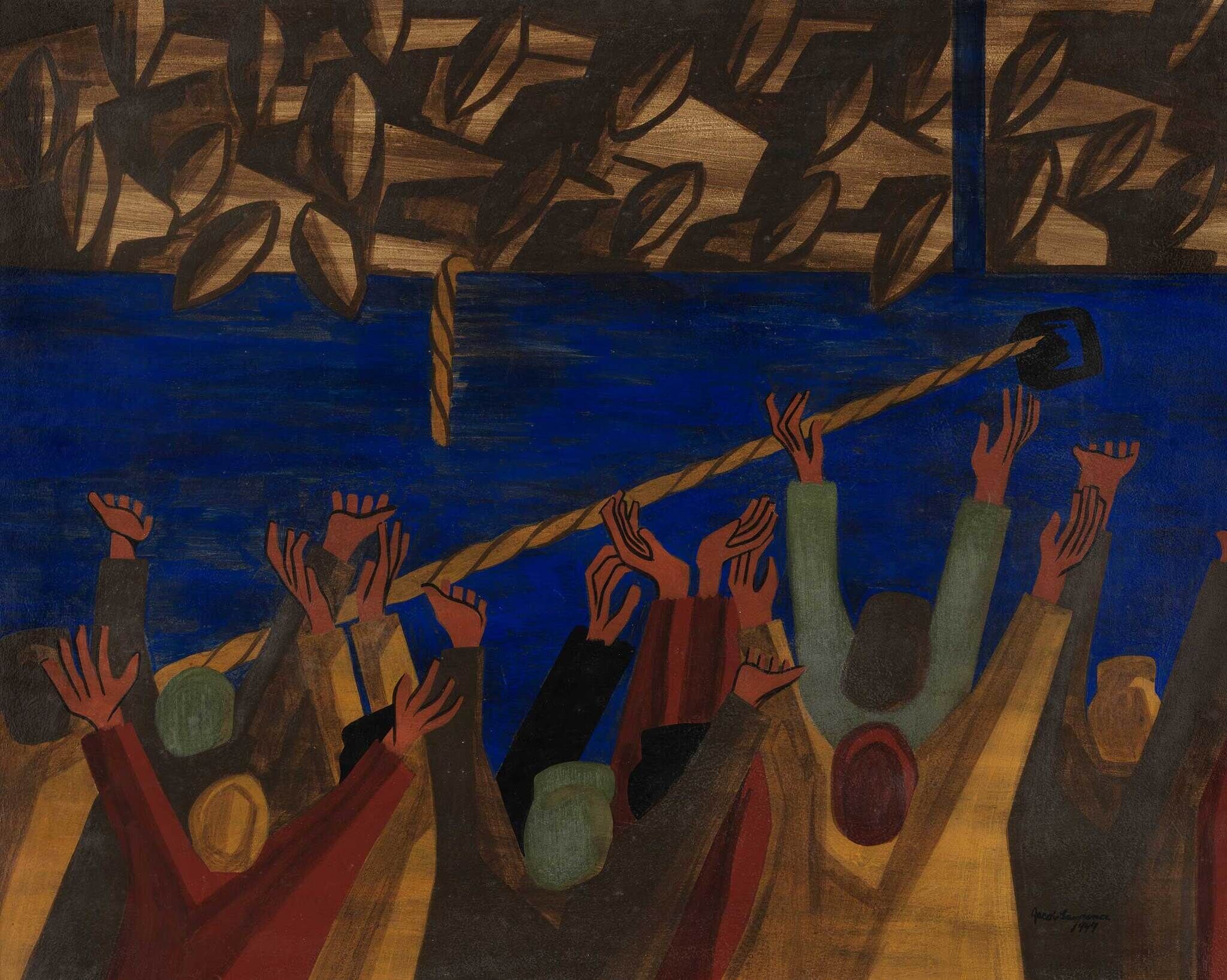
-
731
Jean-Michel Basquiat, Hollywood Africans, 1983
Audio, Kids, Verbal description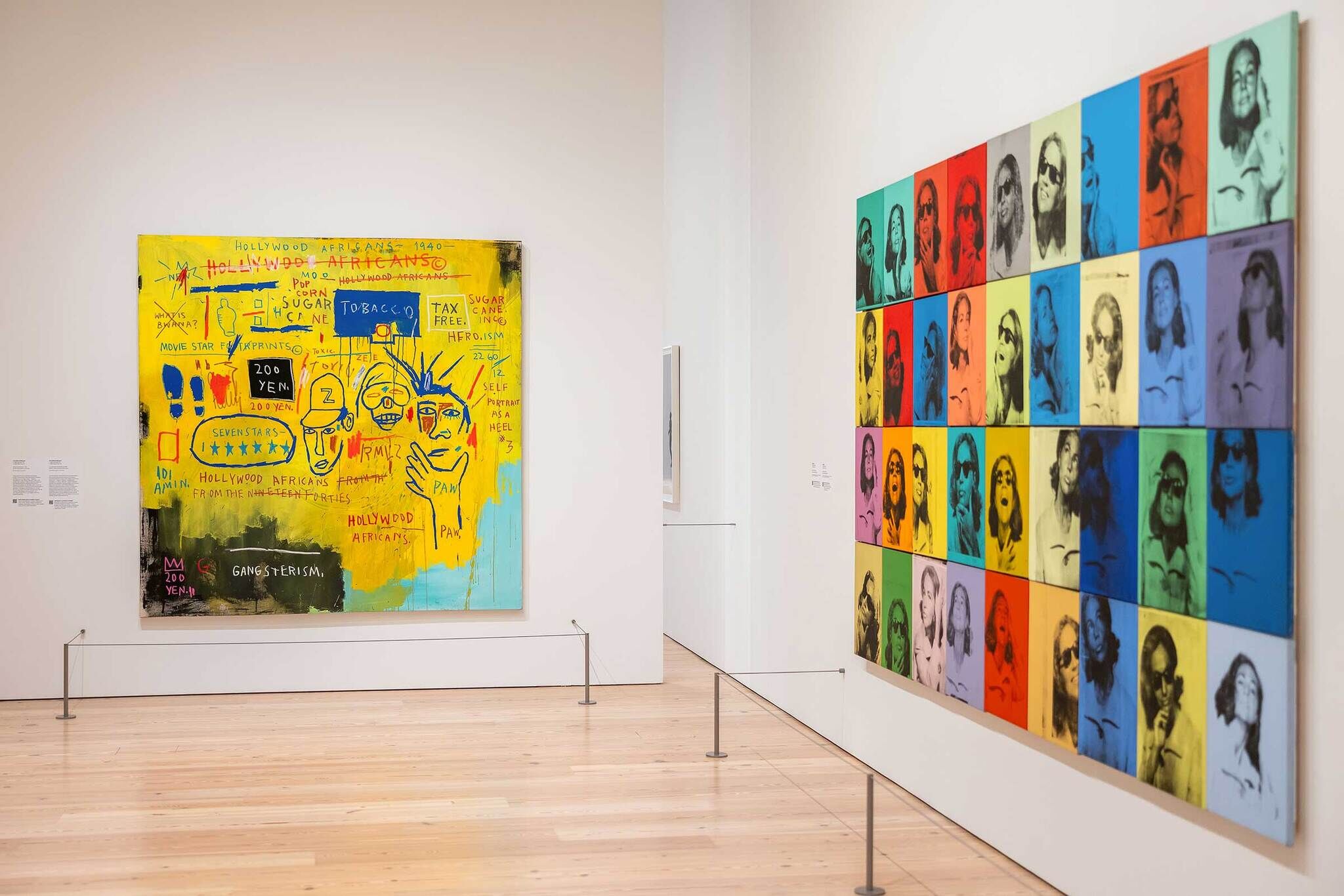
-
732
Andy Warhol, Ethel Scull 36 Times, 1963
Audio, Verbal description, ASL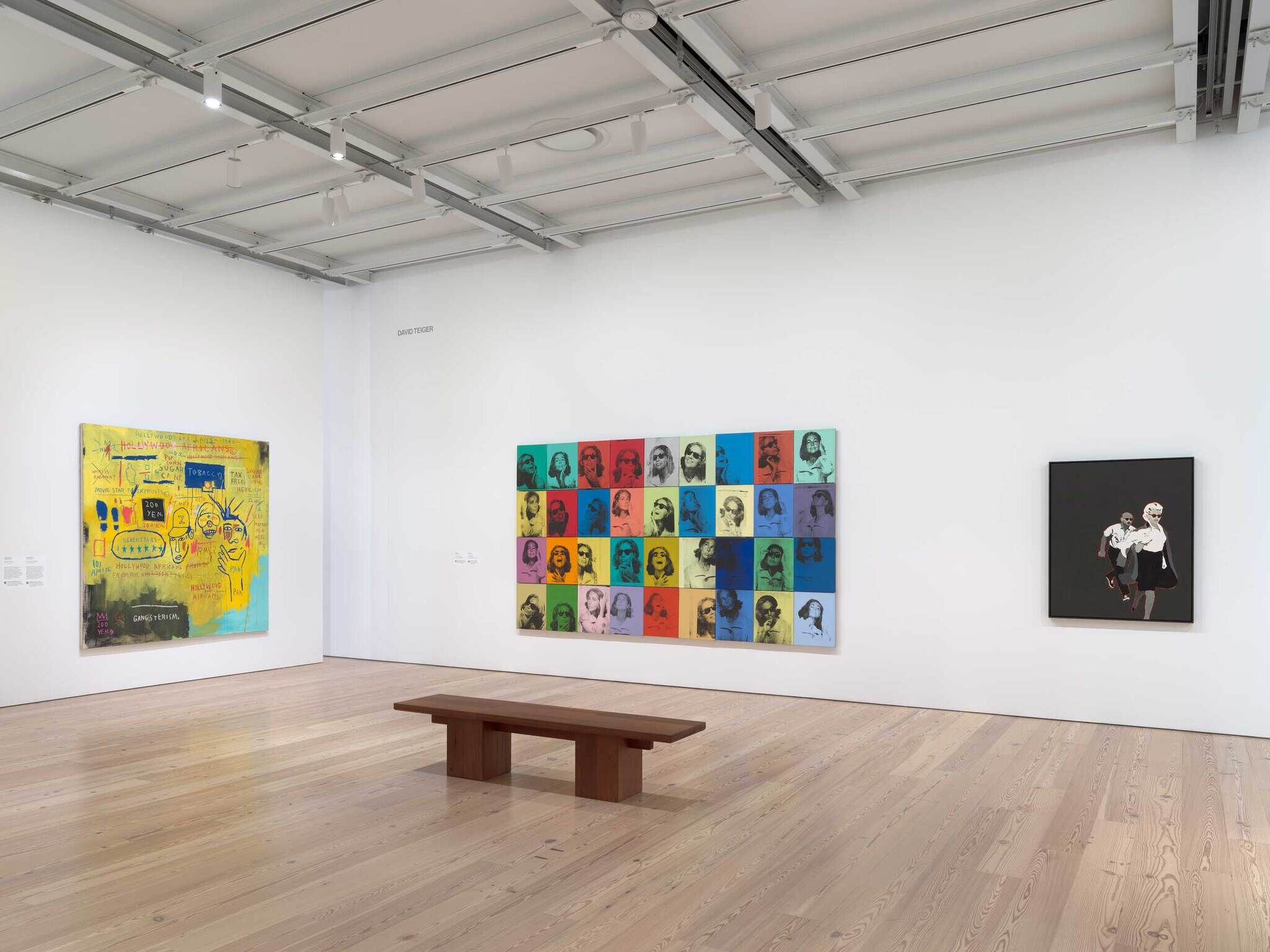
-
733
Rosalyn Drexler, Marilyn Pursued by Death, 1963
Audio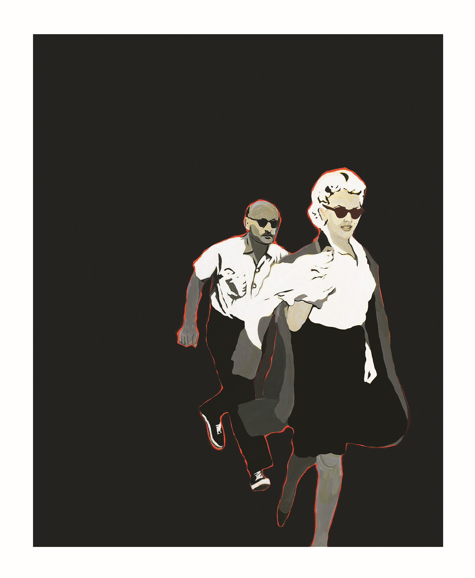
-
734
Edward Ruscha, Large Trademark with Eight Spotlights, 1962
ASL
-
741
Norman Lewis, American Totem, 1960
Audio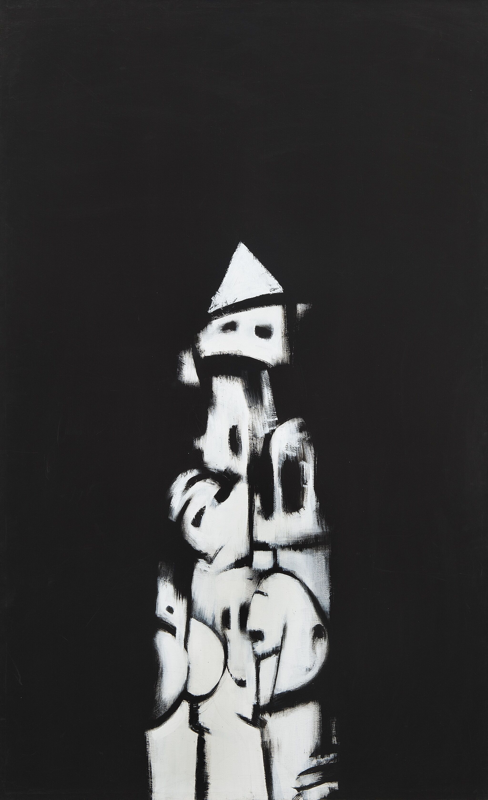
-
742
Jay DeFeo, The Rose, 1958–1966
Audio, Kids, ASL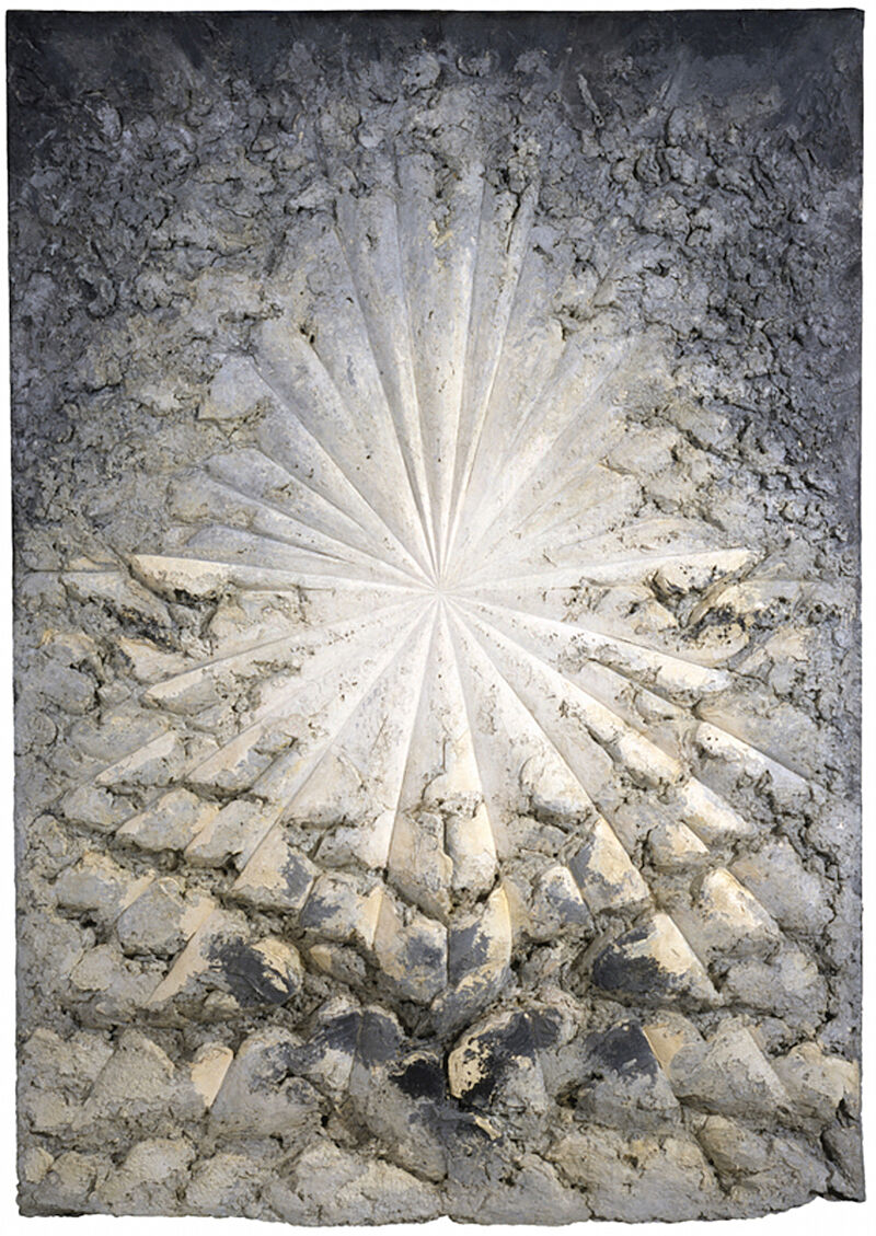
Lauren Haynes: So this work, Mars Dust, was created in 1972.
Narrator: Lauren Haynes is a curator based in New York. In 2015 she discussed this work by Alma Thomas as part of a series of gallery talks at the Whitney, called 99 Objects. You can listen to all of these lectures on our website.
Lauren Haynes: With this work, which has the cobalt blue and the darker blue underlay with the red bands that she made using an elastic band to sort of create the layers. And the different levels of red are her interpretation. I think of dust and this dust storm and this very overwhelming way that the color red is taking over this canvas and how the dust sort of took over Mars, which we know as the red planet.
In 1969, around the Apollo space missions, when we sent the first American astronauts to the moon, and there was a whole series of different landings and explorations, Alma Thomas got very caught up in that. She was really interested in this idea of space, but also the way that technology opened the door for everyone to be able to see what was going on. She has a really great quote: “Today not only can our great scientists send astronauts to and from the moon to photograph its surface and bring back samples of rocks and other materials, but through the medium of color television, all can actually see and experience the thrill of these adventures. These phenomena set my creativity in motion.”
Narrator: Alma Thomas called this painting Mars Dust. Can you imagine why? Maybe you’ve heard that Mars is sometimes called the Red Planet. Under the right conditions, you can even see its color without a telescope! When Thomas made this painting in 1972, it had just recently become possible to take photos of Mars up close. Some of the pictures showed windstorms of red dust swirling over the surface of the planet. Thomas found these images fascinating. Does knowing that change how you see the painting? Notice the way the red marks seem to hover over the background, and the different shades of blue that she has used here. Do you see motion in the composition? And if you do, how would you describe it? If you came here with someone today, tell them what you think!
Alma Thomas, Mars Dust, 1972. Acrylic on canvas, 69 1/4 × 57 1/8 in. (175.9 × 145.1 cm). Whitney Museum of American Art, New York; purchase with funds from The Hament Corporation 72.58. © 2024 Estate of Alma Thomas (Courtesy of the Hart Family) / Artists Rights Society (ARS), New York
Narrator: Like a mirage, a deer skull hovers in the sky above wildflowers. The artist, Georgia O’Keeffe, didn’t like to explain her paintings. To her, they were simple records of what she saw around her. Walking in the desert, she collected bones that had been bleached by the New Mexico sun.
Georgia O'Keeffe: The bones do not symbolize death to me. They are shapes that I enjoy. It never occurs to me they have anything to do with death. They are very lively. They please me. And I have enjoyed them very much in relation to the sky.
Narrator: O’Keeffe, who began her career in New York, eventually began living in the American Southwest in 1929.
Georgia O'Keeffe: When I got to New Mexico that was mine. As soon as I saw it that was my country. I’d never seen anything like it before but it fitted to me exactly. Like something that’s in the air—it’s just different. The sky is different, the stars are different, the wind is different.
Narrator: Georgia O’Keeffe’s Summer Days is a vertical oil painting on canvas. It is about 3 feet tall by 2.5 feet wide. The paint handling is smooth and even across the surface of the work. It depicts a large deer skull with antlers and a bouquet of wildflowers floating in the clouds above a mountainous desert landscape.
A nearly life-sized skull dominates the work. The head is tilted forward — so that the viewer sees its top—and is painted in creamy white and beige tones. O’Keeffe paid particular attention to anatomical detail, such as eye sockets, ridges along the snout, and a fissure that runs from above the eyes to the nasal cavity, emphasizing the form’s symmetry. The skull is centered on the work’s vertical axis and stretches from the top edge of the canvas, which is grazed by the tip of its left antler, to just below the middle of the composition.
A few inches below the hollow nasal passage of the skull, there is a loosely arranged bouquet of five flowers. A red bloom floats on the clouds beneath the skull, and two pink and two yellow flowers stretch diagonally up toward the right, with the upper petals of the topmost yellow blossom at the same height as the skull’s nose.
The skull and the flowers appear to rest weightlessly atop the clouds, which are rendered in a soft white tinged with subtle grays and fill the composition from left to right. It is only in the bottom fifth of the canvas, beneath the flowers, that blue sky starts to peek through the clouds, just above the mountains. The undulating landscape, painted in a range of earthly orange hues, stretches across the bottom of the composition from left to right. The mountains appear to be far in the distance, occupying only a few inches of the lower register of the painting.
Georgia O'Keeffe, Summer Days, 1936. Oil on canvas, 36 1/8 × 30 1/8 in. (91.8 × 76.5 cm). Whitney Museum of American Art, New York; gift of Calvin Klein 94.171. © 2019 Georgia O'Keeffe Museum / Artists Rights Society (ARS), New York
Narrator: In Three Flags—as in the other works in this room—Johns pictures what he called a “thing that the mind already knows.” And yet the paintings themselves can be quite surprising due to the ways he approaches his subjects. For example, it’s always worth looking closely at the surfaces of the works.
Scott Rothkopf: He used his signature technique of encaustic and newspaper collage, which you can see if you look up close.
Narrator: Scott Rothkopf.
Scott Rothkopf: Encaustic was a pretty unusual medium when Johns started using it in the 1950s. It’s basically hot wax that the artist warms on a plate with pigment mixed in. Then, he would paint it onto the surface while it was still warm, and it would dry very quickly on the canvas in a way that congealed or froze the mark almost like a sculpture on the surface. This was really different than, say, painting with oil, where the brush strokes might mush into one another and take a long time to dry.
Narrator: Johns liked the way that this process recorded his activity as a painter, emphasizing the act of making—and not just the finished result.
Mark Joshua Epstein: This is a painting called Three Flags that was made in 1958, by the artist Jasper Johns.
Student 1: It looks like since there are a lot of layers of the American flag, maybe it’s showing that there are a lot of different kinds of people and things in America.
Student 2: Well, first it looks like an optical illusion to me because it’s big, small, and then smaller.
Student 3: I think the artist had this idea, like I’m going to make something with the American flag. They just thought it would look cool, they just stacked a couple of American flags on top of each other. I don’t think it has an actual meaning.
Mark Joshua Epstein: Jasper Johns talked about the American flag as something we see, but that we don’t look at. What do you think he meant?
Student 1: Well, we just kind of just take it for granted. Oh! We see that every day.
Student 2: I think they layered it to make it interesting, so you actually look at it closely and read what the sign says and learn about it and actually get into it, rather than just being oh! that’s the American flag. Next picture.
Jasper Johns, Three Flags, 1958. Encaustic on canvas (three panels), 30 7/8 × 45 3/4 in. (78.4 × 116.2 cm) overall. Whitney Museum of American Art, New York; purchase, with funds from the Gilman Foundation, Inc., The Lauder Foundation, A. Alfred Taubman, Laura-Lee Whittier Woods, Howard Lipman, and Ed Downe in honor of the Museum’s 50th Anniversary 80.32. © 2021 Jasper Johns / Licensed by VAGA at Artists Rights Society (ARS), New York
Kay WalkingStick: April Contemplating May is a, is a picture of two women in a space defined by color. And they are in color. Not white girls.
As I said, I was trying to create space, primarily through color. And certainly the placement of the feet pulls you back into a space, a kind of space. And then having the big blue painting behind her head pushes you a little bit further back.
And it’s in a space with a painting in the back called Pieces of Sky.
When you look at the painting, the sky changes from these bright lovely blues to these sort of gray, smoggy, sooty, whites, and blues.
This also has, for me at least, a suggestion of the importance of taking care of our environment. That this is our country, this beautiful place is ours to treasure and to take care of.
I think I was very happy at this point. I think I had a nice life, and I did have these questions going on in my mind about the American Indian Movement, and the feminist movement, and the so-called sexual revolution.
I was certainly raised with the idea that I was a Cherokee. Stand up straight, Kay, you’re a Cherokee. But I hadn’t really been involved in it, intellectually. So, that was playing a part too.
And that, inchworm green, I love. I just love [laughs] that color. And it's spring, which is, of course, because it's April contemplating May.
Kay WalkingStick, April Contemplating May, 1972. Acrylic on canvas, 49 7/8 × 49 7/8 in. (126.7 × 126.7 cm). Whitney Museum of American Art, New York; purchase with funds from the Painting and Sculpture Committee 2018.138. © Kay WalkingStick. Courtesy of the artist and the June Kelly Gallery
Scott Rothkopf: I'm Scott Rothkopf, the Alice Pratt Brown Director of the Whitney Museum.
This is a portrait of the Whitney's founder, Gertrude Vanderbilt Whitney, which was painted by Robert Henri in 1916. Around this time, Mrs. Whitney began to have a club for artists in New York called the Whitney Studio Club, and she would invite artist friends of hers like Henri to come to parties to see exhibitions, to take drawing classes.
She also happened to be an artist herself, so she cared a lot about the artists in her community that she wanted to support, whether that was financially or through public exhibition and attention.
Robert Henri was one of those artists, and he chose to paint Mrs. Whitney in a way that today could seem almost old fashioned, but at the time was very daring and even almost scandalous. At the time, you never would've portrayed a woman of this social station in pajamas. She wouldn't have been lying down like this with her arm outstretched in a kind of come hither pose and glance on her face.
And here we see her beckoning us as a very modern woman, a proud woman, a woman who is confident in her self-presentation, whether that has to do with her pose, the clothes she's wearing. This portrait was so scandalous at the time, in fact, that it couldn't even be shown in her home on Fifth Avenue. It had to hang in her studio where it would be seen by artists who, like her, understood what it meant to be alive in their time and open to new ideas.
Melanie Adsit: Let's take a look at this portrait. What can you tell me about this person from looking at her portrait?
Student: She looks regal and powerful.
Student: She was lounging on a couch. You can see that she has a lot of jewelry on like rings, bracelets, and necklaces.
Melanie Adsit: I love these observations. This is actually a portrait of Gertrude Vanderbilt Whitney who was the founder of the Whitney Museum of American Art. She was, like you said, a wealthy woman. Something interesting about this is this was painted in 1916. Is this what you would expect a woman who was this wealthy or fancy to be wearing in 1916?
Student: Definitely not.
Melanie Adsit: What might we expect a woman of her social status to be wearing in 1916 instead of this?
Student: Definitely a dress or gala wear, something fancy and extravagant.
Melanie Adsit: Mrs. Whitney was also an artist, and in 1916, it was not traditional for women to wear pants but it was also not traditional for women to be artists. Just like you said, she is not only wealthy and powerful, she's also showing herself as someone who's kind of an independent thinker and maybe a little bit ahead of her time.
Student: She’s really rebelling against what she's supposed to be doing.
Student: I also think maybe she made this portrait because around that same time, there was the women were fighting for equal rights. So maybe she was trying to show that women can be whatever they want, they can do whatever they want.
Melanie Adsit: One of the reasons I loved this portrait is because it's showing not just what Mrs. Whitney looked like, but really what she represented. That's kind of the spirit of the Whitney Museum as well, that we show art that's maybe a little bit ahead of its time just like she was ahead of her time for wearing pants.
Robert Henri, Gertrude Vanderbilt Whitney, 1916. Oil on canvas, 49 15/16 × 72in. (126.8 × 182.9 cm). Whitney Museum of American Art, New York; gift of Flora Whitney Miller 86.70.3
Narrator: Hear artist and illustrator Art Spiegelman talk about this painting.
Art Spiegelman: Hopper's a regionalist and I've always liked the American regionalists like Reginald Marsh and Grant Wood. But the region that Hopper occupies is basically the desolate inner landscape of America.
And in Early Sunday Morning, I also was aware of how thoroughly related this is to my medium, comics. You know the word comics is kind of a misnomer and in Portuguese, I've discovered, they are called quadrenos, little boxes. And basically Hopper's a painter of little boxes. He takes his little box, he subdivides it into other boxes.
So I think of Early Sunday Morning as a comic strip before the Sunday sun comes up. The boxes before they're fully inhabited. Some people sleeping, some people just sort of brushing their teeth, at best. The stores not activated and therefore full of a kind of sad potential.
It looks like the barbershop pole is sort of already tipping its bulb to the little fire hydrant. It's kind of like the CP3O and R2D2 of 1930. This kind of mechanized urban, but very alive, possibly as least as alive as the people living behind those windows might be creatures.
And it kind of makes a mournful song, even though it's morning.
Mark Joshua Epstein: This painting is called Early Sunday Morning and it was made by Edward Hopper. What do you notice about it?
Student 1: Well, it looks like everything is closed, and all the shops and the windows are closed, and it doesn’t look like anybody is on the street.
Student 2: I think that it also really looks like a morning because of the way that the shadows are long.
Student 3: It shows the stillness of the morning when the sun just comes up, everybody is still in bed.
Student 4: I’m wondering if, I think the words were blurred on purpose to let you imagine what the shops would be.
Mark Joshua Epstein: Edward Hopper said that this painting was based on a part of Seventh Avenue, which is a north-south Street in New York, and I’m wondering if anyone notices something funny about the shadows.
Student 1: When the sun rises like east-west and when the street’s sky is north-south, it’s kind of weird, because you think the shadows would be going horizontally rather than vertical.
Mark Joshua Epstein: Does anyone think it’s possible that this painting is a result of a combination of observation with imagination?
Student 1: I think yes because the shadows aren’t very realistic. It’s like realistic but then some things are like a little bit off, almost.
Narrator: All you’re looking at here is a block of brick storefronts with apartments above them. The title, Early Sunday Morning, may explain the emptiness of the street, but it can’t explain the emotional pull of the painting.
When Edward Hopper made this image in 1930, he based it on a real street he knew—Seventh Avenue South in Greenwich Village. But he’s made it look like any main street in any small town anywhere in America. Notice the storefront windows. They have lettering on them, yet Hopper doesn’t let you make out what the letters say. Hopper is an artist of universals, not particulars; he doesn’t want to be that specific.
Now look up at the windows on the second floor. Begin at the left. A yellow shade is drawn; another is half raised; further along, some of the windows are covered with darker window coverings; to the right, a few more have decorative curtains. Each is slightly different, hinting at a life being lived beyond our view. In this small detail, Hopper makes us acutely aware that the people are missing from the picture. As a result, the painting communicates a sense of loneliness.
At the upper right corner of the canvas, a small dark rectangle rises above the building—the suggestion of a skyscraper in the background. It doesn’t catch your eye at first, but once you notice it, the tall building changes the whole picture. A threat overshadows the otherwise quiet street. Sooner or later the juggernaut of commerce and technology will eradicate a small-town way of life.
Edward Hopper, Early Sunday Morning, 1930. Oil on canvas, 35 3/16 × 60 1/4 in. (89.4 × 153 cm). Whitney Museum of American Art, New York; purchase with funds from Gertrude Vanderbilt Whitney 31.426. © Heirs of Josephine N. Hopper/Licensed by VAGA, New York, NY
Narrator: This painting of artist Arshile Gorky and his mother is based on a photograph from 1912. A few years after the photo was taken, Gorky and his family were among more than a million ethnic Armenians who were victims of the Armenian genocide. The artist and his sister survived the ordeal. Geoffrey Hartman was a Professor of Comparative Literature at Yale University.
Geoffrey Hartman: We know that this painting was done when the mother was dead. She died close to him, he says in his arms of starvation when he was, then he would have been, what, sixteen years old.
It's clear in the picture that there may have been some, a painting of actual hands, at least the right hand. But there does seem to be a violence in erasing the two hands. So I am struck by the muteness here. If you wanted to bring that muteness back to the actual features of the painting, you would probably mention the very tightly closed mouths.
Of course, we know that trauma often produces muteness. Sometimes psychologists call it elective silence, often especially in the young child. There's a refusal to speak or a difficulty of speaking.
Arshile Gorky, The Artist and His Mother, 1926-c. 1936. Oil on canvas, 60 × 50 1/4 in. (152.4 × 127.6 cm). Whitney Museum of American Art; gift of Julien Levy for Maro and Natasha Gorky in memory of their father 50.17 © 2017 The Arshile Gorky Foundation/Artists Rights Society (ARS), New York, NY
Alice Neel, Andy Warhol, 1970. Oil and acrylic on linen, 60 × 40 in. (152.4 × 101.6 cm). Whitney Museum of American Art, New York; gift of Timothy Collins 80.52 © The Estate of Alice Neel
Davarian Baldwin: The entire piece is bathed in a kind of a midnight blue, and it gets at the full gamut of what I consider to be Black democratic possibility, from the sacred to the profane.
Narrator: Davarian Baldwin, the Paul E. Raether Professor of American Studies at Trinity College in Hartford, discusses Archibald Motley’s street scene, Gettin’ Religion, which is set in Chicago.
Motley had studied painting at the School of the Art Institute of Chicago. Here, he depicts a bustling scene in the city at night.
Davarian Baldwin: It really gets at Chicago's streets as being those incubators for what could be considered to be hybrid cultural forms, like gospel music that came out of the mixture of blues sound with sacred lyrics. You could literally see a sound like that, a form of worship, coming out of this space, and I think that Motley is so magical in the way he captures that. But the same time, you see some caricature here.
The gentleman on the left side, on top of a platform that says, "Jesus saves," he has exaggerated red lips, and a bald, black head, and bright white eyes, and you're not quite sure if he's a minstrel figure, or Sambo figure, or what, or if Motley is offering a subtle critique on more sanctified, or spiritualist, or Pentecostal religious forms. You're not sure if he's actually a real person or a life-sized statue, and that's something that I think people miss is that, yes, Motley was a part of this era, this 1920s and '30s era of kind of visual realism, but he really was kind of a black surreal painter, somewhere between the steady march of documentation and what I consider to be the light speed of the dream.
Narrator: Gettin’ Religion, made in 1948, is a horizontal oil painting on linen. The painting is displayed in the Black Music section of the exhibit. It is a little over 2 feet tall and 3 feet wide. This night scene shows a lively cluster of people with different skin tones moving around a sidewalk. Some are playing music or strolling by while others watch from windows and a porch on the far side of the road. Some of the people can be identified as Black but not all. In the background from left to right there is a brick building labeled market, a house and an apartment building running from one edge of the painting to the other. The entire painting is bathed in a deep blue color, matching the rich blue of the night sky shown above the tops of the buildings, which is punctuated by tiny stars.
Just right of the center, a prominent street light reaches the top border of the painting and casts a bluish white glow onto the contours of bodies, faces, and the surfaces of the street and buildings. While there are no street signs that make this immediately evident, the painting is set in Bronzeville, Chicago. Motley was one of the first Black artists to attend the School of the Art Institute of Chicago. A patch of grass, a flower planter, and two round hedges give a neighborhood feeling to the scene. The people’s gender, ages, roles, and time period are strongly suggested by their clothing: men wear hats and suits, women wear knee length dresses with steep heels and children wear t-shirts and plain bottoms. The features of the people in the background are undefined yet expressive.
A central focal point of the foreground scene is a tall Black man, so tall as to be out of scale with the rest of the figures, who has exaggerated features including unnaturally red lips, and stands on a pedestal that reads “Jesus Saves.” This caricature draws on the racist stereotype of the minstrel, and Motley gave no straightforward reason for its inclusion. The artist’s ancestry included Black, Indigenous, and European heritage, and he grappled with his racial identity throughout his life. He may have chosen to portray the stereotype to skewer assumptions about urban Black life and communities, by creating a contrast with the varied, more realistic, figures surrounding the preacher. To his right on the platform there is a short, stout, light-skinned man playing a trumpet. Behind him at the left edge of the painting are two women wearing red hats and long sleeved dresses playing trombone and tambourine. Another woman dressed the same presents a tambourine with coins smiling at a man who leans against the street light.
In the foreground from left to right, the majority of the crowd moves along the sidewalk across the street from the buildings; a man stands with his arm around a woman, a child watches alone, a man with a red tie stands contrapposto with a cigarette in his hand. A woman in a singular green dress walks her small white dog. Another man creates a formal repetition with the man holding a cigarette as their profiles both face left. At the right edge of the painting an older man with a long white beard enters the frame walking with a cane.
Archibald John Motley, Jr., Gettin’ Religion, 1948. Oil on linen, 32 × 39 7/16 in. (81.3 × 100.2 cm). Whitney Museum of American Art, New York; purchase Josephine N. Hopper Bequest, by exchange 2016.15. © Valerie Gerrard Browne
Narrator: In 1923, artist George Bellows’ attended a boxing match on assignment for the New York Evening Journal. He made several drawings, on which this painting is based. The late writer George Plimpton described the painting.
George Plimpton: It shows Firpo, the Argentinian boxer--quite untutored, almost an amateur—in what is considered one of the most dramatic moments in fistic history, namely knocking the champion, Jack Dempsey, through the ropes. Dempsey was destroying Firpo when Firpo hit him with this left, as you can see and knocked him through the ropes. Dempsey was a killer. He was referred to as the Manassa Mauler. and simply destroyed people in the ring with him. It's the sort of painting that I think photography really does now.
It's overdramatic, this picture Dempsey was not a popular champion at all. He was famous for hitting low blows, hitting fighters when they were rising from the canvas. On this particular fight in the Polo Grounds everybody's sitting there—Babe Ruth, all these people, dignitaries. Great courses of booze. And I think they really wanted Firpo, this great amateur, to take him out. He was that unpopular, Dempsey was. Somewhat romanticized here, in Bellows' painting. Firpo looking like sort of a great god, looking indestructible tree-like limbs there, legs. And Dempsey of course looked like a beetle falling out of a tree here. But that wasn't the way it turned out, at all.
Narrator: The fight lasted only four minutes—and Dempsey was declared the winner. But the moment that became boxing legend was the one commemorated in this painting, when Firpo knocked Dempsey out of the ring.
George Bellows, Dempsey and Firpo, 1924. Oil on canvas, 51 1/8 x 63 1/4 in. (129.9 x 160.7 cm). Whitney Museum of American Art, New York; purchase with funds from Gertrude Vanderbilt Whitney 31.95
Mark Joshua Epstein: This is a sculpture by the artist Isamu Noguchi that’s called Humpty Dumpty.
Student 1: With the name Humpty Dumpty, it kind of looks like it is pieces, it used to be something flat and whole.
Mark Joshua Epstein: Isamu Noguchi was half Japanese. He had one parent who was Japanese and he lived in Japan until he was about thirteen years old. This sculpture was made just after World War II, which ended because parts of Japan were bombed. I'm wondering if anything thinks that, Humpty Dumpty, the title, has anything to do with this bombing of Japan?
Student 1: Well, I see maybe the artist, he was looking after World War II at the rubble of Japan and the people who had died in the bombing, and he saw that maybe their lives had kind of shattered metaphorically. I think that it is kind of like war, because even after a war might end, it leaves its mark.
Student 2: Well, I feel like it’s sort of a piece of paper when you crumple it up and then you uncrumple it, it’s wrinkled; you can't make it the same.
Narrator: The work Humpty Dumpty from 1946 by Isamu Noguchi is an abstract stone sculpture approximately 5 feet tall by 2 feet wide with a shallow depth of 17 inches. It is composed of five interlocking pieces, installed here standing on a triangular platform. There is one large, flat oblong form with two legs, and four smaller pieces, shaped like bones or boomerangs. Each piece has been slotted together to create a conjoined structure. There are two smooth holes in the center of the sculpture, one large and one small. Hanging around the top and middle of the main piece of stone are the smaller, flattened c-shaped pieces of slate that protrude from the larger hole, hanging vertically like links on a chain. The small hole is just wide enough for light to pierce, appearing like a single eye. The rounded edges of the stone parts give this sculpture a warm and almost animated quality that moves the eye throughout the composition. Noguchi carved this work out of ribbon slate, an especially fragile type of stone. The entire sculpture is a velvety matte grey with subtle variations in texture and color. While the sculpture has a front and back, it is meant to be experienced in the round.
To create this work, Noguchi first sketched shapes on graph paper, cut them out, and then arranged them into small models. He then used the excised paper to calculate the measurements required for enlarging and transferring elements to the final medium. Humpty Dumpty is held together without any screws or glue, and relies on tension between the interlocking pieces to stay upright, making the work susceptible to breaking if moved or jostled. As Noguchi explained, “everything I do has an element of engineering in it—particularly since I dislike gluing parts together or taking advantage of something that is not inherent in the material. I am leery of welding or pasting. It implies taking an unfair advantage of nature.”
The title of the work, and its precarious construction, evoke the character from the nursery rhyme of the same name. However, this seemingly whimsical work may carry more ominous undertones. Produced shortly after the devastation of the atomic bombs dropped on Hiroshima and Nagasaki by the U.S. during World War II, the sculpture suggests the unstable state of the world in the postwar period.
Isamu Noguchi, Humpty Dumpty, 1946. Ribbon slate, 59 × 20 3/4 × 17 1/2 in. (149.9 × 52.7 × 44.5 cm). Whitney Museum of American Art, New York; purchase 47.7a-e. © 2025 The Isamu Noguchi Foundation and Garden Museum / Artists Rights Society (ARS), New York
Wanda Corn: I've always thought that when O'Keeffe painted this work she was kind of having a tongue-in-cheek experience, because she had been known for her flower paintings in New York, which were always based on natural flowers.
Narrator: This flower was artificial. It was probably made out of calico by some of the Latina or Native American women who lived in O'Keeffe's adopted home of New Mexico. As she's painted it here, this fake flower seems as intensely real as anything that could be found in nature.
Art historian Wanda Corn.
Wanda Corn: If you look closely you'll see that no two petals are exactly alike. Each one bends or swerves or moves in and out of another set of petals in its own particularly unique way.
It's not only the flower that's special but also the way she uses white. These are whites which are sometimes tinted with pink, or with tan, or with gray. You'll again notice she never uses the same exact whiteness or the same tone of white for every petal.
She's absolutely fascinated with the structure of this flower. Probably also fascinated because it's an artificial flower! And somebody has done a beautiful job of making a calico flower as complicated and glorious as a natural one.
Georgia O'Keeffe, The White Calico Flower, 1931. Oil on canvas, 30 3/16 × 36 3/16 in. (76.7 × 91.9 cm). Whitney Museum of American Art, New York; purchase 32.26. © 2023 Georgia O'Keeffe Museum / Artists Rights Society (ARS), New York
Narrator: This sculpture of an African dancer is by the artist Richmond Barthé.
Margaret Rose Vendryes: He is the only African American sculptor of his era who worked on the nude. The only one. It was quite daring.
Narrator: Margaret Rose Vendryes was a painter and author of Barthé: A Life in Sculpture.
Margaret Rose Vendryes: There was almost a restriction on using the nude because of all of the difficulties that have come out of this sort of hypersexualization of Black people during that time. And so Barthé, he took some risks, and he leaned in on his classical training to say that the nude is the standard, and that Black figures should be represented within the standard.
Narrator: Barthé made a number of these African Dancers during the 1930s. Like this one, they all stand on a circular form.
Margaret Rose Vendryes: And that is an indication that it is a spotlight, that it's a stage performance. But of course, at least in New York, which is where he was when he made this, you would not have seen a performance of a near nude African woman on stage publicly. That would not have happened.
Narrator: Barthé never went to Africa, and would have based this figure on photographic research.
Margaret Rose Vendryes: I did a lot of research on when would a woman appear dancing with that kind of long covering on her? There are some celebrations and rituals where they're actually pieces of metal. So when they dance, there is a pretty loud sound that comes with it. But the closer you look at it, to me they look like leaves that are covered there. And that is a sign of a woman in mourning. And that matches up with the sort of possession, the posture of her head, the gesture on her face, that it does look like we are witnessing someone in mourning.
Installation view of “Untitled” (America) (Whitney Museum of American Art, New York, July 5, 2025-). From left to right: Georgia O’Keeffe, The White Calico Flower, 1931; Richmond Barthé, African Dancer, 1933; Aaron Douglas, Mural Study for Cravath Hall, Fisk University, 1929. Photograph by Ron Amstutz
Narrator: The factory you see in this painting seems ominous. Look at the four dark cylinders in the center. These are smokestacks, and the thin lines that fill the air around them are support cables. If you think of them only as geometric shapes, they might be beautiful. But as an image of industrialization, they’re gloomy and menacing. They suggest that all is not well in the brave new world of technology. Clouds of toxic fumes drift up from the bottom of the painting and across the sky.
The artist, Elsie Driggs, saw this factory, a Pittsburgh steel mill, on a train trip she took as a child. When she went back in l927 to make a painting, the owners of the mill refused to let her in. They were afraid she was a labor agitator. Anyway, they said, a factory was no place for a woman. Driggs later recalled, “By the time they decided I was harmless, I didn't care if I went in there anymore. But walking up toward my boarding house one night, I found my view. The forms were so close. And I stared at it and told myself, "This shouldn't be beautiful. But it is."
Narrator: Cough, cough, splutter, choke. It’s a little hard to breathe here, outside the factory.
Elsie Driggs made this somber painting of one of the many steel mills in Pittsburgh, Pennsylvania. She liked the cylinder shapes of the chimneys and tubes and thought they had a “cool and classical” beauty. But she wasn't allowed to look inside the factory—the owners told her it was no place for a woman. Instead she found a view from a hill just above the mills. What do you think about that?
Take a look at the colors that Driggs used to make this painting. Why do you think she chose them? What kind of environment is Driggs showing you? It’s pretty dirty, right? But when Driggs made the painting, people didn’t realize what a problem pollution was going to cause. For her, this scene was beautiful.
Elsie Driggs, Pittsburgh, 1927. Oil on canvas, 34 1/4 × 40 1/4 in. (87 × 102.2 cm). Whitney Museum of American Art; gift of Gertrude Vanderbilt Whitney 31.177. © Estate of Elsie Driggs
Narrator: Artist Joseph Stella first saw the Brooklyn Bridge when he arrived in New York from a small town in southern Italy. He was struck by the technological wonders of the city. The bridge was an iconic symbol of the possibilities of the new world—simultaneously grand and frightening. Many nights, Stella visited the vast expanse of the bridge’s walkway. He later wrote, “I felt deeply moved, as if on the threshold of a new religion.”
Henry Petroski was a Brooklyn-born engineer who wrote and lectured extensively about industrial design.
Henry Petroski: The cables that dominate this picture are the suspension cables. The Brooklyn Bridge was really a ground-breaking suspension bridge. It was designed by John Roebling, the civil engineer who wanted to connect Brooklyn and New York, which were then separate cities across the East River.
Stella's perspective is essentially the impression you get as you walk along the bridge. The elevated walkway is cradled in these cables, so you’re caught in this net of cables and wires and it’s really a very spectacular setting.
The Brooklyn Bridge walkway provides one of the classic walks in the world. To walk across the bridge and to approach Manhattan at a walking pace is something that is hard to reproduce anywhere else. It gives you ample time to reflect upon the magnitude of the city, the achievements of the engineers and architects who made the city what it is. The people walking on the walkway coming towards you, walking with you, also remind you of the real diversity of the city. It’s just a spectacular, spectacular experience.
Narrator: Artist Joseph Stella moved to America from a small village in Italy and fell in love with the skyscrapers, subways, and bridges of New York City. They were all so impressive! Stella painted the Brooklyn Bridge several times over the years, visiting it like an old friend.
Here, he captures its sweeping cables, glittering lights, bustling traffic, and spectacular views. Imagine that you've just stepped into the painting—maybe with someone who’s never seen New York City before. This massive bridge is almost shaking with energy. Look around. Find the city sparkling ahead of you. Notice the different types of lights Stella added to the top and in between the openings of the bridge. They might remind you of the stars above. Or maybe the headlights of cars rushing across the bridge, or the bright lights of theater on Broadway.
Joseph Stella, The Brooklyn Bridge: Variation on an Old Theme, 1939. Oil on canvas, overall: 70 1/4 × 42 3/16 in. (178.4 × 107.2 cm). Whitney Museum of American Art, New York; Purchase 42.15
Narrator: At first glance, this looks like an ordinary subway station. But take a close look. The station is full of people, yet each one is traveling alone. Notice how none of them are exactly the same—yet they’re eerily similar. Notice how they are not looking at each other. And what do you think of the looks on their faces?
And another thing: how do you get out? This painting by George Tooker is full of entrances and exits, yet the people appear trapped. Trapped by the low ceiling, the bars and gates to the right and left, and the strange angle of the hallways behind. This isn’t a subway station I’d want to be in. And I don't know about you, but I don't think any of these people want to be there, either.
George Tooker, The Subway, 1950. Tempera on composition board, overall: 18 1/2 × 36 1/2 in. (47 × 92.7 cm). Whitney Museum of American Art, New York; purchase, with funds from the Juliana Force Purchase Award 50.23. © Estate of George Tooker. Courtesy DC Moore Gallery, N.Y.
Laura Phipps: I'm Laura Phipps, associate Curator at the Whitney Museum.
Massacre at Wounded Knee is really Fritz Scholder’s interpretation based on documentary photography of the massacre at Wounded Knee that occurred in South Dakota in 1890.
Narrator: This was the climax of the U.S. Army's late 19th century efforts to repress the Plains Indians.
Fritz Scholder was an enrolled member of the La Jolla Band of the Luiseno Indians, which is in present day California. He's also of German descent. And he had a really ambivalent and ultimately sort of complicated relationship to his own Indigeneity, and in fact really sort of pushed against ideas that he would in his own work sort of depict Native American culture or identity for many, many years. Was really interested in abstraction, in color. really referred to himself as a colorist above all else.
Starting in the late 1960s, Scholder is really more interested in becoming preoccupied with Native American history. And so he's looking at moments in history that have this specific relationship to his own understanding of Native American culture and tying them sort of back to this present moment. So his approach to the Battle of Wounded Knee is this real abstraction of this moment of violence that in his mind is related to the contemporary moment of violence that he was experiencing in 1970.
Installation view of “Untitled” (America) (Whitney Museum of American Art, New York, July 5, 2025-). From left to right: Fritz Scholder, Massacre at Wounded Knee II, 1970; Jacob Lawrence, Shipping Out, 1947; Jacob Lawrence, Docking––Cigarette, Joe?, 1947; Jacob Lawrence, Beachhead, 1947; Jacob Lawrence, The Letter, 1946; Jacob Lawrence, How Long?, 1947; Jacob Lawrence, On Leave, 1947; Jacob Lawrence, Victory, 1947. Photograph by Ron Amstutz
Narrator: Lawrence’s War Series originated during his service on a World War II navy transport ship.
Jacob Lawrence: I served on the USS Sea Cloud, which was a weather patrol ship, and I served on the United States Richardson, which was a troop transport. Again, I will never forget that experience. We would go over carrying 5,000 troops—young, American troops—and we would come back a hospital ship. Many of these cases were horrible. They were terrible to see, what can happen in war, especially what can happen to a person mentally, physically, psychologically. I don’t think I can verbalize that, because I would only cheapen the experience.
Narrator: Lawrence was initially given the rank of Steward’s Mate, a post that was often the only one available to African Americans. He soon rose to serve in an integrated regiment as a Coast Guard Artist, going on to document the war in Italy, England, Egypt, and India. After the war, Lawrence became an influential teacher and completed numerous public works and illustrations in addition to his painted works.
Narrator: In War Series, Jacob Lawrence walks us through the traumatic experience of World War II.
Take a close look at the paintings, one by one. Notice the repetitive shapes and colors. Some emphasize the chaotic conditions of life in battle. Others, the cramped, confined conditions soldiers suffered off the field.
Find a group of soldiers clustered underneath a tank. Notice which directions each of the men are looking. The ones near the top seem focused on the battle ahead—but at the bottom, a wounded soldier is being carried away on a stretcher. What’s the body language like here? There’s an intense mix of stress, pain, and probably fear.
Now look at a person leaning over a black table, and looking at a single bright white sheet of paper. The painting is called The Letter. What kind of news do you think it’s delivering? And what clues does Lawrence give you about its recipients’ feelings?
Finally, let’s look at the last painting. It’s called Victory. It shows a single soldier, his head bent. You can’t see his face, but his body helps to communicate his emotions. The war is won—how would you expect him to feel? Is that how he actually looks? What kinds of words would you use to describe him? Excited? Thankful? Tired?
During the war, Lawrence served in the Coast Guard, which was then part of the Navy. Soon after it was over, he made these paintings in order to deal with his feelings about it.
Jacob Lawrence, War Series: Docking - Cigarette, Joe?, 1947. Tempera on composition board, 16 3/16 × 20 1/4 in. (41.1 × 51.4 cm). Whitney Museum of American Art, New York; gift of Mr. and Mrs. Roy R. Neuberger 51.10. © 2025 The Jacob and Gwendolyn Lawrence Foundation, Seattle / Artists Rights Society (ARS), New York
Thelma Golden: Hollywood Africans is somewhat of a typical Basquiat painting, because the first thing you see is that it’s covered with words. And the words have a hierarchy: some of them are circled, some of them are crossed out, some of them are highlighted in different colors, but really the most important thing is you see the words.
Scott Rothkopf: Thelma Golden is the director and chief curator of the Studio Museum in Harlem.
Thelma Golden: At the core of this painting is a self-portrait of Basquiat himself and his two friends, Toxic and Ramellzee, who were also artists of that era who had traveled with him to L.A., so in many ways, the painting is a document of this trip that they made out to California, encountering out there both the art world as well as the music world, that they were hanging out in. I think it’s obvious to look at Hollywood Africans as a critique of the way in which black people have been portrayed in Hollywood film. But I think, given when this painting was made in 1983, Basquiat was making a more complicated comment about the ideas of freedom and ownership as it related to the Hollywood arena. I often think of this painting, Hollywood Africans, as referring not just to those portrayals of Africa, the stereotypes of Africa in films like Tarzan and the way in which Africans were portrayed, but more a contemporary comment about the role of black people in the film world, right? That they are stars, but yet still, culture defines the way in which they’re understood. So it, to me, seems often like he wasn’t just making a comment about the past, but he was really making—not a comment or a critique—but a statement about the present.
Narrator: Take a close look at this work by Basquiat. What do you notice about the composition? One thing you might see is lots of layers. Layers of color, layers of words. Have you ever noticed a wall on the city street with lots of posters and graffiti, layered together like this? Basquiat got his start as a graffiti artist in New York City. And when he made paintings on canvas, they still looked like art made on the street.
Maybe you’ve noticed that Basquiat crossed a bunch of words out. He did this to call attention to them. Like someone saying “don’t look at that!” and so you can’t help looking. One of the phrases he crossed out is Hollywood Africans, the title of the work. He made the painting while he was in Los Angeles with some friends – an experience that got him thinking about how Black people were limited to playing certain characters in movies. Some of the phrases on the canvas come from those stereotypes. He’s also labeled his own self-portrait, and the pictures of his friends, the rappers Toxic and Rammellzee.
Narrator: Hollywood Africans from 1983 is an acrylic and oil stick painting on canvas. Measuring just over 7 feet tall by 7 feet wide, Jean-Michel Basquiat painted this work on an extended visit to Los Angeles, California. Overall, the painting has a predominantly yellow, washy background with dense text and a few line drawings throughout. At the center of the canvas, Basquiat has painted a schematic portrait of himself as well as his friends and fellow artist-musicians, Toxic and Rammellzee, who had accompanied him to the West Coast. Basquiat is recognizable at the far right by his dreadlocks; the numerals “12,” “22,” “60”—the date of his birth—are inscribed nearby. Basquiat’s disembodied hand cups his face, and he has written the word “paw” twice, on his hand and on his wrist, respectively. To the right the words “SELF PORTRAIT AS A HEEL #3” fill a broad margin. Basquiat, Toxic, and Rammellzee’s faces are locked in a grid of handwritten words in various sizes and colors. Basquiat has written the majority of the text in bright red, warm brown, and cyan colors with occasional white and black crossed out or boxed in. Cobalt blue outlines the portraits, fills negative spaces and shapes, and encircles images.
The yellow background is vibrant and filled with the organic shapes of both hand-written text and the lines and drips that texturize the background. A figure resembling an Oscar award statue without its base hovers above sketches of shoe prints and stars resembling a rating system labeled “seven stars.” Phrases such as “Sugar Cane,” “Tobacco,” “Gangsterism,” and “What is Bwana?” allude to the limited roles available to black actors in old Hollywood movies. The words “Hollywood Africans” are written four times intermittently from top to bottom. Copyright symbols appear after three phrases from left to right.
The background consists of a range of textures. In the lower quadrants of the painting, slivers of raw canvas remain at the edges of the painting under swathes of chalky black and soft teal. Between thin layers of paint that dripped down the canvas, an arc of lines left by fingers drags across the center under the portraits. Basquiat’s distinctive crown signature appears in magenta on the bottom left.
Installation view of "Untitled" (America) (Whitney Museum of American Art, New York, July 5, 2025 - ). From left to right: Jean-Michel Basquiat, Hollywood Africans, 1983; Andy Warhol, Ethel Scull 36 Times, 1963. Photograph by David Tufino
Narrator: Ethel Scull was Warhol’s first portrait commission. She had expected that he would make a painting of her in his studio. But when he picked her up from her Fifth Avenue apartment, that’s not how things went.
Richard Meyer: He puts her in the taxi cab, they go down to Times Square, he took her into an arcade, and he put her in a photo booth machine where you put—at that point it was four for a quarter.
Narrator: Professor Richard Meyer.
Richard Meyer: So he started feeding quarters into the machine and saying to Ethel Scull, "Don't just sit there! Do something, take your sunglasses off, put your fingers through your hair, smile" and he just started basically directing her.
He kept feeding quarters into it until they had over a hundred different images.
You get the sense that Ethel Scull, in this photo booth machine, becomes an actress, and the character she's embodying is a version—or maybe multiple versions—of herself. And yes, it is herself as a celebrity. And that's, I think, what all those people who commissioned portraits of Warhol in the seventies who weren't famous wanted. They wanted the Warhol brand. It wasn't yet a brand here. Yet, this is what helped it become a brand, but they wanted to look famous through Warhol's style of painting them.
Narrator: Ethel Scull 36 Times was made in 1963, and was Warhol’s first commissioned portrait painting. This painting measures 12 feet wide by 6.5 feet tall. It is composed of thirty-six individual screenprints, each one on a separate canvas that is twenty inches tall by sixteen inches wide. All of them are hung vertically, in four rows of nine screenprints each.
The subject of the piece, Ethel Scull, was a wealthy art collector, who eventually accumulated one of the largest collections of Pop art in the world. Each canvas is based on a photograph of her, all in the same format and from the same distance. In fact, Warhol used a Times Square photobooth to shoot all of the pictures in rapid succession. Scull is glamorously styled, with soft, wavy hair, a large collar on her coat, and dark sunglasses. She poses in ways reminiscent of celebrity photo shoots—her head resting on the palm of her hand, one hand running through her hair, or her gazing out into the distance. In most of the photos, Ethel Scull is smiling or laughing; in others, she seems pensive and thoughtful; in still others, she is jokingly pouting or coyly looking into the camera. Because the photos are so clearly from the same photoshoot, it becomes obvious that all of these emotions were put on for the benefit of the artist. Rather than capturing a true moment, Warhol here is highlighting the artifice that goes into some photography, especially photography of celebrities.
Warhol painted each canvas a solid color before printing the images on it. All thirty-six canvases have their own unique color background, though some belong in the same color family. About a third of the canvases are painted in bright, deep reds, oranges, and yellows, colors one might experience in autumn leaves or ripe apples. Another third are painted with rich blues, greens, teals, and purples, colors reminiscent of ocean life. The final third are more muted, pale, and pastel versions of all the other colors, as might be used to paint Easter eggs. There is no discernible order to how Warhol placed these colors within his grid of canvases. They are all jumbled together, with warm colors next to cool or bright next to muted. Placed in this scattered way, they create a spectacular display of color.
Installation view of “Untitled” (America) (Whitney Museum of American Art, New York, July 5, 2025-). From left to right: Jean-Michel Basquiat, Hollywood Africans, 1983; Andy Warhol, Ethel Scull 36 Times, 1963; Rosalyn Drexler, Marilyn Pursued by Death, 1963. Photograph by Ron Amstutz
Alex Da Corte: My name is Alex Da Corte, and I'm an artist living and working in Philadelphia.
Marilyn Pursued by Death is a portrait of a memory that is not one's own, but shared in culture through media. Here it is a collaged photograph of Marilyn Monroe and her bodyguard running off the edge of a canvas. Around their body is the thinly painted red line. Beyond this redness is a black void, which recalls minimal stage design, something one might see in a Beckett play. Drexler was known for making paintings with found imagery, redacting all but what she felt was essential for telling a story or recreating a story, making a new memory.
Rosalyn Drexler once said, "Violence is the most intimate thing that can happen to a person." In Marilyn Pursued by Death, the violence put upon her could be blackness. It could be that which is off the edge of the canvas or out of the picture frame. Here, the violence could be you, the viewer.
Rosalyn Drexler (b. 1926), Marilyn Pursued by Death, 1963. Acrylic and paper collage on canvas, 49 7/8 × 40 in. (126.7 × 101.6 cm). Whitney Museum of American Art, New York; purchase with funds from the Painting and Sculpture Committee 2016.16 © 2016 Rosalyn Drexler/Artists Rights Society (ARS), New York. Image courtesy the artist and Garth Greenan Gallery, New York
Edward Ruscha, Large Trademark with Eight Spotlights, 1962. Oil on canvas, 66 3/4 × 133 1/4 in. (169.6 × 338.5 cm). Whitney Museum of American Art, New York; purchase with funds from the Mrs. Percy Uris Purchase Fund 85.41. © Ed Ruscha
Narrator: Norman Lewis made this artwork, American Totem, in 1960. Instead of addressing racial inequality through representational styles, Lewis turned to abstraction, like many of his contemporaries. He saw action painting, or Abstract Expressionism, as a way to speak to Civil Rights issues.
Norman Lewis: I used to paint Negroes being dispossessed, discrimination, and slowly I became aware of the fact that this didn't move anybody. I found the only way to solve anything was to go out and take some kind of physical action. I find that civil rights affects me, so what am I going to paint, what am I going to do. I don't know. I am sure it will have nothing to do with civil rights directly but possibly I just hope that I can materialize something out of all this frustration as a black artist in America. I think it has to come from black artists.
Narrator: The white, triangular shapes in this painting refer to hoods worn by members of the Ku Klux Klan, a white supremacist hate group.
Norman Lewis: I was born in New York, Harlem. Somebody said violence is as homogenous as apple pie to America. And this is true, you know, but we don't realize it. White America is so goddamn aggressive that it negates anything that gets in its way.
[Oral history interview with Norman Lewis, 1968 July 14. Archives of American Art, Smithsonian Institution.]
Norman Lewis, American Totem, 1960. Oil on canvas, 73 1/2 × 44 7/8 in. (186.7 × 114 cm). Whitney Museum of American Art, New York; purchase with funds from the Laurie M. Tisch Illumination Fund in memory of Preston Robert and Joan Tisch, the Painting and Sculpture Committee, Director’s Discretionary Fund, Adolph Gottlieb, by exchange, and Sami and Hala Mnaymneh 2018.141. © Norman Lewis. Courtesy Michael Rosenfeld Gallery LLC, New York, NY
Matthew Skopek: I'm Matthew Skopek, the Melva Bucksbaum Director of Conservation at the Whitney Museum of American Art. I specialize in the conservation of paintings in the collection and that role gives me insight into the physical nature of the paint and how it’s applied. The painting is almost entirely oil paint. Mostly titanium white, there are some black, some gray mixed in there. And there are layers, actually, of an aluminum-based paint.
Some of it is just simply building up, like you would've built up impasto. I mean there is applying paint and then it dries and you build up more paint and you build up more paint and you carve it back. But she is going in and giving it support in some areas where she wanted to build up volume faster than just paint would allow. So while it is mostly paint–it's over two thousand pounds of paint–there are some areas where she's added fabric or wood dowels to give it additional support.
We know that the composition changed over time, mostly based on earlier photos. So we have a sense of how the composition changed over time, how the canvas was actually expanded at one point from a smaller canvas to its current scale. And we can also see her working and carving back into the dry paint. You can see chisel marks and maybe even in a few places, it looks like maybe she was using a rasp to sort of carve back through hardened paint to change the position and change the composition.
Narrator: What’s the longest you’ve ever worked on a painting? Jay DeFeo spent nearly eight years creating The Rose, by adding thick layers of paint and then scraping massive amounts away.
Layer then scrape—over and over! In between she added things from her day-to-day life: a barrette, bottle cap, keys, and wire.
Sometimes the thick layers of paint would shift overnight. When it did, DeFeo carefully carved the paint until it was back the way she wanted it. Sometimes, a week or even a month later, the paint would shift again! But DeFeo never gave up. She worked through her frustration until it looked exactly the way she wanted.
As you can probably imagine—eight years’ worth of paint makes for one heavy painting! It is 11 inches thick in places, and probably weighs about a ton. That's about twenty-seven fifth graders!
Jay DeFeo, The Rose, 1958–66. Oil with wood and mica on canvas, 128 7/8 × 92 1/4 × 11 in. (327.3 × 234.3 × 27.9 cm). Whitney Museum of American Art, New York; gift of The Jay DeFeo Trust and purchase, with funds from the Contemporary Painting and Sculpture Committee and the Judith Rothschild Foundation 95.170. © 2015 The Jay DeFeo Trust/Artists Rights Society (ARS), New York
0:00
0:00
