American Legends: From Calder to O'Keeffe
2012
This audio guide highlights selected works by artists in American Legends: From Calder to O’Keeffe. Curators, scholars, and artists provide additional commentary.
-
500
Introduction to American Legends
Audio -
About this artist: Oscar Bluemner
Audio -
About this artist: Charles Burchfield
Audio -
Paul Cadmus, Finistère, 1952
Audio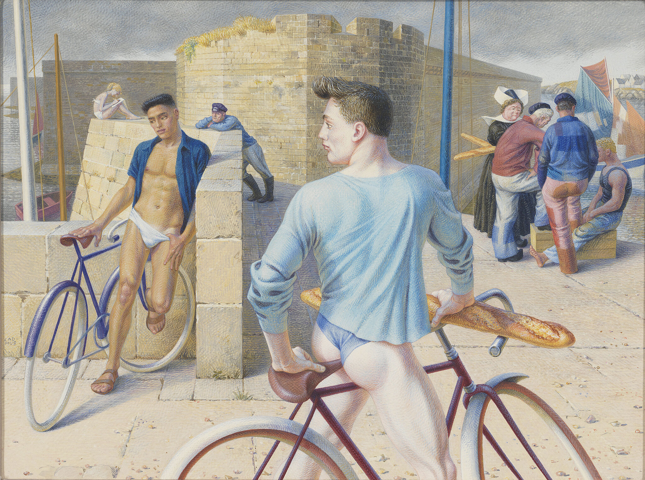
-
About this artist: Paul Cadmus
Audio -
511
Alexander Calder, Jimmy Durante, 1928
Audio -
509
Alexander Calder, Hanging Spider, 1940
Audio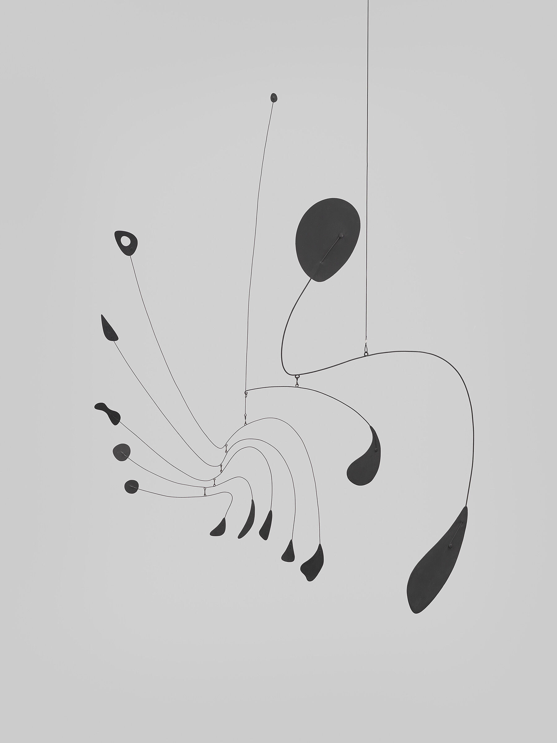
-
About this artist: Alexander Calder
Audio -
About this artist: Joseph Cornell
Audio -
Ralston Crawford, New Orleans Parade, 1956
Audio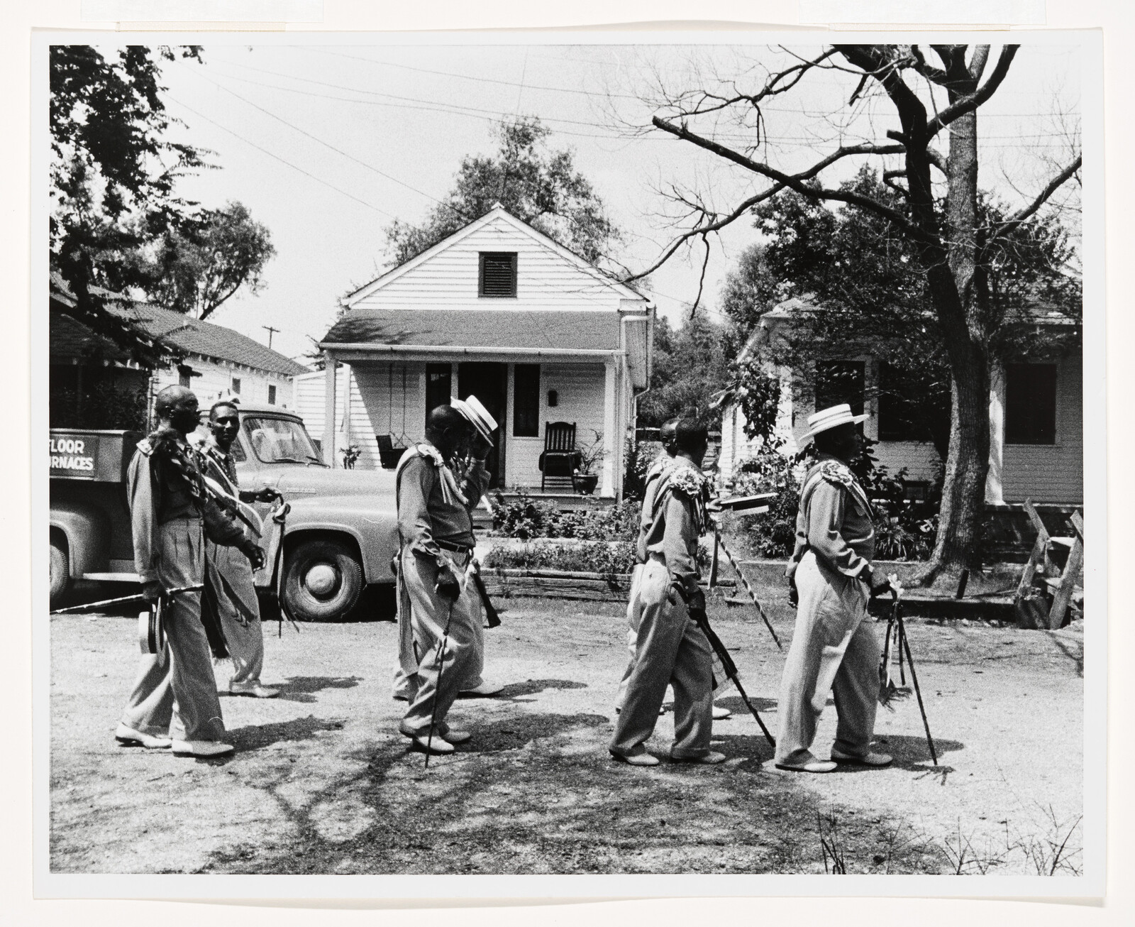
-
About this artist: Ralston Crawford
Audio -
About this artist: Stuart Davis
Audio -
About this artist: Charles Demuth
Audio -
About this artist: Arthur Dove
Audio -
About this artist: Marsden Hartley
Audio -
Edward Hopper, Le Bistro or The Wine Shop, 1909
Audio -
About this artist: Edward Hopper
Audio -
About this artist: Gaston Lachaise
Audio -
508 2
Jacob Lawrence, War Series: Casualty: The Secretary of War Regrets, 1947
Audio -
About this artist: John Marin
Audio -
About this artist: Reginald Marsh
Audio -
518
Elie Nadelman, Untitled (Figurines), c. 1938-46
Audio -
About this artist: Elie Nadelman
Audio -
504
Georgia O’Keeffe, The White Calico Flower, 1931
Audio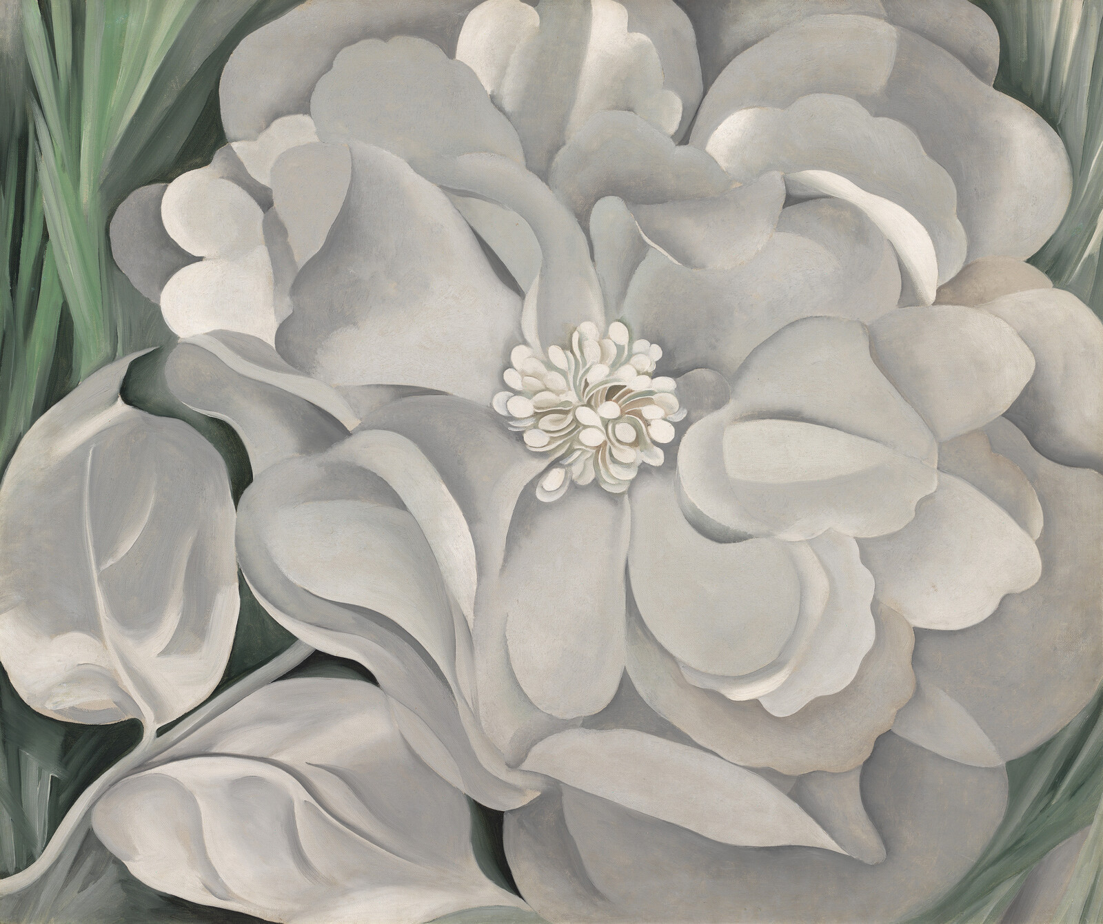
-
About this artist: Georgia O’Keeffe
Audio -
About this artist: Joseph Stella
Audio -
About this artist: Jacob Lawrence
Audio -
Charles Burchfield, August Evening, 1916
Audio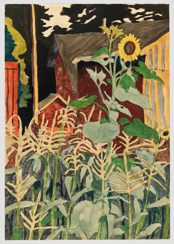
-
Charles Burchfield, Cricket Chorus in the Arbor, 1917
Audio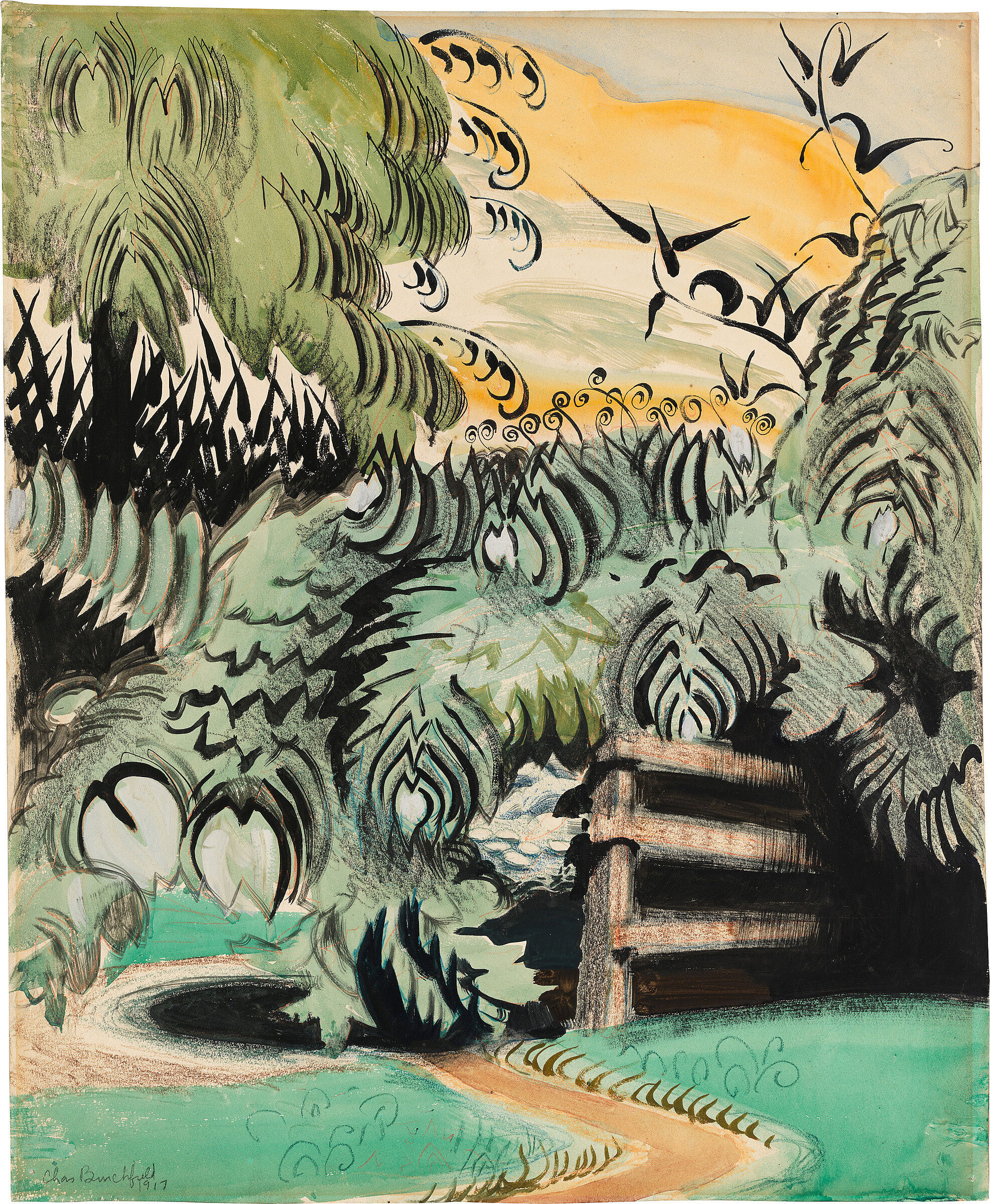
-
Charles Burchfield, Overhanging Cloud in July, 1947–59
Audio -
516
Edward Hopper, Second Story Sunlight, 1960
Audio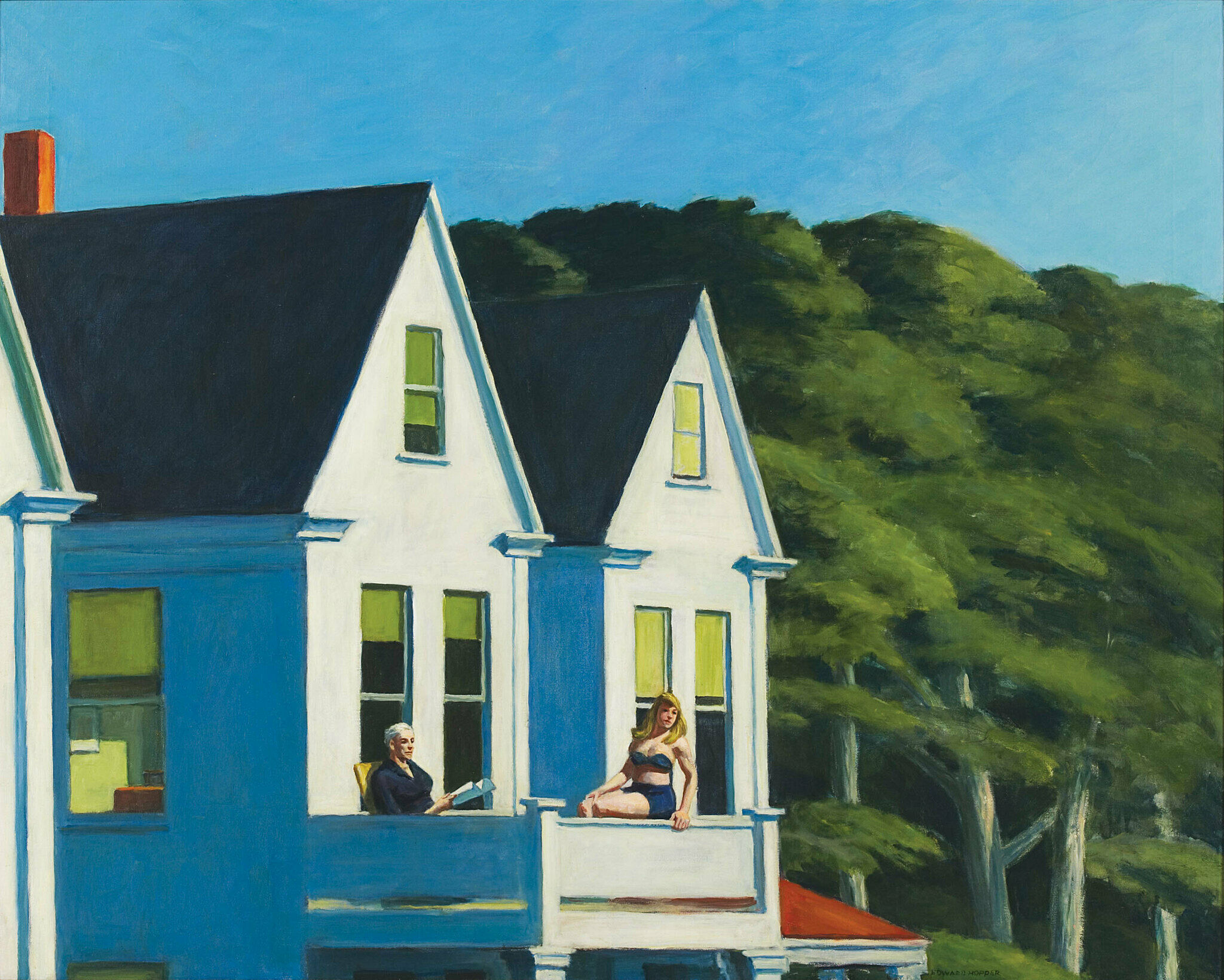
-
510
Alexander Calder, The Brass Family, 1929
Audio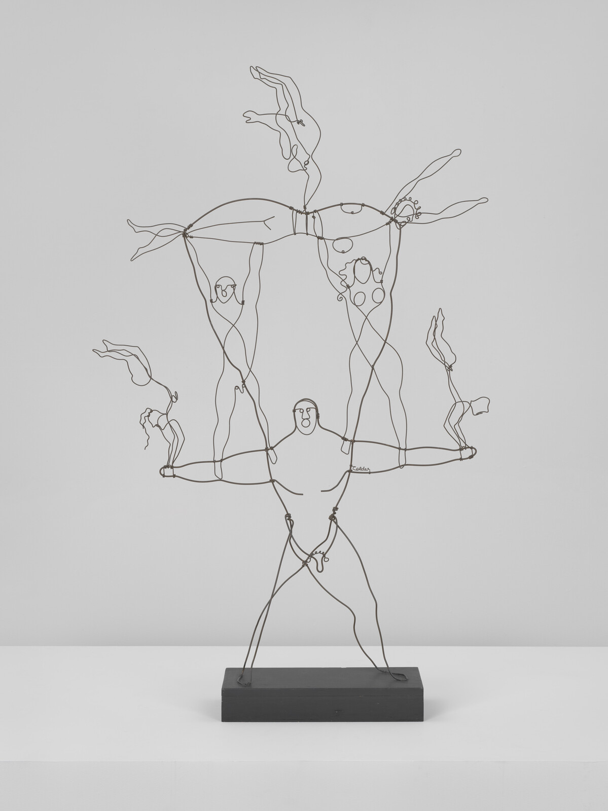
-
520
Alice Neel, Andy Warhol, 1970
Audio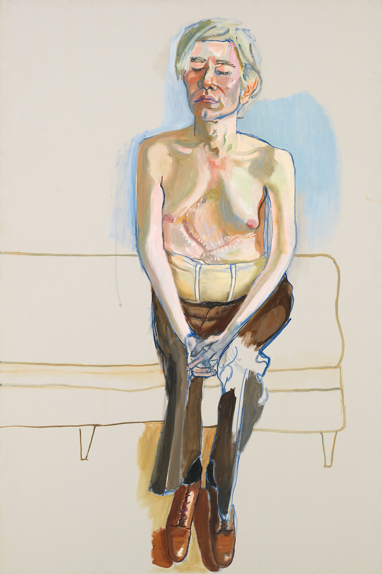
-
503
Burgoyne Diller, First Theme, 1983
Audio
-
501
Jasper Johns, Three Flags, 1958
Audio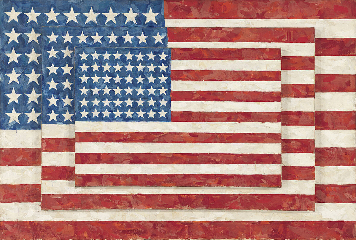
-
519
Roy Lichtenstein, Girl in Window (Study for World’s Fair Mural), 1963
Audio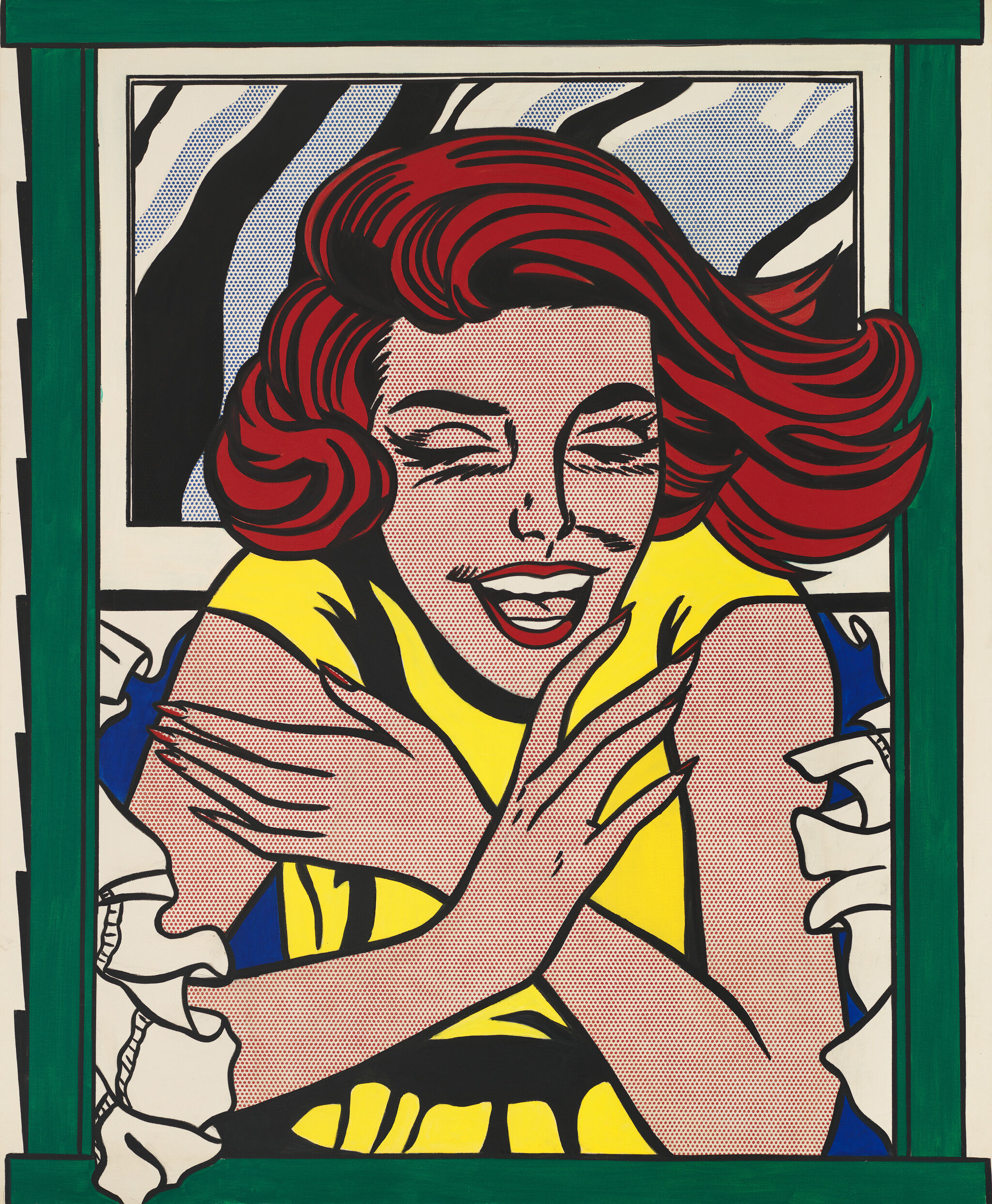
-
502
Jasper Johns, White Target, 1957
Audio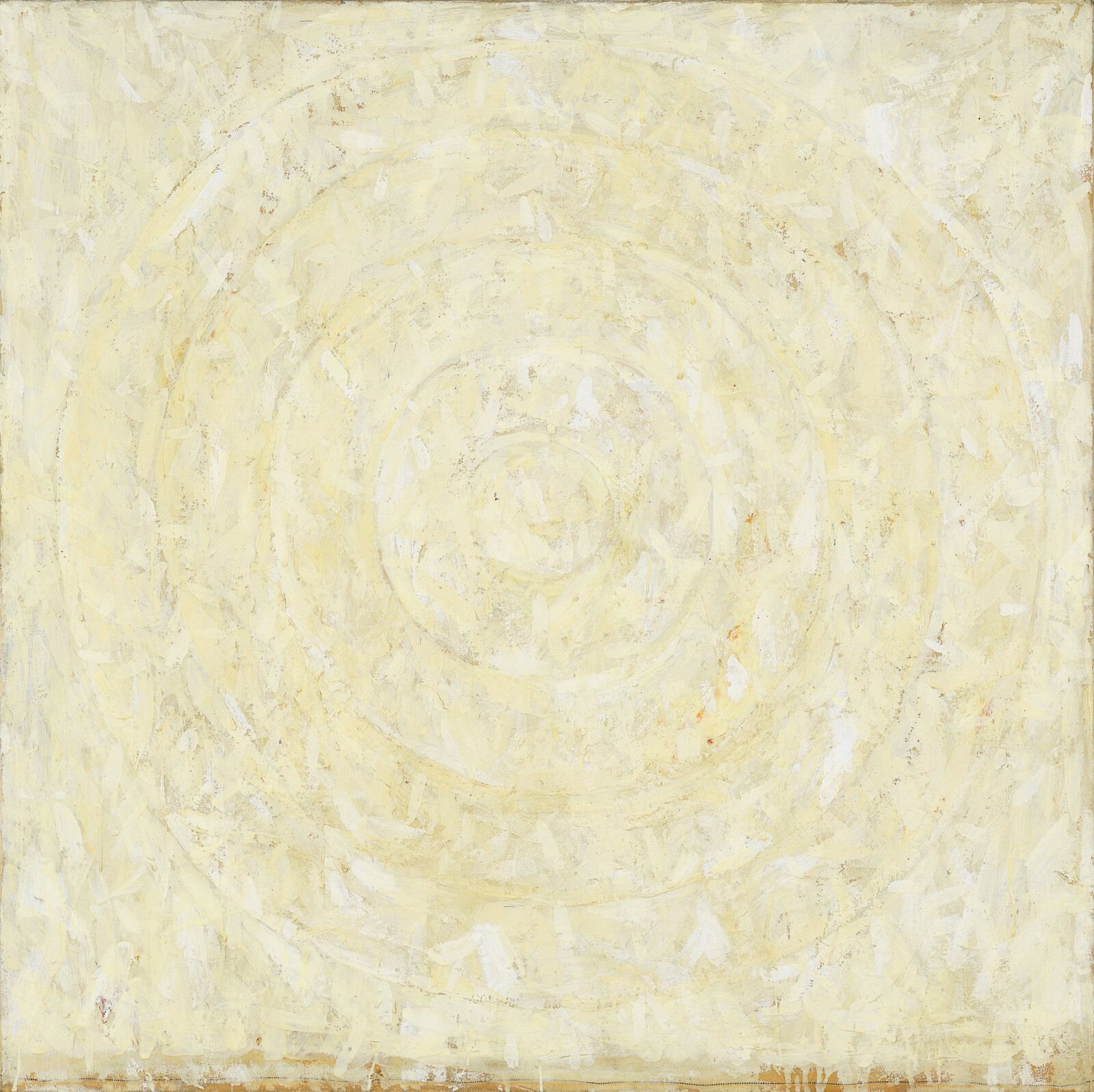
Narrator: Welcome to American Legends: From Calder to O’Keeffe. The exhibition looks closely at a number of artists who worked in the first half of the twentieth century. This was a time when American artists—long in the shadow of Europe—began developing a new confidence. Some of them were inspired by avant-garde European styles such as Cubism and Futurism, but ultimately ended up inventing unique approaches and setting themselves apart from any single movement. Other artists focused instead on the exciting new subject matter that characterized the modern American landscape: the lights, crowds, and speed of the city, or the energetic rhythms of jazz. In the end all of these artists—whether they worked in an abstract vein or a realist one—created their own, highly personal versions of modern art.
The exhibition is drawn from the Whitney’s collection, and consists of the many of artists whose work the Museum holds in the greatest depth. On this audio program, you’ll hear a wide variety of voices—scholars, curators, and contemporary artists. Enjoy the show!
Narrator: Bluemner believed that color could portray abstract emotional states, much as music did. He developed a system of color symbolism, equating color with emotional communication and mystical meaning. He concentrated on composing landscapes using planes of pure color. He identified red, which for him symbolized energy, power, and life, as his signature color, and boldly adopted “The Vermillionaire” as a pseudonym in 1929.
Narrator: Early in his career, Charles Burchfield focused on the spiritual meaning that he found in nature—producing a series of visionary, deeply individualistic landscapes. In the 1930s, Burchfield’s stark images of small towns and industrial landscapes earned him renown as part of the American Scene movement—a term he hated, and even called libelous. Like his friend Edward Hopper, he believed that truth was not to be found in the outward appearance of a place, but the in the feeling it engendered.
In 1943, as he was turning fifty and as World War II was intensifying, Burchfield went through an artistic crisis, unsure of how to develop his work. He started experimenting with the lyrical, expressionistic watercolors that he had made decades earlier. He enlarged them by adding pieces of paper where he felt he needed more space for an image and cutting away parts that he thought were no longer necessary. In this way, the smaller works became large watercolors that more fully expressed the beauty and spirit of nature as he saw it. Having passed through this crisis of artistic faith, he worked vigorously right up until the day he died of a heart attack in 1967.
Narrator: Finistère—the French region that lends this Paul Cadmus painting its name—is in the far west of Brittany, where the English Channel and the Atlantic meet.
The painting’s two main figures are young men on bicycles. Each wears nothing but a shirt and revealing swim briefs. They have the bodies of Classical or Renaissance nudes: idealized and strong. Cadmus was deeply influenced by Italian Renaissance painting. Here, he’s even executed the work in egg tempera, a painstaking medium that most artists had given up by the later sixteenth century.
The picture’s mood is a little odd. The sea wall is labyrinthine, and blocks most of the ocean view. Hardly anyone is looking at each other, and it’s not entirely clear what’s going on. Most of the figures seem intent on their private thoughts or business. There’s a strange huddle of people to the right, including a woman in traditional Breton costume. She adds to the painting’s slightly surreal quality—but perhaps also hints at the presence of conservative society.
The two central men aren’t making eye contact either, but they do seem to be communicating. In this way, the painting is slyly humorous about how homoerotic desire can hide in plain sight—even at a time when that desire was essentially forbidden.
Paul Cadmus, Finistère, 1952. Tempera on paper mounted on cardboard: overall, 12 3/4 × 17 in. (32.4 × 43.2 cm); image, 10 × 13 1/2 in. (25.4 × 34.3 cm). Whitney Museum of American Art, New York; gift of an anonymous donor 64.41. © 2018 Estate of Paul Cadmus/Licensed by VAGA at Artists Rights Society (ARS), New York, NY
Narrator: Using charcoal, pen and ink, and egg tempera as his primary media, Cadmus emulated the meticulous realism and technical virtuosity of the Italian Renaissance masters. He mixed eroticism with an allegorical form of social critique, producing works that were dubbed magic realism. He favored exaggerated, satirical images of sailors, drinkers, and street scenes, as well as muscular male nudes. Cadmus’s career flagged in the post-war period, when abstraction dominated the art world. In the mid-70s there was increasing interest in artists who had been overlooked or censored due to homophobia, and Cadmus received new attention. Cadmus died in 1999, just shy of ninety-five years old.
Narrator: This wire portrait head has comically busy eyebrows—and a truly remarkable nose. It’s Jimmy Durante, a vaudeville comedian, singer, and actor who became an international star in the 1920s. Not surprisingly, a lot of his jokes were about what he called his “schnozzola.”
Alexander Calder began making wire portraits soon after his 1926 move to Paris. Many were caricatures like this one. He also made a number of portraits of the avant-garde artists and musicians who became his friends. All of these works communicate a tremendous amount of personality—even though the sculpture is nothing but steel wire.
Calder studied engineering in college, and became very comfortable with industrial materials. But his first job out of school was as a newspaper illustrator. There he developed a tremendous ability to make funny, evocative line drawings. In his wire sculpture, he drew on both aspects of this background.
Narrator: Alexander Calder called this hanging sculpture Spider. It doesn’t represent a spider in any straightforward way—for one thing, it seems to have more than eight legs. But as it moves with the breeze, it suggests a kind of spindly, daddy longlegs elegance. In the 1930s, Calder had absorbed the Surrealists’ love of biomorphic forms—shapes that suggested life, but were still somewhat abstract. He also picked up on their idea that accident had a role to play in art. This sculpture, with its almost-natural movements and subjugation to the vagaries of air currents, reflects both interests.
Calder invented this form of kinetic sculpture in 1932. He began calling such works mobiles—French for “moving”—at the suggestion of the artist Marcel Duchamp.
Alexander Calder, Hanging Spider, c. 1940. Painted sheet metal and wire, 49 1/2 x 35 1/2 in. (125.7 x 90.2 cm). Whitney Museum of American Art, New York; Mrs. John B. Putnam Bequest 84.41. © Calder Foundation, New York / Artists Rights Society (ARS), New York
Narrator: For most Americans, Alexander Calder’s work has become extremely familiar. His late monumental sculptures populate plazas around the country—and even the world. Versions of the sculptural form he invented—the mobile—hang in nurseries everywhere. It’s easy to forget that the sculptor’s work, accessible as it is, was also very radical.
Sculpture is one of the oldest artistic media. Historically, it was carved or molded in bronze, stone, and other enduring materials. It also tended to be exhibited on a base, which set it apart from the real world. In the early twentieth century, artists like Pablo Picasso and Vladimir Tatlin broke with all of these conventions. They made constructions—collaging elements together in a manner that suggested change and contingency. They used humble materials. And they often displayed the works in unusual ways—lodging them in the corner of a room, for example. Calder followed in their footsteps, and pushed their ideas even farther. He introduced real movement into the medium for the first time in art history, and he lifted it off the base to float free in the air.
Narrator: In the early 1930s, Cornell began to make the assemblages for which he is best known—small boxes filled with objects and images that the artist found in local bookshops and thrift stores. He collected these things obsessively, eventually accumulating over 160 dossiers on different subjects. The things he collected were related to his favorite subjects: nineteenth-century sopranos, ballet, European literature, cinema, and astronomy. Rarely leaving his home on Utopia Parkway in Queens, Cornell transformed these materials into poignant, nostalgic fantasies for the better part of four decades.
Narrator: Ralston Crawford first went to New Orleans in 1949, intending to spend a weekend listening to jazz. He was immediately infatuated, and ended up spending much of the next three decades in the city. He had grown out of step with the New York art world: his geometric abstraction was too cerebral for the Abstract Expressionists and their champions. His personal style was quite elegant, and he didn’t fit in with Village bohemians. In the French Quarter of New Orleans he found a slow pace, civilized manner, and neighborhood quality that appealed to him enormously. He photographed the city voraciously—ultimately producing more than 10,000 photographs of New Orleans. He pictured buildings, jazz musicians, singers, nightclubs, and street parades. These photographs are the most human part of Crawford’s career. They’re openly emotional—especially compared to his earlier paintings of architecture, in which psychological content is latent or implied.
After his death in 1978, Crawford was buried in New Orleans, and honored with a jazz funeral.
Ralston Crawford, (New Orleans Parade), 1956. Gelatin silver print, sheet: 8 × 9 15/16 in. (20.3 × 25.2 cm) Image: 7 5/8 × 9 9/16 in. (19.4 × 24.3 cm). Whitney Museum of American Art, New York; Jointly owned by the Whitney Museum of American Art and the Albright-Knox Art Gallery; Gift of John Crawford 2008.313. © Ralston Crawford Estate / Licensed by VAGA at Artists Rights Society (ARS), New York
Narrator: Ralston Crawford is often identified as a Precisionist artist, because his best-known paintings use flat planes of color and clean lines to portray American industry. But a number of factors separated him from Precisionists such as Charles Demuth and Charles Sheeler. For one thing, he was twenty-three years younger than they were, and so belonged to a different generation. And his subjects weren’t always so optimistic. In both paintings and photographs, he’d focus on small details of the industrial landscape: shadows or mechanical underpinnings that might not otherwise be celebrated.
Crawford was changed as an artist by World War II, both in his artistic style and in his approach to technology. He was drafted into the Army Air Force, and he served as an artist drawing charts for the weather division. In 1946, he was sent by Fortune magazine to document the atomic-bomb test at Bikini Atoll. He developed a jaggedly abstract style, one that suggested the horrors of the atomic test, and those of postwar ruins in Germany, which he visited as a tourist. In his paintings, Crawford evoked these devastated environments using abstract shards of flat, planar color that appear as shattered vestiges of his previous style.
Narrator: Stuart Davis’s early artistic training was fairly traditional. But after he discovered modernist artists such as Henri Matisse and Pablo Picasso, he began to think afresh about what made a good painting. For him, the exploration of avant-garde form was exciting because he believed it mirrored the contemporary world. Only modern art, he felt, could reflect new conceptions of time and space. He believed it was also the visual language that best captured the defining characteristics of twentieth-century America: jazz, the movies, and mass communication.
Narrator: Charles Demuth’s paintings emphasize crisp lines and flattened, planar forms. This style, which later became known as Precisionism, was influenced by the fragmented forms of Cubism and Futurism. Its focus, though, was the modern, industrial landscape of the United States.
In 1927 Demuth moved from New York to his hometown, Lancaster, Pennsylvania. He’d developed severe diabetes, and needed his family’s help in managing day-to-day life. He began a series of canvases based on nearby grain elevators, water towers, and other industrial structures that had been constructed in the years following World War I. His masterpiece My Egypt was among these.
Narrator: Around 1910, Arthur Dove became the first American artist to make a painting that had no recognizable images in it. He resisted calling his paintings “abstractions.” Instead, he insisted that they were “extractions,” since he worked to extract the essential nature of real-world subjects. He believed that objects and places had inner, elemental spirits that were not reflected in their physical forms. His exploration of the line between abstraction and figuration connected him to Georgia O’Keeffe, perhaps his closest colleague among the artists who exhibited with Alfred Stieglitz.
Narrator: In 1909, Marsden Hartley’s bold, colorful Maine seascapes were featured in an exhibition at Alfred Stieglitz’s vanguard 291 Gallery. Soon after, Hartley traveled to Europe. Stieglitz encouraged him to visit Paris, but he ended up in Berlin. He began to make highly personal paintings, influenced by Cubism, that combined abstract shapes with numbers, fragments of uniforms and other regalia.
Hartley returned to the United States in late 1915. Not surprisingly, anti-German sentiment had a negative affect on the reception of his Berlin paintings. After the First World War, the art world took an isolationist turn away from European-inspired modernism. Hartley adopted a more realist style, focusing especially on the Maine landscape of his youth.
Narrator: This painting dates from the years Edward Hopper spent in Paris as a young man. It was by far the most productive time in his career. Hopper first arrived in Paris in October, 1906. He was twenty-four.
Dr. Rick Brettell is a professor of Aesthetic Studies at the University of Texas, a noted Impressionist scholar and has written extensively about Hopper in Paris.
Rick Brettell: When Hopper painted Paris, he painted a city that was almost completely devoid of people. One sees like tiny people rushing across the Pont des Arts or on a distance bridge, or very far away in the suburbs. But there is a sense in which the city is almost a kind of empty stage set, waiting to be populated by others.
Narrator: By 1910, Hopper had left Paris and returned twice, staying once for a full year. Hopper was shy, uneasy in French, and likely spent a lot of time alone.
Rick Brettell: And I think it’s pretty clear when you look at the paintings and drawings and watercolors that he made on those three trips to France that he actually became an American artist in France, and that it was this kind of alienating life of an American, a Protestant American, whose spoken French wasn’t great, in this extraordinarily glittering capital city, that created the kind of, sort of sense of alienation and detachment and emptiness that is so much a part of Hopper’s aesthetic until his death in the 1960s.
Narrator: Edward Hopper is often described as a realist. And careful observation was very important to him: sometimes he’d make fifty drawings leading up to a single painting. But the final works came out of a long process of selection, synthesis, and—above all—imagination. For Hopper, truth had to do with emotion, rather than visual fidelity to a particular scene. His canvases often convey solitude—a mood too personal to be realistic.
For much of his early life, Hopper supported himself as a freelance illustrator. He didn’t achieve commercial success as a painter until he was in his 40s. The turning point was his first solo exhibition, held in 1920 at the Whitney Studio Club in Greenwich Village—a hub for independent artists and the precursor to the modern Whitney Museum. Gertrude Vanderbilt Whitney purchased some of his work for the core collection of the Museum when it opened in 1931, and he was included in many Whitney Annuals. In 1970—in recognition of the Whitney’s long support of Hopper—his widow, Josephine Nivison Hopper, left his estate to the Whitney. The bequest included more than two thousand paintings, watercolors, and drawings.
Narrator: Throughout his career as a sculptor, Gaston Lachaise dedicated himself to the exploration of the female form. His model was his adored wife, Isabel Dutaud Nagle. His renderings of her often reflected fantasy more than reality. In his later work, Isabel took on increasingly ample proportions--despite the fact that she weighed only about 110 pounds.
During Lachaise's lifetime, the public was scandalized by his bold expressions of sexuality. Many of his more erotic sculptures were considered inappropriate for public exhibition. More recently, feminists have critiqued Lachaise for treating women as sex objects. But artist Louise Bourgeois, who drew inspiration from Lachaise's work, defended him. "Lachaise did not exploit women but enjoyed them," she wrote. "It is a compliment to grant the sex object such power that it can trigger such passion."
Narrator: Framed in a doorway, facing away from us, this female figure slumps in grief. A photo on the table shows her son or husband in uniform. The painting's title, Casualty: The Secretary of War Regrets, quotes the telegram dreaded by every serviceman's family.
Lawrence's War Series originated during his service on a World War II Navy transport ship.
Jacob Lawrence: Again, I will never forget that experience. We would go over carrying 5,000 troops—young, American troops—and we would come back a hospital ship. Many of these cases were horrible. They were terrible to see, what can happen in war, especially what can happen to a person mentally, physically, psychologically. I don't think I can verbalize that, because I would only cheapen the experience.
Narrator: Lawrence began the War Series in 1947, two years after he was discharged in December 1945. It was his way of coming to terms with what he'd witnessed.
Narrator: John Marin is best known for his seascapes: watercolors, and later, oils, that seem to capture the elemental forces of nature. As a young man Marin was interested in Cubism and other forms of European modernism. But he took them in a lyrical direction rather than an analytical one. He used loose brushwork and broad colors to suggest vitality and movement. Like Georgia O’Keeffe and Arthur Dove, his peers in the Stieglitz circle, Marin’s paintings occasionally push his natural subjects to the edge of abstraction.
Narrator: Reginald Marsh’s favorite subject was New York street life, especially around Union Square and Fourteenth Street, where he maintained a studio beginning in 1929. Despite his upper-class origins, Marsh preferred working-class entertainments to elite ones. The agitated lines and bulging masses of Marsh’s figures convey a vitality and robust sexuality.
Marsh sketched constantly, and took photographs both as records to turn into artworks and as ends in themselves. His best photographs demonstrate his eye for vernacular detail, capturing signage for cheap hotels and barbers; advertisements for Coney Island freak shows; casual interactions between pedestrians; and thronged beaches on hot summer days.
Narrator: Between 1938 and 1946, Elie Nadelman produced hundreds of figurines, most no more than a foot high. He began each by sculpting a small figure in Plastilene, a non-hardening clay. He’d then cast multiple versions of these figures in plaster. Those casts became a basis for improvisation. He’d sometimes draw on them with pencils, carve into them with small instruments like penknives and forks, sand their surfaces, or dip them in liquid plaster. Most of them have rough surfaces and seem to have been caught in the midst of an incomplete transformation.
For most of his career Nadelman’s sculpture had been the height of refinement. By contrast, these miniatures are odd and indeterminate—fascinatingly so. Classical Greek terracottas were among Nadelman’s inspirations, but so were burlesque performers and kewpie dolls. At moments the resulting figurines seem sexual, at others they appear to have a childlike innocence. Sometime these states coexist—uncomfortably—in a single work.
Narrator: The primary influences on Elie Nadelman were classical sculpture and folk art. He and his wife, Viola Flannery, were avid folk-art collectors, ahead of their time in finding beauty in every day objects. Some of their purchases were commonly collected: textiles, toys, furniture, wrought-iron work, pottery, hooked rugs, and wood carvings. But they also bought whole room interiors; the contents of an apothecary shop—including the leeches; fire-fighting equipment; cockroach traps; American revolutionary posters and broadsides; and household and farm implements. In 1926 they moved the collection into a building designed especially to house it, and made it available to the interested public by appointment. The Museum of Folk and Peasant Arts, as they called it, eventually housed almost fifteen thousand works.
Wanda Corn: I've always thought that when O'Keeffe painted this work she was kind of having a tongue-in-cheek experience, because she had been known for her flower paintings in New York, which were always based on natural flowers.
Narrator: This flower was artificial. It was probably made out of calico by some of the Latina or Native American women who lived in O'Keeffe's adopted home of New Mexico. As she's painted it here, this fake flower seems as intensely real as anything that could be found in nature.
Art historian Wanda Corn.
Wanda Corn: If you look closely you'll see that no two petals are exactly alike. Each one bends or swerves or moves in and out of another set of petals in its own particularly unique way.
It's not only the flower that's special but also the way she uses white. These are whites which are sometimes tinted with pink, or with tan, or with gray. You'll again notice she never uses the same exact whiteness or the same tone of white for every petal.
She's absolutely fascinated with the structure of this flower. Probably also fascinated because it's an artificial flower! And somebody has done a beautiful job of making a calico flower as complicated and glorious as a natural one.
Georgia O'Keeffe, The White Calico Flower, 1931. Oil on canvas, overall: 30 3/16 × 36 3/16 in. (76.7 × 91.9 cm). Whitney Museum of American Art, New York; purchase 32.26. © Georgia O'Keeffe Museum / Artists Rights Society (ARS), New York
Narrator: Georgia O'Keeffe once explained that she felt the world of visual form—pure shape and color—very deeply.
Artist, Georgia O'Keeffe.
O'Keeffe: I can see shapes. It's as if my mind creates shapes that I don't know about. I can't say it any other way. But I get this shape in my head. And sometimes I know what it comes from and sometimes I don't. And I think with myself that there are a few shapes that I have repeated a number of times during my life and I hadn't known I was repeating them until after I had done it.
Narrator: Even when O'Keeffe drew her subjects from nature, she made them her own. And when she painted abstractly, there were always hints of the natural world in her canvases. The tension between abstraction and figuration animated her work. So did her deep sensitivity to her immediate environment. This responsiveness is especially apparent in paintings she made after 1929, when she began spending time in New Mexico.
Narrator: Joseph Stella was one of the first American artists to glorify the new technologies of urban modernity in the early decades of the twentieth century. He had immigrated to New York from the Southern Italian mountain town of Muro Lucano. He fell in love with his new surroundings, even calling the city his “wife.” In 1912 he encountered Italian Futurist painting, with its emphasis on modernity’s speed and dynamism, and soon adapted the style for his own purposes. The Brooklyn Bridge, which he painted numerous times between 1917 and 1941, became his most iconic subject.
Narrator: Jacob Lawrence came of age in the vibrant milieu of Harlem in the 1930s. There he came in contact with writers and philosophers who promoted black achievement and strong cultural identity.
Jacob Lawrence’s visual style was modern, and foregrounded visual concerns. But he stood out among American modernists for his interest in narrative. He often worked in a series, telling loose stories and creating variations on a number of themes. In 1940 and 1941, he completed the Migration of the Negro. This massive series included sixty paintings—collectively portraying the story of African American migration from the rural South to the industrial northern states in the 1920s. The series brought him national acclaim, and in 1941 he became the first African American artist to be represented in the collection of the Museum of Modern Art. He also produced series reflecting life in Harlem, and—in the Whitney’s War Series—his own experience in the Coast Guard during World War II.
Narrator: In August Evening, Charles Burchfield creates a very specific feeling of time and place.
James Welling: You can imagine Burchfield coming home from work, having dinner and going outside and painting these sunflowers as the sun is setting, the dark trees in the background of the picture, the sunset sky in the distance, and this semi-mournful mood in the picture.
Narrator: Photographer James Welling.
James Welling: The sunflowers have reached their full height, August is probably turning to September, the seasons are changing.
Narrator: This painting is from a period that Burchfield later described as his “golden years”—an enormously productive stretch from 1916 to 1918 when he was working for a machine parts company by day and making vast numbers of watercolors before and after work. He had recently finished art school and returned to his home in Salem, Ohio. In this painting and others he tried to express his childhood memories of nature. His focus on transitional moments—when evening turns to night, or summer to fall—suggests that with beauty comes loss. His watercolors’ intensity comes in part from his approach to his subject, but also his approach to his materials.
James Welling: I can almost hear Burchfield's brush on the paper because he's using very thick, dry pigments to make certain parts of the picture. The lower part is done with more fluid paint but the top part is done with almost thick, opaque watercolor.
Charles Burchfield, August Evening, 1916. Watercolor and graphite pencil on paper, sheet: 19 15/16 × 14 in. (50.6 × 35.6 cm). Whitney Museum of American Art, New York; gift of Mr. and Mrs. Lesley G. Sheafer 55.43. Reproduced with permission from the Charles E. Burchfield Foundation and the Burchfield Penney Art Center.
James Welling: Cricket Chorus seems to depict a hedge or a thick foliage with the sounds of crickets so it must be later in the summer when crickets come out, say in August.
Narrator: Photographer James Welling.
James Welling: It appears to be a sunset image with heavy shadows, deep shadows, and sunlit clouds in the background. Burchfield was extremely interested in representing sound in his work and for him the way to represent sound was through repetitive patterns. This work starts out probably with a pencil drawing done on location and then the more ornate parts of the foliage, the repetitive patterns done in black watercolor or gouache, for Burchfield seemed to represent the sound patterns that the crickets are making.
Narrator: This painting is from a period that Burchfield later described as his “golden years”—an enormously productive stretch from 1916 to 18 when he was working for a machine parts company by day and making vast numbers of watercolors before and after work. He had recently finished art school and returned to his home in Salem, Ohio. In this painting and others he tried to express his childhood memories of nature. His focus on transitional moments—when evening turns to night, or summer to fall—suggests that with beauty comes loss.
Charles Burchfield, Cricket Chorus in the Arbor, 1917. Transparent and opaque watercolor, brush and ink, and wax crayon on paper mounted on board: 22 1/8 × 18 3/16 × 1/8 in. (56.2 × 46.2 × 0.3 cm); sheet (irregular), 22 1/16 × 17 15/16 in. (56 × 45.6 cm). Whitney Museum of American Art, New York; gift of Anne and John Straus 2009.203 Reproduced with the permission of the Charles E. Burchfield Foundation
Narrator: Like many of Charles Burchfield’s paintings, Overhanging Clouds in July responds to nature emotionally rather than replicating its outward appearance.
James Welling: This painting has a lot of yellow in it, which is extremely unusual to paint yellow dashes and lines in the sky, and I think for Burchfield it represents a kind of force field.
Narrator: Photographer James Welling.
Jame Welling: He's communing with nature and feeling the intensity of the heat and the sunlight, and he wants to put that physical response down on paper.
Narrator: Burchfield used color and form to communicate a feeling of nature’s majesty. He also used watercolor—usually thought of as a quick, casual medium—in a manner that suggests grandeur. He worked on this painting from 1947 to 1959.
James Welling: Burchfield had a very unique style of working with watercolor—dry, large scale, and slow.
One of the things that happens in watercolor is that the painting is never completely done and Burchfield exploits the fact that you can take a brush and water and re-wet the page in certain passages and remove parts of the painting, add new elements, as a way that watercolor is much more transitory than oil paint.
With oil, once it's dry you have to really scrape to remove anything. With watercolor, you just re-wet it. In a painting like this, Burchfield's working on it for ten years, he's just able to pick up whenever he wants to and continue to work on the painting.
Brian O’Doherty: My Name is Brian O’Doherty and I’m talking about Edward Hopper, who was a friend.
Adam Weinberg: Artist and art critic O’Doherty is a longtime admirer of Edward Hopper’s work and was a close friend of the artist.
Brian O’Doherty: Well, Second Story Sunlight is just one of Hopper’s late masterpieces. He was 76 when he did it, done I suspect more from the imagination than anything else.
And it contains pretty well all of Hopper’s concerns—the mysterious wood to the right, the gable ends of the houses like twins there, the same as the two people below, the windows, the blinds, and the beginning of a house again, another gable on the left margin . . . the little triangle of red on the lower right, which is answered by the chimney, the red chimney, in the top left. The perfect blue sky.
There is a certain atmosphere and mood. And I think mood is what he was after. You can talk about the restlessness of the young, and the calm introspection of the reading lady. Their relationship, well who knows?
Do you see these two gables, these two great triangles, each containing its window? Look at the two windows there. They have a personality and a force that you might say is even more psychologically fascinating and dense than the characters below.
And I think continually you are asking about Hopper’s mood, what is that about? And what it’s about is very mysterious, very uncanny, very strange. And I asked him once, I said, “Well, what are you after? What are you after in this?” —these stupid questions that artists put up with. So he tolerated this for a while and then he finally said, in his heavy voice, “I’m after me.” So you could look upon this work as a vast acreage, populated by the author, who has disappeared into these works. And we track down the missing Edward Hopper who now exists in a variety of potentials, and building, and figure, and wood, and light.
Edward Hopper, Second Story Sunlight, 1960. Oil on canvas, 40 3/16 x 50 1/8in. (102.1 x 127.3 cm). Whitney Museum of American Art, New York; purchase, with funds from the Friends of the Whitney Museum of American Art 60.54. © Heirs of Josephine N. Hopper/Licensed by VAGA, New York, NY
Narrator: This large sculpture, called The Brass Family, is one of many sculptures of circus performers Calder made apart from his miniature Circus. It is much larger than any of those elements, and its parts don’t move. In fact, in many ways it is a work about stability, and immobility. The large nude man who anchors this family is rock-solid: hugely muscular and constructed out of a heavy-gauge wire. His graceful family is more daintily constructed and more vulnerably posed—but there is little sense of physical danger. At the same time, it definitely reminds us that the circus is an entirely different world—The Brass Family doesn’t have the family structure that most of us are used to!
Caroline Simonds: In those days, in the '20s, you were—you were born into a trunk. You were born into the circus.
Narrator: Caroline Simonds is a clown and a former acrobat. She runs the Paris-based organization Rire-Médecin, which brings clowns to the pediatrics wards of hospitals.
Caroline Simonds: You just started off by standing on your father's shoulders when you were eighteen months old. Soon as you could walk they made you stand on your father's shoulders and then on his head, and then they flipped you up in the air and, they caught you by your feet.
Alexander Calder, The Brass Family, 1929. Brass wire and painted wood, overall: 67 × 41 1/8 × 8 7/8 in. (170.2 × 104.5 × 22.5 cm). Whitney Museum of American Art, New York; gift of the artist 69.255. © Calder Foundation, New York / Artists Rights Society (ARS), New York
Trevor Fairbrother: My name is Trevor Fairbrother. I’m an independent curator and writer.
Narrator: Fairbrother discusses Alice Neel’s 1970 portrait of Pop artist Andy Warhol.
Trevor Fairbrother: It’s an interesting year for both of these artists. Alice Neel was actually seventy years old when she painted it, and in a sense was just hitting her stride as an important American realist. She’d had an incredible career since the thirties, but she hadn’t really had much recognition until the wave of feminist interest in the arts in the sixties. And suddenly she was a forebear for a whole new generation of feminist artists and writers.
Narrator: The late sixties were much harder on Warhol. He’d been shot two years before Neel painted this portrait—an attempted assassination by a member of his artistic circle. In posing shirtless for Neel, he exposes the corset that he was required to wear for the rest of his life. He also bares his aging body, his chest sagging so that he almost appears to have breasts.
Trevor Fairbrother: She shows him—I think it’s this kind of essence of loneliness and vulnerability, but at the same time I think she knows that he knows that everybody is looking at him. He was very much invested in famous artists. He wanted to be a kind of brand-name Pop artist, and he certainly is that now, long after his death. He, Warhol, in a sense is rising to her challenge to sit for her, to be painted and to take his clothes off. And so in a sense he’s doing a brave thing, but he’s also―he’s getting through it by shutting his eyes and being very focused internally.
I think part of the soulfulness of this picture is the fact that it might seem unfinished. I wouldn’t say it’s unfinished. I think she decided she had what she needed, and she stopped where she was ready to stop. The picture doesn’t need more.
Alice Neel, Andy Warhol, 1970. Oil and acrylic on linen, 60 × 40 in. (152.4 × 101.6 cm). Whitney Museum of American Art, New York; gift of Timothy Collins 80.52 © The Estate of Alice Neel
Narrator: Burgoyne Diller was one of the most rigorously abstract painters working in the United States during the 1930s. Curator Barbara Haskell.
Barbara Haskell: In this painting called First Theme from 1938, what he has presented is a white square, a white rectangle, which is the largest form against this black field, and then a very small red rectangle in the lower right hand corner. Red being a color which is seen as coming out at you, as being sort of bold and aggressive and coming into our space. Yellow is a more recessive color, which seems to sort of retreat into space. So that this relationship between the yellow and the red, it almost sets up a dialogue with each other on the right-hand side of the canvas, which is then balanced by this white, large rectangle on the left. So what you have is this almost back-and-forth dialogue between these dialogues, which are then held in place. Not one of the rectangles ends up dominating the other, but you have this oscillation back and forth, which creates this tension across the surface of the canvas.
There’s a kind of syncopated energy that these canvases have, but at the same time they’re these harmonious, unified almost static, obdurate objects.
Narrator: Diller believed that these aesthetic characteristics could have a positive impact on society.
Barbara Haskell: to transcend ethnic divisions, racial, economic divisions, and create this sort of symbol of pure harmony, of disparate things coming together into a unity.
Burgoyne Diller, Third Theme, 1946–48. Oil on canvas, 42 × 42 in. (106.7 × 106.7 cm). Whitney Museum of American Art, New York; gift of May Walter 58.58
Narrator: This painting by Jasper Johns, called Three Flags, was made in 1958. Todd Gitlin is a professor at the Columbia School of Journalism and a scholar of American culture of the 1960s.
Todd Gitlin: . . .he's neither celebrating the flag nor. . .stabbing it in the heart. He's. . .to use a later term, deconstructing it. . .[A]nother way to put it is that he's inviting you to become innocent. He's inviting you to look at these things as if you were a Martian. . .And just to stare at them and to take them as natural artifacts.
[T]he question is not just why is Johns painting these flags and numbers and letters but. . .why are other people buying them, exhibiting them, find them interesting. . .
[T]here is an argument to be made that he is retailing. . .in the fifties
a sort of soft aestheticizing of the sacred national symbol in a way that. . .flatters or honors the nation. . .but without genuflection. That is, he's appropriating with. . .a frisson of individuality. . .an attitude of approval which incorporates a brief moment of disapproval and so he's sort of. . .signing on to Americanism. . .as a graceful dissenter.
And in a world that's increasingly cluttered by symbols. . .cluttered with. . .artifacts that are mass produced. Cluttered. . .with noise and. . .slogan. . .and so on.. .that the proper attitude to take toward all of that is a kind of. . .amused, distant, as Rolling Stone would later put it, cosmic giggle.
But in the meantime I think he's also saying. . .and it's part of his appeal to the zeitgeist that he's saying to the world of. . .intellectuality, shut up. Just shut up. Shut up and look.
Jasper Johns, Three Flags, 1958. Encaustic on canvas (three panels), 30 7/8 × 45 3/4 in. (78.4 × 116.2 cm) overall. Whitney Museum of American Art, New York; purchase, with funds from the Gilman Foundation, Inc., The Lauder Foundation, A. Alfred Taubman, Laura-Lee Whittier Woods, Howard Lipman, and Ed Downe in honor of the Museum’s 50th Anniversary 80.32. © 2021 Jasper Johns / Licensed by VAGA at Artists Rights Society (ARS), New York
Max Anderson: Roy Lichtenstein created this painting of a woman for the 1964 World’s Fair in New York. Architect Philip Johnson designed one of the fair’s pavilions and invited leading contemporary artists to create works that would hang on the exterior of his building.
Michael Lobel, author of Image Duplicator: Roy Lichtenstein and the Emergence of Pop Art:
Michael Lobel: When you look at this painting, what you have to understand is that this was a study for a much larger painting. The mural on the façade of the pavilion was in fact 24 by 16 feet, so a large mural. The fair opened in the summer of 1964. As all the World’s Fairs were, this was a celebration of American culture, technological progress and innovation.
Max Anderson: The 1964 World’s Fair featured many works of Pop art―embracing the movement’s new, bold style and interest in commercial images. Initially, though, Americans struggled to come to terms with the new movement. Many considered advertisements and comic strips as not worthy of being artistic subjects.
Michael Lobel: In fact, in 1962, reviewing a show of Pop art, the critic Max Kozloff writes, “the truth is: the art galleries are being invaded by the pinheaded and contemptible style of gum-chewers, bobby-soxers and worse, delinquents.” And this is an index. It shows us. . .the real hostility that Pop was met by in the early 1960s when it first appeared on the art scene.
Max Anderson: At first glance, Lichtenstein’s work may look simple and cartoonish. But as Michael Lobel explains, the artist possessed an extensive and sophisticated understanding of art history.
Michael Lobel: If you look at the window above the head of the female figure, you see the way in which Lichtenstein is very cleverly and knowingly straddling the world of mechanical reproduction and the kind of language of abstract painting. On the one hand, you see everything that distinguishes his language of pop art―the bold outlines, the screens of regularized dots, the reduced painterly palette…so on one hand, this looks like the way a reflection off a pane of glass would be depicted by a commercial artist or popular illustrator. . .But at the same time, he’s using these to make almost abstract shapes. . .In this way, Lichtenstein in his Pop art is straddling these two worlds and bringing them together—what’s often called the high and low, or high art and popular culture.
Roy Lichtenstein, Girl in Window (Study for World's Fair Mural), 1963. Oil and acrylic on canvas, 68 1/8 × 56 in. (173 × 142.2 cm). Whitney Museum of American Art, New York; gift of The American Contemporary Art Foundation, Inc., Leonard A. Lauder, President 2002.254. © Estate of Roy Lichtenstein
Narrator: Jasper Johns made White Target in oil paint and encaustic, a painting medium consisting of melted wax. Encaustic hardens very quickly, so each brush stroke appears on the canvas exactly as Johns placed it. The individual strokes don’t blend into each other. As prominent as they are, there’s a uniformity to them—one that makes the surface very different from the spontaneous brushwork of the Abstract Expressionists. For these artists, who were a generation older than Johns, gesture was a highly personal matter. A dramatic brushstroke was understood to express an equally dramatic feeling. By contrast, Johns’s surface seems cool and somewhat distant.
For Johns, that impersonality was part of the point. He once told the art historian Leo Steinberg that he chose to paint things like flags and targets because they were, quote, “pre-formed, conventional, depersonalized, factual, exterior elements.” He could include them in paintings without them having to mean anything specific—which meant, in a way, that the paintings were abstract. But at the same time, they were very literal. Theoretically, one could play a real game of darts on a Target painting. And Johns’s Flags have stood in for American-ness on many occasions. So are they actual things, or paintings of things? With Johns’s work, the philosophical problems of representation became part of the painting tradition in a way they’d never been before.
Jasper Johns, White Target, 1957. Encaustic and oil on canvas, overall: 30 × 30 in. (76.2 × 76.2 cm). Whitney Museum of American Art, New York; purchase 71.211. © Jasper Johns / Licensed by VAGA at Artists Rights Society (ARS), New York
0:00
0:00