
Artists
Spring 2022
With Jonathan Berger
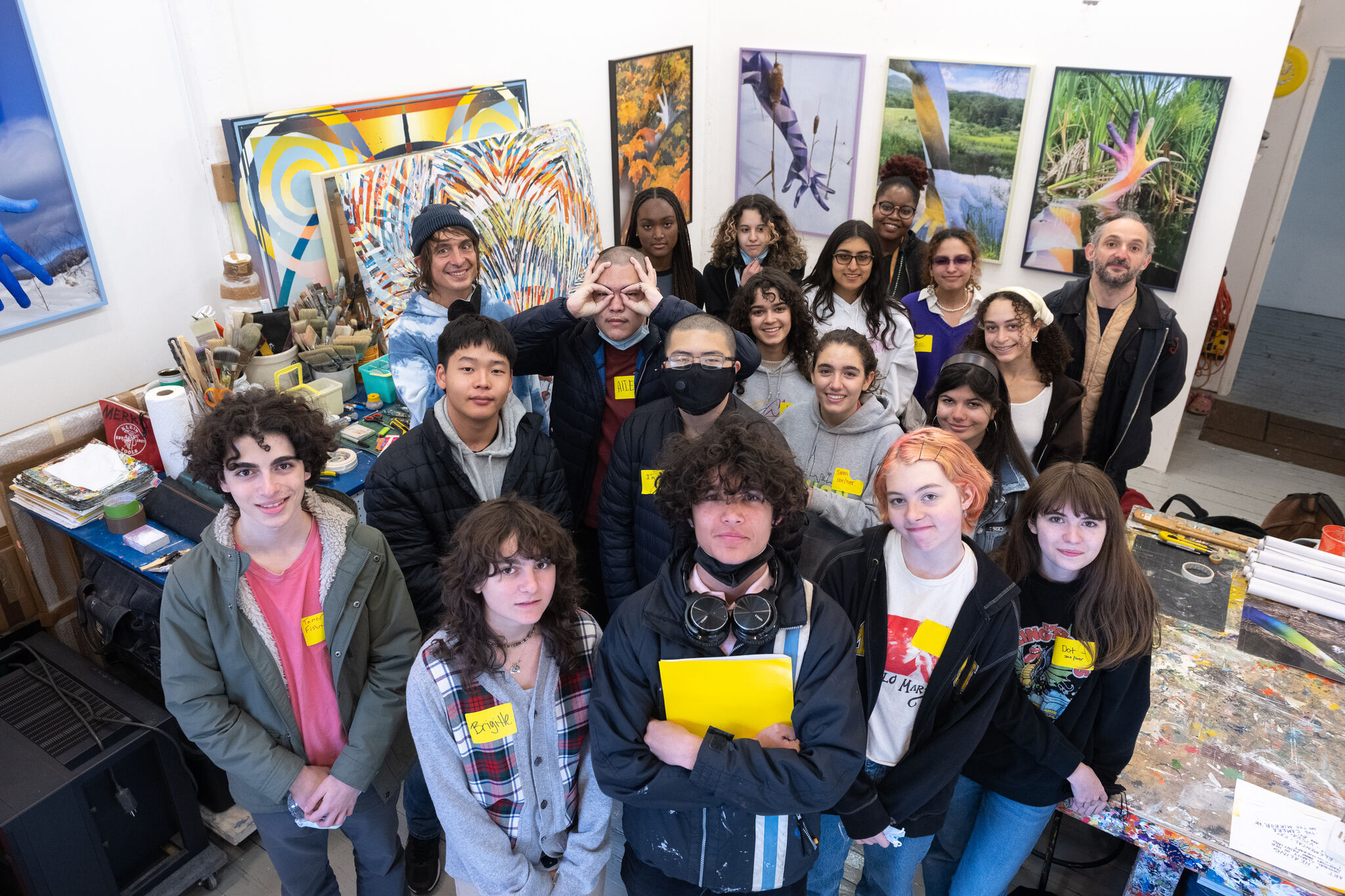
YI Artists with Artist in Residence, Jonathan Berger, April 2022.
On Thursdays, YI Artists worked with 2022 Whitney Biennial artist Jonathan Berger. Berger’s work An Introduction to Nameless Love, explores profoundly transformative experiences of non-romantic love and consists of six text-based sculptures. The text in each sculpture emerged from dialogue between Berger and various individuals that sometimes took place over years. The final distilled texts were generated collaboratively by Berger, the individual subjects, and a guest editor of specific significance to each story. Berger worked with YI Artists and encouraged them to interview the most important person in their life, structuring the conversation around a series of questions they had never had the chance to ask about their life and the relationship that the two shared. YI Artists created an original alphabet, whose 26 letters served collectively as an abstract portrait of this person. Using the letters, YI artists produced original text-based artworks drawing on both excerpts from their interviews, the fonts the that they created, and class discussions exploring the project's themes.
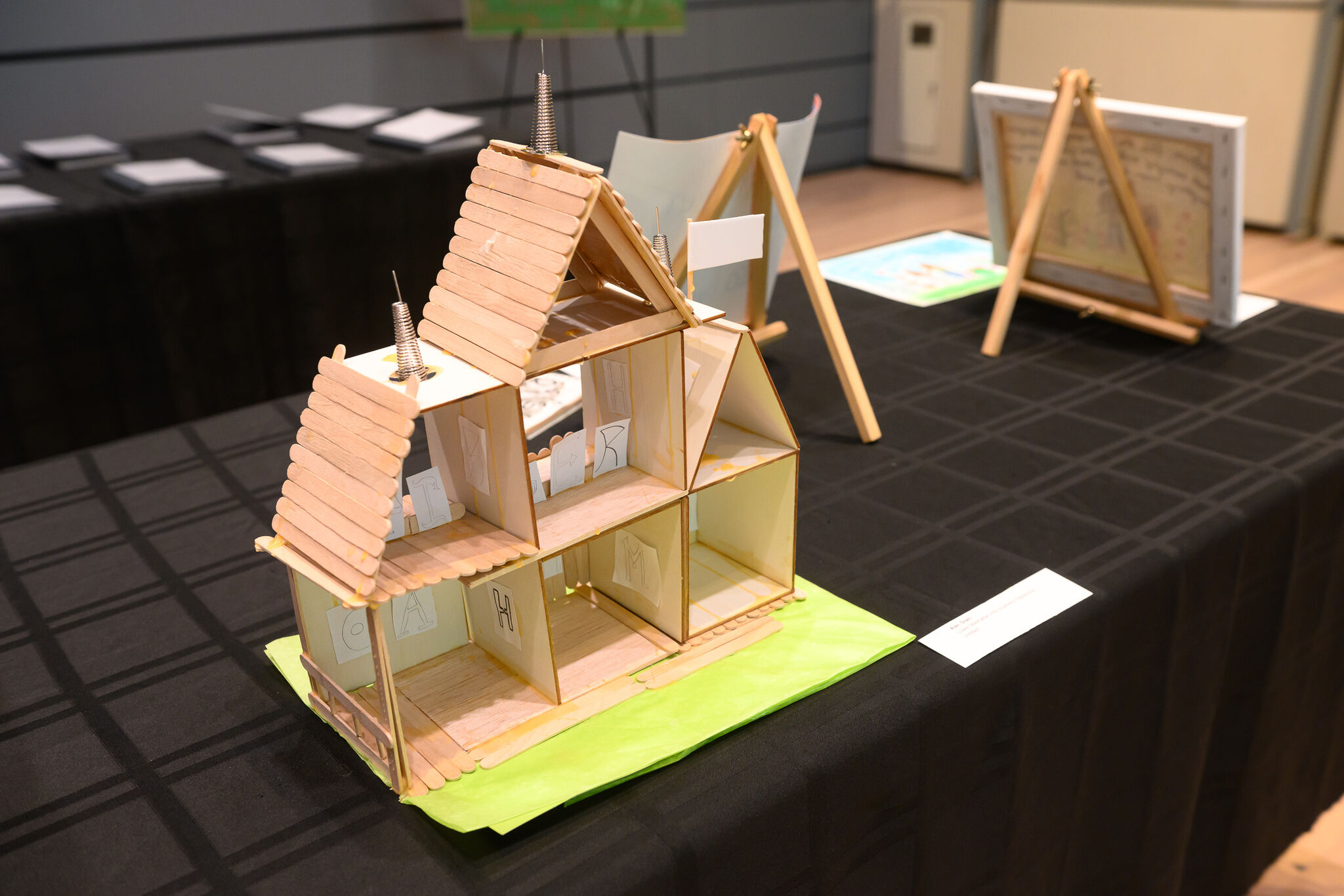
David Sheh
High School Of Health Profession And Human Services
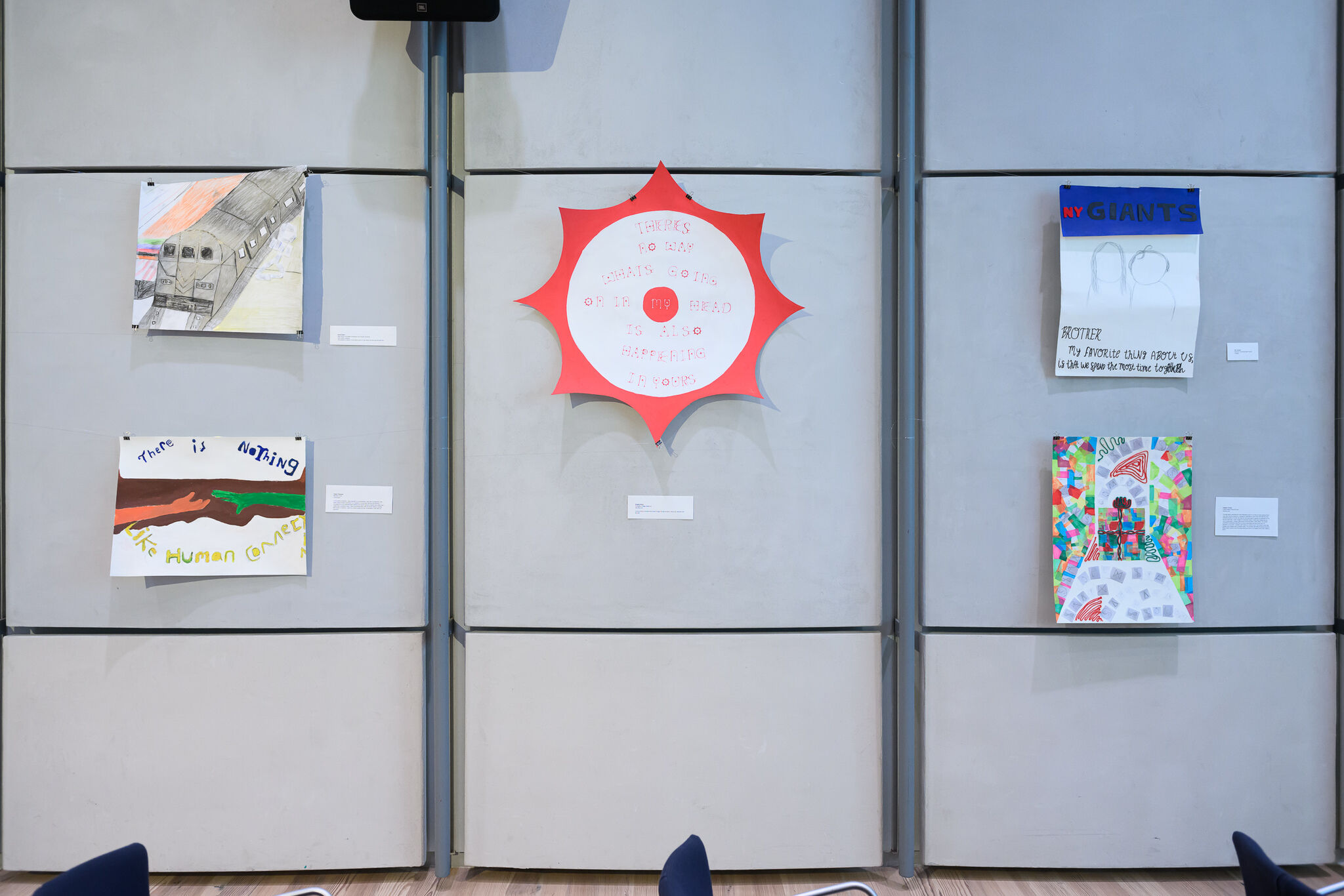
Dad’s Work Lifestyle
This artwork is based on the artist's point of view about his dad and his work life.
Ally Lawrence
Quest to Learn
The Nickster
Nicole Gonzalez
Bronx International High School
Deep on the Blue
Until I first did this project, I didn't clearly understand how deep my feelings were towards her. By using a palette of blues, I intended to show how deep my feelings are for her. By deep, I did not just mean significant, I also mean it is hard to get them unless you swim through all that water until you reach the bottom of that sea and find it in the deep sea. Every piece of this artwork means something different that somehow has a homogenous composition between each other. Every wave, every spark of blue that covers these pieces represents my feelings for her. She is a role model, someone that I look forward to and, since I was young, always wanted to be like. Since I was a child, my family used to tell me that I was the mini version of her, and to be honest, at that time I got a little annoyed by it at that time; Mainly because it was true, and I wanted to be myself, but honestly, I will proudly say that I will be a little like her. All humans have genuine flaws, but in this place, we just see blue. Now let me ask you a question... Cuando eras pequeño Alguna vez te compararon con Alguien mayor de tu familia?
Tamer Fishman
Brooklyn Tech
Connection
In this piece of artwork, I was inspired by a conversation I had with my grandma. She really values human connection so I wanted to incorporate that into the painting. I recreated the iconic Michelangelo painting two hands reaching towards each other and I made them contrast in color. I then surrounded them with the words ‘there is nothing like human connection,’ which is a direct quote from the conversation I had with my grandma.
Levi Obering
NYC Lab High School
Life’s Current
This art was created to show the flow of life. The flow is represented by the waves. The meaning behind this is within the passage written on top of the artwork, it states “life is like the ocean, it moves in every direction, all you have to do is go with it.” This is a phrase from my mom and it shows the “go with the flow” style of life. My motivation and inspiration for this art was the artist Reymond Pettubond. As well as trying to turn a quote into art. My process was creating a font for every letter and interviewing my family and using my favorite answers to sway the way I made this art.
Hannah Kim
Stuyvesant High School
The Moon
This piece is representative of the hardships that an illegal immigrant has to overcome to reach their dream in America. I felt the urge to sympathize with him in some way since the first time I heard his story, about how his family had to risk everything to move to America, from the relationships he had with his closest friends and family to the life of his sister. I longed to capture the complexity of the burdensome emotions he conveyed to me through an acrylic painting of a landscape in Albania and the phrase “Maybe it is not a dream.”
Sahara Sky Price
Clara Barton High School
Angst
Angst is a feeling very common especially for those with anxiety, whether social or panic. I wanted to dedicate this piece to not only my person but to my own struggles as well.
My person has a love for music, and since he is older, he listened to music on a cassette tape when he was my age, in comparison to Spotify or apple music. Going through their tapes growing up and him explaining how amazing the 90s were, helped me become fully immersed into the music, as well as culture. I wanted to create a piece that related to him and that I also felt for, almost a combination of the both of us.
I admire my father a lot, he’s my best friend, my dad, my everything. He battles with being super introverted. It has always been him, sad to watch but to each his own. As a lover of people, sometimes you have to understand why some avoid social interactions at all costs.
Lillian Ji
The Notre Dame School of Manhattan
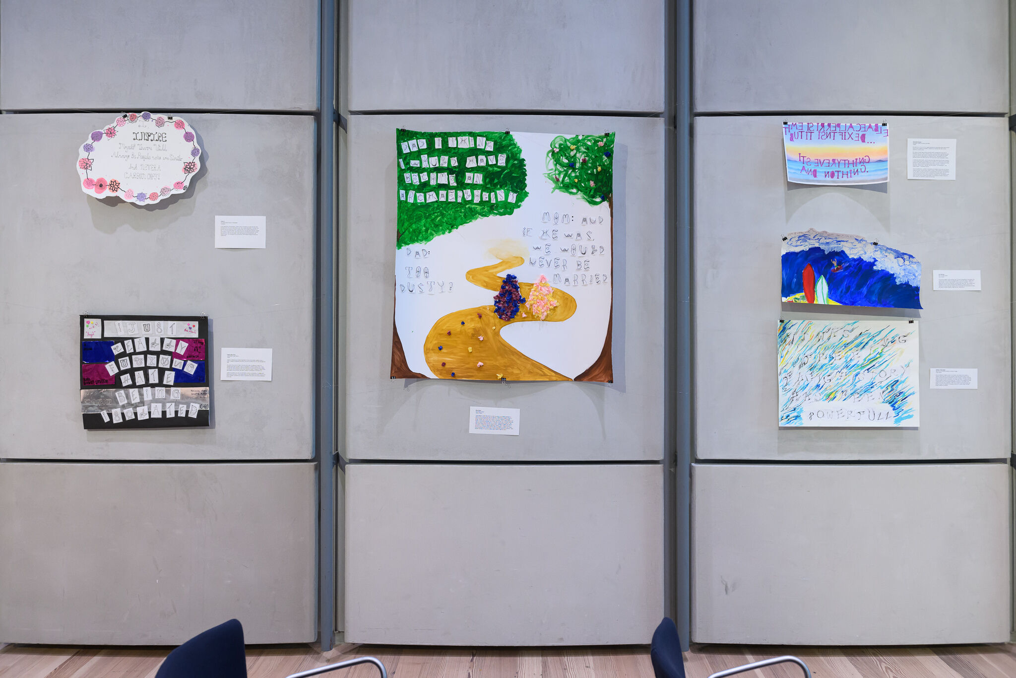
Inspiration
At the beginning of the semester, I tried to look for someone in my life that was really inspiring to me. One of my best friends, Jojo, has a unique personality. The letters are the way they are because my friend is never-ending. She is always going strong. At first, I cut out the printed letters, but I drew them out on the last piece because I wanted some letters to stand out more. I also made stamps for the flowers because I thought they would fit in with the bold letters. I also used gouache for the first time for the colorful circles. I am motivated to do art because I have always enjoyed showing my creative side.
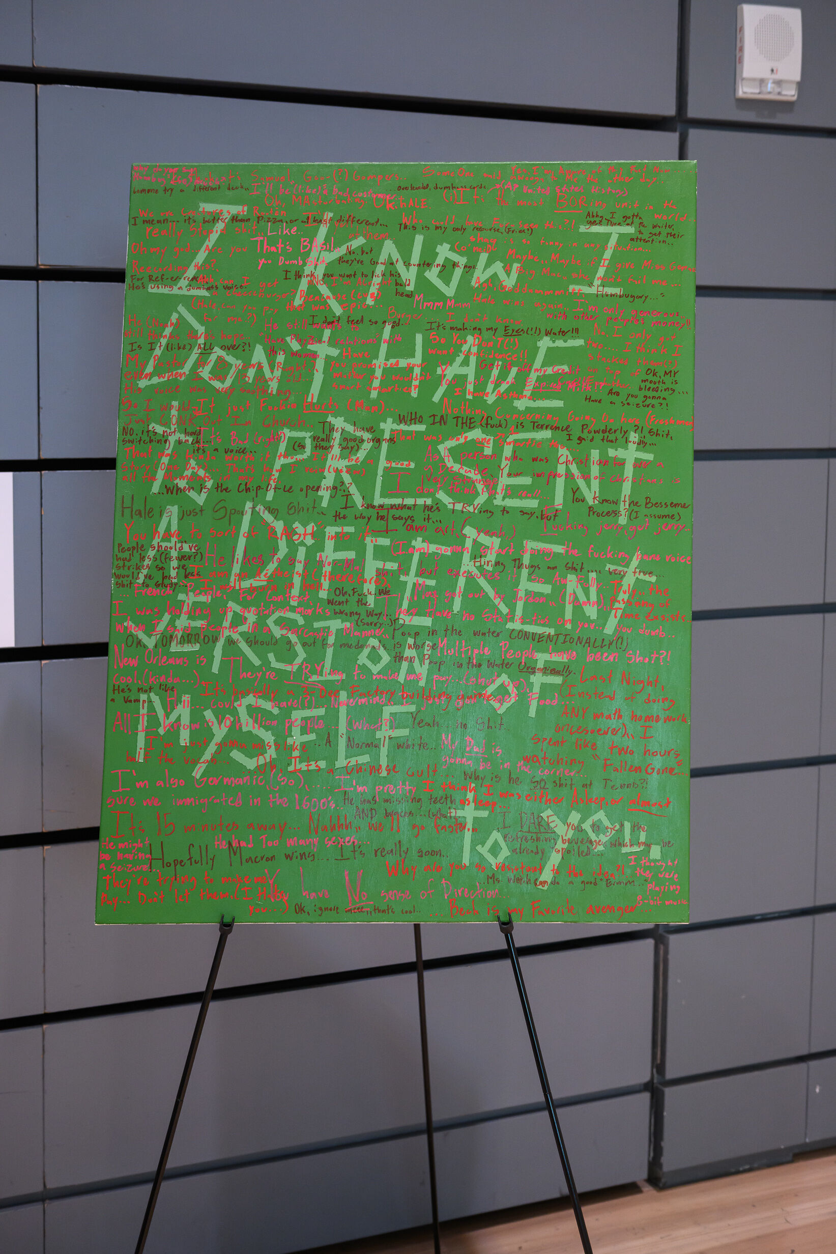
Hale Briner
High School of American Studies at Lehman College
Portrait of Luke Hoppa
Even before I knew who I was going to interview for this project, I immediately realized I wanted to do something that couldn't just focus around one sentence. Humans are very difficult to accurately portray with one sentence, especially if one has a relationship with said human.
I realized that I should interview my close friend, Luke Hoppa, as the focus for my piece. Luke, among other things, is eccentrically passionate. One thing that Luke loves is talking, an activity that never seems to stop. He has prolific opinions, ranging from the current pizza selection that is available to the illuminati-like cults he read about in China. Because of this, I thought of him as nearly the perfect focus for my study.
Using the five hours of recorded conversation, I took one of Luke's more thoughtful statements and used that as the background of the painting: "I know that I don't have to present a different version of myself to you." Although the sentence is meaningful and very appealing to the outside view of our relationship, it is merely a blanket statement. Although an accurate and truthful term, the true structure of Luke from my viewpoint was all of the conversations we've had throughout our friendship, no matter how unimportant or trivial they may be.
Using a type of green known as terra verte to paint the background and main statement of the painting was a reference to the technique used by renaissance painters to paint skin, which included painting an undercoat of green and adding pinks and reds to make the skin tone look more natural. I thought of the background statement as a mere part of the painting instead of the main piece. Without red to complete it, the green is just a green. But when mixed to form an accurate and beautiful color, the green can transform into one of the most important parts of the work. I used the same ideals for the red sentences that swarm the painting, for without a foundation that brings the sentences into something relevant, the red would just be a red.
The sentences that stuck out to me as an important part of our relationship are drawn in a mixture of terra verte and a tint of red, as those are the ones that I think can get as close to forming an accurate portrait of Luke as one can.
The background sentence is done in Luke's handwriting, and the red quotations taken from the recording are in my handwriting. Although a portrait could be a clear and accurate depiction of the person, it is still from the view of the artist themselves, which I wanted to get across through this aspect of my work.
The rest of the piece can speak for itself.
Brigitte Rossi
Manhattan Village Academy
Big Red Eye
You're looking into someone’s mind through the big red eye to see a big, and also red, thought.
Sivan Koen
The Clinton School
Spring Flowers
I was inspired to create this work of art after recording a conversation between my parents. When choosing lines from the interview, I realized that I wanted to focus on both of them and their dynamic for my piece. They are an example of "opposites attract," but they work so well. When I think of my parents, I think of them walking in the winter, my dad wearing all black, hand in hand with my mom who is wearing a light blue coat and a pink hat with pom-poms on it. I wanted to represent that image but in the more festive spring setting and their playful banter. I designed the letters with them in mind and so I created two separate alphabets. However, when creating the piece, I decided to use a mixture of their letters for their conversation as another way to show how connected they are. The process of creating the letters was very unique and I really enjoyed stepping a bit out of my artistic comfort zone to make this piece!
Kathleen Halley-Segal
High School of American Studies at Lehman College
It was Freeing
My art is intended to display a piece of my mother, and a piece of her evolution. I worked in chalk pastel and charcoal, because I knew they would be easy to move around. The lines and words are intended to be hard to discern, to express movement, similar to the way her form of expression, her writing, was freeing. The piece ends with the word powerful, lacking any surrounding color. The lack of color suggests the power of being able to let go of the stresses expressed in the flurry of color earlier in the image. My process was a challenge. I often found myself not enjoying the piece, and wanting to scrap it all. However, I continued to work at it to reach a place I felt that properly reflected my feelings.
Eugene Chung
Frank Sinatra School Of Arts
Mystical Gift
The task was to interview the most influential person in my life and ask questions that I had never had the chance to. I decided to interview my mom since she was the most influential person in my life. My intent for this piece was to express my gratitude for her and her hard work. I have created an inanimate object of what best categorizes my mom’s personality. I chose a gift as she is kind and likes to help others. The words scrambled everywhere describe my mom's personality and key words from our interview. In my work, I created a gift inside of a colorful room. The colorful room was created with multiple colors of tissue paper. The process was difficult because the thin tissue paper would rip and the string would get stuck to my fingers every time I tried to glue it.
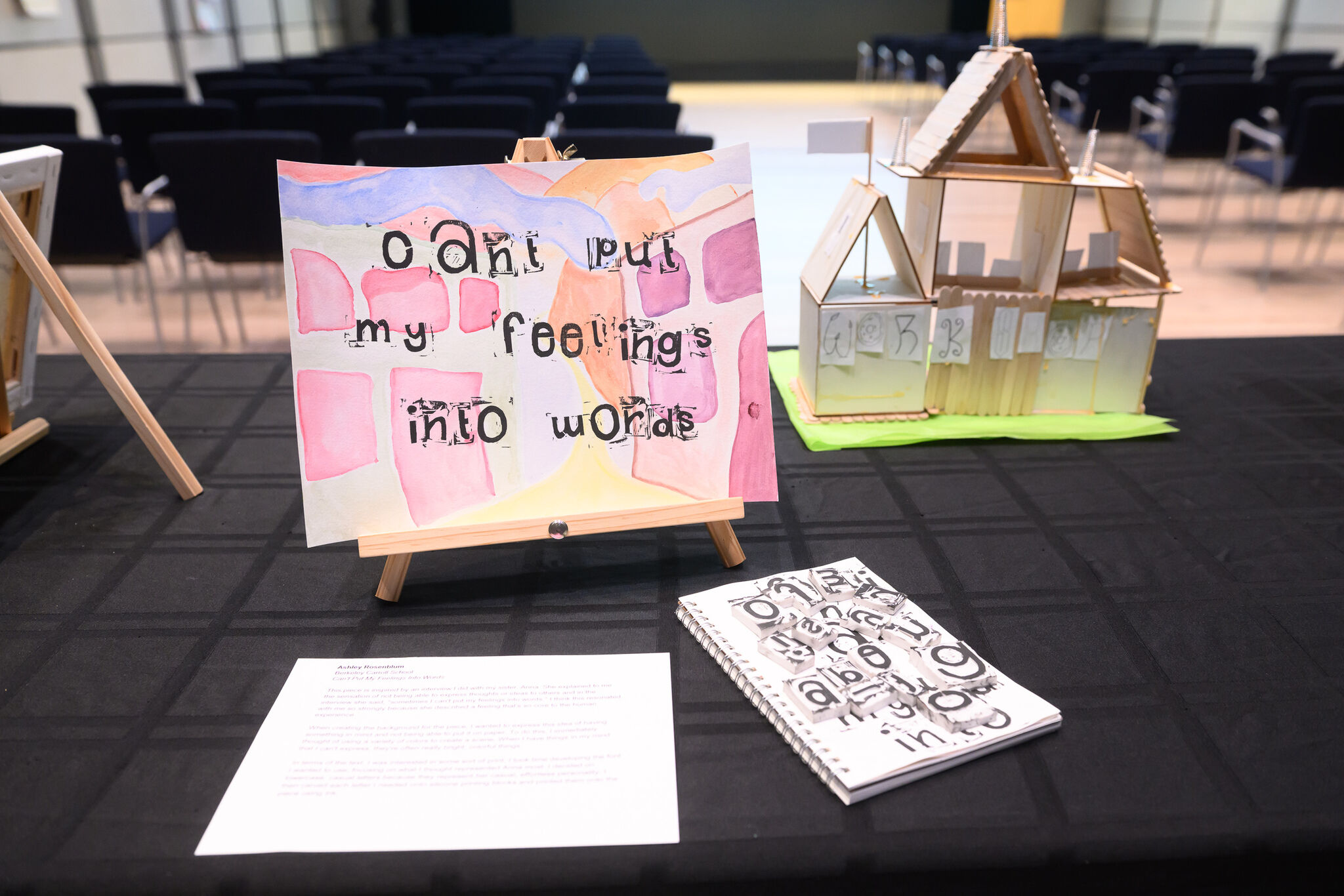
Ashley Rosenblum
Berkeley Carroll School
Can't Put My Feelings Into Words
This piece is inspired by an interview I did with my sister, Anna. She explained to me the sensation of not being able to express thoughts or ideas to others and in the interview she said, "sometimes I can't put my feelings into words." I think this resonated with me so strongly because she described a feeling that's so core to the human experience.
When creating the background for the piece, I wanted to express this idea of having something in mind and not being able to put it on paper. To do this, I immediately thought of using a variety of colors to create a scene. When I have things in my mind that I can't express, they're often really bright, colorful things.
In terms of the text, I was interested in some sort of print. I took time developing the font I wanted to use, focusing on what I thought represented Anna most. I decided on lowercase, casual letters because they represent her casual, effortless personality. I then carved each letter I needed onto silicone printing blocks and printed them onto the piece using ink.
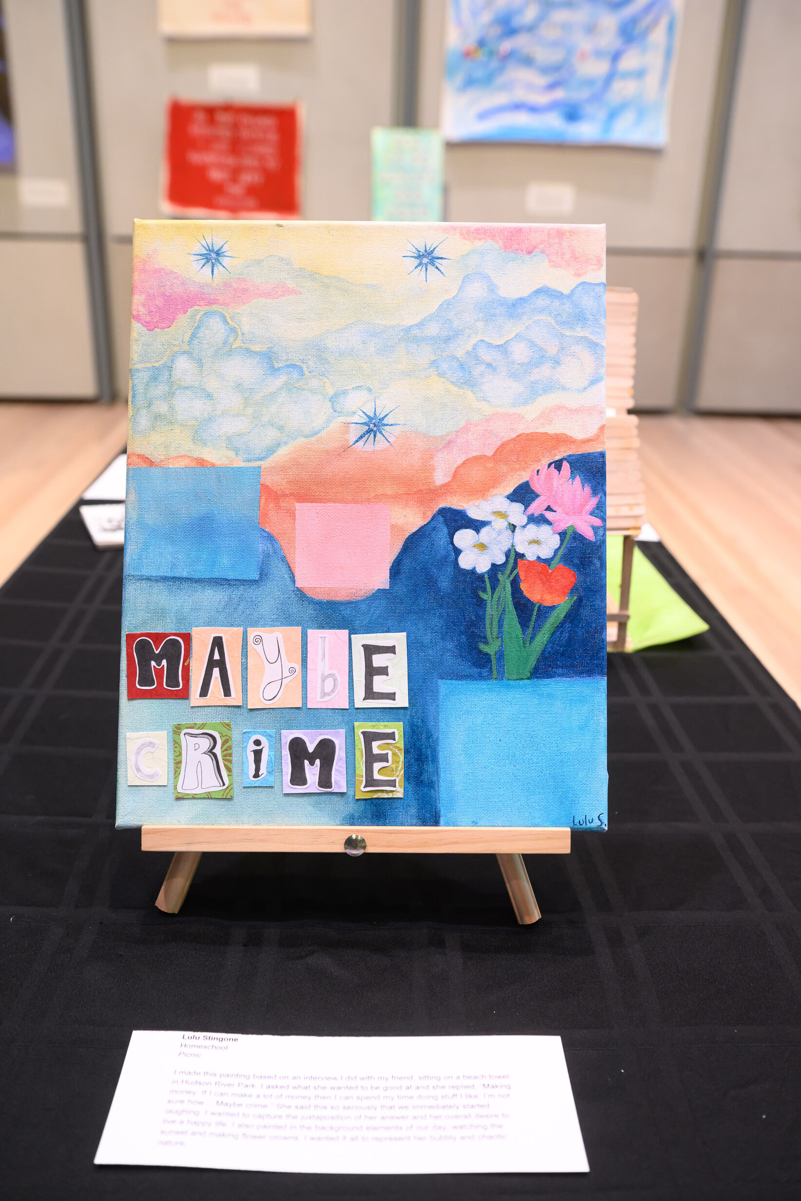
Lulu Stingone
Homeschool
Picnic
I made this painting based on an interview I did with my friend, sitting on a beach towel in Hudson River Park. I asked what she wanted to be good at and she replied, “Making money. If I can make a lot of money then I can spend my time doing stuff I like. I’m not sure how… Maybe crime.” She said this so seriously that we immediately started laughing. I wanted to capture the juxtaposition of her answer and her overall desire to live a happy life. I also painted in the background elements of our day, watching the sunset and making flower crowns. I wanted it all to represent her bubbly and chaotic nature.
Dot Lethbridge
The Clinton School
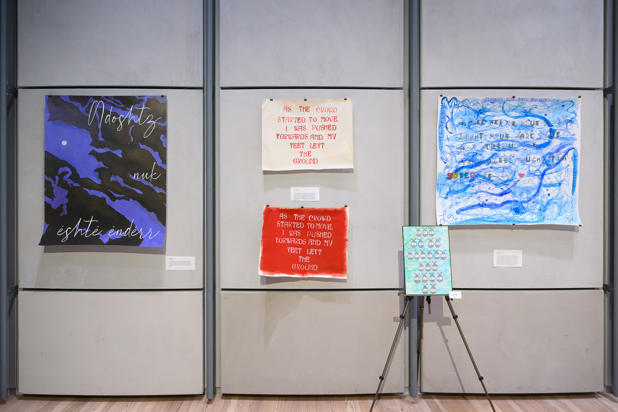
Flying
The quote I used in my works is extracted from an interview I did with my grandmother, in which she recalled attending a protest against the Vietnam War in the late 1960s in London. I left this context out of the works themselves and kept the design on both canvases quite simple to allow room for interpretation before learning the context. In these pieces, I was inspired by the 1960s, especially brands like BiBa, when creating my font as the style is particularly representative of the time. I chose to use a lot of red in these works because my grandmother was a member of the Young Socialists, who are represented by the color red. Overall, my intent with this work was to pack as much meaning as possible into a very simple piece, to allow room for interpretation both with and without context.
Gabryellah Burgos
Manhattan Center for Science and Math
Untitled
My artwork is a 10.5 in. by 18 in. pastel landscape of a clear-skied beach using colored pencils (and oil pastel for the letters), inspired by an interview held with my dad regarding concepts of time.
My creation process began with the interview itself. Choosing time as the topic of discussion was more or less a personal choice, as was choosing to dedicate this piece to my dad. However, both choices complement each other, as my father had initially taught me about the delicateness yet complexity of time. I then sifted through his interview answers and pulled responses I felt could pass on that knowledge to others.
In making the artwork itself, I went through three drafts before this final piece. Deciding to scrap multiple pieces was frustrating, but for the best, as I continuously found myself projecting my artistic preference rather than my dad's. In hopes of expressing his ideas and taste, I asked him what he enjoyed seeing most in artworks, to which he responded, "Pastel colors... light pink, blue, and yellows... And landscapes... Like jungles, deserts... Somewhere remote."
Given his preferences, I wanted to emphasize his fondness for light colors and remote locations through a soothing beach absent of texture. Without texture, the landscape is not only meant to be easy on the eyes, but representative of the quote. The importance of time, and the concept itself, can be overwhelming or liberating. But it relies on individual perspective. Does it mean everything or nothing to you? The simplicity of the beach provides room to answer that question, as the absence of realism evokes the same serenity yet existential curiosity that time does.
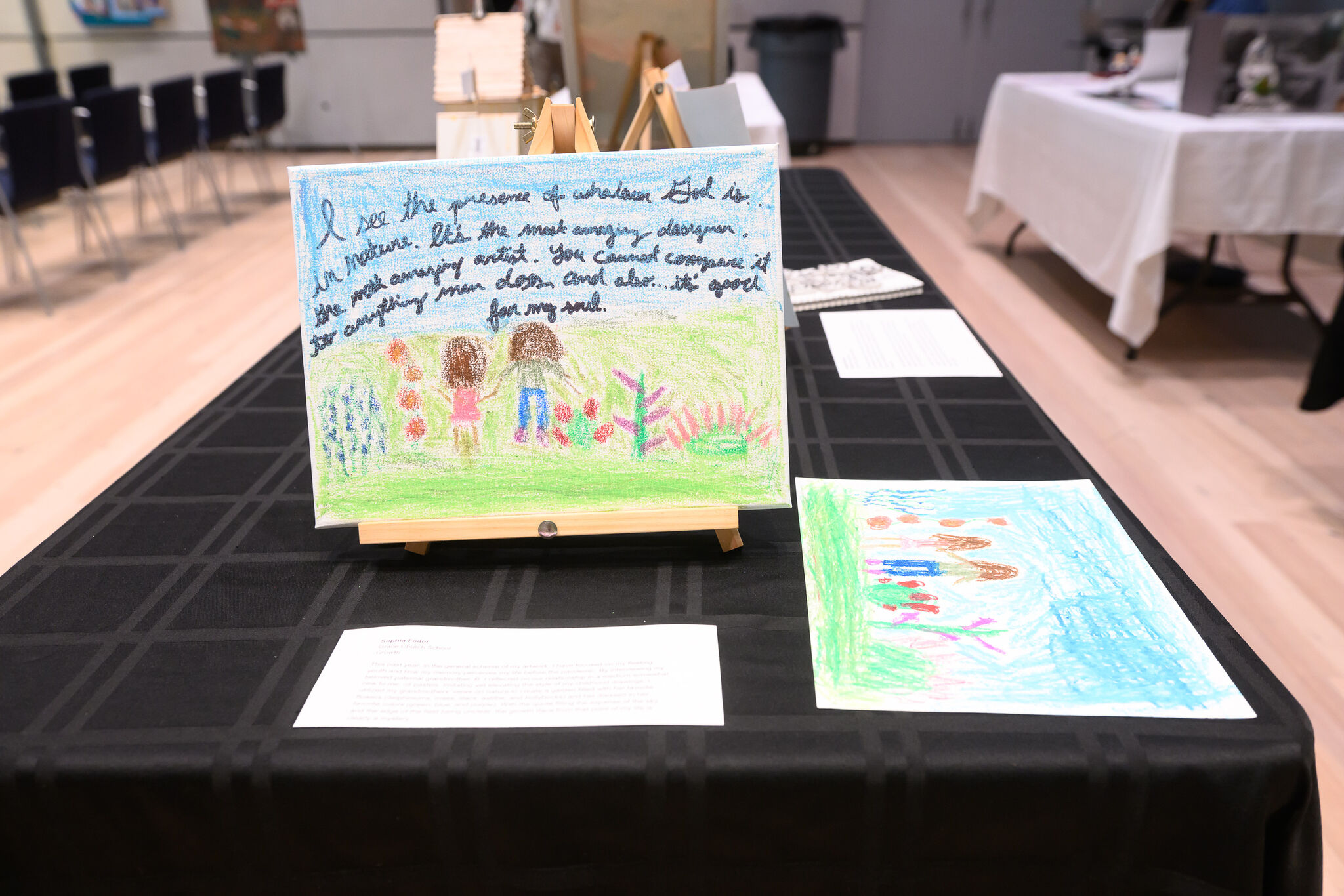
Sophia Fodor
Grace Church School
Growth
This past year, in the general scheme of my artwork, I have focused on my fleeting youth and how my memory perceives my life before the pandemic. By interviewing my beloved paternal grandmother, B, I reflected on our relationship in a medium somewhat new to me: oil pastels. Imitating yet elevating the style of my childhood drawings, I utilized my grandmothers' views on nature to create a garden filled with her favorite flowers (delphiniums, roses, lilacs, astilbe, and hollyhocks) and her dressed in her favorite colors (green, blue, and purple). With the quote filling the expanse of the sky and the edge of the field being unclear, the growth Iface from that point of my life is clearly a mystery.
Alen Sheh
Lower Manhattan Arts Academy Highschool
Untitled
Sia Jumani
Brooklyn Technical High School
Untitled