Teacher Guide:
America Is Hard to See: Grades 6–12
May 1, 2015

About this guide
1. How can these materials be used?
These materials provide a framework for preparing you and your students for a visit to the exhibition and offer suggestions for follow up classroom reflection and lessons. The discussions and activities introduce some of the exhibition’s key themes and concepts.
2. Which grade levels are these materials intended for?
These lessons and activities have been written for Elementary, Middle, or High School students. We encourage you to adapt and build upon them in order to meet your teaching objectives and students’ needs.
3. Learning standards
The projects and activities in these curriculum materials address national and state learning standards for the arts, English language arts, social studies, and technology.
4. Feedback
Please let us know what you think of these materials. How did you use them? What worked or didn’t work? Email us at schoolprograms@whitney.org.
ABOUT THE INAUGURAL EXHIBITION
AMERICA IS HARD TO SEE
Drawn entirely from the Whitney Museum of American Art’s collection, America Is Hard to See takes the inauguration of the Museum’s new building as an opportunity to reexamine the history of art in the United States from the beginning of the twentieth century to the present. Comprising more than six hundred works, the exhibition elaborates the themes, ideas, beliefs, and passions that have galvanized American artists in their struggle to work within and against established conventions, often directly engaging their political and social contexts. Numerous pieces that have rarely, if ever, been shown appear alongside beloved icons in a conscious effort to unsettle assumptions about the American art canon.
The title, America Is Hard to See, comes from a poem by Robert Frost and a political documentary by Emile de Antonio. Metaphorically, the title seeks to celebrate the ever-changing perspectives of artists and their capacity to develop visual forms that respond to the culture of the United States. It also underscores the difficulty of neatly defining the country’s ethos and inhabitants, a challenge that lies at the heart of the Museum’s commitment to and continually evolving understanding of American art.
Organized chronologically, the exhibition’s narrative is divided into thematic “chapters” installed throughout the building. These sections revisit and revise established tropes while forging new categories and even expanding the definition of who counts as an American artist. Indeed, each chapter takes its name not from a movement or style but from the title of a work that evokes the section’s animating impulse. Works of art across all mediums are displayed together, acknowledging the ways in which artists have engaged various modes of production and broken the boundaries between them.
America is Hard to See reflects the Whitney’s distinct record of acquisitions and exhibitions, which constitutes a kind of collective memory—one that represents a range of individual, sometimes conflicting, attitudes toward what American art might be or mean or do at any given moment. By simultaneously mining and questioning our past, we do not arrive at a comprehensive survey or tidy summation, but rather at a critical new beginning: the first of many stories to tell.
Find out more about the exhibition here:
ABOUT THE BUILDING
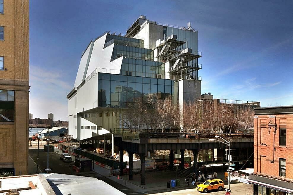
The Whitney’s new building was designed by architect Renzo Piano. Piano’s design was inspired by the industrial character of the neighboring buildings in the Meatpacking District. The connection to the neighborhood is integral to the building. The building is constructed mostly of concrete, steel, stone, reclaimed pine, and low-iron glass. Where it meets the street, the building is “raised” on narrow pillars creating the “largo”, a public space right at the base of the High Line. There’s art all over the new Whitney, in the indoor galleries, stairwell, first-floor lobby, and on the outdoor terraces. Piano designed a special outdoor staircase that goes from the sixth to the eighth floors that echo the forms of the fire escapes on buildings all over New York City. When you visit the Museum, take a walk outside with your students and check out the awesome 360 degree views!
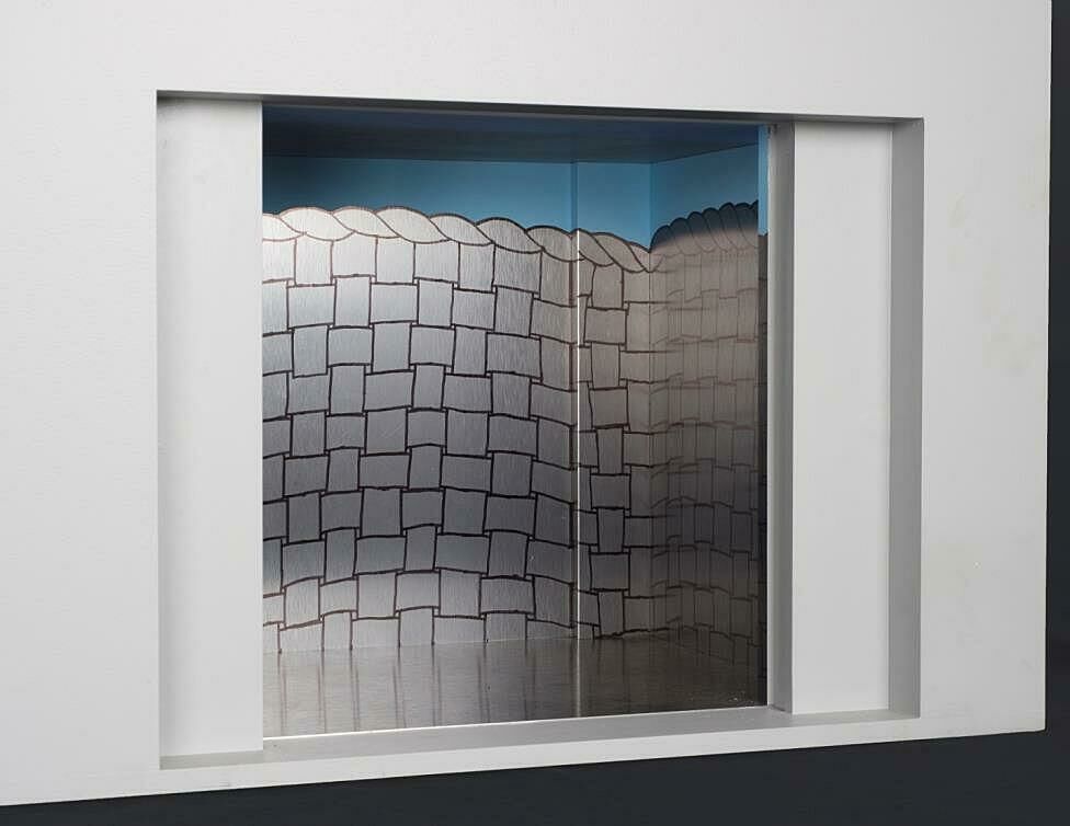
Step into an artwork! Artist Richard Artschwager designed the four elevators for the new building titled Four in Six. The elevators are based on six themes that occupied Artschwager’s imagination from the mid-1970s throughout his artistic career: door, window, table, basket, mirror, rug. Each elevator is an immersive installation. The largest elevator is being inside a giant woven basket that lifts you (and artworks) up and down. In the second elevator you can peer into the looking glass. The third elevator opens, revealing a window and a door that might transport you to another world. In the fourth elevator, it is as though you are literally inside one of Artschwager’s sculptures, under a table.
Pre-visit Activities
Before visiting the Whitney, we recommend that you and your students explore and discuss some of the ideas and themes in the exhibition. You may want to introduce students to at least one or two works of art in the exhibition. See the Images and Related Information section of this guide for examples of artists and works that may have particular relevance to your classroom.
Objectives:
- Introduce students to the works of American artists and examine how they represented the world around them.
- Introduce students to the themes they may encounter on their museum visit.
- Explore how artists have interpreted America and what it means to be American in the twentieth and twenty-first centuries.
ARTIST AS CRITIC
AMERICA IS HARD TO SEE
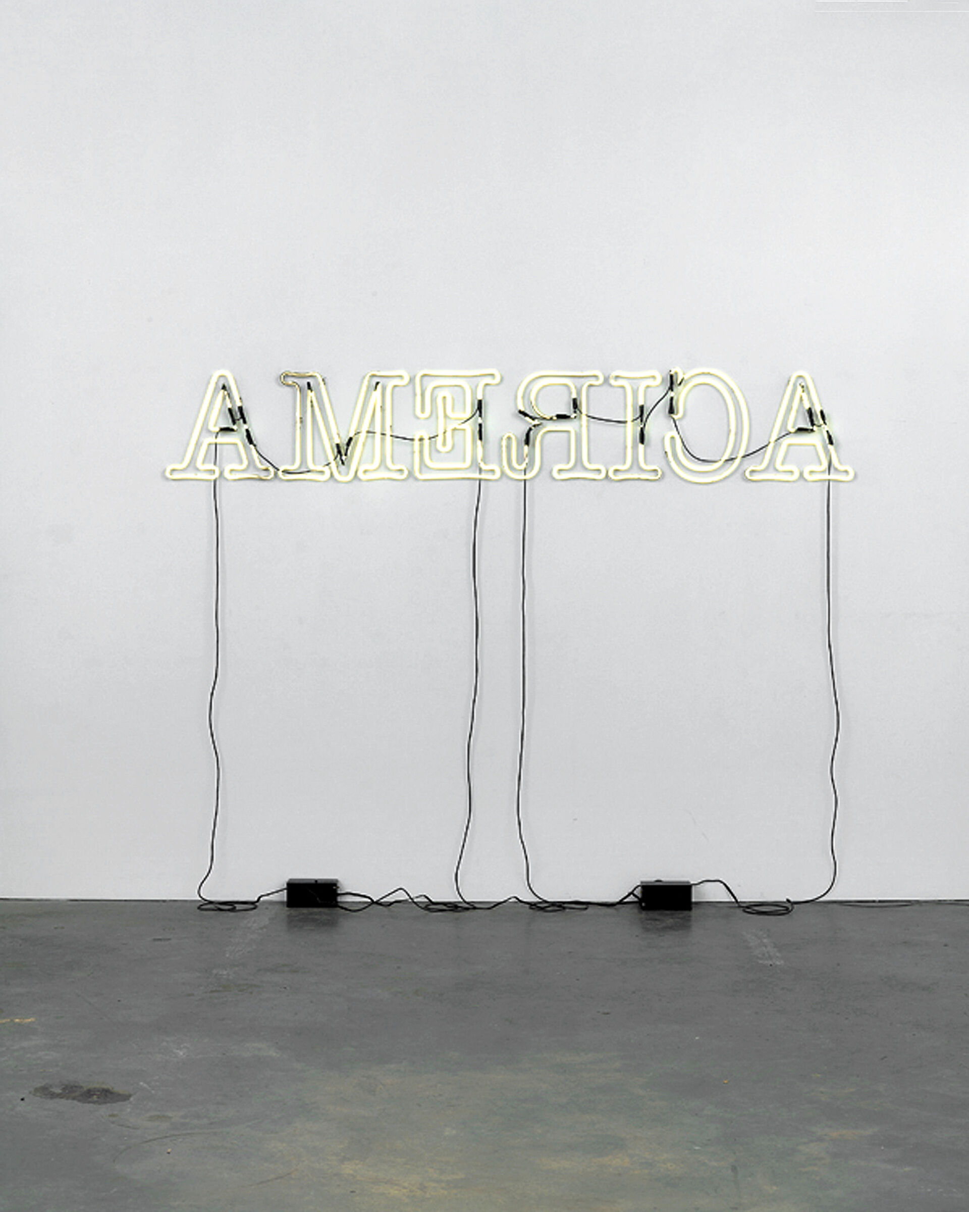
Glenn Ligon (1960-), Rückenfigur, 2009. Neon and paint, Overall: 24 × 145 1/2 × 5 in. (61 × 369.6 × 12.7 cm). AP 1/2, Edition of 3. Whitney Museum of American Art, New York; Purchase, with funds from the Painting and Sculpture Committee 2011.3a-I Courtesy of the artist and Regen Projects, Los Angeles
The exhibition’s title, America Is Hard to See suggests the impossibility of presenting a simplified or single narrative or history of American life. Rather, the title, America Is Hard to See is used as a metaphor to suggest that multiple narratives implied by the works on view are complicated, layered, nuanced, and fluid.
In his neon work Rückenfigur, (2009), Glenn Ligon reconfigured the word America to reflect on a country that, in his words, is both a “shining beacon” and “dark star.” He remarked: “I was thinking about Dickens’s ‘the best of times, the worst of times,’ we can elect Barack Obama, and we’re still torturing people in prisons in Cuba. Those things are going on at the same time.”
a. With your students, discuss Ligon’s statement. In what ways is the United States both a “shining beacon” and a “dark star?” Ask students to consider this question both historically and in our present moment.
How does Ligon use the word “America” to create a metaphor for the times we live in? Ask students to think about how the content, form (reversed letters), and materials Ligon used in this work might function metaphorically or symbolically.
b. Read and discuss Robert Frost’s poem, America is Hard to See (1951) with your students:
http://www.whatsoproudlywehail.org/wp-content/uploads/2012/11/Frost_America-is-Hard-to-See.pdf
What is Frost’s view of Columbus’s voyage and his “discovery” of America?
In what ways does the poem suggest that America is hard to see?
How is this poem different from other poetry, literature, or song lyrics about America that students may have read?
The film America is Hard to See (1970), a documentary about Eugene McCarthy campaigning for the 1968 Democratic presidential nomination by Emile de Antonio, can be viewed on YouTube:
https://www.youtube.com/watch?v=IQ-8m5dbXFU
c. In 1968 Dr. Martin Luther King Jr. and another Democratic presidential nominee Robert Kennedy were assassinated, Republican Richard Nixon won the presidential election, the Vietnam war was still raging, and the country was rocked with race riots and student protests. Ask your students to research and discuss the events of 1968 and compare them to contemporary social and political issues. What are some of the social and political challenges that Americans face today?
d. Using the words “America is. . .” ask your students to brainstorm adjectives, nouns, metaphors, and similes to complete the phrase. Make a group word wall in your classroom.
ARTIST AS CRITIC
WHAT IS AMERICAN? (CONTINUED)
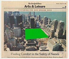
Ellsworth Kelly (1923-), Ground Zero, 2003. Collage on paper (newsprint), Sheet (Irregular): 11 9/16 × 13 1/2 in. (29.4 × 34.3 cm). Whitney Museum of American Art, New York; Gift of an anonymous donor 2003.269 © artist or artist’s estate
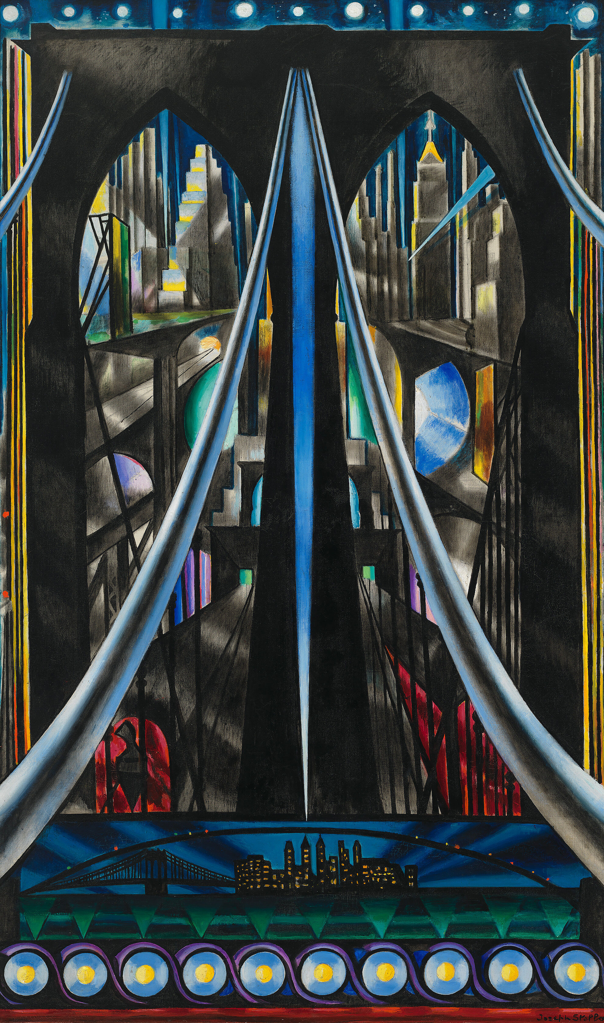
Joseph Stella, The Brooklyn Bridge: Variation on an Old Theme, 1939. Oil on canvas, overall: 70 1/4 × 42 3/16 in. (178.4 × 107.2 cm). Whitney Museum of American Art, New York; Purchase 42.15
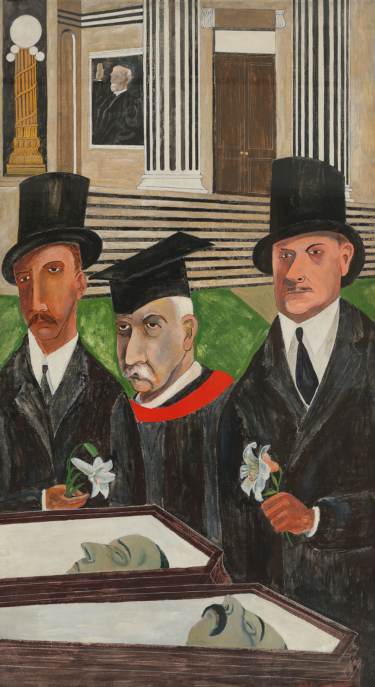
Ben Shahn, The Passion of Sacco and Vanzetti, (1931–1932). Tempera and gouache on canvas mounted on composition board, 84 × 48in. (213.4 × 121.9 cm). Whitney Museum of American Art, New York; gift of Edith and Milton Lowenthal in memory of Juliana Force 49.22 Art © Estate of Ben Shahn, Licensed by VAGA, New York, N.Y.
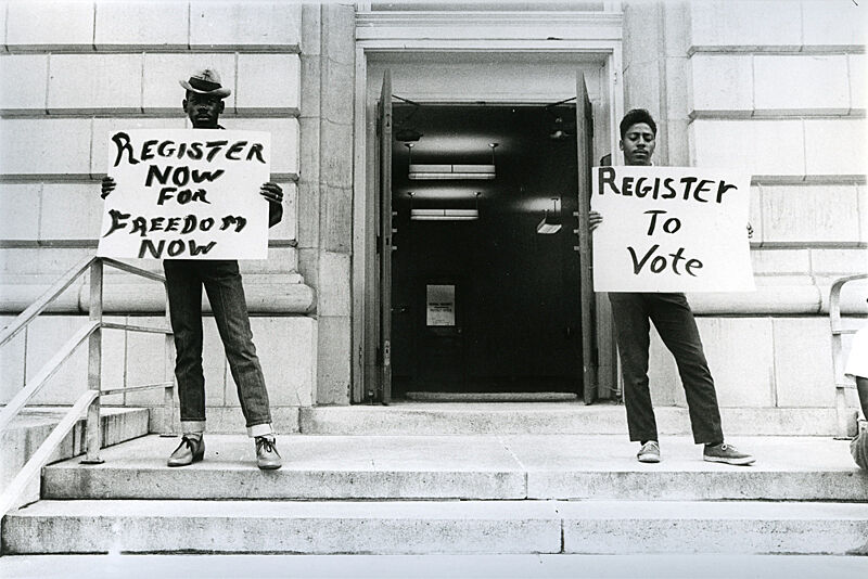
Danny Lyon (1942 -), Two SNCC Workers, Selma, from Blacks: The Movement, 1963. 10 15/16 × 13 15/16 in. (27.8 × 35.4 cm). Whitney Museum of American Art, New York; Purchase, with funds from the Photography Committee 95.6 © artist or artist’s estate
a. Divide students into small groups and ask each group to pick one of the images in this activity. Ask groups to discuss and present how the artist has represented America at a particular moment in time. Students can consider:
What was happening in the United States at the time when the artist made his or her work?
How might this work relate to social, political, or cultural issues of the time period?
What does this work communicate about the artist’s experiences of America?
b. With your students, discuss what it means to them to be American.
In what ways do your students consider themselves American? Or not American?
How do they express their “American-ness?”
What do students record, document, or share about their America?
How do they choose to represent their world and their lives?
What media do they use? Words? Photographs? Audio? Video?
Where do they share their ideas and observations? Smartphone? Social media? Blog? Journal? Sketching?
What politically and socially-minded content do they look for on other people’s social media feeds? What grabs their attention?
What is their collective view of America?
Artist as Experimenter
WHAT IS AMERICAN?
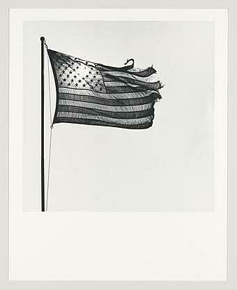
Robert Mapplethorpe (1946-1989), American Flag, 1977. Gelatin silver print, 19 3/4 × 15 15/16 in. (50.2 × 40.5 cm). Whitney Museum of American Art, New York; Gift of The Robert Mapplethorpe Foundation, Inc. in honor of Sondra Gilman Gonzalez-Falla;
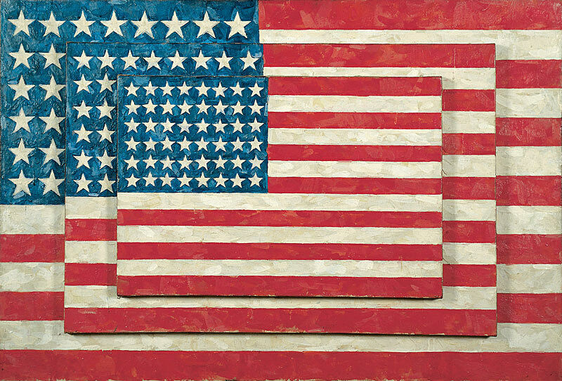
Jasper Johns, Three Flags, 1958. Encaustic on canvas (three panels), 30 7/8 × 45 3/4 in. (78.4 × 116.2 cm) overall. Whitney Museum of American Art, New York; purchase, with funds from the Gilman Foundation, Inc., The Lauder Foundation, A. Alfred Taubman, Laura-Lee Whittier Woods, Howard Lipman, and Ed Downe in honor of the Museum’s 50th Anniversary 80.32. © 2021 Jasper Johns / Licensed by VAGA at Artists Rights Society (ARS), New York
The flag in American art is both an emblem of national identity and a site of dissent. Ubiquitous and familiar in our daily environment, the flag can also be passed by, unnoticed. Additionally it can present ways to contrast the nation’s lofty ideals with its political realities. Jasper Johns’s Three Flags (1958) presents the flag as a flat, stacked object in a way that we don’t usually see it, while Robert Mapplethorpe’s photograph depicts a windswept, tattered flag. By placing the flag in an unexpected context or using it in an unpredictable way, these artists question the meaning of the flag and what it represents.
a. Discuss the American flag with your students.
Where do students usually see flags?
When they notice an American flag, what do they think of?
What does the American flag represent to them?
Is the meaning of the flag fixed or fluid? In what ways?
b. Compare how Jasper Johns and Robert Mapplethorpe have depicted the flag.
In what ways do their representations change the meaning of the flag?
For Johns’s work, ask students to consider the potential meaning(s) of the multiple flags, the shift in scale of three flags, the layering of the flags, and the quality of Johns’s paint application. For Mapplethorpe’s photograph, ask students to consider the potential meaning(s) of the lighting, the decontextualization of the flag, and its tattered quality.
Post-visit Activities
Objectives
- Enable students to reflect upon and discuss some of the ideas and themes from the exhibition.
- Have students further explore some of the artists’ ideas through discussion and art-making activities.
ARTIST AS CRITIC
CHALLENGING MEDIA STEREOTYPES
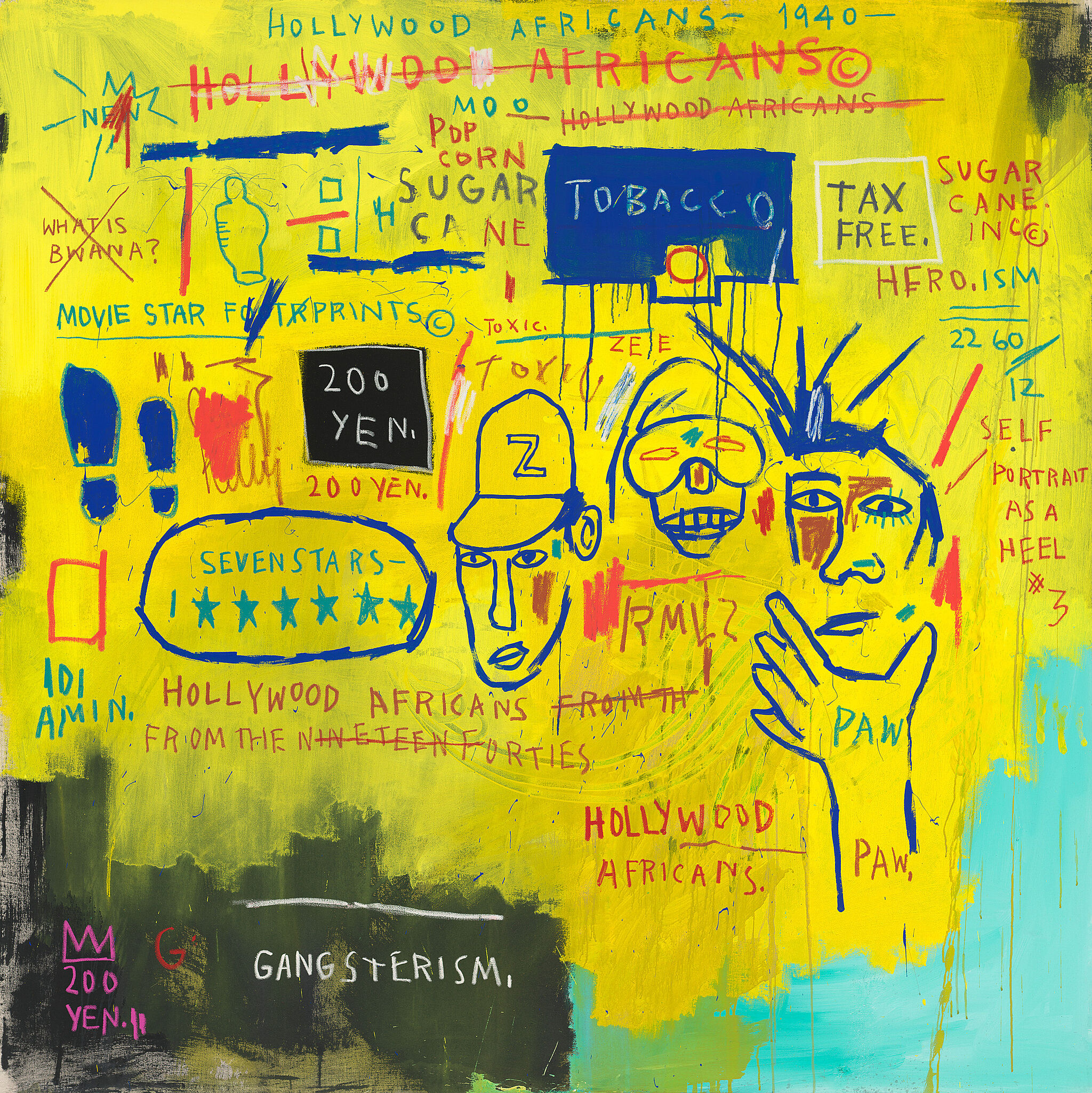
Jean-Michel Basquiat, Hollywood Africans, 1983. Acrylic and oil stick on canvas, 84 1/16 x 84 in. (213.5 x 213.4 cm). Gift of Douglas S. Cramer 84.23. © 2015 The Estate of Jean-Michel Basquiat/ ADAGP, Paris/Artists Rights Society (ARS), New York
In Hollywood Africans (1983), Jean-Michel Basquiat uses symbols and words to draw attention to stereotypes of African Americans in the Hollywood film and entertainment industry. In Untitled (We Don’t Need Another Hero) (1987), Barbara Kruger borrows an images from the mass media and combines them with a phrase that exposes the inequities of gender.
a. With your students, discuss how these artists combine words and images to challenge cultural stereotypes that are reinforced by the media.
b. Ask your students to use found text from newspapers, magazines, or bring in text from digital sources such as their facebook feed, Twitter, and blogs. Pair words, phrases, or sentences with found imagery from ephemera such as newspapers and magazines or Instagram to challenge the expectations of the image, to make a political statement, or to give new meaning to the image through the juxtaposition of words. Look again at Basquiat and Kruger. Ask students to consider color, composition, scale of words and images, layering.
Display and discuss students’ work. Ask them to reflect on the message or statement that they made by combining text and images. Is their work provocative? Activist? Reflective? Introspective? Poetic? Controversial? In what ways?
ARTIST AS CRITIC
IDENTITY POLITICS
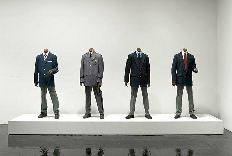
Fred Wilson, Guarded View, 1991. Wood, paint, steel and fabric, dimensions variable. Whitney Museum of American Art, New York; gift of the Peter Norton Family Foundation 97.84a-d © Fred Wilson
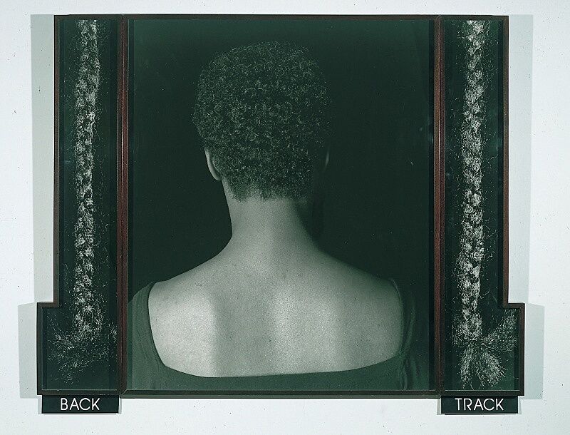
Lorna Simpson, 2 Tracks, 1990 91.59.4a-e
Works in the Guarded View chapter of the exhibition explore how our identities are shaped by culture as much as by birth, and how categories like race and gender depend on the complicated interaction between how we see and present ourselves and how others see us.
In Lorna Simpson’s 2 Tracks (1990), a woman turns her back to the camera, challenging our gaze and our ability to classify her as either an individual or a type, while the faceless mannequins in Fred Wilson’s Guarded View confront us with black figures that serve institutional power but are usually meant to go unseen. With your students, explore how these artists have used the body to provoke a dialogue about race and identity.
a. Ask students to describe what they see in these works. Discuss why they think Simpson chose to show this woman’s back, and to whom the braids might belong to. How might the words “BACK” and “TRACK” relate to the photographs? Discuss what the mannequins in Wilson’s work are wearing and why he chose to represent the guards without heads. How does the title, Guarded View affect the meaning of Wilson’s work?
b. Ask students to do this project individually or in small groups. If the figures in these works could speak to your students, what would they say? How would students give them a voice? Have your students answer this question through a creative writing first person response. Ask them to consider the time when these works were made, the time in which we live, and the time in the past to which these works might refer.
c. By stepping into her or his shoes and embodying the character, what new perspectives did students discover? How did their perspectives differ from one another?
Images and Related Information
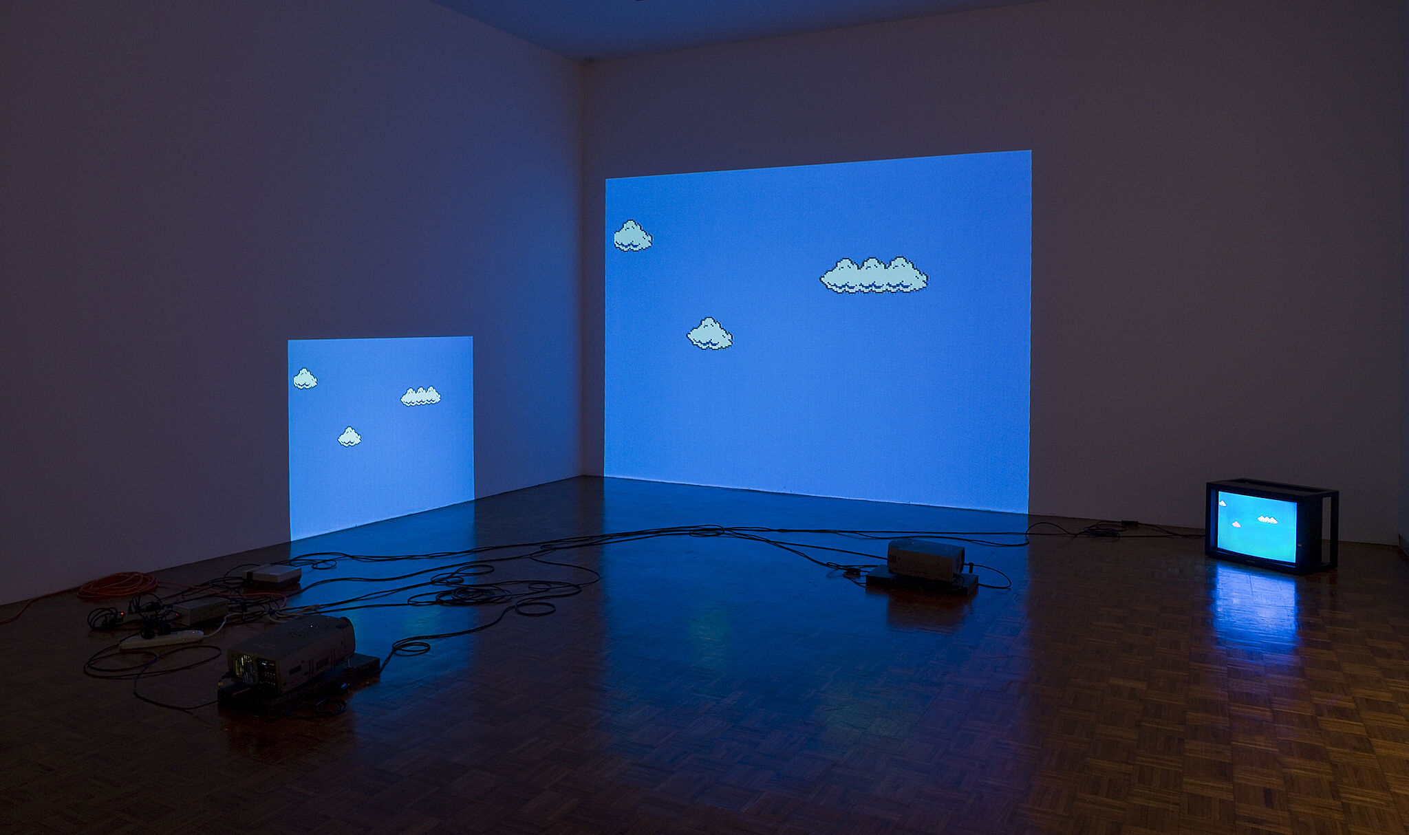
Cory Arcangel (b. 1978). Super Mario Clouds, 2002. Handmade hacked Super Mario Brothers cartridge and Nintendo NES video game system, Edition no. 2/5. Dimensions variable. Whitney Museum of American Art, New York; purchase, with funds from the Painting and Sculpture Committee 2005.10.© Cory Arcangel. Courtesy of the artist and Team Gallery, New York
CORY ARCANGEL
SUPER MARIO CLOUDS, 2002
For this installation Cory Arcangel hacked into and modified a cartridge of Super Mario Bros., the blockbuster Nintendo video game released in the United States in 1985. By tweaking the game’s code, the artist erased all of the sound and visual elements except for the iconic fluffy white clouds that scroll endlessly across a bright blue sky. Arcangel, who trained as a musician, considers computers and video game consoles his instruments; he will often learn a new programming language in order to develop an artwork. Viewers can model their own version: Arcangel provides detailed instructions as well as the code for re-creating the project on his website.
Jean-Michel Basquiat, Hollywood Africans, 1983. Acrylic and oil stick on canvas, 84 1/16 x 84 in. (213.5 x 213.4 cm). Gift of Douglas S. Cramer 84.23. © 2015 The Estate of Jean-Michel Basquiat/ ADAGP, Paris/Artists Rights Society (ARS), New York
JEAN-MICHEL BASQUIAT
HOLLYWOOD AFRICANS, 1983
Hollywood Africans is one of a series of Jean-Michel Basquiat’s paintings that feature images and texts relating to stereotypes of African Americans in the entertainment industry. It was painted while Basquiat was on an extended visit to Los Angeles, California, in 1983. Several of the work’s notations are autobiographical: the trio of figures on the right depicts the artist with the rap musician Rammellzee and the painter Toxic, who had traveled with him from New York, and he includes the digits of his birth date: 12, 22, and 60. Other notations are historical: phrases such as “Sugar Cane,” “Tobacco,” “Gangsterism,” and “What is Bwana?” allude to the limited roles available to black actors in old Hollywood movies. The notion of exclusion or excision is reiterated in the way that Basquiat often crossed out words or phrases in his works. The technique, he explained, was actually meant to direct attention to them: “I cross out words so you will see them more; the fact that they are obscured makes you want to read them.”
Jasper Johns, Three Flags, 1958. Encaustic on canvas (three panels), 30 7/8 × 45 3/4 in. (78.4 × 116.2 cm) overall. Whitney Museum of American Art, New York; purchase, with funds from the Gilman Foundation, Inc., The Lauder Foundation, A. Alfred Taubman, Laura-Lee Whittier Woods, Howard Lipman, and Ed Downe in honor of the Museum’s 50th Anniversary 80.32. © 2021 Jasper Johns / Licensed by VAGA at Artists Rights Society (ARS), New York
JASPER JOHNS
THREE FLAGS, 1958
In 1954, Jasper Johns began painting what would become one of his signature emblems: the American flag. As an iconic image—comparable to the targets, maps, and letters that he also has depicted—Johns realized that the flag was “seen and not looked at, not examined.” The execution and composition of Three Flags elicit close inspection by the viewer. The painting draws attention to the process of its making through Johns’s use of encaustic, a mixture of pigment suspended in warm wax that congeals as each stroke is applied; the resulting accumulation of discrete marks creates a sensuous, almost sculptural surface. The work’s structural arrangement adds to its complexity. The trio of flags—each successively diminished in scale by about twenty-five percent—projects outward, contradicting classical perspective, in which objects appear to recede from the viewer’s vantage point. By shifting the visual emphasis from the flag’s emblematic meaning to the geometric patterns and variegated texture of the picture surface and the canvas structure, Johns explores the boundary between abstraction and representation. As he remarked, this painting allowed him to “go beyond the limits of the flag, and to have different canvas space.”
Ellsworth Kelly (1923-), Ground Zero, 2003. Collage on paper (newsprint), Sheet (Irregular): 11 9/16 × 13 1/2 in. (29.4 × 34.3 cm). Whitney Museum of American Art, New York; Gift of an anonymous donor 2003.269 © artist or artist’s estate
ELLSWORTH KELLY
GROUND ZERO, 2003
Ellsworth Kelly’s Ground Zero (2003) is an independent, unofficial proposal by the artist that was sent with a letter to The New York Times architecture critic, Herbert Muschamp, in response to the controversy about the plans for the former World Trade Center site. Kelly initially imagined the site as a large area of grass, but after he saw the Times’s photograph showing an aerial view of the site with its specific shape, Kelly’s proposal was comprised of a flat green space. As he wrote in his letter to Muschamp: ‘’I was excited to see the site from this vantage point, I was inspired to make a collage of my idea for the space of which I am sending you.’’ ‘’I feel strongly,’’ he continued, ‘’that what is needed is a ’visual experience,’ not additional buildings, a museum, a list of names or proposals for a freedom monument.‘’ These, he said, are ’’distractions from a spiritual vision for the site: a vision for the future.’’
Read more about this work here:
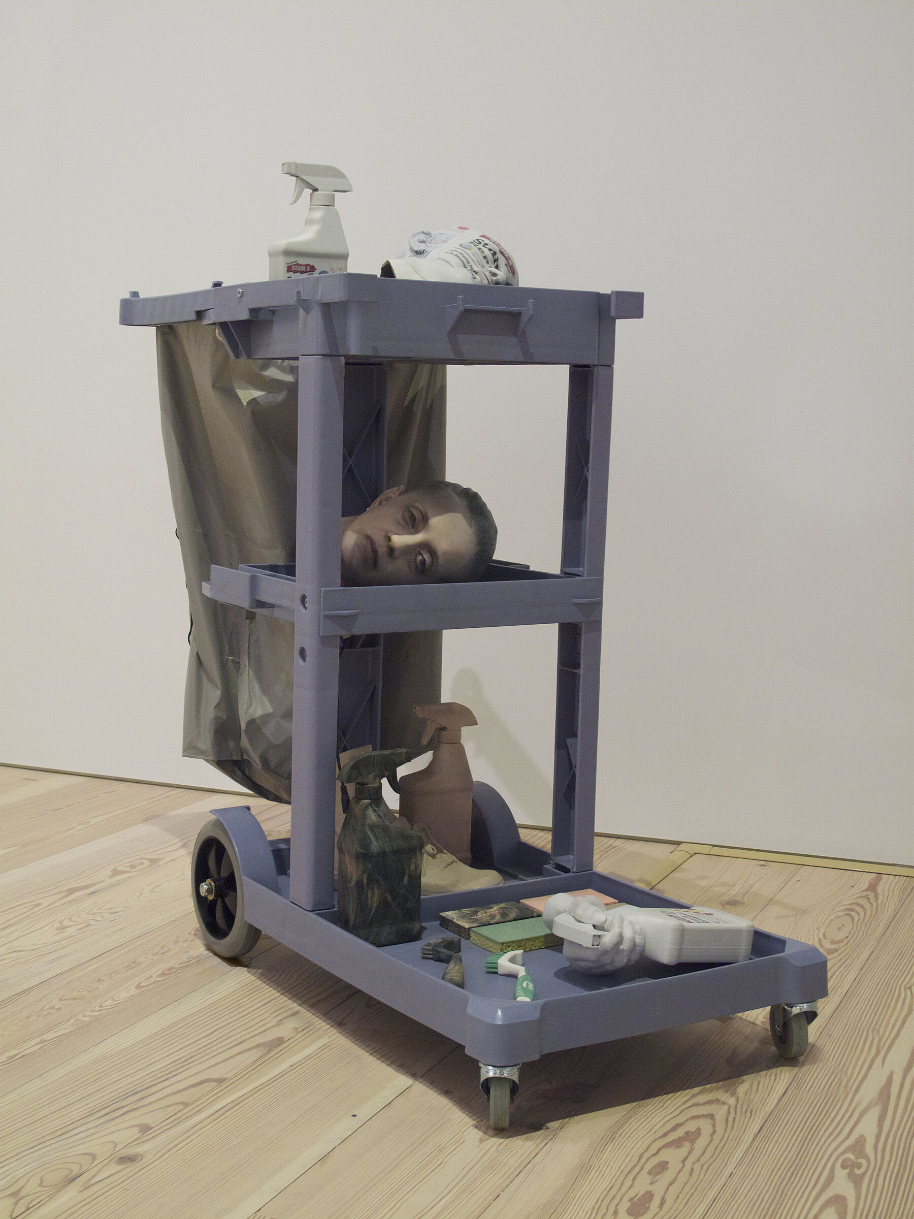
Josh Kline (1979-). Cost of Living (Aleyda), 2014. 3D printed sculptures in plaster, inkjet ink and cyanoacrylate, with janitor cart and LED lights, 44 1/2 × 36 × 19 1/2in. (113 × 91.4 × 49.5 cm). Whitney Museum of American Art, New York; promised gift of Laura Rapp and Jay Smith P.2014.118a o
JOSH KLINE
COST OF LIVING (ALEYDA), 2014
To make Cost of Living (Aleyda) and the other works in this series, Josh Kline interviewed workers—janitorial staff and package deliverers—and then made casts of the body parts they use to complete their daily tasks. In this case he spoke with a housekeeper named Aleyda at the Rivington Hotel.
The artist created each element of the sculptural assemblage using a 3-D printer. The results call attention to the laboring bodies of an often invisible workforce and offer a grim reminder that that workers’ humanity is often valued less than the tools they use to complete their job. Cost of Living (Aleyda) reflects what the artist has described as “the relentless push to squeeze more productivity out of workers—turning people into reliable, always-on office appliances.”
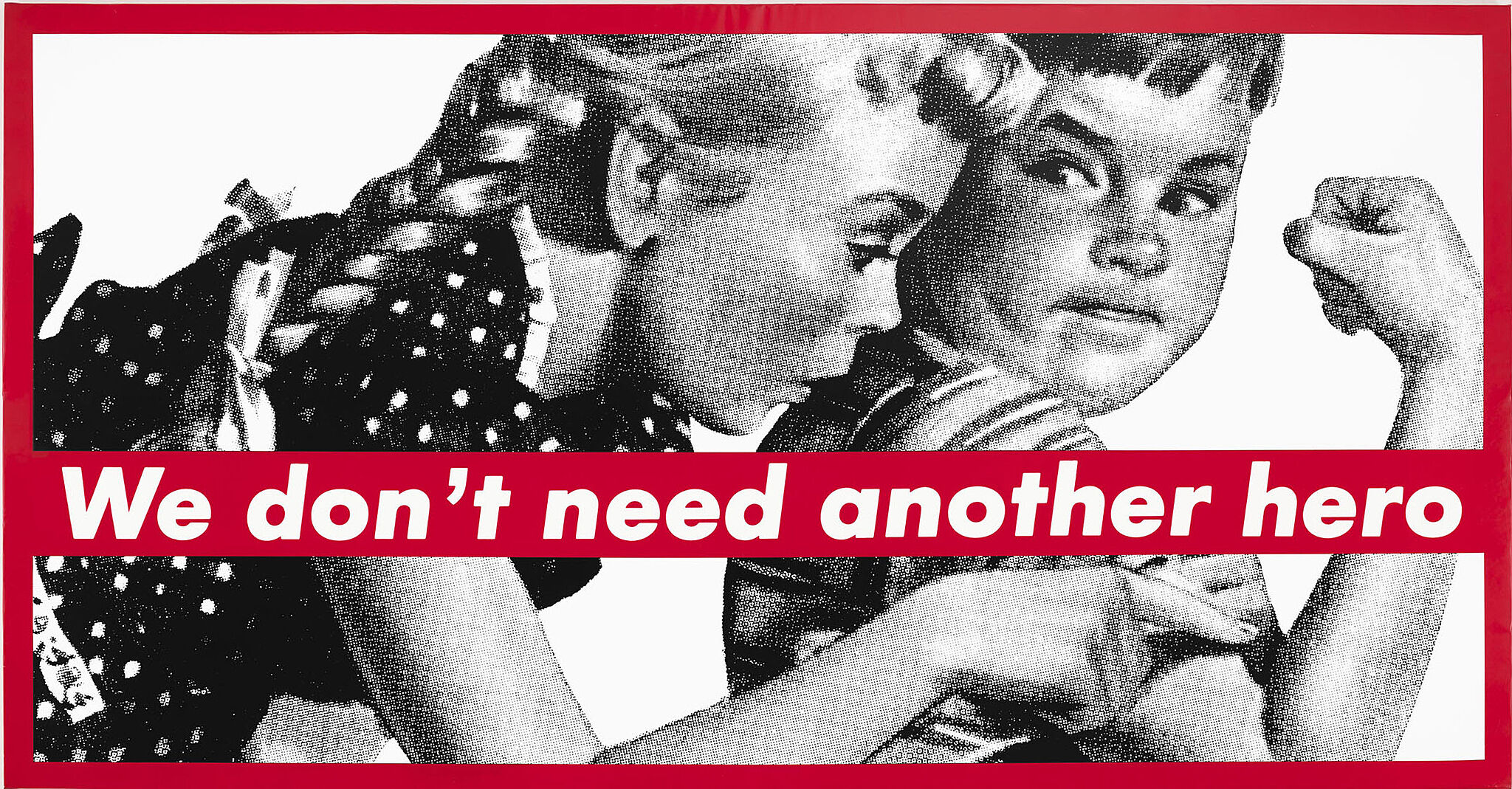
Barbara Kruger (1945-), Untitled (We Don’t Need Another Hero), 1987. Photoscreenprint on vinyl. Overall: 108 7/8 × 209 3/16 × 2 1/2 in. (276.5 × 531.3 × 6.4 cm). Whitney Museum of American Art, New York; Gift from the Emily Fisher Landau Collection 2012.180 © Barbara Kruger. Courtesty Mary Boone Gallery, New York
BARBARA KRUGER
UNTITLED (WE DON’T NEED ANOTHER HERO), 1987
Barbara Kruger’s bold montages juxtapose images culled from the mass media with provocative slogans and phrases, revealing the often unseen and unspoken forces of gender, race, and class that impact our daily lives. Here, Kruger has appropriated the words “We Don’t Need Another Hero” from Tina Turner’s theme song for a Mad Max film set in a barbaric, post-nuclear holocaust future. The words are combined with a stereotypical display of masculine strength, enacted by characters in the style of Dick and Jane books: a boy flexes his bicep while a girl points at it.
Glenn Ligon (1960-), Rückenfigur, 2009. Neon and paint, Overall: 24 × 145 1/2 × 5 in. (61 × 369.6 × 12.7 cm). AP 1/2, Edition of 3. Whitney Museum of American Art, New York; Purchase, with funds from the Painting and Sculpture Committee 2011.3a-I Courtesy of the artist and Regen Projects, Los Angeles
GLENN LIGON
RÜCKENFIGUR, 2009
Since 2004, Ligon’s use of text and his formal and metaphorical play with light and dark has continued in a series of luminous neon wall reliefs, often partially coated in black paint. In several examples, such as Rückenfigur, Ligon reconfigured the word America to reflect on the ambivalent status of a country that, in his words, is both a “shining beacon” and “dark star.” “I was thinking about Dickens’s ‘the best of times, the worst of times,’” he remarked. “We can elect Barack Obama, and we’re still torturing people in prisons in Cuba. Those things are going on at the same time.” The title Rückenfigur is an art-historical term describing a figure seen from behind, and, accordingly, each of its letters is rotated toward the wall. Yet because the A, M, and I are bilaterally symmetrical they appear to face forward, so that the word uncannily addresses us and turns away at the same time. In this regard, Ligon’s glowing sign poetically captures the twinned sense of identification and alienation the country so often inspires. A sense of gleaming promise is haunted by a shadow of doubt.
Danny Lyon (1942 -), Two SNCC Workers, Selma, from Blacks: The Movement, 1963. 10 15/16 × 13 15/16 in. (27.8 × 35.4 cm). Whitney Museum of American Art, New York; Purchase, with funds from the Photography Committee 95.6 © artist or artist’s estate
DANNY LYON
TWO SNCC WORKERS, SELMA, 1963
Danny Lyon’s photographs capture a highly charged moment during the Civil Rights movement. In the first photograph, two workers for the Student Non-Violent Coordinating Committee (SNCC) are pictured on the post office steps in Selma, Alabama. The SNCC encouraged black voter registration in the South; the workers in this image were supporting the African Americans attempting to register at the courthouse across the street. In the second photograph, Selma’s local sheriff had the two workers arrested. Officials from the United States Department of Justice observed the arrest but did not intervene. The first photograph, and others by Lyon were published in the 1964 book, The Movement: Documentary of a Struggle for Equality, with texts by Lorraine Hansberry. The caption that prefaces the image reads, “What the dogs and hoses have proved is that the entire power structure of the South must be altered. The original demand for equal treatment on buses and at lunch counters has had to broaden and sharpen, to strike at the political base of Negro oppression. . .by demanding the vote. In doing so, the Negro has tried to gain the protection of the Federal Government. For the most part it has been a futile effort.” That day in Selma, 350 African Americans waited in line for eight hours to be registered, but only five succeeded.
Robert Mapplethorpe (1946-1989), American Flag, 1977. Gelatin silver print, 19 3/4 × 15 15/16 in. (50.2 × 40.5 cm). Whitney Museum of American Art, New York; Gift of The Robert Mapplethorpe Foundation, Inc. in honor of Sondra Gilman Gonzalez-Falla;
ROBERT MAPPLETHORPE
AMERICAN FLAG, 1977
Robert Mapplethorpe studied a variety of mediums at Pratt Institute in Brooklyn and turned to photography in the early 1970s. He first used a Polaroid and then various medium- and large-format cameras, working predominantly in black and white. His subject comprised nudes, still lifes, and portraits—of himself and of friends, lovers, and fellow artists. Mapplethorpe’s work was marked by rigorous attention to the principles of classical composition, and his coolly elegant images were deftly staged and carefully printed. In addition to the sexually charged portraits and flowers that he focused on in the mid to late 1970s, Mapplethorpe took this photograph of a torn, tattered flag, flying above the summer community of The Pines on Fire Island, at the moment when the sun was directly behind the pattern of stars. This image of the American flag echoes his statement in 1986: “my work is about seeing—seeing things like they haven’t been seen before.”
Ben Shahn, The Passion of Sacco and Vanzetti, (1931–1932). Tempera and gouache on canvas mounted on composition board, 84 × 48in. (213.4 × 121.9 cm). Whitney Museum of American Art, New York; gift of Edith and Milton Lowenthal in memory of Juliana Force 49.22 Art © Estate of Ben Shahn, Licensed by VAGA, New York, N.Y.
BEN SHAHN
THE PASSION OF SACCO AND VANZETTI, 1931-32
The Passion of Sacco and Vanzetti is one of a series of twenty-three paintings that Ben Shahn made about the controversial trial of two working-class Italian-American immigrants, Nicola Sacco and Bartolomeo Vanzetti. In 1927, the men were sentenced to death for armed robbery and the murder of a shoe company paymaster and his guard in South Braintree, Massachusetts. After a jury convicted them on the basis of circumstantial evidence, three specially appointed commissioners upheld the death sentence verdict. The case caused public outrage since the case against the two men was weak, and many believed that they were the victims of ethnic discrimination, right-wing politics, and a corrupt police investigation. Their execution provoked international riots and protest demonstrations. In this large-scale canvas, Shahn vividly portrays all the characters: Sacco and Vanzetti lying dead in their coffins; the unsympathetic commissioners who upheld the death sentence after years of appeal; and Judge Webster Thayer, who presided over the trial and passed sentence, taking an oath in the courthouse. Two members of the committee proffer lilies, a fraudulent mourning gesture in light of their decision. As a well-known symbol of the crucified Christ, the lilies also suggest that Sacco and Vanzetti are martyrs, punished for sins they did not commit.
Lorna Simpson, 2 Tracks, 1990 91.59.4a-e
LORNA SIMPSON
2 TRACKS, 1990
Lorna Simpson’s staged photographs combine image and text, generating meaning indirectly through word play and addressing questions of identity yet refusing to take any straightforward position on race, class, or gender. 2 Tracks is an anonymous portrait; in a technique Simpson has used in much of her work, its closely shorn, female subject faces away from the camera. The photograph is flanked on either side by an image of a single black braid. Two accompanying plaques, reading “back” and “track” have multiple valences, alluding at once to the photographs’ literal subjects, general ideas of progress and struggle, and the specific themes of racism and regression. Deftly eluding a simplistic historical reading, Simpson’s work instead prompts the viewer to fill in the gaps between text and image. As in the tradition of Conceptual art from which the artist emerges, viewers are encouraged to participate in the creation and completion of the work’s meaning.
Joseph Stella, The Brooklyn Bridge: Variation on an Old Theme, 1939. Oil on canvas, overall: 70 1/4 × 42 3/16 in. (178.4 × 107.2 cm). Whitney Museum of American Art, New York; Purchase 42.15
JOSEPH STELLA
THE BROOKLYN BRIDGE: VARIATION ON AN OLD THEME, 1939
To Italian-born Joseph Stella, who immigrated to New York at the age of nineteen, New York City was a nexus of energy. In the engineering marvel of the Brooklyn Bridge, which he first depicted in 1918 and returned to throughout his career, he found a contemporary technological monument that embodied the modern human spirit. Here, Stella portrays the bridge with a linear dynamism borrowed from Italian Futurism. He captures the dizzying height and awesome scale of the bridge from a series of fractured perspectives, combining dramatic views of radiating cables, stone masonry, cityscapes, and night sky. The large scale of the work—it is nearly six feet tall—conjures a Renaissance altar, while the Gothic style of the massive pointed arches evokes medieval churches. By combining contemporary architecture and historical allusions, Stella transformed the Brooklyn Bridge into a twentieth-century symbol, the quintessence of modern life and the Machine Age.
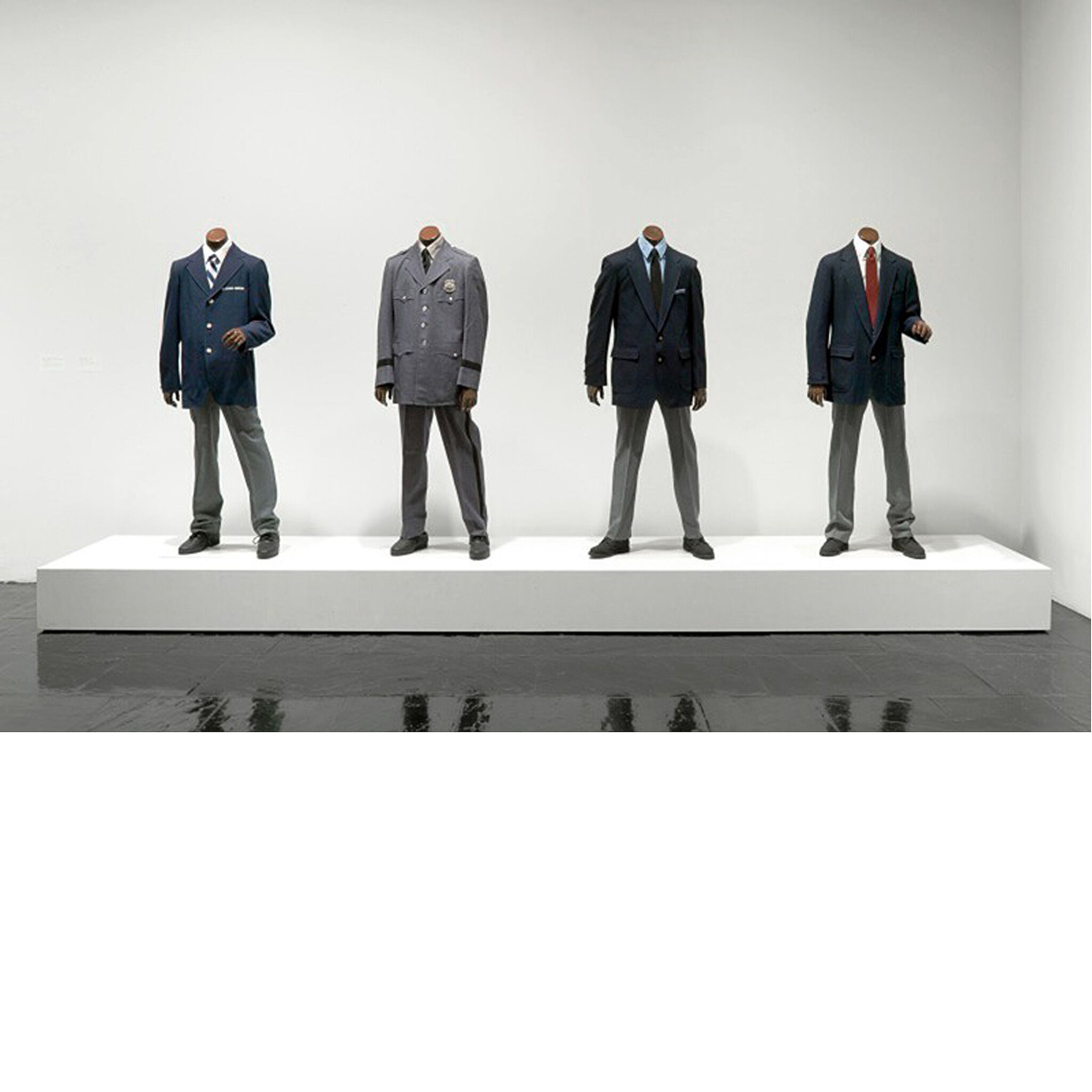
Fred Wilson, Guarded View, 1991. Wood, paint, steel, and fabric, dimensions variable. Whitney Museum of American Art, New York; gift of the Peter Norton Family Foundation 97.84a-d. © Fred Wilson
FRED WILSON
GUARDED VIEW, 1991
Fred Wilson’s Guarded View aggressively confronts viewers with four black headless mannequins dressed as museum guards. Each figure wears a uniform, dating to the early 1990s, from one of four New York City cultural institutions: the Jewish Museum, the Metropolitan Museum of Art, the Whitney Museum of American Art, and the Museum of Modern Art. Despite this specificity, the faceless mannequins underscore the anonymity expected of security personnel, who are tasked with protecting art and the public while remaining inconspicuous and out of view. Wilson himself worked as a museum guard in college, and explained: “[There’s] something funny about being a guard in a museum. You’re on display but you’re also invisible.” He challenges this dynamic by placing these ordinarily unnoticed figures at the center of our attention, pointing to the hidden power relations and social codes that structure our experience of museums. Wilson’s inanimate guards themselves become sculpture—figures that we are meant to observe but are incapable of observing us.
Bibliography and links
Miller, Dana, Ed. Whitney Museum of American Art: Handbook of the Collection. New York: Whitney Museum of American Art, 2015.
/exhibitions/america-is-hard-to-see
America Is Hard to See exhibition information.
The Whitney’s collection.
The Whitney’s programs for teachers, teens, children, and families.
The Whitney’s online resources for K-12 teachers.
Credits
This Teacher Guide was prepared by Dina Helal, Manager of Education Resources; Lisa Libicki, Whitney Educator; Heather Maxson, Manager of School, Youth, and Family Programs; and Pauline Noyes, Coordinator of School and Educator Programs.
Education programs in the Laurie M. Tisch Education Center are supported by the Steven & Alexandra Cohen Foundation, Inc; The Pierre & Tana Matisse Foundation; Jack and Susan Rudin in honor of Beth Rudin DeWoody; Joanne Leonhardt Cassullo and The Dorothea L. Leonhardt Foundation, Inc.; the Barker Welfare Foundation; Con Edison; public funds from the New York City Department of Cultural Affairs in partnership with the City Council; and by members of the Whitney’s Education Committee.
Generous endowment support for Education Programs is provided by the William Randolph Hearst Foundation, the Annenberg Foundation, Laurie M. Tisch, Steve Tisch, Krystyna O. Doerfler, Lise and Michael Evans, and Burton P. and Judith B. Resnick.
Free Guided Visits for New York City Public Schools are endowed by the Allen and Kelli Questrom Foundation.
The Whitney’s Education Department is the recipient of a National Leadership Grant from the Institute of Museum and Library Services.


America Is Hard to See is sponsored by the Henry Luce Foundation and Bank of America.
Major support is provided by the John R. Eckel, Jr. Foundation.
Generous support is also provided by the Juliet Lea Hillman Simonds Foundation, the Keith Haring Foundation Exhibition Fund, the Korea Foundation, the National Endowment for the Arts, and the Philip A. and Lynn Straus Foundation.