Teacher Guide:
Robert Indiana: Beyond LOVE
Sep 26, 2013
About this guide
1. How can these materials be used?
These materials provide a framework for preparing you and your students for a visit to the exhibition and offer suggestions for follow up classroom reflection and lessons. The discussions and activities introduce some of the exhibition’s key themes and concepts.
2. Which grade levels are these materials intended for?
These lessons and activities have been written for Elementary, Middle, or High School students. We encourage you to adapt and build upon them in order to meet your teaching objectives and students’ needs.
3. Learning standards
The projects and activities in these curriculum materials address national and state learning standards for the arts, English language arts, social studies, and technology.
4. Feedback
Please let us know what you think of these materials. How did you use them? What worked or didn’t work? Email us at schoolprograms@whitney.org.
About the exhibition
ROBERT INDIANA: BEYOND LOVE
Robert Indiana (b. 1928) has explored the power of language, American identity, and personal history for five decades. Although his imagery, suggestive of highway signs and roadside attractions, is visually dazzling on its surface and seems to reflect a spirit of optimism, it contains a multilayered conceptual intricacy and darkness that draw on his own biography as well as on the myths, history, and literature of the United States. A seminal figure of the 1960s and 1970s, Indiana’s artistic genius combined Pop art, hard-edged abstraction, and language-based conceptualism, laying the groundwork for contemporary, text-based art.
More than any other artist of his generation, Indiana identified himself as an American. To this end, he worked in what he felt was a quintessentially American style—hard-edge and polychromatic—and allied himself with American writers and painters from the late nineteenth and early twentieth centuries.
Robert Indiana: Beyond LOVE, the artist’s first retrospective in the United States, surveys Indiana’s extensive career, revealing an artist who has harnessed simple words and the graphic immediacy of vernacular signage to explore fundamental issues facing humanity—love, death, sin, and forgiveness—that are still relevant today. Seen together, his works validate his claim: “I haven’t done a painting without a message.”
Robert Indiana, quoted in Vivian Raynor, “The Man Who Invented Love,” ARTnews 72 no. 2, February 1973, 62.
Pre-visit Activities
Before visiting the Whitney, we recommend that you and your students explore and discuss some of the ideas and themes in the Robert Indiana: Beyond LOVE exhibition. You may want to introduce students to at least one work of art that they will see at the Museum. See the Images and Related Information section of this guide for examples of works that may have particular relevance to the classroom.
Objectives:
- Introduce students to the works of artist Robert Indiana.
- Introduce students to the themes they may encounter on their museum visit such as “Artist as Experimenter” and “Artist as Critic.”
- Make connections to the artist’s sources of inspiration including words and signs.
- Explore how Indiana examines complex social and political issues in his work.
Robert Indiana’s paintings and sculptures are replete with deceptively simple words, symbols, and numbers that offer multilayered meanings. He has always seriously considered the responsibility of the artist to comment on politics and the ethics of contemporary American life, describing himself as “a painter of signs, including the signs of the times.” In this sense, Indiana is the consummate observer, experimenter, storyteller, and critic, capturing the American zeitgeist, past and present.
Robert Indiana, in conversation with Barbara Haskell, December 6, 2012.
Artist as Experimenter
LOVE
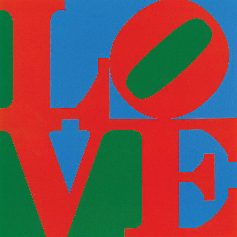
Indiana’s most recognized and celebrated work is LOVE (1966). During the 1960s, just as the slogan “make love not war” was gaining momentum, LOVE confounded the art world with its conflation of word and image, its reductive simplicity, and its visual resemblance to advertising. Yet the public perceived it as a symbol of countercultural freedom, even though the slanting “O” implied a critique of the precariousness and hollow sentimentality often associated with love. Since its creation, LOVE has appeared on products including postage stamps, doormats, and license plates, eclipsing the emotional poignancy and symbolic complexity of Indiana’s art.
Ask students to look closely at Robert Indiana’s painting LOVE. Have students seen this image or similar images before? Where? Ask each student to write down the first three words or phrases that come to mind when they look at the image. Have each student share one of their words or phrases with the class. Are their responses similar or different? Do their classmates’ interpretations make them think differently about this work? In what ways? Share information about the work with your students. What was happening in the United States at this time? Discuss the social and political climate during the 1960s.
ARTIST AS CRITIC
THE AMERICAN DREAM
1. As a class, discuss your students’ perceptions of the American Dream. Have students seen any movies or television, or read any literature that relates to the American Dream? How is it portrayed?
Indiana saw the American Dream as “broken. . .no longer in effect for us and for lots of others.”
Have your students discuss Indiana’s statement.
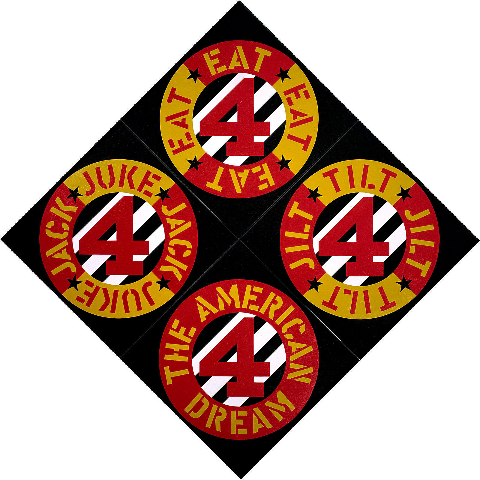
2. View and discuss Indiana’s painting The Beware – Danger American Dream #4, (1963). Look at the words in the image. Can students make any connections between the words in the image and their discussion about the American Dream? Share the title of this work with your students. What might Indiana ask the viewer to beware of? What might be dangerous about the American Dream?
Indiana has often used three or four letter, single syllable words in his work. In 1963 he said: “. . . my first preference is one-syllable words. I happen to prefer the verb to the noun. I use the simple command words first of all. . .I like short, terse words—I suppose I sometimes think of their visual pattern.”
Inspired by the use of language in The Beware – Danger American Dream #4, (1963), have students use rhyming, repetition, alliteration, and only one-syllable words to create a piece of writing or poetry about the American Dream.
3. Here’s a Challenge! for you or a homework assignment for your students: go to the Whitney’s online collection for teachers and make a collection of one or more works of art that might represent and/or critique the American Dream. View and discuss these works in class. In what ways have artists represented the American Dream?
Post-visit Activities
Objectives
- Enable students to reflect upon and further discuss some of the ideas and themes from the exhibition Robert Indiana: Beyond LOVE.
- Have students further explore some of the artist’s approaches through art-making and writing activities.
- Ask students to reflect upon what inspires them when they create works of art.
ARTIST AS STORYTELLER
VISUAL PUZZLE OR REBUS
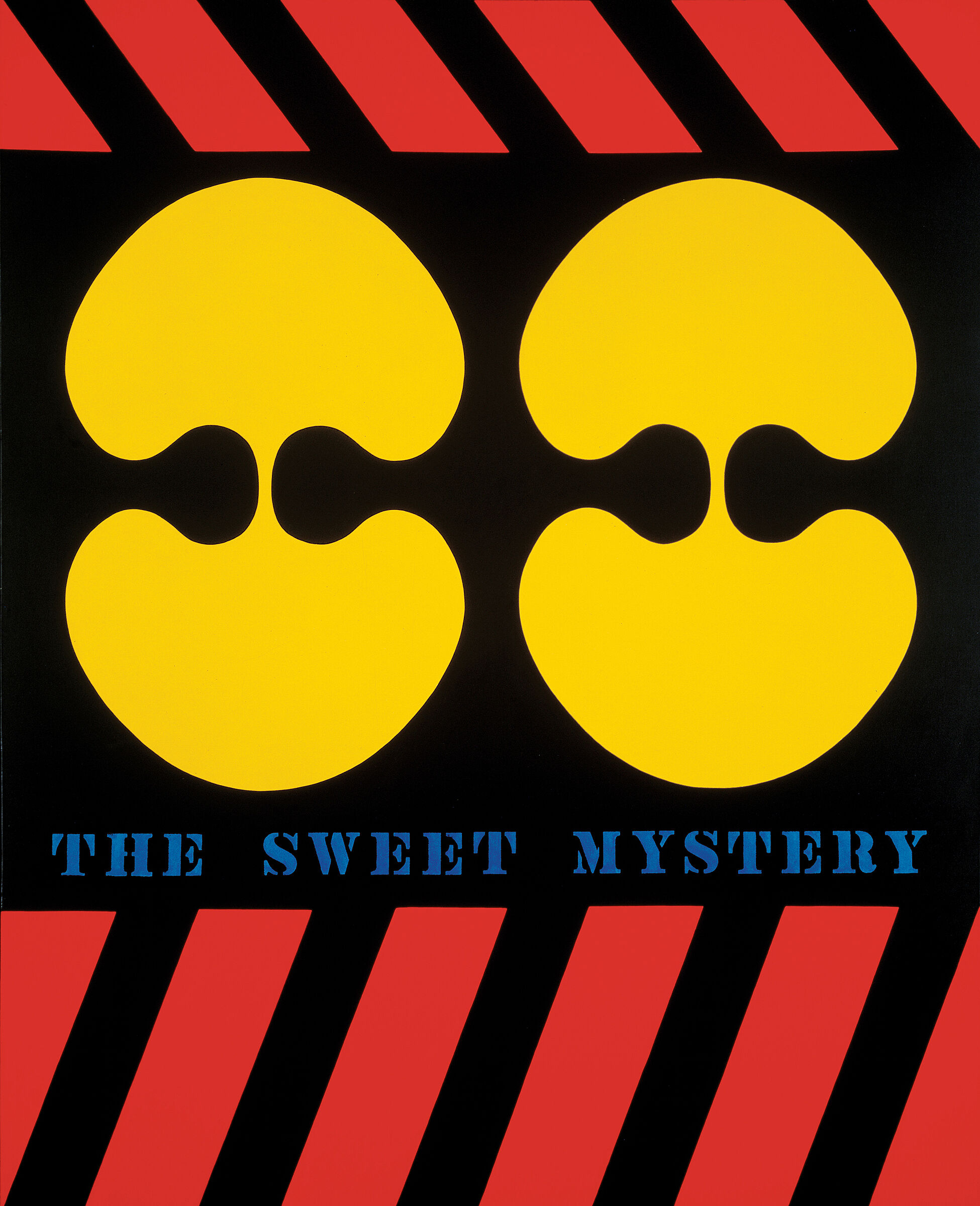
1. View and discuss Indiana’s painting The Sweet Mystery (1959-62) and related information. What do the shapes and words in the painting suggest to your students?
2. A rebus is a visual puzzle or riddle composed of signs, symbols, images, letters, words, and numbers that may represent the sound of certain words and syllables. You can find examples here: http://www.learn4good.com/games/words/rebuspuzzles.htm. There are many ways to interpret and understand the connections amongst the words and images in The Sweet Mystery. The viewer is left to puzzle out the meaning for him/herself. While The Sweet Mystery is not strictly a rebus, it has much in common with such verbal-visual puzzles.
Ask your students to each think of a poem, story, song, food, place, or celebrity that is meaningful to them. What do they associate with this person or item? Have them use images, words, signs, and numbers to draw or collage a rebus. Students could use stencils for words and numbers or computers and Photoshop if available. Ask your students to decipher their rebuses. Can they crack the code of their peers’ visual puzzles?
3. With your students, review the list of sources for The Sweet Mystery. Ask your students to make a list of the sources for their rebuses.
Artist as Observer
INSPIRATION
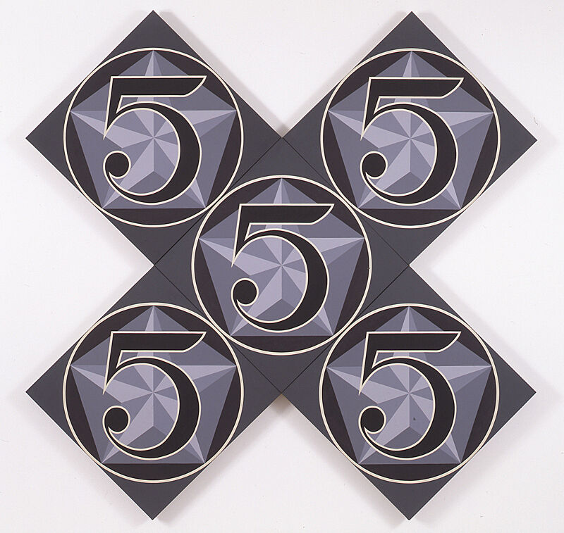
With your students, look at Indiana’s painting The X-5 (1963) and related information. Use the following links to explore the primary sources of inspiration for this painting.
Charles Demuth, I Saw the Figure 5 in Gold, 1928. Metropolitan Museum of Art
http://metmuseum.org/collections/search-the-collections/488315
William Carlos Williams, The Great Figure, 1916.
http://www.poetryfoundation.org/poem/182065
1. Ekphrasis is the Greek term for the verbal description of a visual object. William Carlos Williams’s poem The Great Figure is an example of ekphrasis, so is John Keats’s poem Ode on a Grecian Urn. Find more information about ekphrasis here: http://www.poets.org/viewmedia.php/prmMID/5918. Demuth and Indiana have created a kind of reverse ekphrasis by painting a visual image inspired by a poem. Ask your students to making a painting or write an ekphrastic poem about an object they’ve been inspired by. View and discuss students’ work. What new understanding did they discover about the objects they selected?
2. Use the Whitney’s online collection for teachers to explore works by artists who have used words. Explore the sources that may have inspired these works. For example, Christopher Wool has used the words “run dog run,” found in elementary school primers, while Glenn Ligon has used literary texts by famous authors. Discuss how the artists are transforming words to create new meaning.
“I thought of myself as a painter and a poet and became a sculptor because the potential raw materials were lying outside my studio door.”
—Robert Indiana
“. . .any painting an artist does is possibly a self-portrait. He puts himself into it. It may not be the overt subject, but he’s there, lurking in the shadows somewhere.”
—Robert Indiana
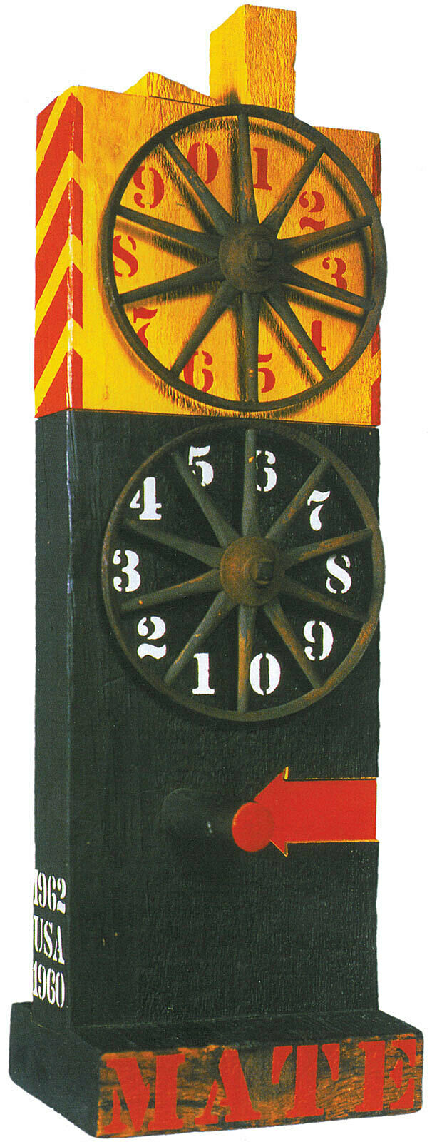
In 1959 Indiana began to make sculptures from objects that he found in his neighborhood. Using these materials allowed him to encode multiple public and personal meanings into his work. He described his process as transforming “the Lost into the Found, Junk into Art, the Neglected into the Wanted, the Unloved into the Loved, Dross into Gold.”
1. View and discuss Indiana’s sculpture Mate (1960-62). Indiana thinks of these sculptures as anthropomorphic or taking on the characteristics of the human form. Define anthropomorphic with your students and discuss how this work might be anthropomorphic.
2. There is also an autobiographical element to this work. The word “mate” had special meaning for Indiana that referenced his environment and the process of making his artwork (see excerpt from “Artist Questionnaire,” February 17, 1966).
As an assignment, ask your students to think of words that they use frequently in their everyday lives. Have them collect a few small found objects that relate to their everyday lives (what they eat, drink, or see, where they go, their style, what they wear, and what they like. For example: cereal boxes, ticket stubs, candy wrappers, pencils, beverage containers, accessories, images, and souvenirs.) Ask students to make a small sculpture that incorporates their found objects and words (which can be stenciled, hand-lettered, or cut and pasted) that relate to their everyday lives. View and discuss students’ sculptures. How did they represent themselves and their everyday lives? What personal meanings did they include?
IMAGES & RELATED INFORMATION
THE SWEET MYSTERY, 1959-62
In 1957, Indiana chose as his subject the fan-shaped leaf of the ginkgo trees that grew in Jeanette Park near his loft in Coenties Slip in Lower Manhattan. Working with a minimal palette of flat color, he began to use Ellsworth Kelly’s technique of isolating and distilling fragments of the seen world until they became unrecognizable. Doubling the leaf at its stem to create a mirror image produced a shape that resembled the yin-yang. Indiana later claimed that he invested the symbol “with a new form.” Titled after a well-known song about love from the turn-of-the-century operetta Naughty Marietta by Victor Herbert, the leaf forms and danger strips on the top and bottom of the painting represent oblique clues to Indiana’s personal life. Indiana painted his ginkgo images on paper or Homasote, a wall board made from compressed recycled paper, whose fragility meant that few of these works survived.
Robert Indiana, quoted in John W. McCoubrey , Robert Indiana, exh. cat. (Philadelphia Institute of Contemporary Art, University of Pennsylvania, 1968, 15.
ARTIST STATEMENTS 1968
The Sweet Mystery (1959-62)
(abbreviated)
The Sweet Mystery came from these things:
1. My first I Ching reading. . .
2. Yin and Yang. . .
3. The ginkgo leaf. . .
4. One year of painting various mutations of the doubled gingko leaf shape.
5. The cycle: from Spring’s Permanent Green Light to Fall’s golden leaves. . .
6. Yellow: my color. . .
7. “Vision binoculaire”: a phrase from Cyril Connolly’s [book] The Unquiet Grave. . .
8. The Sweet Mystery: life and death.
9. The words: among my first cautious uses of them on canvas. . .
10. THE SWEET MYSTERY: song breaking through the darkness.
—Robert Indiana
Excerpt from John W. McCoubrey, Robert Indiana, exhibition catalogue. Philadelphia: Institute of Contemporary Art, University of Pennsylvania, 1968, 15.
MATE, 1960-62
Lacking money for paint and canvas, Indiana began to make assemblages in 1959, using metal objects, discarded bike wheels, and derelict pieces of wood that he salvaged from the streets or warehouses in Coenties Slip that were being torn down for the expansion of Wall Street. He described his conversion of these materials into art as transmuting “the Lost into the Found, Junk into Art, the Neglected into the Wanted, the Unloved into the Loved, Dross into Gold.”
Incorporating materials from his neighborhood gave him a way to connect his work with the real world while also alluding to his life on Coenties Slip. Adding words and numbers allowed him to extend his works’ referential meanings. The rectangular form of the discarded wood beams that Indiana salvaged from demolished buildings in his neighborhood reminded him of herms, the stone or bronze pillars topped with the head of Hermes that were set at important intersections and along roads in ancient Greece. Intrigued by their anthropomorphic allusions, he began to fashion modern-day versions of these ancient pillars by attaching bicycle wheels to evoke the winged sandal of Hermes, painting paired circles at eye level, or inserting phallic wooden pegs in their lower registers.
By 1960, he had begun adding circles, stars, numbers, and three-or-four-letter words to his herms with discarded die-cut stencils that had been used in the nineteenth century to affix trademarks and labels onto commercial freight. The stenciled words evoke the graphics of advertising as well as the tradition of hand-painted signs associated with American folk art.
Robert Indiana, “Artist Questionnaire,” December 11, 1961, Object Files, Department of Painting and Sculpture, Museum of Modern Art, New York.
ARTIST QUESTIONNAIRE: MATE (1960-62), WHITNEY MUSEUM OF AMERICAN ART, 1966
Mate was done in those days on the Coenties Slip when I didn’t have any money for stretchers and canvas of the scale that I wanted to work on, and so instead plundered the nearby demolition sites for those choice pieces of beams that included the “haunched tenons” or the looking devices hand-cut mainly for stair and shaft openings, which I would scout for during the day and return at night to drag away, hoping that [sculptors] Steve Durkee or Mark di Suvero had not spotted the same piece, for us three were in hot competition for those pieces in those years and often lost out to each other. Most of the beams were too heavy to handle alone, requiring an accomplice to carry them back to 25 [Coenties Slip] and up five flights of stairs, for at that time I occupied only one floor of the building, and my painting and constructing were done in the same small loft at the hard top, and so “mate” had special meaning for the accomplishment of everything. And it was the waterfront, and across the park from my loft was the Seaman’s Institute where I took my meals and took my baths, as my building was really cold water and where the designation “mate” was common usage.
—Robert Indiana
Excerpt from Robert Indiana, “Artist Questionnaire,“ February 17, 1966. Object Files, Whitney Museum of American Art, New York.
THE BEWARE – DANGER AMERICAN DREAM #4, 1963
In 1960, Indiana began applying highly saturated color to his geometric paintings. By the end of the year, he was adding words to them, using the same found, nineteenth-century stencils he had employed to affix words to his sculptures. The combination of Indiana’s hard-edged vocabulary and choice of commonplace words gave his paintings the straightforward immediacy of highway signs and roadside advertising. Despite how simple Indiana’s verbal-visual amalgams seem, they contain multiple layers of meaning; deciphering them is akin to unraveling a conceptually complex puzzle. In this painting, the words suggest multiple references—for example, TILT is associated with the greed of gambling and the fraud of “tilting” the pinball machine, JACK may refer to one of Indiana’s closest friends, John (Jack) Curtis, while EAT recalled the cheap diners where his mother worked during the Depression.
INTERVIEW WITH DONALD B. GOODALL, 1976-77
The first two or three dreams I would say were cynical. I was really being very critical of certain aspects of the American experience. “Dream” was used in an ironic sense. Then, as they progressed, they lost that irony; particularly with the fifth Dream, where I became involved with the imagery and experience of [Charles] Demuth. And the same is true of the sixth Dream. And, as the Dreams continue via the autobiographical series, negative aspects have pretty well disappeared. They really are all celebrations. It is a celebration of ten years of my life. [At first] they were, let’s say, very caustic—that might be a better word than saying “cynical”. . .
—Robert Indiana
Excerpt from Donald B. Goodall, “Conversations with Robert Indiana,” in Donald B. Goodall, Robert L.B. Tobin, and William Katz, Robert Indiana, exhibition catalogue. Austin, Texas: University Art Museum, University of Texas at Austin, 1977, 25-41.
THE X-5, 1963
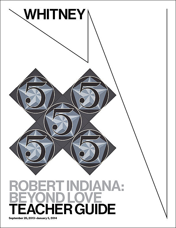
The X-5 is one of a series that Indiana made in homage to Charles Demuth’s The Figure 5 in Gold (1928), an abstracted vision of a fire engine racing down a New York street, and one of his favorite paintings. Demuth’s painting, in turn, was inspired by William Carlos Williams’ poem, The Great Figure: “I saw the figure 5 on a red fire truck moving. . .through the dark city.” Indiana reworked the hard-edged figures and bold colors of Demuth’s image into an unusually structured painting of layered geometries—the numeral superimposed on a star and a pentagon set within a circle. Indiana repeated this configuration on five separate canvas squares arranged into an X-shape, a form inspired by the danger crossing signs at railroad tracks.
ARTIST STATEMENTS, 1968
For in 1928, the year of my birth, [Charles] Demuth painted his “picture” inspired by his friend’s poem “The Great Figure.” It was on a hot summer day in New York. . .that William Carlos Williams, on his way to visit the studio of another American artist of the time, Marsden Hartley, on Fifteenth Street, that he heard “a great clatter of bells and the roar of a fire engine passing the end of the street down Ninth Avenue.” He turned just in time to see a golden figure 5 on a red background flash by. He was so impressed that he took out a piece of paper from his pocket and wrote the. . .poem on the spot. . .
—Robert Indiana
Excerpt from John W. McCoubrey, Robert Indiana, exhibition catalogue. Philadelphia: Institute of Contemporary Art, University of Pennsylvania, 1968, 20.
LOVE, 1966
Indiana introduced his best-known image, LOVE, in 1965 during the counter-cultural revolution. Its immediate valorization as an emblem of sexual freedom led to the unauthorized production of massive numbers of commercial products (including a postage stamp) bearing the image. Over time, the ubiquity of these products overwhelmed the perception of Indiana’s art, muting recognition of its breadth and diversity, and its portrayal of the darker aspects of the American experience.
INTERVIEWS
INTERVIEW WITH BARBARALEE DIAMONSTEIN, 1978
“In the thirties, my father worked for Phillips 66, when all Phillips 66 gasoline stations were red and green: the pumps, the uniforms, the oil cans. . .[W]hen I was a kid, my mother used to drive my father to work in Indianapolis, and I would see, practically every day of my young life, a huge Phillips 66 sign. So it is the red and green of that sign against the blue Hoosier sky. The blue in the LOVE is cerulean. Therefore my LOVE is [an] homage to my father.”
—Robert Indiana
Excerpt from Barbaralee Diamonstein, “Interview with Robert Indiana,” in Inside New York’s Art World. New York: Rizzoli International Publications Inc., 1979, 151-66.
INTERVIEW WITH DONALD B. GOODALL, 1976-77
. . .LOVE is purely a skeleton of all that word has meant in all the erotic and religious aspects of the theme, and to bring it down to the actual structure of the calligraphy itself is like a skeleton. It’s reducing it to the bare bones. It was really a matter of distillation.
—Robert Indiana
Excerpt from Donald B. Goodall, “Conversations with Robert Indiana,” in Donald B. Goodall, Robert L.B. Tobin, and William Katz, Robert Indiana, exhibition catalogue. Austin, Texas: University Art Museum, University of Texas at Austin, 1977, 25-41.
About the Artist
ROBERT INDIANA, B. 1928
Born Robert Clark in New Castle, Indiana, Robert Indiana was adopted by Earl and Carmen Clark from Indianapolis soon after his birth and raised by his mother after his father deserted the family. His childhood was turbulent, marked by financial instability, unsettling yearly moves, and the divorce of his parents when he was eight. Art would become his vehicle for exploring the promises and disappointments of the American Dream that he witnessed firsthand. Indiana took Saturday classes at a local art school while in high school and evening classes while in the Air Force during World War II. He attended the School of the Art Institute of Chicago on the G.I. Bill from 1949 to 1953 and after receiving his BFA he spent a year at Edinburgh College of Art in Scotland.
Indiana moved to New York City in 1954 and settled in an area of Lower Manhattan called Coenties Slip in 1956, which was an artist community that included Ellsworth Kelly, Jack Youngerman, Agnes Martin, and James Rosenquist. Around this time, he started to assemble wooden sculptures out of found materials—many scavenged from nearby docks—onto which he stenciled words such as “HOLE,” “SOUL,” and ”PAIR.” Titled Herms after the guardian figures that served as signposts in ancient Greece and Rome, these objects assumed a distinctly anthropomorphic character. On the eve of turning thirty and launching his signature hard-edged visual style, he abandoned his surname in favor of an identity that unabashedly asserted his Midwestern roots: Robert Indiana.
Indiana began to describe himself as a sign painter, and he went on to explore the formal potential of letters through experimentation with color and contour, transforming them into emblems of advertising and consumer culture. Indeed, much of the imagery in Indiana’s sign-like paintings alludes to the billboards, highway signs, roadside motels, and restaurants of small town America. Although he was associated with Pop art, Indiana set himself apart from his Pop colleagues by the unique ways in which he fused idea, word, and image in his art into “verbal-visual” forms, as he called them. His use of seemingly commonplace and familiar words, names, dates, numbers, and symbols belies his work’s hidden, coded messages.
In 1961, Indiana began a series titled the American Dream, a recurring theme in his work, which along with his other famous stenciled-text images—most notably LOVE—he has used to both celebrate and criticize American life. In response to the popularization of his art, Indiana’s views grew increasingly skeptical, even dystopian, and he relocated to an isolated island off the coast of Maine in 1978 where he continues to make art and maintain an active exhibition schedule.
Bibliography and links
Barbara Haskell, with contributions by René Paul Barilleaux, Sasha Nicholas. Robert Indiana: Beyond Love. New York: Whitney Museum of American Art, distributed by Yale University Press, New Haven and London, 2013.
http://www.blouinartinfo.com/news/story/947169/video-at-home-and-in-the-studio-with-robert-indiana
Interview with Indiana at his studio on the island of Vinalhaven, Maine.
Ted Loos visits Robert Indiana in Vinalhaven, Maine.
The Whitney’s programs for teachers, teens, children, and families.
The Whitney’s collection and resources for K-12 teachers.
A special area of the Whitney’s website with resources and activities for artists ages 8-12.
A site for creating online books.
A resource for creating all kinds of cards.
A content-sharing site that allows members to “pin” images, videos, and other objects to their virtual pinboard.
A user-friendly micro-blogging platform for posting multimedia content.
Twitter is a free social networking and micro-blogging service where users send and read each other’s updates, known as tweets—text-based posts of up to 140 characters, displayed on the author’s profile page and delivered to other users—known as followers—who have subscribed to them.
Credits
This Teacher Guide was prepared by Dina Helal, Manager of Education Resources; Lisa Libicki, Whitney Educator; Heather Maxson, Manager of School, Youth, and Family Programs; and Ai Wee Seow, Coordinator of School and Educator Programs.
Major support for Robert Indiana: Beyond LOVE is provided by Morgan Art Foundation.
Generous support is provided by Shirley and William Lehman, The Lunder Foundation, and the Robert B. Mayer Family.
Additional support is provided by The Gage Fund, Inc., Virginia and Herbert Lust, the Overbrook Foundation, and Barbaralee Diamonstein-Spielvogel.
The Whitney Museum of American Art’s School and Educator Programs are made possible by endowments from the William Randolph Hearst Foundation and the Walter and Leonore Annenberg Fund.
Additional support is provided by Con Edison, public funds from the New York City Department of Cultural Affairs in partnership with the City Council, and by members of the Whitney’s Education Committee.
Free Guided Student Visits for New York City Public and Charter Schools endowed by the Allen and Kelli Questrom Foundation.

