Teacher Guide:
America Is Hard to See: Grades K–5
May 1, 2015
About this guide
1. How can these materials be used?
These materials provide a framework for preparing you and your students for a visit to the exhibition and offer suggestions for follow up classroom reflection and lessons. The discussions and activities introduce some of the exhibition’s key themes and concepts.
2. Which grade levels are these materials intended for?
These lessons and activities have been written for Elementary, Middle, or High School students. We encourage you to adapt and build upon them in order to meet your teaching objectives and students’ needs.
3. Learning standards
The projects and activities in these curriculum materials address national and state learning standards for the arts, English language arts, social studies, and technology.
4. Feedback
Please let us know what you think of these materials. How did you use them? What worked or didn’t work? Email us at schoolprograms@whitney.org.
ABOUT THE INAUGURAL EXHIBITION
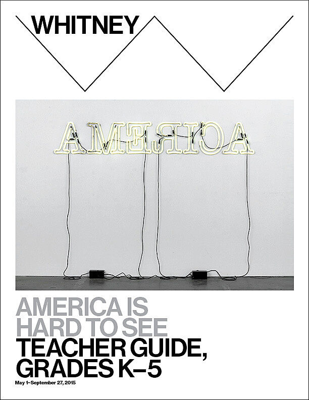
AMERICA IS HARD TO SEE
Drawn entirely from the Whitney Museum of American Art’s collection, America Is Hard to See takes the inauguration of the Museum’s new building as an opportunity to reexamine the history of art in the United States from the beginning of the twentieth century to the present. Comprising more than six hundred works, the exhibition elaborates the themes, ideas, beliefs, and passions that have galvanized American artists in their struggle to work within and against established conventions, often directly engaging their political and social contexts. Numerous pieces that have rarely, if ever, been shown appear alongside beloved icons in a conscious effort to unsettle assumptions about the American art canon.
The title, America Is Hard to See, comes from a poem by Robert Frost and a political documentary by Emile de Antonio. Metaphorically, the title seeks to celebrate the ever-changing perspectives of artists and their capacity to develop visual forms that respond to the culture of the United States. It also underscores the difficulty of neatly defining the country’s ethos and inhabitants, a challenge that lies at the heart of the Museum’s commitment to and continually evolving understanding of American art.
Organized chronologically, the exhibition’s narrative is divided into thematic “chapters” installed throughout the building. These sections revisit and revise established tropes while forging new categories and even expanding the definition of who counts as an American artist. Indeed, each chapter takes its name not from a movement or style but from the title of a work that evokes the section’s animating impulse. Works of art across all mediums are displayed together, acknowledging the ways in which artists have engaged various modes of production and broken the boundaries between them.
America is Hard to See reflects the Whitney’s distinct record of acquisitions and exhibitions, which constitutes a kind of collective memory—one that represents a range of individual, sometimes conflicting, attitudes toward what American art might be or mean or do at any given moment. By simultaneously mining and questioning our past, we do not arrive at a comprehensive survey or tidy summation, but rather at a critical new beginning: the first of many stories to tell.
Find out more about the exhibition here:
About the Building
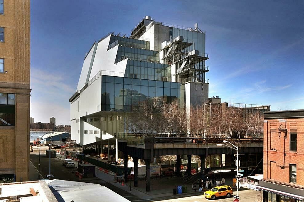
The Whitney’s new building was designed by architect Renzo Piano. Piano’s design was inspired by the industrial character of the neighboring buildings in the Meatpacking District. The connection to the neighborhood is integral to the building. The building is constructed mostly of concrete, steel, stone, reclaimed pine, and low-iron glass. Where it meets the street, the building is “raised” on narrow pillars creating the “largo”, a public space right at the base of the High Line. There’s art all over the new Whitney, in the indoor galleries, stairwell, first-floor lobby, and on the outdoor terraces. Piano designed a special outdoor staircase that goes from the sixth to the eighth floors that echo the forms of the fire escapes on buildings all over New York City. When you visit the Museum, take a walk outside with your students and check out the awesome 360 degree views!
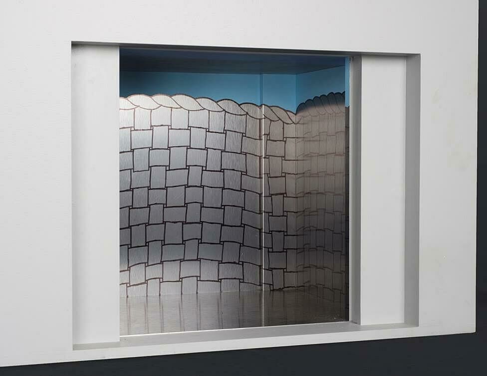
Step into an artwork! Artist Richard Artschwager designed the four elevators for the new building titled Four in Six. The elevators are based on six themes that Artschwager explored from the mid-1970s onward: door, window, table, basket, mirror, rug. Each elevator is an immersive installation. The largest elevator is like being inside a giant woven basket that lifts you up and down. In the second elevator you can peer into a looking glass. The third elevator opens, revealing a window and a door that might transport you to another world. In the fourth elevator, it is as though you are literally inside one of Artschwager’s sculptures, under a table.
Pre-Visit Activities
Before visiting the Whitney, we recommend that you and your students explore and discuss some of the ideas and themes in the exhibition. You may want to introduce students to at least one or two works of art in the exhibition. See the Images and Related Informationsection of this guide for examples of works that may have particular relevance to the classroom.
Objectives:
- Introduce students to the works of American artists and the ways in which they represented the world around them.
- Introduce students to the themes they may encounter on their museum visit.
- Explore how artists have interpreted the idea of “America” in the twentieth and twenty-first centuries.
ARTIST AS STORYTELLER
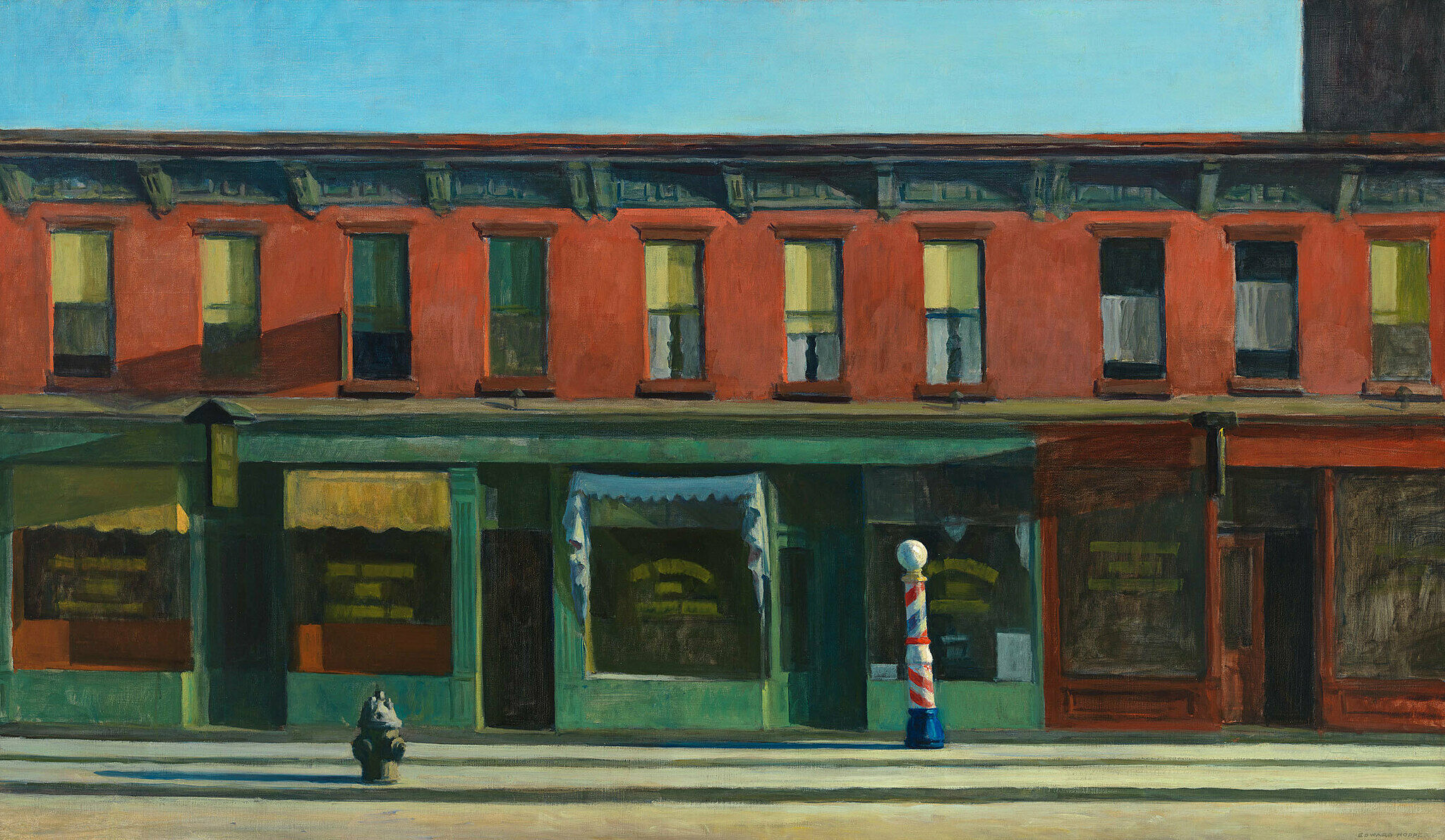
Edward Hopper, EARLY SUNDAY MORNING
View and discuss Hopper’s painting with your students. Ask them to describe what they see. What do students notice about this street? Ask students to look at the windows and notice the similarities and differences. What might be missing from this street scene? If your students could add two things to this painting, what would they be? Why?
Ask students to think about their own neighborhood. How is this scene similar to or different from where they live or go to school?
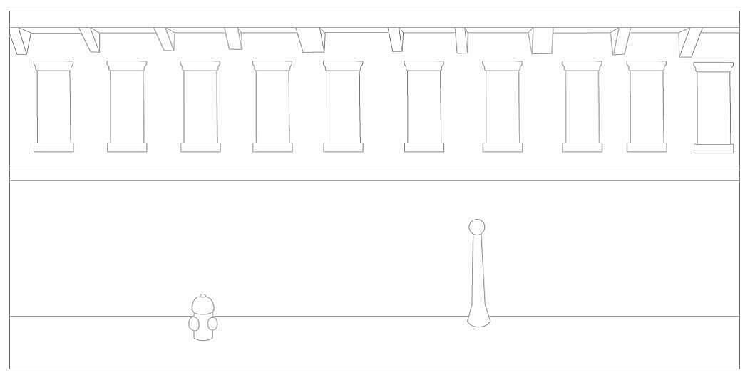
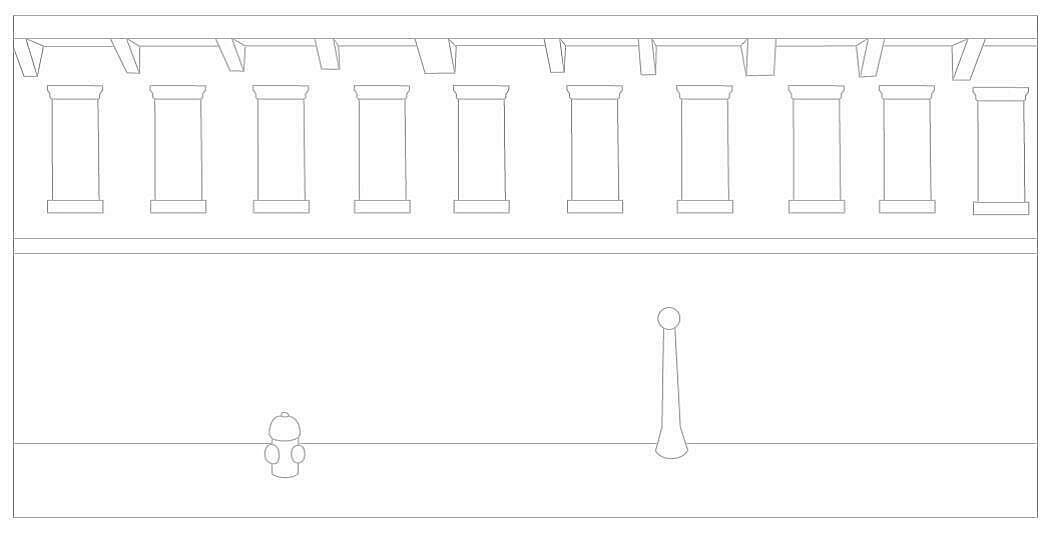
a. Ask your students to imagine what the street in Edward Hopper’s painting, Early Sunday Morning might look like when everyone wakes up. Print out the attached template for each student and ask them to add details to the scene. For example, they can include people, dogs, cars, or whatever else they like.
b. Ask students to work in small groups for this activity. Have them imagine Edward Hopper’s painting, Early Sunday Morning as a scene in a film. Your students are the film directors. Ask them to write a script and draw a storyboard for one scene in the film. Give students different times of day to stage their scene. For example, 7 am, 12 noon, 4 pm, 7 pm, 11 pm. Have students perform their street scene, or they could form a tableau of one moment in the scene. Discuss how the scene changed at the different times of day. Did the mood of the scene change in any way? How?
Post-visit Activities
- Enable students to reflect upon and discuss some of the ideas and themes from the exhibition.
- Have students further explore some of the artists’ ideas through discussion and art-making activities.
Artist as Experimenter
MULTIPLE MATERIALS
- Enable students to reflect upon and discuss some of the ideas and themes from the exhibition.
- Have students further explore some of the artists’ ideas through discussion and art-making activities.
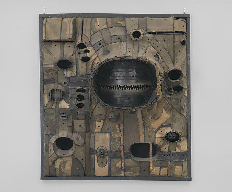
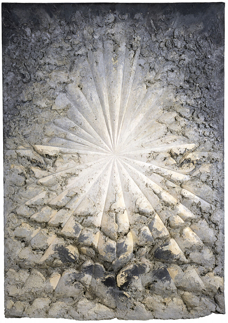
In Untitled 1961 (1961) and The Rose (1958-66) respectively, Lee Bontecou and Jay DeFeo built up the surface of their work in relief. Bontecou included saw blades, metal spools, wire, rope, and soot in her work; DeFeo embedded small objects such as a barrette, bottle cap, keys, and wire in the oil paint of The Rose.
Ask students to begin with a two-dimensional surface such as a wood panel or metal frame, and create a relief piece using art materials such as model magic, paint, paper, and wire, as well as small found objects.
Artist as Experimenter
REPRESENTING THE FIGURE
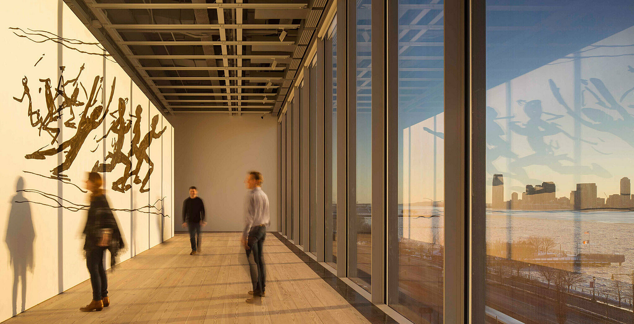
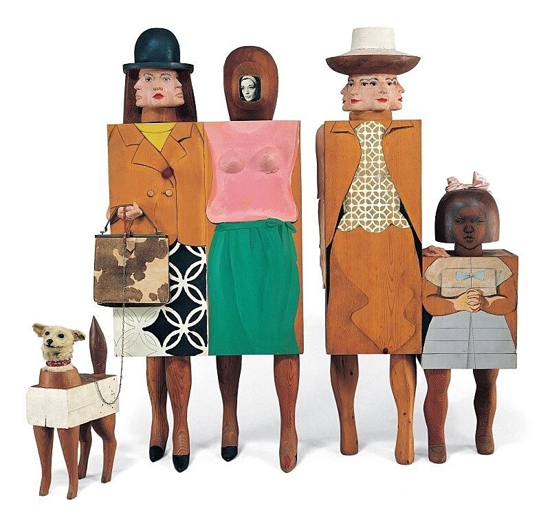
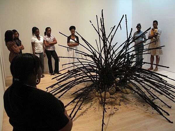
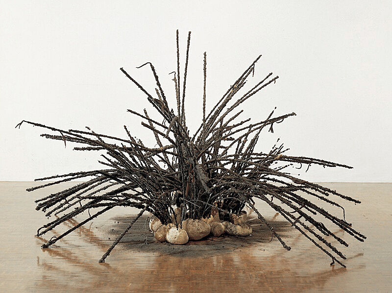
Marisol, David Hammons, and Jonathan Borofsky represent the human figure in diverse and unexpected ways. Marisol included plaster casts of her own face, drawing, painting, and real objects—a photograph of herself, pocket book, and taxidermied dog’s head—in Women and Dog (1963-64). David Hammons used hair, rocks, teabags, beads, feathers, and pantyhose in his sculpture, and Borofsky’s running people can be installed differently each time on walls and ceilings.
Ask your students to create a flashlight figure mural. Tape butcher paper to your classroom walls, including the corners and uneven surfaces. Have students take turns being models, lighting crew, and artists. Ask students to use flashlights to project shadows onto the paper. Have them use markers to draw the outlines of the shadows on the paper. Students can play with scale, distortion, parts and whole, and layering. Encourage students to draw on the paper in the corners of the classroom or on uneven surfaces.
Switch on the classroom lights and have students add color and pattern to their figure mural. What did they find challenging, fun, or unexpected about this process?
Images and Related Information
LEE BONTECOU
UNTITLED 1961, 1961
Between 1959 and the mid-1960s, Lee Bontecou made large-scale, metal-and-canvas wall reliefs. These hybrids of painting and sculpture were created by welding a metal armature and then using suture-like stitches to attach fragments of canvas with copper wire. Bontecou scavenged most of the canvas from bags and conveyor belts discarded by the laundry below her New York studio. She also included other found objects, such as grommets, saw blades, and rope. These objects are configured into a complex assemblage that hangs on the wall like a painting but projects more than two feet into the room. The visual allusions generated by this configuration range from destructive man-made devices to organic and geological structures: riveted airplane engines, celestial black holes, gun barrels, volcanoes, human orifices, and the segmented shells of insects. Bontecou has said that her art responds to the historical moment in which it was created: “I wish my work to represent or to be a part of my time. . .I want them to be things and facts inside us—from war to the wonders of the space age.”
JONATHAN BOROFSKY
RUNNING PEOPLE AT 2,616,216, 1978-79
In 1974, Jonathan Borofsky made the first of many works directly on the wall, treating the blank surface as if it were a sheet of paper. He often used an opaque projector to assist him in realizing large-scale works, projecting doodles or sketches made on acetate gels onto walls or ceilings and then tracing over them with paint. This process allowed Borofsky to activate an entire room relatively quickly. Yet the artist’s presence was not always necessary in creating the work, and in purchasing Running People at 2,616,216—the first wall drawing that Borofsky sold—the Whitney acquired the transparent gel and the drawings and instructions for reproducing it. Like much conceptual art of the 1960s and 1970s, a distinction is made between the idea behind the work and its execution.
Borofsky based Running People at 2,616,216 on a 1976 drawing that was inspired by a dream, as were many of his works. The image can be projected in varying scales onto walls and ceilings, and unlike most works of art it can accommodate architectural and structural breaks. The number in the title refers to Borofsky’s ongoing project of obsessively writing down numbers in sequential order. He started at 1 in 1969 and wrote numbers in succession for several hours per day, picking up where he had left off the previous day. This exercise became his personal record of time, and he regularly incorporated the number he had reached into the titles of his works.
JAY DEFEO THE ROSE, 1958-66
Jay DeFeo began this monumental work simply as an “idea that had a center to it.” Initially, the painting measured approximately 9 × 7 feet and was called Deathrose, but in 1959, the artist transferred the work onto a larger canvas with the help of friends. She continued to work on The Rose for the next seven years, applying thick paint, then chiseling it away, inserting wooden dowels to help support the heavier areas of impasto. Now nearly eleven feet tall and weighing almost a ton, the work’s dense, multi-layered surface became, in DeFeo’s words, “a marriage between painting and sculpture.”
First exhibited in 1969, The Rose was taken to the San Francisco Art Institute, where it was covered with plaster for support and protection, and finally stored behind the wall of a conference room. Legend grew about the painting, but it remained sealed until 1995, when Whitney curator Lisa Phillips had it excavated and restored by a team of conservators, who created a backing strong enough to support the heavy paint. DeFeo resisted offering an explanation or interpretation of the work, although she did acknowledge that despite the work’s enormous size and rough surfaces, there was a connection to “the way actual rose petals are formed and how they relate to each other in the flower.”
DAVID HAMMONS
UNTITLED, 1992
Finding inspiration in the streets and everyday life of the Harlem community where he lived in the early 1990s, David Hammons gathers castoff, ordinary, and ephemeral materials—ranging from fried chicken wings and liquor bottles to dirt and snow—for use in sculptures and performance works. In this untitled sculpture, an array of spiky tendrils seems to sprout from a small bed of smooth stones. A combination of the organic and the manmade, the plant- or spider-like form here is composed of bits of kinked black hair—gathered from the sweepings of barbershops—that are attached to long metal wires. Pieces of hair inevitably fall beneath and around the work, evoking natural processes of change and decay. Like much of Hammons’s art, Untitled summons an uncanny sensation of the strangeness that often lies just below the surface of the familiar. The work also alludes to vernacular African American traditions of making art out of whatever is at hand, and the hair suggests the presence of an extended community of countless anonymous individuals who indirectly contributed to its creation.
Edward Hopper
EARLY SUNDAY MORNING, 1930
Early Sunday Morning is one of Edward Hopper’s most iconic paintings. Although he described this work as “almost a literal translation of Seventh Avenue,” Hopper reduced the New York City street to bare essentials. The lettering in the window signs is illegible, architectural ornament is loosely sketched, and human presence is merely suggested by the various curtains differentiating discrete apartments. The long, early morning shadows in the painting would never appear on a north-south street such as Seventh Avenue. Yet these very contrasts of light and shadow, and the succession of verticals and horizontals, create the charged, almost theatrical, atmosphere of empty buildings on an unpopulated street at the beginning of the day. Although Hopper is known as a quintessential twentieth-century American realist, and his paintings are fundamentally representational, this work demonstrates his emphasis on simplified forms, painterly surfaces, and studiously constructed compositions.
MARISOL
WOMEN AND DOG, 1964
Equal parts painting, collage, carving, and assemblage, Women and Dog was inspired by sources as diverse as its constituent materials. Each of the four life-size, blocky female figures in the sculpture is a self-portrait of the artist, carved from wood and painted. One of the figures incorporates a black-and-white photograph of Marisol; the multiple faces on two of the others were cast in plaster directly from the artist herself; while the small figure is a representation of Marisol as a child. Each is wearing a fashionable outfit of the period, accessorized with found objects that include a real purse and hair bow. The dog’s head—which the artist purchased from a taxidermist—is a central element of the piece; the animal, tethered by his real leash, becomes another kind of accessory to these well-heeled ladies.
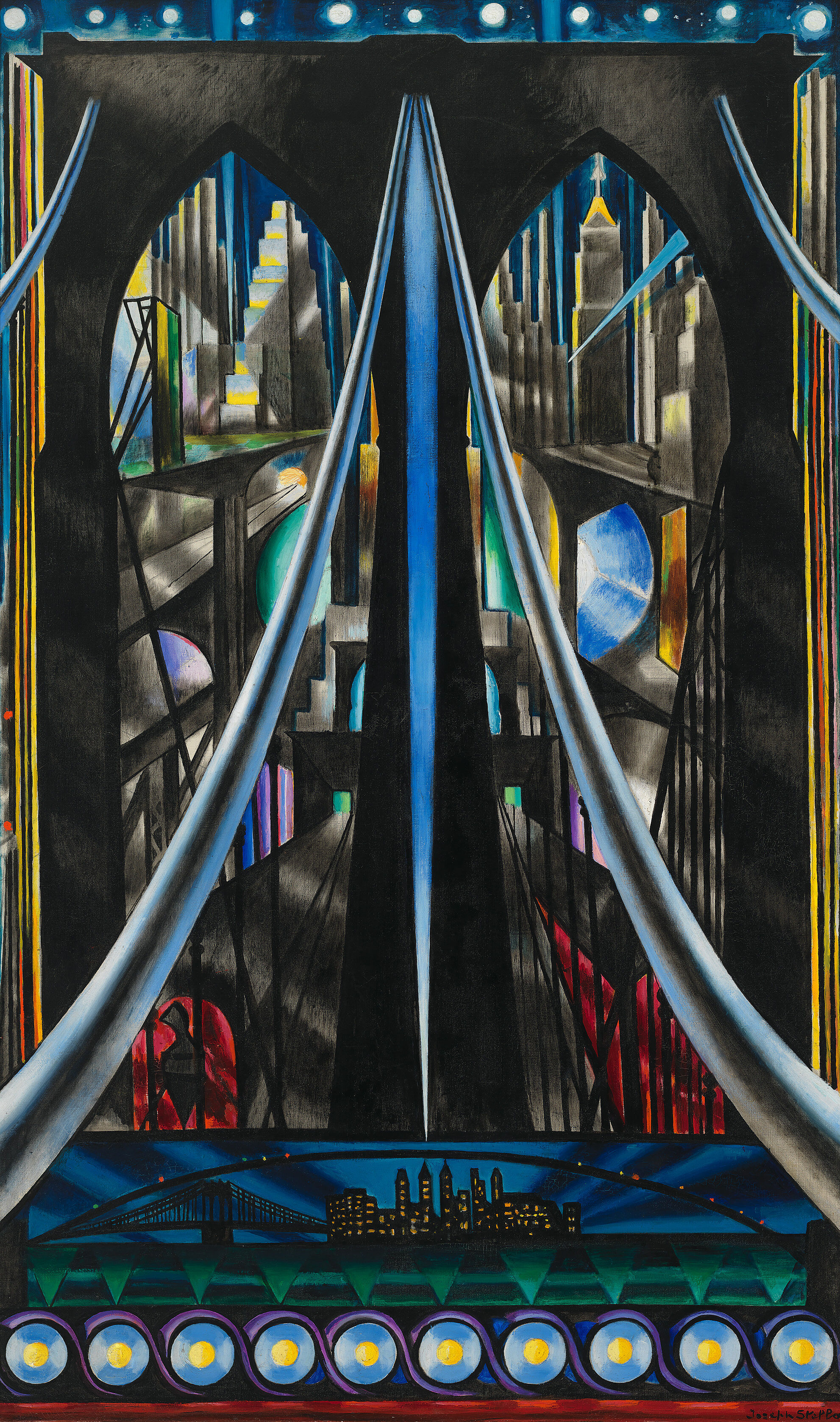
JOSEPH STELLA
THE BROOKLYN BRIDGE: VARIATION ON AN OLD THEME, 1939
To Italian-born Joseph Stella, who immigrated to New York at the age of nineteen, New York City was a nexus of energy. In the engineering marvel of the Brooklyn Bridge, which he first depicted in 1918 and returned to throughout his career, he found a contemporary technological monument that embodied the modern human spirit. Here, Stella portrays the bridge with a linear dynamism borrowed from Italian Futurism. He captures the dizzying height and awesome scale of the bridge from a series of fractured perspectives, combining dramatic views of radiating cables, stone masonry, cityscapes, and night sky. The large scale of the work—it is nearly six feet tall—conjures a Renaissance altar, while the Gothic style of the massive pointed arches evokes medieval churches. By combining contemporary architecture and historical allusions, Stella transformed the Brooklyn Bridge into a twentieth-century symbol, the quintessence of modern life and the Machine Age.
Bibliography and links
Miller, Dana, Ed. Whitney Museum of American Art: Handbook of the Collection. New York: Whitney Museum of American Art, 2015.
/exhibitions/america-is-hard-to-see
America Is Hard to See exhibition information.
The Whitney’s collection.
The Whitney’s programs for teachers, teens, children, and families.
The Whitney’s online resources for K-12 teachers.
Credits
This Teacher Guide was prepared by Dina Helal, Manager of Education Resources; Lisa Libicki, Whitney Educator; Heather Maxson, Manager of School, Youth, and Family Programs; and Pauline Noyes, Coordinator of School and Educator Programs.
Education programs in the Laurie M. Tisch Education Center are supported by the Steven & Alexandra Cohen Foundation, Inc; The Pierre & Tana Matisse Foundation; Jack and Susan Rudin in honor of Beth Rudin DeWoody; Joanne Leonhardt Cassullo and The Dorothea L. Leonhardt Foundation, Inc.; the Barker Welfare Foundation; Con Edison; public funds from the New York City Department of Cultural Affairs in partnership with the City Council; and by members of the Whitney’s Education Committee.
Generous endowment support for Education Programs is provided by the William Randolph Hearst Foundation, the Annenberg Foundation, Laurie M. Tisch, Steve Tisch, Krystyna O. Doerfler, Lise and Michael Evans, and Burton P. and Judith B. Resnick.
Free Guided Visits for New York City Public Schools are endowed by the Allen and Kelli Questrom Foundation.
The Whitney’s Education Department is the recipient of a National Leadership Grant from the Institute of Museum and Library Services.


America Is Hard to See is sponsored by the Henry Luce Foundation and Bank of America.
Major support is provided by the John R. Eckel, Jr. Foundation.
Generous support is also provided by the Juliet Lea Hillman Simonds Foundation, the Keith Haring Foundation Exhibition Fund, the Korea Foundation, the National Endowment for the Arts, and the Philip A. and Lynn Straus Foundation.


