Words on Walls: A Conversation with Tom Black
Nov 3, 2011
“Before I worked in a museum,” says Head of Graphic Design Rebecca Gimenez, “it didn’t occur to me to wonder how the wall texts found their way onto the walls. They seemed inevitable, like the museum itself was talking to me.” In a way, this is exactly what happens: After the interpretive wall texts that accompany each exhibition are written by a curator and commented on by the Museum’s educators and editors, they are designed and typeset by Rebecca’s team. The designers work with curators and educators to determine the right font choice, layout, sizing, and other visual qualities. The final mediator in this collaborative process is the printer, who transfers the introductory texts and object labels to the gallery walls, giving the Museum voice to “talk” to its visitors.
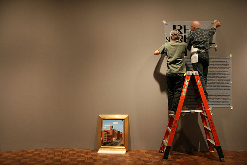
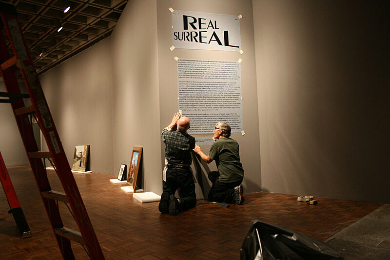
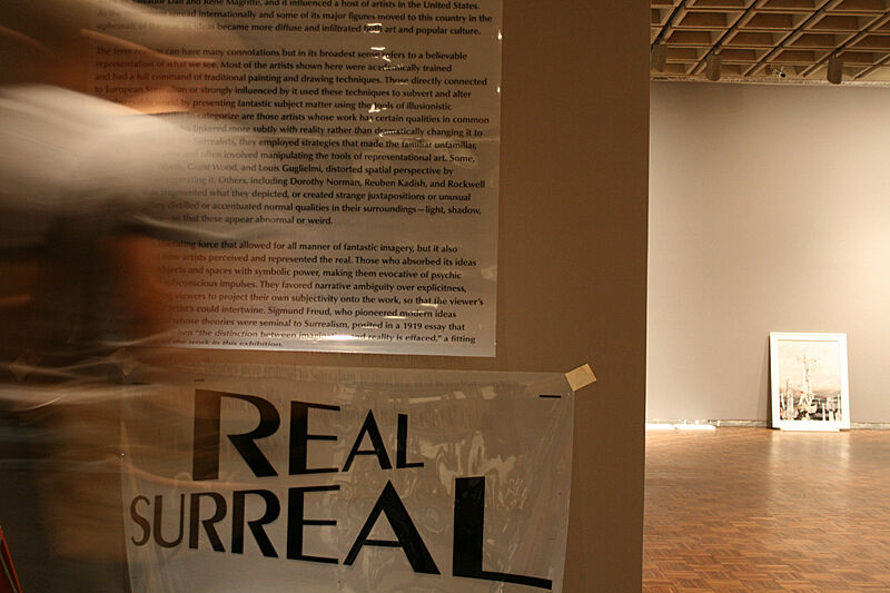
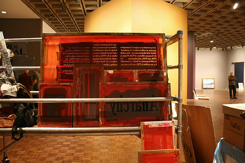
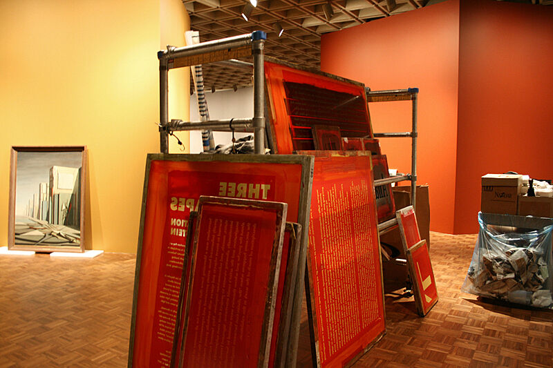
While there are several methods for applying text to a wall, including adhesive vinyl lettering and printed paper mounted on boards, the Whitney prefers to screenprint its texts for aesthetic reasons: screenprinted lettering is seamless with the surface of the wall and remains even after it has been painted over for the next exhibition, becoming a permanent part of the Museum.
For its exhibition texts and graphics, the Whitney works with a master printer, Tom Black of T. E. Black Studio. Arriving in a van loaded with paint, scaffolding, and screens prepped over the preceding weeks, Black and his four-person crew screenprint texts and graphics directly onto the Museum’s walls a few days before the show opens.
Black has been developing his craft for more than forty years. After studying painting as an undergraduate, he began working as a packaging designer for International Typeface Corporation, mentored by such influential type designers as Ed Benguiat and Edward Rondthaler. In 1983 he opened T. E. Black Studio, making limited edition prints for artists and publishers. One day, as Black and his crew were helping an artist bring his work into the Queens Museum, the director of exhibitions asked if they could print an exhibition title on a wall. Today, the studio produces only museum graphics, and is responsible for the lion’s share of on-site printing for not only the Whitney but also the Museum of Modern Art, the Metropolitan Museum of Art, the Guggenheim, and others.
Rebecca recently asked Black a few questions about his practice for “Whitney Stories”:
Rebecca Gimenez: Has working at the Whitney affected your practice in any way?
Tom Black: One day as I entered the museum to print some wall graphics, I was surprised to find Lawrence Weiner there doing one of his typographic installations. This time he was carving the letters into the many layers of wall paint, perhaps an inch or more, and you could see all the colored layers exposed like tree rings. I was, quite frankly, surprised by how thick and how many layers there were exposed. Now, I have this image in my mind of the museum becoming incrementally smaller each time our screenprinting needs to be painted over to make way for a new exhibition. Consequently, whenever I hear a curator complaining about the lack of wall space, I feel just a little bit responsible!
RG: Tell me about your operation. What’s the studio like?
TB: Our team—our merry band!—is rather small. It’s a family business; my daughter is the owner now. Our studio is something of a hole in the wall, more like a factory than an art studio. In fact, it was a nail polish factory before we moved in thirty-three years ago. Actually, the technology area is tidy—it’s the printing area that is grimy. The tech people prepare the film and make the screens, and the printing folks play around with ink and print. There is some overlap in job descriptions—we try to make sure that few stay clean!
RG: How do you manage to transfer enormous graphics onto the Museum’s walls? Is there a maximum screen size?
TB: Our maximum screen size is determined by what will fit into our van. But since we print in increments, there is no maximum image size. We have printed some rather large images—sometimes we paint into printed images for various reasons of special effect. All of our staff members are artists, fortunately.
RG: How exactly do you get the results to appear straight on the wall? It seems like the process is more complicated than using a level and “hoping for the best.”
TB: Most of what is visible in our working procedure is a mechanical registration system that we have developed over the years, and which allows us to have very tight control over the position of the screen. However, what is not so apparent is the printer’s evaluation of the condition of the wall and all the adjustments he has to make to render a quality image. This is the craft.
RG: What happens when there’s a mistake in the screen? Can you correct things on the spot?
TB: Yes, we do make small on-the-spot corrections. Here again, because of our tight control, we are always able to return to a former position. Also, we ourselves make mistakes. We are human and are quite capable of proving it! I think that by approaching the process in small increments, the mistakes do not get out of hand and the work can be brought back on course.
RG: Logistics must be a challenge, working as you do around priceless works of art and the teams of people required to handle and protect them.
TB: Working around works of art is daunting for sure and it is our first consideration. It is, of course, the reason we are at the museum. Sometimes, we are provided an escort; however, I really do not consider them as offering any protection. I see [the objects’ safety] as our responsibility: to see that there is enough distance between our work and the art. We do carry a big insurance policy. In the face of “priceless,” it does not mean much!